

|
cLin posted:I'm a bit confused with profiles and such. What would I use that website listed above for? I noticed they linked profiles, is that something I give them or I would use on my computer?
|
 #
¿
Feb 17, 2009 09:15
#
¿
Feb 17, 2009 09:15
|
|


|

|
| # ¿ May 5, 2024 21:06 |
|
|
poopinmymouth posted:How do you white balance properly in Photoshop? WB in Lightroom is so easy, you can easily warm or cool the WB, or use the eye dropper, OR use the presets. Is there a similar option in photoshop? I normally WB for my subject, and I guess I could re white balance for background, and send that to photoshop too, then mask them together, but I'd love it if there was an actual tool that replicated easy WB within photoshop. I know it gives you more control technically, but I've never been able to white balance properly within photoshop, but can very easily do it in Lightroom.
|
|
#
¿
Feb 18, 2009 04:03
|
|
|
germskr posted:I guess all the photojournalists here should slap themselves in the face.
|
|
#
¿
Feb 18, 2009 04:11
|
|
")
|
Martytoof posted:How the gently caress does Dropbox give away full rights to my files. I've got some MP3s I ripped from a CD in my public folder so I could access them from my UNIX server, somehow I doubt that they're now available to use free of licensing quote:...you hereby grant all other Dropbox... also quote:You represent and warrant that you own or have the necessary licenses, rights, consents and permissions to grant the licenses that both your public and shared folders require, as described above. Or to put it another way, if you've got some MP3s you ripped from a CD in your public folder you had better be the copyright holder or have the copyright holder's permission because you just said to the world "these songs are mine, come and get them!" Good luck with that.
|
|
#
¿
May 24, 2009 13:03
|
|

|
I HATE CARS posted:Too late, remember that the license is "perpetual and irrevocable".
|
|
#
¿
May 24, 2009 23:53
|
|
|
Alctel posted:Whats a good book for learning about Processing in LightRoom for a beginner?
|
|
#
¿
May 24, 2009 23:55
|
|
|
baptism of fiber posted:I'd rather find a solution that makes the images look normal on other peoples' browsers too. Keep going. Don't let bad weather or old age slow you. Eventually, everyone in the whole wide world will have a properly calibrated monitor and your images will look normal to everyone. Alternatively, you could just accept that the internet is not an ideal venue for showing your images, that you cannot make sure that your images will look right on other people's machines and that there is nothing you can do about it. Enabling colour management in a browser doesn't help if the display isn't calibrated. Use the time you would have spent worrying about other people's displays to make better images that you can enjoy more yourself. SirRobin fucked around with this message at 15:40 on Jul 29, 2009 |
|
#
¿
Jul 29, 2009 05:16
|
|
|
poopinmymouth posted:lol
|
|
#
¿
Jul 29, 2009 15:39
|
|
|
HPL posted:Johnny LCD drat, there's a whole myth cycle to be told here, all about how Johnny walked the land, his pet munki on one shoulder, his spyder on the other, with his best friend One-Eyed Huey by his side. He travelled from town to town, checking display devices everywhere and setting them right until one day he was lynched by a mob of angry folk who didn't like that he introduced pure red to their once-gray traffic lights. SirRobin fucked around with this message at 16:22 on Jul 29, 2009 |
|
#
¿
Jul 29, 2009 16:16
|
|
|
brad industry posted:Pretty much this. If you really care about people seeing it how it was intended, make a printed portfolio. But then of course you have to deal with showing your book in places with lovely lighting
|
|
#
¿
Jul 31, 2009 04:52
|
|

|
Shannow posted:My tablet has a mouse a swell and i use it for gaming also, it's much less likey tospaz out on me than a an optical mouse.
|
|
#
¿
Aug 24, 2009 04:35
|
|
|
orange lime posted:Zoom in to 400% and use the Fixed that for you. Tweaking and refining an edge selection with paths is so much easier and more flexible than with lassos. I can't remember the last time I used a lasso for anything other than the very roughest work.
|
|
#
¿
May 13, 2010 05:17
|
|
|
orange lime posted:Eh, I think it depends on what you're used to. Once you get in the groove of add/remove/intersect selection, I find that the polygonal lasso works a lot better for pixel-level stuff. The pen is great if what you're selecting has a geometric curve, but when you have to start masking around things like leaves you're adding so many control points that you might as well be using the lasso in the first place. To each his own, though.
|
|
#
¿
May 13, 2010 14:59
|
|
|
calcio posted:Need to get a better post processing system down and looking at Kelby's latest Lightroom 3 Book especially for the 7 point system. Anyone have any feedback about this book or his 7 point system in general on Lightroom?
|
|
#
¿
Jul 15, 2010 05:16
|
|
|
Bojanglesworth posted:why is is saving in Adobe instead of sRGB like CS4 has been doing the entire time Ive had it? I'm going to go waaaaay out on a limb here and guess it's because you haven't told it to save as sRGB. Check your colour space settings.
|
|
#
¿
Jul 23, 2010 11:55
|
|
|
Bojanglesworth posted:I must be retarded or something cause I have no clue what you are talking about. I have been using a Mac and Aperture for forever so everything is new to me. In Aperture if I deleted something from my library like that they would show up in my recycle bin, when I pull the same move in Lightroom they never show up in my recycle bin. In all of the other cases LR asked you where to store them. Since you don't know where LR has stored them I'm going to assume you have never changed that destination from the default so if you try importing another image you can look and see where LR has been stashing them. It'll look something like this:
|
|
#
¿
Sep 12, 2010 12:52
|
|
|
A5H posted:So if I resize individually in Photoshop then upload to the Internet will all my colors be screwed up? If you're uploading for anyone to see, your colours will be all screwed up on the viewer's end. Not only will they all be screwed up, they will be screwed up in ways you cannot forsee or imagine and there is nothing you can do about it. Edit: It seems I have ranted about this before SirRobin fucked around with this message at 05:54 on Nov 8, 2010 |
|
#
¿
Nov 8, 2010 05:49
|
|
|
TheLastManStanding posted:Even if you are posting to the net you should still deal with your color profile. I'd rather have my colors wonky for most people than for everyone. TheLastManStanding posted:Using photoshops 'save for web' feature is the best way to deal with it. When converting from raw you can set your colorspace. Unless I plan to print something then I'll always work in sRGB. SirRobin fucked around with this message at 09:10 on Nov 8, 2010 |
|
#
¿
Nov 8, 2010 09:03
|
|
|
ExecuDork posted:
But that's only the beginning if you're going to make a good print and, unfortunately, there's not a lot we can do to help you via interwebs. Printers are not monitors. Getting your profiles right will get you close to what you want but not always close enough. Alas, it's the darker areas that will let you down. Subtractive colour mixing will do that to you. You'll probably find that everything above the cloud line will print just fine but you will lose detail on the plain in the foreground. The only way to be sure, after calibrating your monitor and printer, is to do test prints, see what works, adjust what doesn't, wash, rinse, repeat. We can't see your test prints so you'll have to make the call yourself as to what looks best. For example, it took 6 rounds of test prints before I got one that I was happy to show other people of this image:  Umbrella by Paul Duncanson, on Flickr I needed to keep the alley looking dark and gloomy but also needed to keep the fine detail on the walls, the fence etc. Easy to do on screen, tricky on paper. SirRobin fucked around with this message at 23:41 on Dec 8, 2010 |
|
#
¿
Dec 8, 2010 09:04
|
|
|
psylent posted:SirRobin, how was that umbrella shot lit? There's a speedlite with a radio trigger gaffer-taped to the rib bits that fold the umbrella canopy out pointed at a piece of A4 white card stuck to the inside of the canopy. Yellow gel on the speedlite. It was shot late in the afternoon of an overcast day so everything outside of the pool of light from the flash is daylight. 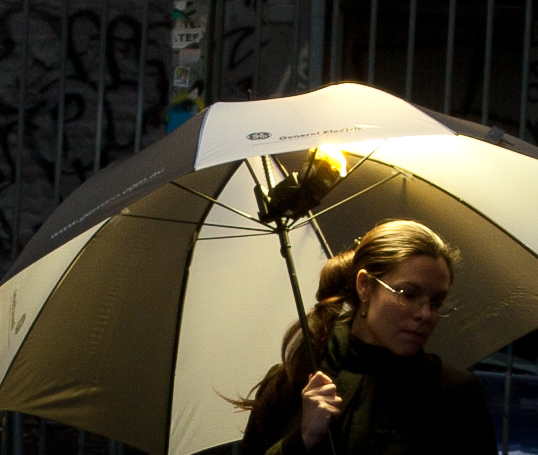 How The Umbrella Was Lit by Paul Duncanson, on Flickr SirRobin fucked around with this message at 14:23 on Dec 8, 2010 |
|
#
¿
Dec 8, 2010 13:39
|
|
|
brad industry posted:You could do this in one test print, just crop a square of shadow detail and make a graduated test strip.
|
|
#
¿
Dec 9, 2010 04:26
|
|
|
psylent posted:Brilliant, I thought you'd taken multiple exposures and then deleted the light stand or something. Nice job  multiple-kate-tea by Paul Duncanson, on Flickr I wanted to show two sides of her personality but there is only one of her. The light stand is holding up the cup
|
|
#
¿
Dec 9, 2010 11:56
|
|
|
Keeping the flash well away from the camera will help but so long as they're not red, a reflection highlight on an eye doesn't always look bad. Eyes are round and wet and do reflect highlights. If there are none there, they can look a little lifeless. Scaled down like this, I can barely make out highlights in any of the eyes so unless it's going to be displayed a lot larger than this you probably don't need to worry about them. What I would worry more about are the darker-haired people who are starting to disappear into the background around their edges and the massive forehead highlights on the leftmost guy, the red-top blonde and the purple-shirted guy.
|
|
#
¿
Dec 11, 2010 07:17
|
|
|
Martytoof posted:Is there a way to re-adjust your ACR options once you've opened up a file in Photoshop? Part of the reason I don't do the bulk of my work in Photoshop is that I can't (or at least I don't think I can) fiddle with the settings once I've opened the file, as opposed to Lightroom where I can doodle all day and only commit once I need something opened in Photoshop.
|
|
#
¿
Apr 11, 2011 04:52
|
|
|
teethgrinder posted:GIMP's not that bad.
|
|
#
¿
Jul 10, 2013 04:57
|
|
|

|
| # ¿ May 5, 2024 21:06 |
|
|
I think a more important question is just how much more poo poo will we have to eat from Adobe before someone comes up with a replacement for LR? Affinity Photo is good enough to replace Photoshop, Affinity Designer is a perfectly capable substitute for Illustrator. Neither have any subscription plans and crippled feature sets for people who don't want a part of them. You pay once, you get your software and that's how I like it. Adobe's development efforts seem to be focussed entirely on designing new and shittier ways to squeeze more money out of us. So who wants my money? SirRobin fucked around with this message at 04:22 on Oct 19, 2017 |
|
#
¿
Oct 19, 2017 04:18
|
|