

|
cLin posted:So this is jsut another method of doing HDRs? Or is this even considered HDR What Topaz Adjust does is tone mapping, and a lot of people label tone mapped images as HDRs. Strictly speaking, a HDR image is just an image that has a higher dynamic range than what the camera can capture/what the monitor can display/what the printer can print. In order to get an image that's actually viewable/printable, you need to convert the higher range of image data to some smaller, usable range, and that's often done by tone mapping. Taking a single, low dynamic range photo and applying tone mapping just gives you a tone mapped image, not a HDR image. http://en.wikipedia.org/wiki/Tone_mapping Sebastian Flyte fucked around with this message at 12:36 on Feb 9, 2009 |
 #
¿
Feb 9, 2009 12:34
#
¿
Feb 9, 2009 12:34
|
|

|

|
| # ¿ Apr 29, 2024 18:46 |
|
|
I have a colour space conversion issue in Photoshop that's really starting to bother me. I regularly calibrate my monitor (with a Huey Pro - 6500K colour temperature and 2.2 gamma) and everything always looks quite as it should. I work in Adobe RGB in Photoshop, and proofing images against my monitor RGB gives only barely noticable differences between unproofed Adobe RGB images and proofed images. However, when I convert to sRGB, poo poo happens every time. Conversion settings are Adobe (ACE) Engine, relative colourimetric intent, and black point compensation and dither checked. Unproofed sRGBs images after conversion look pretty much exactly like the Adobe RGB versions before conversion, but when proofing against my monitor RGB, the converted sRGBs become much more saturated. And that oversaturated look is what I get when I save any sRGB and view it in a browser or other software outside of Photoshop. It's become a habit to always desaturate sRGB images by 10 to 15 before saving, because that's the only way I can get my images to look like they did in Photoshop when viewing them outside of Photoshop. But it is fairly tedious to always rework the colours a little every time I save in sRGB, and I feel it's not quite how things should work when converting from Adobe RGB to sRGB.
|
|
#
¿
Apr 27, 2009 20:39
|
|
|
Loinworm posted:OK, so you have an Adobe RGB image which you work on while proofing against Monitor RGB (I'm assuming this is for web publication) and then it's suddenly oversaturated when you turn it into sRGB. How are you actually performing the conversion? Yep, it's for web. I'm converting to sRGB using "Convert to profile" with the "sRGB IEC61966-2.1" profile selected, and with conversion options: Adobe (ACE) Engine, relative colourimetric intent, and black point compensation and dithering both checked. And as said, it's only the monitor proofed sRGB images that are overly saturated. The proofed/unproofed Adobe RGBs and the unproofed sRGB are pretty much identical.
|
|
#
¿
Apr 27, 2009 21:18
|
|
|
Loinworm posted:Are you absolutely positive that "Proof Colors" is still checked after the conversion? It's coming unchecked for me, but flicking it back gives me the match I expected. "Proof Colours" is always unchecked for me after any profile conversion or whenever loading a new image. I always have to switch it on manually.
|
|
#
¿
Apr 27, 2009 23:13
|
|
|
Loinworm posted:I see the same thing you're seeing immediately following the conversion, but after turning it back on I've got a pretty good match between the Adobe RGB and sRGB images. Not exact, but good. kefkafloyd posted:Use a perceptual transform instead of a relative CM one. Your numbers will have no relation with the Adobe RGB original but it'll look right. Using other conversion options didn't solve the issue. However, I'm fairly certain I've found out what the issue is. My monitor is apparently a wide gamut display, and there are general issues with sRGBs having oversaturated colours in colour unmanaged applications on wide gamut displays. A bit of info here - mainly from a Mac perspective, and a Windows perspective here. So what I'm seeing is actually Photoshop doing its job quite properly - when proofing an sRGB colourspace against the Monitor RGB, Photoshop shows it like any colour unmanaged application will on my monitor - with oversaturated colours. So I guess I'll just ignore colour unmanaged applications for now because they are dumb 
|
|
#
¿
Apr 28, 2009 17:28
|
|
|
A few sunset photos of mine received some favourable responses in PAD, and I was asked if I would share the original files and perhaps write a tutorial. PAD post here. I'll try to go into detail about how to combine the sky and vegetation in this image: 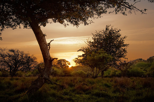 Bigger here For now I won't go into detail about the process after combining the sky and vegetation, which involved a lot of local curves adjustment, as I'll probably need to backtrack a lot and figure out what I did and why. For this tutorial you will need: Scissors and tape, a spanner, 1 pound of flour, a live vole, and some basic Photoshop knowledge. Disclaimer: I am not a Photoshop expert by any standard (whatever that might be), and some of the steps I've taken might not be the most briliant way of doing things. I just do what I've learned to do so far. To start with, I had two RAW files, shot 2 stops apart. In Adobe Camera Raw I only adjusted the curves a little, to get some basic contrast. All other settings were at 0, except in the first one, where I set recovery to around 60, to recover some overblown light in the sky. Also in both images I changed the white balance slightly towards a warmer hue. So in Photshop I started out with these two images: Let's call this the sky image 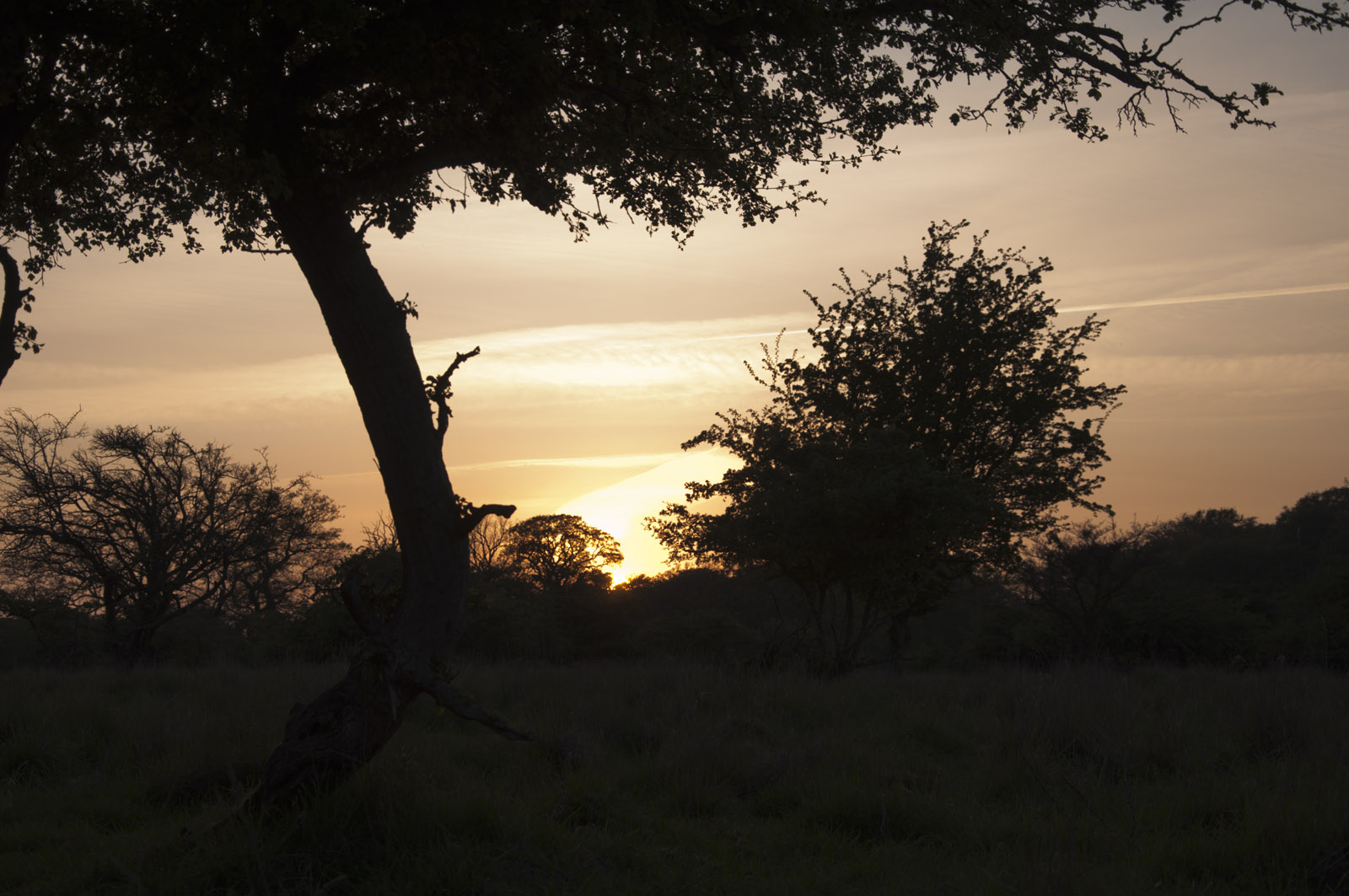 Bigger here And call this the vegetation image 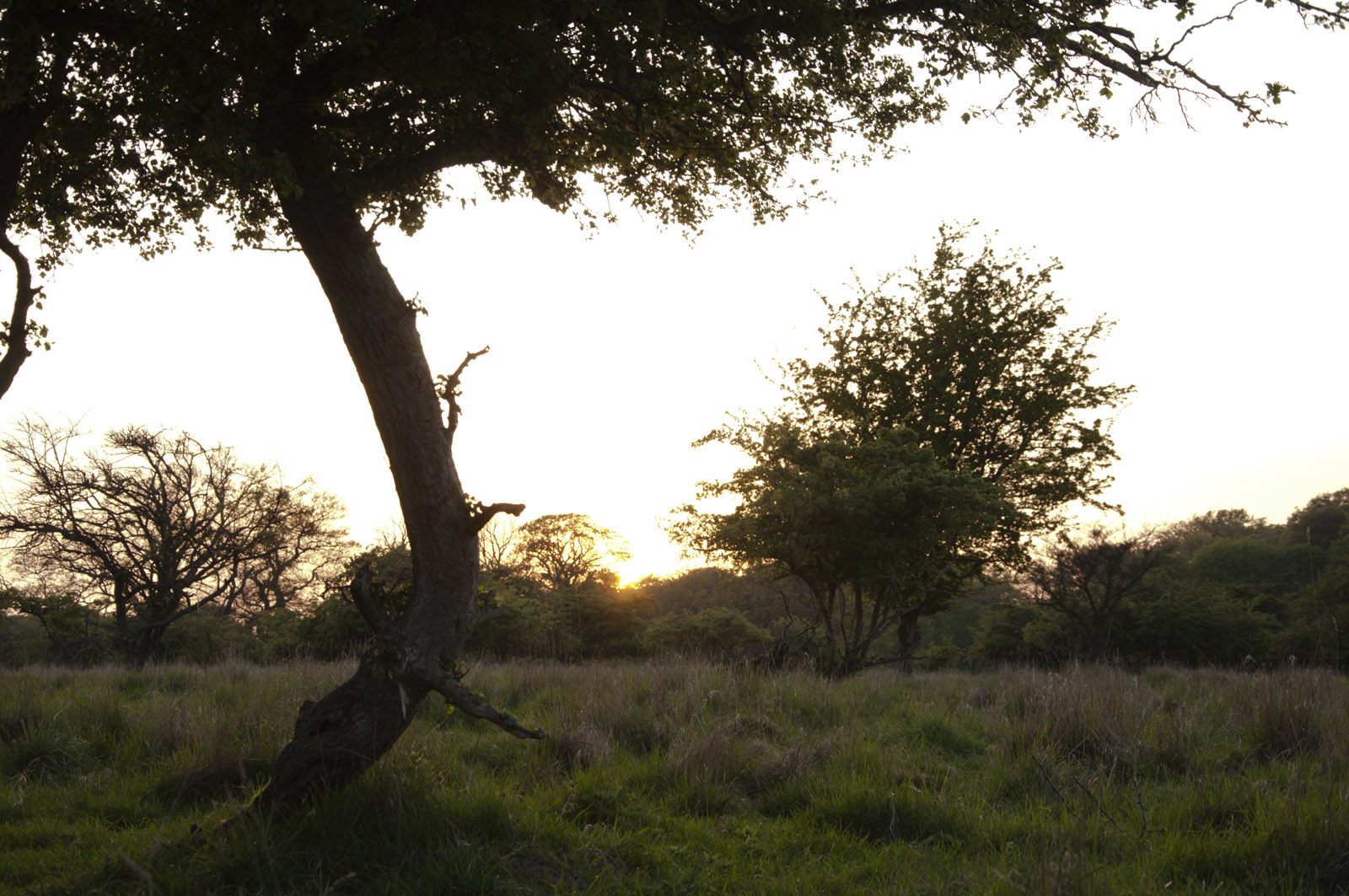 Bigger here All post work was done in 16-bit mode and in Adobe RGB. Only at the end did I convert to 8-bit sRGB. First step was to put the sky image on a layer on top of the vegetation image and then auto-align the two layers. Next I removed the contrail in the sky layer with the clone stamp tool. I very much hope that jet air travel is abolished soon and that we'll bring back the Hindenburg. Not least because blimps with swastikas against a sunset sky would be totally awesome to photograph. Then I wanted to hide the strange diagonal cloud over the sun as it was just too noticable and distracting. So I cloned in some of the wispy clouds, with a very soft-edged brush to make a gentle transition. Then came the bit requiring the most work: Making a mask to only reveal the sky part in the sky layer. I used to do HDRs for shots like these where at least two exposures are needed for the sky and the ground. But I've had too many infuriating battles with Photomatix, as it constantly screws up colours when combining exposures - before it's even started on tone mapping. So instead I combine the sky and the ground in Photoshop with a more or less hand-crafted mask. My starting point for sky masks is usually one of the RGB channels - the one with the most contrast against the sky. In daytime shots, it's nearly always the blue channel. But for sunset/sunrise skies, the red channel usually has the most contrast. So I copied the red channel to a separate layer, and increased the contrast using the levels tool so the sky was totaly white and the vegetation was totally black. Like so, with a sort of before/after border for illustration purposes:  I could probably just as well have made the mask by copying the vegetaion layer instead, desaturating the layer and using the levels tool as above, as the overblown sky was already totally white on the vegetation layer. But I didn't do that. I cannot rationally explain why. I then used the black/white image to create a layer mask for the sky layer. Which turned out like this not very pretty thing with the vegetation layer underneath: 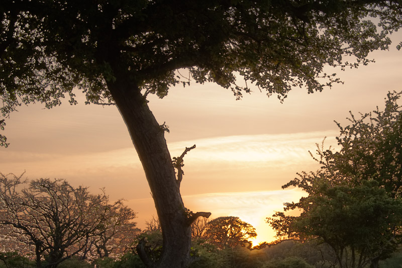 Photoshop had aligned the layers pretty well against the ground, but couldn't quite get it right towards the top, as I had shot this hand-held  It wasn't the first time I went out shooting and forgot to remind myself "Bring your tripod you tremendous twatbucket!" It wasn't the first time I went out shooting and forgot to remind myself "Bring your tripod you tremendous twatbucket!"I then started to paint on the sky layer mask with a soft white brush to reveal the sky layer in those parts of the image with dark naked branches and crap transitions. As both the sky and vegetation layer had the same dark naked branches in mostly the same places, I could just as well completely hide the vegetation layer in those places and reveal only the sky layer. So after around 5-10 mins of painting a bit here and there with big brushes and small brushes, and in a few places with a 50% grey brush, I got this mask: 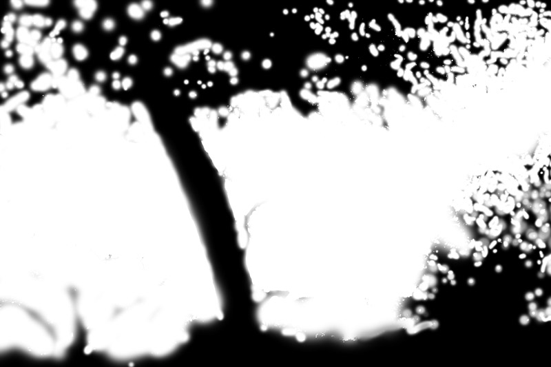 Which combined the sky and vegetation layers like so:  In hindsight I could probably have nudged the position of the sky and vegetation layers to align them a little better, and I could probably have made the mask better with the refine edge tool, so the mask didn't require that much manual painting. But I didn't really think of trying that at the time, and I mainly just needed a useable transition between sky and vegetation without pixel-perfect masking of each delicate little branch and leaf. So that's basically it. When I need to combine two exposures like these, I always use masks rather than HDR software, as masks completely avoid the haloing and colour changes you get in tone mapped HDRs, and it gives you more freedom to tweak the parts of the image separately when you've got the sky and the rest on separate layers. If there's any interest I'll try to write a little about how I did the rest of the post-processing on this image. Sebastian Flyte fucked around with this message at 19:07 on May 6, 2009 |
|
#
¿
May 6, 2009 18:57
|
|
|
baptism of fiber posted:When I open up a folder of raw files in bridge, then click on one, after about a half-second the color changes, looking darker and less saturated. You can't make Bridge or ACR recreate the camera software processing that generated the JPG. It would somehow require that the camera software saved some metadata describing the what it did to the RAW file when adjusting contrast/saturation/highlight and shadows adjustment/etc etc, and then having the Adobe software re-create most of those adjustments. And with all sorts of camera manufacturers doing all sorts of RAW processing in their camera software, it would probably be quite a task for Adobe to emulate all that.
|
|
#
¿
May 29, 2009 06:33
|
|
|
baptism of fiber posted:I've heard of the firefox color management tweak, but I'd rather find a solution that makes the images look normal on other peoples' browsers too. From around version 3.0, Firefox has had colour management, but it was disabled by default, and you had to enable it manually in the configuration settings. However, it worked with all ICC monitor profiles. In version 3.5, colour management is enabled by default, but it doesn't work with ICC profiles version 4 and maybe 3. So with Firefox, there's currently no way to ensure that colour management is enabled for everyone.
|
|
#
¿
Jul 28, 2009 11:07
|
|
|
ricepaddydaddy posted:Is there anyway easy to get ALL programs such as IE/firefox and Windows Photo Gallery to use the same colour profile? I've just noticed that all of my photos look different in different browsers.... IE doesn't do any kind of colour management. Nor does Firefox if your monitor profile is ICC ver. 4, which is what you'll most likely have if you use any sort of colour calibration device. There is no way to force all applications to do colour management in a uniform way. Each application implements colour management by itself, and a lot of Windows applications simply don't have any form of colour management.
|
|
#
¿
Apr 26, 2010 08:38
|
|
|

|
| # ¿ Apr 29, 2024 18:46 |
|
|
Gibertjim posted:Arrrgh, every time I save a file from Photoshop the resulting file has the colors screwed up. Everything looks kind of muted and has a sort of yellow-ish cast to it. Is this some sort of color space or profile problem? I've tried Google but I can only find results about saving for web. Do your files appear muted and yellowish when you load them back into Photoshop, or when you open them in other applications? What colour working space are you using (check your settings in Edit -> Colour Settings).
|
|
#
¿
May 5, 2010 07:03
|
|