

|
My list (bound to be a few repeats) * [ and ] resize the brush * X = toggles the foreground and background color. * alt = hold it to let you color pick from the canvas. You can actually pick the color picker tool to change from a 1x1, 3x3, or 5x5 sample area. 1x1 gives you the exact color of the pixel underneath, but 3x3 and 5x5 take samples of the surouning 9 and 25 pixel areas respectively. * Hold down space while drawing a line, a marquee selection or shape, while still holding the mouse button down, in order to move where the origin starts. * Hold shift to contrain your brush or line to horizontal or vertical (whichever is closest) * ctrl + h = show hide extras (grids, vectors, guide lines, etc) * ` = while viewing a layer mask or alpha channel, this will allow you to see it as a quick mask, overlayed in red over the actual RGB layer. * ctrl + click on a layer will give you a selection based on the contents of that layer. * ctrl + shift + click on a layer will add to your current selection based on the contents of that layer. * ctrl + alt + click on a layer will subtract from the current selection based on the contents of that layer. * ctrl + alt + shift + click on a layer will contract the current selection to just the area occupied by the contents of that layer * ctrl + shift + i = will invert the current selection * alt + delete = fills the layer with the foreground color * ctrl + delete = fills the layer with the background color * D = resets foreground/background to white/black * All tool shortcuts (b for brush, l for lasso) will shuffle through the alternate tools. B for brush, then shift + B gives you the pencil tool. L for lasso, shift + L for polygonal lasso, shift + L for magic lasso, etc.
|
 #
¿
Jan 27, 2009 02:18
#
¿
Jan 27, 2009 02:18
|
|


|

|
| # ¿ Apr 29, 2024 19:01 |
|
|
A few people asked me how I do my sharpening, so I wrote up a quick guide. This came from a few different places, I didn't really invent any stage of it.
|
|
#
¿
Jan 30, 2009 15:01
|
|
|
Remy Marathe posted:He used "soft light" instead, and I wouldn't mind an explanation (non-mathematical) of the difference between the two. Soft light seems to allow the affect without you "seeing" it. One thing I dislike is when your methodology is apparent. Overlay might work in some cases, but I found I had to back off the layer transparency till it basically looked like the soft light method.
|
|
#
¿
Feb 3, 2009 01:33
|
|
|
jackpot posted:Also keep in mind you often don't want the effect over the whole photo; in my opinion IsaacNewton's dog is much improved by the sharpening, but he'd be better off masking out the trees and snow because now they've lost their softness. Yep, I mentioned in the image you should mask to taste. I almost never apply an adjustment layer to the entire image.
|
|
#
¿
Feb 3, 2009 23:40
|
|
|
How do you white balance properly in Photoshop? WB in Lightroom is so easy, you can easily warm or cool the WB, or use the eye dropper, OR use the presets. Is there a similar option in photoshop? I normally WB for my subject, and I guess I could re white balance for background, and send that to photoshop too, then mask them together, but I'd love it if there was an actual tool that replicated easy WB within photoshop. I know it gives you more control technically, but I've never been able to white balance properly within photoshop, but can very easily do it in Lightroom.
|
|
#
¿
Feb 18, 2009 02:36
|
|
|
brad industry posted:I use a Curves adjustment layer. You can do it with Levels or Color Balance. Really there are a lot of ways to correct color in PS.. pick one you like and figure out how to get good at it. You do get a lot more control in PS over LR. Yep, said that in my post, I know it has more control, yet I'm proficient in photoshop, and find it far easier to WB in LR with the WB tools than photoshop. I guess that answers my question that there is no easy way to correct it within PS.
|
|
#
¿
Feb 18, 2009 02:52
|
|
|
LuisX posted:Sometimes match color works: I wish the ACR window could be used as an adjustment layer. I've gone through the online tutorials, and none of the methods are what I want. I will have to white balance twice in LR and send both and mask.
|
|
#
¿
Feb 18, 2009 13:06
|
|
|
Nanohahn posted:I'm not quite sure this is what you're looking for, and it may have been covered in the online tutorials you've seen, but you can open the Camera Raw window as a Smart Object in Photoshop by holding Shift when you click Open Image. This should allow you to edit the Camera Raw settings "after the fact". Awesome, did not know that. Will try.
|
|
#
¿
Feb 18, 2009 16:14
|
|
|
 Quick animation of a typical edit of mine. First parts are editing the back plate, then pulling in the subject. Normally I wouldn't composite, but the light sources were so hard to match that it was actually easier to do it this way in this case. 1. Original photo of background, brought in from lightroom. It's been color balanced, the red shifted to have no orange and be a true red, and some constrast adjustments, bringing the clipped whites around the light back with the highlight recovery slider. CA was removed with my 50mm preset. 2. Distortion removed with the free transform and lens distortion filter. 3. Left half duplicated to right half for symmetry, but using a mask to disguise the middle bits so you don't get a Rorschach effect giving it away. 4. Tire tracks removed using an earlier shot background plate (car ran right in front of me with wet tires) 5. Blue lens flare removed from bottom and top. (very subtle but would be visible in a print) Second parts are bringing her in, masking her out, color balancing the main light, then color balancing the edges. I normally use the photo filter adjustment layers with masks to color balance. 6. Bring in the layer with her in it (notice how I'm in there holding the light stand. I couldn't get an assistant so I was using the 10 second timer and holding the light. I would have needed a HEAVY duty C-stand with a super strong boom to hold this light in this position) 7. Mask away the background using the magic lasso to start, then using a soft 50% opaque brush for the hair and boa to do careful masking. 8. Color balance her main light source. 9. Color balance the "fringe" where the light is leaking around from the fluorescent tube. 10. Final fixes on her fly away hairs, removing the last bit of orange. 11. Desaturate ground layer to hide the dual light sources. I needed the ground here to show her shadow and anchor her down, but had to remove the color giving away the composite job. 12. High pass desaturate sharpen layer. 13. Hide wrinkles and add body using healing brush and overlay layers (this was done under all the color correcting layers, but I did it last. It's non destructive but didn't have as much to do with the final image as all the color sources. In this image, every layer has a mask. Final image: 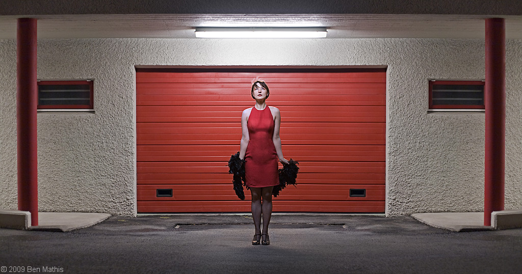
poopinmymouth fucked around with this message at 23:09 on Mar 29, 2009 |
|
#
¿
Mar 29, 2009 22:59
|
|
|
Ziir posted:Couple questions for you guys. 1. I always have the untouched raws. I have the original raw, the lightroom processing settings, and on my best images, a psd with the same name in the same folder, with 5 star rating in lightroom. 2. Have an idea of what you actually want to do, before firing up photoshop. Every image needs it's own specific stuff, and no matter how well you know photoshop, there isn't always a way to make an image better just by mucking with it generically. poopinmymouth fucked around with this message at 05:56 on Apr 2, 2009 |
|
#
¿
Apr 2, 2009 05:53
|
|
|
TsarAleksi posted:Would it be a strict conversion exercise or postprocessing in general? This is done often in 3D where one model (think a digital sculpture) is offered, then as many people as desire do a texture for it (think painting the surface) You really get some amazingly different interpretations, and it's awesome. I'd like to think we should leave basically any manipulation open. So if people want to remove whole elements, or completely paint in something new, it's ok. If I were running it, I'd basically make the only rule: Be sure that people can recognize it was made from the original photo. Also I'm down with offering up some RAWs if volunteers are needed.
|
|
#
¿
Jul 6, 2009 23:27
|
|
|
germskr posted:Yes. I really want to submit some of my portrait shots, but despite owning copyright to the works, I kind of feel bad distributing these people's likenesses all over the web when they volunteered for free. I dunno. I wouldn't have a problem, but some of them might feel creeped out. But I think there should be at least: 1) closeup of a face (skin retouching) 2) full body portrait (body altering) 3) the various non people photos, (landscapes, etc)
|
|
#
¿
Jul 10, 2009 08:31
|
|
|
kmcormick9 posted:Could someone post a tutorial for masking and layering in cs3 for someone with almost zero photoshop experience? Every tutorial online assumes I already know how to mask, etc. http://www.poopinmymouth.com/tutorial/masks.htm Wrote this a while ago.
|
|
#
¿
Jul 21, 2009 21:57
|
|
|
Quick post from last night I figured I could post. Keep in mind it's purposefully underexposed because it's going to be the backdrop for a portrait. Original. I love this location, but hated the modern bits. So I duplicated the layer, flipped it horizontally, added a mask, then inverted it so the mask hides everything. I could then paint into the mask to reveal the flipped version over top of the trash can, pipes, and most details on the right side that were absent on the left. This left just a few plaques which I cloned over on a new layer, then used hue/sat to match them to the concrete they sat over top. Final: 
|
|
#
¿
Jul 22, 2009 10:12
|
|
|
SirRobin posted:Pack your spyder or munki or whatever you use to calibrate your monitor along with a few changes of clothes, some food and a notarized statement from a reputable therapist attesting to your sanity into a sturdy backpack. Start close to home so you can return to your own bed of a night for the first few days. Go door to door, explain to each householder how important it is that they be able to see the colours of the internet correctly and that you're there to help. When they say the inevitable, show them the statement. lol Digital Johny Appleseed
|
|
#
¿
Jul 29, 2009 11:07
|
|
|
Wrote up a masking tricks post, cross posting from PAD. And the masking trick I promised: http://mr-chompers.blogspot.com/2009/08/maskingtrick.html
|
|
#
¿
Aug 11, 2009 00:07
|
|
|
Here's the before/after of the latest shot of mine. I'm thinking of doing a thread where I just go through my whole post processing workflow for an image like this. Any interest?
|
|
#
¿
Aug 13, 2009 21:59
|
|
|
brad industry posted:That's not really a lot of post if you previsualized that result from the start. Yeah it was maybe 1-2 hours? I dunno, maybe I'm just fast at photoshop, but while it was one of my more involving post jobs, I never spend more than about an hour per photo. Ok, I'll try to do a new thread (I'll link in here) on how I went about it.
|
|
#
¿
Aug 14, 2009 09:12
|
|
|
It's up: http://forums.somethingawful.com/showthread.php?threadid=3186994 And in blog form for pasting to non-SA members: http://mr-chompers.blogspot.com/2009/08/journeyinpostprocessing.html
|
|
#
¿
Aug 16, 2009 22:42
|
|
|
rigeek posted:It never dawned on me to shoot / make my own .. I just figured there were tons of them freely available out there.. which I'm sure there are, but I guess you've got a good point, I'll have to keep an eye next time I'm out shooting for shots just to use as textures. http://mayang.com/textures/
|
|
#
¿
Aug 21, 2009 15:12
|
|
|
Zoowick posted:
You should really have fixed the skin on his forehead before using such contrasty processing.
|
|
#
¿
Sep 17, 2009 20:35
|
|
|
brad industry posted:Probably my favorite thing about LR is the H/S/L tool. The ridiculous amount of control you get over your color is awesome. Especially since they added the "click and drag a color" to change it thingie (I forgot what that's called, it rules) which also works with the Curves dialog. Seconded. Seeing a green that is just a bit too blue, or a red you'd like to be really red instead of slightly orangey red, LR just rocks for those kind of things.
|
|
#
¿
Sep 19, 2009 14:34
|
|
|
Pantsmaster Bill posted:All this talk makes me wish I wasn't colourblind! I miss all the subtleties of colours like that. Often I can tell when something doesn't look "right", but I can't figure out how to change it. Try jacking saturation to max, then playing with the colors. Bad color vibrations become more obvious that way. Not sure if it will work with your color blindness, but might want to try.
|
|
#
¿
Sep 21, 2009 11:13
|
|
|
brad industry posted:Nah I use that a lot, it's particularly useful for getting red tones where you want them since digital sensors seem to suck at reds. Brad, have you downloaded the 5D camera profiles from Adobe for Lightroom? They're hidden as poo poo on Adobe's page, but it basically corrects the sensor's color to be as faithful as possible. I have it set to camera faithful to load upon import. It really makes the reds look right, it's a great starting point.
|
|
#
¿
Sep 21, 2009 22:57
|
|
|
Stregone posted:Pretty sure the camera profiles are included in lightroom now. They are better but still not perfect. I don't notice unless there is something in the picture that you know is supposed to be a really red red color. Reds always, always bothered me before. Yellows too, they were always a bit too orangey and not green enough. Now I love it as a default neutral starting point. I still sometimes change the colors, but not to "fix" bad ones, just to make something more how I saw it in my mind, or to harmonize them.
|
|
#
¿
Sep 22, 2009 09:15
|
|
|
notlodar posted:Link? Amazingly I found it again: http://labs.adobe.com/wiki/index.php/DNG_Profiles#Downloads_and_Installation Some fun editing last night. This is gonna be the background of one of my next shoots. I had a 28mm which is a bit too wide, but my 35mm is way too large for my bicycle pannier and I wasn't gonna cart it the 4 hour trip.  
|
|
#
¿
Sep 22, 2009 12:26
|
|
|
Martytoof posted:Add a layer mask to the layer you want to fade out And if that doesn't do you. Here's a more in depth one of mine: http://www.poopinmymouth.com/tutorial/masks.htm Cross posting from the November PAD thread. Started with liquify to reshape his hips and waistline (I honestly tried in person to get it to sag like this and couldn't) dodge/burn for the muscle enhancements, then sponge to fix saturation problems from the dodge/burn. Comped in the background, and another sky, used lens blur to match it to the scene, and that masking trick I posted earlier to get him to look not so cut out. Finally used a layer of just him with an inner glow affect applied, masked it all out, and then revealed it only where background lights would have made fresnel reflections on his silhouette. http://mr-chompers.blogspot.com/2009/11/sebastianbalconyportrait.html 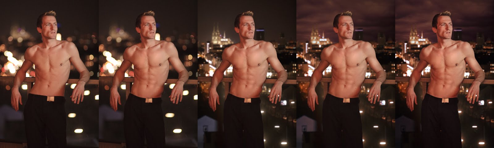
|
|
#
¿
Dec 1, 2009 09:11
|
|
")
|
snowman posted:Yeah that is pretty unlikely, and most definitely sucks, but I've noticed a much more common situation where lightroom is a disadvantage. On my d90 any picture above iso 800 looks like poo poo when I get it into lightroom. The original pictures look great, the camera actually has a pretty good high iso noise reduction built in, but lightroom doesn't get that info, so you have to use the luminance noise reduction slider in light room, which looks like total rear end compared to what comes out of the camera. If I used nikon's software the images would look great, but because of proprietary raw formats I get shafted. Your two main options are to do noise reduction in the nikon software and kick it over, or use a photoshop plugin. apparently noise reduction in LR3 is much improved, but I haven't used it yet. I always leave luma noise reduction at zero, because I hate the smeary look and prefer noise, but my sensor doesn't produce banding.
|
|
#
¿
Dec 15, 2009 23:56
|
|
|
UserNotFound posted:Would this at all be an appropriate place to talk about loading custom curves/profiles into our Nikon bodies, or is that not 'post' enough? O_o You can do that?
|
|
#
¿
Dec 16, 2009 09:35
|
|
|
Cross_ posted:Is there a simple toggle key in Lightroom to do full screen before/after comparisons ? Let's say I changed a setting I can alternate Ctrl-Z and Ctrl-Y to go back and forth between the two. Is there a (better) way to do this with two history states and only one keyboard combination ? Yes, the \ key.
|
|
#
¿
Jan 26, 2010 00:33
|
|
|
spf3million posted:Is there an easier way to use the filter>distort>lens correction in PS? What I'm imagining is similar to the angle correction where you draw a straight line and it automatically rotates it to make the horizontal. What I want from the distortion correction (specifically that vertical and horizontal transform functions) is to be able to draw a straight line which I want to be the right vertical of the image, a line for the left vertical and lines for the top and bottom and for it to stretch/transform/rotate and crop to that size. I took some pictures of big apartment buildings in Hong Kong and I want to make all of the lines perfectly straight with square angles but I can't seem to find the right combination of vert and horizontal transform and angle adjustment. You want to display a grid in photoshop, then transform the layer, and use the skew feature till it all lines up.
|
|
#
¿
Jan 26, 2010 16:55
|
|
|
brad industry posted:Make H/S adjustment layer You can also color pick from this dialog box. First change from the rgb to one of the others, then you can grab with the color picker (they may have fixed this by now). This way you can get the dead center of your intended color, and narrow the sides to match.
|
|
#
¿
Feb 3, 2010 11:02
|
|
|
Pompous Rhombus posted:Is there any easy way to match colors/tint in pictures in PS? I have some (cross-processed) neg scans from a lab that I want at a higher res for printing. My Epson V500 gives rather different colored results from the originals, and my results dinking around with sliders with the original scan to compare haven't been very successful. Photoshop had a feature that did this for a while, and now for the life of me I can't remember what it was called, and if it's still in the new versions. You pointed it to one layer, and told it to apply those color tones to the another.
|
|
#
¿
Mar 22, 2010 10:37
|
|
|
JaundiceDave posted:The last example with the panorama would take enough effort for it to be effectively impossible. Hah, no. I have done exactly that before on multiple panoramas. You just have to have a bit of painting knowledge more than just the tools. I roughly paint in on a layer underneath with colors picked from the image, plus a bit of cloning and healing and it's totally possible.
|
|
#
¿
Mar 28, 2010 21:58
|
|
|
Anjin posted:Has anyone seen this guy's work before? I really like the post-processing work that he does on his photos, it really gives them a timeless look: It's definitely split toning, and a solid color laid over the entire image with either a blending mode or very low opacity. Most of them have warm blue shadows and warm highlights, but then there is some unifying tone over the whole thing that's kind of a cream or vanilla color. I use that technique when an image needs a very specific color theme, you can get it in there without mucking up the existing colors. That said, why would you want to copy his? He's clearly got a looking going on, so biting it wouldn't really help much. If you just want the control over colors he has, try what I said above.
|
|
#
¿
Apr 17, 2010 11:41
|
|
|
fenner posted:I always thought something like that was lame and a lovely gimmick, but nowadsys i'm thinking that people like to see something different or unique, even if it is a gimick, people like to see something out of the norm. I've been obsessing over creating a style for myself for quite a while so that my images stand out from the crowd and they're instantly recognizable as being mine. Unfortunately I still have no idea what i'm doing. Yeah that different or unique thing you're talking about it called "style" and it's what keeps good artists of all media into paying work. You have to develop your own, and the easier it was to create, the faster other people can bite it. if it's a few color actions, it might wow the flickr crowd, but no clients are gonna pay for it unless you're the cheapest closest clone. Much better long term strategy to master the actual aspects of creating a photo, composition, lighting, posing, evoking an emotion from your model if you do portraiture, etc, and then figuring out the things you like to see best, dive further in that direction, wash/rinse/repeat and a natural style can't help but emerge.
|
|
#
¿
Apr 17, 2010 20:36
|
|
|
jsmith114 posted:Can anyone recommend some good reference material on image sharpening? I was using two passes with USM at different settings for several years making prints from 5" to 50" and recently started playing around with the high pass layer followed by smart sharpen that was mentioned in this thread. Both seem to work fairly well and for some images one works noticeably better then the other, but I feel like a deeper understanding of these methods as well as others would benefit me in the long run. Practice and examining the results at various print / screen sizes are useful, but anything that could shorten the experimentation process would be nice. I always resize to my final resolution, then display it at print size. I do my large and medium level sharpening to the point it looks correct on screen without halos or overblack microcontrast (the topaz adjust look that I hate). For micro level contrast, you can't completely control it just from the screen, because pixels stay perfect, and the microdots of ink and the paper you use determines how much micro level sharpening you *need*. I normally crop down to the main subject area from this large print sized image, so I have final resolution, but a tiny area. I do what level sharpening looks right on screen, duplicate it then go a few steps further, duplicate again, then a few steps further still, and print out a quick test sheet with all 3 samples side by side(I buy postcard sized pages of my favorite large sheets just for this purpose, but they have to be the identical paper type for this to work). Whichever one feels right on paper, I use those settings for all images on that paper. If it's a super important print, I will redo this test on the exact image to fine tune.
|
|
#
¿
Apr 20, 2010 00:24
|
|
|
brad industry posted:HDR is just the zone system, except in the zone system the first step is to think about what you want. HAHAHAHAHAHAH
|
|
#
¿
Apr 27, 2010 10:27
|
|
|
tuyop posted:why is there a grey line between the sky and the farthest top of the canyon like, right offcenter in the top of the frame? That�s the edge between two radically different exposure settings. You need to keep the mask crisp between mountain and sky, like pixel perfect to avoid it.
|
|
#
¿
May 12, 2010 16:02
|
|
|

|
| # ¿ Apr 29, 2024 19:01 |
|
|
Cyberbob posted:How the heck do I learn how to craft composite shots? I want to learn the photoshop side of some of Dave Hill's latest campaign shoots, and it's all just individual shots stitched together. I'm getting ready to do an in depth compositing writeup this weekend about this shot: http://www.flickr.com/photos/mr_chompers/4637501114/sizes/o/ I'll post a link in here when complete.
|
|
#
¿
Jun 9, 2010 11:56
|
|