

|
whoops, was meant for the people thread.
poopinmymouth fucked around with this message at 22:09 on Jun 13, 2010 |
 #
¿
Jun 13, 2010 22:03
#
¿
Jun 13, 2010 22:03
|
|


|

|
| # ¿ May 16, 2024 05:20 |
|
|
I didn't see a difference either. This is a case where knowing anatomy and how to straight up paint lighting from nothing (which enables you to create details that adhere to an existing light source) come in handy. Dodge and burn and a little high pass gives: 
|
|
#
¿
Jun 14, 2010 23:31
|
|
|
I forgot to mention, don't just use big rear end soft brushes when doing muscles. That only increases volume. If you want to actually make a muscle look defined, you need hard edges, black right against white. Small soft brushes are for this. I didn't really make his abs any bigger, I just made the creases between them sharper, as if his skin was thinner and shrink wrapped.
|
|
#
¿
Jun 14, 2010 23:34
|
|
|
rear end is my canvas posted:Try this- use a selective color adjustment layer above and set it to luminosity. Slide the red and yellow around for contrast. If the color shifts too much desaturate the reds and yellows with a hue/saturation adjustment layer. This plus high pass only can make existing definition pop more. If you want to truly make a person look ripped, you are often either adding new shadows or highlights that weren't present in the first place, or changing how it responds to existing details. Contrast adjustments are fine for the end, but most fitness touchup goes in and is adding new information with brush work. For example the individual muscles on the sides of the ribcage on LouisX's model were made stronger by hooking the shadows around the insertion points. That happens on people who do tons of chinups and torso stabilization exercises. He didn't have that detail at all in the originals, so contrast and high pass won't bring it out, it was a flat gradient with no detail. If you get into that kind of work, you can do more radical changes:  vs 
|
|
#
¿
Jun 16, 2010 11:05
|
|
|
brad industry posted:Ever since I started using lots of adjustment brushes LR has been slow as gently caress, which is unfortunate because I prefer to do dodging/burning in the RAW conversion. I make sure my new brushes are all zeroed out, paint with O toggled so it gives me red overlay, and hit all the areas first. It's lighting fast when you aren't actually changing the pixels. Then I go in and change the settings of that brush, which is also very fast. It's only when painting with a brush that is actively changing exposure or saturation, etc that it gets slow.
|
|
#
¿
Jun 21, 2010 22:34
|
|
|
brad industry posted:That's a good tip. My problem is I am anal and once you get over 3 or so brushes on an image that whole loving program turns into beach ball land. Yep, I try to place the initial brush stroke in an area that will help me identify it later, so an iris brush goes over the iris first. Face brush goes on the forehead first, sky in the sky, etc. That way they are at least on top of the right area to help clue in the work. But how many are we talking here? I don't think I've ever had more than 3 before I feel like photoshop would be quicker and easier.
|
|
#
¿
Jun 22, 2010 11:45
|
|
|
AtomicManiac posted:I don't think shooting raw is really going to help much with concert photos. You did a pretty good job cleaning it up, my only real recommendation would be to get the bands permission to use flash, then you can shoot with ISO 100 and knock down the lights to make your own lighting. Alternatively, get faster glass/full frame camera or convert to black and white. You should probably lurk and not offer advice on stuff like this till you know better, as both of these points are completely wrong. Jpeg will not have enough data to shift WB to where it needs to be without a shitload of pixels clipping and losing color fidelity. If you are shooting in crappy or mixed colored lighting, always always always shoot raw. Flash photography for live bands is almost always a no-no as it looks better with the stage lighting and the musicians are already greasy and sweaty which on camera flash will exaggerate. The first and easiest way to improve post work on live event photography is to shoot raw so you have more data to work with.
|
|
#
¿
Aug 16, 2010 12:43
|
|
|
Finally did that compositing video. I'm always waffling between making my tutorials (normally I do them on 3d stuff) in depth or surface level. I think I might have made this one too quick, but it's my first photography related one. http://mr-chompers.blogspot.com/2010/09/bandpromocovervideotutorial.html  band promo cover by mr-chompers, on Flickr
|
|
#
¿
Sep 17, 2010 11:35
|
|
|
brad industry posted:Nice job, that looks really good. Is there a reason you didn't path the people out? I know how painful it is to do people by hand and it looked like you would have gotten a cleaner result using the pen tool. High five for smart objects, most useful under used PS feature ever. I would have loved to remove all of them, but the guy who owned the space was letting me use it for free and asked I only remove the ones hanging on nails, not the ones stapled in. The wall was even more crowded originally, hahah. I always feel like paths are too sharp? I dunno, I should start using them, but I like how I can use different softness brushes for different softness of edge transition (like on hair vs the skin of the arms).
|
|
#
¿
Sep 18, 2010 14:43
|
|
")
|
How useful would several very short videos be on super simple things like: *masks *clipping layers *blend-if settings *sharpening *exposure/photo filter *etc Think maybe 1 minute tops just going a bit more in depth exactly how each aspect works?
|
|
#
¿
Sep 20, 2010 16:00
|
|
|
Cannister posted:Those do sound interesting - I'm don't even know what blend-if settings are. I'd personally like to learn a lot more about blending modes in PS. I know they're a really powerful tool and I'd like to learn how to better use them and what each one does exactly. Blend if gives you some p powerful options, I might do that tonight. Basically lets you use the mathematical brightness of either the current layer, or layers below, to say whether the actual layer you're doing it on is visible or not. You can use blend if to reveal a layer only when one below it is over a certain brightness, for instance. Very easy for popping in a new sky when the first layer's sky is blown out.
|
|
#
¿
Sep 20, 2010 16:14
|
|
|
Cross_ posted:Whenever I try to do blend-ifs, I end up with something that looks dithered. As if a dissolve layer mode was involved or something. Alt-clicking and spreading the sliders helps a little but the grain is still there. Unless your image has crazy speckles of light on dark (or vice versa) it should be impossible to have grain if you've separated them. Watch this and keep in mind you can then add masks on top. I've never had the problem of grain remaining after using the blend if sliders separated. Post an example if you have one. http://mr-chompers.blogspot.com/2010/09/blendifblendingoptionsinphotoshop.html Here is a quick one on blend-if layer blending in photoshop. I used one example of blending in a sky, and a 2nd of using blend-if to control where your curves layer is working (though it could be used on any layer affect) 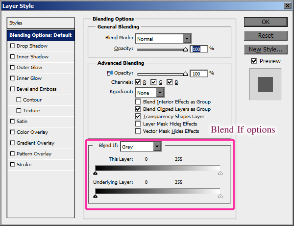
|
|
#
¿
Sep 21, 2010 10:44
|
|

|
Cannister posted:
The main problem is that there is just too much to look at. I'd probably try to reduce contrast a bit on the upper part so it's not so attention drawing, let it be a bit more flat, it will still be grand by sheer design. Also the bride and the alter behind her are very flattening, I would do some kind of cutout on her to either make her bright on a dark background, or make her dark on a bright background, and then fade it till it looks more natural, but right now it's all so very flat because everything is contrasty and all the areas have almost full contrast range.
|
|
#
¿
Sep 21, 2010 12:40
|
|

|
Cannister posted:Wait, what? It's all so flat because everything is contrasty? Tell you what. Because I like you so much, send me the raw file, bjm foto at gmail dot com. I'll show you what I mean. (also, what Cross_ said)
|
|
#
¿
Sep 21, 2010 21:50
|
|
|
I liked the dark purple of the before more.
|
|
#
¿
Oct 1, 2010 16:07
|
|
|
Anyone got a nice shot that is a bit noisy they'd be willing to give me as a full resolution to demonstrate my noise reduction technique? b j m foto (at) g mail dot com
|
|
#
¿
Oct 12, 2010 11:07
|
|
|
DJExile posted:I'll send you the full size of the picture I posted before if you like. You want JPEG or the RAW? Raw
|
|
#
¿
Oct 13, 2010 18:10
|
|
|
DJExile posted:The situation: Until I found the WF RAW extension or whatever, I only shot in "Large Superfine" JPEG mode because I didn't have any way to edit RAW files. Now, my biggest issue is noise (Oly shootin' gently caress yeah I have to do the writeup tomorrow, but here it is after denoising. 
|
|
#
¿
Oct 20, 2010 01:03
|
|
 ) when I can get bitchin' moments like this...

|
DJExile posted:That's a hundred times nicer. drat. http://mr-chompers.blogspot.com/2010/10/noise-reduction.html Full writeup
|
|
#
¿
Oct 21, 2010 12:40
|
|
|
Paragon8 posted:What I'd be especially interested in is more in between photos. It seems like a lot of these tutorials sort of just get you started and then go "six hours later, this is what we get" - and it's incredibly discouraging when you're minutely dodge and burning and not seeing that much of an effect. I know it's about patience but it'd be nice to see what it looked like after 1 hour or after 2 hours and if I'm on the right time frame. If it�s taking you even an hour to do all that, you need to A. buy a tablet, and B. practice more. It�s time consuming yes, but not 2 hours. Learn the hotkeys, buy a tablet, practice more.
|
|
#
¿
Nov 1, 2010 17:02
|
|
|
flyingbathtubpirate posted:Good point about my portfolio, it's pretty out of date to be honest. Most of my last 6 months of work with some seriously awesome photographers is in embargo land until it's published, so the whole site gets an OHSHITSON update in January. I know this is what your client's want, and that if they didn't deliver photographs like that, someone else would. Buuuuut, Do you ever feel like this is basically masturbation? If not even super models can be photographed without 7 hours of pixel level retouching for skin so flawless a spider's feet couldn't cling to it? That's not a real person at that point, why do so many people want to look at it? I'm all for removing blemishes, unsightly wrinkles, etc. I do it on all my photos, but seriously? At some point isn't it too much?
|
|
#
¿
Nov 2, 2010 17:02
|
|
 ) the hours are spent zoomed in to 300% making sure a thread of pixels isn't darker than the next.
|
brad industry posted:It takes maybe a day or two to get used to it. I do a lot of retouching on set, and am at least twice as fast with a tablet for things like clone stamping and and mask making. Using a mouse feels clumsy to me, everything takes 2-3 passes and you often have to backtrack to get things right where it would take 1 with a tablet. It's like scalpel vs. crappy paintbrush. Plus you can't replace pen pressure with a mouse. Fine work needs control in opacity or flow to properly mask and blend.
|
|
#
¿
Nov 13, 2010 13:26
|
|
|
xzzy posted:Do all raw images have an embedded jpeg, or is it only when shooting "RAW+L"? I've always thought it was the latter. All raw have the embedded preview, it is why raw + jpeg is kind of silly, though an easy way to extract that jpeg doesn't really exist. Active D lighting is probably curves adjusted to the RAW making the jpeg, so yes, that's why it looked brighter. Learn how to use a spot meter, or find out whether your camera tends to over/under expose with center weighted and add in exposure compensation. If you find you are always preferring the initial jpeg more than what you come up with, just shoot jpeg to begin with. I like the B&W files my 5D makes a lot, and for family candid shots where I know I won't be going in to do any crazy post work, I just set it to jpeg output.
|
|
#
¿
Jan 6, 2011 18:07
|
|
|
brad industry posted:My friend was talking about a NYC ad photographer he works for who's style is very post-production heavy... who uses the menus for everything in PS. We were joking that being a digital technician is 90% knowing shortcut keys and 10% plugging in cables. My favorite is holding space, right clicking and releasing space. for the "fit on screen, actual pixels, or print size" menu. Being able to slam from 100% to viewing all at any time is quite nice. I hate that they removed R as the blur shortcut though. I reassigned it, but it still sucks not being able to toggle using the shift+R like you used to be able to, though I use smudge a lot less than I did.
|
|
#
¿
Jan 12, 2011 11:07
|
|
|
rear end is my canvas posted:Filter> Stylize> Find Edges Came here to post this. Find edges with a large radius, filter > other > maximize to increase it even more if needed, then blur to soften it.
|
|
#
¿
Jan 14, 2011 14:51
|
|

|
moron posted:I know this is going to be a highly subjective question, but does anyone have any opinions on what size tablet is ideal for photo editing and image manipulation in Photoshop? I have a 6x8 at home I've had forever. In the past work has given me an 8x10 (whatever the next size up is) and I found it too large and I didn't like how big of gestures I had to do.
|
|
#
¿
Jan 14, 2011 14:52
|
|
|
Cyberbob posted:Can someone give some insight into how to process such a "painted" look? There really isn't anything painted looking at all about the subject. It's a contrasty main on a boom (small softbox or a beauty dish) and then harder rim lights, possibly bare flashes, but more likely small reflectors or even silver umbrellas, both at even power, behind and glancing off the edges. If there is anything painterly about the image, it's the background (though I'd disagree on that too, but it's closer to fitting that description than the subject) so I'm curious why you feel she looks painterly? Is it the lack of specularity on her skin?
|
|
#
¿
Jan 27, 2011 14:37
|
|

|
A5H posted:Why dodge behind her? Looks weird. http://www.poopinmymouth.com/tutorial/masks.htm
|
|
#
¿
Jan 27, 2011 16:27
|
|
|
Has anyone used Silkypix? It looks like it has basically every function of Lightroom. I only ask because the Fuji x100 comes with a full version and that's the only Raw editor that will be out at launch. Also I... *cough* haven't exactly purchased Lightroom and I have to reinstall it every launch to get it to work. If Silkypix replicates the experience well enough I might just stick with it. Sucks they didn't go with lightroom like the Leica X1.
|
|
#
¿
Feb 1, 2011 10:52
|
|
|
Anyone know of a software for the following: Put camera on tripod Take photo of background Take photo with subject in it. The sofware would be given the two images, and perfectly cut out the subject, based on only pixels that are different between the two images. There has to be some kind of compositing plugin that can do this. Ideas? *edit* it can't really be as easy as photoshop's difference blending mode, can it? Anyone tried this? poopinmymouth fucked around with this message at 10:25 on Feb 3, 2011 |
|
#
¿
Feb 3, 2011 10:20
|
|
|
evil_bunnY posted:You suck at :files: What was so bad about it?
|
|
#
¿
Feb 3, 2011 16:06
|
|
|
evil_bunnY posted:Stability, processing and interface (especially the labels), but that was 2 years ago. Also the setup would just silently crash on one of my machines. Yeah, I was just hoping not to have to buy a LR license if I really like silkypix. Here is a quote from another forum, just wondering what people thing (especially Brad) I don't feel like I'm prevented from getting good color from LR with my camera profile loaded, but I found this post interesting. (even though anyone who thinks Lightroom is junk is probably not all that knowledgable) poopingmymouth posted:
some dude posted:
|
|
#
¿
Feb 4, 2011 12:21
|
|
|
Evilkiksass posted:Hey how bout them photoshops... As soon as the bar stars, hit "esc" and it won't render it.
|
|
#
¿
Feb 6, 2011 00:56
|
|
|
lllllllllllllllllll posted:I'm using PSE 9 and stumbled upon something annoying: I want to crop my photos to an aspect ration of 15:10 but the crop tool seems inadequate for this: You want canvas size, not image size.
|
|
#
¿
Feb 6, 2011 17:34
|
|
|
TheLastManStanding posted:How is that worse? Saving for web is generally the last thing you do and resizing only takes a second. Not only that but the save for web will have to resize your photo anyway which will take just as long (if not longer). The whole point of having the render is to see how much you can compress the image without it being noticeable. If you aren't watching the render then how do you know you've chosen the optimum amount to compression? By resizing before going in you can actually see the final result and it renders instantly. If I'm resizing. I hit ctrl+a to select all, ctrl+shift+c to copy merged, ctrl+alt+n for a new canvas (it will auto size to what's in the clipboard), ctrl+v for paste, flatten, then resize using the option that is best for reduction, sharpen to taste, then save for web. That's why I like lightroom so much more most of the time. :-)
|
|
#
¿
Feb 7, 2011 11:36
|
|
|
brad industry posted:Actions. Use them. It doesn't really help him if I say "I use my flatten for web action" now, does it?
|
|
#
¿
Feb 14, 2011 11:14
|
|
|
TheLastManStanding posted:Or you could do it properly like Brad suggested and use masks. Masks really are one of the most fundamental tools of photoshop and you need to know how to use them. Not only are they vastly more adaptable and easier to use than selections, but you can ctrl+click them it creates a selection from them. Technically "saved selections" are masks, they just go into the alpha channels rather than applied to a layer.
|
|
#
¿
Mar 22, 2011 02:05
|
|
|
brad industry posted:LR is basically ACR, not PS. It works from the RAW file so it's not the same as working as a raster image in PS. Yeah but technically you can open the RAW as a smart object in photoshop and "re ACR process" it at any time.
|
|
#
¿
Apr 11, 2011 11:45
|
|
|
William T. Hornaday posted:I need a lot of help. I'm trying to teach myself Photoshop (which I have very little experience with), and I'm falling flat on my face right out of the gate. Duplicate entire layer, flip it horizontally, apply an inverted mask so it�s all hidden, paint into the mask to reveal on top of the branch, The hair will have a bit of symmetry, but then you have a clean green edge you can get rid of the more telling fly away hairs that give away what you did.
|
|
#
¿
May 20, 2011 10:41
|
|

|

|
| # ¿ May 16, 2024 05:20 |
|
|
Aeka 2.0 posted:What a bunch of cocksuckers. Yes, truly women and gay men are objects of derision, to which shady companies should be compared so that all know how horrible they are. (because they are like gays and women, both very bad things to be of course)
|
|
#
¿
Jun 21, 2011 11:15
|
|