


|
evil_bunnY posted:Eh, I thought the whole point of hyperfocal focusing was to shoot stopped enough that your foreground *and* background are focused I am pretty sure you are correct, the hyperfocal distance is the point where there is the largest possible depth of field for that aperture, continuing out to infinity. So basically everything is in focus if it is a sufficiently high aperture. You can figure it out with math, but old manual focus lenses actually sometimes have it marked on the focus scale. I don't think there's anything boring about that, as long as everything in the photo is interesting enough to be in focus. Look at Ansel Adams. The person above who said that the background was just slightly blurry probably just fudged it a little bit and focused slightly too close.
|
 #
?
Jul 17, 2009 20:38
#
?
Jul 17, 2009 20:38
|
|


|

|
| # ? Apr 25, 2024 06:13 |
|
|

|
|
#
?
Jul 17, 2009 21:17
|
|

|
These are probably my favorite landscapes that I have made. ")  
|
|
#
?
Jul 17, 2009 22:23
|
|

|
Thanks for the contributions.
|
|
#
?
Jul 18, 2009 21:13
|
|

|
torgeaux posted:Thanks for the contributions. This is nice, my small nit pick is the branch in the lower right and in the very right corner there is something dark that bothers me a bit.
|
|
#
?
Jul 18, 2009 22:36
|
|

|
Evilkiksass posted:Ringo R, this is absolutely stunning, what kind of post processing did you do to this? Could you post the original? Thanks! It's an hdr of three different exposures which all look very boring when viewed individually. After merging them I used the dodge/burn tool to make the sunlight really golden looking. Then I cropped the top of the sky as suggested by some guy in PAD as it wasn't very interesting. 
|
|
#
?
Jul 19, 2009 08:02
|
|

|
I'm cross posting this from pad because its probably the first landscape shot I've been happy with. 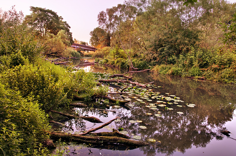
|
|
#
?
Jul 19, 2009 22:23
|
|
|
It's strange but I'm a sucker for portrait-oriented landscapes. I like normal landscapes too, but when I'm out taking pictures I just find more interesting portrait oriented shots than normal ones. I feel pretty dumb, but what can ya do.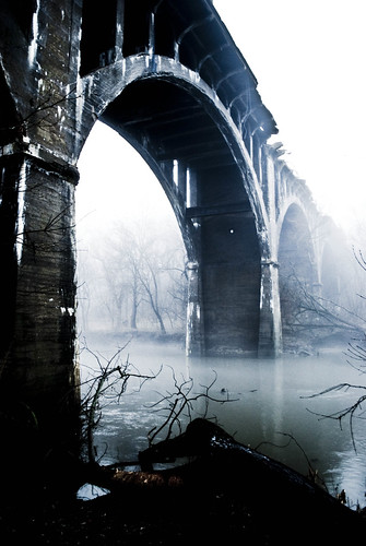  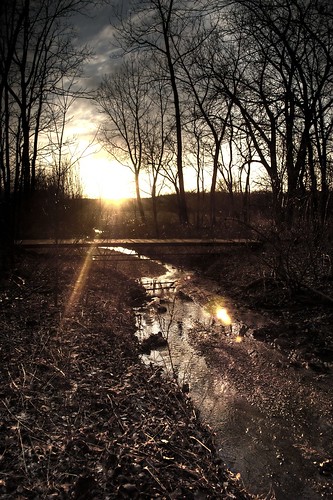
|
|
#
?
Jul 20, 2009 16:45
|
|

|
RangerScum posted:It's strange but I'm a sucker for portrait-oriented landscapes. I like normal landscapes too, but when I'm out taking pictures I just find more interesting portrait oriented shots than normal ones. I feel pretty dumb, but what can ya do. Portrait orientation can often work quite well, I find it works better for tighter space such as rivers etc. 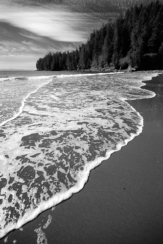 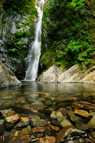
|
|
#
?
Jul 20, 2009 17:23
|
|
|
Canon EOS 5D Mark II, Canon EF 17-40mm f/4L USM 10s f/16.0 at 17.0mm iso100 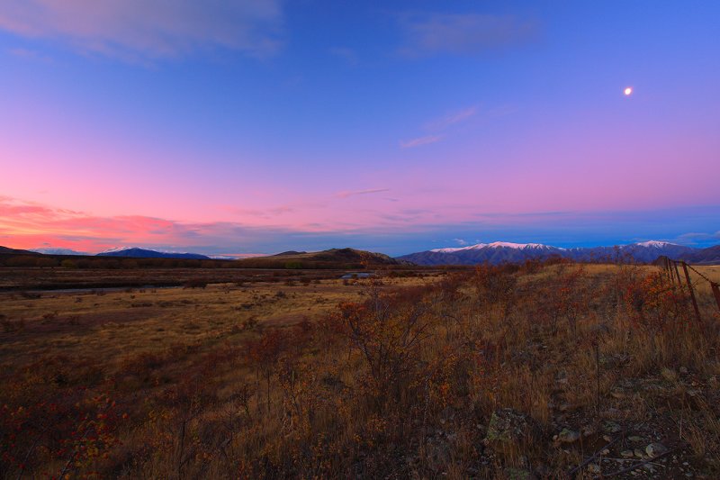
|
|
#
?
Jul 20, 2009 17:27
|
|
|
snowman posted:I'm cross posting this from pad because its probably the first landscape shot I've been happy with. i'm not sure if it's creative effect but the white balance/tint looks a bit wacky too me. jumping on the iceland bandwagon  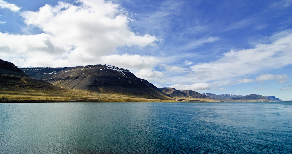 I used the tokina 11-16 a lot. It's a good lens for what it is, f/8 is sharp, but f/22 is unusable imo. Lots of ca as well.
|
|
#
?
Jul 20, 2009 21:37
|
|

|
unixbeard posted:i'm not sure if it's creative effect but the white balance/tint looks a bit wacky too me. 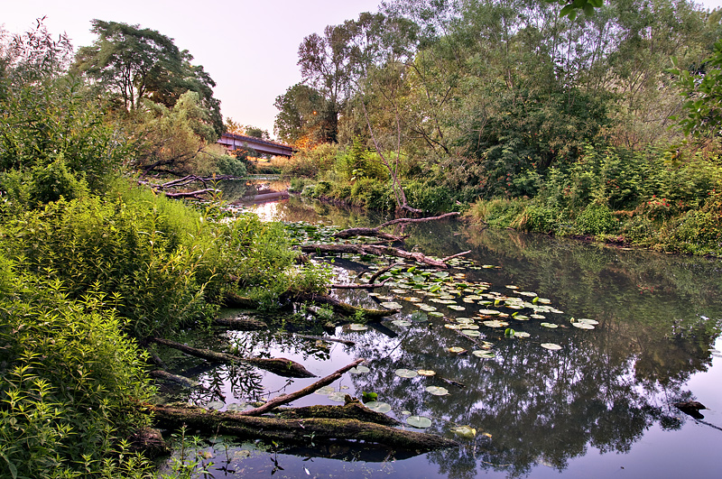 old photo for reference better, worse? I don't have a calibrated monitor, but it was kind of yellow and magenta. The sun was setting and the sky was pink and gold, I didn't even manage to capture it very well in the photo.
|
|
#
?
Jul 21, 2009 02:53
|
|
|
For better or worse I edit most of my landscapes pretty heavily. However I usually know what I'm going to do with a shot before I take it. Here's some before and after shots.      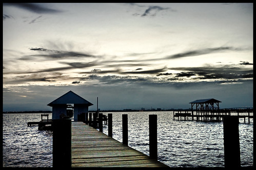    
benisntfunny fucked around with this message at 05:00 on Jul 21, 2009 |
|
#
?
Jul 21, 2009 04:52
|
|
|
Going for more of a layered look: 
|
|
#
?
Jul 21, 2009 06:48
|
|

|
snowman posted:Adjusted photo I think to pull off the pink sky you would have needed to have taken a couple of exposures and done some blending to make it work. Assuming you didn't do that, I'd probably tone down the color in the sky completely. It looks really out of place in the photo. Your foliage and water looks much better now, but that sky in the upper left is giving the edges of the leaves an strange magenta fringe. It's made worse by the fact that that fringe is absent on the right hand side instead replaced by a subtle blue one. I would mask off the areas up top that are getting that magenta color and tweak them a bit so it looks more natural and flows with the color in the rest of the shot.
|
|
#
?
Jul 21, 2009 13:56
|
|
|
benisntfunny posted:For better or worse I edit most of my landscapes pretty heavily. However I usually know what I'm going to do with a shot before I take it. Cool, I'm no expert by any means but I like em. Care to quickly describe what you generally do to each image? I'm assuming you shoot in RAW and process it from there?
|
|
#
?
Jul 21, 2009 15:14
|
|

|
I'm not sure if it's too much crossover with the post-processing thread, but if anyone has some general tutorials (or just straight-up tips) for single exposure and multiple exposure landscape post-processing, I'd love to see them. I'm not an experienced Photoshop user, but I've started dabbling after covering some basics in a photography course.
|
|
#
?
Jul 21, 2009 15:44
|
|

|
Canon EOS 5D Mark II, Canon EF 17-40mm f/4L USM 2s f/16.0 at 17.0mm iso100 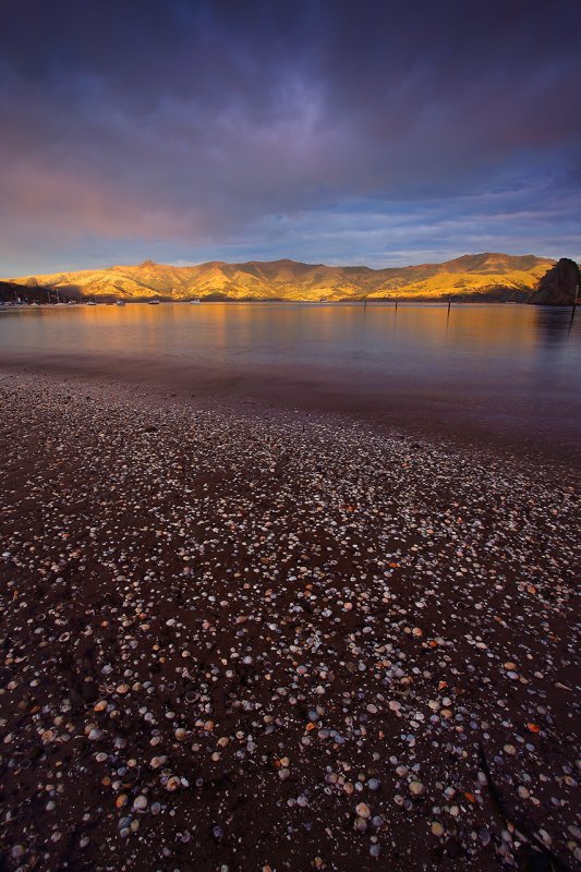
|
|
#
?
Jul 21, 2009 17:37
|
|
|
benisntfunny posted:That is an amazing photo, especially after taking a look at the bigger one and seeing the details like the people on the cliffs and the birds flying about. But, for me the gradient filter (?) job is very obvious and detracts from it, maybe the adjustment brush would be better to make it a little cleaner. If Dread Head's photos teach us anything, it's that there's no such thing as too much blue :horses:
|
|
#
?
Jul 21, 2009 19:34
|
|
|
The Wormy Guy posted:Cool, I'm no expert by any means but I like em. Care to quickly describe what you generally do to each image? I'm assuming you shoot in RAW and process it from there? Sure. I've already been called out on my gradient filter approach. I abuse it like crazy from Lightroom. But I'll talk to each one step by step... yes they're all raw originally. The first is mostly just a gradient filter in Lightroom. I came across this by accident actually when I put the contrast of the whole photo way down and realized in that bright crappy sky had clouds and sun beams that actually existed. Because I was way too lazy I did do a gradient rather than brush filter to bring out the sky. After, I edited the cliffs with lucisart in Photoshop to pop them a little and finished the rest in Lightroom (Desaturated the water). I have another version where I've removed the people from the Cliff but they're so small it's almost worth keeping them in because the detail is impressive. The second is sadly tone mapped. I say sadly because I think it's far overused. I actually hate this photo but people seem to comment nice on it. I also cleaned up the ice a little bit to make it less dirty. It's still dirty. The third was all photoshop. All LucisArt and all section by section. Nothing special here just apply the filter to one section and mask out the rest. The 4th, the city is 95% lightroom modifications but I did take it into photoshop to remove some of the glow from the building lights I found distracting after being put into mostly B&W The final is a mix of everything above. It's tone mapped, it has gradient filters from Lightroom, LucisArt and selective brightening within Photoshop. I have noticed that if I try to edit my photos outside of RAW it's not as nice. Especially in the areas of tone mapping and contrast adjustment. I try my hardest to mix up the plugins I use too and techniques. I don't want my pictures to all have the same look to them. I see a lot of photographers who take the same approach to everything. Hey, if it works go for it I suppose though. Having a nice camera also gives a lot more room to alter photos without trashing them. Going from XT to 5D was a giant jump, then 5D to MKII made a pretty significant difference as well. Especially in terms of noise created because of editing.
|
|
#
?
Jul 21, 2009 21:57
|
|
|
poopinmymouth posted:I like where you're going with this one, but the rays of light seem a bit overdone. The high saturation in the foreground and desaturated background make a highly stylized, layered composition in the lower two thirds of the frame that I really like. However, your treatment of the sky at the top portion doesn't really complement the lower portion, especially with the exaggerated rays of light coming through the clouds, which don't complement the flatness of the ground objects at all. benisntfunny posted:For better or worse I edit most of my landscapes pretty heavily. However I usually know what I'm going to do with a shot before I take it. Your initial shots could use some work, but I don't think you're actually improving them with your heavy editing. In the first one, as you admitted, you need to go easy on the gradient filter. The sun beams are much too intense and the result is rather artificial looking. When you "popped out" the cliffs, you left the edges a bit too sharp against the background. It's not all bad though, I think the treatment of the water is an improvement over the original as you really brought out the surface texture. In the last one, everything is oversharpened and oversaturated. The bright orange sunlight coming through the clouds looks extremely unnatural, and the contrast of the bright streak going across the sky against the surrounding clouds completely wrecks the compositional integrity of the original. When you look at, you're immediately drawn to the flame-like streak and nothing else. These aren't terrible photos to begin with, but if you want to improve them, try to be more subtle with your edits. HPL posted:Going for more of a layered look: You've pulled it off well, especially in the second one. The overall composition reminds me of Japanese wood block prints.
|
|
#
?
Jul 22, 2009 02:26
|
|

|
Way Past Cool! posted:You've pulled it off well, especially in the second one. The overall composition reminds me of Japanese wood block prints. Thanks. I'm having 8x10s made of them.
|
|
#
?
Jul 22, 2009 04:08
|
|
|
Way Past Cool! posted:I like where you're going with this one, but the rays of light seem a bit overdone. The high saturation in the foreground and desaturated background make a highly stylized, layered composition in the lower two thirds of the frame that I really like. However, your treatment of the sky at the top portion doesn't really complement the lower portion, especially with the exaggerated rays of light coming through the clouds, which don't complement the flatness of the ground objects at all. Thanks for taking the time to critique. I agree, and I'll keep that in mind for my next edit of a similar subject.
|
|
#
?
Jul 22, 2009 10:04
|
|

|
Canon EOS 5D Mark II, Canon EF 17-40mm f/4L USM 1s f/16.0 at 17.0mm iso100 
|
|
#
?
Jul 22, 2009 14:45
|
|
|
I've never shoot landscape so I decided to give it a try while I was in Colorado.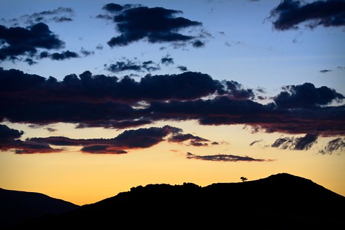 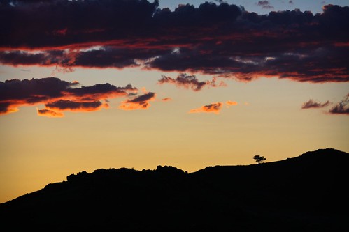 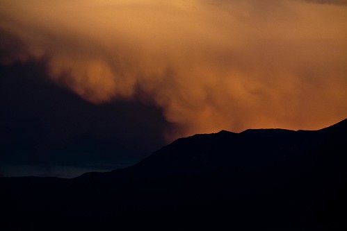
|
|
#
?
Jul 22, 2009 20:06
|
|

|
Where in Colorado were you? I live in Fort Collins, and I absolutely love Colorado sunsets, but for me they're hard to get a good shot of without looking cliche because here everyone and their mom (literally) has a stack of about a thousand lame snapshots of them. I really like the second and third of yours though, the third especially.
|
|
#
?
Jul 22, 2009 22:51
|
|

|
penneydude posted:Where in Colorado were you? I live in Fort Collins, and I absolutely love Colorado sunsets, but for me they're hard to get a good shot of without looking cliche because here everyone and their mom (literally) has a stack of about a thousand lame snapshots of them. How funny, I was just going over a pic I took over Lake Loveland four years ago. I didn't know what the hell I was doing then and don't know much more now (seriously I'm a complete photography noob) so I don't know what to make of it. Sorry if it's cliche :/ 
|
|
#
?
Jul 23, 2009 06:12
|
|

|
There's some dynamite stuff in this thread! Here are my attempts to keep up with you guys:  Gloss/Glass Mountains, Oklahoma quazi fucked around with this message at 01:25 on Jul 24, 2009 |
|
#
?
Jul 23, 2009 14:30
|
|

|
What do you guys think of full frame vs crop for landscapes? I'm contemplating getting a second hand D700 when the new D700s or whatever comes out.
|
|
#
?
Jul 23, 2009 15:30
|
|
|
Eegah posted:Sorry if it's cliche :/ Haha, it's a lot better than most I've seen, I'm really liking the light rays coming down from the clouds. Your horizon is right smack in the middle of the frame vertically though, which tends to lead to a static feeling picture. The rule of thirds applies to things like horizons as well, and I think if you had placed the mountains either up a bit or down a bit in the frame (I'd say down personally, but it would depend on what the sky above that looked like) it would make for a better shot.
|
|
#
?
Jul 23, 2009 15:40
|
|
|
Cross posted from a previous PAD thread. Let me know if these count as landscape. I like the beach. For many reasons. This is one of them:   
|
|
#
?
Jul 23, 2009 16:44
|
|
|
penneydude posted:Where in Colorado were you? I live in Fort Collins, and I absolutely love Colorado sunsets, but for me they're hard to get a good shot of without looking cliche because here everyone and their mom (literally) has a stack of about a thousand lame snapshots of them. Thanks. I was in Westcliffe. 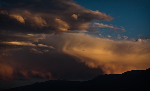 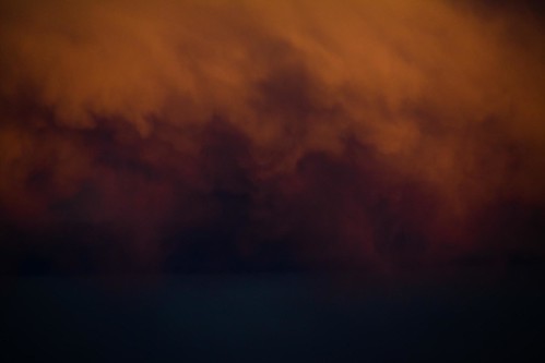
Whitezombi fucked around with this message at 20:52 on Jul 23, 2009 |
|
#
?
Jul 23, 2009 17:07
|
|
|
 The only landscape I've ever really been happy with
|
|
#
?
Jul 23, 2009 23:46
|
|

|
I just realized I haven't posted any actual pictures in here. I used to tone map.  But then I realized that was stupid.  
|
|
#
?
Jul 24, 2009 00:19
|
|
|
LuisX posted:Cross posted from a previous PAD thread. Let me know if these count as landscape. Absolutely not landscapes. And they suck. Man, first you shoot hot chicks day in and day out, add to that that you do it well, and on top of all that, you shoot some kickass landscapes. You suck.
|
|
#
?
Jul 24, 2009 02:15
|
|
|
torgeaux posted:Absolutely not landscapes. And they suck. Thanks Check my fitness log thread, you'll kill me ")
|
|
#
?
Jul 24, 2009 02:26
|
|
|
This thread rocks. Landscape photography is one of the most satisfying types of photography there is, IMO. Some of the stuff in here is absolutely incredible. 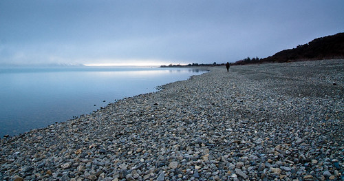 The composition isn't amazing but I liked the stillness of the water. I want to go back here sometime and recompose it so that the water starts at the bottom left hand corner instead of slightly above it.  PAD seemed to like this!
|
|
#
?
Jul 24, 2009 03:38
|
|
|

|
|
#
?
Jul 24, 2009 03:49
|
|
|

|
|
#
?
Jul 24, 2009 06:11
|
|
|

|
| # ? Apr 25, 2024 06:13 |
|
|

|
|
#
?
Jul 24, 2009 09:02
|
|