


|
Bob Ross' trees were happier than that.
|
 #
?
Jul 29, 2009 06:29
#
?
Jul 29, 2009 06:29
|
|


|

|
| # ? Apr 25, 2024 15:10 |
|
|
benisntfunny posted:For better or worse I edit most of my landscapes pretty heavily. However I usually know what I'm going to do with a shot before I take it. I'm fairly intrigued. Are these HDRs or are you using RAWs? I'm looking at the pre picture and generally I can see how the post picture can get certain colors or enhance certain characterestics, but I can't seem to do that in comparing your pictures. Like for example, in the last one, that firebolt looking thing is awesome, but I can't possibly see how that came from the original pic.
|
|
#
?
Jul 29, 2009 07:43
|
|


|
octane2 posted:Canon EOS 5D Mark II, Canon EF 17-40mm f/4L USM To give some advice rather than be insultingly snarky. Why do you have the red bush, and the mountains (the two most eye-drawing points) in the dead center? If you were to back up a tad, and move to one side, you could make the bush a bit smaller, put it in the bottom left thirds point, and the mountain in the top right point. I think having the bush abnormally large and stretched by the wide angle is hurting the readability of the photo, and having the focal points centered is also dissorienting. Bob Ross would also never give someone a critique like Reichstag did. He was about making art enjoyable, fun, and approachable to everyone. In short, he wasn't a dick.
|
|
#
?
Jul 29, 2009 11:11
|
|


|
I don't have anything special to contribute at the moment.  
|
|
#
?
Jul 30, 2009 04:23
|
|
|
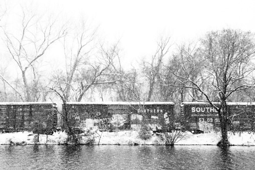
Bottom 2 are pretty loving special imho
|
|
#
?
Jul 30, 2009 04:31
|
|

|

|
|
#
?
Jul 30, 2009 07:28
|
|
|
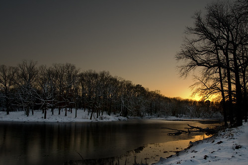
fenner, That is an absolute stunner of an image. This image would also work if the sun was out of frame (so long as the subject/composition was right/tight), thanks to the beautiful highlights caused by first light. Well done!
|
|
#
?
Jul 30, 2009 09:48
|
|
|
Eegah, thanks! I am inspired by neoclassical painting and strive to achieve a painting-like quality to my images. So, a greater compliment, I couldn't ask for!Eegah posted:That seriously looks like a Bob Ross painting. I've never claimed to be a great landscape photographer, nor have delusions of grandeur when it comes to composition or colour theory. However, my intended purpose was fulfilled in someone remarking about the painting-like quality to the image, regardless of crap composition and whatever else. I appreciate your critique, nonetheless. Reichstag posted:Bob Ross had a much better understanding of composition and colour theory. Hey, poop. Thanks for the comment and critique. You've seen some of my other stuff, and, you'll note that most of the time I do follow the rule of thirds, and, this shot still follows it, albeit loosely, with the mountains. This shot wasn't premeditated or planned, and is far from my best effort. I was simply walking along a track, enjoying the scenery and thought I'd snap something I'd not encountered before. I thought it was rather interesting flora. A lot of my other images are planned, this one wasn't. ") Again, I appreciate the critique, and, it's something I can strive for on another shoot. Cheers! Again, I appreciate the critique, and, it's something I can strive for on another shoot. Cheers!poopinmymouth posted:To give some advice rather than be insultingly snarky. Why do you have the red bush, and the mountains (the two most eye-drawing points) in the dead center? If you were to back up a tad, and move to one side, you could make the bush a bit smaller, put it in the bottom left thirds point, and the mountain in the top right point. I think having the bush abnormally large and stretched by the wide angle is hurting the readability of the photo, and having the focal points centered is also dissorienting.
|
|
#
?
Jul 30, 2009 10:00
|
|
|
Landscapes are definitely not my area of expertise, but I'll give it a go with some of the better ones I've taken over the year or so.           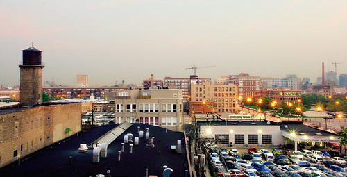 https://www.flickr.com/photos/bradgillette
|
|
#
?
Jul 30, 2009 10:56
|
|

|
  I went a little nuts on the editing but that's what it looked like in real life. I also had to crop them because this thread taught me the rule of Thirds. Thanks! Also ,that black streak in the second one is most likely a black lab, hopefully that doesn't break the pet rule.
|
|
#
?
Jul 30, 2009 12:47
|
|

|
woot fatigue posted:This is awesome. Do want more urban landscapes. I love the color you were able to capture reflected in the windows. I was never much of a wait for sunrise kind of guy.
|
|
#
?
Jul 30, 2009 17:30
|
|

|
woot fatigue posted:By far my favorites. Very nice stuff all around though.
|
|
#
?
Jul 30, 2009 18:41
|
|
|
I don't want to point any fingers with this post but "good composition" is not the same as "following the rule of thirds" or "plotting your photo onto a spiral" or whatever. Composition is much more about each object in the scene and how they relate to each other, NOT JUST SPATIALLY, but also with regards to the inherent meaning and function of those objects and how they interact, including individual intent, in or outside of the scene. E: this doesn't just apply to landscape/topographic photography but most other fields of photography as well. This is pointing fingers: I'm glad that you're trying to make your photos look painterly with your expensive camera body, octane2, but you should know that a bad painting is about as critically valuable as a bad photograph. Twenties Superstar fucked around with this message at 20:03 on Jul 30, 2009 |
|
#
?
Jul 30, 2009 20:00
|
|

|
advion posted:I don't have anything special to contribute at the moment. I'm into this one, you should look up Brad Moore. Twenties Superstar posted:I don't want to point any fingers with this post but "good composition" is not the same as "following the rule of thirds" or "plotting your photo onto a spiral" or whatever. Composition is much more about each object in the scene and how they relate to each other, NOT JUST SPATIALLY, but also with regards to the inherent meaning and function of those objects and how they interact, including individual intent, in or outside of the scene. Yes thank you, I am tired of the kneejerk "this would be better if it were following the rule of thirds" responses so many images get here. The rule of thirds is not the end-all be-all of composition, it's only purpose is to get noobs to not loving automatically center things and beyond that doesn't have any real value. Composition is about balancing visual weight (or making it unbalanced if that is what works for what you're trying to do). There are no rules that can help you compose better, you have to actually think about how things relate two dimensionally and how those relationships add or detract from what you are trying to show.
|
|
#
?
Jul 31, 2009 03:02
|
|

|
So the photograph is horrible. I understand that. I thought I'd try something different. That's the beauty of experimenting, especially with photography, if it doesn't work out, you can try something else another time. Not every photo everyone takes is going to be everyone's cup of tea. I thoroughly appreciate your critique and will endeavour to post worthy photographs. Feel free to pull them apart as it will only assist me the next time I decide to press the shutter. Cheers. Having said that, the print looks great. I may never get a request for a print, however, I am content with looking at it on my wall and remembering that gorgeous day along Lake Diamond. brad industry, I agree with you re: rule of thirds. It's not the be-all-and-end-all of anything. Twenties Superstar posted:This is pointing fingers: I'm glad that you're trying to make your photos look painterly with your expensive camera body, octane2, but you should know that a bad painting is about as critically valuable as a bad photograph.
|
|
#
?
Jul 31, 2009 10:01
|
|
|
|
|
#
?
Aug 3, 2009 01:20
|
|

|
Fbi2thegrave posted:I'm fairly intrigued. Are these HDRs or are you using RAWs? I'm looking at the pre picture and generally I can see how the post picture can get certain colors or enhance certain characterestics, but I can't seem to do that in comparing your pictures. Like for example, in the last one, that firebolt looking thing is awesome, but I can't possibly see how that came from the original pic. No HDR, I haven't done an HDR shot in years. I tried a few back in the day but it's so ugly I can't even look at it. Every once in awhile I'll tone map a shot using photomatix (#2 is tone mapped) but for the most part just stick to levels, color balance, saturation, etc.. (basic things) for most shots. I'm pretty sure the sky in the 4th one is the result of pumping up the contrast and lowering brightness for the sky with some saturation added. Well I'm not pretty sure, I'm exactly sure. Someone had commented that my photos look fake and that I wasn't doing justice to them by applying such intense editing. My thoughts on this are that landscapes are boring, especially when shooting scenes that everyone has done a million times over. If I'm going to shoot something, like that Tomb in Ireland, or the cliffs or Moher and actually show someone.. i want it to look different. I'm not at all concerned with the realness of it.
|
|
#
?
Aug 3, 2009 04:36
|
|
|
German largest rock
|
|
#
?
Aug 3, 2009 06:50
|
|
|
octane2 posted:So the photograph is horrible. I understand that. I thought I'd try something different. That's the beauty of experimenting, especially with photography, if it doesn't work out, you can try something else another time. I don't think that photo was horrible. gently caress the rule of thirds.
|
|
#
?
Aug 3, 2009 18:46
|
|


|
woot fatigue posted:Landscapes are definitely not my area of expertise, but I'll give it a go with some of the better ones I've taken over the year or so. This is a great shot.
|
|
#
?
Aug 4, 2009 21:04
|
|
|
benisntfunny posted:Someone had commented that my photos look fake and that I wasn't doing justice to them by applying such intense editing. Landscapes are only boring if you make them boring. If you spent more time setting up the shot and framing it in an interesting way, then maybe you wouldn't feel compelled to edit them so heavily. It's not so much that they're unrealistic, but that some of the choices you made really threw off the aesthetic balance of the compositions, like in your "firebolt from the tomb" photo. I'm not anti-editing. If you look back to my previous post, I said that I actually liked some of the edits that another poster had made, but his photo still needed work. I just really dislike overediting.
|
|
#
?
Aug 4, 2009 21:31
|
|
|
Hopefully soon I can get out and try and shoot some epic poo poo like I see in this thread. The pics you guys are posting are amazing.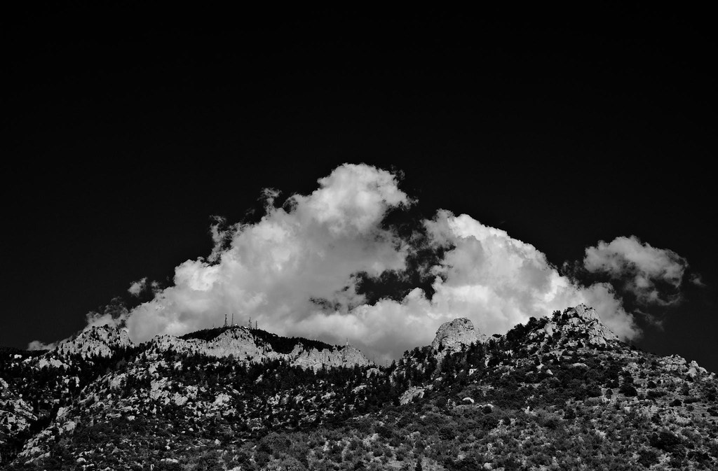
|
|
#
?
Aug 4, 2009 21:49
|
|
|
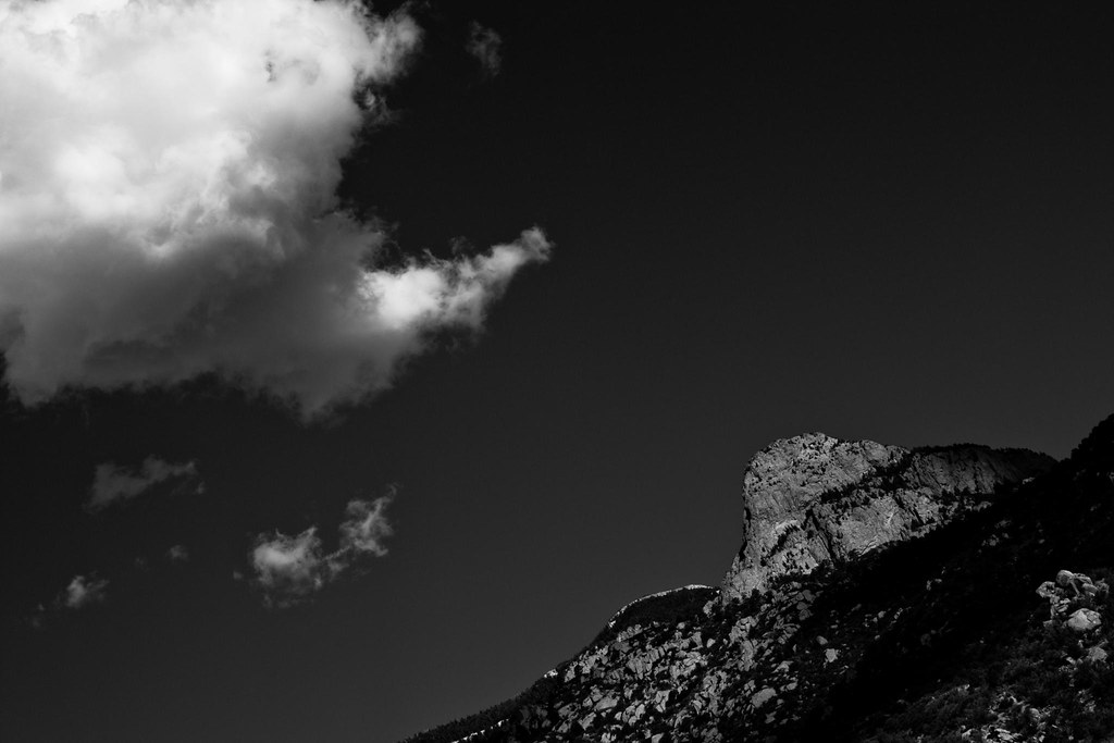
Whitezombi posted:Hopefully soon I can get out and try and shoot some epic poo poo like I see in this thread. The pics you guys are posting are amazing. Really digging the black sky although I feel it is a bit empty at the top. Looks like quite the location where is it and what is that structure at the top?
|
|
#
?
Aug 5, 2009 06:07
|
|

|
woot fatigue posted:Landscapes are definitely not my area of expertise, but I'll give it a go with some of the better ones I've taken over the year or so. Holy. Amazing, this shot is absolutely amazing, if I had money I would actually ask to buy a print from you. Care to share some post techniques, your shots have a different look to them which I really like but would have no idea how to go about doing it myself.
|
|
#
?
Aug 5, 2009 07:17
|
|
|
Dread Head posted:Really digging the black sky although I feel it is a bit empty at the top. Looks like quite the location where is it and what is that structure at the top? Thanks. I'll see what a 16:9 crop looks like. It's the Sandia Mountains in Albuquerque New Mexico. Those are various towers for cell phones, radio, etc.
|
|
#
?
Aug 5, 2009 18:11
|
|
|
fenner posted:Nope, no ND filter. f/22 on kit lens Is ND8 the equivalent of the .9 filters? e: nvm, yes it is, google is cool. Malalol fucked around with this message at 22:28 on Aug 5, 2009 |
|
#
?
Aug 5, 2009 22:20
|
|

 . I really need an ND filter though, ND8 is the most common and gets the job done fine I think, but I have no idea about brands.
|
fenner posted:Holy. Amazing, this shot is absolutely amazing, if I had money I would actually ask to buy a print from you. Contact me through my Flickr account and I'll hook you up with a full res for print. (Through Flickr mail or there's an email link on my profile) If I knew what I was doing with my post-processing, I'd share it, but it really changes with every image, and I just sit and stare at the images until they look good. The only solid thing I can say is that I start with the lowest-contrast image possible, then add in contrast selectively through curves and layer masks. That image was a part of the campaign I did for the city of Healdsburg, in Sonoma County, California. I was asked to do a series of landscapes capturing wine country, along with numerous shoots of bed and breakfasts, hotels, and restaurants, which were featured in a print and web campaign, along with billboards and building wraps in Los Angeles, and bus stop ads in San Francisco. It's probably the coolest project I've done so far (hopefully I'll get the Campagna motors T-Rex campaign, which will blow this out of the water), and has guaranteed free trips out to Healdsburg working on ongoing projects for years to come. 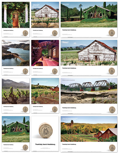 Print Ads 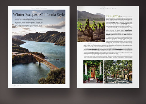 C Magazine 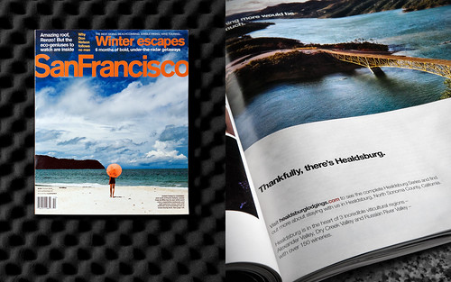 San Francisco Magazine  Building wrap in Beverly Hills 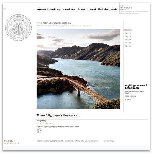 Website  https://www.flickr.com/photos/bradgillette woot fatigue fucked around with this message at 22:35 on Aug 5, 2009 |
|
#
?
Aug 5, 2009 22:23
|
|
|
I'm doing some pretty heavy experimenting on processing with these landscapes. I have an idea of some places I want to shoot and process this way.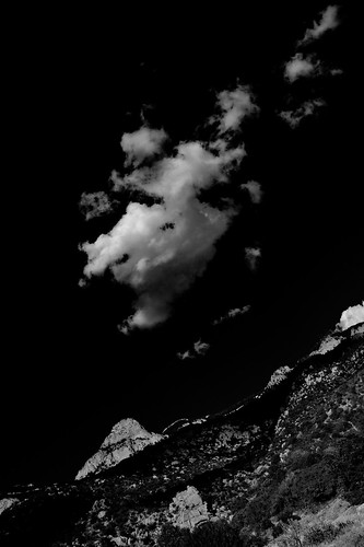 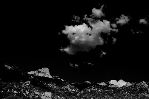 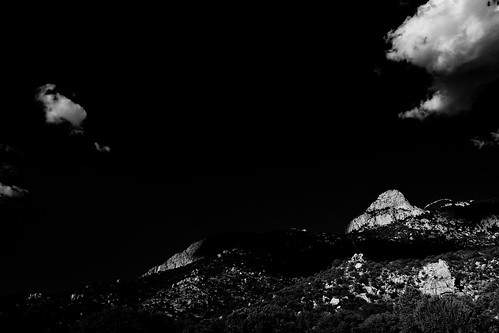
|
|
#
?
Aug 6, 2009 00:37
|
|
|
 Sugarloaf Rock in South West of Western Australia
|
|
#
?
Aug 6, 2009 13:26
|
|

|
woot fatigue posted:Awesome photos. Just want to say I'm jealous, and you did an awesome job on these. The final campaign looks great, very cohesive, very pro, and makes me interested in the product, even though I don't know what it is.
|
|
#
?
Aug 6, 2009 14:23
|
|
|
penneydude posted:Haha, that's a pretty hilarious way to get a tilt shift effect. I bet it gets expensive pretty fast too!!
|
|
#
?
Aug 6, 2009 14:46
|
|
|
Some people talked about doing one exposure for the sky and one for the foreground- I've been having trouble merging those two together. I've been trying to do the masking and all that, but the skyline is very irregular and has trees which is making it difficult. Does anyone have any suggestions?
|
|
#
?
Aug 6, 2009 16:08
|
|

|
woot fatigue posted:Sweet project. I was going to offer my suggestion for the already amazing bridge shot, and suggest you crop off a bit of the sky at the top. Then I see your post with the print layout, and the space at the top works great for text. And then I scroll down further and see the exact crop that I was imagining. Bravo!
|
|
#
?
Aug 6, 2009 17:34
|
|
|
it's pretty much impossible to post after brad  
|
|
#
?
Aug 6, 2009 23:13
|
|

|
Hey woot fatigue, I've seen those up all over SF - nice work, didn't know a goon shot it.Whitezombi posted:I'm doing some pretty heavy experimenting on processing with these landscapes. I have an idea of some places I want to shoot and process this way. I think what is interesting to me about these is how they lose the sense of scale and perspective with the dark skies. I would pursue it more along those lines when you're shooting, rather than as an after-the-fact processing thing.
|
|
#
?
Aug 6, 2009 23:37
|
|
|
       octane2 posted:Here's one from me. Not the best one out of the collection, but, shows a different perspective on landscapes.  you can't convince me you weren't trolling. Nobody is actually like this. Jesus, what a beauty of a post. you can't convince me you weren't trolling. Nobody is actually like this. Jesus, what a beauty of a post.
|
|
#
?
Aug 7, 2009 19:13
|
|

|
ElZilcho posted:
This is a really great shot, with some nice post-processing it would be mind blowing. 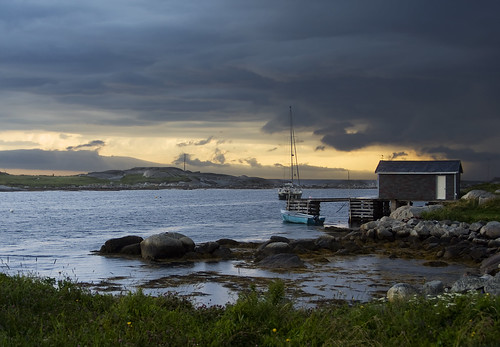 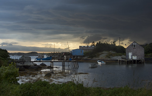
|
|
#
?
Aug 8, 2009 01:33
|
|
|
Two from tonight was hoping for a better sunset but oh well.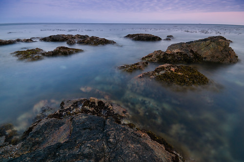 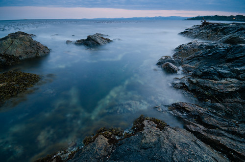
|
|
#
?
Aug 8, 2009 08:42
|
|
|
And one from today!
|
|
#
?
Aug 9, 2009 07:22
|
|
|

|
| # ? Apr 25, 2024 15:10 |
|
|

|
|
#
?
Aug 9, 2009 09:10
|
|
