


|
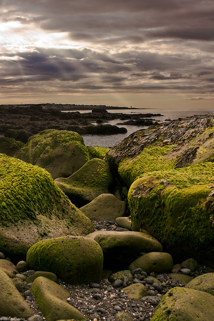
poopinmymouth posted:I like where you're going with this one, but the rays of light seem a bit overdone. The high saturation in the foreground and desaturated background make a highly stylized, layered composition in the lower two thirds of the frame that I really like. However, your treatment of the sky at the top portion doesn't really complement the lower portion, especially with the exaggerated rays of light coming through the clouds, which don't complement the flatness of the ground objects at all. benisntfunny posted:For better or worse I edit most of my landscapes pretty heavily. However I usually know what I'm going to do with a shot before I take it. Your initial shots could use some work, but I don't think you're actually improving them with your heavy editing. In the first one, as you admitted, you need to go easy on the gradient filter. The sun beams are much too intense and the result is rather artificial looking. When you "popped out" the cliffs, you left the edges a bit too sharp against the background. It's not all bad though, I think the treatment of the water is an improvement over the original as you really brought out the surface texture. In the last one, everything is oversharpened and oversaturated. The bright orange sunlight coming through the clouds looks extremely unnatural, and the contrast of the bright streak going across the sky against the surrounding clouds completely wrecks the compositional integrity of the original. When you look at, you're immediately drawn to the flame-like streak and nothing else. These aren't terrible photos to begin with, but if you want to improve them, try to be more subtle with your edits. HPL posted:Going for more of a layered look: You've pulled it off well, especially in the second one. The overall composition reminds me of Japanese wood block prints.
|
 #
¿
Jul 22, 2009 02:26
#
¿
Jul 22, 2009 02:26
|
|


|

|
| # ¿ May 4, 2024 07:50 |
|
|
benisntfunny posted:Someone had commented that my photos look fake and that I wasn't doing justice to them by applying such intense editing. Landscapes are only boring if you make them boring. If you spent more time setting up the shot and framing it in an interesting way, then maybe you wouldn't feel compelled to edit them so heavily. It's not so much that they're unrealistic, but that some of the choices you made really threw off the aesthetic balance of the compositions, like in your "firebolt from the tomb" photo. I'm not anti-editing. If you look back to my previous post, I said that I actually liked some of the edits that another poster had made, but his photo still needed work. I just really dislike overediting.
|
|
#
¿
Aug 4, 2009 21:31
|
|