


|
One thing Dreadhead is good at, but that he hasn't mentioned, is that compositional rules still apply to landscapes. Keep your horizon line on a rule of thirds line unless you have a good reason not to. Dead centered horizons are boring. Technically the horizon is centered in this photo, but the clouds act as another line, and it hits more along the top thirds line. 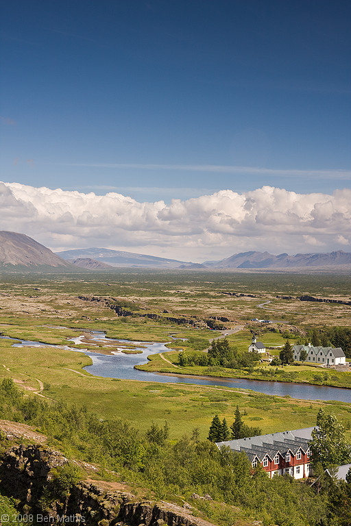 If there is a visual interest point that pulls the eye the most, try to get it one of the intersecting thirds line. In this one, the waterfall is the visual interest, and it's in the lower thirds intersection. 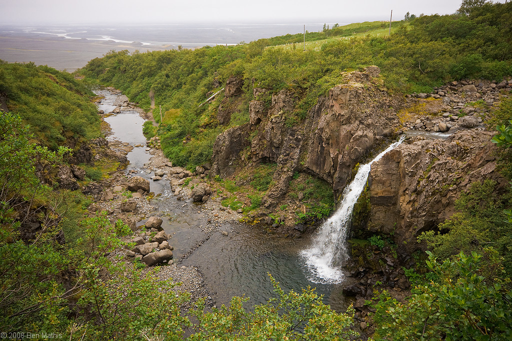
|
 #
¿
Jul 15, 2009 09:57
#
¿
Jul 15, 2009 09:57
|
|


|

|
| # ¿ May 6, 2024 01:46 |
|
|
maws posted:These are beautiful, where do you live? Both are from Iceland, where I used to live, but now I live in Germany. Thanks though!
|
|
#
¿
Jul 15, 2009 14:06
|
|
|
octane2 posted:
I'm sorry, but I'm not seeing it. I don't always need flashy and in your face, but I think this one is just too blase. It literally just looks like a shot into Joe Everyman's backyard woods. I don't want to be insulting, but I'm almost positive this kind of shot needs supreme expertise to make it engaging, because there is no clear focus point, the depth is flattened by the visual noise, and nothing is really recognizable shape wise. It lacks focus, contrast, a subject, and depth, all of which I normally like to see with a medium or even high level, especially in landscapes. maws posted:
Sure, can do:  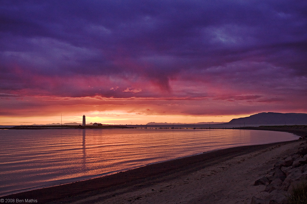 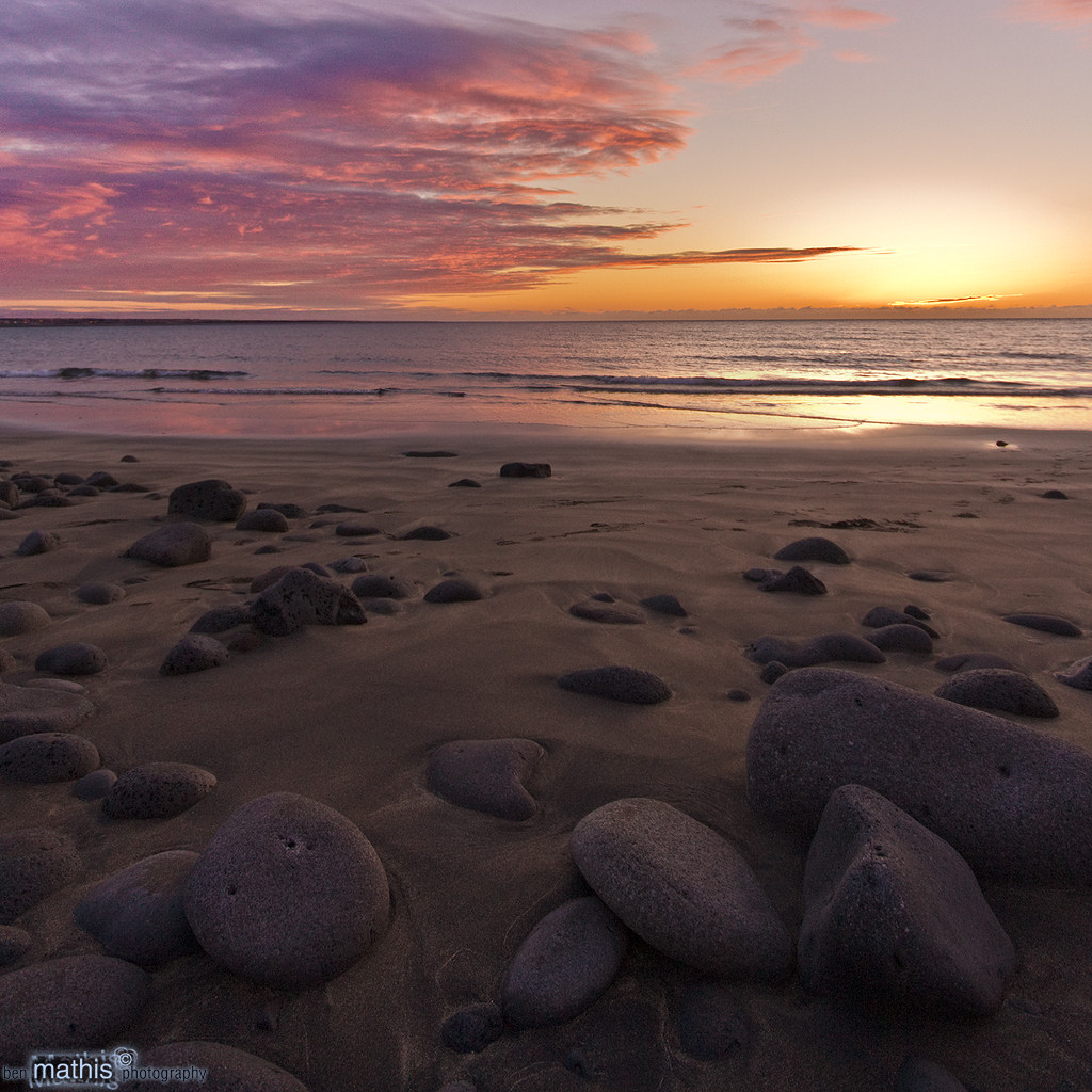   
|
|
#
¿
Jul 15, 2009 14:51
|
|

 I'd love to see any more shots you have though.
|
AIIAZNSK8ER posted:The perspective on this really makes it stunning to me. It simultaneously makes you feel big compared to the sand and rocks and small compared to the vast horizon and open sky. Do you remember how high off the ground you were and did you have to angle it up or down much? EXIF shows a 10mm lens, I've never worked with such a super wide. I was actually crouched, I believe. That was the sigma 10-20mm, which owns, but I traded it along with my 40d for a 5d original and never looked back.
|
|
#
¿
Jul 15, 2009 16:48
|
|
|
brad industry posted:I am only ever interested in shooting landscapes on 120. I don't know why, something about square format. Like the first one, love the last one.
|
|
#
¿
Jul 17, 2009 09:09
|
|
|
Way Past Cool! posted:I like where you're going with this one, but the rays of light seem a bit overdone. The high saturation in the foreground and desaturated background make a highly stylized, layered composition in the lower two thirds of the frame that I really like. However, your treatment of the sky at the top portion doesn't really complement the lower portion, especially with the exaggerated rays of light coming through the clouds, which don't complement the flatness of the ground objects at all. Thanks for taking the time to critique. I agree, and I'll keep that in mind for my next edit of a similar subject.
|
|
#
¿
Jul 22, 2009 10:04
|
|
|
unixbeard posted:hey dread, beautiful shots, i looked at the exif and was wondering why you shoot in spot metering mode? He can answer as well, but I also shoot landscapes in spot, so I'll give my answer. I like to use a quasi-zone system. With the spot I can point to either the brightest part of the scene that I want to keep, or the darkest, and adjust my meter to match. For example: +2 for the brightest, or -2 for the darkest.
|
|
#
¿
Jul 27, 2009 13:34
|
|
|
octane2 posted:Canon EOS 5D Mark II, Canon EF 17-40mm f/4L USM To give some advice rather than be insultingly snarky. Why do you have the red bush, and the mountains (the two most eye-drawing points) in the dead center? If you were to back up a tad, and move to one side, you could make the bush a bit smaller, put it in the bottom left thirds point, and the mountain in the top right point. I think having the bush abnormally large and stretched by the wide angle is hurting the readability of the photo, and having the focal points centered is also dissorienting. Bob Ross would also never give someone a critique like Reichstag did. He was about making art enjoyable, fun, and approachable to everyone. In short, he wasn't a dick.
|
|
#
¿
Jul 29, 2009 11:11
|
|

|

|
| # ¿ May 6, 2024 01:46 |
|
|
woot fatigue posted:Awesome photos. Just want to say I'm jealous, and you did an awesome job on these. The final campaign looks great, very cohesive, very pro, and makes me interested in the product, even though I don't know what it is.
|
|
#
¿
Aug 6, 2009 14:23
|
|