|
evil_bunnY posted:mcmadcow what's your flickr name? McMadCow ") http://www.flickr.com/photos/mcmadcow/
|
 #
?
Oct 27, 2009 00:30
#
?
Oct 27, 2009 00:30
|
|


|

|
| # ? Apr 26, 2024 03:33 |
|
|
Thanks, couldn't find it from inside the iphone app and assumed it was something else. Woops.
|
|
#
?
Oct 27, 2009 12:44
|
|

|
McMadCow - The more I look at that series, the more I like it. I looked at your flickr when you posted it over in the fine art thread and on first glance I was generally meh toward the portraits. On second and third looks, they've all grown on me. I'm not sure why, but there we are. I did some portrait tests over the weekend, trying to keep the lessons from that 70s portrait book's exercise with the bust of Aphrodite in mind. My ABs have yet to come in, so I had to use hot lights, which suck. Anyway, here are some of my favorites. Compelling portraiture? No. Good practice? Probably.    
|
|
#
?
Oct 27, 2009 18:07
|
|
|
What's the terminology used for when the light is hitting the side of the face that's facing the camera, and its opposite term for when it's the "dark side" of the face that's facing the camera. squidflakes - you've used the former here. Works well. Very by the book.
|
|
#
?
Oct 27, 2009 20:42
|
|
|
First time doing any portrait photography in a studio while on a photography course I am doing. I wish I had got her to take off that coat but after taking the photos it was us who became the models for the next person so I was rather nervous about directing people.
|
|
#
?
Oct 27, 2009 23:08
|
|

|
I had a total of 15 minutes to take these, from arrival. I had to move a heavy podium and figure out who was who and what to do in front of a large crowd  I am happy I got close to usable results, they are going to be printed tiny like. all the crookedness, all the drat chairs i had to contort around, panicing to somehow get all the people in the group photo IN THE GROUP PHOTO (samples)    (intentionally flat and not stylized in any way) LESSON: Ask what the hell you're doing BEFORE you show up
|
|
#
?
Oct 28, 2009 21:10
|
|

|
15 minutes and people expect half-way decent portraits?
|
|
#
?
Oct 28, 2009 21:16
|
|
|
notlodar posted:
Dude on the far left of the group portrait is suffering from some radical lens distortion.
|
|
#
?
Oct 28, 2009 21:24
|
|

|
squidflakes posted:15 minutes and people expect half-way decent portraits? think they are below average? i really can't judge these right now as they weren't on my terms and too little time has passed... torgeaux posted:Dude on the far left of the group portrait is suffering from some radical lens distortion. 
notlodar fucked around with this message at 21:32 on Oct 28, 2009 |
|
#
?
Oct 28, 2009 21:30
|
|
|
torgeaux posted:Dude on the far left of the group portrait is suffering from some radical lens distortion.
|
|
#
?
Oct 28, 2009 21:43
|
|

|
I don't know if I'd say below average. You at least took the time to pose everyone, even if the lighting makes them flat and boring. The people themselves look like they would like to be anywhere but right there, but if this was a work thing I'm surprised you even got the hint of a smile. The only thing that really irks are the reflections off the gilt lettering on the books and, in the first portrait, the plastic announcement holder. The holder you could have moved, but the spines would obviously reflect unless you were lighting from the sides.
|
|
#
?
Oct 28, 2009 21:47
|
|
|
notlodar posted:
|
|
#
?
Oct 28, 2009 21:47
|
|
|
jackpot posted:Woman second from left in the group portrait is just suffering She is the nightmare of photography...the "I don't smile, I just look dour" person.
|
|
#
?
Oct 28, 2009 21:48
|
|
|
jackpot posted:Haha if you scroll up the page from the bottom you notice this woman actually blends in with the books, it's like she's wearing some kind of librarian camo. She'll never die, just slowly fade in to the stacks.
|
|
#
?
Oct 28, 2009 21:50
|
|
|
torgeaux posted:She is the nightmare of photography...the "I don't smile, I just look dour" person. Her stripes are horizontal, a rookie mistake. They either need to be broader (to blend more with the shelving) or vertical (to blend with the books). She's really just hiding herself below the waist. Since it's a given that she's a virgin, that may be the point.
|
|
#
?
Oct 28, 2009 22:00
|
|
|
jackpot posted:Woman second from left in the group portrait is just suffering squidflakes posted:I don't know if I'd say below average. You at least took the time to pose everyone, even if the lighting makes them flat and boring. The people themselves look like they would like to be anywhere but right there, but if this was a work thing I'm surprised you even got the hint of a smile.  Oh, there was actually a MIRRORED WINDOW thing behind some books, WHY, its actually what's in front of those fan things jackpot posted:Haha if you scroll up the page from the bottom you notice this woman actually blends in with the books, it's like she's wearing some kind of librarian camo. I sorta fixed the distortion I failed to notice, kinda, to a "good enough" state, but it totally warped the background, i don't know what was going on, i think i had one food on a chair for the last one so I was somewhat off balance. 
|
|
#
?
Oct 28, 2009 22:03
|
|
|
Notlodar I think those are nice, I guess what I feel is missing is a level of polish, perhaps. Taking the librarian portrait, for example, for a commercial style portrait I think it could stand to have a lot more light in her eyes-- these kinds of shots seem generally to call for lots of light and a fairly bright nature rather than deep discrepancies between light and dark areas, particularly in the eyes. ... Posted these in PaD but looking for some more feedback, I've got a bunch of headshots lined up...  
|
|
#
?
Oct 30, 2009 00:21
|
|

|
Composition is far, far, better in the first shot. Just enough negative space to the left, face slightly to the right, and the hair makes a nice line creating a circle: hair, neck of blouse, back to the neck, and up again.
|
|
#
?
Oct 30, 2009 00:26
|
|


|
TsarAleksi posted:Notlodar I think those are nice, I guess what I feel is missing is a level of polish, perhaps. Taking the librarian portrait, for example, for a commercial style portrait I think it could stand to have a lot more light in her eyes-- these kinds of shots seem generally to call for lots of light and a fairly bright nature rather than deep discrepancies between light and dark areas, particularly in the eyes. Your lighting is crisp and even. Two lights? The only flaws I'd say would be the posing. The first one suffers a bit from the head on gaze - a little tilt adds some femininity to it. The second I feel you could kick the lights up a bit higher to try and get some shadow under the neck to define the edge.
|
|
#
?
Oct 30, 2009 00:28
|
|

|
Ah, and just so that we don't get caught up in analysis alone, I really like the first one. Second one is good and most clients would likely be happy with it, but after seeing the first one it's less attractive. Black cards on the left and right would get a tiny bit of definition like Paragon8 mentioned, and may be worth testing before your shoot.
|
|
#
?
Oct 30, 2009 00:33
|
|
|
More fun! Comments are entirely appreciated, because I'm not yet sure if this processing is going to be final.   
|
|
#
?
Nov 2, 2009 03:32
|
|


|
I really like the pose in the first one... its a neat photo. As a whole the pictures don't go together very well though. They all kind of have their own look. I don't think there is enough light on the face in #3.
|
|
#
?
Nov 2, 2009 03:53
|
|

|
I agree that they're not cohesive enough. I'll have to think about that some more. More light is easily fixed though.
|
|
#
?
Nov 2, 2009 04:04
|
|
|
I'm a sucker for girls in 1950s/60s fashion so I'm loving those shots nonanone, especially the first one.
|
|
#
?
Nov 3, 2009 01:24
|
|

|
I don't really have a question, just want to vent in a place where somebody might be able to commiserate. I'm a student intern with my university's public relations department. Our theater department is notoriously bad at scheduling our university photographer for shoots, even though they know what shows they're doing and have internal schedules months in advance. Anyway, this morning, the photographer that I assist gets an e-mail "reminding" him about photo call (promotional shots) this evening. Unfortunately for them, he's got H1N1, so I got assigned photo call. Fortunately for me, nobody in the PR department cared if I totally hosed up. I was told that this shot, like all photo calls, would be with the actors in costume, on the completed set, with completed stage lighting. We're not allowed to use any of our own lighting to shoot them, no matter how hideous the stage lighting may be (last photo call was dark as hell and entirely backlit... here are your silhouettes, Mr. Director!). So I show up today with an assortment of lenses, but no lighting equipment. Walk to the stage... nobody there. Half-finished set. No lighting. Awesome. The director eventually showed up and informed me that since the set wasn't finished on time, we'd be doing photo call "in a room with nice furniture." They take me to a glorified waiting room with two recessed ceiling lights and a handful of dim lamps. She wouldn't let me run back to the office to grab proper lighting equipment, so I got to shoot all of photo call with available light. At that point I had no qualms putting her staff to work, so I had a couple of them move furniture around to make use of the ceiling lights, while making the assistant director hold a floor lamp and maneuver the lamp shade to bounce some fill light onto their faces. It seemed like a disaster at the time, especially considering it was my first legitimate solo portrait session, but it's certainly something I'll remember for a long time about thinking on my feet. I had to dump the photos at the office without getting a chance to look through them, but I'll grab a few selects tomorrow and share them, hopefully they didn't turn out too terribly. ...oh god that was way too long, sorry about that. Feels good to get it off my chest though.
|
|
#
?
Nov 3, 2009 04:56
|
|

|
nonanone posted:I think the door frame/window frame to the left is really annoying. Clone tool it out maybe? (But then the background might be a bit bleak and shallow). I like the first but I think it's cropped a little too high, if you cut off more from the top you'd be focusing more on her wonderful expression. Basically, that's the best bit so having too much background when it's pretty clear and busy is distracting. The 2nd one, I see what you were going for, and the lighting is pretty good except the shadow that is cast by the right girls hat onto her face is a bit annoying. The last one seems to have the light centred on her neck and not on her face and her pose makes her seem not centred. Basically get her to keep that pose but move her a foot to the right.
|
|
#
?
Nov 3, 2009 06:47
|
|
|
This was taken almost a year ago when I knew basically nothing about lighting in the studio, but I figure I'd post it just to further fuel the "what makes something a portrait" debate. I'm aware this probably doesn't qualify for a classical portrait. (It was definitely inspired by an Avedon shot, and I think we can agree he did portraiture) Leyendecker fucked around with this message at 07:16 on Nov 3, 2009 |
|
#
?
Nov 3, 2009 07:12
|
|


|
BobTheCow posted:...oh god that was way too long, sorry about that. Feels good to get it off my chest though. If it makes you feel better, I feel your pain.
|
|
#
?
Nov 3, 2009 07:22
|
|

|
I am now a big fan of the unconventional approach. High contrast film + hard light from a flash I played with as a child... I hated this style a couple of years ago when I was dumber (may be related)      i like metal backgrounds that can PROPERLY reflect my flash.
|
|
#
?
Nov 3, 2009 08:04
|
|
|
notlodar posted:I am now a big fan of the unconventional approach. High contrast film + hard light from a flash I played with as a child... I think that look can really work...or be really out of place. Any really strong effect is that way, though. I think your shots here turned out fine. I like one and three, as quoted, but I would like to see your model's eyes. Not necessarily in that shot, it works for me, but I'd like the second one in that series to be more of a departure. The second shot quoted I'm on the fence about the focus.
|
|
#
?
Nov 3, 2009 13:59
|
|
|
I think it looks soft because I pushed it in post (and I increased the light output of my "softbox"), so the combined effect of too much scattered light and underexposed details probably made it a bit soft. also these aren't really a series, I wasn't sure which one of the two scrunch face pictures was stronger... I actually like the other one but mostly because it's funnier to me
|
|
#
?
Nov 3, 2009 16:53
|
|
|
Just got a 430EX SpeedLite and 85mm f/1.8 prime (both for relatively cheap!). This is a shot I took of my girlfriend while I was fooling around. I was bouncing the flash off the ceiling, and I know that bra strap is pretty distracting. Otherwise I think I did an OK job .
|
|
#
?
Nov 7, 2009 11:45
|
|

|
It looks to me like the focus is on her jeans rather than her eyes.
|
|
#
?
Nov 7, 2009 12:03
|
|

|
DuckBOT posted:Just got a 430EX SpeedLite and 85mm f/1.8 prime (both for relatively cheap!). That's the problem I've found with the 85mm f/1.8- you really need to watch your focus. It's hard to see on the LCD, but if on the computer you zoom in, sometimes the wrong part is emphasized, like in your picture. Her jeans/bottom part of her shirt are the most in focus, where as the face isn't... and that's where everyone's eyes going to be looking in a portrait. As for the composition, it's pretty alright. Like you said, the bra strap but also some of the background elements could be eliminated or positioned so they aren't so distracting (like the blanket on the bottom).
|
|
#
?
Nov 7, 2009 14:03
|
|
|
DuckBOT posted:Just got a 430EX SpeedLite and 85mm f/1.8 prime (both for relatively cheap!). Having her face in the high upper left hand corner sorta forces me stare at boobs first and foremost. I think if you had given her a little more space for her head, placing it a little more near the thirds point, it would have drawn the eye to her face better (assuming that's what you wanted to do)
|
|
#
?
Nov 7, 2009 17:01
|
|
|
I've posted once already, here's some stuff I've done since then.        I'm kind of bouncing back and forth between trying to establish series/styles, and constantly wanting to try something new. I got a couple of Lumopro L-120 speedlights, but my SB-600 kicked the bucket. Balance is maintained.
|
|
#
?
Nov 9, 2009 01:43
|
|

|
I've been working on some portraits for class, and I think this is the best I've done so far, especially in terms of lighting. It helps that I've been using my friends so far in pictures, but the real test will be someone that I don't know so well. And my professor says that I can skip a pre-req so I can take a real studio class next semester!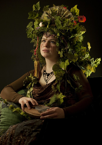 
|
|
#
?
Nov 9, 2009 14:36
|
|
|
Cover shoot where everything went wrong, but we made lemonade from lemons. Renzi Stone, former University of Oklahoma basketball player, now big guy at and OKC HR firm. 
|
|
#
?
Nov 10, 2009 17:06
|
|
|
So what (DELL) went wrong (DELL) with the shoot?(DELL)
|
|
#
?
Nov 10, 2009 17:12
|
|
|

|
| # ? Apr 26, 2024 03:33 |
|
|
Interrupting Moss posted:Cover shoot where everything went wrong, but we made lemonade from lemons. Renzi Stone, former University of Oklahoma basketball player, now big guy at and OKC HR firm. I like everyone in the background, but coach's face seems... off somehow. Is the girl on the left holding a cell phone? I'd love to hear the story about this. The shot has a lot of potential.
|
|
#
?
Nov 10, 2009 17:41
|
|