|
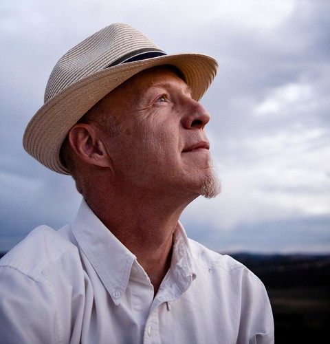
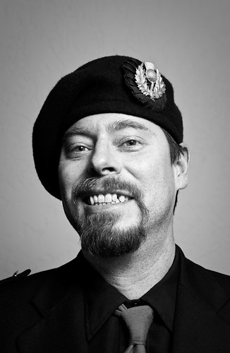
Hey thanks for starting this thread. I have to say though, portraiture is a pain compared to working with models who know what they're doing, and I really respect it when people can pose other people well. Let me know if you think fashion/beauty shouldn't be lumped in. I'm hoping some other fashion people will come out of the woodwork.  I think a really important topic is how to interact with your model/person. By making them feel comfortable and beautiful in front of the camera, you can often coax a much better look out of them. Sincere compliments are always best, I've met more than couple photogs who think that by telling the girls how "hot/gorgeous/sexy" the girls are, they're complimenting them. No, you just come off creepy. Also, even men (read as: especially men) need some encouraging words too.
|
|
|
|
|
| # ¿ Apr 30, 2024 06:35 |
|
I'd imagine if you're polite and just ask nicely it wouldn't be a problem. Or, you could just say you're documenting street fashion and explain yourself. If you were able to hand them over a website, it'll also look much more legit. I really like your writeups, poopinmymouth, as well as your images. I'm a big fan of both environmental images and studio work. They each have their strengths, and environments are important for telling a story, while studio allows the focus to be narrow in on the model or the clothes/props. What are people's opinions on showing the preview LCD? I recently had one girl who kept asking me, and I had to kind of shut her down and say "I'll tell you when it looks really bad, don't worry about what's going on over here." The only time I was really okay with showing was with one model who was trying something new and politely asked to check to see how it was looking from my end.
|
|
|
|
ConfusedUs posted:If I chose the same pose, I'd have her lay her arms on top of each other, rather than wrapping around each other, and I'd adjust my main light a bit so that the air did not cast shadows. I agree with these pretty much exact changes, the first one is not nearly as good as the second. The only thing is if it's for the bag, I would make it more prominent instead of so separated. I feel like there should be an interaction/a focus. As an overall thing, it very rarely looks good with joints pointing towards the camera, and her body language is insecure in the first one. I like your stuff ConfusedUs, it's all so wholesome and natural 
|
|
|
|
ConfusedUs posted:You say that like two of my last three self portraits didn't involve knives, somehow. You can't say it's not natural? Besides, your kid pictures are always so cute (yes, even the child labour ones) 
|
|
|
|
TsarAleksi posted:It's entirely possible that I only see this because I know they are comped together, but to me a lot of her composite portraits seem to be lacking connection between the subjects-- you can't tell they are comped on account of the light, cutting together, or whatever, because that is flawless, but there is a certain vacant quality to many of them that I sometimes notice. That's not a knock on comping images, just on some of Leibovitz's work that I've seen. I've noticed this as well, and I think it's because with a comped photo, there's no interaction between the people. I think that accounts for the "vacancy" feeling, because every person looks as if no one else is there.
|
|
|
|
AIIAZNSK8ER posted:What I don't really get right now is the difference between a portrait of a person and a fashion photo. What is the distinction in posing and composition to capture someones likeness versus promoting qualities of a product modeled by a person? I'll try to tackle this question too. There are certain styles that are prevalent in fashion. Certain poses (lots of weird body contortion and angles), certain lighting, certain types of models. The face is often distant (ie not smiling), as to not catch attention away from the style/clothes of the photo. In a way, the model is an accessory to the rest of the photo, but if the model doesn't look good, the clothes don't look good. Composition also often tailors to the body instead of the face.  In this photo, there's strong body language and strong light that is not necessarily going to flatter the model. Your eyes don't necessarily want to stay at the face, it's not the most important part.  Here, we have a strong connection to the face, and the clothes don't matter at all, even if the shot showed more of the body. It's important to make the model here look pretty/nice/pleasant in a normal way. The thing is though, there are definitely lines blurred between here, especially when you get into print stuff, like department clothing ads, where they want bright and smiling people, or serious portrait work that pushes some boundaries.
|
|
|
|
In the future, if you have to shoot in strong light again, I find a good generic direction to take is just "strong" images. Imagine high contrast, strong body language, etc. Once you start on an idea too, it grows and you can build from there. Another problem I see in the set is that the people aren't really interacting. This is probably most evident in the pics with the two girls.
|
|
|
|
I suggest shooting the in the shade, or near sunrise/sunset to get a softer light. Also, try not to cut off body parts at weird lengths (ie, just the top of the knees showing in the first one).
|
|
|
|
Bumping this thread. People are (imo) the most interesting things. Everyone, please post more pictures of people.   
|
|
|
|
Whitezombi posted:You want people? People are my favorite thing to shoot and I do not do it enough. This one is my favorite. Everytime I see it, I like it more. 
|
|
|
|
I agree, actually, that last one is by far your strongest. I think maybe that last one might benefit a tad bit less yellow. Right now she just kind of looks jaundiced. The other pictures are without any context to the viewer, and the people themselves look like they mean something to you, but not much to the viewer. For a specific example, the laughing girl: there's a lack of connection because of the sunglasses, but there's not much else context to look at. Who is this girl? Without context and without eyes or something else interesting to focus on, you lose what makes the photo interesting to an outside party. Your last photo, in contrast, has personality and a fascinating expression that draw a viewer in, well done 
|
|
|
|
This is kind of true. I have a lot of photographer friends, so it's easy for me to forget sometimes what kind of pictures people usually take, because even the worst of them usually expose things properly. Some other people I know though, what they do to make their photos "artsy" (read as: crank saturation +5000 or black/white so high contrast nothing is recognizable). To be fair though, they usually aren't doing it any sort of serious fashion. I like to think that the crowd here is better than that
|
|
|
|
8th samurai, I really like that 2nd one too. The third seems awfully blue though. I think you did a great job with the conditions you had. (and a great job overall, though I like the last one the least)
|
|
|
|
I always liked to think about portraiture as the connection between the person in the photo and the viewer, whether it is happy/sad, commercial, aloof, disconnected, etc. I would hate to think that all portraiture has to be flattering. I tend to prefer a face for easy connection, but don't forget that as people, we communicate tons with just our body; the face isn't necessary all the time. Here is another picture of a person for your viewing pleasure  
|
|
|
|
I really like that second one. The others seem kind of contrived ie "duuude you're taking my picture!" but that second one I really really like. Here's some more people!   
|
|
|
|
AIIAZNSK8ER posted:I had them sit on a window ledge in one of my office's big conference room. Because of that weird kind of angle, it does look like a composite a bit. I wanted to highlight the building as well though because its a local landmark, kinda. Its the tallest building in VA that was just completed a few years ago. I had a hard time balancing flash on the subject and the background, and agree that it is a bit harsh. There is a reflection on both, and I couldn't figure out how to clone them out.I wish I could have backed up further, but a large immovable conference table was in my way. The extreme separation of the background and the person is what kills it for me, plus the harsh look of the flash. Add to that, there's no frame of reference, so it makes it looks like they were composited in. I think that if you had included a reference (window edge or ground or something to anchor them) this would help that feeling immensely.
|
|
|
|
One thing I find works out better is if it's cold again, try to keep a super positive attitude and make jokes about how they should pretend it's a beautiful summer day, etc etc. It really makes a difference, and helps them relax, despite the lovely weather. Maybe have some hot cocoa available. Another thing that strikes me as really weird is how they're wearing all black, and every single shade of black is different.
|
|
|
|
sneak preview, newest shoot: 
|
|
|
|
I was about to post this in snapshots, but I might as well here; it's really funny (and makes sense) that you shoot your portraits like landscapes. When you're working with people, it's really important that the person isn't "lost" in the compositional elements. For example, your second shot, the frame of the arch dominates the shot, and is the on the main plane of focus, and the person isn't the attention. Another thing is to pay attention the body (earlier there was posted a really good posing guide), the poses you chose aren't very flattering. Little things like in the first one, her arms will look kinda fat that way, and having her head down shortens her neck. In the second and third, her posture isn't very good, so you get some crumpling of her belly, also making her look bigger. Obviously you have all the technical stuff down, so I think something that would help immensely is thinking about what you want each picture to say about the person. Mostly it will be that you want them to look pretty and thoughtful, etc, but sometimes adding in an element/prop that adds something else to their "story" really helps; ie a balloon to make them look cute, contrast to make them look strong, a pet, dancing, motion, and so on. This will also help you find a direction for processing.
|
|
|
|
The different thought processes is also probably why I suck so bad at landscapes
|
|
|
|
More fun! Comments are entirely appreciated, because I'm not yet sure if this processing is going to be final.   
|
|
|
|
I agree that they're not cohesive enough. I'll have to think about that some more. More light is easily fixed though.
|
|
|
|
DuckBOT posted:Just got a 430EX SpeedLite and 85mm f/1.8 prime (both for relatively cheap!). Having her face in the high upper left hand corner sorta forces me stare at boobs first and foremost. I think if you had given her a little more space for her head, placing it a little more near the thirds point, it would have drawn the eye to her face better (assuming that's what you wanted to do)
|
|
|
|
Yes, like McMadCow said, you should basically tell her to deal with what you choose to give or gently caress off. The truth is there are plenty of models who won't be picky, and if they're looking for portfolio pictures, YOU are providing a service that is worth money. So don't let them jerk you around. There is one girl who contacted me last year, she wanted me to shoot some pics for her. I set it up and she flaked. She's contacted me 4 times since, and also wanted to work with some other photographers in the area; I told them she was flaky. One of them gave her a chance and she flaked out on that too. The dumb part is she still tries to contact me, I just ignore her because it's so not worth the trouble. You couldn't pay me a million dollars to work with someone who wants to run on their own time/lead people on.
|
|
|
|
Not bad, especially for a paper. Will you be erasing the 'sanitary blah blah" though? It's killing me, that's the only thing I'm really staring at.
|
|
|
|
Oh, that didn't even occur to me. I guess you shouldn't then...(*is used to fashion where entire face and body shapes are changed*)
|
|
|
|
Here is another thing to keep in mind, the guy on the right jean's don't fit and it makes him look squat and not very commercially. He kind of also looks a zombie. The second picture looks really posed in an awkward way. Her camera-left hand is awkward looking and you've sort of cut off him in a weird way too. It works for the first one to cut in a weird way, but not the second. Also that couch is hideous, which might not be that big of a deal if it weren't such a big part of it. Also the frame on the left is really distracting. poopinmymouth covered the lighting, but another thing to keep in mind is you have a very shiny wall behind them.
|
|
|
|
I wouldn't worry about it. It's naturally warm ish looking, which gives a lot of life. What an animated kid, one of those rare cases you can actually say is a really cute baby.
|
|
|
|
That looks really nice. 
|
|
|
|
Just plain people    
|
|
|
|
I'm definitely seeing some sort of cartoon paint tube.
|
|
|
|
they are in focus edit, he has contacts
|
|
|
|
I like this one the best, the others are okay.
|
|
|
|
Yeah, what poop said, plus if you wanted something similar you could just use a large window on a cloudy day.
|
|
|
|
Mannequin posted:Ooh this is great! Looks fine to me (*not on a calibrated monitor) Shadows look a little on the dark side for a happy/commercial photo, but considering your description of the conditions, it looks fantastic. You may want to remove some shine spots so her skin doesn't look so greasy.
|
|
|
|
psylent posted:What's the best way to remove shine spots/reduce redness? The best thing you can do is have a good makeup artist (or even have some proper powder on hand), but in lieu of that, I like using the patch tool in photoshop to remove shine spots, same way as if you were removing a blemish. To reduce redness I usually play around a little, but there's usually a sweet spot between a little less red and still some nice color in the face. Some people are just naturally kinda red. Messing around with the orange can help make the red areas not so patchy.
|
|
|
|
This was my first time doing an album cover. There was a lot of processing involved; I'd show the before pics but it may be better for them just to never be seen, working with "regular" people is something I've gotten out of the habit of. At least it pays better. 
|
|
|
|
Oh man, people who tuck in their chin like that, it just looks so terrible. I would suggest giving the first two photos some more shoulder room, the high cut-off is making their neck look squat. Otherwise, they look really uncomfortable, so try catching them off guard/making jokes etc to make them look more comfy. The lighting is nice, and the color scheme too, although there's big hot spot on his forehead in the 2nd photo.
|
|
|
|
AtomicManiac posted:Thanks for the advice, the second one isn't cropped, yet, I'll have to play with it. How do you suggest cleaning up the skin fold? On the first one I used the liquify filter to tuck her tummy a bit because she holds it weird in some shots and it makes it look a lot bigger than it is, but I'm not super good at it and touching up shots like that always makes me hate them because all I can see are the major surgery in the shots. First thing I notice: they're a little dark, and the clothes are awful  . Those shorts look really bad and do no favors towards her body. I'm exactly sure how she's posing in that first shot, but it kind of looks like she's feels like she's being "coy" but coming off quite awkward, same with the second. In the second one, it also looks like her leg is quite purple and her pose is extremely awkward (possibly due to the weird lower left angle). That's what's making her arm and belly looking yucky. The cut-off at her foot is kind of weird too. . Those shorts look really bad and do no favors towards her body. I'm exactly sure how she's posing in that first shot, but it kind of looks like she's feels like she's being "coy" but coming off quite awkward, same with the second. In the second one, it also looks like her leg is quite purple and her pose is extremely awkward (possibly due to the weird lower left angle). That's what's making her arm and belly looking yucky. The cut-off at her foot is kind of weird too.Keep shooting, but also take a look at people's who's work you like and look at how the models are posed and how they're cropped and so on. Try starting more simply, maybe try mimicking simple photos from other people, and move on from there.
|
|
|
|
|
| # ¿ Apr 30, 2024 06:35 |
|
AtomicManiac posted:It looks to me like it was a single strobe fired from behind. Directly from the side actually makes people look fatter because it shows the stomach so prominently (like in maternity shots). Try a 3/4, and the RIGHT CLOTHES (this makes a biiig deal) Big belts can help define a waist, and clothes that aren't too big (this makes people look bigger). If you don't have control over the clothes, try getting them to be more dynamic so they engage some muscles and get some kind of definition.
|
|
|


