


|
Jiblet posted:Does he have a massive growth on the top of his head? Is that why you keep cropping it out? It's completely acceptable to crop before the top of someone's head.
|
 #
¿
Dec 21, 2010 23:25
#
¿
Dec 21, 2010 23:25
|
|


|

|
| # ¿ May 17, 2024 17:18 |
|
|
Cross_ posted:It seems to be acceptable in fashion photography, though it always rubs me the wrong way. Chopping off limbs is okay, but not part of the head please Chopping limbs is ok, chopping at joints is not. Although, yes, I'd still avoid chopping limbs when possible but I crop head-tops all the time.
|
|
#
¿
Dec 22, 2010 01:04
|
|

|
Ack! Shots 1 and 3 have some piece of fabric sticking out of the bottom of her shorts. This is why you bring along an assistant. 
|
|
#
¿
Dec 24, 2010 05:35
|
|
|
Oprah Haza posted:As weird as it seems, the shorts are actually made that way. I was very confused. Really? Wow, color me confused as well, then. It looks like it's only happenning on one side of them, too.
|
|
#
¿
Dec 24, 2010 16:19
|
|
|
TheLastManStanding posted:You're supposed to let the model bring a friend (if they want). NO. Seriously. It's not like the model having an escort will absolutely ruin the shoot, but I've never seen it improve anything. More often than not, an escort is someone for the model to be MORE self conscious in front of.
|
|
#
¿
Jan 7, 2011 19:30
|
|
|
nonanone posted:Basically if an escort is a problem, I'll ask them to leave the area, but otherwise, I'm not going to begrudge a model for wanting to bring someone along. I will not hesitate to tell them to leave the shoot though. That's actually been my policy as well, but the more I do this, the more restrictions I put on escorts and eventually I'll stop allowing them altogether. You'd never find an escort on a professional set, and since I'm trying to head in that direction I feel like I should operate the same way. I keep a list of all the models I've worked with. A new model can do their research before hand.
|
|
#
¿
Jan 7, 2011 19:56
|
|
|
Paragon8 posted:I've sort of come away from that because it just makes going through selects much harder just in terms of choice but it's a good way of building confidence. That's interesting you would say that. My one professor wouldn't let us crop at ALL- also for confidence building. I suppose either method can work, depending how you're approaching it.
|
|
#
¿
Jan 7, 2011 23:32
|
|
|
I'm about as close to getting married as I am to being elected president of Mars. I'll have to settle for networking as well.
|
|
#
¿
Jan 8, 2011 00:00
|
|
|
RangerScum posted:Why do her finger tips matter at all to the photo? People seem to be focusing so much on things getting cut out lately when for 90% of the photos the extremeties add nothing to the photo at all. I understand that you said "some people" indicating not necessarily yourself... Cropping at joints creates a false impression of the limb's dimensions. McMadCow fucked around with this message at 08:17 on Jan 9, 2011 |
|
#
¿
Jan 9, 2011 08:14
|
|
|
AIIAZNSK8ER posted:Here's some portraits I'm really happy with, so I need some crit to tear me down again. I really don't feel like you used the location to its maximum potential here. She's got such a colorful, interesting, and fun place, but you put her in the same poses you would shooting a dentist in their waiting room. I can't tell you what I would have done with it because I wasn't there, but from where I sit it seems like a bit of a missed opportunity to do something out of the ordinary. Also, her arms are crossed in two of the shots. A door-to-door salesman once told me that's a closed pose, and that it looks defensive to the customer. The proprietor of such a fun place shouldn't look inaccessible! EDIT: Less "suck", more "such". 
McMadCow fucked around with this message at 20:16 on Feb 4, 2011 |
|
#
¿
Feb 4, 2011 18:26
|
|


|
I'm on the fence about this one, but so far it's pretty well received on Flickr. 
|
|
#
¿
Feb 10, 2011 21:42
|
|
|
Paragon8 posted:I just wish you could see more of her eyes Yeah, that happens a lot shooting with her. That and her elbow crop are my gripes.
|
|
#
¿
Feb 10, 2011 22:07
|
|
|
Cross_ posted:Is she very short or is the lens distorting the proportions ? She's 5'6". What do you mean by lens distortion? I shot that with a normal lens- although from slightly high- it really shouldn't be doing much to her proportions.
|
|
#
¿
Feb 11, 2011 00:06
|
|
|
^^^ From shooting high, I guess. Maybe from the crop, too? Not much else of her is shown for a comparison.Gazmachine posted:I think your lighting lets this one down. Right now her nose is almost completely lacking in dimensionality. Something needs to be done to sculpt the stuctures on her face, even if only slightly. Also, get her away from the wall.
|
|
#
¿
Feb 11, 2011 00:10
|
|

|
Gazmachine posted:Cow, can I ask why you want me to bring her away from the background more? Because I can see her shadow on it (or a shadow from something). It doesn't do anything to improve the picture so there's no reason for it to be in the frame. It's really nothing but a distraction.
|
|
#
¿
Feb 11, 2011 19:00
|
|
|
I have no problem with seeing her blurred arm, but you should definitely add some more DOF to get both of her eyes in focus.
|
|
#
¿
Feb 28, 2011 21:29
|
|
|
Rintycakes you have a nice style but you need to be more aware about getting enough light into your subjects' eyes.
|
|
#
¿
Mar 10, 2011 20:15
|
|
|
Also, IsaacNewton, there's no reason to include the white wall in the upper left corner of the frame. It's distracting and it doesn't add anything to the shot. I'd crop it out.
|
|
#
¿
Mar 10, 2011 22:42
|
|
|
Alvination posted:
That poor girl lost her hands.
|
|
#
¿
Mar 24, 2011 16:59
|
|

|
Paragon8 posted:With regards to limb cropping in general I'd say avoid cropping along joint lines, but at the end of the day if it works - it works. It doesn't, though. Not for this shot, at least. It really does appear as though her arms are stumps. I'm all for breaking rules when it strengthens the picture, but this is a textbook example of why that rule came about in the first place. e: spelling McMadCow fucked around with this message at 18:12 on Mar 24, 2011 |
|
#
¿
Mar 24, 2011 18:08
|
|
|
Paragon8 posted:It's a pretty obvious inference that she has hands. Nobody that isn't looking to nitpick is going to think she's an amputee. I know you were going for hyperbole but it's just a pet peeve of mine. You can reasonably expect your audience to fill in beyond the frame for a lot of photography. It's not hyperbole, and it has nothing to do with inferring whether or not she really has hands. It has to do with the viewer seeing a frame line at the exact place their brain is telling them there should be a new body part. It's visually confusing, and it takes the viewer out of the picture. It does for me, at least. I'm not looking at that picture and comparing it against a checklist of rules. I looked at it and went "what the...?" because visually it looks like she's holding herself up against the bottom of the frame with stump arms. I don't have to honestly believe that her hands are missing for the visual disconnect to still affect the picture.
|
|
#
¿
Mar 24, 2011 18:52
|
|
|
Alvination posted:Perhaps a tighter crop would work? It's possible, but I don't know if I'd get your hopes up. When I crop really tight I try to get my subject to lean in if possible. She's leaning away in your shot, so it may create some other unexpected awkwardness. Probably worth a shot though, it's an otherwise nice picture. ")
|
|
#
¿
Mar 24, 2011 19:37
|
|
|
Paragon8 posted:Gaaaah, I'm sorry I'm coming across like a real pedant. It's just that it should be more of a decision when you choose to crop an image beyond "oh boy I don't want people to think she's an amputee" - it should be more about balancing composition - do you want to emphasize her head and shoulders by tightly framing on them, or show more of the environment etc. But I'm not talking about the loss of the hands being the problem. There's nothing that says a viewer has to see something to infer its existence. That goes for the hands the same as the back of her head. She's facing us and we can't see it, but we can assume it's there and not get taken out of the picture for it. The problem isn't her lack of hands, it's the visual confusion caused by cutting her arms at a place where our brain expects to see something continue on. I 100% promise you we wouldn't be having this discussion if he had cropped her in the middle of her uper arm. We'd be seeing even less of her limbs, but there wouldn't be the visually jarring image of a crop right on a point of movement. THAT'S the problem with cropping at joints. It's not the parts that get left out, it's the LOCATION of the crop and its relationship to how we naturally view a body.  Portrait by McMadCow, on Flickr I just printed this last night, so it's timely to have an example. She's cropped (roughly) in the middle of a limb, and there's nothing (I don't think) that distorts our perception into thinking something is wrong.
|
|
#
¿
Mar 24, 2011 20:46
|
|
|
Paragon8 posted:Don't worry about thinking I'm getting pissed off, it's just a fun discussion. I like to talk about the what and the why, to go along with the rules. I'm all for successfully breaking them when their reasons are understood.That said... Paragon8 posted:The first one I don't like at all. I realize it's a Guess ad with Anna Nicole Smith back when she was hot and living, and I'm just some loudmouthed schmuck on the internet, but I think that's another perfect example of a poor crop at a joint that results in a totally distorted visual of the proportions of a body. Kudos to them for selling it, but it's really bad to me personally. The second one is little more than an annoyance. I like the shot, I wish it wasn't wierd near her hands, but overall I'm pretty forgiving of it. The third shot I think suffers from a bad crop, but not because of a cut joint. Rather, it's because she's jammed into the bottom of the frame where it happens. I don't get weirded out by her cropped joint, but doing so has the secondary effect of crowding the scene. Eh, rules are meant to be broken, and if it can be done successfully, then more power to you. Sometimes it works, sometimes not. I think the photographer needs to be aware of the relationship of the shape of their subject to the shape of the frame. I don't think Alvination pulled it off in that shot, and lo and behold, there's a rule about it. I wouldn't have said anything if it would have gone off without a hitch.
|
|
#
¿
Mar 25, 2011 00:16
|
|


|
dreggory posted:Some fun in the new studio. I like the first for the intimate feel, and I really like the spontaniety of the third. Really a fan of the technical aspects of both of them, too. The second one isn't really doing it for me, though, for a combination of the pose which makes her body look awkward, and the fact that she looks uncomfortable. Often times when a model wants to do nudes but doesn't want to reveal any of the R-rated bits, the movements and poses required for modesty often leave the photo feeling forced. I feel that way about the second one, as well as a few of the others in your flickr stream. It was the same thing as  ZOCROWES' GIRLFRIEND a few months back. Otherwise nice shots with some distractions that took the viewer out of them. ZOCROWES' GIRLFRIEND a few months back. Otherwise nice shots with some distractions that took the viewer out of them.
|
|
#
¿
Apr 12, 2011 22:02
|
|


|
I had a portrait session with a cast member of the opera this past weekend. Obviously he would be a great model, so a successful shoot would be all on me. I've just started printing from the session, but I'm happy so far. Jimmy in the City by McMadCow, on Flickr  Jimmy by McMadCow, on Flickr
|
|
#
¿
Apr 13, 2011 22:19
|
|
|
Might as well post these because I feel like I'm on a bit of a roll. Made these prints last night. This guy was so great to work with, I wish all models were this good. Jimmy Again by McMadCow, on Flickr  So Cool... by McMadCow, on Flickr
|
|
#
¿
Apr 16, 2011 01:08
|
|
|
I'm glad these are going over well with people. This is sort of a different look for him and it seems to be working.
|
|
#
¿
Apr 16, 2011 15:24
|
|
|
Mannequin posted:I think you really have to watch out for the distracting background elements behind the subject. The second is fine but the first has problems. I think if you had positioned him in the frame just a little bit higher, (with his head between the globe and the stairs), it would be a lot less obvious. I noticed the distracting background in this one, too. IMO it ruins the picture. I think, otherwise, you did some great processing on the film and good poses and great wardrobe and overall the look is very impressive. Thanks for the input. I agree with you on the shot you linked. The shot made the cut because of other elements, and I dodged the background to make sure he didn't blend, but yeah I wish I would have seen that better in the viewfinder.
|
|
#
¿
Apr 18, 2011 20:32
|
|
|
He gets gigs because he's a sales and networking machine and we should all be going to him for advice because he's awesome at the hardest part of a photography business.
|
|
#
¿
May 19, 2011 20:13
|
|
|
Well I can't un-see that.
|
|
#
¿
May 20, 2011 20:43
|
|
|
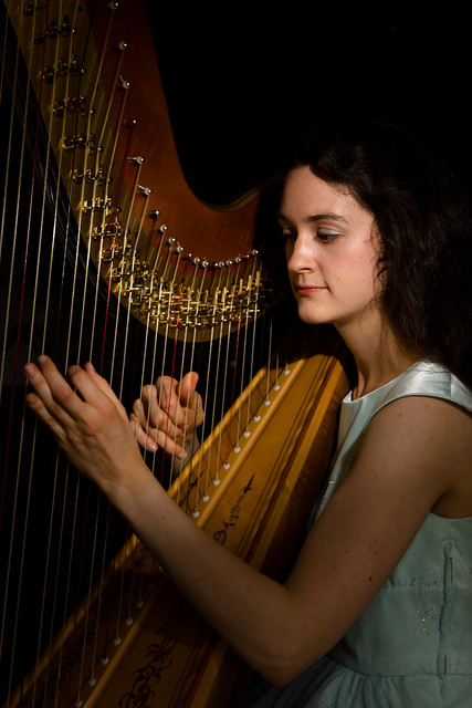
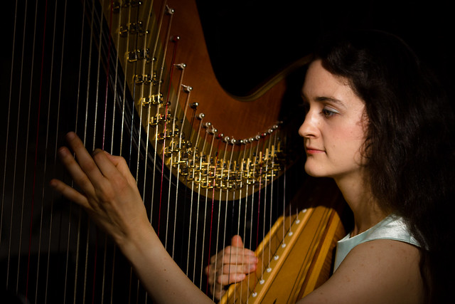
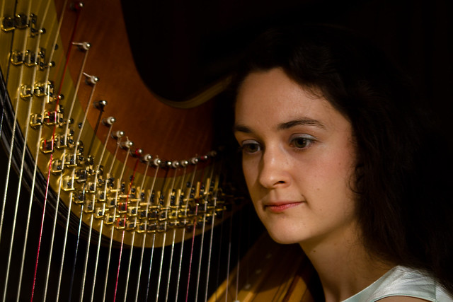
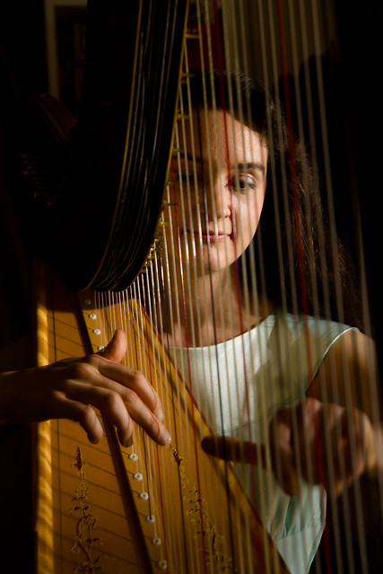
INTJ Mastermind posted:
I think only #4 is really successful from these. In the first 3- especially #3- she doesn't look like she's involved or at all invested in playing the harp. That's not entirely your fault since she may be a tough model to get a genuine moment out of, but it's pretty much the most important aspect of a shot like this. You can't have a musician's instrument look like a generic prop. Printed this last night. Figured I'd post it here since it is a portrait... 
|
|
#
¿
May 27, 2011 17:05
|
|
|
INTJ Mastermind posted:But maybe eyes closed would make her seem more lost in the music? It's possible. I singled out #3 because there seemed to be no relationship at all between the performer and her instrument. Having closed eyes may improve on that. Also, we're pretty used to seeing classical musicians being very expressive with their body and their face when they're playing. She's got the same exact expression in all 4 shots, so if you use more than one, I'd take only one from this group and seek out another where she's got a different look, or maybe one without a direct shot of her face.
|
|
#
¿
May 27, 2011 19:12
|
|
|
dakana posted:Messing around with some friends last night. flickr This is a very dramatic look and all, but unless you have a very good reason for leaving it like that, neither eye is properly lit, and it's a bit distracting. I'm not saying it can't work, but it's not working for me in this case. The other shots are pretty solid, though.
|
|
#
¿
Jun 1, 2011 20:32
|
|
|
TheAngryDrunk posted:Anybody else like Breaking Bad? Those are all really weird. That's about the best word for it that comes to my mind.
|
|
#
¿
Jun 10, 2011 23:35
|
|
|
Cyberbob posted:Couple from this weekends shoot. Her pose in this one is not nearly dynamic enough, and neither is your composition. She should be getting way more bendy and your comp should be taking advantage of it. Her stance is all biased upward, and her eyes create a line that follows the pattern. Well, it's not working... next time, try having her look AWAY (down/right instead of up/left) from the motion being implied by her body. It creates way more visual drama. It stands out in this shot moreso because of the aforementioned lack of interesting posing. Also, watch cropping at joints (ankle). It looks really awkward.
|
|
#
¿
Jul 6, 2011 02:19
|
|
|
Get more light on to those eyes!
|
|
#
¿
Jul 12, 2011 01:24
|
|
|
paisleyfox posted:(Also, I just noiced I cut off feet in that one. Oh boy, stumps ahoy, here...) The rule about cropping at joints tends to start a bit of controversy here, but it's a good foundation. In my opinion, the rule isn't some hard-and-fast unbreakable law, but more often than not a picture looks seriously awkward when it's broken. My personal guideline is that if my mind non-awkwardly fills in the blanks where the rest of a limb ought to be, it's worked out ok. If I immediately "see" stumps, then it hasn't.
|
|
#
¿
Jul 15, 2011 17:02
|
|
|
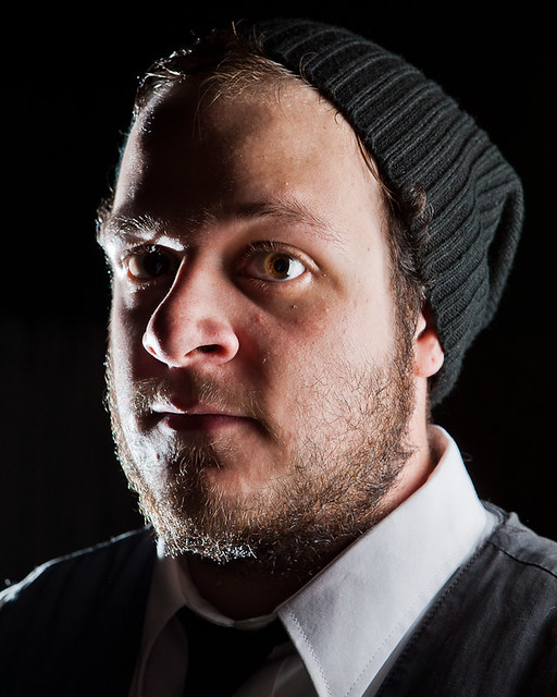
Reichstag posted:I like this shot but I wish he didn't have printing on his shirt. I found myself inadvertently reading it instead of looking around the rest of the picture. I wish I could see a bit more of his eyes but I do like the expression a lot.
|
|
#
¿
Aug 11, 2011 19:40
|
|

|

|
| # ¿ May 17, 2024 17:18 |
|
|
Oprah Haza posted:Session - she wanted very serious looks These don't look serious to me. They look blank, to be honest. And maybe a bit uncomfortable as a result. She's so stiff that it doesn't look like you captured much of a moment like you're going to want to in fashion/glamour. I'm just not sure what the motivation is for her looking so stern, yet dressed in sexy things. EDIT: Also what torgeaux said.
|
|
#
¿
Aug 12, 2011 18:43
|
|


