


|
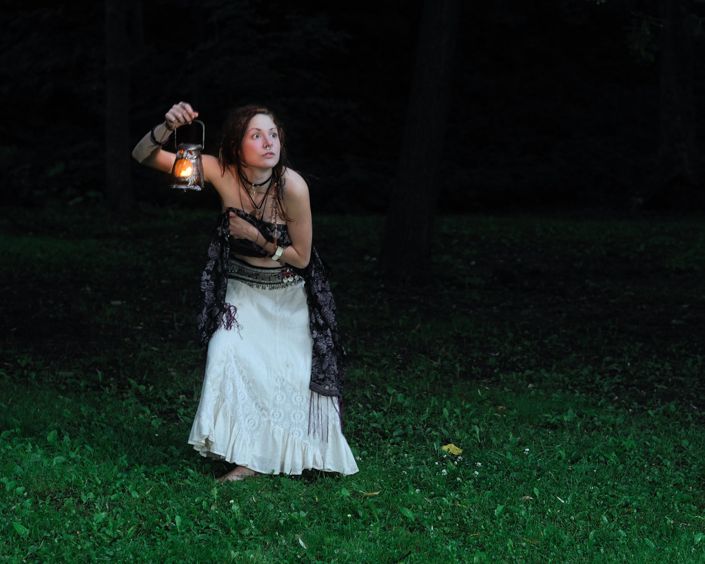
pwn posted:My friend wanted to play dress-up and I needed off-camera lighting practice. The first three were right before dawn, going for a walking-home-after-a-party-under-moonlight look. Why is she carrying a lantern if it's totally bright out enough to see? Here is more how I would have balanced it. Probably a snooted strobe with a gel (or post) to make it look like the orange lantern, then killed the ambient till it's there, but barely. I'd also have done a 2nd, very high blue strobe for the moon. Like so:  
|
 #
¿
Jun 29, 2010 02:45
#
¿
Jun 29, 2010 02:45
|
|


|

|
| # ¿ May 21, 2024 09:44 |
|
|
poopinmymouth posted:Why is she carrying a lantern if it's totally bright out enough to see? Here is more how I would have balanced it. Probably a snooted strobe with a gel (or post) to make it look like the orange lantern, then killed the ambient till it's there, but barely. I forgot just how much my work monitor sucks. I meant to leave the dark areas able to "see into" which is possible on my calibrated photo monitor at home, but it just looks like a sea of black here.
|
|
#
¿
Jun 29, 2010 10:15
|
|
|
RangerScum posted:I think it makes her look like a male that is in his late 40s-early 50s. I agree with the above comments on harsher processing for females. Unless a girl is a soldier or something badass and tough like that, they usually seem to prefer more flattering pictures. Uggg, not everyone woman has to be (or wants to be seen) as a super smooth barbie clone. I love the shot, and if she likes it, I bet she's a cool person to be around, it's a good portrait.
|
|
#
¿
Jun 29, 2010 17:16
|
|
|
Hanpan posted:Had my first experience with setting up my own lighting rig yesterday... I was really worried incase I messed it all up but the set came out really nicely. I'll update this post with some more later, but here is the first shot I ran through photoshop: As someone who normally likes texture, you sharpened her pores far far too much. It's jarring with the otherwise glamor esque aspects of the shot.
|
|
#
¿
Jun 30, 2010 11:59
|
|

|
HPL posted:I'm not worried about girls, it's if I'm doing a band promo shoot or something and I don't want guys faces shining like light bulbs. Or you can learn about specularity and how to get rid of it using light size and placement. You can keep a mirror from having specular highlights with enough knowledge. http://mr-chompers.blogspot.com/2009/06/light.html
|
|
#
¿
Sep 11, 2010 13:26
|
|
|
Reichstag posted:I took my Bessa and Nokton to a Tea Party rally as a form of local safari. Despite my aversion to the subject matter, I like the portraits. Can't really explain further, they just seem nice to look at.
|
|
#
¿
Sep 13, 2010 10:21
|
|


|
Penpal posted:It was shot at 1.8 dude! And I don't know about using a rim light. I usually use only one strobe for portraits like this in a natural setting with natural light, because then it seems too artificial if you know what I mean. I haven't come across many photographers who can keep a natural looking photo while still using 2+ strobes. I have another portrait that I'll be posting in an hour, or tomorrow morning Every single day you see people lit from more than one direction. You are thinking of the latest trend to boost rim lights to 11 and keep them at extreme angles. You must not study much photography if you haven't seen people making natural looking photos with 2+ flashes. Make your 2nd source as soft as possible and keep the ratio to the main way down and you can get separation without it screaming for attention. Not saying this photo needs it, just commenting on the "only 1 light looks good" post.
|
|
#
¿
Sep 16, 2010 11:49
|
|
|
Cannister posted:How the hell. I would love to know more about how the guy who shot this achieved that without a reflector. I'm impressed! Where is it you think the reflector would have been, had this been shot with the aid of one?
|
|
#
¿
Sep 20, 2010 19:51
|
|
|
Cannister posted:Yeah but overcast clouds are above you, in the sky. It just seemed like there was light coming in from in front of her face. I supposed I wasn't thinking about magic hour and how light can come in more laterally at that time. Keep in mind there was probably at least a little post lifting up the face. Also just because it's without dedicated lighting equipment, doesn't mean the photographer is in the middle of a field. Could easily have been taken between two buildings designed to block out some side light while only allowing it in from above. Or any other structure, trees, etc. But either way, it would be very very difficult to get this kind of soft even lighting with a reflector.
|
|
#
¿
Sep 20, 2010 20:06
|
|
|
Tshirt Ninja posted:This is cool. Is all the light natural? How much post did you do? It almost feels like multiple exposures. Not really. You might be thinking so because of how well the face is exposed, but that's bounce light from her arms onto her face from the blown out sun. If you look most things in the scene are either near overexposed or underexposed, but because human eyes are drawn to faces and that's properly exposed, everything else falls into place as looking "right" to us.
|
|
#
¿
Oct 7, 2010 10:56
|
|
|
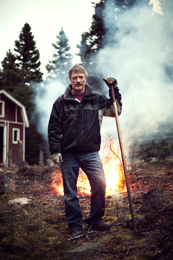
Penpal posted:my dad was burning some fuckin' wood so I ran out really quick and took a pic This owns. The one thing I dislike is the blur of the trees against the sky is kind of busy and grating. It could be sharpening on the bokeh, or just a lens with unpleasing blur, but my fix would be to mask out all sharpening effects from there, and if it's still there, duplicate the layer, use the blur > lens blur with an 8 bladed curve aperture setting just high enough to get rid of the grating look, then mask it all out, and mask back in just on the edges of the tree.
|
|
#
¿
Nov 22, 2010 11:41
|
|
|
DanTheFryingPan posted:This is a great shot because it speaks volumes about your dad for others, while still being a great picture for the family. Man that first guy is handsome. On the lighting, you should try not to make your rim light so hot. It not only flattens the face, but it also makes it feel like you should care about the source. My eye wants to go out of the frame camera right to see the source of the light because of the brightness and prominence of the effect. Dim it by at least one stop, maybe 2.
|
|
#
¿
Nov 22, 2010 11:43
|
|


|
Reichstag posted:I don't think that's what's distracting there at all, it's the extreme contrast that's drawing your eye to it. Actually now looking at the full size, it looks like it's just super aggressive sharpening applied to the entire image. Mask that poo poo. And potentially burn the sky like Reichstag suggested.
|
|
#
¿
Nov 22, 2010 12:03
|
|
|
New shoot from this weekend. http://mr-chompers.blogspot.com/2010/11/svavarshoot.html 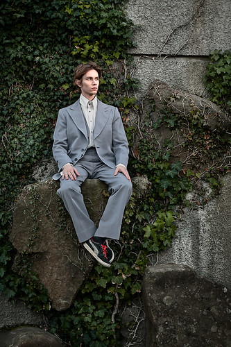
|
|
#
¿
Nov 23, 2010 11:09
|
|
|
Penpal posted:I've been using the high-pass filter for a while now, it makes hair and other fine textures (wet streets) really pop. It's just masking that I'm poo poo at. I want to become a masking wizard. Help me, someone. Here: http://www.poopinmymouth.com/tutorial/masks.htm don't say I never gave you nothing.
|
|
#
¿
Nov 29, 2010 11:39
|
|
|
flyable posted:Best one for me, but agreeing with spf3million in that the lack of blurry background makes it feel a bit like a cutout.
|
|
#
¿
Dec 7, 2010 12:09
|
|

|
rockamiclikeavandal posted:This is my first time posting pics in here and would like to know what you all think. Right now I feel like I should've used more fill on the first one. The second one I like except it looks like he is squinting in the smaller versions. Anything else I would love to hear. You need more control over your shadows. The first one has skunk face where he has a black line from the non intersecting lights. Either use a very low on axis fill light, or don't keep the lights at such opposite angles. The 2nd one I feel the same way, even though he doesn't have a black line, lights coming evenly from both sides is a very infrequent lighting setup. You don't get any light on the eyes, and the shadows of the ring go so dark it just feels half lit (the whole image). Assuming you have only these two lights, on the first I would have moved the main further forward, so it hits the front of his face, more at 45 degree angle, instead of from the side. Anything you could do to soften it would be good also, softbox, umbrella, etc. 2nd light I would have pushed even further behind, and if at all possible put up higher so that both lights weren't coming from below. I would have dialed it down in brightness and left it hard with no lighting modifier. For the 2nd I would do almost the same, but change up the angle of the lights. Put your main on the right side, 45 degree angle, some kind of light softening modifier like a white shootthrough umbrella or silver bounce umbrella. I would have kept it fairly high to help reveal the contour of his face and muscles. The 2nd I would have put way back in the ring on the left side and aim it forward, angling it so that most of it hits him and rim lights the ropes, but so enough feathers to light up the ring a little.
|
|
#
¿
Dec 8, 2010 11:14
|
|


|
IsaacNewton posted:Take my opinion with a grain of salt as I am starting out myself. The part that shows muscle is having the light rake across it. You won't see too much hard unmodified light on muscle magazine covers, for instance. You can use an umbrella or softbox and as long as it's coming from the side you'll still get highlight/shadow showing off the volumes. I agree on the focus, but honestly that can be done in post. An alternative would have been to shutter drag to let in a lot more ambient, so that the shadows don't go so crazy dark.
|
|
#
¿
Dec 8, 2010 17:15
|
|
|
Bojanglesworth posted:Thoughts? Brad will chime in on this as well I'm sure, but it's just how things are done in this industry. The idea of a one man/woman master is not feasible in any career. What about using a camera you didn't make yourself? lights? how do you take credit for how attractive the person you shot is? What about just getting lucky with an amazing subject you didn't put together in a candid street? I think retouchers should probably get billing as well somehow, but this is almost the same as a movie having Michael Bay's name all over it when thousands of other people did a lot of work too.
|
|
#
¿
Jan 1, 2011 17:13
|
|
|
Bojanglesworth posted:Although I have toyed with the idea of having a company retouch photos for me when I do weddings here and there, but hitting a group of photos with some color correcting and curves is a little different than adding in a new sky and background, and changing the clothing someone is wearing. The problem with this reasoning is twofold. The first is the assertion/assumption that there is some such thing as purity or truth in photography. We've talked about it a lot, but nothing is lost when stuff is modified (well) in post. In fact many times things are added to meet the original vision. That's the minor problem, the bigger problem is that paying customers don't give a poo poo. They want the images they desire, be they flattering bridal portraits or a kick-rear end movie poster. The number of people it took, or the percentage of untouched pixels/film granules in the final matters not to them.
|
|
#
¿
Jan 1, 2011 18:26
|
|
|
Reichstag posted:
Does the fact the photo isn't representative of the subject matter to the viewer in any way unless the subject is famous enough for the viewer to know them?
|
|
#
¿
Jan 7, 2011 16:26
|
|

|
Reichstag posted:Not unless they know the subject, I was just saying, you know? My apologies, then.
|
|
#
¿
Jan 7, 2011 23:22
|
|
|
Paragon8 posted:Haha, yeah I'm very jealous of female photographers because you don't have to work as hard to build trust. Guys who act flamboyantly gay seem to get away with a lot too. If you read or study even the slightest bit into feminism or the theory of patriarchy, you should have no problems figuring out why a woman would be on guard in front of a relative stranger dude with a photographic instrument. Also FYI you don't even have to be flamboyant, just being gay is enough with plenty of women to be a lot less worried.
|
|
#
¿
Jan 7, 2011 23:29
|
|
|
Paragon8 posted:Yes, I know why women would be on guard in front of a relative stranger dude with a camera and I don't have a problem with that, and understand completely why that happens. I'm more upset with other straight male photographers that reinforce negative stereotypes that make my job harder than a female or gay photographer's job being easier. I'm not offended, I just felt like commenting.
|
|
#
¿
Jan 8, 2011 14:48
|
|
|
AtomicManiac posted:^^ I'd say you've got it dialed in pretty good, that's a great shot. You should really have been dragging the shutter to let in more ambient. It's near-black.
|
|
#
¿
Feb 1, 2011 10:42
|
|


|
AtomicManiac posted:At first I wanted to do a low-key all black shot, but when I was dialing that in I liked the way the sky looked, and I thought her black coat would have thrown it off. I think what I really should have used was a second light coming in from the other side as fill or a nice rim-light to show her form off, rather than have it slink into darkness. Of course I don't have 2 lights right now since my Vagabond is broken. The problem is that you have properly exposed her face and everywhere else the flash's light is hitting. This makes the dark areas very noticeable, and they don't seem to be purposefully dark. It doesn't offer anything letting her jacket fall into nothing and losing her silhouette. A rim light would have separated her, yes, but it would just make her look even more cut out. You need to figure out how to make her look a part of the background unless you're saying something visually about her being set apart or somesuch. I think dragging the shutter and then selectively darkening the parts of the background that might be too attention grabbing would be best. You might also want to think of someway to ground her in the environment with placement, right now she is probably 10 meters or more away from any environment chunk, making her seem to float in darkness.
|
|
#
¿
Feb 1, 2011 13:53
|
|
 .
.
|
HPL posted:It's come to the point where I can look at photos without seeing the user name and pick out AIIAZNSK8ER's photos. In other words, congrats on finding a style. How much other photography do you look at? Not trying to insult the guy, but there really isn't anything noteworthy that should make it memorable unless you only look at photos here in the dorkroom. There are hundreds, if not thousands of people with off camera lighting that do shots that could be slipped in without anyone noticing.
|
|
#
¿
Feb 15, 2011 10:26
|
|
|
AtomicManiac posted:My favorite from a shoot with my best friend today: Why is this outdoors? You've ignored the lighting of the scene and used your own, and she is far enough away from it that she isn't a part of it. It might as well be a composite for all the interaction she is doing with it. Next time either shoot her in the studio on a seamless background, or figure out why you want to be outdoors. If you think the woods make her seem more rugged, get some bushes or branches in the fore, middle, and background so it looks like she is there. If you think the lighting or color temperature made it a compelling location, gel or color your lighting in post so it matches. Right now unless you have some crazy meta-explanation, there is no good reason she is outdoors and not in a studio, the background is offering nothing to the final image. No light, no color, no space interaction. It's just "studio lit female" on top of "random trees".
|
|
#
¿
Feb 15, 2011 10:29
|
|

|
Gazmachine posted:I think people are confusing Skater's pics with Atomic's pics. I'm not.
|
|
#
¿
Feb 15, 2011 13:49
|
|
|
She's beautiful, but just telling her that isn't going to get rid of her nose issues. You can photoshop it smaller:  Or for comedic affect, just get rid of it completely. 
|
|
#
¿
Feb 24, 2011 12:55
|
|
|
Playing around with 35mm portraits in preparation for the x100 I lie awake thinking about.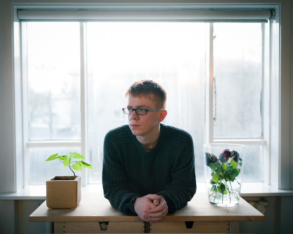 IMG_6456.jpg by mr-chompers, on Flickr
|
|
#
¿
Feb 27, 2011 17:54
|
|
|
First portrait shoot with the x100: http://mr-chompers.blogspot.com/2011/04/x100andnaturallight.html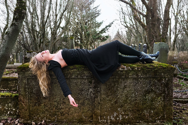 steph01 by mr-chompers, on Flickr  steph02 by mr-chompers, on Flickr
|
|
#
¿
Apr 20, 2011 13:34
|
|
|
RangerScum posted:Was it an accident you decided you liked? Yep. In fact so much that I plan to use the affect on purpose in the future when the situation warrants it.
|
|
#
¿
Apr 20, 2011 15:08
|
|
|
He's handsome, but you made a few mistakes in your shooting. First is that you backed him up against the background in every shot. Even the one with the city in the bg, he is flat against a railing. It works in the first image (though the composition needs more headroom) because it adds some nice tones to the concrete, but in all the rest, it would have been stronger to move him away. In the second image, pull him closer, let the grafiti wall blur a bit, and in post processing don't saturate the background as much as him, as it flattens the image and makes it hard to read visually. The third has the most potential, that background is killer, but he's lost in it. The easiest thing you could have done is put him on that large door to the right, and the eye would go to him quicker, but what I would have done is go with a square crop of the right most 2 windows/doors, pull him way forward so he's only maybe 2-3 meters from you, and try to place him in a visually un-busy spot. That background is so classic italiano, I would have tried a lot of distances and compositions because imo it's the best of the ones you posted. 4th, his head level is right where the horizon line is, compositional no-no. Either crouch so his head ends up in the sky, or stand on something so it's below the horizon line. 5th, I would have moved him and the camera 2 meters to the left, put him in that glowy doorframe and let it all overexpose a bit so he has rim light, and the door frames him. As is, same crit as the 2nd image, color contrast flattens and steals focus, and the background is just kind of blah for a setting as presented. Though desaturating the background a bit (focusing most on killing the sameness of the grafiti blob behind him and his suit color/saturation level) would help this image as is, a lot. 6th is just plain awkward. Text begs to be read, and it's more saturated than he, so the eye goes to the Sarah text first. He's backged against a wall, and the angle/lighting flattens his otherwise attractive face into something less so. Just from what I can see of the background, I might have tried shooting the stairs from straight from the side (off to camera left) and have him sit on the upper half and try to get a profile shot of him sitting with his elbows on his knees.
|
|
#
¿
Apr 21, 2011 11:23
|
|
|
Elemeno^P posted:
How did you like it? Do a writeup!
|
|
#
¿
Apr 28, 2011 12:11
|
|
|
Elemeno^P posted:It was pretty good. Thank ya sir.
|
|
#
¿
Apr 29, 2011 12:01
|
|
|
just chiming in to say I think all 3 are excellent.
|
|
#
¿
May 10, 2011 15:44
|
|
|
Second portrait shoot with the X100: http://mr-chompers.blogspot.com/2011/05/secondshootwithx100.html 
poopinmymouth fucked around with this message at 23:28 on May 17, 2011 |
|
#
¿
May 17, 2011 14:37
|
|
|
evil_bunnY posted:You've got some pretty noticeable halo'ing going on :| Yeah I need to clean it up. It's not all that noticeable on my calibrated monitor at home, but the less nice one at work shows it more. I was using adjustment brushes with feathering rather than actual masks in photoshop.
|
|
#
¿
May 17, 2011 15:07
|
|
|

|
| # ¿ May 21, 2024 09:44 |
|
|
Paragon8 posted:There are enough gay photographers shooting men that it's not a unique or interesting perspective. And yet, there are 50x as many straight male photographers shooting attractive women, but those kind of images are still the most popular both here in the dorkroom, and in society as a whole. Just sayin.
|
|
#
¿
Aug 19, 2011 11:40
|
|