


|
I really like the pose in the first one... its a neat photo. As a whole the pictures don't go together very well though. They all kind of have their own look. I don't think there is enough light on the face in #3.
|
 #
¿
Nov 2, 2009 03:53
#
¿
Nov 2, 2009 03:53
|
|


|

|
| # ¿ May 5, 2024 20:47 |
|
|
Reichstag posted:Nikon D100 and a Nikkor 50 1.8 AF-D. You used a digital camera? Get away from me... you disgust me. 
|
|
#
¿
May 6, 2010 19:28
|
|
|
Whitezombi posted:I like #2 a lot more, I'd cut down on the empty space at the top.
|
|
#
¿
May 8, 2010 05:40
|
|
|
Anti_Social posted:I'm pretty pleased for my first portrait shoot. Very solid start! Here are the keepers from my shoot on Friday. First time working with an "Edgier" model or whatever you'd call her. I really liked 2 of the shots and was happy with the others. 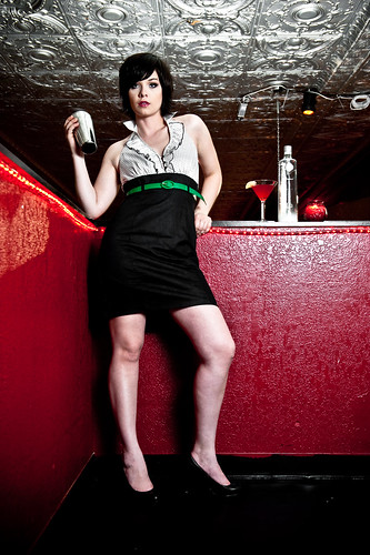  (She is flipping a mixer in case you didn't notice) 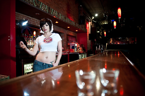 (This one was my favorite) 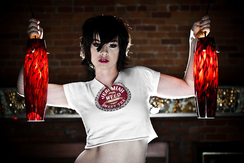
|
|
#
¿
May 17, 2010 05:17
|
|
|
orange lime posted:I like these, but in three of them she's doing basically the same pose. The second one is my favorite, partly for that reason. That is a pretty funny point. 1/3 and 2/4 are pretty similar poses. Definitely something I'll keep in mind in the future though at least I still got a decent shot for my port from the shoot.
|
|
#
¿
May 17, 2010 13:38
|
|
|
Well since I killed this thread I'll post some more content and kill it twice. I wanted to do a Lady Gaga inspired shoot where things were kinda eccentric/ridiculous so I converted my living room from boring into kinda weird, tossed a red gel out on my front porch pointed at my blinds and lit the rest of the room with a B800 placed at camera left with a reflector that I extended by about 5-6 inches with the cardboard from a case of bud light. 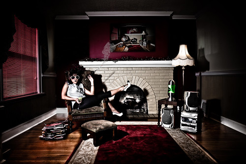 First shot is the money shot I wanted, second was just loving around because I felt bad having her do the makeup and only having a single shot where her face isn't even the focus. 
|
|
#
¿
May 25, 2010 02:41
|
|
|
poopinmymouth posted:I don't think all the pure black is working, it's not really adding much and makes it overly dark. You should try having an on axis fill light really low to fill them just a little. Ring lights are popular for this, but you could also use just a white umbrella over your head, and just keep it super lower power, just enough to see into your dark shadows. It will look much more controlled, and less contrasty in a good way. Yeah I have been wanting to get a third flash for a while and will probably do so this summer. You can do a lot with two but I'm starting to find a lot of situations where I would like a third. This room was pretty hard to work in and I had to do some decent editing to get it to look the way I wanted it to. There are a few light spots on the wall that will suddenly becomes very obvious for example. I also noticed I forgot to fully edit out one of the cords on the floor, oh well I'll do that later. Non-edited pic of the room:  After my initial edit it was just easiest me to make those areas black and have a very slight gradient on the left wall where my flash was focused.
|
|
#
¿
May 25, 2010 13:23
|
|
|
poopinmymouth posted:You don't even need a 3rd light. Just throw your camera on a tripod and either drag the shutter till the ambient lights up the dark areas enough, OR just take a shot at the very end (being careful not to move your tripod at all) with your flash bounced and get a well lit room shot like the one you posted, that is pixel perfect the same as your money shot. Then it makes it really easy to put that as a layer above, and blend to taste so your shadows have a smidge of detail. That sounds like a good idea, I will try it out next time. Thanks for the advice! Edit: in this situation I would have most likely had to bounce it off the ceiling because leaving the shutter open very long causes some weird lighting coming in from those windows.
|
|
#
¿
May 25, 2010 15:09
|
|
|
The light in the photo looks kinda artificial to me, like he cranked the 'Fill Light' slider in Lightroom way to the right.
|
|
#
¿
Jun 1, 2010 14:48
|
|
|
AIIAZNSK8ER posted:It's cool with me, I hadn't thought about a black and white look, and I've never been able to pull off that vintage feel very well. If they were my photos I would desaturate the greens and oranges more and maybe mask in an un-edited version of the subjects so you don't screw up their skin tones.
|
|
#
¿
Jun 25, 2010 22:12
|
|
|
Whitezombi posted:She has seen it. Why? I think it makes her look like a male that is in his late 40s-early 50s. I agree with the above comments on harsher processing for females. Unless a girl is a soldier or something badass and tough like that, they usually seem to prefer more flattering pictures.
|
|
#
¿
Jun 29, 2010 17:08
|
|
|
poopinmymouth posted:Uggg, not everyone woman has to be (or wants to be seen) as a super smooth barbie clone. Hence why I said usually. I didn't say I didn't like the picture, just that it isn't necessarily flattering.
|
|
#
¿
Jun 29, 2010 17:44
|
|
|
Whitezombi posted:I like these a lot, very nice focus with #1.. that is some awesome detail.
|
|
#
¿
Jun 30, 2010 15:43
|
|


|
red19fire posted:I was aiming for sultry It's pretty much the same as the first. I think you need to play with your lighting and composition more. It's mostly flat lighting which reduces the photo to "just look at this person" which in this case is just an unhappy looking girl squeezing her big boobs together. Try placing the flash in different places.. maybe a silhouette shot would have worked better for her since it seems her facial expressions are kinda weak. Content: Took this on top of a mountain last night. 
|
|
#
¿
Jul 10, 2010 01:35
|
|
 . Here's another one from the set, which is hopefully more of the 'smoldering' look i was going for. I need a creative partner or something, I'm pretty bad at interpreting facial expressions.
|
Whitezombi posted:I would desat the oranges a tad... I'm sure it's entirely plausible that her skin was really that color or maybe my work monitor blows, but this photo has an "atomic orange" kinda vibe. Otherwise it's a nice casual portrait.
|
|
#
¿
Jul 19, 2010 18:50
|
|
|
Cannister posted:How the hell. I would love to know more about how the guy who shot this achieved that without a reflector. I'm impressed! Yeah it's just a properly exposed shot is all. It looks good, don't get me wrong, but it's really simple.. light source (probably the sun behind some clouds or something like that) is directly above the model casting that shadow on her neck and lower cheeks as such. I think the eyes have been touched up, they don't seem consistent with anything else. I could be wrong!
|
|
#
¿
Sep 20, 2010 20:08
|
|
|
evil_bunnY posted:I hate the cut feet but I love everything else about it. What would her feet add to the shot? I'm just curious of your opinion.
|
|
#
¿
Oct 28, 2010 15:29
|
|
|
sildargod posted:This was a fun shoot, I was lucky enough to have a projector to use, exposing it at all was a bitch though. I dunno what's going on in this pic but using a projector as a light source leads to some very interesting ideas...
|
|
#
¿
Nov 5, 2010 14:42
|
|

|
I hope you also immediately noticed in the LCD and got a shot with the correct settings...
|
|
#
¿
Nov 8, 2010 16:03
|
|
|
I like the composition but the focus seems off a bit... her bangs are the part of the photo that draws my eye the most.
|
|
#
¿
Dec 13, 2010 17:43
|
|
|
Also going to add that the negative space at the top doesn't really add anything to the picture.
|
|
#
¿
Dec 13, 2010 20:43
|
|
|
AtomicManiac posted:Lighting is a bit flat in #1 but not horribly so. I think the pose is a little messed up, her legs are doing this crazy stuff and she's just holding her hands together behind a shrub. It sorta looks like one half of her is trying to be dramatic (her legs) and her top half is like "oh no, I'll be having none of that!"... including her face. She's an amateur model though, when it comes to expressions she's probably going to suck like most other amateur models do. Being shy doesn't help any... did she know you were going to bring another guy to photograph her? #2 my main complaint (besides the exposure being messed up all throughout) is the shadow from her nose. Look at it. Stare at it. You won't ever do it again. LOOK AT THAT THING!
|
|
#
¿
Jan 7, 2011 16:03
|
|


|
HPL posted:Nowadays I try to shoot a little wider than what I think is good at the time because it's a lot easier to crop the photo a little than to shake your fist at the screen and curse because you cut off a toe or something. I don't think there is anything wrong with shooting wide, it just depends on the types of shots you are taking. When I go for a more editorial style that displays a scene rather than just a headshot, etc. I always shoot wide. If you want to avoid weird distortions just keep the model in the center of the frame where it's least likely to occur. Also if you are wanting to take a real friendly looking image wide works great... I think telephotos are more important when doing beauty/fashion where stuff like a big hand or foot can totally ruin an image. Good:  Bad:  Obviously the 'bad' example isn't terrible in this particular photo but you get the point. Also obvious, this isn't a rule but more of a guideline. Lens distortion can be awesome when used creatively. In fact that just gave me a few ideas, oh ho ho ho Also HPL I'm not directing this at you personally as I am pretty sure you already know all this, it's just for the people still getting into portrait photog.
|
|
#
¿
Jan 7, 2011 22:44
|
|
|
AIIAZNSK8ER posted:Natural light is always the best light, no need for excuses there. They are both nice portraits. Some might see a problem with her fingers cut off on the first one, but you've framed her nicely with the tree branches. Her expression seems like of sleepy or bored. I'd say you're off to a good start. Why do her finger tips matter at all to the photo? People seem to be focusing so much on things getting cut out lately when for 90% of the photos the extremeties add nothing to the photo at all. I understand that you said "some people" indicating not necessarily yourself... People need to remember that when offering criticism they don't have to go over a checklist of things that a photo must be. That being said, I think her complexion looks like poo poo in #1 but otherwise I like it. I like her expression and it is well composed.
|
|
#
¿
Jan 9, 2011 06:11
|
|
|
HPL posted:I think it looks fine. You know, brown people and all. Because all brown people have bumpy skin, oh yes.
|
|
#
¿
Jan 9, 2011 15:13
|
|
|
The problem I have with showing the dune is that there isn't really a point of reference to see how large it is.
|
|
#
¿
Jan 26, 2011 15:43
|
|
|
Ouhei posted:words and pictures Exposure is good so you'll be fine in that area. I'm not really a fan of the setting in any of them but if you were just practicing then who cares. #3 probably needs a slightly closer crop. The hardest thing for me when I started out was instructing people and coming up with poses. It looks like you probably had that problem as well, especially in #3. Look at lots of different engagement session photos and find some poses you like and will fit the personalities of the people you are photographing. Figure out how you are going to direct the couple to get in those poses. As for using the 50mm, that will be fine for what you're doing but don't be afraid to experiment with some wide-angle shots too.. engagement sessions are usually used to convey happiness and shooting wide can help if you're coming up short on ideas.
|
|
#
¿
Jan 31, 2011 18:10
|
|
|
I like 1 and 3, though in #1 I'd play with exposure a bit or in the future pay attention to how the pipe is kinda getting lost into his suit since they are both darker colors. A small posing or perspective change where it would be silhouetted by the white background would have been an easy fix.
|
|
#
¿
Mar 22, 2011 15:41
|
|
|
Have her laying on her back in a lab coat and nothing else (ok maybe a push-up) with a bunch of dissected rat carcases scattered around her. It's important that she have red lipstick, heels, and that her hair is splayed about on the floor above her head. Blood spatters on coat optional.
|
|
#
¿
Mar 25, 2011 20:24
|
|
|
Whitezombi posted:This week I am shooting 10 head shots for a make-up artist. Do you guys have any pointers? I guess it depends on what type of work the MUA does but if it's beauty, I'd go with very soft lighting on the face with rim lights in the back. If you are shooting on location, try to find a background that compliments the model/makeup- think color/texture/pattern. It depends what the MUA wants though... you can obviously be really dramatic with a head shot but if he/she just wants to show off the makeup, I'd keep the lighting straight in front and maybe angled down slightly. Make sure the eyes are exposed nicely and there isn't a shadow from the brow/nose. Also pay attention to the shadow under the chin- a very small one helps give it definition but a larger one can be distracting.
|
|
#
¿
Apr 4, 2011 22:18
|
|
|
I like the first one though I'm curious as to why the second one is pretty much completely out of focus? Was it an accident you decided you liked?
|
|
#
¿
Apr 20, 2011 14:16
|
|
|
I don't think that's the right attitude to have at all. It's good to have options, but going into something with the intention of "I'll just keep shooting, I'm bound to have a few shots that are good!" just reeks of mediocrity/a total lack of effort. Study some compositions/exposures that you like, and then try to recreate them. You can have a variety of shots due to facial expression, etc... but for something like focus, check that poo poo on your lcd, zoom in all the way and see how in focus you really are. Maybe I'm in a minority but when I'm doing a shoot, I absolutely love it when I take a shot, look at it, and say "ok this is the one, we're done."
|
|
#
¿
Apr 26, 2011 14:04
|
|
|
You're underexposing as well. See how the background is appearing grey instead of white? Also for a cleaner look, make sure subject has a distance between them and the background so that it doesn't throw shadows on it... or Terry Richardson this setting up and get naked.
|
|
#
¿
May 2, 2011 17:14
|
|
|
INTJ Mastermind posted:
Took me a bit to pinpoint what I didn't like about this shot, but I think it's with the shadows on your friend. Take a look at how dark they are and compare them to the background- I don't like how strong the difference is. The harsh light drop off as soon as it goes around the corner of his face kind of makes him look a little weird too. I'd try lowering the contrast in the photo or perhaps boosting the shadows, and also bringing up the background a bit. Is there a specific reason you underexposed the scene?
|
|
#
¿
Jun 6, 2011 15:36
|
|

|
No, just don't shoot at 1/200, f/16.0. Just increase the ambient exposure a bit and the contrast between the flash-lit areas and the shadows won't be nearly as bad. RangerScum fucked around with this message at 19:57 on Jun 6, 2011 |
|
#
¿
Jun 6, 2011 19:55
|
|
|
That makes sense, I still think your background/sky is underexposed though. Look at how grey those clouds are, while a better exposed sky would result in white clouds. Also, if taken in broad daylight did you even need a flash? He doesn't appear to be standing in shade or anything.
|
|
#
¿
Jun 6, 2011 20:32
|
|
|
Paragon8 posted:I'm not getting much separation between her background and hair on my monitor. Might want to rim that. Ditto, you also could have increased your exposure by about half a stop and been good. I'm sure it's completely fixable in post. I dig the the light though!
|
|
#
¿
Jun 9, 2011 14:49
|
|
|
xenilk posted:I think that's pretty much what I'm lacking; knowledge of the male form/shape and knowing which postures I like/am looking for in a male model. What kind of shots are you looking to take? Is this going to be health/fitness, fashion, adventure, general living, etc. ? If you want lots of interesting pictures of guys, I recommend picking up a copy of GQ. While mostly fashion oriented, there's usually at least one pretty-good editorial shoot of some celeb. I've also heard that Wired is a magazine with good photos too, and I remember seeing a shoot with Brad Pitt that I really enjoyed. Paragon8 posted:~links~ Might want to add a NWS for homotography, there's a pretty healthy collection of asses and pubes. RangerScum fucked around with this message at 14:39 on Aug 19, 2011 |
|
#
¿
Aug 19, 2011 14:37
|
|
|
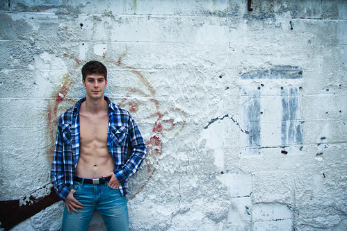
This is the only one I think should be scrapped. It's an awkward photo in general and the hand placement is rather strange. The rest are pretty good general portraits. The fourth one is a much better "open shirt" photo because it looks a lot more natural. Is he trying to get into modelling? He should probably work on his facial expression diversity.
|
|
#
¿
Aug 25, 2011 15:36
|
|
|

|
| # ¿ May 5, 2024 20:47 |
|
|
I actually took this back in April but his manager called me up last week and told me I needed to find pics of the musician in the studio for Mix magazine so I went trolling through my old photos, found this one, edited and sent it out. I am pretty shocked I passed this up on my first pass of the set... I really dig this shot now. He looks exhausted.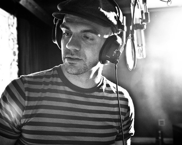 Untitled by Myotomy, on Flickr
|
|
#
¿
Aug 30, 2011 17:34
|
|