|
Matty D posted:The Animator's Survival Kit by Richard Williams - this baby is a must. Like 100 pages in this book alone on walk cycles. Everyone loves recommending this book first and foremost but I honestly believe everyone should be reading "The Illusion of Life" as a more important book, at least once every 1-2 years. It's obviously a more comprehensive and longer read compared to the (fantastic) Animator's Survival Kit, but in the extra time you spend to read Illusion of Life, you take in 4x as much insight into two of the nine old men's teachings. There's a lot to think about all at once with animation and you'll never remember it all or see it all (which is why critique and co-workers/supervisors are so important) and this book is the same. No matter how many times you read it, you'll realise something you've never realised before reading it for the 2nd, 3rd, 5th and 10th time. It's about time we got another animation thread in here! I'm animating at Blur right now and since I sent off my reel a while ago I can't show anything I've been working on yet! But I have some fun personal stuff in early stages I wanna get on with. 9nine posted:As for things I've made in the past, here's a clay/ paper on glass animation I made last year: http://www.youtube.com/watch?v=_HDkgmLQulo This is great stuff, and I love the Jan Svankmajer animation you referenced. It's great when you watch a short animation and realise it's actually pretty clever, and you then have to re-watch it to figure out where the gag overtook you. Then again when you realise it works on more than one level. On another note in my long boring post in this thread, I found Superjail to be an absolutely fantastic animation on TV, reaffirming the idea that TV animation can be good (and not flash cheated or pop culture gag randomness with no thought put into it like almost everything else on adult swim, with the exception of spots of greatness like these) Also want to point you guys towards this fantastic pencil test blog which is pretty fantastic: http://www.penciltestdepot.com/
|
 #
¿
Sep 29, 2009 08:51
#
¿
Sep 29, 2009 08:51
|
|


|

|
| # ¿ Apr 28, 2024 18:46 |
|
|
In this day and age you'd do fine taking a 2D course and keeping current with the occasional (good) 3D animation in Maya/Softimage with a free rig on your own time. After a few years it isn't impossible to be a fantastic artist in both 2d and 3d. However don't be naive. A lot of the work out there is 3D right now, along with a lot of great animators to learn from.
|
|
#
¿
Oct 2, 2009 09:08
|
|
|
Not sure I follow 
|
|
#
¿
Oct 2, 2009 22:19
|
|
|
Something interesting I found today for all you students out there: http://www.animationmentor.com/landing/becomeanimator/podcast.html
|
|
#
¿
Oct 7, 2009 01:15
|
|
|
Good jump. Shame you didn't post the blocking as there are a few things you could've incorporated easily at that stage: Overlap: those legs can be offset a lot more in their poses, as can the hips to the upper body. The skinny legs/hips/head are driving that heavy flabby body, so there's going to be an overlap where the middle torso catches up to where the hips are pushing them towards and where the head is pulling. And back down again: The torso is going to have more momentum than the hips and take longer to slow down, accelerate and slow down again. This different in mass is what is going to cause that overlap you're missing. Right now the body moves as one solid object. Spacing: Maybe an animation "snappy look" you're going for, but the ease out at the top of the apex is non-existent for the belt line/hips. Snappy motions need more overlap and 2ndary motion to really sell it. Speak of the devil: the secondary motion you have on your belly raises up too early on the down of the bounce. Maybe this is a line clarity thing, but the belly (line at the top where it reaches his tits) raises up only once it's stopped at the apex and is beginning the down. up>stop>up>down sort of motion doesn't read naturally. I don't think the head movement at the apex works too well with the rest of the motion right now, but if there was overlap on the legs at the apex (and less twinning), then I think the head movement would work well, as he's basically reversing his curve, but it's not strong enough pose to reverse curve into (its the same pose, just a curved spine), and just makes his head look light and wobbly. In fact with the legs it would be nice to see him do something fun at the apex, like a little kick or something slightly original than just a generic bouncing ball with legs motion. Ask yourself "is this entertaining?" before you decide on anything. especially in little tests, as those are the simplest, hardest, and really educational playgrounds in which to experiment. If the answer is "no" then don't bother animating, just go out and watch someone do it instead, see how they make it interesting, and store it in your "interesting things" bank in your brain for a rainy day. It's a good jump, I like how the hands stay really still when he's in the air, would love to see them stay still throughout as well, push that precision to a caricature of someone skipping, where his hands and skipping rope form a perfect sort of sphere while his body is sloppy and imprecise. [edit] Oh, and sorry I have to be pedantic about this, but Flash vids and youtube should be banned from this thread as much as possible (and animated .gifs especially) as if you want a crit, you're making it almost impossible without letting the person scrub forwards and backwards and view individual frames.
|
|
#
¿
Oct 17, 2009 09:25
|
|
|
Matty D posted:Unfortunately I think the majority of this guy is going to have to stay as is. I can fix technical issues, but as for as acting goes I just need to move on. I have to animate a character rolling on a ball down a half pipe. I'll post blocking for that. Oh, definitely move on with your next anim rather than go back and re-work the jump. It's a really good animation for your second go, and I understand what you mean about just getting things working ") Vimeo is cool. Viewers can download the source (quicktime) file from Vimeo, and Quicktime is probably the best format for scrubbing.
|
|
#
¿
Oct 17, 2009 19:43
|
|
|
I remember flipping through the art of Ratatouille and remarking how impressively accurate the 3d lighting was to the fabulous light/colour studies done in 2d. The rat studies are also fabulous to look at, as there's a ton of character to those simple sketches.
|
|
#
¿
Dec 6, 2009 09:13
|
|
|
Might as well post this. Last 5 months of animation at work on various projects. Here. No personal more cartoony animation to show, yet, but give me a few months and I should have some of the technical stuff dealt with so I can start getting back on with animation. Re:Exporting Flash animation to Quicktime solutions: This is astonishing. Are the profit margins THAT THIN in the 2d industry that nobody in the entire industry can afford to hire one single tools developer to write a better solution? Quality of Adobe software asides, that is (they're notoriously oblivious to professional industries on the whole).
|
|
#
¿
Jan 17, 2010 07:05
|
|
|
Flex Mentallo posted:I remember a bunch of years ago when when you posted some pretty good character+dialogue animations (11-second club entries maybe?), and talked about learning animation on your own or something. Really cool to see that you are doing crazy stuff at blur now. Thanks. I struggled trying to find a job in London and after 3 years of repeatedly being fobbed off without any communication I applied for work in America and landed a job immediately. It was a little rough for a while but now I seem to be getting settled and couldn't be happier. gently caress London. Megaspel posted:Could I get some feedback on this? Honestly it made no sense and that's a bad thing and means that it boils down to very simple shapes that you moved around the screen in uninteresting ways. Spend 8 hours a day doing much, much smaller scale projects and get the quality to a much higher degree. Try learning some animation methods, do tests, experiment. You're wasting your time doing lame repeated stuff like this. If you're getting paid for it then that's one thing, but on your own time? Do something worthwhile. I don't want to sound overly mean, or say you're poo poo or anything. It's just I've seen a lot of this sort of flash animation "for the internet" and its always terrible. Don't fall into that self-congratulatory group of teenage kids who think 3 "tweens" in flash and a picture of a flying monkey is the epitome of bizarre animation comedy. Keep it simple, do it well.
|
|
#
¿
Jan 18, 2010 01:51
|
|
|
From the poo poo I've read Adobe developers say, I am fairly certain Adobe currently hire a bunch of liars and criminals who are permanently on drugs. They release "updates" based on technology that better developers made 5-10 years ago before they fired them and took up their halfway house status. They have no concept of how any of the industries they cater for work, and insist that their methods developed back in 1989 are still groundbreaking. HOWEVER, I can't blame them entirely. This is the position any company ends up in after they buy up all of their competition. I'm more ashamed that nobody else has risen to the challenge of bloodying Adobe's nose. tuna fucked around with this message at 03:29 on Jan 18, 2010 |
|
#
¿
Jan 18, 2010 03:27
|
|
|
Ah so that's where Mirage went. I was looking around for it a while ago and could only find this semi-related anime suite, of all things.
|
|
#
¿
Jan 29, 2010 20:53
|
|
|
BrokenCycle posted:Yeah, really. The clip was incredibly inspiring. Gotta agree. First off it was well done and awesome to watch. I've got a lot of respect for stopmo animators, as I have no doubt I couldn't do it for poo poo. That said, animation is never without critique and I'd like to offer mine (for your next planning). It's about the timing and spacing. Mainly to add more to your resistance and animation physics, also to spice things up and make it more interesting to watch. Really pay attention to your overlap and spacing (timing). The most boring thing about your animation was the timing of the actions. For instance, taking off the lid was a single linear motion, as if the lid had no resistance on the pen, but in the same timing that the lid was taken off the pen, the pen was also lowered to the paper, and that timing was the same as the timing that it took to lift the pen off the table. These are 3 distinct actions and are all completely different in how we do them based on physics and intent. For instance: lifting the pen off the table: it isn't a heavy pen, it can be left exactly as you have it, it has a speedup as it's lifted and works well. the lid taking off needs to show more resistance. You never manage to take pen lids off with the first instance of a tug, it takes a gradual increase of your pressure to take it off, and that means the pen lid is going to stay on for a fraction longer while your wrists tense up, then the lid will snap off and both hands will shoot out for a fraction of a second while you readjust the pressure of your pull. It's the most distinct characteristic of pulling a pen lid off, and you need to include this into your spacing in order for it to read well to the audience. Now here is where the acting choice comes in. It would also come into the lift of the pen, but let's keep things simple. Has the guy decided what he is about to write? Is he taking pen to paper as a method of thoughtful experimentation (as his hands on hips gesture would suggest), this is what decides how he lowers the pen back down to the paper, and this is acting. Instead of simply lowering the pen down to the paper, in a linear way, like a robot, he needs to show some sort of motivation or thought throughout, so the audience knows what he's thinking. Will he lower it most of the way, pause, draw a shape in the air before deciding that's the best way to start his drawing? Will he draw the circle fast and finish it off with wispy, finer facial features? Will he pause at drawing the mouth, a conflict of how he feels? This is what will tell the audience what is happening, not the result. It's sort of like how the story is told, not what the story is. I think your control over the armature is good enough that you can start dealing with these things now, and I really look forward to seeing the results. [edit] dont mean to sound condescending at all, and sorry if im pointing out silly things here tuna fucked around with this message at 14:41 on Feb 14, 2010 |
|
#
¿
Feb 14, 2010 14:38
|
|
|
That's a really appealing design now it's complete. Cool stuff!
|
|
#
¿
Feb 17, 2010 04:39
|
|
|
The Third Man posted:Yeah, I layed in those expressions pretty quickly this morning and they are too fast. How do you feel about the first section, where the line is "...or any member of your family..."? The characters head is remaining fairly static as he's leaning forwards, and it's kind of bothering me. In the reference I shot I wasn't moving my head at all and it didn't stand out like it does now. Is it just me, or does that section need something? If anything it needs less. Things like shaking his head after he says "you", and the movement while looking at his pencil (especially his downwards head look on the word "diagnosed") don't read and don't really make sense and it's just too busy, for no apparent reason. You have his hand and pencil awkwardly passing over his mouth at one point too, which makes reading either of those two things harder. I'm not understanding why his hand stops before touching the paper at the start, or why the pencil hand has an awkward w shaped curve to it. His voice sounds bored as well, so slow down that eye blink and make the movements simple and clear, use the timing of his actions as emotions. If he is bored, he's going to be moving his hands lethargically and they're going to be heavier and the timing & arcs need to reflect that. Also watch out for shot continuity. The pose of the doctor at the end of the first cut has his hand down on the paper ready to write. Then it cuts back to him and his arm is back up in the air again, forcing you to move his hand in order to check the paper which also forces you to make him look down to see where he's putting the pencil. If you keep the pencil on the paper at the cut, then he can say "i'd call that a big yes.." and he can check the box on the paper without him looking away from the mental guy running off, which is more entertaining. The contrast in the shot of the doctor's acting should be "bored, not looking at the patient, routine medical question" to "cant. look. away. what a mentalist" So exaggerate the acting to make those sorts of entertaining contrasts really read. Keep it simple and concentrate on the fundamental point of the scene, rather than "can i add more movement here?".
|
|
#
¿
Aug 30, 2010 00:16
|
|
|
neonnoodle posted:OK so I'm working on my submission for the 11 second club. Can I get some feedback on where it's at so far? It's looking good, but I have to say that the energy level in the acting is quite far beyond what the voice is giving out in the first half. I'd honestly say his gestures need to be 10% of that size, and closer up. You're using 4 big poses and gestures on 'you', 'possibly', 'be' and 'dumber' that don't really vary in size or direction. In fact his right arm does the same motion each time. You'd want to break this up quite a lot otherwise the large gestures become redundant and drown each other out as there's no contrast, just big. You've also got completely locked and squared up feet for these large gestures which is limiting what you could do physically and acting wise. It's an unnatural stance that doesn't really read as to how he's feeling. The 2nd half is way better because the energy level is matching up great, he's moving nicely and his stance at the end works, although his hips are perhaps a bit too twisted towards the camera. Also don't neglect anticipation on big gestures like 'redeem'. Honestly I think the root of the problem in the first half is your staging. It's a quiet spoken piece there and having a wide shot of both characters, showing full body is just awkward and needless, with a bunch of wasted space. Cuts are awesome for big changes in energy or tempo or revealing jokes, etc. They're also a great cheat, so use them! You're always going to animate slightly differently depending on how the staging is working, and I think you shoeboxed yourself into acting choices that were clear and visible in such a wide shot, that may not quite be the right acting choices overall.
|
|
#
¿
Jul 21, 2011 21:43
|
|
|
neonnoodle posted:I think I'm going to have to finish cleanup on this one as it is (warts and all) and submit it, because while your other criticisms of it are correct, I won't have enough time to really re-think and re-do by the 31st. I made some big workflow breakthroughs this time around, so I am more optimistic about my ability to plan out and execute something better next month. Yeah that's definitely what you should do. The actual technical animation is getting along great, so seeing that through is the best idea. Getting feedback early as possible is something that's super important. You said you got some workflow breakthroughs, which is always important because it definitely helps you confidently schedule your time on a shot like this in the future. Not worrying about how you're going to be able to actually animate a certain action or nail a pose or whatever, is going to benefit you as you won't feel pressured into diving into that as soon, and you'll ultimately spend more and more time in 1st pass and planning, which is (IMO) the most fun and definitely most important part of the process. I've had shots where I'm joining a show late, or for whatever reason I'm rushed getting out initial blocking or cycles and from then on it is nothing but pain trying to fix errors all the way through the rest of the show. Even if it doesn't feel like you're making any progress, getting good solid planning and blocking is by far the best method for a smooth ride. I also struggle with staging and camera moves the most as it's the least character driven part of the process and deals on a broader narrative that will take a back seat on tests like these, such as the 11sec competition, which are the most fun tests!
|
|
#
¿
Jul 21, 2011 22:25
|
|
|
You'll want to add a frame of the cannon's "chamber" expanded for a frame before the ball flies out, then of course reverse that a lot afterwards for contrast and reversing curves in the shape. Also a big problem is how you're trying to show a horizontal force by using vertical movement, as the cannon recoils the movement of the end of the barrel goes straight up and down. The cannon itself should shoot backwards. There is also no reason the cannonball should be in 2 frames. It's moving much too fast for that. I'd suggest just having the cannonball sort of like the 2nd frame (very stretched), except perhaps further away from the cannon. Perhaps even just mostly speedlines or something resembling a smearframe of a cannonball. I made a quick lovely test to demonstrate all of the things im talking about : http://www.puppetstring.com/cannon.mov tuna fucked around with this message at 09:15 on Mar 22, 2012 |
|
#
¿
Mar 22, 2012 09:11
|
|
|
Times posted:Thanks for the feedback! 2D animation is more my forte - CG so far has been fighting me every step of the way, so it's easy to lose track of things like weight. Keeping track of weight/balance is one of the things I need to fix in that scene. Weight is definitely the problem in the animation. The timing is acceptable because it is driven by the music, so the problem with the weight comes directly from the poses themselves (and anticipation/followthrough by nature). There are several poses where the hips aren't taking on weight, and also lots of motion where the quick, snappy motion is not generated anywhere, shoulders being dislocated and silhouettes are sometimes cloudy and weak when they need not be. It is a really tough task trying to animate a dance sequence like this as there are a million things to take into consideration, however most of the problems can be solved without restarting. Did you film any reference for it? I'm sure I've mentioned this before, but people who submit animation for critique in youtube format really don't want feedback, because you cant scrub a youtube video frame by frame. Also nobody seems to be including frame numbers on their videos, so even if I could precisely stop a youtube on a single frame (I can't), I wouldnt be able to name it anyway. Stop using Youtube for anything other than final animation if you want meaningful critique! 
|
|
#
¿
Apr 1, 2012 09:18
|
|
|
Vimeo does have that functionality because it lets registered members download the source video you uploaded, which will be .mov if you uploaded it as such. I personally bought my own webspace, it costs around $100 a year for way more bandwidth than I will ever need. I'm sure there are even cheaper solutions available for less than $100 a year. Honestly I don't care. The problem is that it's impossible to give good feedback on a video hosted on Youtube, so solve that problem if you want good critique. Sorry If I sound like a dick, but $8 a month is nothing.
|
|
#
¿
Apr 1, 2012 13:45
|
|
|
Mr. Frustration Man posted:I hope it's not too annoying to post a video requiring a password, but I want to share my new student film I finished up a few weeks ago; right now I'm still waiting for at least another month for the school's sound guy to do the final audio before I post the final version publicly on Vimeo. I took the 6 month Digital Character Animation program at VFS where our final project was to do our own short (modeling, rigging, texturing, animating, storyboarding, everything) and I'm not too sure if I'm happy with how it all came together in the end, but I'm pretty happy I got it done at all I guess since I'd never touched Maya before this and it made me want to tear my face off. I'll probably still fix some small things that are driving me crazy, but this is more or less the final product and any thoughts would be nice! Nice short! Well done. Love the 2d/3d crossover style, and simple, effective short storytelling. Lots of quite fun things in there like the mounted trees and such. As far as animation, I'd love for the character to be more consistent with the weight of the axe. It's a nice acting moment when they first grab the axe and it's unwieldy and too heavy for them. That acting should've continued on for the rest, but suddenly they're carrying it and moving it around as if it's second nature and they got 3x as strong. One scene that was a bit confusing for me (I had to rewind and watch it again), was the shot with the axe missing the tree. At first I thought the tree flew off into the air. That's about it, really.
|
|
#
¿
Jan 24, 2013 08:37
|
|
|
There is also Pencil. You're always going to be doing cleanup in something like Photoshop, however.
|
|
#
¿
Apr 3, 2013 05:52
|
|
|
redcheval posted:Illustrator to make the snowflakes, then After Effects to animate! Essentially just using Trim Paths and offsetting the animation. Nice, I always wondered how people did that style "sketching" and handwriting kind of animation.
|
|
#
¿
Dec 28, 2014 03:45
|
|
|

|
| # ¿ Apr 28, 2024 18:46 |
|
|
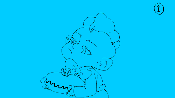
I can't draw so I won't comment on proportions, but during his head turn it's a good and pretty standard location to close the eyes and squash the head, so that they can open and the head can stretch big again once he has finished turning. Also right now if you follow the nose during the rotation it's a dead straight line motion, add some arc to it along with the squash/eyes and it'll have a lot more appeal.
|
|
#
¿
Jan 19, 2016 07:17
|
|