

|
PaintVagrant posted:So Ill start this off with some poo poo ive painted recently, as well as some miniatures I have boners for:
|
 #
¿
Oct 3, 2009 23:34
#
¿
Oct 3, 2009 23:34
|
|


|

|
| # ¿ May 17, 2024 13:44 |
|
|
PaintVagrant posted:I assume she meant colors, because she had to use white and black in addition to those two colors, right? No, she used only those two paints. Everything is either brown with a ivory highlight or irovy with a brown shade, to simplify things. Here's some daemons:     and a teaser:  Click here for the full 629x671 image. That dude is just getting his paint finished up this week, so I'll post him soon.
|
|
#
¿
Oct 4, 2009 15:35
|
|
|
Big Willy Style posted:Yeah I have noticed that actually. They ship them with bristle guards in brush containers. It's not at all a problem.
|
|
#
¿
Oct 4, 2009 19:10
|
|
|
bhsman posted:A dick that don't release his painting recipes Smoke a bowl, paint awesome. 
|
|
#
¿
Oct 4, 2009 20:53
|
|
|
Aranan posted:I am interested in doing a limited color scheme. Black armor with black clothing (and silver/gold detailing but whatev). The only thing I'm worried about is making the armor and clothing look different. I guess I could just count on the sculpts being enough to show the difference between baggy pants or armor plating, but I'm not sure if that would be enough. Yeah. The armor highlighting is broader but it does not build up to the same whiteness. That makes sense since metallic armor is more reflective than cloth pants. The highlighting on the armor is much more harsh. Like you said, its more "concentrated" and it gets to a lighter shade of blue-gray, while the pants are pretty much only done up to a mid cool gray.
|
|
#
¿
Oct 5, 2009 00:49
|
|

|
Cthulu Carl posted:Anyone have any ideas for painting albino lizards? I'm painting my Saurus Oldblood to be Gor-Rok and want him completely albino, not the "almsot-all-white-but-still-bluish" albino Saurus in the book but a completely lack of color. White base (what ever foundation paint you want, I use dheneb stone, but it's VERY redish, so I would not use that one as a base). Highlight that with some skull white or whatever your whitest white is. Hit the area with the blue wash, then highlight maybe once with a blue gray, once with a blue gray+skull white and than a final skull white highlight. Also I am finding the GW bloodthirster is really bad to paint. His textures are really messy and make it hard to do anything interesting. On the other hand, he looks fuckin sexy with silver armor and dark red skin.
|
|
#
¿
Oct 5, 2009 19:57
|
|
|
Here's some pictures:  e: those pictures are lovely, here is a better one:  aw, hell I'm a whore. Here's a sultry rear end shot: 
!amicable fucked around with this message at 20:27 on Oct 5, 2009 |
|
#
¿
Oct 5, 2009 20:21
|
|
|
Sole.Sushi posted:Crosspost from the Warhammer thread, because PV is awesome and also threatened us with violence. The LoC also has an awesome feel to him. I really dislike the stock model, but your repose and GS work make him look much more menacing.
|
|
#
¿
Oct 6, 2009 17:49
|
|


|
Fix posted:
You can add some card to the elbow joint pretty easily. Even easier than that is the wrist and probably easiest of all is just popping some between the shoulder and body. You can also bulk the pads up a lot. In general its not super hard to lengthen the thighs, greaves or arms, it's just tedious if you need to do 30-40 marines like that.
|
|
#
¿
Oct 7, 2009 01:00
|
|
|
Sole.Sushi posted:Helpful tip: When trimming the sword from the hand, leave the grip intact and remove only the pommel in back, and use a sharp knife to trim the hilt to a spike--instant pins that are actually part of the model, thus saving you a shitload of time and frustration when you drill holes to attach the polearm halves to. Found this out by accident, but hey, it worked really well. Were they the chaos knight polearms?
|
|
#
¿
Oct 7, 2009 14:42
|
|
|
Pagan posted:nmm Of course it might be more complicated, maybe you only blend the dark to mid then the mid the light, but when you are done there should be a gradient, not a distinct division between color 1 and color 2. For your darkest color you might consider something a bit less saturated since areas that get less light reflect less color, but that's not really super important. The second horse from the right looks really good. If you can manage to clean up the paint work, I think you can push that one pretty far. It might also be what PV said: that horse looks like it has the most "inbetween" tones before the final highlight.
|
|
#
¿
Oct 10, 2009 15:43
|
|
 blending
|
Pagan posted:Alright, so how do I thin them? I'm already using paint that's thinned down pretty good, and lightly running the edge of the brush along the highlight. Even my finest tipped brush, were I to use the point, would leave thicker lines than that. Paint flow control. You need to just practice getting super even lines with a brush. It's hard and not super rewarding unless you want to do detailed work like this. It's not an issue of brush size as much as being able to modulate how hard or soft you apply the brush, which correlates with how much pigment you leave behind. A good practice is to draw a checker pattern on a flat surface and color it in. When you can do that evenly try it on a curved surface. It's hard and I have never really mastered it, but it's good practice for this sort of stuff.
|
|
#
¿
Oct 10, 2009 15:45
|
|
|
Pagan posted:I'm glad you guys don't mind helping. Just what ever size you are comfortable with, then getting smaller and smaller until you can't do it neatly at that size. I think it's been said like 100 times already, but paint thickness, the amount of paint on the brush and your ability to control how much paint gets on the surface all really matter to this sort of stuff. Right now your paint looks thin enough but you have too much on your brush if it's pooling up. You could probably use your paint a bit thicker depending on what you are doing. When I do the checker exercise/game, I have my paint thinned only enough to have a good flow, but thick enough that I don't need to paint a line multiple times, for examples. I'm not really sure that's that useful of an exercise, but it's distracting and fun. PaintVagrant posted:The manowars are the best troop models in the entire PP range Doomreavers disagree.
|
|
#
¿
Oct 11, 2009 02:49
|
|

|
 
|
|
#
¿
Oct 11, 2009 03:01
|
|
|
Morham posted:Yes I had a search for one and saw the price tag, was confused and then realised why...it's a very nice miniature though and I WILL buy it at some point! Yes. I hate sealers, they make me sad. I think the best solution is to hit it with some gloss after matte or matte after gloss, thin layers so they even out. Even then it's meh. I have assumed i am doing something wrong. It's also a huge problem with metalics. Gloss will probably solve that. Mine just always look washed out.
|
|
#
¿
Oct 11, 2009 17:16
|
|
 he's still one of my best painted miniatures, but it was kind of a shame.
|
The turquoise gems and eyes look really good and make the army cohesive. gently caress the haters.
|
|
#
¿
Oct 12, 2009 16:57
|
|
|
Pagan posted:With that said, this is a damned tedious process, and the thought of doing it on 15 knights is a bit . . . well, needless to say, I'm open to other ideas on how to make their armor look cool without using metallic paints. And gently caress it a paint job that looks great on a mini doesn't look much worse blown up on a computer screen at 300% Dude, that is awesome. I personally have tried to scale photos to miniatures, but they usually look worse for it. It's a bitch no matter what you do, using a flash will gently caress the way the colors look. Anyway, despite the photo, the horse looks really good. I think you could pull it off as lacquered armor on the knights, it would be pretty sweet. The more you do it, the faster you will be able to work. On the other hand, you could just go for some simple armor using metalics and thin layers of color to spruce it up. I'll try to dig up a tutorial of what I mean, it's definitely a cool option.
|
|
#
¿
Oct 12, 2009 22:40
|
|
|
crime fighting hog posted:last night I was at my game store and this complete jobber was bragging about how he paints his daemons and how he's gonna stomp the competition once their all assembled. I asked him how he paints them and he said "It's a secret that I figured out, I'm not sure I want to tell" He might just be talking about using a lot of thin layers of paint to build up a gradient. But given the way you describe him, he is probably just stupid.
|
|
#
¿
Oct 16, 2009 01:23
|
|
|
Those metals are really sexy dude. You should do a tutorial on that. I totally forgot to look up that tutorial for Pagan, but you did an awesome job and your tutorials are really spot on.
|
|
#
¿
Oct 16, 2009 20:30
|
|
|
PaintVagrant posted:Dont have time to do a photo tutorial, but the metal: Very cool. When I finish my defiler I'll try to post some steps. I used a lot of glazing and colored washes to make the metal look less boring (I hope!)
|
|
#
¿
Oct 16, 2009 20:46
|
|
|
Here's some lovely photos of things I am painting: Click here for the full 1523x1185 image.
|
|
#
¿
Oct 21, 2009 20:26
|
|
|
He's sort of a douche for trying to sell paint thinned with liqutex medium to be honest. On the other hand, at least he made it public I guess?
|
|
#
¿
Oct 21, 2009 20:57
|
|
|
rzal posted:What is the crab thing? It's a soulgrinder. The blue dude rides it. He is magnetized. e: the blue dude is not in that photo  here: 
!amicable fucked around with this message at 23:57 on Oct 21, 2009 |
|
#
¿
Oct 21, 2009 23:54
|
|
|
rzal posted:What the hell is the blue dude supposed to be. Some sort of Tzeentch demon? The other pictures of soulgrinders have the demon with the orc powerklaw. Whatever it is, it looks pretty cool. Yeah. I didn't feel like paying for the soulgrinder so i just found some cheap defilers on ebay and sculpted the demon. My second one has a powerclaw: 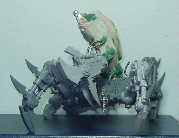  I have not started to paint him up at all though. I think I did some more work on him after those pictures but I can't honestly recall.
|
|
#
¿
Oct 22, 2009 03:37
|
|
|
Aranan posted:I have no idea what you're talking about, but it sounds awesome. They are used in chem labs to stir flasks. You pop one in a flask then place the flask on top of a pad that has a whirring magnet in it and it does the stirring for you. 
|
|
#
¿
Oct 23, 2009 04:50
|
|
|
Destro85 posted:That's a lot of bases! Sadly none of them were the one I have been looking for, though there are some great resources here. Thanks! I posted it before. I'll dig it up in a moment, but you can find it via Dakka. It was on someones WHFB Slannesh warriors blog.
|
|
#
¿
Oct 23, 2009 14:51
|
|
|
bobvonunheil posted:Okay guys, I've been trying to paint a dude in armor (specifically, this bastard) and when painting his smooth armor with GW's foundation paints, it's coming out with a grainy texture instead of being smooth. Yes, foundation paints can get clumpy if you paint straight from the pot. Which you shouldn't be doing anyway. Thin your paints.
|
|
#
¿
Oct 24, 2009 15:19
|
|
|
PaintVagrant posted:There arent enough wtc emoticons for this Those mutants are just black people.
|
|
#
¿
Oct 26, 2009 00:32
|
|
|
Maybe in french mutant is just the PC term for africans?
|
|
#
¿
Oct 26, 2009 02:06
|
|
|
landis posted:I can vouch for how amazing this stuff is. It cuts through acrylics, tempura, and even oils; making your brush like new (the advertisement isn't a lie). I think you mean tempra. Unless you have been using your brushes for deep frying.
|
|
#
¿
Oct 29, 2009 14:54
|
|
|
landis posted:Actually, I meant tempera! I haven't used my brushes for deep frying in like, years, odd slip that one. loving spelling.
|
|
#
¿
Oct 29, 2009 18:12
|
|
|
enri posted:I know this is a bit of an old post to respond to but I need this model so bad so I can paint it up for my better half, she loves her fairies and things and whatnot and I think she'd love it Guess you don't love her 30E worth.
|
|
#
¿
Oct 30, 2009 23:13
|
|


|
The dead dude under his foot looks pretty awkward to be honest. He's really clean looking and his toes are pointing straight up, wicked witch of the west style. The illusion that he is a crushed corpse just is not working at all and I can't help but focus on it since you made him have MUCH more contrast and interesting colors than the dread itself.
|
|
#
¿
Oct 31, 2009 01:56
|
|
|
I am digging what you are doing with that orc dude. Keep at it.
|
|
#
¿
Nov 3, 2009 06:36
|
|
|
Here's some stuff: lovely photo. It's a Tzeench demon prince on a chariot. I will try to shoot some better pictures of him; he's riding some tau poo poo, all doomrider style. I still need to give him arms, finish the faces all coming out of his torso and make the tau thing look all hosed. I guess the fluff behind him is that even Tau can get hosed up by demons despite having no warp presence because, gently caress YEAH I'M A DEMON SUCK MY DIIIIIICCCKKKK On that note, here's a Keeper of Secrets:   Thanks to PV who sold me the spawn kit for mad cheap. These dudes were spawn. e: in the last photo of the KoS I didn't rotate him correctly and his sword got caught on those spikes, so he's leaning back a bit.
|
|
#
¿
Nov 12, 2009 01:21
|
|
|
^^^ Still love the car. Whoa there!   And some more love: 
|
|
#
¿
Nov 15, 2009 08:13
|
|
|
rzal posted:The head growing out of the tentacle is inspired. Hah. Thanks. Here's my Herald; I think I posted him before, but maybe these pictures are better? I varnished him and sort of like the shine he has now, it does make him look worse with a flash, but I think it looks MUCH better than matte varnish in person. I still need to make a light box...     
|
|
#
¿
Nov 16, 2009 05:04
|
|
|
crime fighting hog posted:E; nevermind I'm too retarded to read. They look great though. They are mad shiny. If that's what you were saying. It's really because I used a flash. All the more reason to finally build a light box I suppose.
|
|
#
¿
Nov 16, 2009 05:50
|
|
|
Fyrbrand posted:What's the diameter on those bases? I'm sure there's an appropriately sized rare-earth magnet you could buy to fit underneath. I'd say gently caress it to the magnet under the base and cut their bases off then glue them to the magnet itself.
|
|
#
¿
Nov 18, 2009 20:47
|
|
|

|
| # ¿ May 17, 2024 13:44 |
|
|
Oh lord  
|
|
#
¿
Nov 19, 2009 20:59
|
|