

|
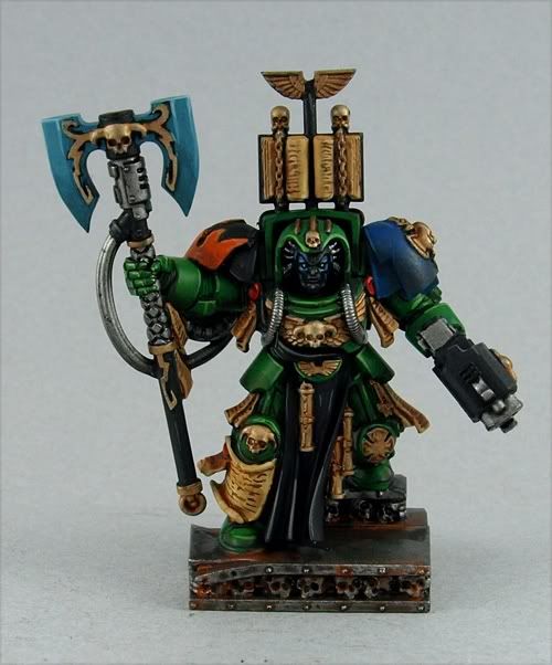
Aranan posted:I am interested in doing a limited color scheme. Black armor with black clothing (and silver/gold detailing but whatev). The only thing I'm worried about is making the armor and clothing look different. I guess I could just count on the sculpts being enough to show the difference between baggy pants or armor plating, but I'm not sure if that would be enough. I believe using a light brown like Kommando Khaki or Bleached Bone is also good for making black fabrics look more "fabric-y". I'm not sure this is the technique used, but I thought I'd put it out there. Also, to contribute, my Master of the Arsenal:     I know I should have thinned my paint a bit more, especially white. And my camera doesn't like macrophotography.
|
 #
¿
Oct 5, 2009 03:50
#
¿
Oct 5, 2009 03:50
|
|


|

|
| # ¿ May 22, 2024 02:04 |
|
|
crime fighting hog posted:well they look like complete rear end That was never going to work with just tape. Masking on corrugated surfaces sucks. You could use blu-tac, but it would be difficult to get your lines straight. Warhammer: Pull on the base and not the mini itself What do you do with magnetising slottabases? One little magnet on each side?
|
|
#
¿
Nov 24, 2009 06:55
|
|

|
PierreTheMime posted:That red bone has to be from something. This is a fun game--find the random boardgame bitz! 
|
|
#
¿
Jan 25, 2010 00:55
|
|
|
LewdMonocle posted:Lastly; loving around with scrap models. That centre model is loving wierd. What are those models, and why do you have so many of them?
|
|
#
¿
Jan 28, 2010 07:26
|
|

|
PaintVagrant posted:This. That librarian's eyes are awesome, and a little bit scary.
|
|
#
¿
Feb 23, 2010 00:03
|
|
|
Yog-Sothoth posted:There's some rules, I got some rules when I show down and I do my standup, I got rules and poo poo. Faggots aren't allowed to look at my rear end while I'm on stage! That's why I keep moving while I'm up here. You don't know where the human being section is, you gotta keep movin'. So if they do see it, quick, you switch, they don't get no long stares at your poo poo so that their imagination is flowing about my I know when you're looking, 'cos my rear end starts to get hot.
|
|
#
¿
Mar 1, 2010 06:58
|
|

|
crime fighting hog posted:green with lightning if you can. It'll offset everything else. Seconding this. Blue or turquoise won't stand out enough from the power armour.
|
|
#
¿
Mar 29, 2010 05:17
|
|
|
I'd definitely replace the legs, I can't stand those fourpack knees. Also file off the blood drop gems, purity seals, possibly the scrollwork too.
|
|
#
¿
Apr 8, 2010 01:14
|
|
|
Zarkov Cortez posted:You could always just take a little gs and fill in the grooves. The lower leg "muscles" also look pretty bad too. Easier to just swap completely. PaintVagrant posted:I like the collar/cuff on that armor a lot This. Also just noticed the lightning effect on the official painted models. Best lightning effect
|
|
#
¿
Apr 8, 2010 02:37
|
|
|
Zarkov Cortez posted:We have a winne- Zarkov Cortez posted:Wait. Holy fu- Zarkov Cortez posted: (Top one is best farseer I've seen.)
|
|
#
¿
Apr 9, 2010 02:08
|
|


|
e; /\/\/\/\/\ http://www.freewebs.com/grimdarkness/painterprogram.htm!amicable posted:Is that supposed to be verdigris? Why is that vindicator made of copper? 
|
|
#
¿
Apr 12, 2010 03:02
|
|

|
Fyrbrand posted:
Requesting more open-topped Ork dreads
|
|
#
¿
Apr 23, 2010 00:37
|
|

|
I think if you cut behind his left knee and brought the calf back toward him a bit, that would fix the stance problem.
|
|
#
¿
Apr 30, 2010 06:06
|
|
|
PaintVagrant, just noticed a couple of things on your new site. 1. Under Basing Products, the basic kit has 2 drop-down menu options for static grass, but the description says you only get one. 2. Small typo under Commissions in the Display description: quote:Included:
|
|
#
¿
May 3, 2010 01:37
|
|
|
yum posted:Not really sure on the base either. I'd probably go with a desert base. Fits with the whole Egypt-esque Thousand Son thing, and would also contrast the dark blue.
|
|
#
¿
May 3, 2010 05:28
|
|
|
Can I get some tips on painting OSL? I've got a good idea for this month's Irongob ingredient, but I'm afraid I won't be able to pull it off.
|
|
#
¿
May 4, 2010 01:08
|
|
|
!amicable posted:What is it exactly? Thanks for the advice, PV too. I want to do a welding laser, so the beam would be the source. What if I want to do OSL on metallic surfaces (not NMM)? Should I just paint solid "light" straight over it, or should I blend it/give it some transparency? Or is this a bad idea?
|
|
#
¿
May 4, 2010 03:57
|
|
|
Maybe I should just do the laser without the OSL. At least until I do some practise. Perhaps I'll model some sparks instead.
|
|
#
¿
May 4, 2010 04:05
|
|
|
 Place the wet brush along the "Line of Heart" on your hand. Slightly cup your hand. While gently turning the brush, pull it out of the crease.
|
|
#
¿
May 4, 2010 05:37
|
|
|
e: /\/\/\ That sword must be heavy.Manifest posted:This is a GREAT color scheme. I may do something similar with my Space Hulk nids. I haven't painted my Space Hulk models either, simply because I can't decide on a scheme for the 'nids. I've been considering using mica or some of that interference paint on their carapaces. Has anyone done something similar?
|
|
#
¿
May 6, 2010 02:49
|
|
|
tendrilsfor20 posted:Is there like a training school for painting? I went through the OP of the warhammer thread, but 50% of the links are dead. A friend pointed me at like a $25 kit from Games Workshop that has like 6 paints and 3 figures to mess around with and get a feel for painting before I go ordering my own little ships. Don't get the starter kit from GW. They're overpriced for what you get (average brushes, bad paint). If you're painting Firestorm Armada models, you shouldn't really need a huge range of colours to start with. I'd have a look at some paint schemes online and decide on what you want, then get those colours. You can always expand your range later.
|
|
#
¿
May 7, 2010 00:20
|
|
|
I don't think I've ever seen such smooth pink before, particularly on the three large models. Nice.
|
|
#
¿
May 11, 2010 01:05
|
|
|
 Storm trooper best trooper.
|
|
#
¿
May 13, 2010 01:40
|
|
|
iirc the traditional scheme is Fortress Grey with Rotting Flesh stripes (blended where they meet, probably doable with drybrushing). Found this little gem when looking for some info: http://www.dakkadakka.com/dakkaforum/posts/list/236631.page This guy used Iyanden Darksun and Snakebite Leather for his infantry coats. He also does some awesome modelling.
|
|
#
¿
May 13, 2010 04:07
|
|
|
Fix posted:I was just thinking that, but I imagine it'd probably leave me with a sticky, fabricky mess. Not to mention it'd probably go a long way to alleviate the whole "quick" part of the project. But I guess quick looks crap in the long run. Yeah, looks like cut up lino to me. The "grout" is waaaaay too wide for it to look like real masonry. Maybe if you cut up the "tile" parts into actual little tiles, and lay them in patterns or something?
|
|
#
¿
May 17, 2010 03:15
|
|
|
crime fighting hog posted:I've been wondering about this stuff, too. What's a good use for it? An antique ceramic effect. Best example is Chris Clayton's Ultramarine from the 2009 UK Golden Demon Open Category (the white armour).  Average score on CMON: 9.9 WIP here edit: WIP Part 2 MaliciousOnion fucked around with this message at 07:53 on May 17, 2010 |
|
#
¿
May 17, 2010 07:22
|
|
|
crime fighting hog posted:Oh I know all about this one. I'll give it a shot on my soul grinder maybe. Thanks If you can get the crackle to work (apparently it can be a bitch, so I'd probably do a few tests first), a Chaos machine of some sort would probably be the best possible way to use this effect. (I really hope you do this.)
|
|
#
¿
May 17, 2010 07:44
|
|
|
Tentacle Party posted:Still, the guy is a winner because drat he has some skill. Not to mention time and money. S.J. posted:And IIRC the guy who beat him painted loving woodgrain at 28mm. He deserved the win. It's hard to seen any woodgrain on the posted pics, but that tree looks pretty detailed. Twigs!
|
|
#
¿
May 18, 2010 02:39
|
|
|
crime fighting hog posted:if it had been a cool chapter (anything but ultramarines) we wouldn't be having this conversation GW had a huge hard-on for Ultramarines around that time. Not that it makes it OK.
|
|
#
¿
May 18, 2010 03:54
|
|
|
Sole.Sushi posted:This. The Ultramarine is supposed to be chillin' after the fight. While the pose isn't dynamic, I doubt that it would be the reason it didn't win. For me, it's the unnatural look of the face that ruins it. I guess you could also say that most of the techniques he used (salt masking, crackle effect, metalcote, etc) don't actually require a great amount of skill compared to more traditional layering techniques present in the gold winner. Still, that loving banner...
|
|
#
¿
May 18, 2010 06:10
|
|
|
crime fighting hog posted:how the gently caress do I do that on a goddamn trygon you psychopath http://www.liquitex.com/Products/paintinterference.cfm
|
|
#
¿
May 18, 2010 06:38
|
|
|
Tactical Bonnet posted:Maybe consider raising the whole thing off the base with one of those clear rod things and make both of the legs a bit more extreme, so it's way more obvious that he's flying. It looks like the model could be descending to the ground. If it's supposed to be taking off, I'd lean the torso forward, and perhaps the whole model too. I think I've found an insignia for my SM chapter:  Original:  It's an old Roman legion symbol, which ties in to the look I'm going for. What's the best way to print it as decals?
|
|
#
¿
May 19, 2010 01:56
|
|
|
bhsman posted:You better not be going for a mostly-black overall scheme or else it looks like you're going for Not-Raven Guard My colour scheme is dark red with white shoulders, so I didn't want to have a red insignia too.  Sole.Sushi posted:On decal paper, of course. I was more wondering if there's certain brands to use/avoid or other things I should know.
|
|
#
¿
May 19, 2010 02:43
|
|

|
Tentacle Party posted:You know you want to freehand those, don't you. Unlike you, I suck at freehand. Check out the "TERRA" on that model I just posted. Apparently my chapter employs 4-year old scribes. Speaking of Terra, I was thinking Praetors of Terra for the chapter name (trying to go for a real Roman theme here). Vinco Prognatus for the Chapter Master?
|
|
#
¿
May 19, 2010 03:04
|
|
|
moths posted:Don't bother freehanding SM logos unless you're only doing one squad or you do that poo poo professionally. Thanks. I might do some freehand on larger areas (banner), but yeah, gently caress doing it to the 25-odd models I have so far.
|
|
#
¿
May 19, 2010 04:12
|
|
 . I anticipate having to do some touch-up work, but it's better than trying to freehand logos.
|
Crossposting from the Oath thread.     Seriously, I'm pretty happy with how it turned out. The drybrushing is a bit messy in places, but I can live with it.
|
|
#
¿
May 27, 2010 02:11
|
|
|
Laser-welding or something... edit: How the gently caress are you supposed to highlight beams of light?
|
|
#
¿
May 27, 2010 02:20
|
|
|
If I wanted to make a hill bunker type thing, what would be a good material to use for the "hill" part? I was thinking either foam or some sort of clay/epoxy. I'm guessing foam would be ideal, but I don't know how hard it is to work with, particularly if I'm going to be putting doors and such in it. And I'm guessing clay/epoxy would be a bit expensive for something as big as a hill. Perhaps a combination of the two? Thoughts/suggestions?
|
|
#
¿
Jun 1, 2010 08:26
|
|
|
Bachtere posted:I also got a couple of boxes of the River Trolls. Awesome set. I assume this is for vomitmarine? 
|
|
#
¿
Jun 2, 2010 01:08
|
|
|

|
| # ¿ May 22, 2024 02:04 |
|
|
The sponged bits look a little uniform, but I'm only saying this to feel better about my own inferiority (never stop PV  ) )Fix posted:So I'm flipping through an Imperial Armo(u)r book, and looking at how they do all kinds of filters to the pictures they put in there to get all cool and stuff, saturation and grain and whatnot. Anyone here do that with their models? Seems like something that might be an interesting distraction from the same old same old of the modeling thread. 
MaliciousOnion fucked around with this message at 06:15 on Jun 3, 2010 |
|
#
¿
Jun 3, 2010 05:28
|
|