


|
EDIT: ^^ Oh man, I thought it was good, realistic faces with good expressions. Then I continued to scroll down. I really like this week's Uncanny X-Men's cover (and it's not Land!). It really feels like an old Star Wars poster (probably intentional, given the storyline). It was penciled by Terry Dodson, according to Marvel's site. 
|
 #
¿
Apr 14, 2011 17:52
#
¿
Apr 14, 2011 17:52
|
|


|

|
| # ¿ May 5, 2024 11:42 |
|
|
Yeah, I'm just stating my citation. Also, I know I didn't even notice the signature there the first time, so I wanted to make it a bit more human-readable. Plus, I don't know if he inked/colored it, so I'm just giving what I do know.
|
|
#
¿
Apr 14, 2011 19:19
|
|
|
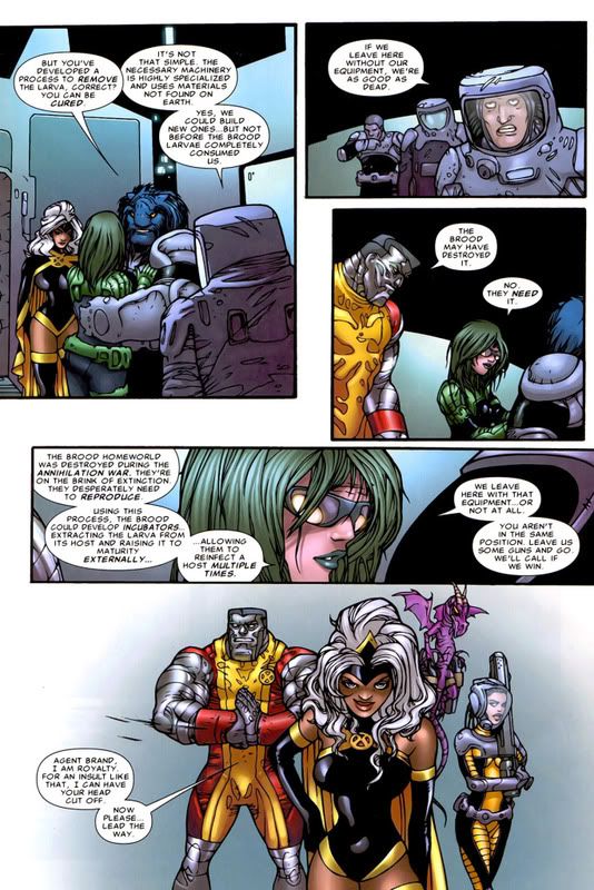
Breetai posted:Astonishing X-men 38 is the worst thing. So what number of mutations is Beast on in that first panel?
|
|
#
¿
Jun 2, 2011 16:27
|
|
|
Quantify! posted:X-Men shouldn't be worked on by geniuses, leave it to the hacks. Hey now, it's that attitude that is giving Greg Land a job.
|
|
#
¿
Jun 20, 2011 03:57
|
|
|
EDIT: Now that you have content, now so will I.Madrox posted:These 4 are from Amazing Spider-Man 655 This spread is so amazing I want to get this issue, even though I have no interest in Spider-Man. IUG fucked around with this message at 22:03 on Jun 25, 2011 |
|
#
¿
Jun 25, 2011 20:30
|
|

|
Malachite_Dragon posted:
Oh like you've never done something retarded/annoying as a teenager.
|
|
#
¿
Jul 3, 2011 23:46
|
|
 Humanity is doomed. Our 'futures' are too loving retarded to function.
|
DJ Turbo Punch posted:I'm not sure who's to blame here, but goddamn. Maybe I'm just blinded because I like that series, but I don't really see that much wrong with that cover. Can you go into a bit more detail?
|
|
#
¿
Sep 29, 2011 16:58
|
|

|
Revol posted:Holy motherfucking poo poo: Jack Kirby's 'Space Busters' concept art surfaces Man. I've been readin the old X-Men Omnibuses, and Kirby did some of the work in the early issues of X-Men. And you bring up a good point about seeing his work in raw ink. Now that I think of it, the part of the art that I generally don't like is probably because of the color work from back then.
|
|
#
¿
Oct 16, 2011 17:56
|
|

|
fritz posted:oh it's not just Liefeld. check out that tumblr I posted a little while up. Yeah, that logo says Spider-Girl, but my brain just sees that as Spider-Man doing something very wrong. That's not how you use webbing Spider-Man! 
|
|
#
¿
Dec 8, 2011 04:51
|
|

|
Darth Nat posted:I actually really like it when Power Girl is drawn so that she looks, well, powerful, but I prefer it when she doesn't look like a lumpy sack of potatoes. Did you say a sack of mashed potatoes?  Deadpool MaX-Mas Art by Kyle Baker
|
|
#
¿
Dec 31, 2011 23:32
|
|
|
I hope someone attends covered in as many belts and pouches as they could find/buy/wear.
|
|
#
¿
Jan 13, 2012 20:14
|
|
|
Yes, it had a propeller hat. Also, it was a zombie (the one from Marvel Zombies). That whole Corps storyline was the worst storyline of Deadpool I've ever read. As Gavok has said before, people need to stop putting Deadpool in space. The origin story with Kid Deadpool was awesome though.
|
|
#
¿
Jan 15, 2012 23:46
|
|
|
RevKrule posted:It's not different. It's a variant/chase costume. They spent a lot of money and time tracking it down and it'll be worth so much more in the future. Better than those lazy Fantastic Four variant costumes. You know the ones, they're all white with only their logos on it. They say it's so you can just do stuff with the whitespace, but we all know it's just easier to make an all-white costume and slap a logo on. Why spend your time designing when people will buy the new stuff with zero effort?
|
|
#
¿
Jan 21, 2012 01:19
|
|
|
Dacap posted:What stood out to me was that he's somehow squinting his visor. He just got a shield to the face, and it's a dent. In the AvX thread, people disagreed with me, but I thought this looked goofy as gently caress, not badass:  AvX #2 Even Magma looks like she is laughing behind his back.
|
|
#
¿
Apr 20, 2012 02:34
|
|
|
Baron Bifford posted:It's bizarrely drawn, but then again these characters are supposed to be inhumanly proportioned. Liefeld can also draw great monsters when he doesn't have to care about human proportions. How about uploading some pages featuring regular human characters? That would better showcase the artist's talent. The topic title says no more Liefeld, so I wouldn't. Also, I'm sure that it would account for less than 5% of his work, so saying he can do one thing good when he never does it, would not represent the artist well. IUG fucked around with this message at 22:36 on Apr 21, 2012 |
|
#
¿
Apr 21, 2012 18:37
|
|
|
Quantum of Phallus posted:That's like a...triple negative right there. Woops, said "does it" in my head, and I guess my fingers misheard me.
|
|
#
¿
Apr 21, 2012 22:36
|
|
|
Ruin Completely posted:Did I miss it, or did no one post any Jamie Hewlett? I really love his linework, and he includes exactly the right amount of detail. Details like entire bullets being fired intact? (I like him too, but I noticed it).
|
|
#
¿
Jun 1, 2012 14:17
|
|

|
"You're an artist who knows how it should be done. You shouldn't say anything. You should only be able to criticize what I draw if you're a fan. Because then you wouldn't know better. And then I can ignore it."
|
|
#
¿
Jun 22, 2012 23:44
|
|
|
Mr Wind Up Bird posted:What does this even mean? Was he not yelling at another artist for criticizing him? He said that the only people who can yell at him are his fans. I assume it's because he doesn't care about their opinion on how to draw.
|
|
#
¿
Jun 23, 2012 00:27
|
|
|
Bottom left panel makes it look like they're trying to feel how strong his muscles are.
|
|
#
¿
Jun 27, 2012 18:03
|
|
|
Gavok posted:They're rereleasing Marvel Superheroes and Marvel vs. Capcom 1 for Xbox 360 and they got Whilce Portacio to do the art. Hey Magneto. Hey Doom. Any idea what we're doing here? Nope. Are we supposed to be here? It says "Heroes" above us. Still no clue.
|
|
#
¿
Jul 6, 2012 05:12
|
|

|
It took me until now to realize that they're in some kind of canyon standing around, and that's not some crappy explosion. I guess that explains most things about their poses, but Chung-Li is still flying around back there.
|
|
#
¿
Jul 6, 2012 17:01
|
|
|
I figured they were trying to catch up with that smaller, Winnebago-sized ship, by going to ludicrous speed.
|
|
#
¿
Jul 26, 2012 19:21
|
|
|
Daggerpants posted:When I read that issue I immediately thought "That would make a fantastic avatar." If that happens, the custom text under it should be either "ludicrous speed now" or "they've gone plaid".
|
|
#
¿
Aug 2, 2012 22:23
|
|
|
Have people forgotten how to read the topic title?
|
|
#
¿
Oct 11, 2012 22:36
|
|
|
Adam Strange posted:Why would anyone willingly read motion comics I really liked the Astonish X-Men one on Netflix I saw. I thought it was better than decent. EDIT: It also has good voice acting, so there's nothing to "read" if you're being literal.
|
|
#
¿
Jan 14, 2013 04:16
|
|
|
I really like this cover from the latest Dark Tower book: (Yes, that character does have down syndrome, before you ask) I believe the cover was done by Richard Isanove, if I googled it right.
|
|
#
¿
Jan 16, 2013 17:49
|
|
|
Pacra posted:Speaking of Strong Guy (who was/is a great character in X-Factor of a few years past): I liked the idea that Strong Guy got hit by a car and didn't release the power in time, so he's permanently charged with extra mass that he can't use and hurts him constantly. That excuses a bit of his odd looks (not all of them in that picture I guess), and makes him more interesting than "peak human strength guy".
|
|
#
¿
Jan 20, 2013 21:57
|
|


|
scary ghost dog posted:I tried to make this easier to parse, and... IT WORKED The "AMUSING" in the top corner is just so great.
|
|
#
¿
Apr 6, 2013 05:09
|
|

|
I looked at that and wondered why they had a Grey alien with them, then realized it was Iceman.
|
|
#
¿
Apr 14, 2013 14:53
|
|

|
Madrox posted:That's OG Iceman, so he's in his more snowy form. I know, but I was exaggerating because it looks more like an alien than old Iceman.
|
|
#
¿
Apr 15, 2013 04:37
|
|
|
 I just saw this cover posted as a preview, and couldn't stop staring at it. It would be a quicker list to just list what they drew right. That list might also be empty. I know Deadpool's a comedy comic, but I can't tell if it was intentionally terrible, or this was an honest attempt.
|
|
#
¿
May 22, 2013 04:42
|
|
|
Baron Bifford posted:I'm curious to know what the other end of Nightwing's rope is attached to. He's swinging over rooftops. Is there a skyscraper in the middle of those smaller buildings? This is an issue that crops up a lot in Spider-Man. The answer for Spider-Man has always been "passing helicopter".
|
|
#
¿
Sep 4, 2013 15:15
|
|
|
Metal Loaf posted:Although I can indeed read the thread title, I feel inclined to post this Rob Liefeld cover I have never seen before; I'm actually surprised it isn't on either of the Progressive Boink lists of his worst drawings: Man, that cover's so busy I never noticed until now those two "background" characters on the left side.
|
|
#
¿
Sep 7, 2013 00:55
|
|

|
Servoret posted:Edit: I knew that image of Kang chilling on the invisible couch looked familiar. It's from Avengers #8. Ah, that also explains (not that it needed explaining) this week's Uncanny Avengers #12 cover:  I thought the signatures were a nice touch.
|
|
#
¿
Sep 29, 2013 15:11
|
|

|
Forget the gun or the arms. I can't figure out what that sentence means.
|
|
#
¿
Nov 22, 2013 03:24
|
|

|
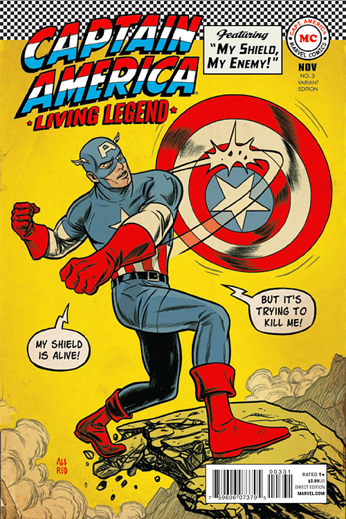
Senor Candle posted:
Yup. My shop has had this poster in their window, and I actually asked them about this image when I last went in. It's good to know that, indeed, his shield was trying to back him off the cliff.
|
|
#
¿
Nov 26, 2013 18:23
|
|
|
What's wrong with that 2012 Avengers cover? I also have no problem with that movie Spider-Man illustration.
|
|
#
¿
Dec 7, 2013 17:21
|
|
|
Waterhaul posted:what is Black Widow hanging from? A passing helicopter, of course. I just like that Sandman is in there. And he got way more space on that cover than whoever's hiding behind Scarlet Witch's cape by the edge of the page.
|
|
#
¿
Dec 7, 2013 17:49
|
|
|

|
| # ¿ May 5, 2024 11:42 |
|
|
Hey, quote is not edit.Flesh Forge posted:I'm pretty sure the Liefeld cover was the crater. The Perez cover is great for what it is, a huge compositional mess that shoehorns every character possible into the image. It's a whole lot better than most of that type.  X-Men 200 I'm biased because I have this framed on my wall in my office.
|
|
#
¿
Dec 7, 2013 17:50
|
|