|
Pipes said he "wouldn't mind" a thread like this, so here we go. Rules: -Post website design critiques elsewhere -Don't let it turn into an echo chamber that repeats three "critique" sentences over and over, like the photo-a-day thread did when I followed it. -If you're going to do a coup-d'thread and comment on every single thing that's posted... that's great! But if you're the only one doing that, you better know your poo poo. (I, for example, don't know my poo poo. But I will post comments from time to time.) -Just post your works for comment and critique other peoples' stuff, okay? We can handle this. If there are resources and links that would be good to keep in the OP, I don't know em. Link me. Attached: THE BEST POSTER EVER MADE.
|
|
|
|

|
| # ? May 3, 2024 23:45 |
|
palceholder
|
|
|
|
Here's a poster I made. We're getting them printed today, but we'll do another run soon--I'd like to do some touch-up work before the second run. I'm not quite sure what's off here. Some of the text still looks "photoshopped," are there any good filters or overlay styles I should use? How's the kerning? Any other thoughts? Thanks! 
Mescal fucked around with this message at 22:53 on Jul 27, 2011 |
|
|
|
I'll talk about weathering in a second, but first, your choice of fonts: It's all Gill Sans, which is great. What's not great is Gill Sans Bold (or maybe it's Heavy but what I'm basically talking about is the "The cut is right" bit). Change that to Gill Sans Light. I implore you. As for weathering, you can always overlay a texture on your typography using layer blending modes - though good looking high res textures are pretty hard to find. If you want to go the extra mile and make it look really good, though, print out just the type on a cheapo b&w laser printer and rough it up. Then scan it back in at like 600 dpi and use layer blending modes to make it fit with the colors and poo poo. So yeah! There you go! Easy Peasy
|
|
|
|
Fayez Butts posted:I'll talk about weathering in a second, but first, your choice of fonts: It's all Gill Sans, which is great. What's not great is Gill Sans Bold (or maybe it's Heavy but what I'm basically talking about is the "The cut is right" bit). Change that to Gill Sans Light. I implore you. Thanks for the comments! I appreciate it. About using bold--I did my best to emulate the penguin cover this is based on. That cover used bold, and I copied that and the kerning and leading they used. I'll see how it looks with light.
|
|
|
|
My old design professor was big on "authenticity" for things like weathering and distressing, so I'm really happy to see that printer suggestion. Failing that, I noticed the striping isn't exactly straight, but the type's baseline is. Use the Ruler tool and rotate all the type enough so it matches the poster's faux skew.
|
|
|
|
I will admit that I don't know my poo poo. As for "The cut is right" poster if I were to explain why some of the text appears photoshopped it would be that the new text's edges are blurred. The base material gives the impression of having a lightly corrugated texture. The original print (I'm guessing the shapes) seems to be rather crisp but, because it was printed on this type of texture, the edges of the shapes appear blurry but are actually just "wavy". However, the new text is blurred around the edges (and probably a bit transparent) and my eyes have a bit of trouble focusing on the fringes of the letters. I'm not sure if there would be an easier way to do this, and it's still just a hunch, but it might look better if a very thin horizontal bar mask (same size as original striping) was put over the text and then have a very slightly scaled down (or maybe up) copy of the text just beneath it. If that works out then I would start playing around with trying to match the shading of the striping or adding a bit of ink feathering.
|
|
|
|
I'm not sure I trust my eye on this one, but the Y and E seem a bit loose in 'yes'. Hairline change.
|
|
|
|
Great advice everybody, thanks! My second run is going to look awesome. Now somebody else post something for crit 
|
|
|
|
Why no love for web?
|
|
|
|
pennywisdom posted:Why no love for web? Web Design is such a different beast that I can't see it blending well. Not too mention this thread would be flooded with nothing but web design.
|
|
|
|
Really? I'm actually kind of surprised at the lack of web design in this subforum all together. Most of the stuff people post is more along the lines of 'critique my portfolio'. Enough derailing, carry on!
|
|
|
|
http://dl.dropbox.com/u/22299513/CGosson_TOW6.pdf http://dl.dropbox.com/u/22299513/artistsstatement.pdf Two things here, people say they hate my kerning so be warned you will probably cringe :/ I'm about to graduate from a community college with an AAS degree in design but I still don't feel anywhere near up to par. I think I desperately need to intern somewhere. The first is a little 8 1/2x11 quote poster, the second is going to be part of resume/cover letter/artists statement. Artistic Monkey fucked around with this message at 06:09 on Oct 20, 2011 |
|
|
|
I'd suggest picking up some books on typography. Ellen Lupton's "Thinking With Type" is a good one.
|
|
|
|
One of the most important things you need to remember is to give your text breathing room. Sure, there's plenty of space between lines but then the text boxes are all scrunched up against the the border and one another. Basically, you've got tons of room on the page, but that doesn't mean use it all! Second of all, kerning. This is also all about white space (or negative space, however you want to call it.) The best way to get good at it is to do it by hand, a lot. Blur your vision and just look for areas in a word that look overweight compared to its neighbors and fix it. It will take time to get good at it but it is something you need to do. I've redone your Goudy page, same border, same arrangement, but with just Akzidenz Grotesk and a hint of Mrs. Eaves. It's not particularly beautiful, but see how everything has lots of nice breathing room? Ain't it sweet? Hopefully this link will work: https://dl-web.dropbox.com/get/types.pdf?w=c300e99f
|
|
|
|
Artistic Monkey posted:http://dl.dropbox.com/u/22299513/CGosson_TOW6.pdf Find a non-profit that needs someone, it might lead to a job - or it might just be meaningful practice. And, pay someone $10 to draw you a good pointing-lady in SA Mart. unbuttonedclone fucked around with this message at 02:47 on Oct 21, 2011 |
|
|
|
Moist von Lipwig posted:Web Design is such a different beast that I can't see it blending well. Not too mention this thread would be flooded with nothing but web design. Well it's not like there's much else for web design to flood at the moment, so perhaps we could start including them? A feedback/critique thread for web design / layouts would be great, and this seems like the most relevant and appropriate place for it to go (and coding questions can go in the web design questions megathread in Cavern of COBOL).
|
|
|
|
thylacine posted:Find a non-profit that needs someone, it might lead to a job - or it might just be meaningful practice. I don't even think you should have a pointing lady. It's kind of unnecessary if all she's doing is pointing to text that I'm clearly going to read anyway. your quote on the side is about having drive- draw a girl behind a steering wheel i think to at least tie everything together. Also, as far as artist statement, I like most of what you said but I think you should change the angle a bit. Your current perspective is: my dream is to be a designer since I felt a connection with the practice of design. Your actual perspective should be: I am a passionate designer who can bring my talent to making your (re: client's) product stand out from everyone else's i am so clearly awesome did i mention how i am oozing with talent.
|
|
|
|
Artistic Monkey posted:http://dl.dropbox.com/u/22299513/CGosson_TOW6.pdf Long poster critique: Sorry, but yeah the kerning needs a lot of work. Nothing to do but get a lot of practice at it. Here's a few things to try working out your kerning if you're unsure about it: Unfocus your eyes so that you're looking at blobs of light and dark (Or throw a blur filter on the type, same thing) and get even weights between them. Alternatively flip them upside down or mirror the text, so that you're looking more at forms and the space between them. It's all about space. You dont want to cram letters too close together, nor have them too far apart. At least not unevenly so. That block of tiny text in the upper left is full of characters packed so close that they're actually merging into each other, and it looks like you're trying to push everything into set spaces, rather than letting the content dictate the form. The larger text has issues with gulfs between some letters and not enough space on others. As for your artists statement, it could be laid out much better. Right now again there's gulfs everywhere and no real flow. What are you supposed to look at first? The text in the explosion? 'Artists statement'? The last paragraph that the lady is pointing at? Clean it up and figure out what's decorative and what's important, and work on your hierarchy and layout. And yeah finally for your source of inspiration: if you arent aware of Timba Smits/Wooden Toy drink deep from this kind of work, as well as doing your own research to add that authenticity to your own work. http://www.woodentoypublishingco.com/ http://timbasmits.com/ And generally from looking around (I'm looking at you SA-Mart logoteers!): SET KERNING FROM METRIC TO OPTICAL OH MY GOD PEOPLE Seriously this is enough to take care of 90% of kerning issues and is almost always good enough for body copy if you just adjust the tracking, and will only leave you to do touchups to your personal preference for titles. edit: Sorry about that, I appear to have sperged out a bit! Synthbuttrange fucked around with this message at 13:03 on Oct 21, 2011 |
|
|
|
Think in terms of a grid. This helps with balancing headlines, your kerning/tracking/leading, blocks of type themselves, images, etc. Think about eye-tracking (how the reader's eye moves about the piece). Always be aware of eye-tracking and hierarchy. What's the most important thing? The second most? What's merely support? Right now the Artist Statement piece has a lot of elements competing for my eye. I'm looking EVERYWHERE and too many things are screaming at me for attention. So much so that I don't want to look at it. Also, lighten the textured background. It's pretty heavy (and over-used). That stuff is to design what auto-tune is to singing.
|
|
|
|
Artistic Monkey posted:http://dl.dropbox.com/u/22299513/CGosson_TOW6.pdf Agreeing with the posters before me, notably about metric/optical. I'd rip out all of that kerning and start at the beginning. that typeface, admittedly, looks like a difficult kern with those combinations of letterforms. My instinct is to give it a looser feel which helps ease off immediate abasions.    This game may be surprisingly educational for you. http://type.method.ac/
|
|
|
|
A good method I've found is to kern until you think you've nailed it, then look at the word in three-letter blocks. If the letters inside the blocks aren't evenly spaced, kern some more. Then look at the entire word again. It should be beautiful.
raging bullwinkle fucked around with this message at 16:01 on Nov 1, 2011 |
|
|
|
For kerning I print it out and turn the piece upside down. Also, optical in InDesign is your friend. Always print out your work.
|
|
|
|
I could be totally off-base here, but also, your second thing (not the type poster) looks way more "Fallout" inspired than retro inspired, right down to the lady. I mean, Fallout obviously draws heavily on retro imagery, and I certainly did not live during the time period, but the 'dirtiness' of it and the lady pinged more Fallout vibes to me than anything else. Again this could be total bullshit, just thought I'd point it out v
|
|
|
|
I thought I'd resuscitate this old thread instead of creating a new one just for this inconsequential post. Basically I've just got a couple of old design projects that I'm not currently working on but would still love a professional opinion. So here they are: Book design (unfinished) I've never done anything like this before so it was very interesting to basically brute force my way through it. Here are the best pages:      Package design (basically finished) This was my family's big Christmas present. I think I went a little overboard with it but I also really really love how it turned out. My photography sucks though.     
|
|
|
|
I'm redoing some of the interface elements of my app TC-11, which is an iPad synthesizer. What I'd love some suggestions on is the app's font. Right now I'm using Univers, which feels very neutral to me. While I like it, it feels too close to Helvetica, and makes it seem a bit too 'default-y' to me.   I liked the look of Animoog's font, which I think is Futura. But Futura only looks good to me when it's in all-caps. I need something that looks a bit more technical, futuristic, but still looks nice in mixed case.  Any suggestions?
|
|
|
|
lord funk posted:I'm redoing some of the interface elements of my app TC-11, which is an iPad synthesizer. What I'd love some suggestions on is the app's font. Right now I'm using Univers, which feels very neutral to me. While I like it, it feels too close to Helvetica, and makes it seem a bit too 'default-y' to me. Most kind of futuristicy space-age fonts are poorly constructed without a lot of weights. Keep in mind that in UI legibility is critical, so stuff with closed-down terminals is going to kill legibility. What I would go for is a squarer sans serif maybe. Vitesse? Klavika? Maybe even an Akzidenz or early Grotesque. but you might even be able to get it out of Univers if you do 57 with extra tracking. You'd want to test them in the app for legibility, obvs.
|
|
|
|
Fayez Butts posted:I thought I'd resuscitate this old thread instead of creating a new one just for this inconsequential post. Basically I've just got a couple of old design projects that I'm not currently working on but would still love a professional opinion. So here they are:
|
|
|
|
lord funk posted:I'm redoing some of the interface elements of my app TC-11, which is an iPad synthesizer. What I'd love some suggestions on is the app's font. Right now I'm using Univers, which feels very neutral to me. While I like it, it feels too close to Helvetica, and makes it seem a bit too 'default-y' to me. I agree about avoiding futuristic/techno fonts. They suck at legibility and always give me a sense of ham-fisting the message of 'we are awesome and highly technological and cutting edge'. Use of futuristic/techno fonts just look amateur. In fact, I'm currently finishing up a rebrand for the robotics start-up I work for, and we're ditching this font in the wordmark for all-caps Gotham. It's so much better and more professional than some sci-fi space font it's not even funny. Also, Gotham is really similar to Futura in a lot of ways, but the lowercase is more refined and I like it way better than Futura's lower case. I'm a huge Futura fan, but I just like the Gotham letters a bit more. It's timeless, old school, and modern at the same time, depending on its context. Authentic You fucked around with this message at 00:57 on Feb 29, 2012 |
|
|
|
Fayez Butts posted:
The type weight of "Decoded" is different between the labels and the cards. You should think of matching them up more (make the type heavier on labels). Also, have thought bringing the green color from the cards into the labels? They look a little flat right now.
|
|
|
|
Here's a poster I've been working on for the past few days. I started out with a few abstract sketches and felt this idea was strongest, even though the sketch I picked had a detailed cityscape to contrast the celestial weirdness at the top.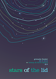 I wanted to explore an aurora borealis theme and ape the style of the talented Alvin Lustig. Tall order, yeah. The line colors strike me as a little oversaturated, but many aurora images have strong cyan/seafoam tones. Plus, the contrast with the purple night sky works. I like Clarendon for the title but not as much for the smaller info. spider wisdom fucked around with this message at 03:33 on Feb 4, 2012 |
|
|
|
spider wisdom posted:Here's a poster I've been working on for the past few days. I started out with a few abstract sketches and felt this idea was strongest, even though the sketch I picked had a detailed cityscape to contrast the celestial weirdness at the top. I like the colors in the top bit a lot, but there's too many in the text. I'd limit the text colors to maybe two. It's quite nice otherwise, I like the unevenness of the auroras.
|
|
|
|
spider wisdom posted:Here's a poster I've been working on for the past few days. I started out with a few abstract sketches and felt this idea was strongest, even though the sketch I picked had a detailed cityscape to contrast the celestial weirdness at the top. I agree with kidcoelacanth. Let the aura speak for itself and dial back the use of colour in the text. I'd run it all one colour. I also think the space isn't feeling very resolved, the hierarchy between the 2 levels of typography isn't working well, which ties into your feeling about the clarendon for the smaller info. What I think is not working about it is the plentful, round ascenders & descenders making the area feel lumpy and unkempt. I would try 10-15% smaller, in small-caps with loose leading, and increasing the size of 'stars of the lid' as well.
|
|
|
|
Thanks for the feedback, chums. Had similar feelings regarding the multiple font colors...looks so much better after such a big small change. Also, Disreputable Dog -- great name. If that's from the book series I think it is, you win.
|
|
|
|
spider wisdom posted:Thanks for the feedback, chums. Had similar feelings regarding the multiple font colors...looks so much better after such a big small change. It totally is. Glad to see the colour change worked out.
|
|
|
|
I'm currently sketching out various code and graphics designs for a personal budgeting app for Windows 8 I want to write (their new Metro UI poo poo). I dabbled around a bit and made up a first rough sketch of where I want things to go. Criticism would be appreciated.
|
|
|
|
Overall, I like it. Very clean looking so far. Depending on how your app will work, you may well need to move the vertical logo from that app to the top. Scrolling content will cover it up (and possibly some low-resolution setups, too). You may want to have your dashboard commands in the application's context menu, which is hidden by default, and pops up from the bottom of the screen when it is called up, sort of like on Windows Phone OS. I think by and large, once you get into the actual dev environment and get a feel for how the layout system works, you might find tweaking your design to be easier. Give this Channel 9 presentation a watch, it goes into some good details on Metro stuff: http://channel9.msdn.com/Events/BUILD/BUILD2011/BPS-1004
|
|
|
|
What are some other good books to teach yourself design besides "Thinking with Type"? I read smashingmagazine.com pretty obsessively but I'd like something more physical.
|
|
|
|
02-6611-0142-1 posted:What are some other good books to teach yourself design besides "Thinking with Type"? I have some good referential stuff, like Meggs' History of Graphic Design, Making and Breaking the Grid and Elements of Typographic Style. Wucius Wong's books, like Principles of Form and Design/2D/3D Design have been pretty helpful too, but I'm always looking for more. Before & After is a decent resource as well.
|
|
|
|

|
| # ? May 3, 2024 23:45 |
|
MrSaturn posted:Overall, I like it. Very clean looking so far. Meanwhile, I removed the black transparent boxes and stretched the top gradients all over it, and put dark translucent rectangles on top of it, to give the box borders some accents. It's more in line with the Metro style and how it homescreen icons look. MrSaturn posted:I think by and large, once you get into the actual dev environment and get a feel for how the layout system works, you might find tweaking your design to be easier. And yeah, using a live layout system helps speeding up the design. Right now I need to cram the three boxes into a slightly smaller space to make room for additional text. I'm kind of not doing it, because it'd mean reworking the whole PSD instead of just tweaking a bunch of values in a XAML file.
|
|
|


