|
mutata posted:
I think you're on the right track. I would simplify the shapes to a single chevron and a circle (with lines). I'd also have generous white space in between all the individual shapes.
|
|
|
|
|
| # ? May 4, 2024 01:34 |
|
I'm gonna ruin it for you right now, it's the pringles man edit: ok, not quite as much as I remembered
|
|
|
|
I would give both ^ shapes rounded bottom corners, rather than just on the top.
|
|
|
|
mutata posted:
Non-solid signs are too Japanese-flag and B&W doesn't have the spacing to make a simple circle/triangle work.
|
|
|
|
I'm doing some designs for a personal business card and I've settled on an illustration of Lady Godiva as a theme. I wanted to do something that was visually complex, with lots of swirls and line, something that would take me out of my minimalist comfort zone. Also, it would give me some good experience with working with Illustrator CS6. I'm trying to decide which one I should go for, color-wise, or if I should try other color combinations.    What do you think?
|
|
|
|
mutata posted:
Looks pretty Nippon. The first one especially looks like a Japanese roof partially obscuring a Rising Sun.
|
|
|
|
Young Freud posted:I'm doing some designs for a personal business card and I've settled on an illustration of Lady Godiva as a theme. I wanted to do something that was visually complex, with lots of swirls and line, something that would take me out of my minimalist comfort zone. Also, it would give me some good experience with working with Illustrator CS6. I'm trying to decide which one I should go for, color-wise, or if I should try other color combinations. I think the last one, the line drawing, in gold or silver, on the above blue background would look pretty darn sharp.
|
|
|
|
Ferrule posted:I think the last one, the line drawing, in gold or silver, on the above blue background would look pretty darn sharp. I did some revisions to the background color, desaturating it a bit and brightening up, as well as making a version that brings the eyes out more.   I felt the contrast was too much so I generated one where the pupils are slightly darker than the rest of the line. 
|
|
|
|
The line drawing is still the best in my opinion. The latest round looks to be an improvement, but the shadows on the face adds a depth that is lacking in the hair. This creates a discrepancy visually that's while not obvious is still enough to be noticed, at least subconsciously. The color choice is also a bit bland to my eye but that could just be another symptom of the lack of depth in the hair. I would recommend adding a shadow to the undersides of the hair curls. Otherwise the concept is pretty sweet to my eyes. Keep at it!
|
|
|
|
RGBRIOT posted:The line drawing is still the best in my opinion. The latest round looks to be an improvement, but the shadows on the face adds a depth that is lacking in the hair. This creates a discrepancy visually that's while not obvious is still enough to be noticed, at least subconsciously. I agree about the line drawing being best, particularly for a business card. It has a more graphical quality that will print clearly and be more striking on such a small object. Sure, you're having fun playing with color schemes, but consider what the end product will be.
|
|
|
|
RGBRIOT posted:The line drawing is still the best in my opinion. The latest round looks to be an improvement, but the shadows on the face adds a depth that is lacking in the hair. This creates a discrepancy visually that's while not obvious is still enough to be noticed, at least subconsciously. I just finished adding the shadow. I was hesitant to begin with, because I wanted the lines to portray the depth, but I may as well go with the straight line drawing if I did that.  I'll take all of your criticism to heart before making a final decision. Maybe play around with the color scheme or just go straight with the almost-monochromatic line work.
|
|
|
|
Young Freud posted:I just finished adding the shadow. I was hesitant to begin with, because I wanted the lines to portray the depth, but I may as well go with the straight line drawing if I did that. To me this looks much better. Great understanding of a light source illustrated here. Well done.
|
|
|
|
Thanks, I think I ended up going with, at least temporarily, with straight black line art with the shading (especially when the 50% black I started with was barely visible). It looks good, but I'll probably play around with the color scheme more as well as make sure the lineart is visible. The good thing about it being in Illustrator is that I can blow it up for T-shirts and prints if I want to.
|
|
|
|
 Here's a thing I'm working on (sketching in PS, going to redo it in Illustrator when it's done). I'm going to try and simplify the demon faces further, because they get cluttered at smaller resolutions, but I'm also kind of concerned about the faces reading as the letter "M." Is that working? If not, do yall think it is possible to push them enough that it does, or is this a lost cause haha
|
|
|
|
Haledjian posted:
It's not offensive to the eyes, but it looks like too many things. Namely it looks like a Duracell semi trailer, partially hiding behind a hockey team logo on a billboard, in 1990.
|
|
|
|
Haledjian posted:
I think the short horned demon reads better as an M than the long horned demon, especially in monochrome. You could maybe try thinning the face and making the chin pointed will get the point across better, but I think short-horns works better. However, I don't see the M for the "mini" as much as I do for "Maxwell", so it maybe better to break that off by writing out "mini" instead of combining them with "ini".
|
|
|
|
"Here at Maxwell, we specialize in demon engineering and remodeling your parent's guest houses into swingin' bachelor pads you can live in until you're 37." Rather than a paragraph explaining what you're thinking about doing, try to write a paragraph that explains what you want to do. Cause I got no idea, at all.
|
|
|
|
It's for a network emulator which is named after Maxwell's demon.
|
|
|
|
Rather than a sentence explaining what your product is, try to write a paragraph explaining what you want to do here.
|
|
|
|
I want to make a logo for it. Actually two, since there's a pro version and a mini version, right. So they should be similar but distinctive. They have to use blue and green. They don't have to have demons on them. They should be something that can be put on the device and on a webpage for the device.
Haledjian fucked around with this message at 01:19 on Jun 13, 2012 |
|
|
|
You can do a lot more with a logo than just making it distinctive. You can fill it with subtle subconscious associations tailored to the target market by your choices in colour and shape. Logo design is a pretty fascinating science, I only ever passed over it briefly at uni, but I've been getting into it pretty seriously lately because my family business needs rebranding. Find out what the company/product is trying to say, find out what sort of people they're trying to say it to, come up with a strategy that works with those two things, and go from there. Read a bit on gestalt principles, the psychology of shapes and the psychology of colour combinations (there isn't much to learn, you could learn the lot in a few hours). Then start throwing visual ideas around, colour choices that might work, etc. Then once you've got all that stuff sorted out, start thinking about the aesthetics of it. You still want it to look cool, but the cool look should be the garnish on the research you've done. The bottom one of those logos looks cool, and the drawing is good, but it doesn't really say anything to me, and I have no idea what kind of product it might be.
|
|
|
|
Try to make the logo so that the customer would be proud to tell people about it. "Sweet logo, man. Why does it look like that?" "Had to have two logos that were similar but distinctive to put on the device and webpage. Had to be green and blue, but didn't have to be a demon." You can do better than that! Anyway, the current design looks like it's for some heavy-duty product (power tool?), both because of the heavy font and the green color, I don't know if that's intentional. Also, as mentioned, Duracell. http://www.pycomall.com/images/P/p-19618.jpg
|
|
|
|
Haledjian posted:I want to make a logo for it. Actually two, since there's a pro version and a mini version, right. So they should be similar but distinctive. They have to use blue and green. They don't have to have demons on them. They should be something that can be put on the device and on a webpage for the device. Again, you're not explaining what you want to do with this. You're giving technical information about what you want, but that doesnt actually articulate your goals. Try harder. What do you want to communicate visually? Try using nouns and adjectives like "strong, innovative, reliable, new," etc. Try to think of other logos which convey ideas or emotions you think are appropriate (Seagate? Intel? AMD? Microsoft? Your mom's Etsy knitting shop?) I'm betting that this exercise has just gotten a lot more difficult than you anticipated. But seriously, give it a shot. If all else fails, find a logo you like and copy it or adapt it. At least it will then be cohesive, even if it conveys something you're arent actually trying to get at.
|
|
|
|
Is there a similar thread for motion design or is this it? I have some works in that field I'd like to share. 
|
|
|
|
You probably want the animation thread: http://forums.somethingawful.com/showthread.php?threadid=3207887&pagenumber=19#lastpost There's also a 3D thread and a video editing thread. If your questions are technical you might get better answers in the 3D thread.
|
|
|
|
So, I'm working on a brochure for my ballooning business - something I can drop off at restaurants as a way of garnering interest. Here's what I have so far - I'm thinking a Z-fold brochure. The white triangles and squares are just markers for when I print it, for fold lines and trimming.  I'm trying to make it professional, yet fun. I'm open to all criticisms - especially on the text. There will be a back side to this as well, but I haven't designed it at all yet. I'm not even sure what I want to put on the back - Testimonials would be good, but what else? "Dos and Don'ts" of ballooning?
|
|
|
|
Drop "Contact Info." People aren't going to be confused about who the email or phone # belongs to. You can also make the actual info bigger, with "Contact Info" gone. The design looks alright to me, but I'd put your work first - right now it looks like your face will be on the front? Nobody gives a poo poo about what you look like and it won't encourage anyone to read further. The "why hire me?" copy needs work too. The first two paragraphs say "I, I, I." You're talking about yourself. That's not good. Nobody cares about you. They want to hear how you can solve their problems. The third paragraph gets marginally closer - you're at least sort of describing a situation where you'd be useful. The fourth paragraph is you either making poo poo up (don't), or it's true and you've presented it in the worst way possible. If you've done balloon nights and more people came, get in contact with that restaurant or whatever. Get a hard number on sales increases, or net profits or something. 15% more people compared to a regular Wednesday. $800 more in gross sales. Instead asking the customer to believe you about how you'll be helpful, show it. Testimonials should be the second/3rd thing people see, after the pictures of your work and hard numbers. If you can combine testimonials and hard numbers, do that. "Noel's balloon nights are wildly popular with families here at X. We see a 20% increase in sales. Well worth it!" That's what you want people to read. Do deep research. The managers don't want to think about whether or not hiring you makes sense monetarily. Take your hourly rate, and try to find out how much more business the restaurant would have to do to break even on you. I'm sure you can look up the margins for typical restaurants somewhere. Tell them this break even point: "If I attract six more average families, it's worth it to you! And I average ten-twelve more!" Make it so they can't say no. Make turning you down a losing proposition. Right now all they see is your face, and bunch of poo poo they have to clear with the owner. More work for them. Instant "no." If you can give them credible, hard data on how much you can boost their business, they don't have to worry about looking stupid for bringing it to the boss. These links will help you. The first is a general post about freelancing. The second is a (long) video about creatives finding freelance work. It goes in depth in to how to get inside the customer's head and make them eager to hire you. You need to watch all of it. http://www.iwillteachyoutoberich.com/blog/finding-clients/ http://www.iwillteachyoutoberich.com/blog/creatives-earning-more-psychology/ Prolonged Panorama fucked around with this message at 05:29 on Jun 30, 2012 |
|
|
|
|
Wow, that's a lot of good info. Thanks, I'll look at both of those, and revamp it. Copy is not my strong suit, so I appreciate the comments.
|
|
|
|
Just wanted to say that's some fantastic advice/criticism. Thanks for posting it.
|
|
|
|
TwystNeko posted:I'm trying to make it professional, yet fun. I'm open to all criticisms - especially on the text. There will be a back side to this as well, but I haven't designed it at all yet. I'm not even sure what I want to put on the back - Testimonials would be good, but what else? "Dos and Don'ts" of ballooning? Some things that jump out to me: - Is wood grain really the best texture for this? It cost more to print and doesn't really have anything to do with ballooning. If you're going for a 'on a desk' look perhaps you should move away from this texture because it looks like its meant more for wood flooring. - Drop the semi-thick black outline around the poloroids. It doesn't match the sticky note in the lower right, and you can achieve a border around the photos by judicious use of drop shadow/outer glow/stroke. Something like this for example:  This is just a quick and dirty example, but see how the photos and the bg get along better and look less 'blocky'?
|
|
|
|
I've been working on a re-design of my school's athletic logo for (hopefully) a research project in the fall. The first iteration is on the right, and though I like most of it, the mane on the left side looks too short (due to the corner bit and hair streak), but I feel it needs the yellow to balance the logo overall. The fixes are the two on the left, I don't particularly like the small streak in the middle version but I think it needs something to balance. What do you guys think.
|
|
|
|
Looking at just the tiny version that you've timg'd in, I'd say the silhouette shifts drastically among them. The one on the left is definitely not the way to go. It turns into some weird-looking cougar. I'd take the middle one and develop that concept. Maybe instead of trying to minimize the left detail, push a little more so it reads as a mane without any doubt. Perhaps add a couple more streaks? Also, I know it's a stylized logo, but consider your light source. Is it from the top, down? Then there should be more light colored detail on top bleeding to less light colored detail on bottom. Etc etc depending on what you decide the light source is.
|
|
|
|
Of those, the middle one. The way the eye is being sliced off by the mane is bother me, though. There's also some weirdness going on with the jaw-line and how the snout(?) is pointed upwards. I know it's stylized and all but in some ways it doesn't look like a lion.
|
|
|
|
I couldn't put into words what I wanted to suggest exactly so I just added a couple of spots to your current design to illustrate what I think you might want to do. (Based off the middle one) The shapes should be redone, I just copied the one you made in the upper left. Placed the copies in such a way to help fill out the mane and to help differentiate between the mane and the mouth of the lion to help move away from the cougar look. But something like this should help break up all that blue space a bit. Love this design. I hope you get it worked out and the school picks it up. It's intense! E: VVV I disagree. Taking out the yellow on the right will flatten the image and make it harder to recognize the lion... unless hi-lights were added (in yellow) to break up the the blue space and define the mane's outline a bit. VVV RGBRIOT fucked around with this message at 11:07 on Jul 21, 2012 |
|
|
|
kidcoelacanth posted:I've been working on a re-design of my school's athletic logo for (hopefully) a research project in the fall. The first iteration is on the right, and though I like most of it, the mane on the left side looks too short (due to the corner bit and hair streak), but I feel it needs the yellow to balance the logo overall. The fixes are the two on the left, I don't particularly like the small streak in the middle version but I think it needs something to balance. What do you guys think. It's good you posted this as TIMG because thumb's a good way to gloss a logo. Lose the yellow bit on the right. It won't confuse the picture: motherfucker's got a big mane, see. And anyway, bordering the mane with both positive and negative space throw it into Escher territory.
|
|
|
|
Yip Yips posted:Of those, the middle one. The way the eye is being sliced off by the mane is bother me, though. There's also some weirdness going on with the jaw-line and how the snout(?) is pointed upwards. I know it's stylized and all but in some ways it doesn't look like a lion. The general shape I kept based off our current mediocre logo, if that explains why it looks a little weird as far as lions go. I wanted to keep it somewhat consistent so there would be a link to the past as it were.  Will work more on this today and keep you all updated. My next goal is to work on an athletic font and I have no idea where to begin with that.
|
|
|
|
I'm not a designer, but could part of the problem that the lion's mane doesn't completely surround his face? I noticed it does on your old logo, and if you take a look at a real lion, the mane extends under the chin-- in yours it kind of looks like he tossed his hair back over his shoulder or something: It really is a cool design, though, it looks great. 
|
|
|
|
Okay so here's an update on that: I took into consideration everything everyone suggested, some things like the mane on the chin I couldn't get to work at all. I'm not too big on the versions with the right gold space removed, I feel like it makes the lion more of a cougar or panther or something. I also changed how the top left corner and mane works, I think it helps the balance some. edit: Okay, weird looking mane versions:  
kidcoelacanth fucked around with this message at 03:58 on Jul 22, 2012 |
|
|
|
kidcoelacanth posted:Okay so here's an update on that: I want to go with the middle one, but it does look like it's too much of a mountain lion or cougar than an actual lion. Even though you have one golden swoosh, it still doesn't look like the mane is connected. Maybe try to make three or four gold swooshes like radiating sun beams from the head might give the impression of a mane without taking too much away from the rest of the logo.
|
|
|
|

|
| # ? May 4, 2024 01:34 |
|
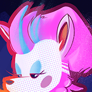
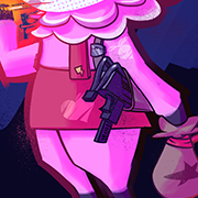
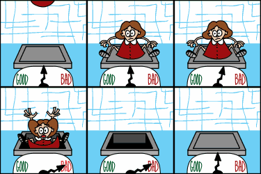
I recently yelled at a guy on the internet and was showered with gifts afterwards - among them an offer for a very significant amount of free advertising for my webcomic. However, besides a simple TF2 weapon I've never designed an ad before. Help me, Megathread! I'm aiming for something simple and appealing, but I'm not sure how the composition is supposed to work in a 728x90 banner.                  Any of these on the right track?
|
|
|


