|
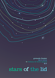
spider wisdom posted:Here's a poster I've been working on for the past few days. I started out with a few abstract sketches and felt this idea was strongest, even though the sketch I picked had a detailed cityscape to contrast the celestial weirdness at the top. I like the colors in the top bit a lot, but there's too many in the text. I'd limit the text colors to maybe two. It's quite nice otherwise, I like the unevenness of the auroras.
|
|
|
|

|
| # ¿ May 18, 2024 04:21 |
|
Fayez Butts posted:That is an excellent way to segue into me showing off a bit of logo design I recently did. (And sorry for resurrecting this thread then leaving, I did read everyone's replies -- thanks!) But basically, the bottles are too flat. I'm going to have an incredibly difficult time not stealing "Ye Old Fart" for my upcoming wine packaging class project
|
|
|
|
Nah dude I wouldn't do that to you, just appreciating the perfect name for a brewery. I should have actually some stuff to be critiqued in this thread soon, been having trouble with some projects.
|
|
|
|
That low-opacity grass is going to get really messy really easily. Try something a little more solid, maybe cutting out bits of the letters in grass-blade shapes, or something to that effect. As it is it's going to be a big problem at reduced size.
|
|
|
|
I would give both ^ shapes rounded bottom corners, rather than just on the top.
|
|
|
|
I've been working on a re-design of my school's athletic logo for (hopefully) a research project in the fall. The first iteration is on the right, and though I like most of it, the mane on the left side looks too short (due to the corner bit and hair streak), but I feel it needs the yellow to balance the logo overall. The fixes are the two on the left, I don't particularly like the small streak in the middle version but I think it needs something to balance. What do you guys think.
|
|
|
|
Yip Yips posted:Of those, the middle one. The way the eye is being sliced off by the mane is bother me, though. There's also some weirdness going on with the jaw-line and how the snout(?) is pointed upwards. I know it's stylized and all but in some ways it doesn't look like a lion. The general shape I kept based off our current mediocre logo, if that explains why it looks a little weird as far as lions go. I wanted to keep it somewhat consistent so there would be a link to the past as it were.  Will work more on this today and keep you all updated. My next goal is to work on an athletic font and I have no idea where to begin with that.
|
|
|
|
Okay so here's an update on that: I took into consideration everything everyone suggested, some things like the mane on the chin I couldn't get to work at all. I'm not too big on the versions with the right gold space removed, I feel like it makes the lion more of a cougar or panther or something. I also changed how the top left corner and mane works, I think it helps the balance some. edit: Okay, weird looking mane versions:  
kidcoelacanth fucked around with this message at 03:58 on Jul 22, 2012 |
|
|
|
Steve McScene posted:What do you guys think to this? I'm not sure you need the AB bit at all, it doesn't translate at all (to me at least) and just sort of seems unnecessary. Just combining the aperture and the wheel seems like it would make a slick enough logo, especially looking at what you've got there already.
|
|
|
|
Yeah I think that works a lot better as a logo, makes it a lot more bold overall. I'd remove the tiny triangle on the bottom (it's a little distracting) and maybe add back the circle in the middle, only this time in full? I'm just spitballing on that last one but it might give it a nice center point to rest the eyes. Don't get me wrong, I generally like initial logos, but within another logo entirely it becomes too much.
|
|
|
|
Quick and dirty as a thought in case you want to try a slightly different approach to this one: And yeah like pipes said brainstorming more things is defintely a good idea, you don't want to fall into the trap of sticking to your first idea (like I do every time  ) )
|
|
|
|
I really like the overall shape and feel of it, but I'm a little confused as to what you're actually showing us. Is it a cover of some sort? It's got too many little details to really be a logo or icon. The note thing itself is really neat though.
|
|
|
|
Well, what is it? Can't really tell you much without knowing what you're trying to portray.
|
|
|
|
Well I'm not sure if it's the part you said you've fixed or not but I think it could definitely benefit from a more solid structure, in that the rounded edges make it seem too free and loose where an anvil meant for design purposes would probably be best represented by something very methodical and grid-like, if that makes sense. I just woke up I don't think my words are at their best right now.
|
|
|
|
I think #4 works best. I don't have a reason why, leave me alone gosh.
|
|
|
|
I would suggest, similar to what everyone else has, trying some ideas that completely break what you've done so far. Different placement (No on top of Future?), using the same font for both words, just other things. Everything you've shown so far has been a variation on Font A, Font B.
|
|
|
|

|
| # ¿ May 18, 2024 04:21 |
|
Two colors is definitely the way to go, whether the green highlights the D or H is really up to which of your names (or initials) you wan to emphasize. You might want to see how it looks if you change the respective name to that color in the wordmark, too.
|
|
|


