


|
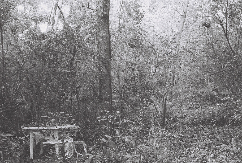
pootiebigwang posted:I like this when looked at from an abstract perspective, but from a landscape perspective it's just too busy to work. What's the subject? The tree? The table? I like the choice of B+w, as it forces the viewer to focus on the shapes and not the colors of your photo. Here are a couple of mine. I don't really know what to do with fog. I really want to accentuate it, but I don't know how. Thoughts goons? 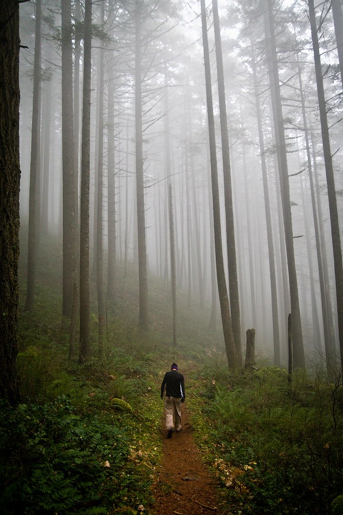 Forest2 WIP by Jenseales, on Flickr 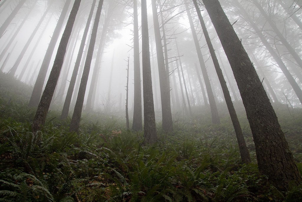 Forest WIP by Jenseales, on Flickr
|
 #
?
Dec 12, 2011 16:19
#
?
Dec 12, 2011 16:19
|
|

|

|
| # ? Apr 25, 2024 23:05 |
|
|
Turd Nelson posted:I like this when looked at from an abstract perspective, but from a landscape perspective it's just too busy to work. What's the subject? The tree? The table? I like the choice of B+w, as it forces the viewer to focus on the shapes and not the colors of your photo. I really enjoy both of these. The first one seems slightly off-level, but it could be my lovely monitor isn't level. The bright, saturated foreground blends nicely with the muted colours and contrast of the fog.
|
|
#
?
Dec 12, 2011 18:25
|
|

|
Turd Nelson posted:
The fog looks fine to me. Maybe bring out the greens a bit more like in your first photo? My only issue is the tree on the right in the foreground. Not sure if it's the natural bend of the tree, but it's really distracting to me. This is me not taking pictures of the Golden Gate Bridge just before sunset. I've been informed that I do not take enough pictures of people during trips. Pictures of people are not my thing.  The reflection in the water is too strong, and I'm not sure how to make it less intense. Thinking of turning this into a B&W.  Snapshot. Feel like I could bring her out more in post. As it stands, she just sort of blends in.
|
|
#
?
Dec 12, 2011 19:29
|
|


|
CarrotFlowers posted:I really enjoy both of these. The first one seems slightly off-level, but it could be my lovely monitor isn't level. The bright, saturated foreground blends nicely with the muted colours and contrast of the fog. I love these as well. I disagree on the levelness of the first one - the trees are crooked. If you look at the man walking (ostensibly the subject?), he's vertical.
|
|
#
?
Dec 12, 2011 20:09
|
|

|
Pope Mobile posted:
It feels like she is held back because the shadow is essentially swallowing her. Here are my three. I am looking for comments mostly on the third one, but I threw in two more just in case.    I had the aperture on the highest setting, I wanted to blur out the most I could out of the back and have it all be her. Don't know what else I could do. Camera is nex-3 with 18-55 lens. Enigma89 fucked around with this message at 19:33 on Dec 13, 2011 |
|
#
?
Dec 13, 2011 19:30
|
|

|
I think you need a lens with a much shallower DOF, like a prime lens. Here is something I took with a 50mm prime, 1.8 II as an example:  Also, think about the rule of thirds when shooting people.
|
|
#
?
Dec 13, 2011 20:29
|
|

|
Pope Mobile posted:
The first one is a cool concept and you've achieved the silhouette effect very well. The main thing that stands out to me is that the sky and water are a rather unattractive, flat smog color. I'd be inclined to play with the color balance a little and come up with something more toward the blue side. And what about brightening the midtones up a bit to give the picture more dimension? I don't agree that the reflection on the water is too strong; I think it looks great filtered through the leaves. Also, watch your horizon. It's a little tilted. The second picture is at a really awkward angle and her posture and expression make her look like she doesn't want her picture taken at all. She's also underexposed because the lighting situation kind of sucks with the sun coming in at a low angle behind her like that, which is probably why you feel like she's just blending in. Try to think about how you can work backlighting to your advantage, e.g. a closer shot exposed for her face with the background blown out. Enigma89 posted:Here are my three. I am looking for comments mostly on the third one, but I threw in two more just in case. #1 has no clear subject and I don't know what you're trying to show me with it. #2 has a much clearer subject, but again, what are you trying to show me? I've seen cell phones, cigarettes, and beer bottles sitting on a table like this before; I want you to show it to me in a fresh way. It's also a bit dark. With #3, what was your focal length? That will have an effect on background blurring as well (you're looking for a longer focal length to blur the background out more). Unfortunately, her hair is melting into the background; I'd be interested to see this in color because I'm not sure the black and white is doing this picture any favors. Also, I know it's a candid, but she's too pretty to be caught at a weird angle like that. There's often a way to set up candids so the composition is more deliberate, but the process is still minimally intrusive.
|
|
#
?
Dec 13, 2011 20:40
|
|

|
Thanks for the responses above. To the last poster, I guess you are saying, I should stand back a bit and zoom in more with my lens and then take the photo?
|
|
#
?
Dec 13, 2011 21:02
|
|
|
Yes. You're on the right track with the wide aperture, now you just need to mess around with your lens and get a feel for how focal length will affect background blurring.
|
|
#
?
Dec 13, 2011 21:14
|
|
|
Kingdom of Sin posted:The first one is a cool concept and you've achieved the silhouette effect very well. The main thing that stands out to me is that the sky and water are a rather unattractive, flat smog color. I'd be inclined to play with the color balance a little and come up with something more toward the blue side. And what about brightening the midtones up a bit to give the picture more dimension? I don't agree that the reflection on the water is too strong; I think it looks great filtered through the leaves. Also, watch your horizon. It's a little tilted. I didn't even notice the horizon until you pointed it out. I'll poke around with the background colors and see what I can come up with. quote:The second picture is at a really awkward angle and her posture and expression make her look like she doesn't want her picture taken at all. She's also underexposed because the lighting situation kind of sucks with the sun coming in at a low angle behind her like that, which is probably why you feel like she's just blending in. Try to think about how you can work backlighting to your advantage, e.g. a closer shot exposed for her face with the background blown out. Yeah, she tells me that I should take more pictures of people but doesn't like me taking candid photos of her (which, of course, that is). There's also the fact that I take multiple shots at once and change stuff, so she never knows whether I'm messing with the settings or taking the shot. Her face and posture completely encapsulate what she says to me quite often. Guess that's why it stands out to me.
|
|
#
?
Dec 14, 2011 00:18
|
|
|
Okay, so I went back and edited my second photo. Here's Before: Forest WIP by Jenseales, on Flickr and after:  Forest WIP 2 by Jenseales, on Flickr Good or bad? Even noticeable?
|
|
#
?
Dec 14, 2011 00:59
|
|
|
I think brightening up the ferns is a step in the right direction, although now the greens are REALLY GREEN. I also feel like you've lost a little of the beautiful, hazy subtlety that the fog has in the first version. I think the lower contrast might be preferable for the trees, and then maybe work independently with the ferns? Both your fog pics are gorgeous, by the way, especially the one with the guy walking along the trail. I wouldn't worry too much about messing with the fog and agree with Pope Mobile that it looks good the way it is.
|
|
#
?
Dec 14, 2011 01:30
|
|
|
Turd Nelson posted:Okay, so I went back and edited my second photo. Here's Before: I miss the detail on the trees that was lost in your recent edit. I also agree that the intensity of the greens detract from the picture a bit.
|
|
#
?
Dec 14, 2011 01:52
|
|

|
Kingdom of Sin posted:
Just to add to this, in layman's terms (I am a layman), the more you zoom in with that lens, the less background blur you will be able to get. The kicker is that the more you zoom in, you will reach a focal point more appropriate for a portrait, but lose the blur you are looking for. Here's a nutcracker! I don't know if I am really happy with either one of these, but I like that at least the nutcracker in the second one looks bored as hell (much like my posting). It is in my house, so I have more opportunities, but which one is off to a better start?  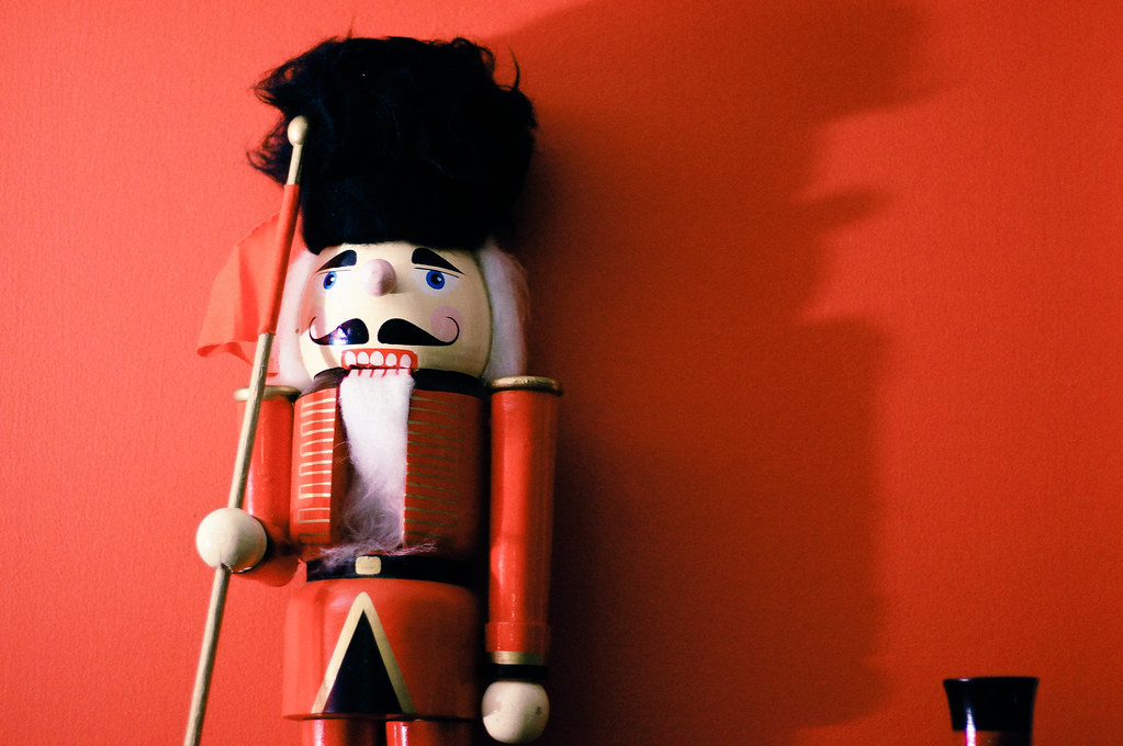 DSC00940 by cadence440, on Flickr Here's picture of a Death Star greenhouse thing that I found. I wanted to do something interesting with it, but feel like it might have come out too dark. Not sure about the composition, though. 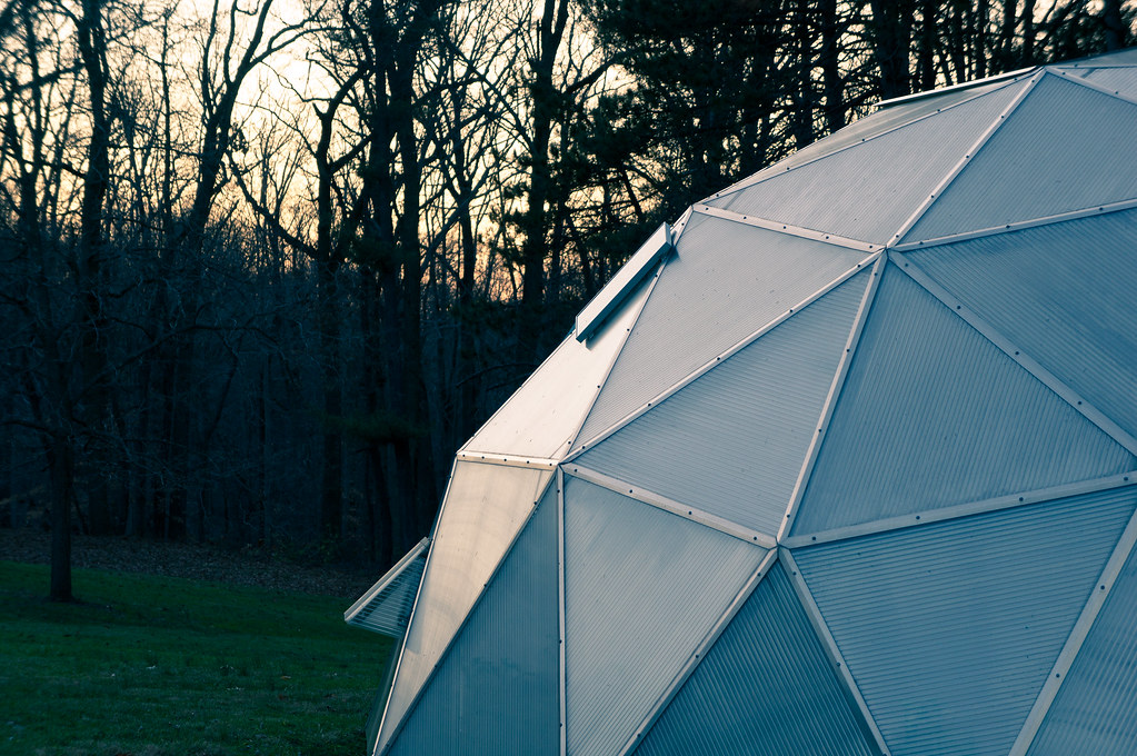 Death Star green house by cadence440, on Flickr This seemed more interesting when shooting it and now seems to have come off cliched. I'm wondering if the post processing works, and if I am being too hard on myself, because it took a couple days to find a crop that I could live with. 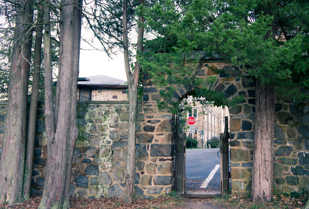 STOP by cadence440, on Flickr
|
|
#
?
Dec 14, 2011 03:02
|
|
|
Turd Nelson posted:Good or bad? Even noticeable? I would keep the trees from version 2 and combined the foreground from before and after. I would maybe play with some masks so the few trees in the foreground still have the look you had in the second photo, then softly, and gradually mask off areas, so those changes don't take effect in the background. That may help preserve the better fog "feel" from the first photo, or maybe accentuate it.
|
|
#
?
Dec 14, 2011 13:27
|
|
|
Kingdom of Sin posted:I think brightening up the ferns is a step in the right direction, although now the greens are REALLY GREEN. I also feel like you've lost a little of the beautiful, hazy subtlety that the fog has in the first version. I think the lower contrast might be preferable for the trees, and then maybe work independently with the ferns? Both your fog pics are gorgeous, by the way, especially the one with the guy walking along the trail. I wouldn't worry too much about messing with the fog and agree with Pope Mobile that it looks good the way it is. Thank you! Okay, This is probably going to be my last edit of it, as i'm getting frustrated with my lack of photoshop skills. How does this compare to my second revision? old Forest WIP 2 by Jenseales, on Flickr New 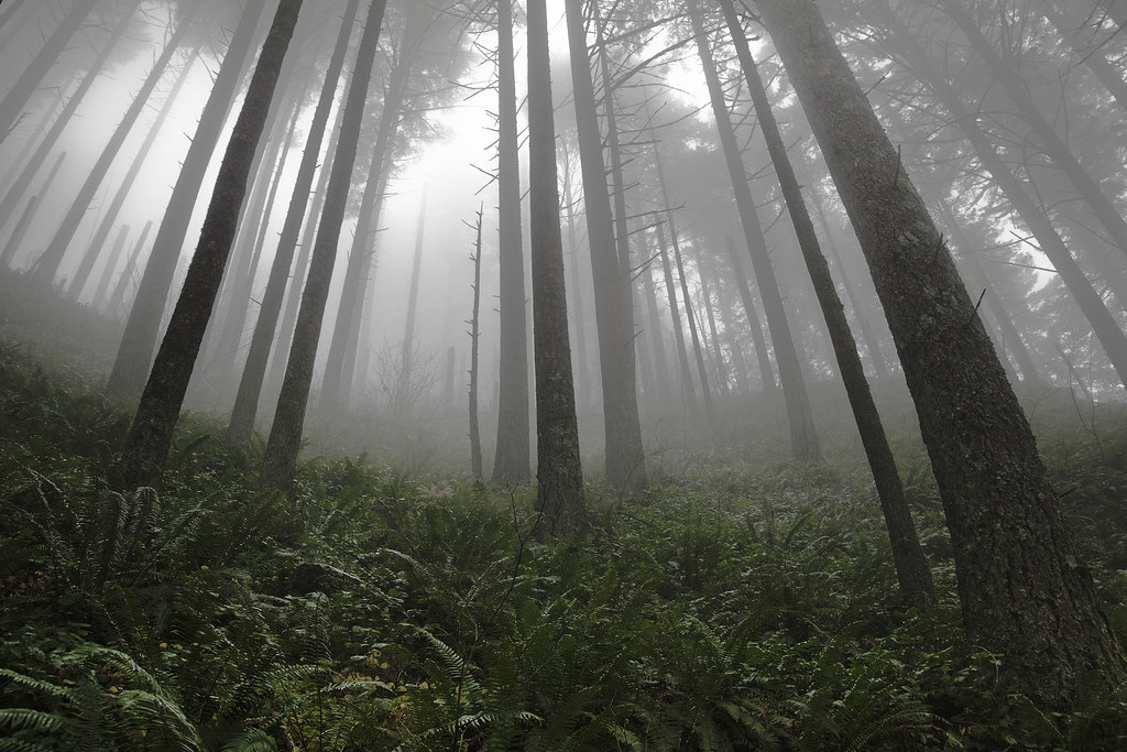 Forest WIP 3 by Jenseales, on Flickr I really appreciate you guys giving me your input, Kingdom, Rio and Ferris Bueller!
|
|
#
?
Dec 15, 2011 02:38
|
|
|
I think you hit it spot on with the new one. Nice subtle improvements over the first one you had posted. It pops, and keeps that nice fog feeling.
|
|
#
?
Dec 15, 2011 03:04
|
|
|
Have to agree there, that looks great. Everything you did relates well to the overall tone, and you have kept clarity in the right places while still refining the contrast.
|
|
#
?
Dec 15, 2011 03:41
|
|
|
Turd Nelson posted:
The first seems to go from grayscale to color in a completely natural and pleasing way. And it doesn't matter that it's crooked, in fact I like that too. It fits the pose of the person. I love it. The second one reminds me of times I've shot wide-angle to distract from the fact that my subject matter was boring. Pope Mobile posted:
The pose looks both deliberate on her part and meaningless. No emotion communicated through it. And when a photo's high-contrast, it demands attention. This photo demands the viewer pays attention, but doesn't reward it. There's no theme I can find, and it's not even meaninglessly pretty. There's no overall shape to admire in the composition. the posted:I think you need a lens with a much shallower DOF, like a prime lens. You're really fuckin' close here. The expression is beautiful, but you're at the wrong angle to catch it. That would be fine if there were something out-of-focus, but discernibly pretty on the right half. But instead you've got some empty space and a blob. Also, her face doesn't stand out from the background since they're close to the same color and tone.  This is a film retake of a digital shot I took forever ago. Bronica medium format, 200mm lens, expired 200iso slide film. lovely fuckin' scanner.
|
|
#
?
Dec 15, 2011 08:15
|
|

|
Turd Nelson posted:Thank you!
|
|
#
?
Dec 16, 2011 12:06
|
|
|
Edit: Woops, due to a terrible mixup I commented on photos from the first page, instead of the last one. I'll post other criticisms in a minute!Beaver Fever posted:I took several shots of this dog on the porch, this one I ended up liking the best. The theme here is definitely interesting (got the whole sad dog waiting thing going on), but the lines in the picture are a bit distracting for me. I think if you would have positioned yourself a bit more to the left, the lines of the door, the fence and the floor woud have aligned more with the borders of the photo. But I'm not sure though, maybe I only feel like that because the focus is on the line in the floor. Which brings me to my second criticism: I think you should have focussed more on the dog's face.. rio posted:This picture, there is something not right. The composition does not seem how I had imagined it and I feel like I missed something that could have made it a good shot. Or I may be too self critical and not trusting myself. I would love any advice as to what I missed or what could have been done to make something like this a good picture, either in shooting or in post. I disagree with Retemnav that the triangles look slightly off. I don't think you could have made them more symmetric. I think it is because the shape of the stones is so irregular, and their layout so random, it plays a trick on the eye and the whole picture seems off. I don't know what you could have done about it (the picture doesn't really do anything for me), but I do think that it could have been sharper. Especially the grass and the leaves on it. ========= My turn! I rarely take pictures nowadays, but I'm temporarily relocated to the French Riviera for a few months (for work) and there is plenty of interesting sights around! 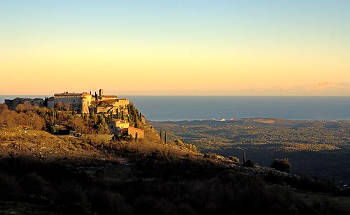 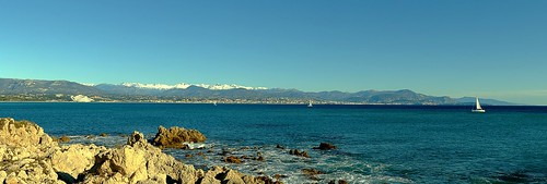 For this one I am especially interested in how I should crop it, because I think it is too big (it is a huge stitched panorama but it doesn't show with the flickr resolution). I want to bring out the snow on the mountains. 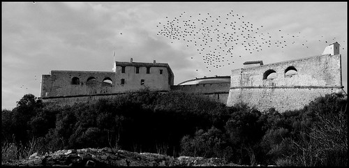 Is it obvious I clone stamped 90% of the crows? 
Touchdown Pope! fucked around with this message at 21:43 on Dec 17, 2011 |
|
#
?
Dec 17, 2011 21:39
|
|


|
rio posted:Just to add to this, in layman's terms (I am a layman), the more you zoom in with that lens, the less background blur you will be able to get. The kicker is that the more you zoom in, you will reach a focal point more appropriate for a portrait, but lose the blur you are looking for. That's the inverse of what he was saying? I think if you have such a lens, call NASA because they will definitely be interested! ") rio posted:Here's a nutcracker! I don't know if I am really happy with either one of these, but I like that at least the nutcracker in the second one looks bored as hell (much like my posting). It is in my house, so I have more opportunities, but which one is off to a better start? I like the first one better: more interesting viewpoint, and the flashy red backdrop gives it an nice artificial toy appearance. You are shooting in a controlled environment (your house) so I do think you should get rid of the blow-outs in his face. As for the second one: it has the same potential, but the thing in the bottom right is distracting. I also think you should get rid of the shadow and replace it with a flashy backdrop like in the first photo. It's not a realistic subject, so you should go wild with the saturation IMO rio posted:Here's picture of a Death Star greenhouse thing that I found. I wanted to do something interesting with it, but feel like it might have come out too dark. Not sure about the composition, though. rio posted:This seemed more interesting when shooting it and now seems to have come off cliched. I'm wondering if the post processing works, and if I am being too hard on myself, because it took a couple days to find a crop that I could live with. Colours are good, but I think the stop sign is a bit tacky. I also don't really know what it means in this context.
|
|
#
?
Dec 17, 2011 22:01
|
|
|
Thanks a lot for the comments and advice - it definitely gives me some stuff to think about, and some new things to try. The Stop sign wasn't even something I had really noticed which shooting, so it was kind of unfortunate that it came out looking like the subject. After realizing that, I cropped it to make it into a proper subject, but I think what you are seeing is that there is no real sense behind it. About the lens, I might have just not said what I was trying to say clearly. He is looking for a defocused background on a portrait. 18mm for a portrait is not really that flattering usually, but will give him the largest aperture on that lens, so all I was saying is that he would either have to sacrifice the blur or a portrait-appropriate focal distance when using that kit 18-55. As for your shots: 1) I love the colors, and the picture it quite majestic. I don't know if this is a bad or good thing, but there is so much going on contrary to the shapes set via composition and the smooth sky. I would almost like some small sections of that picture on their own, just to be able to take in something more meaningful rather than have my eye jumping all over the place (might just be my inexperience and sometimes ADD style attention). At the same time, I love picture that I can just look at for a while, and this definitely fits that bill and keeps me interested. 2)I like this one too - those colors are great (again). Color-wise a nice contrast to the first. I don't have anything critical here to say. Very pretty landscape. 3) I think this one is my least favorite. The birds looked unnatural, and then after reading the thing about the cloning, I understood why. A lot of them look like little fighter jets flying in formation. I think it is noticeable enough that it is hard to look at the rest of the picture objectively.
|
|
#
?
Dec 18, 2011 05:34
|
|
|
rio posted:About the lens, I might have just not said what I was trying to say clearly. He is looking for a defocused background on a portrait. 18mm for a portrait is not really that flattering usually, but will give him the largest aperture on that lens, so all I was saying is that he would either have to sacrifice the blur or a portrait-appropriate focal distance when using that kit 18-55.  DSC_0288-2.jpg by Krakkles, on Flickr With low-end lenses, focal length is the way to get the blurry background. See: Canon S95. I don't know the specs for sure, but I can almost guarantee you're not going to get an aperture low enough on that kit sony lens to get that effect - but you will be able to get it with the length.
|
|
#
?
Dec 18, 2011 20:33
|
|
|
Krakkles posted:But you're missing that focal length will also give you a blurred background. Extreme example, but here's f/4.8 @ 125mm: That's great info - thanks. I looked up a couple other resources via google, and took out an old and moldy 70-200 to try some things and definitely see what you mean. I had only been using that kit lens and primes, so I had clearly missed part of the equation.
|
|
#
?
Dec 19, 2011 07:25
|
|
|
Touchdown Pope! posted:
quote:quote:
quote:
Here are a few of mine, all feedback gratefully received for these or others in my stream! 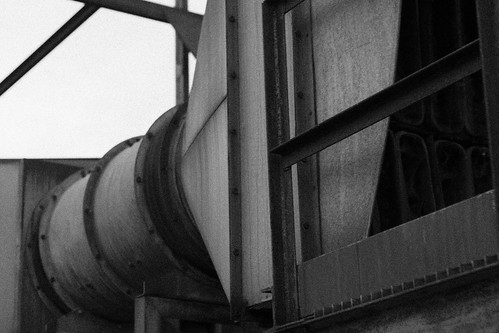 IMG_3002 by waaarg, on Flickr 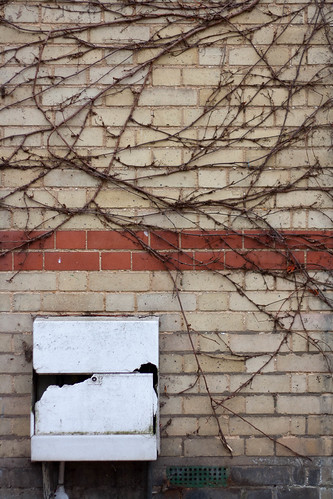 IMG_2961 by waaarg, on Flickr 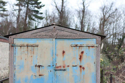 IMG_2959 by waaarg, on Flickr
|
|
#
?
Dec 20, 2011 20:51
|
|


|
Waarg posted:First off, I think all of your pictures are awesome, really striking! Also great to see someone getting such good results from the 1000D! I will try to find something to criticise them for. I am a beginner so take my feedback with a grain of salt. Thanks for the feedback. The pictures mostly come out pretty crappy out of the 1000D, but post processing goes a long way to fix that. Waarg posted:
The first one would be my favorite, because it has a theme going on (abstract, industrial). I would advise a simple contrast increase to enhance those effects and make it more gritty. For the same reason I like this one on your stream: http://www.flickr.com/photos/t_ogden/6544525689/in/photostream That is also the weakness of your second picture: it lacks a theme. I don't really know what it 'means'. On the plus side, it is exposed very well. It would also benefit a lot from some quick and easy postprocessing (contrast, levels, ...) You should experiment more with that. To illustrate I did some of the basic enhancements that I do to my pictures to one of yours: http://i41.tinypic.com/1zz6lpd.jpg I also don't really know what to make of the third one. I think the subject is the rust against the blue door, but I think the other picture of the same door on your stream does a better job with that. Again, some postprocessing is definitely in order.
|
|
#
?
Dec 20, 2011 22:33
|
|
|
Touchdown Pope! posted:quote:
Here's two of mine (the first being a crosspost from SAD):  Bay by Victor's adorable world of pixels (Interesting note, the above picture is taken at around 1pm. God bless Danish winter sun, barely rising above the horizon.)  Unjoy by Victor's adorable world of pixels I really like this photo, though I've no idea what's happening with the top of his head there.
|
|
#
?
Dec 25, 2011 13:33
|
|
|
quote:I really like this photo, though I've no idea what's happening with the top of his head there. Errant light on the lens, maybe? I probably wouldn't have noticed if you didn't say anything - great photo, I love it. Exodos fucked around with this message at 02:03 on Dec 26, 2011 |
|
#
?
Dec 26, 2011 01:59
|
|

|
Waarg posted:Here are a few of mine, all feedback gratefully received for these or others in my stream! The first one doesn't do anything for me. It's not contrasty enough to be abstract, and the lines and shapes don't really line up in such a way to be pleasing or interesting to the eye. A contrast adjustment might help, but I would just try again. Think about what you are trying to achieve with the picture, and then actively frame your shot with that in mind. The second one is my favourite because the rectangles and squares of the bricks, the white thing, the little drain at the bottom all kind of match each other, and you have the harsh lines of the vine to break it up. Try correcting the perspective though, it looks slightly off. The third one again, I don't really get. The building is cut off in a weird place, the other building peaking in on the left is distracting, and the contrast/colours are kind of bland. I think you've got something in mind that you want to get out, but keep practicing and trying these shots and you'll learn to capture what it is you want the viewer to see. Try to keep in mind that we are not there, and all we can see is what you show us, so any of the environmental stuff around that may have affected your decision to take the picture doesn't affect us, so you have to show that somehow in your photo. I posted these in SAD, but they aren't snapshots. This is the first time I've tried something really different from what I usually do, which is very friendly, smiley, "nice" portraits.  IMG_2455 by Breanne Unger, on Flickr  IMG_2464 by Breanne Unger, on Flickr
|
|
#
?
Dec 29, 2011 02:26
|
|
|
CarrotFlowers posted:I posted these in SAD, but they aren't snapshots. This is the first time I've tried something really different from what I usually do, which is very friendly, smiley, "nice" portraits. I'm gonna cross-post 2 of mine from SAD, as they weren't intended as snapshots either, and I may as well put my money where my mouth is with a little bit of self critique thrown in 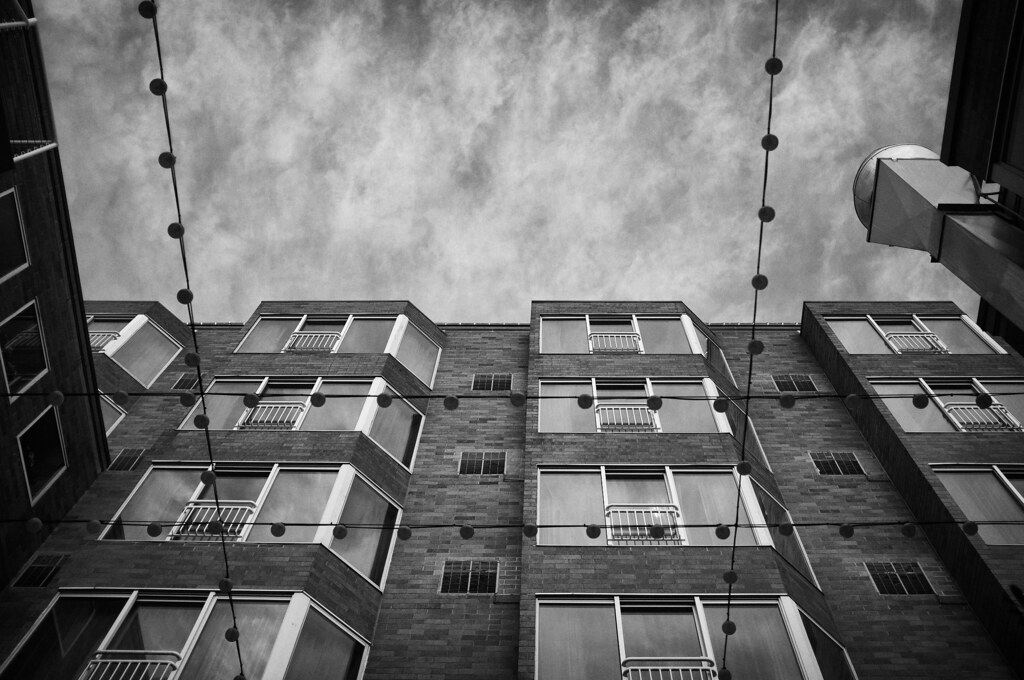 sky and lights by Trip Sixes, on Flickr 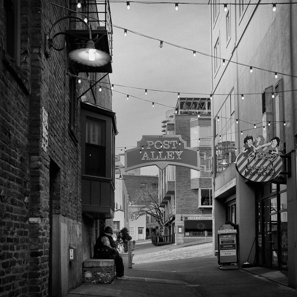 alley by Trip Sixes, on Flickr I really like both of these images, but I will say that I wish the sky in my second shot was not just a slab of uninteresting gray. It took a bit to tame the verticals in that one, and I know they're not perfect, but I went for the best compromise I could.
|
|
#
?
Dec 29, 2011 03:50
|
|
|
CarrotFlowers posted:
The actual tone of these I don't really like, kind of reminds me of cheap film (this is just my personal preference). The poses are kind of awkward, but not awkward enough to be intentional. It feels like you had a good idea going in but didn't flesh out exactly what you wanted so you experimented around hoping you'd hit it accidentally. The photos where she is less of a focus, I feel, do a better job of conveying "lost girl in the woods" type of thing. The clothing is also quite awkward, but again, not in a deliberate way. Basically for me it comes down to, if it's going to be about the girl, the clothes, expression/body language becomes that much more important and it's not coming across. If it's about the scene, and she's a player in that scene, the photos where she is not as large of an element in the photo have a much better feel. The composition is also much stronger in those photos.
|
|
#
?
Dec 29, 2011 10:45
|
|


|
krackmonkey posted:
I really like the second one, though I would have taken a couple more at night-time (not a big deal, you can't stand there all day) and in color. Also maybe one after the person had left.  IMG_1396 by DAMNNIGERIAN, on Flickr I think it'd be better if I waited until it was even darker. Was in a rush, and I didn't notice at the time that it was kind of tilted.
|
|
#
?
Dec 29, 2011 11:16
|
|
|
drat NIGGA posted:I really like the second one, though I would have taken a couple more at night-time (not a big deal, you can't stand there all day) and in color. Also maybe one after the person had left. This picture is really boring, kind of like you couldn't even bother to fix the tilt after the fact. The business of left hand side disrupts the vanishing point effect, and the colors of the lights at night are generally awful. I don't know what you were trying to go for, or why you would want it darker. In general, it's just sort of messy and pointless. I'm sure you can put more thought into it.
|
|
#
?
Dec 29, 2011 11:37
|
|
|
krackmonkey posted:I think you nailed it with the composition and posing this time, getting around the complicated comfortable footwear issue that your previous attempts had. I even like the post-processing and the muted colors. My only real gripe is that your model doesn't have an expression that does either shot the justice they deserve. If she looked a little more mysterious or a little more frightened, it would have closed the circle on the images as a whole and really sold them as evocative. I think you get closer each time, so I really hope you keep experimenting like this. Thanks. We struggled a bit with the expressions. My model is pretty self conscious, so she was holding back a lot and needed really really explicit directions which I wasn't really able to provide in such a short time. Something I need to work on, and something I've always struggled with. nonanone posted:The actual tone of these I don't really like, kind of reminds me of cheap film (this is just my personal preference). The poses are kind of awkward, but not awkward enough to be intentional. It feels like you had a good idea going in but didn't flesh out exactly what you wanted so you experimented around hoping you'd hit it accidentally. The photos where she is less of a focus, I feel, do a better job of conveying "lost girl in the woods" type of thing. The clothing is also quite awkward, but again, not in a deliberate way. Basically for me it comes down to, if it's going to be about the girl, the clothes, expression/body language becomes that much more important and it's not coming across. If it's about the scene, and she's a player in that scene, the photos where she is not as large of an element in the photo have a much better feel. The composition is also much stronger in those photos. It's pretty amazing how all of your assumptions about these photos are pretty much bang on. I had an idea of what I wanted, but wasn't able to scope out the scene beforehand, and I had about 5 minutes while she ran back to the truck to get changed to come up with something that I thought would work. I have a few where she takes up less space in the frame - I might try those and maybe I can get back some of that lost in the woods feeling. The clothing again, spot on: I didn't bring anything out with me from home, and I was reduced to digging through my mom's old clothes to find something that sort of fit what I wanted. I wanted something really lacy, flowy, muted colours, and this was the best I could find. The posing was something I struggled with, and something I always struggle with. I was trying to show her what I wanted, and she was almost there, but like I said, she's pretty self conscious and I think she felt really weird going all the way and really committing. Not trying to shift blame, as I definitely need to direct more, but I think it'll be easier with a model who is more theatrical and needs less direction. Also I need to plan out more thoroughly beforehand, as I was rushed because of the cold again, and I felt a little scrambled. She gets mighty cranky and I didn't want to piss her off :P I really appreciate the feedback. I'm going to take this back with me and pick up some new clothes and try some new concepts with a few different models when I get back to the city. The comments on the processing are also welcome - The cheap, harsh look was what I wanted, but not sure if it really fits the scene now. Depending on how bored I get over the next few days I might redo it completely differently and see where that gets me. Post is something I definitely still struggle with, especially when it's quite heavy handed.
|
|
#
?
Dec 29, 2011 19:08
|
|
|
Hopefully I'm not going overboard by providing a small album of photos instead of the maximum of 3, but I'm looking for an overall critique of my "style/intent" for lack of a better way of putting it. I've not really done any photography for over 2 years now so I'm very, very rusty. http://imgur.com/a/OVl0A The first few were shutter speed tests but were left in for the sake of completion. Overall I was aiming to try and obtain natural shots of human reactions to the event, no forced or fake smiles, no posing, etc. Just the true emotions and actions of those there. The only lens I had that was capable of taking shots in a low light level was a EF 50 mm f/1.8 II Lens which kind of has a fixed range for what I would consider a well structured shot. On top of that, the event was busy and the crowd was constantly moving which, in combination with the lens limitations, made it quite hard to get optimum shooting positions. Some, I feel, did come out OK (I particularly like the ones where you can see the details of the flames) but ultimately I think I knew what I wanted but lacked the tools or skill to pull it off properly. Again, I hope I'm not breaking the rules by posting the album but it might provide a better indication of bad habits I carry through shots, etc.
|
|
#
?
Jan 2, 2012 18:49
|
|

|
Kin posted:Hopefully I'm not going overboard by providing a small album of photos instead of the maximum of 3, but I'm looking for an overall critique of my "style/intent" for lack of a better way of putting it. I've not really done any photography for over 2 years now so I'm very, very rusty. I think if you want people to look at your work as a whole it would be better if you posted a new thread dedicated to that. The other thing is it is better for you to select a reasonable number of shots that you think are best/ones you want opinions on. If you just provide a link to a gallery to a large number of photos you are making it harder for people to look at your work or tell what you are going for. I think one of the harder parts of doing a project or series is actually making the selection of photos since this can greatly change how the project is presented etc.
|
|
#
?
Jan 2, 2012 19:31
|
|

|
Dread Head posted:I think if you want people to look at your work as a whole it would be better if you posted a new thread dedicated to that. The other thing is it is better for you to select a reasonable number of shots that you think are best/ones you want opinions on. If you just provide a link to a gallery to a large number of photos you are making it harder for people to look at your work or tell what you are going for. I think one of the harder parts of doing a project or series is actually making the selection of photos since this can greatly change how the project is presented etc. Also, learning to evaluate and pare down your own work is an important skill and will eventually help you when making a portfolio. Here's a new project: You have 48 pictures there. Pick the 10 best and post a thread about them, like Dread Head said. Tell us what you like about them and how they represent your style or what your intent was.
|
|
#
?
Jan 2, 2012 20:51
|
|

|
King Hotpants posted:Here's a new project: You have 48 pictures there. Pick the 10 best and post a thread about them, like Dread Head said. Tell us what you like about them and how they represent your style or what your intent was. Cool, thanks for the direction guys. I'll start picking out 10 of them now.
|
|
#
?
Jan 2, 2012 21:38
|
|
|

|
| # ? Apr 25, 2024 23:05 |
|
|
I had a quick look at them, and most of them are pretty boring to an outsider. There are many snapshots that does not tell a story, so I think you should work a bit on composition and/or the point of each photo. Also the white balance is pretty blue on some of them.
|
|
#
?
Jan 3, 2012 12:29
|
|