


|
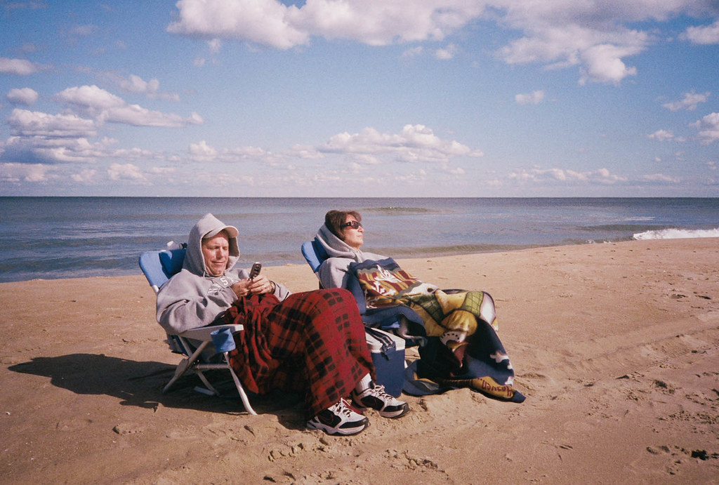
AIIAZNSK8ER posted:Would like some crit on the following: This is the kind of thing that, for me, is really fun to look at. I like the film look, and I think that the magenta cast gives it character rather than being something that needs to be fixed. There might be some other options in terms of color, but it certainly does not beg for correcting (to me). I love that the woman looks like she is trying to find a good time, and the guy is so into his phone and obviously he has found something to temporarily entertain him. Being back to the ocean, it all just really falls together. Gazmachine posted:I think you were too hard on yourself on the first two of the three photos you posted. Just wanted to say that I liked them - and even if the 2nd was a bit cliche, it was well executed and looked good. This one, though, I didn't like. I was trying to identify what it was...I think it is that you have a lot of strong lines, and then that one gradual shadow running across the wall on the right. To me, if that were also a strong line like the others in this photo, it really would have been cohesive and just worked. The colors are nice, though. -- I tried to post these last week, but my computer crashed and then the forums were down all night. So, here we go again. These were taken new year's day at Ikea. I would greatly appreciate any critiques, comments, advice, or opinions, as I am trying to learn through shooting and reading and I trust the Dorkroom and have learned a lot here. 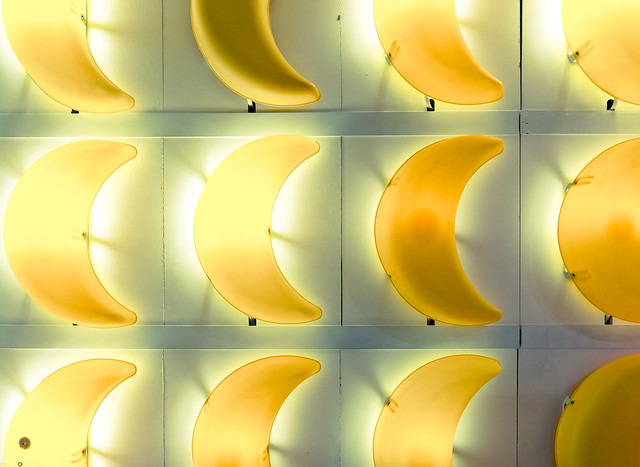 crescent pattern by cadence440, on Flickr 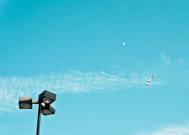 take me away by cadence440, on Flickr  no natural predator by cadence440, on Flickr
|
 #
?
Jan 13, 2012 07:19
#
?
Jan 13, 2012 07:19
|
|


|

|
| # ? Apr 20, 2024 11:51 |
|
|
AIIAZNSK8ER posted:
I like the shot - it could be the cover of a an album (vinyl, not cd). From an amateur's point of view, I think it lacks some vertical interest, although that may be in my minds eye I cannot un-see a bus stop sign behind the pair. I also think the guy's shoes ruin the look a bit. I don't know if it's a staged shot or not, so there wasn't much that could be done if it wasn't a staged shot. rio posted:
I really like the first two - not sure the last one does anything for me. The banana lights are framed very well - good choice to cut the bottom and top rows in the middle. Love the colours of the second one and the simple objects in it draw the eye from the lights to the bird and then the moon - it's definitely my fav of the three. Maaaaaybe the pole could be straighter in the frame, although I only just noticed it after looking at it for a while. I can see what you were trying to do with the light bugs but it's not very compelling to my eye. truncated aardvar fucked around with this message at 08:33 on Jan 13, 2012 |
|
#
?
Jan 13, 2012 08:22
|
|
|
I've been away from this thread for a while, but I will be happy to share my thoughts on others photos and any ideas I have for them. rio posted:I tried to post these last week, but my computer crashed and then the forums were down all night. So, here we go again. These were taken new year's day at Ikea. I would greatly appreciate any critiques, comments, advice, or opinions, as I am trying to learn through shooting and reading and I trust the Dorkroom and have learned a lot here. The first two are great. They really nail the simple, minimal, vibrant style that works really well, and you did a good job with the processing and colors. I think the third one doesn't hold up nearly as well though. The composition is off, especially compared to the first two, maybe singled out a single color instead of capturing them all. If you could have gotten a tight shot of the red area then these three shots would fit nicely as a whole in a cute way. The first could probably use a slight straightening though, it looks slightly crooked. TMZ posted:
I just started a 365 project myself, with the aim of staying active, previsualization, pushing my comfort zone, and refining my style. I'm keeping a notebook with sketches for any ideas I have, then I refine them and shoot them for each days photo. I tend to lean towards what I call a cinematic style, and a lot of shots in this project will be made towards developing that further. I want my shots to look like a singular frame from a movie basically. I don't know how better to explain that but I hope it comes through in the works (where appropriate). Day 1  Day 1 by David Childers, on Flickr Day 2 This was a drastically different style from my typical work, and I feel like it shows. I was going for an editorial look, like Wired or ESPN magazines. The arms are blown out because the lights were too close to me and the handlebars gave off a nasty shadow on my legs, but overall I learned a lot from trying out this kind of shot, but I'm eager to hear any tips or ideas to improve it.  Day 2 by David Childers, on Flickr Day 3  Day 3 by David Childers, on Flickr Bottom Liner fucked around with this message at 08:47 on Jan 13, 2012 |
|
#
?
Jan 13, 2012 08:41
|
|

|
Bottom Liner posted:I've been away from this thread for a while, but I will be happy to share my thoughts on others photos and any ideas I have for them. I think as your photos progress they get better. I think the first one is the weakest, there are a number of distracting elements and it looks like the drummer (you?) is floating as you can see his legs. The idea seems ok but I dont think shooting at night really working in this case. The bike image I think you already mentioned most of the stuff. I think if you played with the lighting some more you could get a cool shot. I really like the bright bold colours and how they compliment each other. Day 3 is diffidently the strongest in my mind. I love the floating particles, the one thing that bothers me is the magenta cast on the side of the face. I am not sure if this was something intentional and I am not sure it is bad I am just not sure if I like it. ---- 
|
|
#
?
Jan 13, 2012 08:55
|
|

|
I too found the magenta to be a bit much, and I too loved the shot otherwise. The lighting is very nice - a good realisation of a vision.
|
|
#
?
Jan 13, 2012 10:39
|
|
|
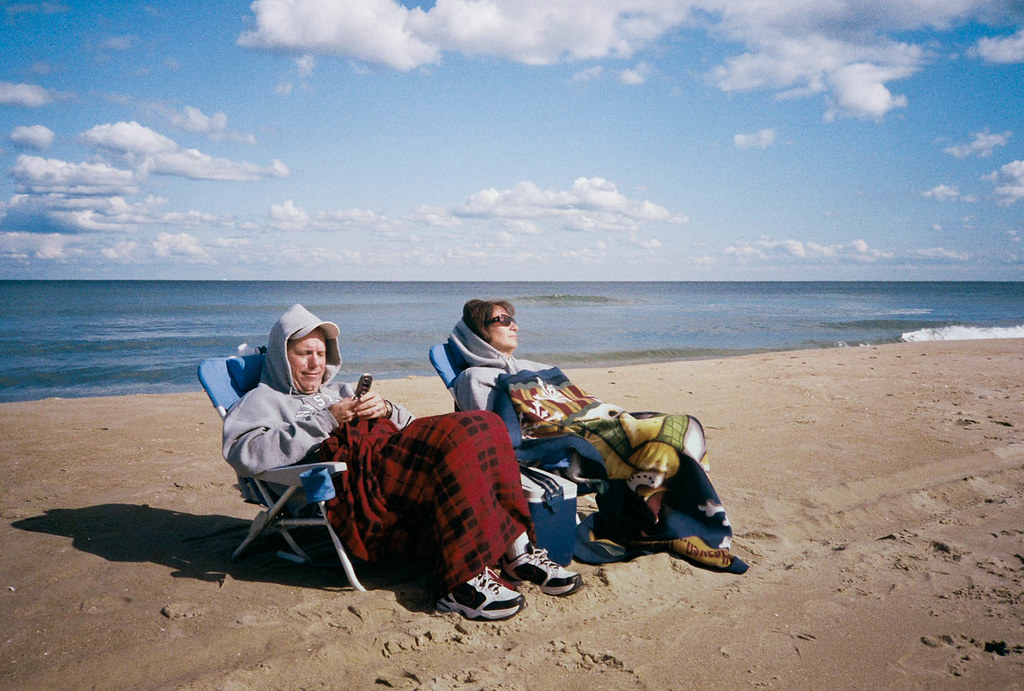 I think this fixes the color issue some have had. I'm not convinced that either version is any stronger than the other. This was not staged, these people were really like this. I think this was in August or September. They were facing away from the ocean for some reason and I saw him on his phone and she was kind of just sleeping. I walked over to them and asked if I could take some photos of them. They didn't care and I took 3 snaps. I liked this one the best because of how they fit between the sky, water, and sand. The other frames ended up intersecting heads with the horizon line that just don't look as clean. Opposite the ocean is the boardwalk and view of all the hotels. I think maybe the were just trying to face the sun? I found it funny to see these people all bundled up at the beach. rio posted:
The first one needs to be more consistent in exposure to show a pattern well, or be really deliberate in any bright spots and contrast. The shapes, lines, and colors are not even at all and don't show me a pattern at all. The second is meh. I've taken tons of street lamps, I think next to squirrels and benches, it could be a Dorkroom favorite. Each element in the photo make a nice idea, but keep trying. The third makes no sense to me, and doesn't seem like a thoughtful photo. What did you like about it? Bottom Liner posted:
Welcome back! I miss seeing your stuff. Good on you to take up a 365 project, I never could. I'm not seeing the cinematic thing you're going for. It's difficult to pinpoint what makes a still frame movie like to me other than it has such a cohesive mood that I can imagine the entire scene the photo was lifted from. The first I think needs more ambient light. The subject is floating torso in darkness banging away at floating drums to me. It just gets too lost in darkness, which doesn't seem deliberate enough because of that yellow patch of vinyl siding above his head. You know what you did wrong in the second shot. His arms are too hot, you framed it too tight, and odd shadows on the legs. The third has a great mood and is interesting to look at, pretty awesome photo for me. Feels awkwardly framed though. It's kind of square but not? Maybe some of that awkwardness comes from me thinking he's a dead body laying on the ground which you've then set right side up by rotating the photo.
|
|
#
?
Jan 13, 2012 15:44
|
|

|
AIIAZNSK8ER posted:
It may have seemed like I didn't like this photo when I first commented on it, but I actually like it a lot. I really feel like the magenta cast added nothing at all to the picture, and now that you removed it in this picure, I absolutely love it. If I had to critique it now, I might say up the contrast just a tiny bit, but that is completely up to the discretion of the artist (you) and it is not a deal breaker at all, it would just be nitpicking at this point.
|
|
#
?
Jan 13, 2012 19:38
|
|

|
Dread Head posted:I'll take a stab at this one. The color is a little too drab for me, and I feel like the image would be stronger if taken on a better day. I like the sense of motion from the waves, but without any context the image sort of falls flat. What about this spot interested you? Crosspost from SAD: 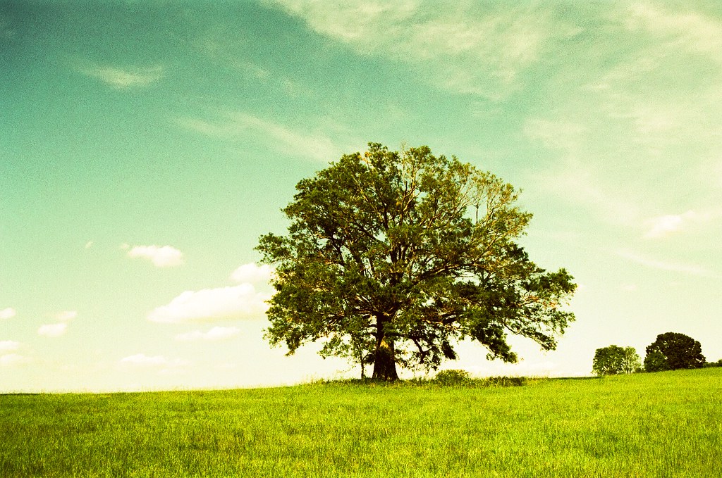
|
|
#
?
Jan 13, 2012 20:28
|
|

|
Dread Head posted:Before I crit this, I want to explain why I'm critting it. First, I would say that, out of the regular posters in the dorkroom, you would be considered the best landscape guy. Second, I personally don't get much out of landscape photography, both taking and viewing, so I am probably good source for a harsher crit. Third, as you are hitting a peak with your landscape, I figure you'd appreciate a harder crit to help you improve on what is already excellent work. Good stuff: From a technical point of view (composition, exposure) this is spot on - what I would expect from your work. The colour of the sea is really soft and beautiful. I'm a fan of a muted palette when done well like this and it feels like you can just sit and stare into this image for a long time. Bad Stuff: The long exposure of rocks in the sea with a moody sky is a very overdone subject, and it's something you personally do a lot. I think you have a marvellous eye for landscapes and it's a shame so many of them that you have posted feel quite samey. If this is the kind of landscape you love, which you clearly do, then that's cool and you do it very well. As someone who doesn't get much out of landscapes, this setup can wear on me quite quickly and I feel like I've seen a million of them in my lifetime. Sorry if that seems aggressive: it's not my intention. I want to set you a challenge, if you choose to accept it: make a landscape shot that excites me, as someone who doesn't get much out of landscape. I think your work is excellent but I think your next step would be to create something that can make someone like me go "wow, I love that. I would buy that". Hope that makes sense and helps and doesn't sound like I'm being horrible! pootiebigwang posted:I'll take a stab at this one. The color is a little too drab for me, and I feel like the image would be stronger if taken on a better day. I like the sense of motion from the waves, but without any context the image sort of falls flat. What about this spot interested you? I would take some of your crit of Dreadhead and apply it to your own image here: what was it about this spot that interested you? I also feel that the post work is a little too sharp and bright - what was your thinking behind processing it this way? Gazmachine fucked around with this message at 22:02 on Jan 13, 2012 |
|
#
?
Jan 13, 2012 21:59
|
|

|
Gazmachine posted:
I didn't mean disrespect to Dreadhead in anyway so I hope my post didn't come off that way ") Landscape photography is incredibly difficult and I am in no way qualified to judge anyone on it. I just went off the first impression as I have not seen much of his/her other shots, and was required to give critique before posting, and noticed his/hers hadn't been mentioned. The comment of the color was more geared towards the sky. The technical aspects are great but that much was obvious (I agree that the water looks great) so I tried not to focus on it. Landscape photography is incredibly difficult and I am in no way qualified to judge anyone on it. I just went off the first impression as I have not seen much of his/her other shots, and was required to give critique before posting, and noticed his/hers hadn't been mentioned. The comment of the color was more geared towards the sky. The technical aspects are great but that much was obvious (I agree that the water looks great) so I tried not to focus on it. As for my shot, I drive by that tree quite a bit on the way to school/to see my girlfriend and friends. It's mostly farmland out there so the tree has always stood out for me and has always looked inviting. I tried to capture that feeling by getting the grass in the foreground leading a pathway up to the tree and show the isolation of the tree. The sky was also pretty good for the day and had a good amount of cloud to blue ratio so I wanted to include that, and with it being iso 50 film I wanted to make sure I had enough light although I might have gone too early in the day. But I do feel like the brightness and warmth of the sun could be inviting especially with the shadows and shade the tree create. As for the processing, it was shot on Velvia 50 film as I knew at that would saturate the colors and bring them out a bit. Unfortunately there's no place in my area that develops E-6 film so I had to get the film developed at the local lab and get it cross processed. I knew this would give an interesting look to the shot but not ruin the film. It is however unpredictable so a good bit of it was out of my control. I do not own any editing software and my negatives are scanned to cds. I apologize as I should have included a concise explanation of what I was going for with the shot in my original post, especially after the critique I gave. TLDR; Tried to make a tree interesting. pootiebigwang fucked around with this message at 00:55 on Jan 14, 2012 |
|
#
?
Jan 13, 2012 23:51
|
|
|
No no, don't get me wrong, that wasn't a "hey well why don't you take a look in the mirror punk before you start critting other dudes" sort of comment: I thought your crit was perfectly fine. No need to apologise. I would say, for me personally, the tree feels too far away to be inviting. In fact, I'm not sure you can show the isolation of something whilst making it inviting at the same time. I don't know. I reckon this tree could look inviting if you walked right over to it and tried a more "intimate" shot, for want of a better word.
|
|
#
?
Jan 14, 2012 02:27
|
|
|
pootiebigwang posted:I'll take a stab at this one. The color is a little too drab for me, and I feel like the image would be stronger if taken on a better day. I like the sense of motion from the waves, but without any context the image sort of falls flat. What about this spot interested you? I like the rocks in the FG, I am not sure what extra context I could have added. Is there something in particular you feel is missing? I know without seeing the location that is kind of a hard question... Gazmachine posted:Before I crit this, I want to explain why I'm critting it. First, I would say that, out of the regular posters in the dorkroom, you would be considered the best landscape guy. Second, I personally don't get much out of landscape photography, both taking and viewing, so I am probably good source for a harsher crit. Third, as you are hitting a peak with your landscape, I figure you'd appreciate a harder crit to help you improve on what is already excellent work. I think I answered this above but I liked the jagged rocks along the shore line with the waves. I would rather people be awful than have useless praise. I have not been shooting as much as I used to because I feel my images are lacking, the big problem is I don't know what they are lacking... I am hoping posting in here someone will jolt something because right now I don't really know what to change or what I am doing wrong but I feel like something is not there. I would much rather get a crit of someone hating on an image because that is usually much more informative than "nice photo I love the light!" or something like that.
|
|
#
?
Jan 14, 2012 03:55
|
|
|
Dread Head posted:I have not been shooting as much as I used to because I feel my images are lacking, the big problem is I don't know what they are lacking... I am hoping posting in here someone will jolt something because right now I don't really know what to change or what I am doing wrong but I feel like something is not there. I would much rather get a crit of someone hating on an image because that is usually much more informative than "nice photo I love the light!" or something like that. I sorta rambled about this in the landscape thread a while ago but I think it might help if you drastically changed your landscape process for a little while. Like use a long telephoto or shoot handheld long exposures or shoot more short/medium distance landscapes or maybe find some human element to incorporate into them. There's not much about the picture you posted to make me pause to look. It's just a rocky sea shore. Almost as if there's no personal touch to it, even if it was technically difficult. There's no vision. Maybe if there was a boat out there and it was processed to make it more odd it would be different? Maybe not though. Experiment for a while. Don't worry about forcing or thinking yourself into a new level of photography. Change it up, take terrible pictures and experiment your way to something else.
|
|
#
?
Jan 14, 2012 05:16
|
|

|
Thanks for the feedback, sorry for the late replies.Santa is strapped posted:How did get access to the roof though? Is there some kind of unlocked hatch you go through? dreggory posted:These are awesome. I haven't seen many film shots from the playa. What year was this? pootiebigwang posted:Fake Edit: didn't realize it was film, nice; grain is unavoidable then but I really like the effect you got out of it. Dread Head posted:
|
|
#
?
Jan 14, 2012 12:06
|
|
|
Dread Head posted:I like the rocks in the FG, I am not sure what extra context I could have added. Is there something in particular you feel is missing? I know without seeing the location that is kind of a hard question... I thought you'd take it the right way, I just wanted to make sure that it didn't come across as dickish. I figured you'd appreciate an aggressive critique but I wanted to make my intentions clear. I think your problem at the moment is you've worked yourself into a corner with regards to your style of shooting. Get out of your comfort zone, I officially ban you from long exposure sea shots with rocks in them. Go somewhere totally new and get shooting. Impress me!
|
|
#
?
Jan 14, 2012 14:02
|
|
|
IsaacNewton posted:Had a photo session with the neighbors grand kids. It was pretty fun, but I'll never have a shoot past 10 am with a kid that age. He was tired from the get go. Working with kids can be hard. The lighting you have is pretty good, there aren't any stray hard shadows messing up anyone's face. That said, I think the light may be a little too soft. There could be more definition in their faces. Right now they look kinda flat. You can see it's just smooth flat skin tone from the top of her nose all the way to her chin and ear. This is also a bit of an awkward point in a kiss to take a photo. They just look a bit silly. Her hair crosses her eye, which bugs me as well. If her head was turned slightly so her face was more towards the camera it would help the photo a lot. 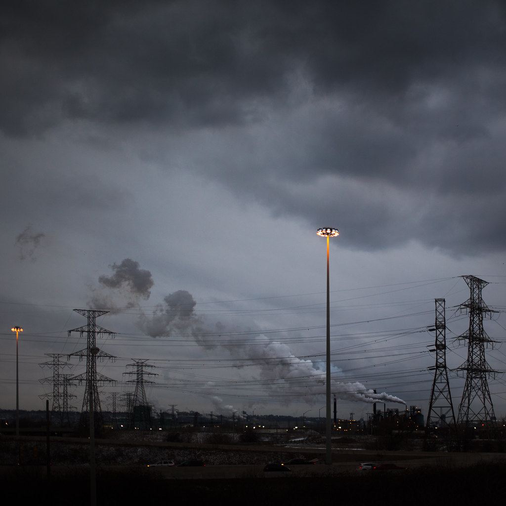 2012-28 by Tom Rintjema, on Flickr
|
|
#
?
Jan 14, 2012 17:42
|
|

|
AIIAZNSK8ER posted:Yeah, that helped a ton. The magenta thing really didn't add too much to it. I not exactly crazy about the noise, but the colors are muted enough to have that vintage 60's look without actually being vintage. It's not what I would consider the greatest technical photograph, but you captured a really fun, silly, and interesting image. Which is really what a lot of good photography is about in the long-term. Even with the cellphone in it, this is a photo that now or 50 years down the line, people will find the same things to like about it and be asking the same questions, which is something very, very difficult to do in our era. TomR posted:
This is a pretty mixed bag, in my opinion. It is extremely busy with the lines going all over the place between the electrical wires, the lamps, the smoke, etc. I feel like I would get more out of it if it was cleaner in that regard. However, the detail in this is stellar. I love the crop you chose, since the smoke and sky really deserve the focus with the amount of clarity you have in this. I also do like the lamps, just not how they're framed. It's a good concept, and the splash of light and color they add really stand out. I feel like maybe the focus should have been either the sky or the lamps, as right now it's a lot of good elements that conflict with each other a bit too much. Finally got out and about to take a fashion/conceptual shoot, which I haven't done well in ages. I definitely need to relearn a bit that I've forgotten. We had fun, though, and I feel like there are enough solid shots in the batch that I'm not sure which ones to be pushing in my online galleries. Also, we had out first experience of being told we couldn't take photos in an LA park without a permit, even without having so much as a tripod with us! Honestly surprised they didn't remotely bring up the clothes instead.  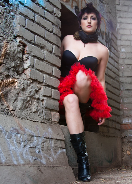 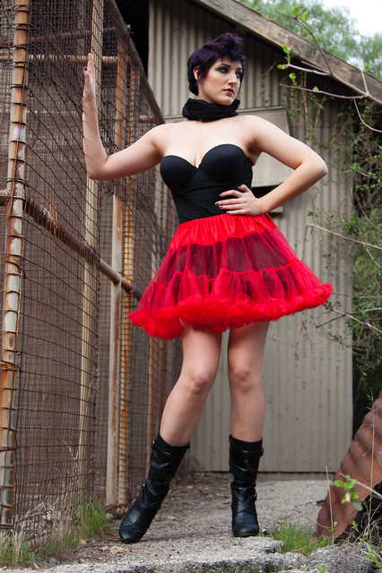 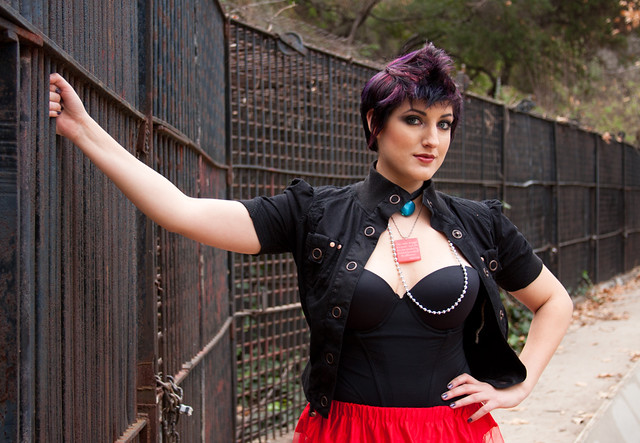
|
|
#
?
Jan 15, 2012 05:39
|
|

|
Axel Serenity posted:It's not what I would consider the greatest technical photograph, Can you expand your thoughts on this point? What about it, technically, would you change?
|
|
#
?
Jan 15, 2012 05:58
|
|

|
CarrotFlowers posted:Can you expand your thoughts on this point? What about it, technically, would you change? Well, the color was fixed, which helped a ton. But, I'm still not entirely crazy about the grain and don't think the photo would suffer any at all if there was less. I'm also a fan of tight crops, at least from the sides with that one white strip of foam on the right, but that's probably a personal choice in the matter. Looking at the data, it looks like this was shot on film? If so, I'm not sure it can be fixed, but I feel like there is something funky going on with the blanket with the reds kind of merging together a bit more than they probably should. It's actually kind of hurting my eyes now that I focus on it a little more. I can't really place my finger on it, and it could be a saturation thing given that the rest of the photo is relatively muted in comparison. Those are my thoughts, anyway. And don't get me wrong; I absolutely love this photograph! But more for the imagery and story it tells than the overall look and feel. I'm not much of a fan of that vintage look in general, but this is a great photograph to use it. I just prefer a little more contrast in photos (some would probably say too much contrast). Axel Serenity fucked around with this message at 06:12 on Jan 15, 2012 |
|
#
?
Jan 15, 2012 06:10
|
|
|
TomR posted:
I like this a lot. It has a really grim and bleak feeling to it. Being towards the dark side of the value range helps with this I think. If I was processing it I'd have tried making the foreground a little bit lighter just to get some more detail in there, or perhaps making it even darker so it's a complete silhouette. Axel Serenity posted:On the first one the crop feels a little tight vertically, I'd like to see more empty space above her head. The second one I probably would have gone a bit higher, there's something off to me about seeing someone from that low an angle. Third one I wouldn't change, composition's great I tried doing the whole low-contrast vintage split-toned thing. How did I do? 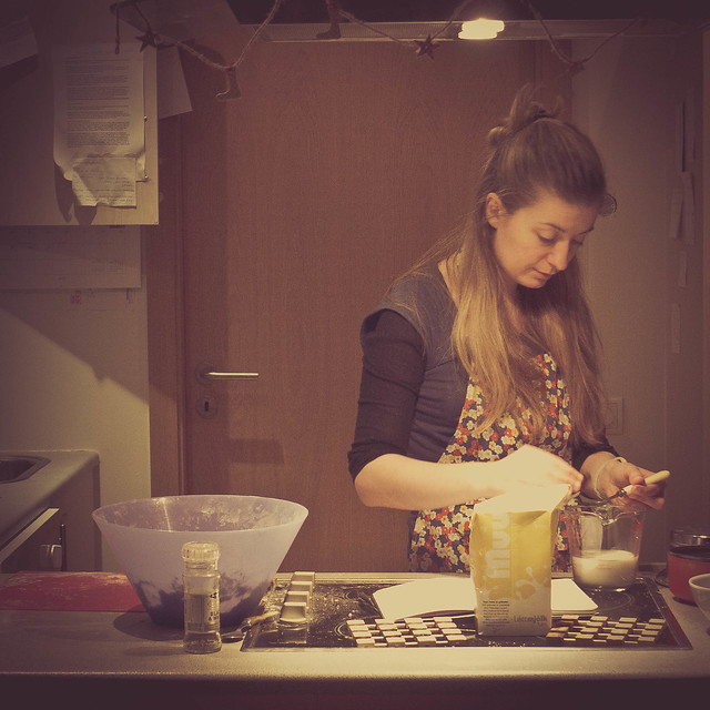 14/366 - Homemade Yoghurt Pizza by fuglsnef, on Flickr
|
|
#
?
Jan 15, 2012 17:50
|
|
|
Axel Serenity posted:That necklace is pretty awkward. Necklaces tend to do that on large busted women when moving around, so just make sure to check that.
|
|
#
?
Jan 15, 2012 18:03
|
|
|
Axel Serenity posted:Well, the color was fixed, which helped a ton. But, I'm still not entirely crazy about the grain and don't think the photo would suffer any at all if there was less. I'm also a fan of tight crops, at least from the sides with that one white strip of foam on the right, but that's probably a personal choice in the matter. Looking at the data, it looks like this was shot on film? If so, I'm not sure it can be fixed, but I feel like there is something funky going on with the blanket with the reds kind of merging together a bit more than they probably should. It's actually kind of hurting my eyes now that I focus on it a little more. I can't really place my finger on it, and it could be a saturation thing given that the rest of the photo is relatively muted in comparison. I'm glad you find it interesting. The grain is just part of the film I used. It's cheap drugstore fuji 400. I shot on an olympus XA, prob just set to f/8. It's not cropped at all, I think I just leveled the horizon a bit. I felt that the subjects are placed in the frame at where I find it comfortable. The blanket is doing some funky stuff, I'll have to look at the original negative and see where the scan lost some detail. It was scanned by Ritz. I'm not sure what you mean by vintage look because it's modern film and a modern camera. If I could change it, I wish I could have them at the same angle, but I would have been able to make the sand horizon level as well, but they way they were turned, it wasn't possible. TomR posted:
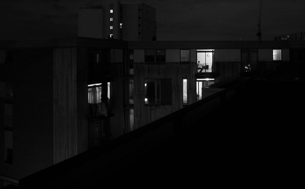
My first thought was that there is too much room a the top. The layers of grey and clouds aren't that strong. I love the scene that you have found, its very industrial with the towers and smoke stack. The single light tower makes a good subject for me, for that reason I think you should crop out the second smaller light on the left side. Any reason you went with a square view? Axel Serenity posted:The first pose doesn't work very well. It removes any height she has and foreshortens her body weirdly. She looks crammed into that space both physically and in the photo by framing it so close to the top of her head and bottom of her feet. The brickwork is shown at a weird angle. The second photo is is OK, but I think you should shoot with a longer lens to compress her in the scene more and shoot either at eye level or just a bit higher. The third photo is the strongest of the set, keep experimenting with poses and looks because the photos you have shown remind me more of a senior portrait session with funky clothes rather than a fashion concept. Your exposure and camera work are pretty solid, keep shooting and show us what's next.
|
|
#
?
Jan 16, 2012 01:22
|
|
|
Thanks for all the comments guys, I appreciate you taking the time to look and discuss my photos. Axel Serenity posted:Overall I think her look is just too busy. Too many things fighting for your eyes. For instance, number 2 would be a much better look without the scarf. The top and skirt look great, and her hair and hair color already have plenty going on up top. This isn't under your control, but would definitely improve things. I don't mind telling models when to ditch an article or accessory, and they usually are happy to oblige, just tell them it's distracting. Also, for fashion these are a little plain. They are fine technically, but fashion tends to do a lot of exciting things with post, lighting, or concept. They work fine as portraits, but they don't really fit into the fashion photography realm (which is a crazy world in itself, I hate a lot of the styles that are big right now in fashion). Also, I try to never shoot from below a female, it is almost never flattering to their figures, especially with a curvy lady. 2012-28 by Tom Rintjema, on Flickr [/quote] I get what you're going for here and like the composition, but I think it would come across better as black and white. I like the lights in the center but the brake lights on the cars are distracting, and B&W would fix that. I think you could show a more dramatic range of tones that way too. Just a thought. David Pratt posted:
Was this cropped a lot? The resolution is suffering almost to the point of looking like an iphone photo. The cross processing is a little heavy, way too much brown/yellow and not enough color to keep it grounded. As for the photo itself, getting level with the counter would be a better angle and add a nice depth to the scene. Here are the next few from my 365 project: Day 4 I wanted a fun shot today, and Evan was the perfect subject for a silly shot like this. She's a great baker, and I wanted to highlight that somehow, and this fits her personality perfectly. The side lighting was really needed to seperate the flour from the wall. I wanted to keep this photo simple and be all about the action.  Day 4 by David Childers, on Flickr Day 5 We were sitting at Barnes and Noble today looking through girly magazines when I had the idea to do a beauty shot. I asked Ericka to be my guinea pig and she happily obliged. This was a great exercise to work on soft light and skin retouching. If you light it well you don't have to do much retouching.  Day 5 by David Childers, on Flickr Day 6 I've been watching a lot of Ken Burns documentaries lately and I wanted to create a photo that reminds me of his work. A big part of his films is the photos showing American lifestyle and culture. My favorites are the 70s era photos, especially in the Jazz series. I love the old paint and the mood the lighting, both in the house and the flash, create here. I wanted an old film look here and I think I got close.  Day 6 by David Childers, on Flickr Bottom Liner fucked around with this message at 09:32 on Jan 16, 2012 |
|
#
?
Jan 16, 2012 09:27
|
|
|
I wanted to thank the three of you for the advice and critique - I've been trying to keep in mind your comments while shooting for the past few days. AIIAZNSK8ER posted:
I liked what my brain was trying to go for in the shot, and it just was not executed well at all. I really needed to hear from others, though, to make sure it wasn't just me being overly self-critical. I'm glad it failed so much, in a way, because it gives me a list of things to avoid in the future. I think thoughtfulness is something I really need to work on. p.s. the slight color alteration you made on that beach shot looks great.
|
|
#
?
Jan 17, 2012 00:54
|
|
|
TomR posted:
Also, it feels like there are 3-4 potential images here. The right third could be this, maybe? Bottom Liner posted:Day 6 My immediate reaction: This feel good. It's 62F and the air smells earthy with a bit of highway. This is a great example of what I brought up earlier -- the long shadow invites me in from a distance, and once I'm zoomed in, the detail tells the story. There's a sense of movement - the camera is panning from left to right and slowly zooming into the guitar. There's stuff going on here and the photo alone doesn't give away everything. Nice. --- What the hell am I doing? Is this any good? Hackneyed clich� bullshit? It's a pretty big departure from what I usually do. Tear it apart. 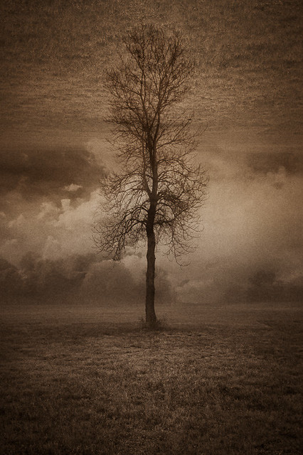 earth tree earth by jwallacephoto, on Flickr 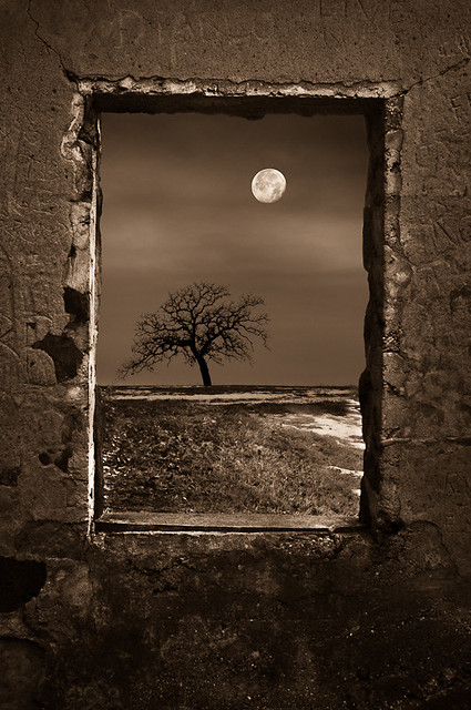 dead of winter by jwallacephoto, on Flickr  path of power by jwallacephoto, on Flickr
|
|
#
?
Jan 17, 2012 01:48
|
|
|
quazi posted:What the hell am I doing? Is this any good? Hackneyed clich� bullshit? It's a pretty big departure from what I usually do. Tear it apart.
|
|
#
?
Jan 17, 2012 01:59
|
|
|
Bottom Liner posted:
You are doing a ridiculous job for a 365 project. Each shot has been varied and you are exploring all kinds of styles and techniques. Please keep it going. The first shot is an almost for me. The highlights are bit too bright. The box of cake mix and baking power are laid out so perfectly, but you've also got a knocked over bottle of spices. I think all of these detract from the subject the moment you've created. If you removed the 'props' I would still know what was going on without being fed too much information. I've found that I try to put props in to give the scene some context, but in this case, the mixer and flour flying through the air is enough. Everything else is too much fluff and distracting, especially because the boxes are bright colors with big bold writing. quazi posted:
I hope you know of Uelsmann because these give off that vibe. The first is my favorite because of it's simplicity. It shows a clear concept to me. The second feels too forced and is clunky. If it didn't have the concrete window border, it might still work. The third does nothing for me, the leading lines you've created don't take me anywhere interesting. I really enjoy the tones and mood you've created though. I look forward to seeing more of these. I think you should take this idea and look for more negative space that you can create and try to keep it simple like the first photo.
|
|
#
?
Jan 17, 2012 04:07
|
|
|
AIIAZNSK8ER posted:The second photo is is OK, but I think you should shoot with a longer lens to compress her in the scene more and shoot either at eye level or just a bit higher. Thanks a ton for the feedback on the photos, guys! I'll definitely keep it in mind for next shoot, especially about the lower angles. I was wondering, AI, if maybe you could expand on the quoted section a little more or maybe link to a post/tutorial on how a longer lens would affect it. I only really own a 28-135mm kit lens that came with my 40D, so my experience with different lengths is pretty limited. I understand that different lengths will affect DoF and a photo in different ways, but I still don't quite understand the technical aspects of how it works or how to keep it in mind for future shoots for when I can eventually afford longer glass. vvv Thanks! That was exactly was I was looking for
Axel Serenity fucked around with this message at 08:03 on Jan 17, 2012 |
|
#
?
Jan 17, 2012 04:13
|
|
|
People tend to look better if you use a longer focal lengths. It's hard for me to explain, but shoot someone full length at the wide end and again full length at the long end and you will see how distant things now appear closer together in the frame. Sometimes this will simplify a background and the subject will look more naturally proportioned. The downside is that you will need to back up a bit farther. These links kind of give you an idea of what I'm trying to say. http://www.mcpactions.com/blog/2010/07/21/the-ideal-focal-length-for-portraiture-a-photographers-experiment/ http://www.ephotozine.com/article/focal-lengths-in-portraits-5687
|
|
#
?
Jan 17, 2012 04:37
|
|
|
AIIAZNSK8ER posted:I hope you know of Uelsmann because these give off that vibe. Not sure about the sepia, but I'll keep playing. Thanks for the feedback!
|
|
#
?
Jan 17, 2012 05:36
|
|
|
quazi posted:There's definitely some Uelsmann going on. Sometimes I think my traditional work is getting a bit stale and needs a kick in the nuts, and what better way to do that than to cannibalize it into new work. My most popular pieces feature a dominant subject in a field, so it makes sense to carry that mindset over. If you want a real kick in the nuts, start photographing people. Your interior commercial stuff is amazing. Put some people into those spaces and find a way to bring more life into the scene.
|
|
#
?
Jan 17, 2012 06:35
|
|
|
AIIAZNSK8ER posted:Put some people into those spaces and find a way to bring more life into the scene. 
|
|
#
?
Jan 17, 2012 15:09
|
|
|
quazi posted:The sky detail is fantastic, but the ground is pretty dark. View it as a thumbnail, shrink it to a postage stamp and see what dominates the view. When it's large, I'm having fun playing with the zig-zag road and the smokestacks. When it's small, the power poles stand there and everything else is muddy. Thanks for all the responses on my photo. I did have a hard time with composition as there is so much going on in that area. I considered going black and white with it, but I just couldn't give up the orange on the light pole. Out of camera the prominent light was in the center of the frame, which I didn't like. I went with square crop because I wanted to contrast the busy lower half of the photo with the much sparser sky. I do like the crop you came up with, but I would reshoot this if I was going to crop that much. earth tree earth is okay, I don't think I like it any better than I would have liked just the tree and earth with that sky behind it. The treatment works well with the subject matter and I like the colour. dead of winter I like. I know it's one of those things that have been done to death, but this was done well so there's nothing wrong with that. The only thing that bugs me is the window frame isn't 100% square, but if it was it would look too fake I think. path of power uses the mirror effect much better, but the first tower is too clear and the second tower is too muted. I would bring out the second one and tone down the first one as it really jumps out right now, like it was suck on after. Everything else has a bit of a dreamy feel to it. The tower is also a bit close to the top of the frame, some space above it would help I think. Maybe if you re-framed the shot so it wasn't sitting right on the horizon, and was instead closer to the foreground, bringing it down some. EDIT: I was messing with the Lightroom 4 BETA and thought I'd post the results. I didn't crop this time, other than to straighten it. 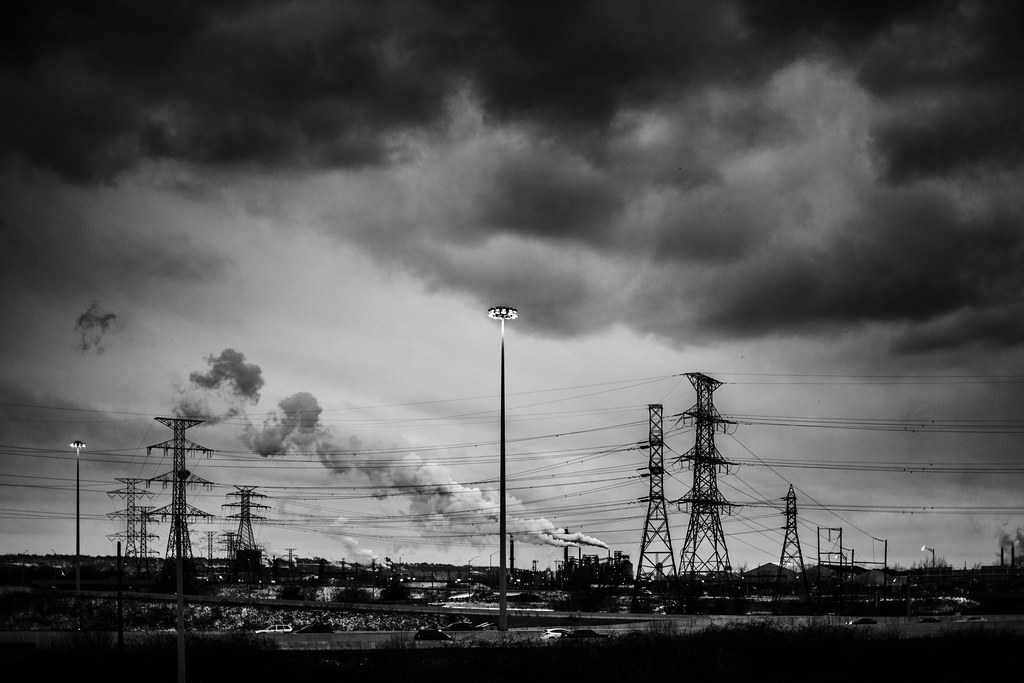 2012-29 by Tom Rintjema, on Flickr TomR fucked around with this message at 00:18 on Jan 18, 2012 |
|
#
?
Jan 17, 2012 23:18
|
|
|
TomR posted:
I like this version better, but I still think there's too much headroom.
|
|
#
?
Jan 19, 2012 01:06
|
|
|
TomR posted:
I know this has been commented on quite a bit, but here's my input: I really enjoyed the yellowness of the lamplight in the color version; it was probably the single most dynamic element in the photo, to my glance. The black-and-white, while causing the clouds to 'pop' a bit more, somehow eliminates a lot of the gloomy feeling of the scene. Also the lamp being dead-center removes some of the dynamism from the scene. I might try cropping the other side off, right behind the back of the silver SUV on the left maybe. Disclaimer: this is my first post in the PAD thread, ever, so what the hell do I know about anything? Let me know what you think of these guys, and don't worry about brutalizing my feelings with harsh criticism; I'm made of stone.  20111116-_DSC3846.jpg by chupacabra spaceboy, on Flickr This is from my photo-a-day project, the first day the little duck pond on my way to work was fully iced over. I was looking to showcase the texture of the ice, but wanted some object in the frame to give some draw to the image.  20111009-DSC_0386.jpg by chupacabra spaceboy, on Flickr An attempt to blur water in broad sunny daylight, this is of a fountain in the park. Should I have cropped off the right corner?  black widow by chupacabra spaceboy, on Flickr A third.
|
|
#
?
Jan 19, 2012 02:47
|
|
|
AIIAZNSK8ER posted:I like this version better, but I still think there's too much headroom. I have to agree now that you say that. The black and white does work better though. quazi posted:
The first one is perfect. The second one feels like a cheap comp, and the third is too mirrored to work as well as the subtle first one. The color you used for all of them fits perfectly though. miketh posted:
It doesn't seem like much thought went into the first two. They just look like you wanted to take some artsy shots but didn't put in much thought to the photos. The spider photo is nice and the tones work well, it almost looks like film. gently caress getting that close to a black widow though. The next three of my 365. First week down so far, and I love how it's keeping my mind on photos all day. I am really happy with a few photos so far, and I've decided how to fix a lot of things I'm unhappy with in others. I highly recommend shooting every day if you're not already, it's quickly changing how I approach everything I shoot. Day 7 Today's photo is a simple and sweet portrait. No fancy lighting, just a good location, a good model, and my camera. This is from a headshot session with Katie, who is a great actress and performer that has some big plans for her career. I wanted to show her sweet personality with these photos, and this was my favorite from the set.  Day 7 by David Childers, on Flickr Day 8 I love wildlife and nature, and I've long been a fan of a photographer by the name of Igor Siwanowicz who specializes in insects, reptiles, and amphibians. This goal of this photo was to create a portrait of the animal, very different from most animal photos. I don't have a macro lens so I decided to use Lainey's hand to hold him and show their interaction as well. This snake (named Metallic) is a 1.5 year old corn snake. He's a cute little guy that is very friendly. We were lucky enough to see his weekly feeding after this shoot, he earned it!  Day 8 by David Childers, on Flickr Day 9 I knew going into this project that I was going to have to stretch myself out of my comfort zone of working with people as subjects and create photos I wouldn't normally take. This is the first attempt at that. A night landscape in B&W. I ride my bike a lot at night and I love these trees and the light on them every time I pass this spot. I love the depth of the scene, you can make out the sky and clouds towards the top of the frame, and the layered trees all the way down the street came out just right. Note, this one looks terrible online for some reason, out of focus and kind of blah. I don't know why, it's the first photo that's given me this issue and my workflow is 100% unchanged.  Day 9 by David Childers, on Flickr Bottom Liner fucked around with this message at 10:02 on Jan 19, 2012 |
|
#
?
Jan 19, 2012 09:47
|
|
|
Bottom Liner posted:
Fantastic!! You've given me some inspiration to do the same. Wish I had trees in my neighborhood.
|
|
#
?
Jan 19, 2012 17:37
|
|
|
dowdy_pants posted:Fantastic!! You've given me some inspiration to do the same. Wish I had trees in my neighborhood. What is it that you like about the photo? It would be more helpful to Bottom Liner if you expanded on why you are drawn to it, and how it inspires you.
|
|
#
?
Jan 19, 2012 20:58
|
|
|
Bottom Liner posted:
I like that she has a natural smile in this one. In the ones you posted to the portrait thread, her smile looks much more forced and unnatural, so I like how you caught her in a nice smile. I don't find that the straight-on portraits work very well for females as they aren't very flattering. Kind of widens everything out, the face looks flat and it's just not a good look for most girls. I sometimes forget that when I'm taking the photo because people will naturally turn their whole body to the camera and just smile. It feels unnatural to have your body facing one way and your face or even just your eyes looking at the camera, so most people won't do it naturally, but it looks much more flattering. I'm not sure if I'm a fan of the processing. I like the colours of the background, but her skin looks weird to me. A little too magenta or something. My major issue though is that she's a performer and an actress, and this is just a normal, standard portrait. I feel like none of the performer is coming through, and that a more dynamic pose or expression would really help that. Without the description, I would have never guessed she had the dynamic personality needed to be a performer, and I wish I could see that come through in the image. Do you have any which may not be as typically "nice" but show off a bit more of her personality?
|
|
#
?
Jan 19, 2012 21:48
|
|
|

|
| # ? Apr 20, 2024 11:51 |
|
|
Yeh, as I hinted in the portrait thread, it was really hard to get her to open up for the camera. I couldn't get anything but smiles, but I feel like that was my fault as much as hers. I work with a lot of really photogenic people, so I need to force myself to direct people that aren't as loose a lot more heavily.
|
|
#
?
Jan 19, 2012 22:06
|
|