


|
Ok, here is the deal. I've lurked this thread for a while, and never really felt confident to post any of my own stuff, but I finally got my computer working again and am trying to teach myself lightroom. I have only used it a couple times and really don't know what I'm doing, so I figured now is the time to man up and ask some opinions. Here are a few things I edited today. Feel free to tell me anything you want about them. 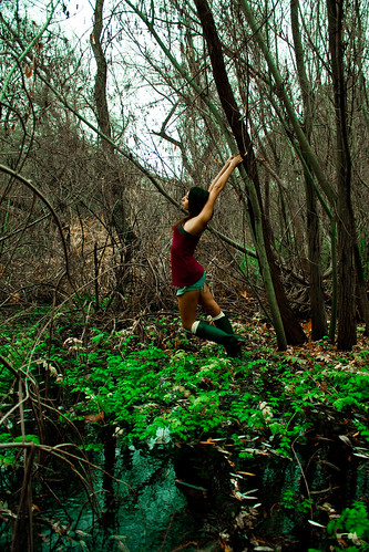 Swamp fever by Everyday Adam, on Flickr Took this on a really dark overcast day, and ended up getting poison oak during the shoot, but I'm starting to like this shot. I'm mostly wondering if I should do any other color correcting. I only did a little to make the green on the plants look a little brighter.  Who has a light? by Everyday Adam, on Flickr I'm mostly just wondering if this one is decent or if I like it because the bird jacked a cigarette. I do regret having the wide angle lens adapter on, as with the flash it has that dark shadow in the center bottom on my friends shoulder. Is this picture too dark in general? Or should i run with it and try to remove the light sources on the left and right? I kind of feel like they are a bit distracting.
|
 #
?
Feb 8, 2012 11:17
#
?
Feb 8, 2012 11:17
|
|


|

|
| # ? May 1, 2024 11:44 |
|
|
my vinyl heart posted:
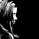
To me the green in the first picture is a little too bright and saturated, but it might of been your intention to do that, because it looks a little painterly. As with the bird picture I really like it. Another one I finally got around to from the other day. 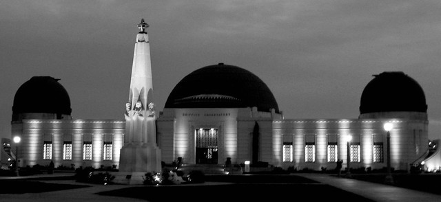 Observatory 1 by DAMNNIGERIAN, on Flickr
|
|
#
?
Feb 8, 2012 11:24
|
|

|
Bottom Liner posted:I think one of the reasons it is not optional to give criticism here is because that is part of the process. Learning to disect, discuss, and think about what makes a photo good and bad is important for developing your own eye and skill. Don't feel bad about your level of knowledge or skill, that's not what is important, your opinion is still valid as an active viewer of the photos. You can point out the strong points, talk about things you would change, or say something just doesn't work for you, all are ok. That's reassuring to hear, even though it's spelled out in the OP. I've been putting some input in from a newbie's perspective, but it's hard to tell if it's welcome on occasion. Sometimes I wish people would critique me on my critiques. The last thing anyone wants is to have people rolling their proverbial eyes at some noob trying to school them in poo poo they have very little understanding of, which is why I try to keep my technical advice to people near my level and just give emotive reactions to those who have obviously been doing it a while. I do wish this thread was a little more active - it's very informative to see what other people think of shots, how they see something that I wouldn't see. I add that to my knowledge and it becomes so obvious when I see it down the track some time. drat NIGGA posted:
Going on from others have said, I will say in terms of composition the lines are quite pleasing. A little less exposure, whilst adding a tad of fill light in post, might give you a better result. Bottom Liner posted:That's an intriguing compliment. I'm generally torn on Brooke's photos one way or another, either the pose or the processing, but she's fantastic regardless of my opinion. I'm working in realm that's not quite as dark as her stuff, combining more natural portraits with conceptual fantasy-ish themes, but with a "happier" feel I guess. I completely agree with the lighting on the first. I shouldn't have added the fill from the right, but that ended up being the best pose so I'm torn there. I've enjoyed your 365 journey so far. Do you feel you've gained a lot so far? I actually like the lightness of the model in the first one. She's meant to have an ethereal air about her, no? I think it's hard to capture that without resorting to some tacky post-added halo effects. Her expression doesn't work for me though; it's hard to tell what sort of expression a woman of the forest should greet you with whilst sitting in a nest, but I'm pretty sure that's not it. Then again, the more I look at it, the better it becomes. It really is a beautiful image - I prefer it to number two, which seems to be everyone else's favourite. Number three's legs look like they're from an autopsy slab, but apart from that I really enjoyed the shot. Pity you told everyone how it was done ") eggsovereasy posted:Here are a couple cross posts from SAD. I like the first one. What I like most about photography is the way it gets you to explore paths you just wouldn't go down normally and leading you to find intimate, unexplored places with some small measure of delight. This shot exemplifies this feeling in a nutshell. I'm kinda torn on the processing, but I'm trying to overcome my early prejudices against "hipster" presets and the like. Anyway, in the spirit of sharing, I present something that I'm not sure about. I'm seem to be drawn to simple, geometric images, so I like it, but I'm wondering if it's compelling at all to anyone else. This is of the bars in the security door casting large shadows onto the flyscreen behind it. It's from the sun reflecting off of a window, through another window and onto the inside of the door - an event that doesn't happen very often. I didn't crop this one - just messed around with some curves and such.  Pimp my fly screen.jpg by dj stevens, on Flickr Whilst I've been trying to get away from stupidly small DOFs, I stepped it down to f1.8 again for this shot. Whilst this gave me the bokeh I was after on the 35mm DX lens, I noticed some distinct purple fringing on some high contrast parts of the image. Another lesson learned! I'll also add this one:  DSC_0711.jpg by dj stevens, on Flickr It's one I took a few weeks back shorty after I got my camera. It could be a little straighter, but the architecture was kinda wonky as it was.
|
|
#
?
Feb 8, 2012 11:40
|
|


|
E: oops many to post this in snapshots a day.
carcinofuck fucked around with this message at 20:22 on Feb 8, 2012 |
|
#
?
Feb 8, 2012 12:55
|
|
|
my vinyl heart posted:
It's certainly worth doing a little more post on this one as it's a interesting subject. I would definitely remove the light sources and see what it's like a little brighter. I think it could benefit from being square crop and you might try cropping the bottom up to where the shadow starts and seeing what it looks like. The colours are spot on so I wouldn't change them at all, you are very nearly there just play around and see. Some film shots from me   Medusula fucked around with this message at 15:24 on Feb 8, 2012 |
|
#
?
Feb 8, 2012 15:22
|
|
|
truncated aardvar posted:Anyway, in the spirit of sharing, I present something that I'm not sure about. I'm seem to be drawn to simple, geometric images, so I like it, but I'm wondering if it's compelling at all to anyone else. This is of the bars in the security door casting large shadows onto the flyscreen behind it. It's from the sun reflecting off of a window, through another window and onto the inside of the door - an event that doesn't happen very often. I didn't crop this one - just messed around with some curves and such. #1. I'm having a hard time writing a crit for this and I feel bad because I can see this is the one out of the two that you put the most time and effort in to. It's not because it's bad in anyway but in the stuff I do I don't get turned on by abstracts or patterns so I'll leave that to someone else who has an eye for that style! #2. This is not a bad image at all but as a stand alone photo It's not very compelling. I'm assuming this is a dog/horse track and where I think this would work is as a series showing the track in full swing at race day and then the run down quiet nature of a place like this on off days. Technical stuff, it seems a bit close, I'm imagining a nice gable end above the doors thats just begging to get in frame and the white door on the left is suffering by being cut in half, but then I don't know what else would be in frame if you did that so I could be dead wrong. Processing wise it looks a bit flat on the BW conversion, but thats an easy fix with a contrast adjustment, notice how there's no true white in the image? As a side not that also looks like a good place to drag an attractive friend and do a few model type shots with that as the background.
|
|
#
?
Feb 8, 2012 15:38
|
|
|
carcinofuck posted:
These are all really nice but you should read the rules 
|
|
#
?
Feb 8, 2012 17:49
|
|


|
carcinofuck posted:
First: I find myself drawn toward the valley in the background. Everything else kinda runs together. Love the light quality though, it actually feels hot (as it should, it's a desert!) Second: Be careful with the blue saturation. The shadows are getting a bit colorful. There's no dominant subject, but I'm a sucker for southwest alien landscapes. Third: Great use of magenta and yellow. It's a shame that this kind of light only happens for a few minutes. I'd love to see more with this quality to them. Fourth & Fifth: Try posting them a day apart from the first three  Medusula posted:The second one has no dominant subject. Maybe that building, but it's way in the background. Maybe the water, but it's not really doing anything interesting -- just sitting there reflecting the sky, like it always does. And given that the sky is pretty much gone, shooting in a different time of day would add some good punch to it. --- Here's more of whatever this is: Hrm, might have to tone-down the stars. They didn't seem this punchy when I was working on it.  little white building by jwallacephoto, on Flickr This is a bit silly. 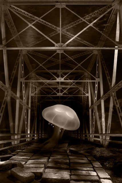 jelly bridge by jwallacephoto, on Flickr
|
|
#
?
Feb 8, 2012 20:37
|
|
|
my vinyl heart posted:Ok, here is the deal. I've lurked this thread for a while, and never really felt confident to post any of my own stuff, but I finally got my computer working again and am trying to teach myself lightroom. I have only used it a couple times and really don't know what I'm doing, so I figured now is the time to man up and ask some opinions. Here are a few things I edited today. Feel free to tell me anything you want about them. The first has potential, but when shooting in a high contrast scene you need to subdue that in post, especially when you're shooting a person in the scene. I try to compress and get tight (either with zoom or my proximity to a model) to make the frame have a more consistent light so that I can control and use it better. For instance, having her in the shade so you can get a nice even exposure instead of fighting with the dark ground and bright sky. You did much better with this photo as far as that idea is concerned. http://www.flickr.com/photos/30814206@N08/6839369141/in/photostream/ The second, while a funny shot, looks like you just snapped a funny picture of a funny incident. It's a really cool bird though, he would make a good subject if you ever get the chance to try something more thought out with him. All of these were nice but this one is much much better than the rest. Where were these taken? It's a beautiful place and this photo makes me want to go there. truncated aardvar posted:
Yeah, we can all do our part to make this thread more active. I'm personally trying to comment more on photos and make sure I post here when I have images I feel are worth sharing. The 365 project has been a great motivator for me to actually follow through with plans I've been making. I started out shooting random stuff and now I'm working more on different themes and series like the ones I just posted, which I feel is a better use of the time and effort than just random ideas that don't have much forethought. The hardest part for me is scheduling things with people, so I end up shooting most of them for a week in 2 or 3 days. I don't feel like I'm cheating the idea though, I'm still producing 365 photos in 365 days, which is my goal, so I don't worry about shooting one image per day as much. I would highly recommend everyone do something like a 365, even forcing yourself to produce 1 image a week will give you something to always be thinking about and planning, as well as being able to constantly critique your own work and progress. It's also been a good move business wise for me, I've booked a few shoots and gotten wedding inquiries from people seeing my 365 photos, as well as selling prints and licensing for some of them. My Facebook page, which is the heart of my marketing efforts, has blown up, getting 2000% growth on interactions and 10x the reach of my normal posts, so that's a cool side effect.
|
|
#
?
Feb 8, 2012 21:04
|
|

|
my vinyl heart posted:
Okay I'm really bad about giving criticism but I'll give it a shot since you gave me the courage to stop lurking! I really like your idea behind this one and I think you pulled off the frame nicely. I especially like the water in the foreground, and I think the colors work well. I don't think you need to go any brighter on the green. My only criticisms are with the contrast and focus. Everything's in focus and contrasty, it makes the image seem busy and my eyes go all over the place. What I would do is use lower f/stop next time to blur the background and lure her out more. Working with woody backgrounds is hard as there's so many little things everywhere, so I usually try to blur as much as I can. As for what you can do in post, I would lower the contrast to even everything out and maybe give her a bit of a halo to make her pop a little more. truncated aardvar posted:
I like abstract images and this one just jumped right at me. What grabs me is all the different patterns on a single plane and then the monotone of the foreground over the colorful background. My only complaint is all the dust breaks up the pattern a little, but I don't know what you could do about that. I think it's hard to give criticism on abstract works but I wanted to let you know at least someone digs it. I have a few that I just finished processing that I'd love some commentary on. These were on an overcast morning, all natural light. I have a bad tendency to not get close enough to the subject and always have to crop it a lot closer, so I tried to make a conscious effort to get in tighter on camera. I like them but I'd love some feedback. 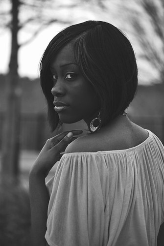 Invitation by victus_arca, on Flickr 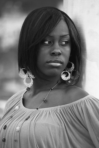 Inversion by victus_arca, on Flickr 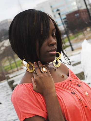 Invisible by victus_arca, on Flickr
|
|
#
?
Feb 8, 2012 23:43
|
|

|
Robot Jelly posted:
I prefer the pose in the first one. Something about it is mysterious and compelling. The position of her hand is fantastic. I don't care for the middle shot as much, I think her features are done better justice when not viewed straight on. The third one is also nice for a more traditional portrait look... but watch for little details on your subject like hair and jewelry. I think this shot could have been better if her bangs were fixed, etc. The lighting is nice, overcast days = giant softbox... always a win for soft and pretty portraits. Be wary of your background elements in a busy downtown area like this, too. Since someone else posted swamp shots, I'll follow that theme. Any CC is welcome. I took these on a workshop with a well lauded wedding photographer in my area. She had an assistant shining an led video light off to the side. I like these alright, but it was hard to elbow for a good spot with 20 other photographers... definitely takes away from the creative spirit for me, but a great learning experience for talking to other photographers. I also found it really amusing that our models were styled as follows: Indian, Pirate, Girl in a lacy white dress. Don't ask me, I have no idea.  Swamp Shoot in Orlando by Jenna Michele, on Flickr 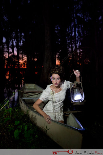 Swamp Shoot in Orlando by Jenna Michele, on Flickr  Swamp Shoot in Orlando by Jenna Michele, on Flickr 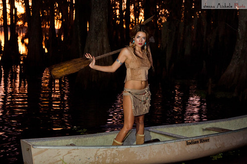 Swamp Shoot in Orlando by Jenna Michele, on Flickr Leit Motif fucked around with this message at 07:14 on Feb 9, 2012 |
|
#
?
Feb 9, 2012 07:04
|
|

|
Leit Motif posted:
The exposures are nice, and the models and locations are great, but the lighting is so flat it really hurts them. I really like 1 and 3, but the 2nd model's poses are really off for the subject matter. I know that's not under your control because of the workshop. Robot Jelly posted:
Be really careful in B&W with dark colored skin, it looks like you made her skin significantly darker in the B&W shots than color. Of these three, the first pose is the strongest. The third's hair in the eyes is distracting, the second is ok but not great, but the first is very flattering and she looks great there, just lighten it up a little. Use color channel mixer in the B&W editing to get her skin tones right.
|
|
#
?
Feb 9, 2012 08:05
|
|
|
AceClown posted:#2. This is not a bad image at all but as a stand alone photo It's not very compelling. I'm assuming this is a dog/horse track and where I think this would work is as a series showing the track in full swing at race day and then the run down quiet nature of a place like this on off days. Technical stuff, it seems a bit close, I'm imagining a nice gable end above the doors thats just begging to get in frame and the white door on the left is suffering by being cut in half, but then I don't know what else would be in frame if you did that so I could be dead wrong. Processing wise it looks a bit flat on the BW conversion, but thats an easy fix with a contrast adjustment, notice how there's no true white in the image? Thanks - that's very helpful, particularly your comments on there being no true white in the image. I guess I was trying to be faithful somewhat to the original tones and atmosphere, which was early morning and overcast, but unless it's in a series or some other kind of context, trying to do that is a bit silly, as all the person viewing the image is seeing is a dull grey panel. I guess the other lesson I learned is to take some more time at a scene, even if it means missing out on other places later in the day. I have some shots with the gables and roof in them, but they were taken with so much upwards angle, I'm even going to try and apply any vertical distortion adjustments (which is what I did to the shot I posted and it's why some of the original shot is cropped out). Robot Jelly posted:I like abstract images and this one just jumped right at me. What grabs me is all the different patterns on a single plane and then the monotone of the foreground over the colorful background. My only complaint is all the dust breaks up the pattern a little, but I don't know what you could do about that. I think it's hard to give criticism on abstract works but I wanted to let you know at least someone digs it. Thanks for your kind words. Yeah, the dust is very noticeable - you should see it in full crop! I kinda like it though, but if I ever come across that again I might give it a quick wipe. The dust is handy in the actual mesh of the fly screen though - it catches all the light. I like your portraits, and like others here I think the first one is the strongest. She's a beautiful woman, which helps. I flicked through your flickr - is it safe in assuming that you're fairly new to portraits? There are plenty of cool abstract shots from some time ago, some of which I have zero idea of what they are.
|
|
#
?
Feb 9, 2012 09:11
|
|
|
Thank you guys for the feed back. I'm going to work on those and a few more and maybe ask you guys about them afterwards. I really appreciate it. Now that I've posted, I'm going to have to learn to start critiquing work myself to contribute.
|
|
#
?
Feb 9, 2012 10:31
|
|
|
Thanks a lot for the comments guys. The model was fantastic , I let her do her own thing for most of it and she really hit it out of the park, the hand placement was all her. It was a bit windy during the shoot, so that's what was throwing the hair around. I would fix it whenever it got goofy looking but I agree it is distracting in the third one, I'll try to keep an eye out for it more next time. I have a bad tendency to go overboard on contrast in post, so I'll try dialing it back a bit and playing with the channels to get her skin lightened up.truncated aardvar posted:I like your portraits, and like others here I think the first one is the strongest. She's a beautiful woman, which helps. I flicked through your flickr - is it safe in assuming that you're fairly new to portraits? There are plenty of cool abstract shots from some time ago, some of which I have zero idea of what they are.
|
|
#
?
Feb 9, 2012 21:15
|
|
|
truncated aardvar posted:
That looks great to my somewhat untrained eyes. The contrast helps establish the pattern, and the bokeh reinforces it too - how did you do that? What is that lighter white bokeh that corresponds with the overlaps of the metal? I wanted to see if anyone could offer some advice as to what I could do differently with this shot: 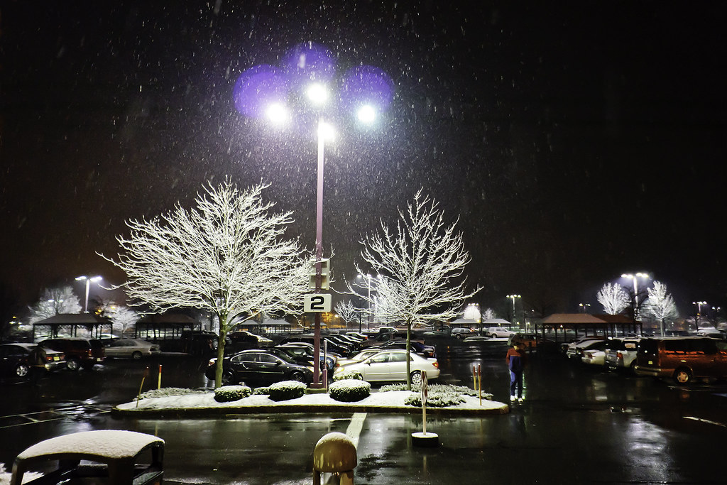 second snowfall of the season by cadence440, on Flickr I feel like (as with everything I try to do) there was potential for a cool shot and I missed it. Unfortunately, this time I can't totally blame myself because I was under an overhang and couldnt get further into the lot like I would have liked, because the camera and lens would have gotten wet. There was a bit extraon the sides and bottom that I cropped, and it has been through post of course. I'm still trying to find my feet in post. Also, learned a fun fact uploading this. The reds do not display properly on Google Chrome - viewed it on Safari and they look like normal. Read some comments on flickr that every browser uses its own color profile or something.
|
|
#
?
Feb 10, 2012 02:48
|
|

|
rio posted:
I'm not an expert by any means, but I find that when I critique other people, I tend to be more harsh about my own photos, and hopefully do some better, but (again, my own opinion), I don't see one central thing to pull my focus to. I would think that it would be the light post and two trees in the front, but there are a ton more behind it and to the right. Kind of pulls the focus off of (what I assumed you wanted to be) the main focus of the picture. Personally, I'd have cropped out the left side to cut out the person. I think the trees looks fantastic in the snowfall and light, but the massive amount of space to the right kind of distracts. Again, take this as you will, I just started photography, but that is what I would do. I took a picture in a similar manner, but I wore out my welcome a week or so ago, so I'll wait to post some more and not forget the rules.
|
|
#
?
Feb 10, 2012 04:56
|
|

|
rio posted:That looks great to my somewhat untrained eyes. The contrast helps establish the pattern, and the bokeh reinforces it too - how did you do that? What is that lighter white bokeh that corresponds with the overlaps of the metal? Firstly I'll explain my mysterious fly screen - here's a link to a close crop of the original which will probably be more illuminating: http://i.imgur.com/U6Quk.jpg The "lighter bokeh", if I get what you're trying to say, is just the sun shining on the material of the flyscreen. There is a gap between the bars and flyscreen of about 5mm. The dark areas of the flyscreen are caused by the shadows cast by the bars; the sun was at a very oblique angle to the door. It looks weird because the shadows are larger than the lit up bits, which is counter intuitive. As to your picture - there isn't really much there in that shot to work with. The main interest of the picture are the cool white trees and the little island of white where they stand, which is what I think you were looking at - you had great image of these in your head but you failed to capture it I would say. I kinda like that there is a distant repetition of these trees to the right of the frame. I've taken the liberty of fiddling with it (let me know if you want me to remove these)maybe more of what you had in mind, maybe not. Regardless, I've fixed up the nasty colour flares, which is fairly simple to do. I've also increased contrast and deepened blacks and shadows to highlight the main attraction of the picture. Crop one:  Crop two:  I'm not crazy about any of them - perhaps someone with more experience can add to this. Really, I think you needed to get much closer to the interesting white trees with some narrower depth of field to hide the uninteresting suburbia. I know you didn't want to get your gear wet, but the isolated rain in that pic just doesn't look good - if it was even across the whole frame it might have looked cool, and the only way to do that would be by getting closer to the trees; perhaps angling the camera up through the branches, rim lighinting the snow on the branches. truncated aardvar fucked around with this message at 08:57 on Feb 10, 2012 |
|
#
?
Feb 10, 2012 08:48
|
|
|
Medusula posted:I love this. The color and the space and the serenity. I like that little cabin on the left, the stillness of the water. Makes me want to go to there. The first one had too much sky space for me. -- I'm quite new and trying to improve. This picture is not good, but I feel like, it should have been, or could have been something. Please help me to improve my processing and composition. 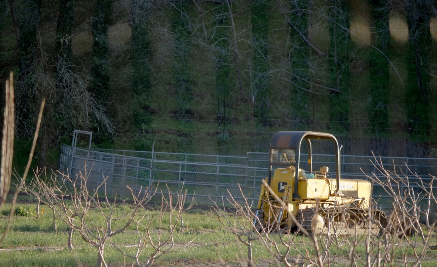
|
|
#
?
Feb 11, 2012 02:49
|
|

|
What did you have in mind when you were taking it? What were you trying to capture? I think this is another case of your mind's eye presenting a cool photo opportunity but due to lack of experience you were blinded to the fact that there really wasn't much of a photo there to begin with. I've been there many times. I can understand why some film people say that shooting with film sharpens you quicker, because you are forced to think through a scene before even taking the lens cap off. For me the biggest issue is the dark, long-lens-compressed, underexposed background of that hillside. Crop that out to just above the small (electric?) fence and you'll improve the picture straight away and it will get rid of most of those lines from the foreground fence. Also crop out those obnoxious sticks coming in from the left of frame. Whilst you shouldn't rely heavily on cropping and should learn to compose in frame, it's a handy tool to help you learn what works and what doesn't. For an exercise I'd also suggest reducing exposure a tad in post, increase contrast a bit and then play with blacks and fill light. What program do you use for post and do you shoot in RAW? In reality though, I just don't think there's a decent shot from where you were standing. The lovely piece of machinery is begging to have some shots taken of it from much closer, with a reduced depth of field to blur the background somewhat. As it stands, even with a crop, the foreground clutter combined with the lack of any lines to draw you into the picture just doesn't work. I'd also suggest a getting a Flickr account so we can see how you shot things and what you shoot them with. What I'm doing is trying to start with really simple scenes and see which ones work for me and which ones don't. Less is sometimes more. Try and replicate what other people have done. Lots of shutter time will help you. Knowing what doesn't make good pictures is part of knowing what will make good pictures. I'll leave you with some salient words from Bryan Peterson: http://www.youtube.com/watch?v=LlcZu1CtS4o&feature=mfu_in_order&list=UL
|
|
#
?
Feb 11, 2012 08:39
|
|
|
truncated aardvar posted:awesome Been a bit too busy to pop on for the past couple days, but I defintely wanted to say thanks for the help. The advice and crops are really illuminating, and have given me a lot to think about in terms of trying to improve. Also, thank you Dradien for the critique. I find myself in that same situation that you described, where critiquing others is helpful to my own thought process when trying to shoot and edit. ----Leit Motif: Those are pretty interesting pictures. Interesting because I'm like, what the gently caress is going on here, a girl in a wedding dress canoeing across a lake in the twilight? I think the colors of the sky are really nice, and everything individually is good, but when put together, I am left wondering what is going on (much like the subject, but that is more subjective, I guess). For example, there are the colors from that lovely sunrise/sunset, but then the model is looking like there is a police car shining their spotlight on her. There is no sense of any light coming from her lantern - I'm kind of left wondering, where is all of that light coming from? Maybe instead of the lantern only illuminating that small part of the boat, it could have caught part of her face as well in an interesting way? I don't know. With that said, I have not delved into any kind of lighting setups, so this might be somewhat on par for some sort of style I am not familiar with, but the contrast between the natural and unnatural light seems too much for me. I think the 3rd and 4th are more successful in regards to the lighting. ----- One more I was hoping to throw out there for advice. I was at the mall and this guy was totally asleep standing up behind the counter. This mall is filled with empty stores, it has really declined. All I had was a 16mm lens, so I ended up shooting wide of course, took off some clutter on the left and ended up with my first crop:  empty mall by cadence440, on Flickr I started thinking about keeping the subject clear...The empty mall surroundings were interesting to me because I was there and knew the context, but I started to think it would not be interesting to a viewer, and I should crop tighter.  the pretzel industry was not as exciting as Tom had imagined by cadence440, on Flickr Does this work? I should have just walked up to the guy, but I thought he would have woken up. Also a good lesson that I need to bring my camera bag with me so I have an appropriate lens all the time! rio fucked around with this message at 23:19 on Feb 12, 2012 |
|
#
?
Feb 12, 2012 20:19
|
|
|
Just to clarify, those are Leif's photos, not mine. Your wording makes me think your thought they were mine?
|
|
#
?
Feb 12, 2012 23:09
|
|
|
Whoops - was scrolling backwards and must have picked out the wrong name. Sorry about that - I'll edit that out.
|
|
#
?
Feb 12, 2012 23:17
|
|
|
quazi posted:Here's more of whatever this is: In the first one, something about the nature of the compositing makes the stars seem more like dust or something. The second one doesn't seem too silly to me - I like the contrast between organic and constructed. It feels like we're looking at the underwater remnants of a civilization. rio posted:One more I was hoping to throw out there for advice. I was at the mall and this guy was totally asleep standing up behind the counter. This mall is filled with empty stores, it has really declined. All I had was a 16mm lens, so I ended up shooting wide of course, took off some clutter on the left and ended up with my first crop: The second one works better compositionally and I think there's still plenty that shows you how empty the mall is. ------------------------------- A few from California I just scanned.  Santa Ray by RHITMrB, on Flickr  Mandana by RHITMrB, on Flickr  Sea View by RHITMrB, on Flickr
|
|
#
?
Feb 13, 2012 05:48
|
|

|
tijag posted:I'm quite new and trying to improve. I agree that this could be something, but it really feels like the whole shot lacks focus, I don't really know what I'm supposed to be looking at. Also did you shoot it through a window? Or what is the glare, it's really distracting as well. I think you just need to pick something and focus in on it. I went out hiking the other day (50 in Upstate NY in February is really odd) and took a few pictures but I feel like they are lacking something, I wish I could have waited to go out a few hours for sunset, but the park closed too early 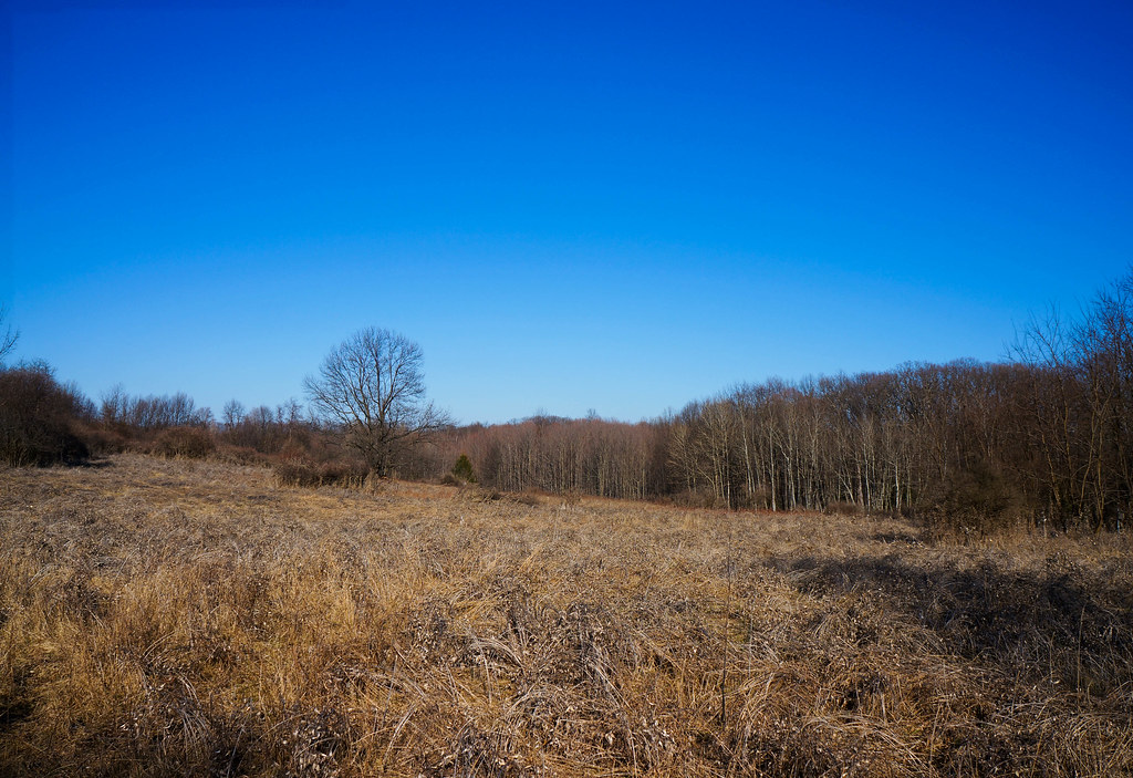 Dead in Feb by bates.james.e, on Flickr 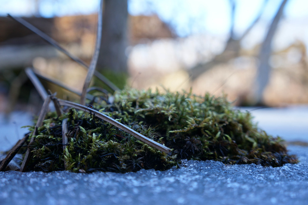 Frozen Bog by bates.james.e, on Flickr  Moss and Leaves by bates.james.e, on Flickr
|
|
#
?
Feb 13, 2012 06:20
|
|

|
rio posted:
That's classic. Good catch - the photo definitely tells a story, which in my opinion is more important than technical details. I do prefer the second one. The kiosk acts as a frame for the picture, so you could have shot/cropped even tighter than that if you wanted to. The only things I'd suggest is after you caught that one, you should have stuck around to improve the angle. I mean look at him - I don't think he's going to chase you. I'd have tried a low down crouching angle and, as you say, getting right close to him. Getting closer or using that longer lens you didn't have would have enabled you to reduce the DOF a bit, isolating him - the background is a little distracting. BigEast55 posted:I went out hiking the other day (50 in Upstate NY in February is really odd) and took a few pictures but I feel like they are lacking something, I wish I could have waited to go out a few hours for sunset, but the park closed too early There's not much going on in the first one and as you say, coming back during the "golden hour" may have improved things. I have some botanical gardens I'd like to shoot around me, but they all open and close during daylight - it's frustrating. I guess it reduces vandalism. Getting the camera a lot closer to the ground may have added some interest. A little extra contrast might make it pop a bit too. The colour of the second and third are good, as well as the texture, but the DOF is a bit narrow, f/9 might have been more appropriate - bump up the ISO if you have to. The narrow DOF may be a preference of yours of course, but personally I'd try and get a bit more in focus. Also moss is a very cliche, first thing I do when I get a camera kind of thing, but I do like a good moss picture. Perhaps you should try some macro stuff - you seem to have a leaning towards that? I'll add that I looked at your stream - "cold ducks" made me laugh. There seemed to be a turf war between the ducks and the seagulls going on.
|
|
#
?
Feb 14, 2012 10:55
|
|
|
truncated aardvar posted:That's classic. Good catch - the photo definitely tells a story, which in my opinion is more important than technical details. I do prefer the second one. The kiosk acts as a frame for the picture, so you could have shot/cropped even tighter than that if you wanted to. The only things I'd suggest is after you caught that one, you should have stuck around to improve the angle. I mean look at him - I don't think he's going to chase you. I'd have tried a low down crouching angle and, as you say, getting right close to him. Getting closer or using that longer lens you didn't have would have enabled you to reduce the DOF a bit, isolating him - the background is a little distracting.. Thanks for the encouragement! I am going to try and take your suggestion next time I am in that situation and, after taking a safe shot to make sure I get something, getting up close and try not to worry about it. (unless it looks like I am about to get my rear end kicked).
|
|
#
?
Feb 14, 2012 23:33
|
|
|
BigEast55 posted:
If you could of waited for the sun, this would've looked great with the sun shining on the dead plants on the ground. I'd love to shoot a long exposure at that place. I'm trying to do more portraits and good thing a friend doesn't mind. 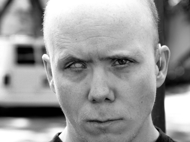 Snapshot by DAMNNIGERIAN, on Flickr
|
|
#
?
Feb 15, 2012 01:59
|
|
|
drat NIGGA posted:If you could of waited for the sun, this would've looked great with the sun shining on the dead plants on the ground. I'd love to shoot a long exposure at that place. Definitely an interesting photo. I want to know his story. It would help if the top of his head and his jaw weren't cut off, but he has very expressive eyes. The B&W works well for this. I feel you could have an excellent shot with a more thought out composition. Well, here goes. My first PAD post. I had my first shoot with an actual model on Sunday. I was very apprehensive because I wasn't expecting to have a model, only to do a test shoot. Regardless I am very happy how it turned out, and would like some critique. Did I go too far on the split toning for #2?  IMG_2248.jpg by b to the zor, on Flickr  IMG_2280.jpg by b to the zor, on Flickr
|
|
#
?
Feb 15, 2012 03:37
|
|

|
drat NIGGA posted:If you could of waited for the sun, this would've looked great with the sun shining on the dead plants on the ground. I'd love to shoot a long exposure at that place. He is definitely worth working with, I'd love to know what he was thinking.
|
|
#
?
Feb 15, 2012 12:22
|
|

|
I'm confused about the subject here. If you're trying to do what I think you are trying to do in the second photo, then I find the non-parallel lines that are obviously parallel in real life to be sort of distracting because it seems unintentional. I think this scene is one whose value is in repeating patterns, but typically you see those types of shot realized in a flattened, almost two-dimensional style, usually with framing lines running parallel to the border of the photo, and extraneous detail minimized. Your processing runs in line with what I've seen of that style, but shooting into the corner makes it difficult to establish that geometry (if that's what you were going for.) I think the dented garage door is distracting and I'd like to see more or less of it. This is just a great detail capture. The removal of extra detail makes the scale of the photo uncertain at first viewing which I find interesting. Where in Cali were you shooting? Okay, now it's time to shred myself. I have had a desire to shoot a wide angle, shallow DOF self portrait for a while now. I have also had a desire to refamiliarize myself with strobe lighting, so I figured an outdoor portrait while on vacation would be the perfect opportunity to do both. This is today's effort, lit by two speedlites on the left and sun on the back right. My issues: camera is at ball level which is a lot more obvious than I thought it would be, my nose shadow cuts off my left eye, there are too many slightly different horizontal lines in the photo leading to a confusing horizon. Anybody else?
|
|
#
?
Feb 15, 2012 18:41
|
|
|
Today I decided to finally get of my arse and take a few photos. My reasoning being that the best way to learn how to swim is to throw oneself into the sea. NiceDay by FreeRadical17, on Flickr  Argument by FreeRadical17, on Flickr  StormBrewing by FreeRadical17, on Flickr  OldSoldier by FreeRadical17, on Flickr Here is the rest of the set: http://www.flickr.com/photos/76752400@N04/sets/72157629340010921/
|
|
#
?
Feb 16, 2012 09:12
|
|

|
Ambihelical Hexnut posted:
Well, from my limited experience, self portraits are a bitch. I actually think the horizontal lines work well. The horizon is a bit busy on the right side, but I think the fact that there's OMG steam coming out of a building makes up for it. It's probably not like you could wait until the clouds moved I'm guessing. Were the speedlights together? Just wondering why you didn't separate them to fill in your other side. Were they used with diffusers? (not a critique, just trying to learn). Did you have stands? (they don't seem terribly high). I do find the blue jacket a bit jarring. Love the post, especially the saturation of the browns. I'm slowly working my way through the post thread - I'm hoping you have some words of wisdom in there as I've been a fan since coming into this corner of goondom Xerxes17 posted:Today I decided to finally get of my arse and take a few photos. My reasoning being that the best way to learn how to swim is to throw oneself into the sea. Firstly, I'd say you have to get off auto mode. It may not make your shots any better initially, but if you get an understanding of how exposure works, you can begin to think like a camera and be able to work with your tools better. Read "Understanding Exposure" - http://www.amazon.com/Understanding-Exposure-3rd-Photographs-Camera/dp/0817439390/ref=pd_sim_b_1 The first one almost works. I'm not sure if the trees work there but I see what you were trying to do. I guess it's better to have the trees there than to have just their shadows in scene. #2 - The birds are too centred. There's a time to have things centred and there's a time to stick with the rules of thirds. I think in this case the latter would have been more appropriate. #3 - I like the tone, but the composition isn't very compelling at all. #4 - The strongest of the four. You probably needed to take a couple of steps back to ensure you didn't cut off the tire and the top of that clock tower. Taking those extra five-ten seconds in the view finder makes a big difference. Be aware that some view finders aren't accurate to the final image, so give yourself some extra room to crop if need be.
|
|
#
?
Feb 16, 2012 13:48
|
|
|
truncated aardvar posted:Well, from my limited experience, self portraits are a bitch. I actually think the horizontal lines work well. The horizon is a bit busy on the right side, but I think the fact that there's OMG steam coming out of a building makes up for it. It's probably not like you could wait until the clouds moved I'm guessing. Thanks for the critique dude. To answer your questions: The flashes were together because a single one on full blast was way too weak to overpower the sun. At a distance of about 6 feet even two on full power, one at full zoom and one at medium, was just enough for this. And even with that, they only just barely illuminated my feet, which required a ton of adjustment to bring some detail back out of. They are also together because I wanted to create the shadows on the sun side so that the sunlight would become my rim lighting; in hindsight I don't really like the two light colors and wish I could've gelled the flashes. I could probably fix a lot of it by masking and color adjusting the highlights in photoshop but  I agree with the jacket but it's the only hiking-worthy one I brought on vacation so... Both lights were bare of modifiers. I mounted them both to a single manfrotto nano stand which I was able to get about mid-chest height before the 40mph wind was knocking it over reliably. Same deal with the camera, whose tripod legs were extended to about 4 feet at the last position before parallel to the ground to prevent a tip over. These portrait attempts have confirmed that YN-560s will take a five foot stand-fall onto gravel like a champ, and that they will lie about the batteries being dead repeatedly. I was always able to turn the flash back on and get 10-20 more pops out of every set of AAs. Also confirmed that the Yuongo wireless remote/trigger setup will flash sync on my 5D pretty reliably up to 1/250, but that they will not sync AT ALL if you piggyback two receivers to one trigger so you can have a remote and a wireless flash at the same time. The flash will pop when the camera fires, but it's mistimed just enough to not even be visible at 1/10, which means that every one of these portraits has forced me to do the 10 second timer dick dance for every single frame. Thanks!
|
|
#
?
Feb 16, 2012 15:10
|
|
|
MrBlandAverage posted:------------------------------- I really like this one. It feels off, almost creepy, in a good way. I expect something to be hiding in that window, but maybe that's because I've been watching some horror films lately. Ambihelical Hexnut posted:I'm jealous. It's a good shot, but I'm not crazy about the perspective of the camera. I would like to see it higher off the ground looking you more in the eye instead of looking up. This might help give a bigger sense of scale by showing more of the background and less of the sky. Just a thought. The lighting is good, and has a straight forward adventure editorial feel. Here are a few I like from this week  day 32 by David Childers, on Flickr I tried layering lighting with a long exposure. I wish I had gotten the back trees more to really add that extra depth. Oh well, the owl is cool.  day 35 by David Childers, on Flickr Self portraits are hard, especially with no tripod or remote shutter release.  day 36 by David Childers, on Flickr
|
|
#
?
Feb 16, 2012 20:47
|
|
|
Bottom Liner posted:Here are a few I like from this week I do like this a one a lot but I have one petty little complaint: I think it would feel more personal if the model weren't wearing shoes. Or at least not big thick heels. They feel really out of place with the rest of the scene. The shoes say, "I just stepped off the sidewalk for this photo" whereas barefoot would more convey that lost in the woods feeling.
|
|
#
?
Feb 16, 2012 20:55
|
|


|
Bottom Liner posted:
rio posted:
This is fantastic. If it wasn't for the cluttered background, I could have mistaken this for a woot fatigue photo. (is he still around?) e: to elaborate a little, it's not just the guy's expression, though it certainly contributes. I think that pretzel stand, with its cartoonish colors, and strangely regular lines, could be a strong subject in itself. If you're not averse to digital manipulation, I think it'd be interesting to knock out that distracting background, and place the stand on a mall hallway. Cockwhore fucked around with this message at 23:31 on Feb 16, 2012 |
|
#
?
Feb 16, 2012 23:23
|
|
|
Laser Cow posted:Unlike bobz0r, I actually think this could work well with a tighter crop, I might be talking out of my rear end but I'm trying to get better with critically analysing photos as art. Do you think it would look good with maybe the top fifth cropped off and more contrast on his face? Yeah I have a bunch of ideas I want to do with him. He loves it, couldn't get him to stop smiling. One I took the other day of this cool looking old dude.  Uphill by DAMNNIGERIAN, on Flickr
|
|
#
?
Feb 17, 2012 00:11
|
|
|
Bottom Liner posted:Self portraits are hard, especially with no tripod or remote shutter release. Tether camera to laptop, face screen to me, set interval timer to 3sec between shots... still pretty tedious. (Oh poo poo, no tripod? drat...) Good job, though. The right photo is pretty BA.
|
|
#
?
Feb 17, 2012 02:10
|
|
|

|
| # ? May 1, 2024 11:44 |
|
|
The more I look at them I agree. It was really just a study in lighting, and I wish I could have shot the right one a little farther back in a landscape orientation.
|
|
#
?
Feb 17, 2012 02:20
|
|