


|
Tigertron posted:
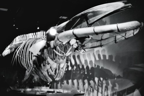
Besides being a bit muddled and out of focus like robertdx said, the bright white light on the skull makes it look like it has a headlight for an eye, and once I saw it, I couldn't unsee it. I'm really new to actually learning about photography (versus point-and-shooting), but one thing I find helps me in quick judgements is viewing a small version of the photo. Sometimes, I'll have a large image that I think looks good, but when I view it at a smaller size, it'll look muddled. And generally, if it doesn't look good at both sizes, if I really study it I'll find that it's actually not a good picture. I'm sure there are exceptions to the rule, but I've found it to be a pretty good rule of thumb. I guess the smaller size helps your eye see the entire composition better. Does that make sense? AlienApeBoy posted:Just to use yours as an example, the timg really highlights how busy the picture is, and makes the brown background in the bottom right stand out much more. At least to my eye. So this is my attempt at composing a shot and doing some post-processing, rudimentary as it may be:  Snow Day Beer by Retemnav, on Flickr This was just a shot I took messing around with macro at my parent's farm which I thought turned out nicely:  Bush Hog by Retemnav, on Flickr
|
 #
¿
Nov 28, 2011 21:18
#
¿
Nov 28, 2011 21:18
|
|


|

|
| # ¿ Apr 27, 2024 22:08 |
|
|
rio posted:One thing I think detracts is that you are ever-so-slightly off center, so that the triangles formed by the grass on either side are different shapes and the path looks slightly askew. It'd be better if they either were more similar OR more dissimilar. The closeness of them now makes it seem like you were going for centered and missed slightly?
|
|
#
¿
Nov 29, 2011 17:31
|
|
