


|
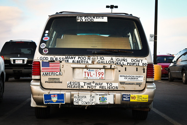
Mightaswell posted:Okay, let me have it. I know this is one of those pictures that is interesting only because of the subject, and not because of any compositional storytelling. That being said, I'd still like an honest opinion on the way I presented it. Is the horizon straight? If not, did you intend this? Also, maybe you can adjust crop to cut the small bit of car popping out on the left? I would also clone out the light fixture sticking out of the top of the car. But it really isn't that bad if cars in parking lots are your thing.
|
 #
¿
Jan 5, 2012 00:56
#
¿
Jan 5, 2012 00:56
|
|


|

|
| # ¿ Apr 30, 2024 22:32 |
|
|
Dandy Cheddar posted:
I really like the idea of this. However I feel like this is more of a snapshot. Try to go back and take the same exact photo while paying attention to the small details. Could you have done this as a long exposure to reduce the noise and banding in the image? Can you maybe light it a bit from the back with a flashlight to give more detail on the lego guy? What about putting it into a setting where it is not just a "guy" with his hands up screaming about fire, but rather this combo is a part of a whole scene. Mr. Despair posted:
The dirt and grime does nothing for me. The reflection in the lens is fine and adds a nice touch of color. I would be more worried about just how dirty it all looks. Couple from a concert I shot on Saturday. Technically all shots there are "snapshots" but these turned out particularly well. My 3 favorite shots are:    Edited for size, and added one more. Evilkiksass fucked around with this message at 09:00 on Feb 8, 2012 |
|
#
¿
Feb 7, 2012 02:51
|
|


|
ohrwurm posted:I really wanted to get a lower angle on this one, but the lot was fenced in. Focus / cut a hole through the fence.
|
|
#
¿
Mar 13, 2012 22:48
|
|
|
smallmouth posted:I meant for it to be the three guys walking nonchalantly past the sign that says pedestrians detour that-a-way. I was hoping the foreground elements of the logo on the mail truck (basically an arrow going the opposite way of the sign) and tree were enough to balance the arrow of the detour sign. And that boxing them in the foreground elements was enough to set them up as the subject. For what it is worth, this is what I got from the image also. But the fact that they look like they are construction workers and thus belong there kind of ruins it. Also the "problem" (it is not really a problem, just a stylistic choice) is that the elements you are using to box them in provide too much information to the user. They are not just framing, they have contrasty, sharp details which distract from the rest of the image. Try taking the shot and cropping a bit to see what you can accomplish with it.
|
|
#
¿
Mar 23, 2012 01:56
|
|
|
Sevn posted:For what these are, they are nothing short of amazing. The only thing I could wish for would be that they are just a bit wider. Why do you think them being wider would help?
|
|
#
¿
Apr 6, 2012 18:50
|
|
|
jwvgoethe posted:So I will take another stab at this thread. I understand that you were just walking around and took this kind of as a snapshot but here are a couple points to consider: 1. There are a number of small elements in the bottom of the frame. Tops of trees it looks like, did you leave these in for a reason? Possibly crop them in post? 2. The light poles seem to be bent in at odd angles, I am guessing this is due to perspective distortion. Did you intentionally leave these as such? Did you consider fixing this in post?` 2a. Did you consider the placement of the light poles? Are they where they are for a reason? If so, could you explain to me why? 3. If these are giants as you tried to convey, then why are they pointed down if you want to show giants reaching up? If your goal is to show them reaching down, then wouldn't it work better with the lights lit? Consider going back and looking at this during the night, possibly reshoot it differently to see if you can convey your meaning in a different manner? Ok now for mine. I am taking a photo class and our first assignment includes some basic portraits with the 3 classic lighting setups (rembrant, side light, and butterfly). I was shooting this with film, but was using my DSLR to get the lighting right first. So I edited a couple of my test shots and here are the results. The model was just a random classmate that I got to sit for me.  and  Self crit, spoilering so that you don't think about it during first viewing of the images: I think that the brightness difference between my key and fill lights was too high. Also, I may need to spend more time finessing the hair light. I actually used 2 lights on him from behind. One was a snooted hair light high and left, the other was a barndoored light directly behind him. I am also not sure if I made him look too orange. The other thing is, have I over sharpened / claritied it? I am pretty happy with how I whitened his teeth, and brightened his eyes in the first shot. But I couldn't get the eyes to pop as much in shot #2 without looking like they didn't match the lighting. On the topic of posing, I wasn't paying as much attention to head position in these shots since they were just test shots for the lighting, but I feel like I need to make sure his head has less tilt (side to side) as well as making sure the model keeps their chin pointed down.
|
|
#
¿
Apr 19, 2012 19:44
|
|
|
Maker Of Shoes posted:
I think one thing to consider is where are the birds going to be where they will make it easier for you to shoot? Photography is as much about controlling the situation you shoot as how you shoot it. Are there places near you where certain birds are known to roost? Are you thinking ahead of time and planning your light and angle of approach? Are there going to be other "things" there that may interfere? For example, if you go to a park where people feed birds, you may notice that squirrels will also run up to eat the same food.
|
|
#
¿
Apr 19, 2012 22:31
|
|
|
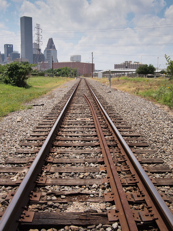
William T. Hornaday posted:Define 'snapshot' please. Augmented Dickey posted:A few shots from a walk yesterday Augmented Dickey posted:I really like the idea you have in the first shot. I am wondering if you intentionally left the "doorway" brighter than the rest of the photo. Is it supposed to indicate the way? What is the story you saw in this photo? I kind of see a weird gateway into a world of planks. The second photo, as has been said, is just a pair of boring tracks like every photo book ever. However, I think I know what you were trying to achieve. That said, to execute that shot properly you would need a long empty area of tracks leading to an amazing skyline in the distance. The problem here though is that the background is not a cool enough looking skyline, and the fore and midground are too busy with random poo poo (extra rail, trees, and small buildings). Also lines dead center don't look nearly as cool. Consider doing the same shot idea, but try and frame it so you have curved tracks like in photo 3 on an open space, leading to a skyline that either A. fills the frame pretty full or B. is tiny and small in the distance but still visible.
|
|
#
¿
Apr 29, 2012 23:23
|
|
|
Is there a reason why nothing is sharp in the first photo? Is this part of the feeling you were trying to convey? How close did you get on this photo to the vision in your head when you shot this? I like the photo overall, but I can't help but this that this is a lucky coincidence. Photo number two I think is really well executed. I like how the left lane entry and the bridge across interact with one another. As well as the fog / clouds in the distance and how they create the mood. Contribution: 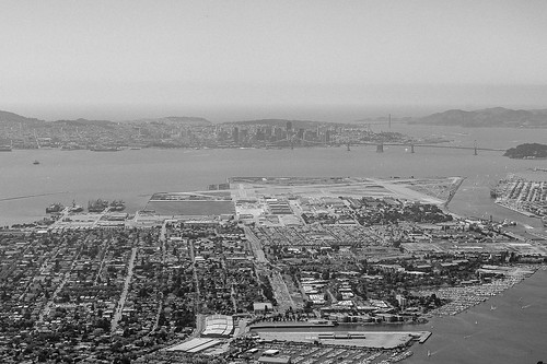 Alameda, SF in the background by bowbles, on Flickr 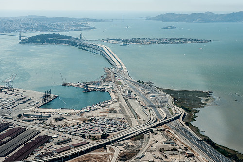 Bay Bridge - Oakland side by bowbles, on Flickr
|
|
#
¿
Sep 1, 2012 05:33
|
|


|
Mr. Despair posted:no, you're a stupid photo. -10 points, gently caress mannequin .  20120920-IMG_1444.jpg by SacktapDeluxe, on Flickr Crosspost from "Show Yourself". Still on the fence about this one. Let's talk about this photo. You have a clear intent here, good start! Now lets move on to composition. You like the style of image which presents distortion based on your choice of lens. The CDJ / turntable on the right, provide for an interesting deformed leading line, ensuring that the viewers eye is kept on target to the subject in the center. But what about on the other side? What are you trying to do with the mixer and amp you have? Also, what about the room in the background? Is it intended to communicate something? Did you consider adjusting what was back there for the sake of improving the shot? The positioning of the face results in my eye flowing to the empty portion of the photo on the left, and the lack of anything interesting there. As for facial expression, I get a strong feeling of you trying to imitate a Hunter S Thompson esque look. He had a certain style for himself, and trying to copy that style has it's ups and downs. Can you comment as to your intent here? More technical notes: Clean your lens / sensor? It looks like it is super dirty. Why did you leave the amount of noise you did in the photo? Lack of understanding of NR? Intentional choice for the look it adds? Something else? (USER WAS PUT ON PROBATION FOR THIS POST)
|
|
#
¿
Sep 27, 2012 04:13
|
|
|

|
| # ¿ Apr 30, 2024 22:32 |
|
|
Why have you chosen to do selective desaturation? Do you think that it adds value to the image you are creating? I feel like you are trying to make the bike pop more against the background in each of the shots which is a noble goal, but I think the technique which you have chosen to use should be used in a more subtle manner in combination with other techniques to really achieve what you are looking for. Here are some from a fire across the street from me: 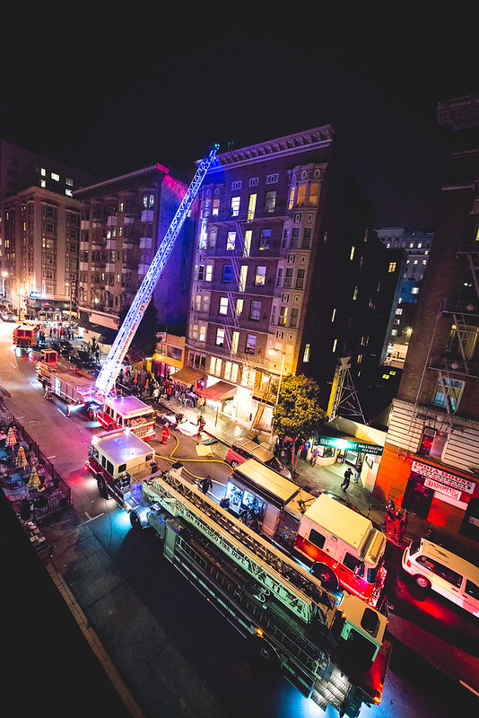 fire-103 by bowbles, on Flickr 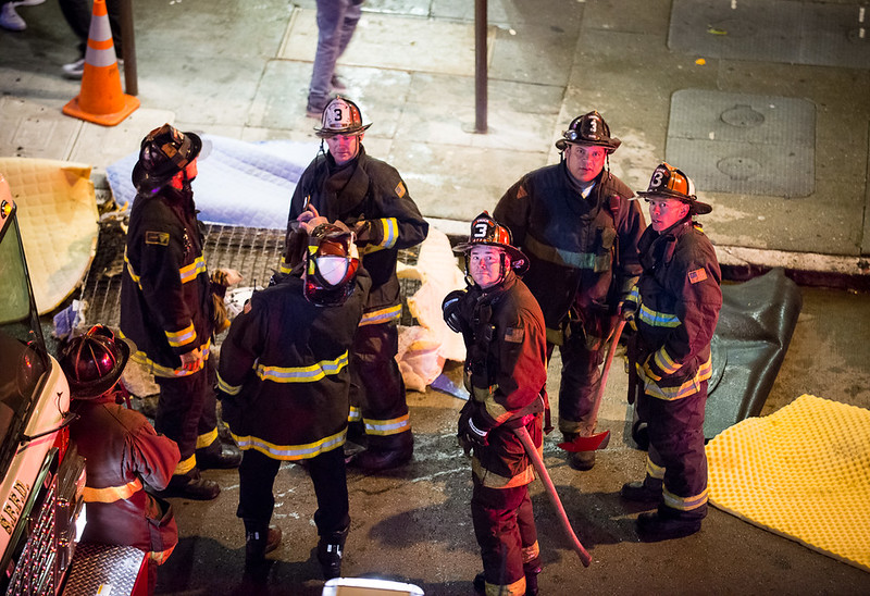 fire-107 by bowbles, on Flickr
|
|
#
¿
Mar 3, 2013 06:35
|
|


