


|
my vinyl heart posted:
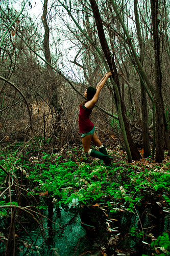
Okay I'm really bad about giving criticism but I'll give it a shot since you gave me the courage to stop lurking! I really like your idea behind this one and I think you pulled off the frame nicely. I especially like the water in the foreground, and I think the colors work well. I don't think you need to go any brighter on the green. My only criticisms are with the contrast and focus. Everything's in focus and contrasty, it makes the image seem busy and my eyes go all over the place. What I would do is use lower f/stop next time to blur the background and lure her out more. Working with woody backgrounds is hard as there's so many little things everywhere, so I usually try to blur as much as I can. As for what you can do in post, I would lower the contrast to even everything out and maybe give her a bit of a halo to make her pop a little more. truncated aardvar posted:
I like abstract images and this one just jumped right at me. What grabs me is all the different patterns on a single plane and then the monotone of the foreground over the colorful background. My only complaint is all the dust breaks up the pattern a little, but I don't know what you could do about that. I think it's hard to give criticism on abstract works but I wanted to let you know at least someone digs it. ") I have a few that I just finished processing that I'd love some commentary on. These were on an overcast morning, all natural light. I have a bad tendency to not get close enough to the subject and always have to crop it a lot closer, so I tried to make a conscious effort to get in tighter on camera. I like them but I'd love some feedback. 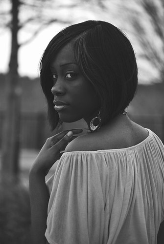 Invitation by victus_arca, on Flickr 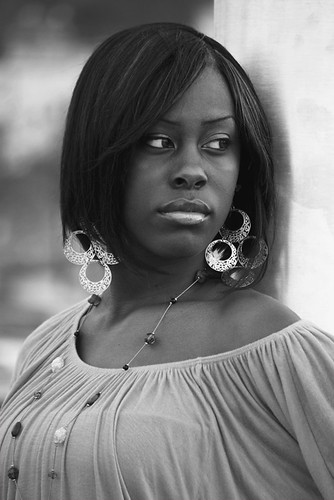 Inversion by victus_arca, on Flickr 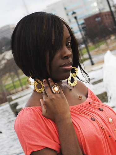 Invisible by victus_arca, on Flickr
|
 #
¿
Feb 8, 2012 23:43
#
¿
Feb 8, 2012 23:43
|
|


|

|
| # ¿ May 22, 2024 18:14 |
|
|
Thanks a lot for the comments guys. The model was fantastic , I let her do her own thing for most of it and she really hit it out of the park, the hand placement was all her. It was a bit windy during the shoot, so that's what was throwing the hair around. I would fix it whenever it got goofy looking but I agree it is distracting in the third one, I'll try to keep an eye out for it more next time. I have a bad tendency to go overboard on contrast in post, so I'll try dialing it back a bit and playing with the channels to get her skin lightened up.truncated aardvar posted:I like your portraits, and like others here I think the first one is the strongest. She's a beautiful woman, which helps. I flicked through your flickr - is it safe in assuming that you're fairly new to portraits? There are plenty of cool abstract shots from some time ago, some of which I have zero idea of what they are.
|
|
#
¿
Feb 9, 2012 21:15
|
|