|
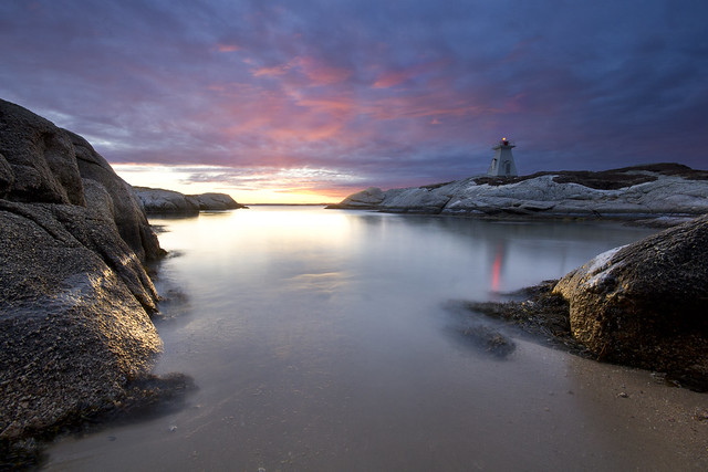
whaam posted:I find the first two very uninteresting. The grass is underexposed, the trees tops are cut off and the composition is just a bit off. I think you had a good idea, and if you shot more or less equal sky/building/grass, while framing the trees right, and properly exposing it, it would be a neat photo. That's a lot of ifs though. I personally like the positioning of the lighthouse in this image; however, I'm very new to photography having just picked it up as a new hobby this summer so I have no idea what I'm talking about. I really like the colours thought and the exposure of the light reflecting off the water/against the rocks. I think it's technically a strong photo and, as a beginner, if I took this photograph, I'd be pretty drat pleased with myself. The only weakness for me is that this type of landscape doesn't do a whole lot for on a personal level. If there were something more interesting in the foreground, that would up the ante a bit. But that's coming from someone who gravitates toward portraits so who knows. Here's my first picture that isn't just a snapshot of my pets or random practicing etc. I thought it owuld be fun to light a hot wheel on fire and have a little lego man staring at the fire. I know next to nothing so I would appreciate criticism on all aspects from exposure, to composition etc. It's a direct ripoff of Slinkachu's miniature concepts so keep in mind that it was just a way for me to practice and create a subject that was slightly more photo-worthy than my 15 year old dog.  DSC_0023 by Jordan M Zephyr E, on Flickr
|
 #
¿
Feb 6, 2012 01:48
#
¿
Feb 6, 2012 01:48
|
|


|

|
| # ¿ May 1, 2024 11:36 |
|
|
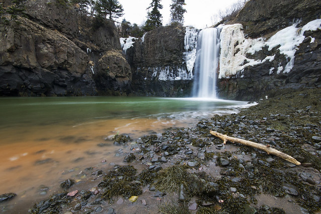
whaam posted:I think you had the right idea focusing close and tight on these ice formations. They are very interesting and deserve to be the focal point of the image. The problem is the composition just doesn't feel quite right. I've run into things like this a lot where I'll find something really interesting for a focal point, but the landscape itself is full of dull winter colours (dark rocks, sparse brush, snow patches) and I usually fail to make anything of it. Looks like you were in a similar situation here, but you did a better job than I usually end up doing. That being said it still has some of the same pitfalls. Somehow these didn't get any love or critique. As an amateur, I cannot really give you any constructive criticism. To me, they look perfect. Very pleasing images to look at, love the colours. A++ would look again.
|
|
#
¿
Mar 16, 2012 14:44
|
|

|
Wafflecopper posted:I like the silhouette and the soft, pastel shades in the sky. The foreground is really distracting though. It's too bright/saturated and looks unnatural and really jarring next to the great sky. Plus I can see where you've been brushing and missed parts (the bottom left corner especially.) I really like the depth of field in this photo and the composition is nice. The vignette works in this photo - adds a nice dreamy quality to the picture. I'm just a beginner so I can't really provide a great critique for you because I don't really know what I'm looking for. I can say, however, this is pleasing to the eye. The high ISO creates a bit of noise but it doesn't take away from the photo...actually looks kinda subtle and cool. Gives it a vintage feel. Here's one I did with a friend's band's album cover in mind. While I like some aspects of it and it was fun to paint a cap gun with spray paint, it didn't turn out as well as I hoped.  DSC_0046 by Jordan M Zephyr E, on Flickr
|
|
#
¿
Jun 8, 2012 21:04
|
|