|
CarrotFlowers posted:
The actual tone of these I don't really like, kind of reminds me of cheap film (this is just my personal preference). The poses are kind of awkward, but not awkward enough to be intentional. It feels like you had a good idea going in but didn't flesh out exactly what you wanted so you experimented around hoping you'd hit it accidentally. The photos where she is less of a focus, I feel, do a better job of conveying "lost girl in the woods" type of thing. The clothing is also quite awkward, but again, not in a deliberate way. Basically for me it comes down to, if it's going to be about the girl, the clothes, expression/body language becomes that much more important and it's not coming across. If it's about the scene, and she's a player in that scene, the photos where she is not as large of an element in the photo have a much better feel. The composition is also much stronger in those photos.
|
 #
¿
Dec 29, 2011 10:45
#
¿
Dec 29, 2011 10:45
|
|


|

|
| # ¿ May 5, 2024 14:20 |
|
|
drat NIGGA posted:I really like the second one, though I would have taken a couple more at night-time (not a big deal, you can't stand there all day) and in color. Also maybe one after the person had left. This picture is really boring, kind of like you couldn't even bother to fix the tilt after the fact. The business of left hand side disrupts the vanishing point effect, and the colors of the lights at night are generally awful. I don't know what you were trying to go for, or why you would want it darker. In general, it's just sort of messy and pointless. I'm sure you can put more thought into it.
|
|
#
¿
Dec 29, 2011 11:37
|
|

|
I like the balance of the new edit better, more dynamic. Tones are much nicer too.
|
|
#
¿
Jan 4, 2012 11:38
|
|
|
The 2nd one doesn't grab me at all. I think that without the obvious dreamy nature of the composites, (the 2nd is not obvious enough to me as a composite) the processing doesn't add much. The first and third though are really great and they are all definitely photography. This kind of layering and photo manipulation have been around as long as photography. I'm a big fan of the lines in the sky on the first one, suggesting winds and curves and shapes, and the bottom one is quite nice too, except I think the mountain could be even more prominent/larger like unreal-large. Just my personal 2-cents but I think you could really push the visual boundaries in terms of reality. It reminds me a lot of this one photographer that I cannot for the life of me remember her name who did a lot of similar works juxtaposing nature and the human body.
|
|
#
¿
Jan 20, 2012 03:02
|
|
|
Dradien posted:So, I just got my T1i a couple days ago I have been messing around with it, waiting for my tripod, case, and new lens to come in. Color balance is off (too warm), you need more light (and more even light, see that shadow in the back right corner?) and depth of field is too shallow. You could probably also do with a little more room on each edge, no need to have the photo chopped right at the edge of the product. I know you said you weren't "going for anything" but if it's a picture of a phone with no other context in a light box, I'm going to assume it's a product photo and it needs those things at the very least. The easiest way to make it look way better is give it a ton more light, or expose for more light. Use manual, not AV because the automatic exposure may make it rather grey, since the background should actually be white.
|
|
#
¿
Jan 23, 2012 18:43
|
|

|
Sevn posted:
Chinese/Taiwanese people love getting their picture taken! Just motion towards your camera and tell them you love their outfit  Although I have to agree that Mannequins portraits get kind of boring. Glad to hear you'll be moving in a different direction. It's just not really special or interesting to do NYC street portraits, considering the sheer number of (good even) photographers that do them. Part of the challenge though! I saw an interesting version where someone did street portraits, but only through the reflection of puddles on a wet day.
|
|
#
¿
Apr 11, 2012 16:40
|
|
 This sums it up very well. It is easy to critique someone who does street shots, but difficult to understand the feeling and emotion behind it. It is definitely hard to approach a complete strange in what is possibly a hostile environment, ie on the street. It is equally difficult to take a good picture of a random stranger without approaching them. There are a lot of great photographers here, including you.
|
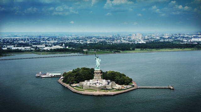
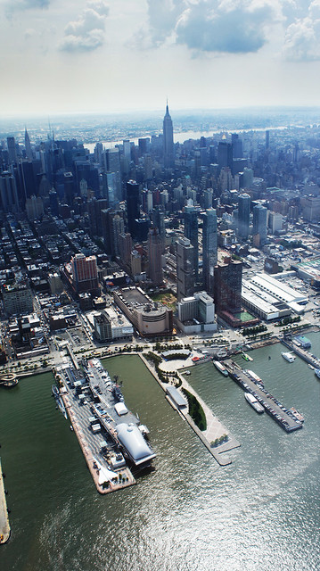
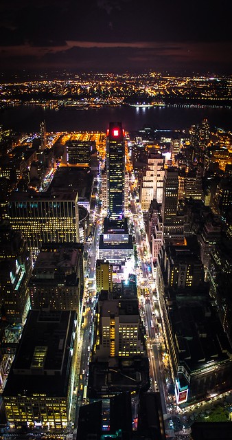
BreakingDolphins posted:The car really stands out in the picture and that's also what I like about it, it seems that the horizon is a little bit of but that might just be me, also the bouncy houses in the background are still a little bit too much. Maybe you could even try to go completely wild and try a sin-city effect on the car? Why such a heavy handed vignette on the first one? The focus and composition is nice though, but I think those two things is enough to draw attention to the statue. As for the others, was the idea just to take a "nice" picture of the city from above? It feels like not a lot of thought was put into it (For example, the second has just a smidgen of an outcropping there in the left lower corner, that could easily be cropped out) I took the time to view it full screen, but I still felt it just looked kind of generic in a bad way. You clearly have a good eye for composition (esp the first two) so maybe just think a little harder about either making it more clearly about just aesthetics, or whether you're trying to convey something more.
|
|
#
¿
Sep 21, 2012 16:29
|
|
|
Pukestain Pal posted:Dang, I don't know how I missed those doors. Thanks for that. Proof that a 2nd look is always good! This is really great, except the watermark. It actually ruined the feel completely for me, which felt more like an initimate street photograph, which was then interrupted by the idea that this is commercial. Other than that, it's awesome. Casu Marzu posted:The first feels a little weird to me. The distinct roll of the wave but because it was a slower shot the smoothness of the water rolling over really distracts me for some reason. I really love the color you got on the hills in the left and center. The first one here is quite nice, especially the lighting. I don't feel like the extra space at the "normal" crop adds much though, I think it would look quite nice with the top and bottom cut off a bit. The sense of movement is really nice. The second has a bit of an odd color cast that's throwing me off. The balance of elements in the photo is actually quite nice. My first thought was that it was kind of boring, but after I thought it about it a bit, I like the lines of the sky, treeline, ground, and grass, as well as the clear left-to-right eye movement. Very natural. I think the color's throwing that off though, and you could use that to bring out the lines of movement.
|
|
#
¿
Sep 27, 2012 21:16
|
|


|
xenilk posted:I have to agree with you on that one. As much as I like the flowing clothes I think they often screw the silhouette when there's no belt or anything to define the waist when seated. When she's up I can use the hands to define it but I'll have to figure out a way to do it when seated! I guess it'll be my challenge for Fall! Binder clips. Stylists use lots of tools to get clothing to fall "just right" so don't be afraid to mess with things!
|
|
#
¿
Sep 28, 2012 19:52
|
|
|

|
| # ¿ May 5, 2024 14:20 |
|
|
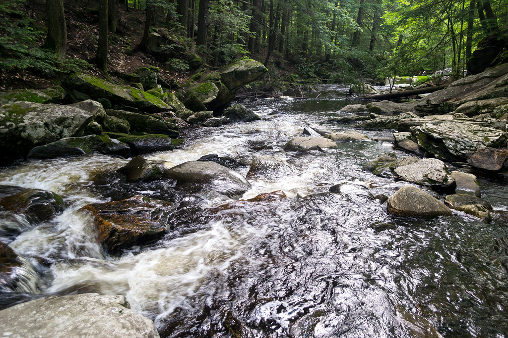
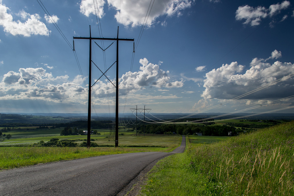
Shampoo posted:I really like the processing on these. It's a good balance of color and really helps get a feeling of temperature from the location. Well colored while still not being over-saturated. I don't know if it was actually hot there, but it sure looks it. I would have probably tried to bring the sidewalk/piazza down in 4014, but that's personal preference, and it's not like it's blown out or anything here. The first one, at first I didn't like the perspective, but on further reflection I like the excitement of being close to the water. I think you could have used a tad more flow in the water, with a longer shutter speed. I like it, I just think the rush of the water and the way it cuts through the forest could be emphasized more. What kind of feel are you going for? I think it could just use "more" in general. The second is not boring to me. It's simple, but nice and clean. ") This last one is boring though. It's not badly composed, it just feels like there's no interesting focus. Is the landscape supposed to be pretty? Geometric? Mundane? It shows you have a good eye, but it doesn't seem like you had much point in taking the picture other than taking a nice picture.
|
|
#
¿
Jul 11, 2013 17:11
|
|