


|
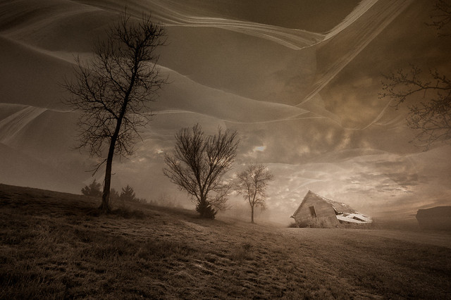
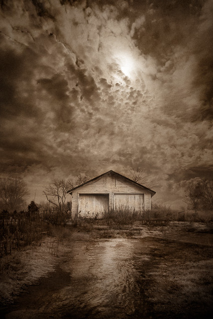
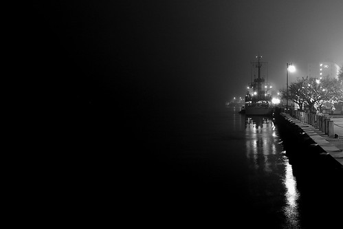
quazi posted:bandaid posted:The negative space in the second one is fine and it seems to be emphasizing the inky darkness of the night and open water, but it just seems too dark and too completely featureless. Like you were holding your hand over the left 2/3 of the frame when you took the picture. Something in me just really wants to see something out there, no matter how small or trivial; reflection off a ripple in the water, a distant boat light, or even just some more dim foggy, haze. Just something. � Intermission � Here are a couple recent photos that I want some critique on, particularly the processing. It seems to be a direction I've been unconsciously going in lately with my photos and I'm really fighting myself as to whether I like it or hate it. I'd love a second and unbiased opinion. Does it look bad? Fake? Gimmicky? Good?  
|
 #
¿
Jan 26, 2012 01:11
#
¿
Jan 26, 2012 01:11
|
|


|

|
| # ¿ May 7, 2024 05:35 |
|
|
A lot of good comments. A bunch I agree with, a few that I kinda don't, and a couple I'm still trying to wrap my head around. I think there's a lot more practice and fine-tuning that I need to do with this particular style of post before I'm happy with it. I think I may ultimately try to pull reign it back in a bit and see what it looks like. I guess I'm trying to keep a relatively believably 'natural' look with almost a studio lighting kind of feel to it, and to not cross the very fine line into over-proccessing where people just look at it and wonder what the hell I was thinking and why I would garishly ruin an otherwise good photo. Sometimes I'm successful, a lot of times I'm probably not. The diorama comments struck me as slightly disturbing, as the look of taxidermy is something I'd kind of like to avoid; but they actually hit a lot closer to the mark of what I'm going for than I initially realized when I read them. Generally, I like creating these portraits where the subjects sometimes seem almost surreally still and pensive. A lot of it is due to my educational and professional background, but I'm really, really attached to the idea that an animal doesn't have to be doing anything particularly interesting or remotely active in order to be incredibly fascinating. I guess I just really never developed much of an interest, photographically or otherwise, in animals doing things that most people would find exciting. It's my style, I suppose. Bottom Liner posted:Yeah, how the hell are you lighting those or getting that lighting from the ambient?
|
|
#
¿
Jan 27, 2012 06:51
|
|
|
Saint Fu posted:You may have done this already somewhere else, but could you post a before and after shot? It might help with opinions regarding the post processing. They definitely look ridiculous compared side-by-side, but I always remind myself that nobody (except the fine people of the Dorkroom) ever sees the originals. Straight Out Of The Camera >>> Lightroom Edits >>> Photoshop Edits       And for good measure, another one that I've felt conflicted about.   
|
|
#
¿
Jan 27, 2012 14:37
|
|
|
aliencowboy posted:While the processing is quite good, I don't think this one is up to snuff. Usually your animal photos function very well as portraits, but I just don't feel any personality in or connection to the subject here. Yeah, I agree that the baboon one is a little weak, but I thought it was a good example of the post-processing that I was having issues with.
|
|
#
¿
Jan 27, 2012 19:52
|
|
|
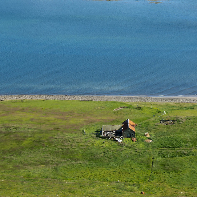
This is gorgeous. The half-blue half-green square composition, the contrasting textures of the water, shore, and grass, all of it. The farmhouse is just kinda there and makes sense visually, but I for some reason I'm not really drawn towards it at all; but it works and I think the image might suffer a little without it, so I guess it's all good in the end.Hotwax Residue posted:
Munkaboo posted:The fact that it's face is so close to the left side and looking out of the frame leaves the right side feeling somewhat empty, neglected and boring, even if there is technically something there. It's part of the animal and should draw at least some visual interest, but it's gaze draws your eyes in the opposite direction. A much stronger composition would probably be for it to be looking in towards the rest of the frame, and even better if you can fill the empty space in front of its face with something visually relevant, if not particularly eyecatching or distracting; a 'pose' where it's looking back across its body (almost over the shoulder) is something I usually try to capture. And generally, animal portraits are much more engaging when taken at eye level; unfortunately, that vantage point is not always available with zoo exhibits. And now for a few of my own.   
|
|
#
¿
Apr 26, 2012 02:42
|
|


|
In my personal opinion, yeah, it's better. Though I might be tempted to go even closer and give it a little upward boost to keep from falling out of the frame.  I dunno. I may not really know what I'm talking about. Grain of salt.
|
|
#
¿
Apr 26, 2012 03:43
|
|
|
dukeku posted:This thread isn't for snapshots.
|
|
#
¿
Apr 29, 2012 22:50
|
|
|
guidoanselmi posted:while driving and blind shooting out of the sunroof. i-wanted-the-shot: Probably too late to do anything about it now, but the bottom feels a little chopped off. Right now, it's like a photo of a person that was cropped at the joints. The top of the grass is floating and visually I want to look downward towards their base, but the photo ends and it's kinda uneasy. Unfortunately, just cropping out the grass entirely creates the exact same problem for the power lines, though I'd be tempted to do it anyways and just content-aware them out. And it's slightly crooked. samjack56 posted:
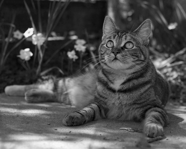
I like this a lot. Though I think it'd be a bit stronger with something like a 2x3 ratio where it gives a little bit more room at the far left between the feet and edge of the frame; feels just a tad cramped over there. It's probably safe to be able to bump up the contrast a bit and crank up the exposure (maybe with a mask of just the cat and leave the background a bit darker.) Echoing what someone else said, try to get rid of the railing thing at the right edge. I'm torn on the 63 in the top left corner; I like it, but it's distracting. I'm debating whether it would be a good idea to try and bring out more of the texture/detail/rust in the wall. Regardless, it's a really nice photo. the posted:
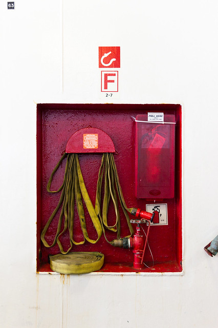
I dunno, man. This is just so incredibly busy. The lighting is harsh which creates a lot of sharp edges and contrast, and combined with apparently everything being in focus it's almost headache inducing. There's really nothing that grabs me and draws me in, and I'm just left frantically looking around the frame for what I'm supposed to be focusing on. drat NIGGA posted:
This is awesome. I'd probably recommend trying to get a more neutral white balance look (too warm right now) and bring up the exposure a bit, particularly in the wall. Otherwise it's fantastic. And you should probably post some critique of your own or something.   Preemptively, I'm going to say that I desperately wish there was more space at the left of both of these. William T. Hornaday fucked around with this message at 16:06 on May 3, 2012 |
|
#
¿
May 3, 2012 16:02
|
|


|
I like them a lot. EDIT: Now that I'm sober. I'll expand on that a bit (in a fairly incoherent and rambling way.) The first one is the best. The composition is great, and the opportunity to capture a shot like that arises very, very rarely at a zoo. I like the crop, the framing of the leopard in the bushes is perfect, and the lighting is great. Now, if it were me (which is unfortunately not the case, because I don't have a shot like this in my collection,) this would probably be one where I'd really push the processing and do a lot to it; the scene seems appropriate. Not saying that you necessarily should do this, but I think it could work well for this image. If possible, get rid of the mesh in the background; blur it out, replace it with something else. It's slightly distracting and ruins the illusion. I might try bringing down the brightness a bit (or maybe even a lot) on it too (and maybe the drop the vibrancy a bunch,) it'd probably allow the the leopard to stand out a lot more. I really like the foreground and think that you could rely on it a bit more. The bare dirt is a nice little pathway leading up to the doorway in the bushes; maybe dodge it up a bit, add some warmth, and kinda make it look like the light is pouring in through the opening. The bushes could probably benefit from a slight vignette to help pull the attention back towards the middle since there's a lot still going on at the edges of the frame. And maybe creatively play around with some field blur in the leaves to help with that too. And I'd probably drop down the exposure on the leaves as well, though maybe boost the contrast a bit to give it all a shadowy look (and dodge in some brighter patches, like that spot at the right just above the trunk.) The leopard is in pretty good shape, though I might do a little dodging and burning to emphasize the lighting that's already there. If you want me to, I can throw together a mockup of what I'm talking about. The ruffed lemur is good. Black and white animals are a pain in the rear end, as it's often difficult to expose the whole thing properly without getting any clipping at either end; but not seeing any of that. It's looking out of the frame and there's little to draw the eye to the right half of the image, which is too bad, but there's not really anything to do about it at this point. The black look good, though I might dodge up the more well-lit areas of white to where it's almost over exposed and maybe little bits in other areas to emphasize the fur texture. The hands get a little bit lost, maybe dodge up the front edge to give a little bit more defined and visible shape. The tail gets a little bit lost, I think because the bottom left corner it too dark. It seems too uniform, and dodge up the top edge of the little pieces of wood would probably rectify that. The greens down there would add a nice balance to the stuff at the top, so maybe lighten those up too. Ruffed lemurs are cute. But they're also loud, obnoxious, incredibly dense, and often a pain in the rear end to work with and be around. The orangutan is a tough shot to make work well. Mesh just sucks and does a great job of utterly killing any sort of decent shot; it just makes a photo scream, "I shot this in a zoo" and thus distracts a lot from the rest of the photo. Orange is always a bit difficult, as I have a lot trouble telling what looks 'normal' and figuring out whether it's been pushed it too far; but I think it looks decent and not too garish. The eye contact is clearly the main focus in the photo, and it looks like you made an effort to emphasize that. The front eye looks very flat though. Always got to be careful to maintain an appropriate amount of contrast. Though shouldn't be anything a little tone curve fiddling can't fix. Once that's fixed, give the white of the eye a little dodge attention and bring it closer to where the other eye is at. I'm not sure what it looked like out fo the camera, but there does appear to be a little bit of a glow around the edges in some places, particularly at the top edge of the right arm and head; poo poo like that tends to happen when doing it my way. Either get in there and try to run it it right up to the edge of the fur, or just back off the darkness a bit and make the transition more gradual. Some of this may have made sense, a lot of it probably not. And I'm incredibly flattered. William T. Hornaday fucked around with this message at 15:23 on May 1, 2013 |
|
#
¿
May 1, 2013 02:29
|
|
|
Might as well take advantage of that wall of text from earlier and get some critique on stuff I haven't yet posted in this thread...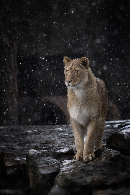 Lion by William T Hornaday, on Flickr 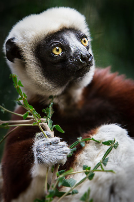 Coquerel's Sifaka by William T Hornaday, on Flickr 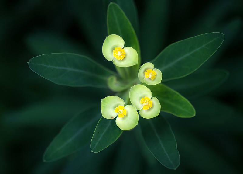 Flowers by William T Hornaday, on Flickr
|
|
#
¿
May 1, 2013 20:37
|
|
|
Cloudy days may give you boring, contrast-less light, but they also make colors look pretty fantastic. And as mentioned, I love doing post on cloudy day photos. William T. Hornaday fucked around with this message at 23:39 on Jun 4, 2013 |
|
#
¿
Jun 4, 2013 23:34
|
|
|
VelociBacon posted:Edit: Should I desaturate it? It seems weird to do that to a photo right out of the camera. Don't desaturate it. The colors you've got there are gorgeous. The only thing I'd do is crop in a couple pixels at the right to make it truly symmetrical, otherwise the framing is good. Ars Moriendi posted:
The giant chunk of empty space in the middle is bothering me a bit. The two focal points of the photo are right up against the opposite edges, so much so that they almost feel like they're falling out of the frame, and then there's this big gaping void between them. The lady is in focus and so she's a pretty solid object, but I feel like I have to mentally drag the man back into the frame lest he start to slip out of view. Or who knows, that could all just end up metaphorically describing what's going on with the couple in the photo; and in that case, props. The processing is good. I'm kinda treating these first three as a triptych. Pretend like they're next to each other.  Flower by William T Hornaday, on Flickr 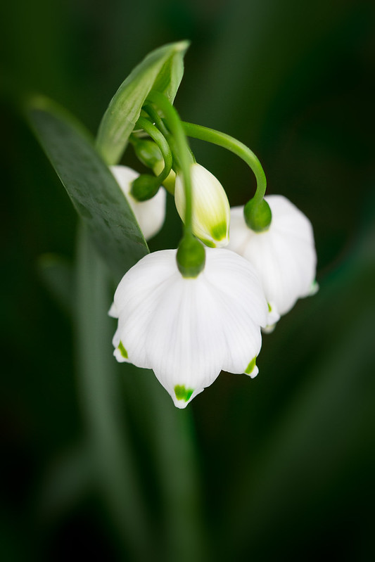 Flower by William T Hornaday, on Flickr 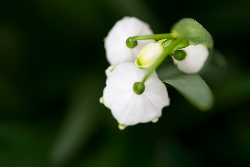 Flower by William T Hornaday, on Flickr And this one is unrelated. I like the composition, but wanted to do something with the processing but nothing really seemed to work. 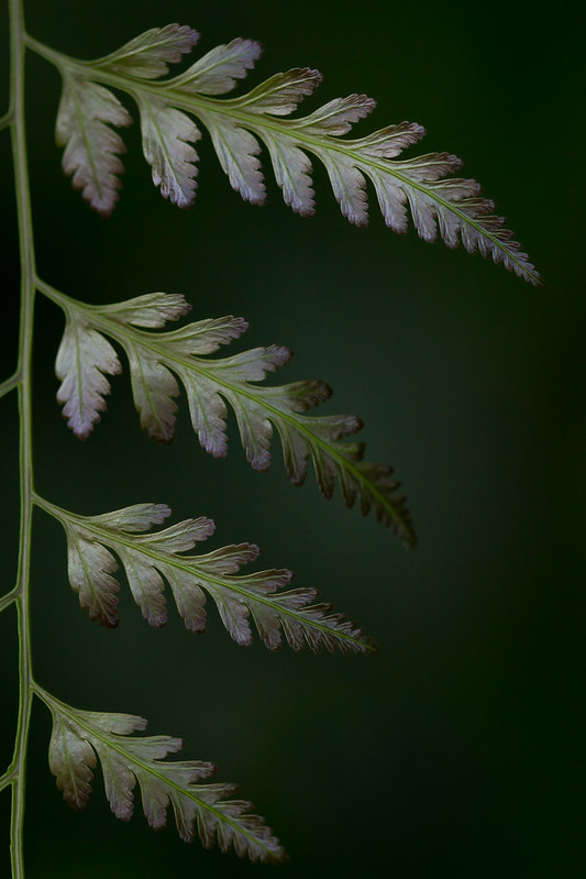 Leaves by William T Hornaday, on Flickr William T. Hornaday fucked around with this message at 14:40 on Aug 7, 2013 |
|
#
¿
Aug 7, 2013 14:37
|
|
|
GunForumMeme posted:Thanks Huxley, Kenny Logins, jackpot, and TsarAleksi re: horse pic. I appreciate your critique. One thing I was wondering about his how to fix the eye focus. I actually had center point focus, grabbed the eye (back button) and then recomposed for the shot, so after racking my brain I'm at odds on how to fix it to make the eye sharper. If you've got Photoshop, you could try doing a high pass filter and using a mask to have it only apply to the area of the eye. That could help a bit. You should have used a Lytro.
|
|
#
¿
Mar 12, 2014 15:37
|
|
|
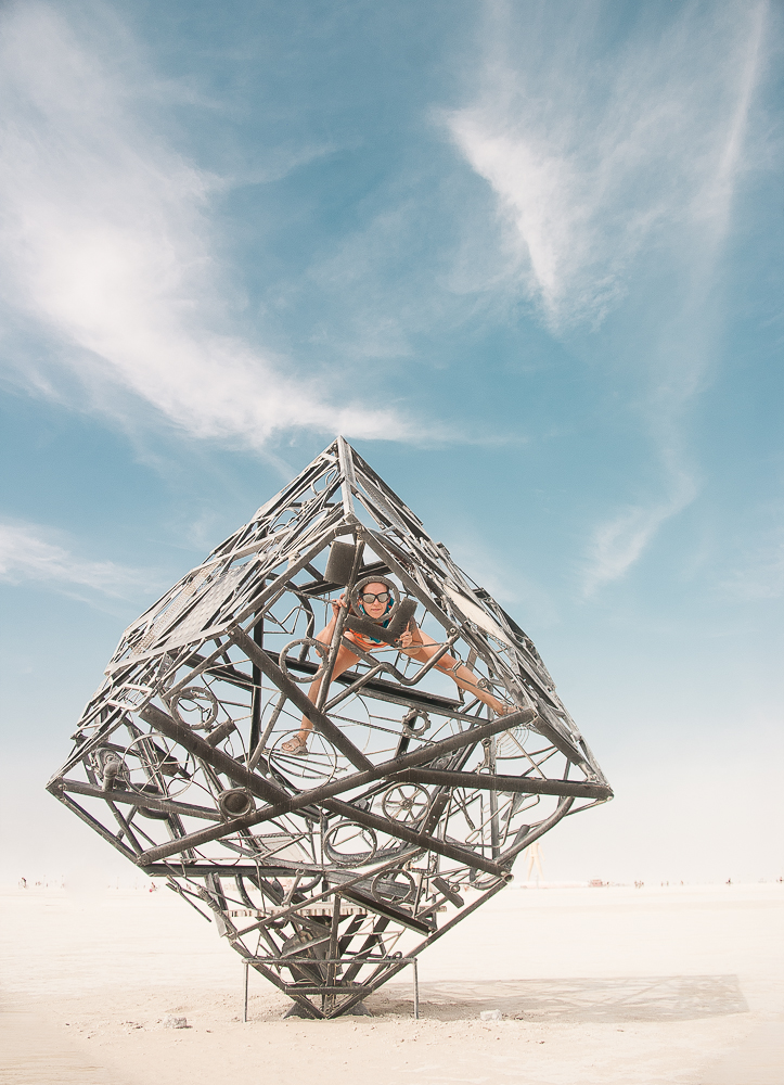
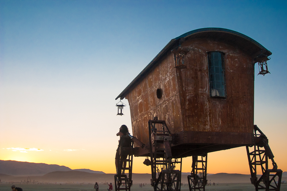
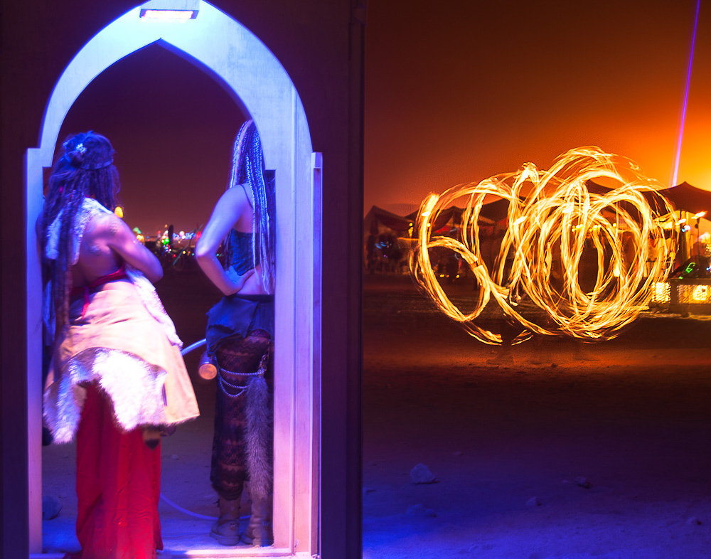
CommunistCow posted:A few things from burning man. Trying out some new lightroom processing techniques: I could've gone for the first one as a horizontal composition (still fine as is,) the second one would definitely be better if the feet of the thing weren't cut off, and not really feeling whatever is going on in the third one.
|
|
#
¿
Sep 4, 2014 05:03
|
|
|
CommunistCow posted:Do you guys think that including the legs with a bunch of people around would have been better? Personal preference, but I'd rather have the subject of the photo not be awkwardly cut off by the crop at the cost of having some small extraneous poo poo than the way it is now. Plus it's in the middle of the desert; that'd like the easiest clone stamp job ever to fix it.
|
|
#
¿
Sep 4, 2014 22:35
|
|
|
Shiruan posted:Here are a few I'm working on from a recent trip in Kenya/Tanzania. Click 'em for obnoxiously large. Digging them, especially the last one; even better if the frame extended a lot more to both sides and really showed the emptiness. Getting some Nick Brandt vibes from those.
|
|
#
¿
Sep 25, 2014 16:43
|
|


|
|
| # ¿ May 7, 2024 05:35 |
|
|
Yeah, I'm gonna need proof of that.
|
|
#
¿
Jan 7, 2015 13:08
|
|