


|
TheLastManStanding posted:I think this is a great subject for a black and white shot - can't really comment on the post-processing since I'm still not really an expert in that area, but it looks good to me. Personally, I would have shot it from a different angle. There doesn't seem to be much going on at the street level, besides the solitary bike. I think the architecture should take up more of the image. I would have taken the shot from in front of the archway, or at least with the camera angled up towards the upper half of the building, away from the largely uninteresting street below. Enough of my amateurish critique. I'm still trying to narrow down my selection of images for my course portfolio, and I need to decide between these two: 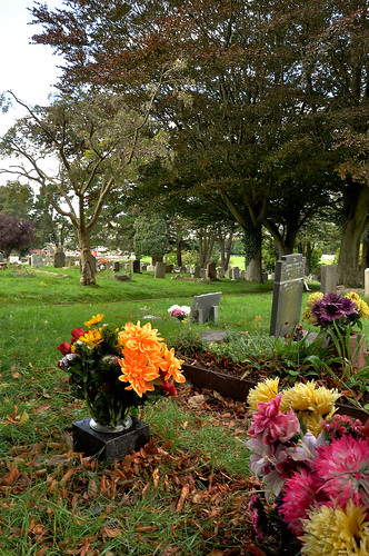 cemeterypic2(sharp) by Tom.Plk, on Flickr  cemeterypic1(sharp) by Tom.Plk, on Flickr I welcome criticism of either picture, but if anyone could let me know which of the two images they prefer that would be great.
|
 #
¿
Nov 19, 2011 19:55
#
¿
Nov 19, 2011 19:55
|
|


|

|
| # ¿ Apr 28, 2024 13:03 |
|
|
AlienApeBoy posted:I prefer the 1st photo, because my eyes take a more interesting path from the flowers, to the foreground gravestones, to the background gravestones. The 2nd one it's pretty much a straightforward line from left-to-right. However, I get the sense I might've preferred both with a landscape orientation. The 1st one, if you were to print it, I'd recommend a non-standard square crop of the bottom 2/3s of the photo to get rid of the bright white sky in the top-left. I preferred the first one as well, I thought the composition in the second pic was all over the place, especially with the background. I think I will crop the first one, I wasn't sure about the sky either.
|
|
#
¿
Nov 20, 2011 17:05
|
|
|
Enigma89 posted:The crop improves the image, but personally I think it would have been better if we could see what the model was looking at below the balcony. I would have liked to see a bit more of the street scene below as a backdrop. Failing that, it would have been good to see more of the models face, since she is now the focus of the image. A few images of my own. I decided to play around with angles while shooting some urban architecture, just to make things more interesting. Does it work? 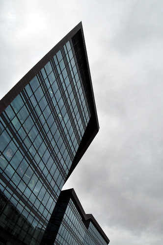 RL5 by Tom.Plk, on Flickr Here is an attempt at a still-life: 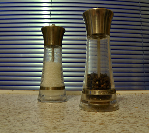 condiments by Tom.Plk, on Flickr I'm not sure about the post-processing on the above pic. Can't quite put my finger on what the problem might be though.
|
|
#
¿
Dec 4, 2011 23:50
|
|

|
RangerScum posted:I think you need to put more thought towards your subject in this. This is a dead-on picture of a salt and pepper shaker on your counter in front of some window blinds. When you're taking a picture of something so mundane, try and at least come up with a more interesting composition that gives people something to look at. I would be surprised if anyone finds this photo interesting. Thanks. That was actually my attempt at a more interesting composition - the first attempts at this pic had the two shakers level, filling the frame. I think what pootie said earlier was right about the background - I might have been more interested in the background than the subject. I saw the shakers against the blinds and thought "that would look good". Back to the drawing board I guess.
|
|
#
¿
Dec 5, 2011 12:06
|
|
")