


|
Cacator posted:I took some pictures while walking (not standing still to take a picture) to a pub last night (after already having consumed a fair amount of alcohol), and although I probably shouldn't have done that, I like how this one turned out. Is the motion blurriness effective or does it just make it look like a mess? Please advise. The blur creates just enough motion without losing the detail, I think it works. If you hadn't dragged the shutter it would just be a boring shot of some people's backs. In some respects it still is, but you took an ordinary situation and applied the technicals to give it interest. Brewdog posted:
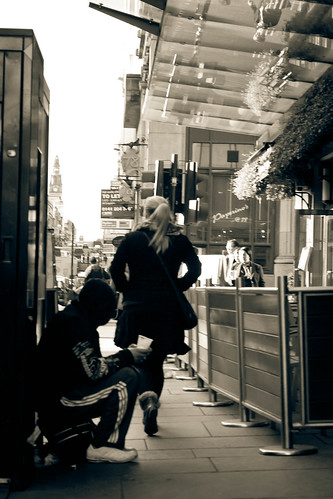
I can't tell what's going on in this photo, it doesn't speak for itself at all and without the context of a title/description nobody might even realize that guy was a beggar (I didn't.) This type of photo is a very common yet important stage of photographer development where you are seeing the idea materialize before it happens but it just hasn't been executed well enough to give the same emotion you felt to someone viewing it. I know the photo is contrasty and has that nice, silvery B&W appearance, but given your goal in telling the story of the woman and the beggar I think you need to keep trying by maintaining the awareness when shooting in public to identify this situation again, anticipate it, and set yourself up with a composition that conveys the story you are trying to tell. Also you need to correct the time and date your camera is set to, it ain't 2012 yet! It was foggy this morning, attached is my favorite of what I shot. I tried to bring out the super faint destination area they're walking to but it was looking like crap so I left it as is. I cropped this a few different ways and I think the overcontrast/tiny people/vertical format is working for me right now, but I'm trying to get back into photo-ing so critiques are appreciated.
|
 #
¿
Nov 25, 2011 08:08
#
¿
Nov 25, 2011 08:08
|
|

|

|
| # ¿ Apr 28, 2024 10:56 |
|
|
I'm confused about the subject here. If you're trying to do what I think you are trying to do in the second photo, then I find the non-parallel lines that are obviously parallel in real life to be sort of distracting because it seems unintentional. I think this scene is one whose value is in repeating patterns, but typically you see those types of shot realized in a flattened, almost two-dimensional style, usually with framing lines running parallel to the border of the photo, and extraneous detail minimized. Your processing runs in line with what I've seen of that style, but shooting into the corner makes it difficult to establish that geometry (if that's what you were going for.) I think the dented garage door is distracting and I'd like to see more or less of it. This is just a great detail capture. The removal of extra detail makes the scale of the photo uncertain at first viewing which I find interesting. Where in Cali were you shooting? Okay, now it's time to shred myself. I have had a desire to shoot a wide angle, shallow DOF self portrait for a while now. I have also had a desire to refamiliarize myself with strobe lighting, so I figured an outdoor portrait while on vacation would be the perfect opportunity to do both. This is today's effort, lit by two speedlites on the left and sun on the back right. My issues: camera is at ball level which is a lot more obvious than I thought it would be, my nose shadow cuts off my left eye, there are too many slightly different horizontal lines in the photo leading to a confusing horizon. Anybody else?
|
|
#
¿
Feb 15, 2012 18:41
|
|
|
truncated aardvar posted:Well, from my limited experience, self portraits are a bitch. I actually think the horizontal lines work well. The horizon is a bit busy on the right side, but I think the fact that there's OMG steam coming out of a building makes up for it. It's probably not like you could wait until the clouds moved I'm guessing. Thanks for the critique dude. To answer your questions: The flashes were together because a single one on full blast was way too weak to overpower the sun. At a distance of about 6 feet even two on full power, one at full zoom and one at medium, was just enough for this. And even with that, they only just barely illuminated my feet, which required a ton of adjustment to bring some detail back out of. They are also together because I wanted to create the shadows on the sun side so that the sunlight would become my rim lighting; in hindsight I don't really like the two light colors and wish I could've gelled the flashes. I could probably fix a lot of it by masking and color adjusting the highlights in photoshop but  I agree with the jacket but it's the only hiking-worthy one I brought on vacation so... Both lights were bare of modifiers. I mounted them both to a single manfrotto nano stand which I was able to get about mid-chest height before the 40mph wind was knocking it over reliably. Same deal with the camera, whose tripod legs were extended to about 4 feet at the last position before parallel to the ground to prevent a tip over. These portrait attempts have confirmed that YN-560s will take a five foot stand-fall onto gravel like a champ, and that they will lie about the batteries being dead repeatedly. I was always able to turn the flash back on and get 10-20 more pops out of every set of AAs. Also confirmed that the Yuongo wireless remote/trigger setup will flash sync on my 5D pretty reliably up to 1/250, but that they will not sync AT ALL if you piggyback two receivers to one trigger so you can have a remote and a wireless flash at the same time. The flash will pop when the camera fires, but it's mistimed just enough to not even be visible at 1/10, which means that every one of these portraits has forced me to do the 10 second timer dick dance for every single frame. Thanks!
|
|
#
¿
Feb 16, 2012 15:10
|
|
|
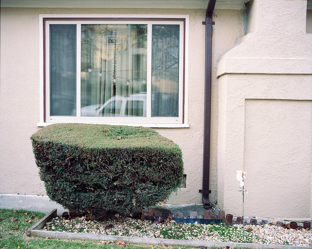
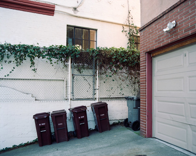
8th-samurai posted:Since I have started posting critiques I may as well post some arts. My work is kind of in a transitional phase right now. Since I moved to Seattle I have been heavily into landscapes. My work isn't really of the "pretty hills and trees" variety, it's about people and how we fit into the space around us. The first one doesn't really land with me, and if I hadn't read your intent for these I wouldn't have been able to read it from that photo. The second is getting there with relating your idea, but I can't really see any of 'the space around' it because it's pretty tight. I am not an art photog, so take this for what it's worth, but I see this scene being more effectively used as the backdrop for some kind of subject or context that establishes your idea clearly. A dude dumping out trash into the grass, a wider shot relating proximity to a manicured lawn, something like that would help my artless brain look at this and say "I get it!" Third is my favorite. I feel like there is a house that has been swallowed by a plant in there. I'd like to see more of the frame showing the other houses to clearly display the contrast between the two. Probably difficult with the greenery layout of the neighborhood, though.
|
|
#
¿
Mar 31, 2012 08:01
|
|


|
No SAD makes me sad, but I'll play along. Recent critique a few posts above this one. We're in the middle of a short spring, a new fighting season, and the brief period between snow and dust where the shaded side of the wind carved hills is fertile enough to bear grasses. The dots on the hillside is a herd of sheep.  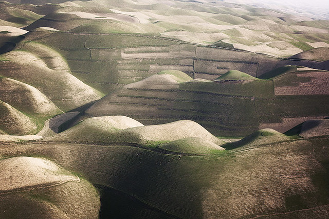  I hate my processing on all of these but I just feel stuck. The dust and haze in the air makes a properly exposed picture occupy the central 1/4th of the histogram and nothing else, then trying to recover the contrast blows the detail out of the highs and lows. It's pretty challenging to maintain a realistic look that isn't also harsh and ugly, and that's what is frustrating me about processing landscapes lately, arrgh. 
Ambihelical Hexnut fucked around with this message at 04:21 on Apr 1, 2012 |
|
#
¿
Apr 1, 2012 04:19
|
|
|
Edmond Dantes posted:
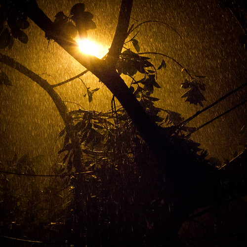
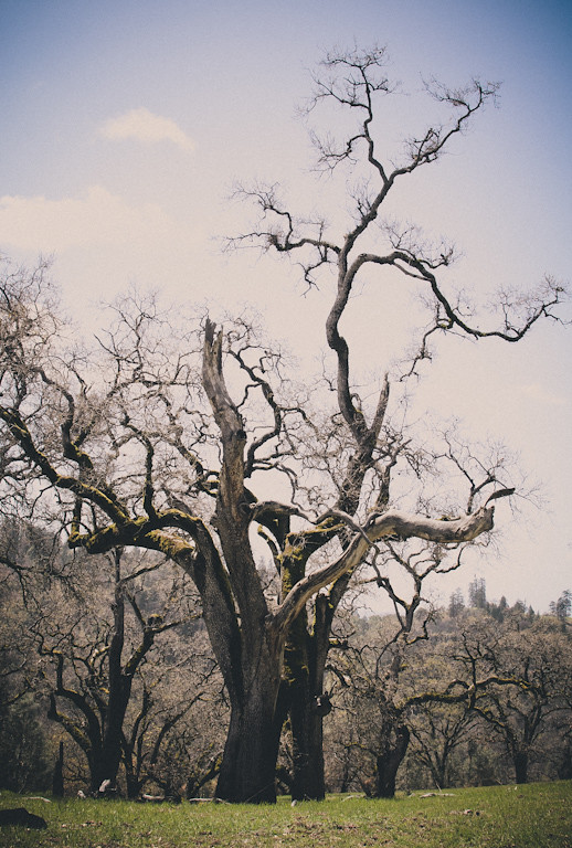
It's a simple shot but I like it. The rain is well lit by that streetlight, good find. Eclogite posted:The processing in the first doesn't read as 'film like' to me except that it's lower contrast and saturation. What I see in the processing here is uncontrolled use of the Shadow/Highlights filter; I'm not saying that's what you did, I'm just saying that's what it looks like to me. CONTEMPLATE THIS ON THE TREE OF WOE. I think the processing on the second one is more appropriate for what you were going for. The third picture is best for me. The light on that tree is nice and it's an interesting shape. Next time I would work on separating it from the background a little more. Tshirt Ninja posted:I dunno if it's missed focus or a soft image or what but it is distracting. The whole thing is a little flat, and while I think the super dark shadow looks great in the thumbnail it bugs me in full size. I DO like the ducks in a row composition and I think it's a good spot that you could massage in lightroom a little better. Mannequin posted:After looking at these for a minute the first is my favorite, which is funny because it was my least favorite of the three upon first glance. The smile and pose feel natural and intimate, like the viewer is her friend. The second is good but I want a tiny bit more detail in the background- I understand what other people are saying with the 'step out of the world' sentiment, but I felt I had to look a little hard to get his context/setting. The third is also good but the facial expression feels to me like the same "I'm being polite but are you done yet?" expression I get out of everyone. ZoCrowes posted:
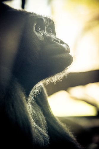
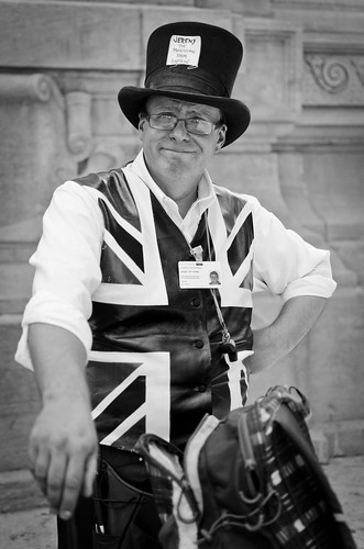
Is that a living animal in the second one? Because it looks like a stuffed animal posed under a spotlight. It's very expressive, I like it. Branch on the right could go, but it's not that big of a deal. I would have no idea what the third picture guy did if not for the caption. I don't think it describes him very well, and without color all is wacky accouterments kind of blend together.
|
|
#
¿
Apr 6, 2012 07:38
|
|


|

|
| # ¿ Apr 28, 2024 10:56 |
|
|
Critiques a few posts up. Here are some more loving landscapes. Again.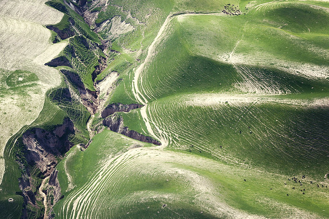 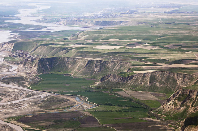 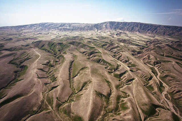
|
|
#
¿
Apr 6, 2012 16:30
|
|