


|
Cockwhore posted:#1. I don't think the processing is over the top, other the fact that you seemed to have pushed the recovery slider way too hard. If you look at the clouds, parts of them are blown out - which is fine in itself - but the parts that are blown out aren't white but are this murky shade of grey, which you should avoid. I also think the composition could have been a lot more interesting, if you had tried to align the lamp-posts to the pillars of the gate. Moving so that the the concrete path is right in the center in the image (and its lines converge in the middle of the image), would have also yielded a stronger image. Everything is almost symmetrical, but not quite, which is driving my brain crazy. Sometimes this can be desirable, but I don't feel this is one of those times. Overall, I think out of the three pictures you posted this is your strongest one (just push the recovery slider back a little bit, please). These didn't get any critique, so I thought I would throw some out. 1st picture. I don't usually like pictures where people aren't facing the camera, but I think it works here. They are both turned facing each other and it looks like they were really enjoying their conversation. On top of that, the lighting is great and it really adds a great feeling to the picture, like 2 people leaving at the end of the day. One thing I would change about this picture is the flare, mainly the green part of it that is hitting the guy's back and the grass in front of him and to the left. It doesn't look difficult to clone out, and I think the picture would be better without it. The second picture. I don't have much to say about this one. Again, I like the lighting and the expression on his face. However, this one suffers greatly because of the branch that looks like it is coming from his mouth, as well as the shadow that is falling on his face. Not much you can do about that, unless you want to spend hours meticulously cloning it out  Also, the second time I looked at this picture, I thought that the branches really take up most of the frame, he is much smaller compared to the bush, or whatever it was. Also, the second time I looked at this picture, I thought that the branches really take up most of the frame, he is much smaller compared to the bush, or whatever it was.
|
 #
¿
Jan 10, 2012 17:00
#
¿
Jan 10, 2012 17:00
|
|


|

|
| # ¿ May 3, 2024 11:25 |
|
|
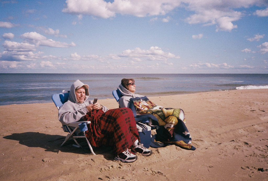
AIIAZNSK8ER posted:I think the problem your having is actually creating a mood. When I saw this photo, I enjoyed seeing primary colors on the dresses, but I don't see a solid concept or vision. Are you trying to show a lifestyle or culture or tell any kind of story? Making the chandelier look like it's lighting the scene would help set the mood. Right now the light looks like a spotlight to me with a hard edge all around the frame. The distortion in the ceiling and the one yellow bright dot are distracting me from enjoying the rest of the frame because it seems so carefully set up. You said you can't go back and re-shoot, but could you have moved the pool table between the two windows and center the moose head. Then get closer and only show the two windows and the top half of the pool table? Unless the full bodies are important to you I think you should get closer. This picture baffles me. Everything about it seems good, and it also seems bad at the same time. The composition is good, colors are good though there is quite a bit of a magenta cast. The grain works well with it also. They look bored. It looks set up, they are facing away from the water, it looks cold, and they look completely uninterested. Fix the color also.
|
|
#
¿
Jan 12, 2012 20:13
|
|
|
CarrotFlowers posted:I disagree with Sevn. I really like this picture. I like the colours and the light. I like that they're sitting on a beach, but away from the water - makes me wonder why they are doing that; what's opposite the water that's so interesting? I think that creates a story. I also love that they're bundled up and bored looking because it's so atypical for a beach scene and also reminds me of several days when my family has gone to the beach on freezing days and had to bundle up. I think the contrast of "they're facing away from the water so something must be interesting" vs the bored faces and the guy checking his phone is really nice. I don't think it looks set up in the least. Sorry, I didn't mean it was a bad thing that they look uninterested, I rambled a little bit. I still think he should fix the color though. I took a look at it, and correcting the color makes it a lot better, in my opinion. Edit: I can see that my wording was quite bad. My only critique is the magenta cast on the picture. It looks a lot better if that is edited out.
|
|
#
¿
Jan 12, 2012 21:05
|
|
|
AIIAZNSK8ER posted:
It may have seemed like I didn't like this photo when I first commented on it, but I actually like it a lot. I really feel like the magenta cast added nothing at all to the picture, and now that you removed it in this picure, I absolutely love it. If I had to critique it now, I might say up the contrast just a tiny bit, but that is completely up to the discretion of the artist (you) and it is not a deal breaker at all, it would just be nitpicking at this point.
|
|
#
¿
Jan 13, 2012 19:38
|
|
|
Oprah Haza posted:Here are my three (I posted critique three posts up). I like the expression in the first photo, but 2 things bother me. First, it is underexposed, and second, it has the framing of a passport/driver's license photo. I like the post processing on the second picture, it reminds me of a painting. However, the picture looks really flat to me which makes it feel strange because he is a big guy. Picture three. I want to like this but I just can't. She is cute, has great hair, and beautiful eyes, but it looks like a random hand is touching her face, the top of her head is cut off, you can just barely see part of her shirt (easy enough to clone out), and it looks like she is trying to look sexy and provocative but it leaves me feeling like you snapped the picture right as she opened her mouth to say something. As for my pictures. I wanted to do something cliche, a jumping picture. Luckily I was looking in their direction right when they were acting like they were fighting. I only took 1 picture of the "fight" and this is it. 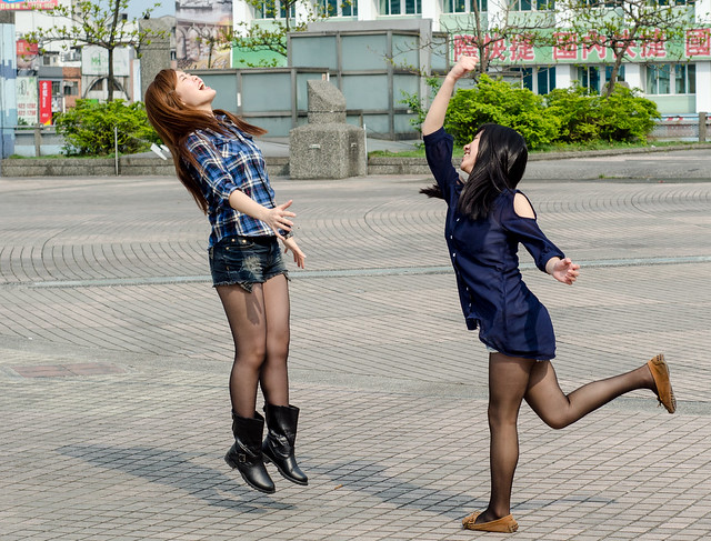 DSC_7012 by DarSevn, on Flickr Second picture. Weather has been fair here and I was waiting for the MRT, so I tried to line this up and make it look nice. I know there is a Taiwan goon here, you might or might not recognize the location, if you have been there of course.  DSC_6929 by DarSevn, on Flickr Edit: One more because I was trying to do some street shots today, along with eating and being interesting to the people I was with. Largest octopus tentacle I have ever seen at a BBQ stand here, and one of the youngest workers I have seen, she couldn't have been older than 14. 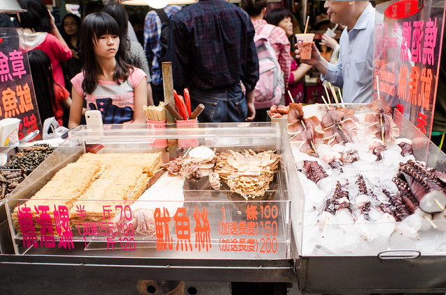 DSC_6991 by DarSevn, on Flickr Sevn fucked around with this message at 13:28 on Apr 4, 2012 |
|
#
¿
Apr 4, 2012 13:12
|
|


|
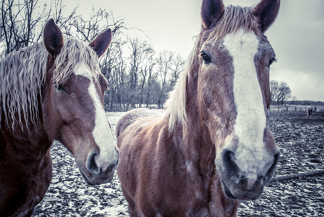
RangerScum posted:I am sure that things were very cramped when you were taking this, but I don't think either of the things you mentioned in your explanation of the photograph are emphasized in this. It's very busy and with all the people behind her, it's hard to tell that the girl is even a worker at the stand. Not to mention that the octopus tentacle you're mentioning is all the way over on the edge of the frame. Plus it's been shot at a goofy angle. Like I said, I'm sure it was cramped, but this photo has a lot of problems. Oh cramped is an understatement. Sunny day, holiday, and one of the best markets in Taiwan. I couldn't even stop to line up anything in that shot. I don't wanna poo poo up the thread with more shots from the market, but I added one more picture to Flickr to give a sense of the amount of people in that market. It also shows the tentacle maybe a little bit better, the thing was the size and girth of my forearm! Edit: As far as your shot of the horses, I like it but I think it is a little cramped also. It looks like really dreary weather, so it would have been nice to see more of the ground and also the rest of the horse's head on the right.
|
|
#
¿
Apr 4, 2012 19:31
|
|
|
Mannequin posted:I scrolled down too quickly and this is what I saw on the way down. I instantly thought it looked like a Mannequin picture but not a Mannequin pose. The subject is killer and if it was candid you did a great job capturing it. Which brings me to the only thing I dislike about it, it is just a little tight. I know some people will disagree with that, and if you didnt approach him at all, it is easy to see why it is so tight. I remember a few months back you mentioned that you were a little burned out doing street portraits, have you think about using a slightly wider lens and doing something like this instead?
|
|
#
¿
Apr 5, 2012 16:29
|
|

|
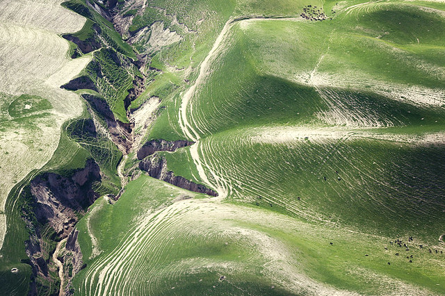
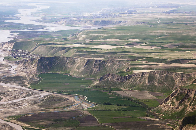
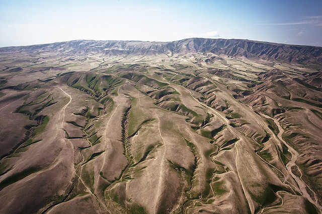
Ambihelical Hexnut posted:Critiques a few posts up. Here are some more loving landscapes. Again. For what these are, they are nothing short of amazing. The only thing I could wish for would be that they are just a bit wider.
|
|
#
¿
Apr 6, 2012 17:22
|
|
|
Evilkiksass posted:Why do you think them being wider would help? 2 of them are at 135mm. I just thought if they were at 85mm or even 50mm, I could see even more awesomeness 
|
|
#
¿
Apr 8, 2012 16:58
|
|
|
Mannequin posted:I don't think it's that boring. Sure, some of it is a little hit or miss here and there, and maybe lately, it may seem repetitive. But I don't think it's boring. I can think of a lot of things before my street portraits that are boring. Maybe I'm biased. Either way, you are free to your opinion!  This sums it up very well. It is easy to critique someone who does street shots, but difficult to understand the feeling and emotion behind it. It is definitely hard to approach a complete strange in what is possibly a hostile environment, ie on the street. It is equally difficult to take a good picture of a random stranger without approaching them. There are a lot of great photographers here, including you. This sums it up very well. It is easy to critique someone who does street shots, but difficult to understand the feeling and emotion behind it. It is definitely hard to approach a complete strange in what is possibly a hostile environment, ie on the street. It is equally difficult to take a good picture of a random stranger without approaching them. There are a lot of great photographers here, including you. It is even more impressive that you realize you were in a rut doing the same thing over and over and now you are planning on branching out. Now, I just need to practice my Chinese so I can approach random strangers on the street
|
|
#
¿
Apr 11, 2012 14:50
|
|
|

|
| # ¿ May 3, 2024 11:25 |
|
|
nonanone posted:Chinese/Taiwanese people love getting their picture taken! Just motion towards your camera and tell them you love their outfit I have been here too long, I am past the cute stage of speaking Chinese, I know too much. Now I either have to act like I know nothing, or learn more Either that, or I get business cards and just hand those out when I take a picture :P
|
|
#
¿
Apr 11, 2012 17:10
|
|