


|
I don't have any critique to offer other than I really, really like that pic. I grew up oceanside and that sort of weather pattern happened frequently, but never really showed up well in photos, and I think you nailed it. The eerily sharp and crisply contrasting above/below cloud lighting, the water in the sand flowing down to the water, fading into the sea, it's great. Well done. Although I admit I sort of expect to see a big "And the Lord will shine his light unto thee, Chronicles 4:20" or something on it. 
|
 #
¿
Jan 30, 2012 18:47
#
¿
Jan 30, 2012 18:47
|
|


|

|
| # ¿ May 1, 2024 06:40 |
|
|
I was just screwing around today. I really don't like this first one at all: it's cluttered, too dark, and the colors of the toy don't pop like I wanted them to. I like the idea of it, but there was no place I could go to get the shot I wanted.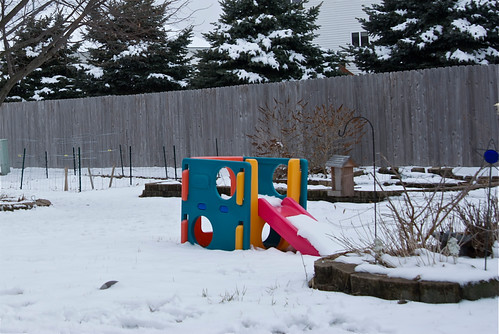 DSC_0003 by Greg Short, on Flickr e: Here's another version which I like more, although I still didn't get the picture I wanted: 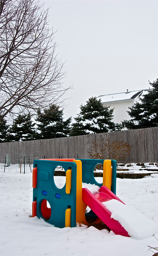 DSC_0002 by Greg Short, on Flickr This one I like a lot more, although the branches in the lower left corner need to be removed.  DSC_0005 by Greg Short, on Flickr Bad Munki fucked around with this message at 21:45 on Feb 7, 2012 |
|
#
¿
Feb 7, 2012 21:17
|
|
|
Bottom Liner posted:Here are a few I like from this week I do like this a one a lot but I have one petty little complaint: I think it would feel more personal if the model weren't wearing shoes. Or at least not big thick heels. They feel really out of place with the rest of the scene. The shoes say, "I just stepped off the sidewalk for this photo" whereas barefoot would more convey that lost in the woods feeling.
|
|
#
¿
Feb 16, 2012 20:55
|
|

|
I have a new baby as of Thursday so I've been working on taking better baby photos.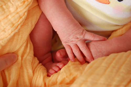 Consolidated hands 'n feet by Greg Short, on Flickr I love this one. The colors are warm and wonderful for the springtime, the image itself is clear and sharp, the lines are nice with a sort of background-in-the-foreground from the cloth, and everything else really draws the focus of my eye into the center of the image with the jumble of fingers and toes. If I had the skills, I'd photoshop out the adult finger on the left side, since I don't think a tighter crop would work here. If I were imaginarily publishing this, I'd remove a couple of the skin pieces on the hand. Beyond that, I can't really think of anything I'd change here, or compose differently, but I'd really love some further feedback.
|
|
#
¿
Apr 4, 2012 02:33
|
|
|
Haggins posted:I can see you're trying to do something, it's just not coming together. What are you trying to focus on? Your baby's form? The details of his/her hand? As you've said it's a jumble of fingers and toes. This photo is chaotic and you need to bring more order to it. Maybe you could pose your child a little bit better so s/he isn't bunched up or switch tactics and fill the frame with his/her hands and/or feet. I did try the black and white thing but it really did nothing for the image and just made it feel really bland. The intended focus was really just the chaotic-but-delicate jumble of digits, with the incredibly calm atmosphere that was present when the photo was taken. Posing is difficult, but is something I'm slowly figuring out how to trick her into doing. For the moment, it's more a matter of snapping a picture when I see something interesting. Harsh or not, it's fair, I'm not offended or anything. Everyone gets a different vibe, and I'll be the first to point out that I'm obviously biased in regards to anything concerning this baby, so that's likely to change my own self-critique in a pretty heavy way. ") Since you pointed it out, though, I can see how the jumble is perhaps too chaotic. Part of my own critique is probably also affected by the multitude of pictures I went through to get that one, and by comparison, it's positively tranquil. On the other hand, I feel like just getting a big image of a single hand or foot, though, is too common, like the sort of thing you see in every freakin' baby frame at walmart. I'm not sure how better to compose all four extremities...The only thing I think I actively disagree with is the colors, as I really like them. Contrast is definitely nice and can make for some really eye-popping images, but to me, the lack of color contrast makes the image feel much more subdued and calm.
|
|
#
¿
Apr 4, 2012 03:21
|
|
|
Okay, still struggling with fancy-pants baby pics, so I played around this morning and picked out three I'd like some further critique on. really appreciated the feedback yesterday, so let's try this again. Today, I tried to pick just a single thing to focus on, with a more color-contrasted background than yesterday's yellow, but which still isn't jarring color-wise. I have some brilliant colors I could put behind her, but I'll work up to that later I think. I think this would look better with the light coming from a less acute angle and being less directional, instead of being almost in a plane with the blanket, which made the lighting feel sort of harsh and put the fingers largely in shadow. I think the blanket ended up looking more washed out than it is in person to my eye, but I was having trouble doing anything there that I liked. I did attempt to retouch the fingers just a tiny bit to remove some shedding skin. To my untrained eye, the parts I retouched look okay, although there's still a lot of tiny bits left, but I decided to leave them rather than further apply any ham-handed editing. The skin looks a bit magenta the more I look at it. I hope the composition feels better than my previous attempt. In the end, though, I feel like this is just "a picture" and it doesn't really do anything for me or inspire any real emotions. 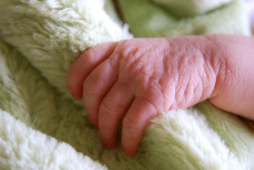 Hand and Blanket by Greg Short, on Flickr The same thing, but in black and white just to see how they compare. I like it, but again it doesn't really do much for me. I tried playing with the contrast and such for a bit, but the shadows are already big enough as is and most anything I did made it either washed-out or made the shadows way too black, and I feel like a baby picture like this should be soft and delicate, not hard and gritty.  Hand and Blanket in Black & White by Greg Short, on Flickr Lastly, this one was just for fun, I didn't really have a plan or anything, but I thought the end result was interesting, if nothing else. I like having the focus right on the eyelid, with everything else out of the focal plane, and the half-and-half composition of the image is, as I said, "interesting," at least to me. I feel like a more artistically-inclined person could do something more significant-feeling when taking such a picture, but I wanted to give it a try anyhow. ") 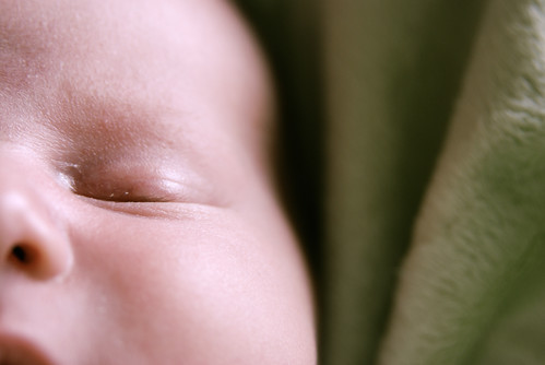 Baby Face by Greg Short, on Flickr
|
|
#
¿
Apr 4, 2012 18:02
|
|
|
xzzy posted:Babies with their eyes closed never works, because they look dead. Haha, wow, you totally changed that picture for me. Probably doesn't help in that particular case, either, that the colors are as cool as they are. What if I managed to get something similar with eyes open and warmed everything up a bit? Or (instead of adjusting the temperature) did it on a sunny day instead of a really grey--but bright--overcast?
|
|
#
¿
Apr 4, 2012 19:48
|
|
|
Mannequin posted:Oh man, I love this. The subject's expression, the sharpness of him, his features, even his hair, all set against the muted but still active background, it's all great. I hate to say "tells a story" but that's the feeling I get. I like how everything feels grey and overcast but not in a cold way, just extremely neutral and dispassionate. I could look at photos like this all day.
|
|
#
¿
Apr 5, 2012 06:21
|
|

|
New day, new allowance of three photos! Still working on this...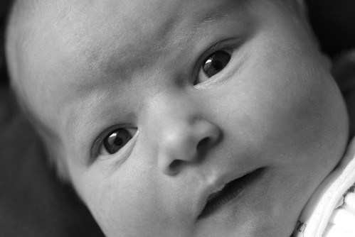 Awake and Alert by Greg Short, on Flickr In an attempt to avoid dead baby syndrome, I tried to get an open-eyes shot. The framing feels a bit off to me, I think the crop should be shifted down a very little bit to show more chin and less forehead. I do like how there's nothing much else to focus on but the face here, and how she really seems to be looking back at you. The black and white treatment definitely helped the picture, especially in the eyes. I wish I hadn't been quite so close/zoomed out and had instead been further away/more zoomed in so that the focal plane wouldn't be so shallow, since her nose is getting blurry at the tip and it'd be stronger overall if every part of the face were completely in focus. Hopefully I'm making some sort of progress here.
|
|
#
¿
Apr 5, 2012 16:34
|
|
|
dukeku posted:Why do you have to be so close? Is the baby a monster, ready to devour the frame? Because last time when I tried to get more in the frame it was advised I try a tighter crop, maybe I'm just not getting it. 
Bad Munki fucked around with this message at 20:53 on Apr 5, 2012 |
|
#
¿
Apr 5, 2012 20:49
|
|
|
Also, I was trying for a more intimate feeling, is it just not working here? Usually when holding a baby, you really are that close. Babies just aren't meant to be held at a distance.
|
|
#
¿
Apr 5, 2012 20:54
|
|
|
Hmm, okay, that gives me something to work with. Thanks for the tips, all, and I'm sure I'll be back later on.
|
|
#
¿
Apr 5, 2012 21:06
|
|
|
Okay, I went nuts this afternoon and took a little over 600 pics. Surely there's something in here that will accurately and skillfully represent my baby dau--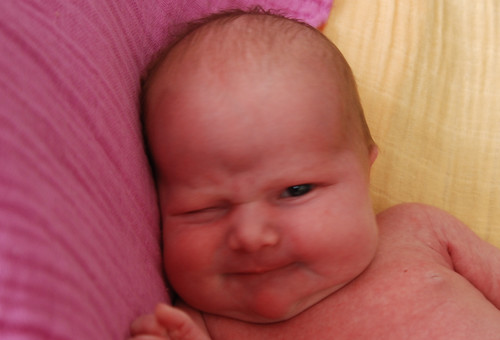 Whoops by Greg Short, on Flickr Erm, scratch that. Let's try this again. Below is the picture I chose as my strongest showing today. I feel like I must be getting closer to a "good" crop, but maybe the frame's still a little crowded? The original photo is bigger, so I can pull back a bit further if it'd help. I'm not sure how I feel about the pink baby on a pink background, I think next I'll be shooting on a pure white or black background and we'll see how that goes. The focus isn't great on these because it was a lot darker than I realized, but the smaller version that gets embedded looks sufficiently sharp. Also, I may have screwed the colors up a bit here. I'm doing all my editing on a laptop and I feel like getting consistent color, temperature, and tint is nigh impossible. If the colors look crazy to you, that's probably why, and I'd love to see something that looks more correct so I have some sort of baseline to work from. I do feel like I may have inadvertently instragrammed the color version a little bit, although I don't think it's necessarily a bad thing in this case. Should I have placed the head further to the right? I can't decide, I feel like with the way her eyes are looking over there it helps to have some open space on that side of the image. 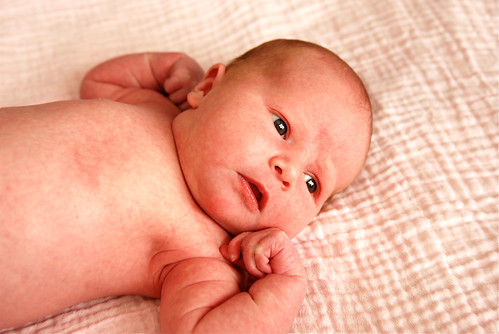 Gazing Baby by Greg Short, on Flickr And the same thing in black and white because I really can't ever decide, although I think in this case I prefer the color one the more I look at them both. However, I lightened this one up a bit based on some advice from earlier today, and I definitely think it helped. 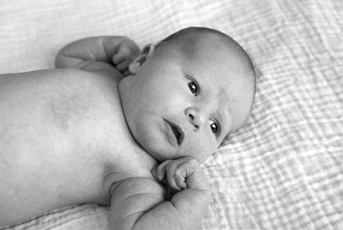 Gazing Baby 2 by Greg Short, on Flickr I also spent some time looking at random baby photos today, trying to pick out things I liked and didn't like, although it's hard for me to find any overarching aspects, it just seems so random as to whether or not a baby picture is going to nail it or not. Maybe that's part of the problem, I don't know. In any event, thanks a ton for all the critiques and advice, folks. It's really appreciated and hopefully I can put it to good use.
|
|
#
¿
Apr 6, 2012 01:41
|
|
|
I do, from time to time. Or at least, I try. Maybe not super in depth, I suppose, but so far I've posted 3 times critiquing and 4 times looking for critiques. Also, I always attempt to provide a more thorough critique on my own work as practice for when I critique others.
Bad Munki fucked around with this message at 02:30 on Apr 6, 2012 |
|
#
¿
Apr 6, 2012 02:26
|
|
|
Okay, I'll attempt to be more thorough in the future when critiquing others here. I guess I was sort of working off of what appeared to me was the norm, i.e. one- or two-line critiques seems to be the common theme in here, mores than complete critiques, anyhow, but if I mis-read that, apologies.
|
|
#
¿
Apr 6, 2012 02:32
|
|
|

|
| # ¿ May 1, 2024 06:40 |
|
|
I shall henceforth wear more pieces of flair!
|
|
#
¿
Apr 6, 2012 02:36
|
|