|
pootiebigwang posted:I like this when looked at from an abstract perspective, but from a landscape perspective it's just too busy to work. What's the subject? The tree? The table? I like the choice of B+w, as it forces the viewer to focus on the shapes and not the colors of your photo. Here are a couple of mine. I don't really know what to do with fog. I really want to accentuate it, but I don't know how. Thoughts goons? 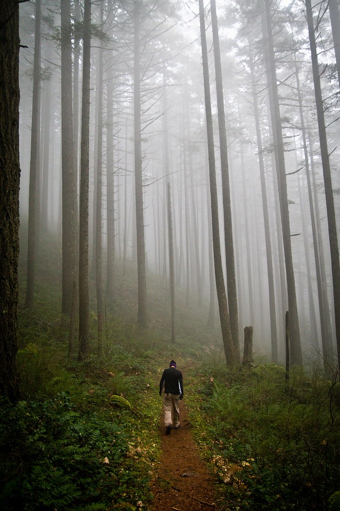 Forest2 WIP by Jenseales, on Flickr 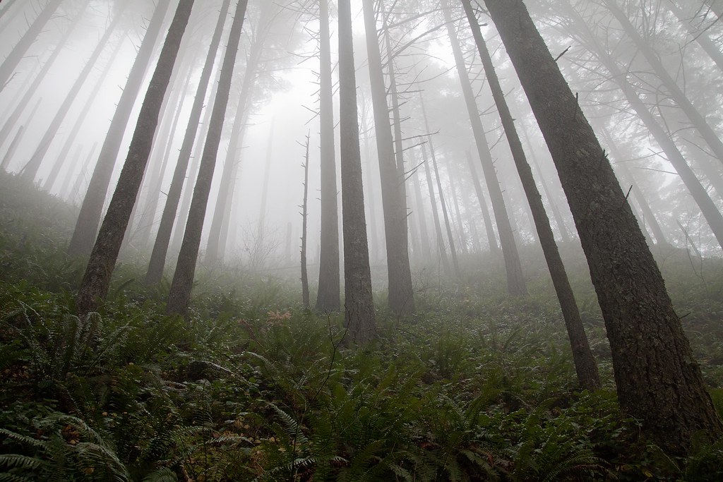 Forest WIP by Jenseales, on Flickr
|
 #
¿
Dec 12, 2011 16:19
#
¿
Dec 12, 2011 16:19
|
|

|

|
| # ¿ May 5, 2024 16:35 |
|
|
Okay, so I went back and edited my second photo. Here's Before: Forest WIP by Jenseales, on Flickr and after:  Forest WIP 2 by Jenseales, on Flickr Good or bad? Even noticeable?
|
|
#
¿
Dec 14, 2011 00:59
|
|
|
Kingdom of Sin posted:I think brightening up the ferns is a step in the right direction, although now the greens are REALLY GREEN. I also feel like you've lost a little of the beautiful, hazy subtlety that the fog has in the first version. I think the lower contrast might be preferable for the trees, and then maybe work independently with the ferns? Both your fog pics are gorgeous, by the way, especially the one with the guy walking along the trail. I wouldn't worry too much about messing with the fog and agree with Pope Mobile that it looks good the way it is. Thank you! Okay, This is probably going to be my last edit of it, as i'm getting frustrated with my lack of photoshop skills. How does this compare to my second revision? old Forest WIP 2 by Jenseales, on Flickr New 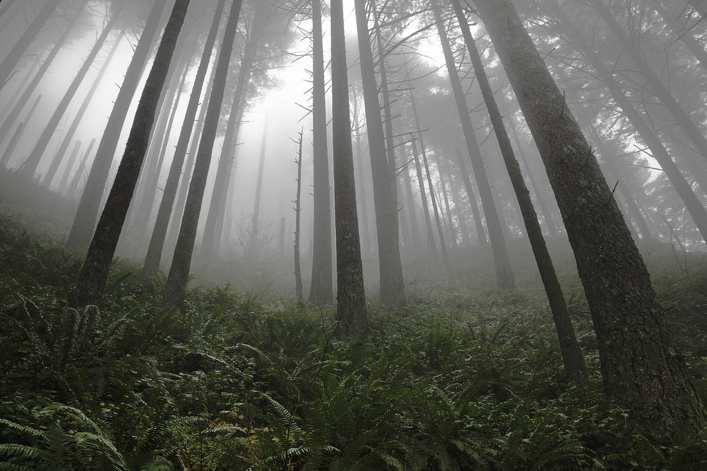 Forest WIP 3 by Jenseales, on Flickr I really appreciate you guys giving me your input, Kingdom, Rio and Ferris Bueller!
|
|
#
¿
Dec 15, 2011 02:38
|
|
|
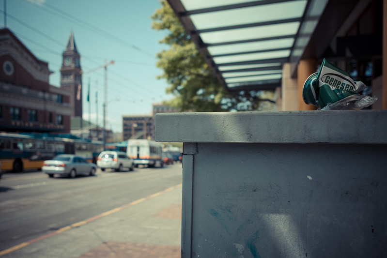
KongGeorgeVII posted:This is great, I love how the light is positioned. I know it's impossible but I wish the microphone wasn't blocking our view of the dude. The colours are amazing, and the diagonal lines make the composition more energetic. I don't know what you were going for with this. It looks like you had a bunch of stuff lying on your desk and you were too lazy to go outside, or you wanted to show off your iPhone, iPad and Macbook. I'm not trying to insult you, I've fallen prey to just taking pictures of poo poo on my desk all the time. I just feel like this is a lazy picture. *edit* I also think that, while the lighting is decent, it looks a little underexposed. I went to the Portland Japanese Gardens today. Here are the two best pictures of the day for me. Let it rip! By the way, the colors look best in firefox. Chrome makes it look really lovely.  Japanese Garden by Jenseales, on Flickr 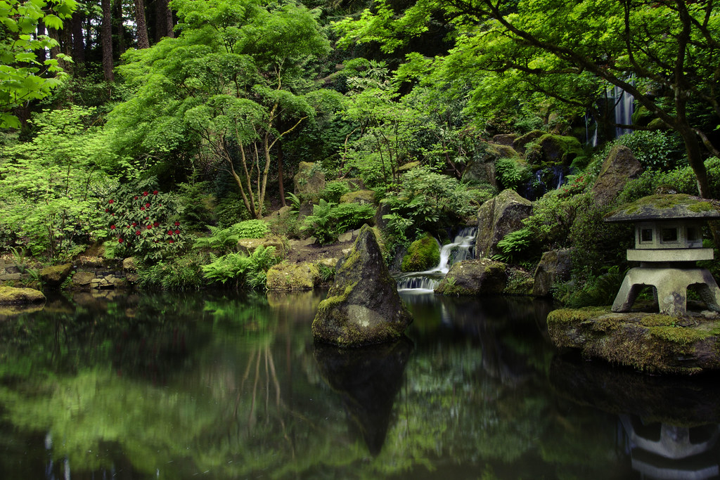 Reflection by Jenseales, on Flickr Turd Nelson fucked around with this message at 03:56 on May 18, 2012 |
|
#
¿
May 18, 2012 03:53
|
|


|
krackmonkey posted:went for a walk at lunch today, trying to shoot my way out of a slump - still pretty deep into one...keep shooting... I really like the tone and color of these. That yellow hydrant really pops! Did you do split toning on these? I like split toning. You've done a fine job at making the subject stand out without removing it too far from its environment. I think the shortcoming lies in the subject - firehydrants aren't terribly interesting to most people and unless it's shown in an irregular context or it's doing something (like spewing water!) Thanks for the feedback everyone! I went ahead and removed the bench at the bottom (which I hadn't noticed until it was mentioned). 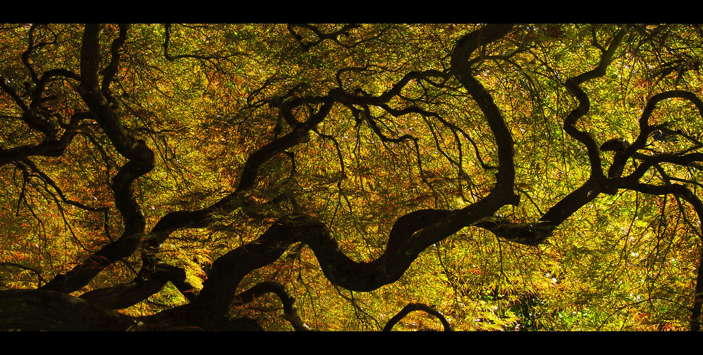 Japanese Garden by Jenseales, on Flickr Here's another shot from the Japanese gardens. I was trying to emulate the look of Alien Cowboy's stuff. How do the colors come off? Too green?  Untitled by Jenseales, on Flickr
|
|
#
¿
May 19, 2012 07:09
|
|

|
Redleg posted:
This picture makes me so happy ") It's like you stumbled on a tribe of goats that were making merry music when you stumbled upon them. Nice depth to the photo overall. I will say that it's a bit dark - brightening it by like 1/2 - 1 stop might make it even more appealing! It might have also been nice to keep that tree on the right in to make a nice framing. It's like you stumbled on a tribe of goats that were making merry music when you stumbled upon them. Nice depth to the photo overall. I will say that it's a bit dark - brightening it by like 1/2 - 1 stop might make it even more appealing! It might have also been nice to keep that tree on the right in to make a nice framing. I took this shot in Bodie, California - I think everyone from Cali knows about this ghost town. 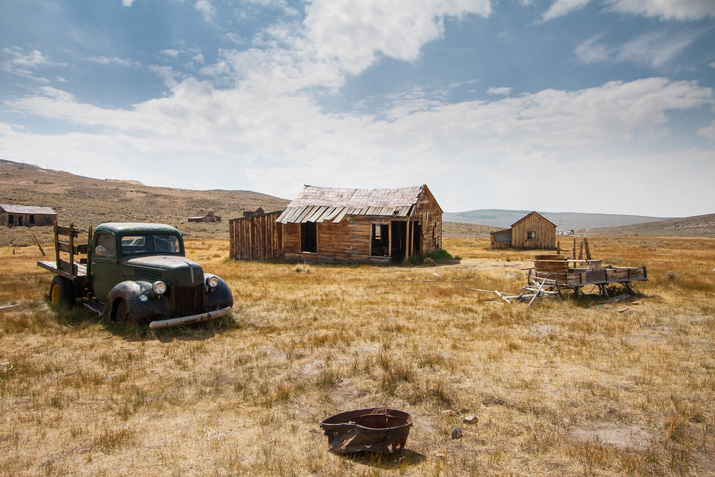 Home by Jenseales, on Flickr
|
|
#
¿
Sep 7, 2013 05:35
|
|

|
NebZ posted:
Well unfortunately it's too late to turn around and drive 700 miles back there, but I took everyone's critiques into consideration, played with the curves a little, AND got rid of that house on the left. How does this look? 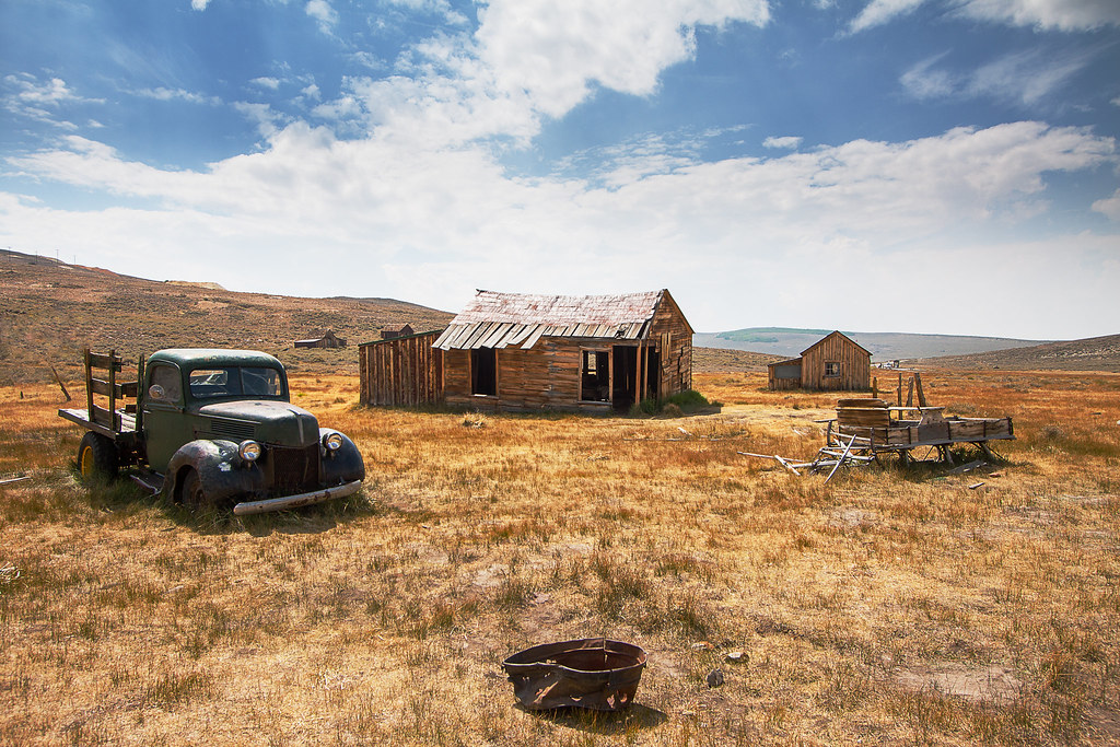 Version 2 by Jenseales, on Flickr Original Home by Jenseales, on Flickr
|
|
#
¿
Sep 20, 2013 15:21
|
|
|

|
| # ¿ May 5, 2024 16:35 |
|
|
Tenterhooks posted:
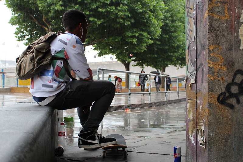
It seems like he's staring at the pillar. I agree that it's telling a story, but it would be much more powerful if we could see what he was looking at - maybe a group a girls or some skaters? Maybe if we could even see his face? I can't tell what his emotion is. The pillar has some interesting texture and colors on it, but it's a big blob that takes up good quarter of the screen. I commend you on using leading lines to reinforce where the viewer should be looking!
|
|
#
¿
Sep 20, 2013 15:35
|
|