


|
RangerScum posted:Ok I'm going to count my last critique towards this photo. I'm kind of stuck with this image. I need something to make it a bit more memorable... but I'm not having a lot of ideas pop into my head. I think the problem your having is actually creating a mood. When I saw this photo, I enjoyed seeing primary colors on the dresses, but I don't see a solid concept or vision. Are you trying to show a lifestyle or culture or tell any kind of story? Making the chandelier look like it's lighting the scene would help set the mood. Right now the light looks like a spotlight to me with a hard edge all around the frame. The distortion in the ceiling and the one yellow bright dot are distracting me from enjoying the rest of the frame because it seems so carefully set up. You said you can't go back and re-shoot, but could you have moved the pool table between the two windows and center the moose head. Then get closer and only show the two windows and the top half of the pool table? Unless the full bodies are important to you I think you should get closer. Would like some crit on the following: 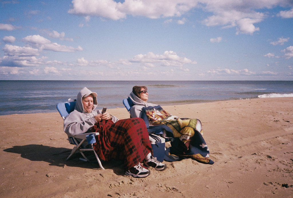
|
 #
¿
Jan 12, 2012 17:19
#
¿
Jan 12, 2012 17:19
|
|


|

|
| # ¿ May 3, 2024 10:39 |
|
|
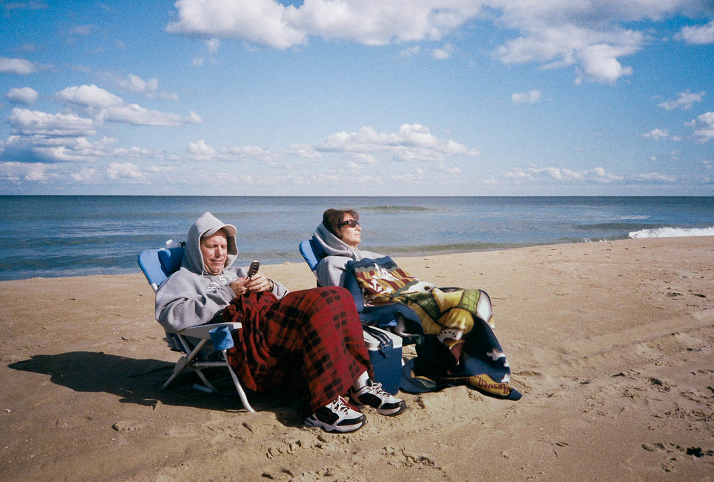 I think this fixes the color issue some have had. I'm not convinced that either version is any stronger than the other. This was not staged, these people were really like this. I think this was in August or September. They were facing away from the ocean for some reason and I saw him on his phone and she was kind of just sleeping. I walked over to them and asked if I could take some photos of them. They didn't care and I took 3 snaps. I liked this one the best because of how they fit between the sky, water, and sand. The other frames ended up intersecting heads with the horizon line that just don't look as clean. Opposite the ocean is the boardwalk and view of all the hotels. I think maybe the were just trying to face the sun? I found it funny to see these people all bundled up at the beach. rio posted:
The first one needs to be more consistent in exposure to show a pattern well, or be really deliberate in any bright spots and contrast. The shapes, lines, and colors are not even at all and don't show me a pattern at all. The second is meh. I've taken tons of street lamps, I think next to squirrels and benches, it could be a Dorkroom favorite. Each element in the photo make a nice idea, but keep trying. The third makes no sense to me, and doesn't seem like a thoughtful photo. What did you like about it? Bottom Liner posted:
Welcome back! I miss seeing your stuff. Good on you to take up a 365 project, I never could. I'm not seeing the cinematic thing you're going for. It's difficult to pinpoint what makes a still frame movie like to me other than it has such a cohesive mood that I can imagine the entire scene the photo was lifted from. The first I think needs more ambient light. The subject is floating torso in darkness banging away at floating drums to me. It just gets too lost in darkness, which doesn't seem deliberate enough because of that yellow patch of vinyl siding above his head. You know what you did wrong in the second shot. His arms are too hot, you framed it too tight, and odd shadows on the legs. The third has a great mood and is interesting to look at, pretty awesome photo for me. Feels awkwardly framed though. It's kind of square but not? Maybe some of that awkwardness comes from me thinking he's a dead body laying on the ground which you've then set right side up by rotating the photo.
|
|
#
¿
Jan 13, 2012 15:44
|
|


|
Axel Serenity posted:Well, the color was fixed, which helped a ton. But, I'm still not entirely crazy about the grain and don't think the photo would suffer any at all if there was less. I'm also a fan of tight crops, at least from the sides with that one white strip of foam on the right, but that's probably a personal choice in the matter. Looking at the data, it looks like this was shot on film? If so, I'm not sure it can be fixed, but I feel like there is something funky going on with the blanket with the reds kind of merging together a bit more than they probably should. It's actually kind of hurting my eyes now that I focus on it a little more. I can't really place my finger on it, and it could be a saturation thing given that the rest of the photo is relatively muted in comparison. I'm glad you find it interesting. The grain is just part of the film I used. It's cheap drugstore fuji 400. I shot on an olympus XA, prob just set to f/8. It's not cropped at all, I think I just leveled the horizon a bit. I felt that the subjects are placed in the frame at where I find it comfortable. The blanket is doing some funky stuff, I'll have to look at the original negative and see where the scan lost some detail. It was scanned by Ritz. I'm not sure what you mean by vintage look because it's modern film and a modern camera. If I could change it, I wish I could have them at the same angle, but I would have been able to make the sand horizon level as well, but they way they were turned, it wasn't possible. TomR posted:
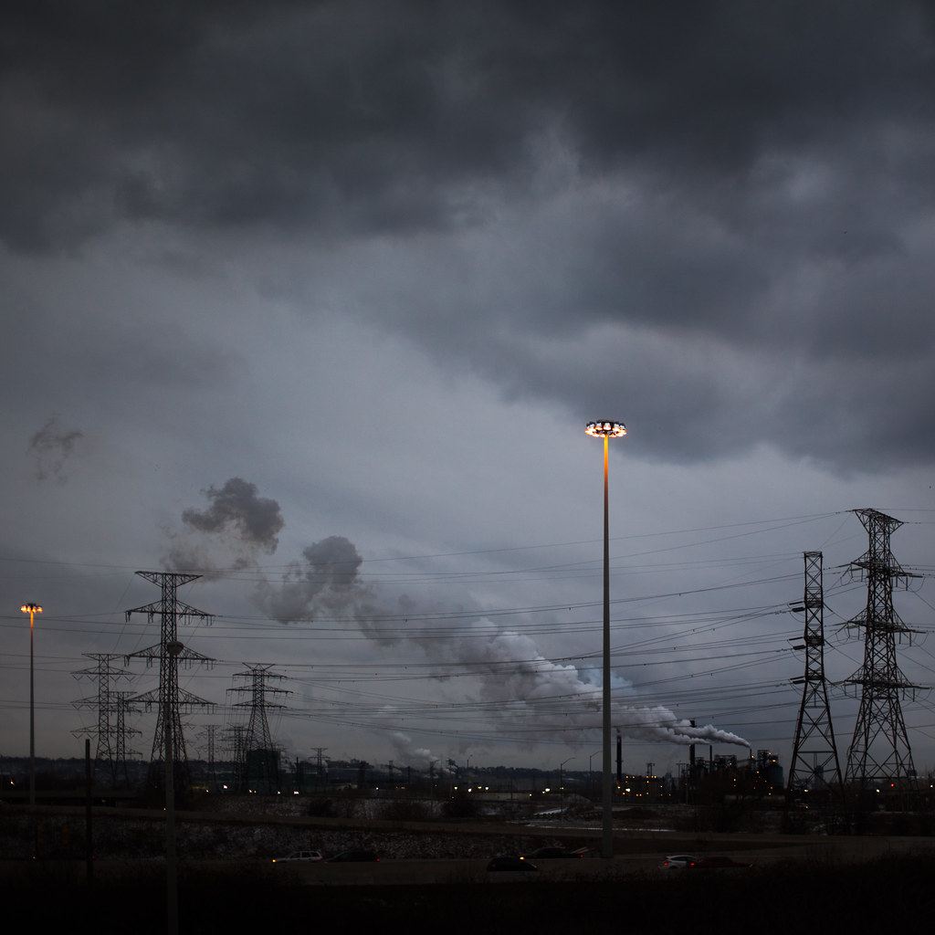
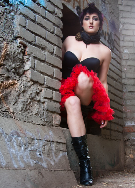
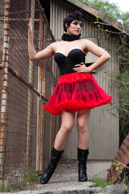
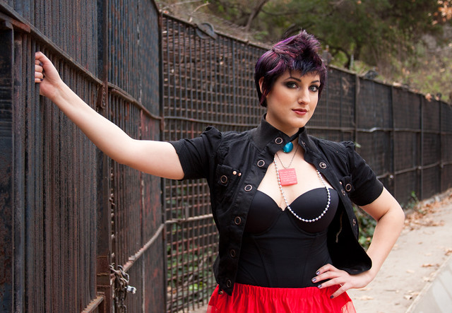
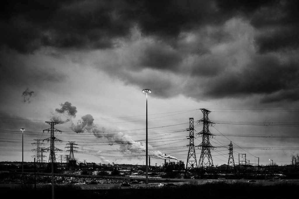
My first thought was that there is too much room a the top. The layers of grey and clouds aren't that strong. I love the scene that you have found, its very industrial with the towers and smoke stack. The single light tower makes a good subject for me, for that reason I think you should crop out the second smaller light on the left side. Any reason you went with a square view? Axel Serenity posted:The first pose doesn't work very well. It removes any height she has and foreshortens her body weirdly. She looks crammed into that space both physically and in the photo by framing it so close to the top of her head and bottom of her feet. The brickwork is shown at a weird angle. The second photo is is OK, but I think you should shoot with a longer lens to compress her in the scene more and shoot either at eye level or just a bit higher. The third photo is the strongest of the set, keep experimenting with poses and looks because the photos you have shown remind me more of a senior portrait session with funky clothes rather than a fashion concept. Your exposure and camera work are pretty solid, keep shooting and show us what's next.
|
|
#
¿
Jan 16, 2012 01:22
|
|
|
Bottom Liner posted:
You are doing a ridiculous job for a 365 project. Each shot has been varied and you are exploring all kinds of styles and techniques. Please keep it going. The first shot is an almost for me. The highlights are bit too bright. The box of cake mix and baking power are laid out so perfectly, but you've also got a knocked over bottle of spices. I think all of these detract from the subject the moment you've created. If you removed the 'props' I would still know what was going on without being fed too much information. I've found that I try to put props in to give the scene some context, but in this case, the mixer and flour flying through the air is enough. Everything else is too much fluff and distracting, especially because the boxes are bright colors with big bold writing. quazi posted:
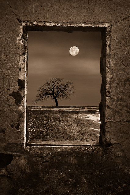
I hope you know of Uelsmann because these give off that vibe. The first is my favorite because of it's simplicity. It shows a clear concept to me. The second feels too forced and is clunky. If it didn't have the concrete window border, it might still work. The third does nothing for me, the leading lines you've created don't take me anywhere interesting. I really enjoy the tones and mood you've created though. I look forward to seeing more of these. I think you should take this idea and look for more negative space that you can create and try to keep it simple like the first photo.
|
|
#
¿
Jan 17, 2012 04:07
|
|


|
People tend to look better if you use a longer focal lengths. It's hard for me to explain, but shoot someone full length at the wide end and again full length at the long end and you will see how distant things now appear closer together in the frame. Sometimes this will simplify a background and the subject will look more naturally proportioned. The downside is that you will need to back up a bit farther. These links kind of give you an idea of what I'm trying to say. http://www.mcpactions.com/blog/2010/07/21/the-ideal-focal-length-for-portraiture-a-photographers-experiment/ http://www.ephotozine.com/article/focal-lengths-in-portraits-5687
|
|
#
¿
Jan 17, 2012 04:37
|
|
|
quazi posted:There's definitely some Uelsmann going on. Sometimes I think my traditional work is getting a bit stale and needs a kick in the nuts, and what better way to do that than to cannibalize it into new work. My most popular pieces feature a dominant subject in a field, so it makes sense to carry that mindset over. If you want a real kick in the nuts, start photographing people. Your interior commercial stuff is amazing. Put some people into those spaces and find a way to bring more life into the scene.
|
|
#
¿
Jan 17, 2012 06:35
|
|
|
TomR posted:
I like this version better, but I still think there's too much headroom.
|
|
#
¿
Jan 19, 2012 01:06
|
|
|
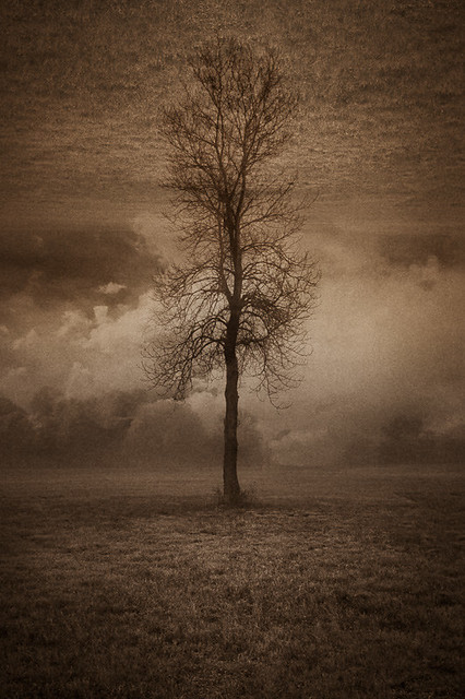
dowdy_pants posted:Fantastic!! You've given me some inspiration to do the same. Wish I had trees in my neighborhood. What is it that you like about the photo? It would be more helpful to Bottom Liner if you expanded on why you are drawn to it, and how it inspires you.
|
|
#
¿
Jan 19, 2012 20:58
|
|
|
8th-samurai posted:As a series I'm interested in seeing more. The first photo is the weakest of the three, but is definitely a part of the mood and atmosphere of the set. The first photo is all about the stop sign for me, but it's not drawing me into the photo as much as it could. The second photo is awesome. Are you able to recover the sky any more in the original print? I think it would be really stunning if you could see some more detail in the clouds. The layers you have found with light/shadow, artificial horizons, and colors really make me enjoy this photo. Good Stuff! The third photo really makes me want to go out and shoot more. You captured some amazing light and soft colors. This really succeeds as a landscape about people. Since snapshot has been kidnapped, have a scene I found interesting, instead of cat photos. 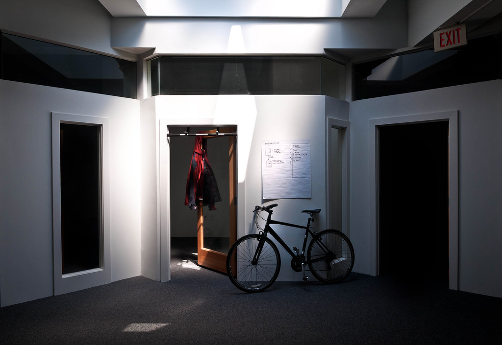 rice bowls-0379 by AIIAZNSK8ER, on Flickr
|
|
#
¿
Mar 31, 2012 19:18
|
|


|
Bottom Liner posted:First photo: The subject and composition are interesting, but the lighting setup is too artificial and a bit harsh. There's not enough tension in the frame as is and there is not enough mood in the lighting either. Think about showing more stiffness, like an out of place mannequin, or more action to show the middle of a scene. Second Photo: Really nice, I like the scene, I like the characters in it and everything kind of fits. It's got a nice moment. My one complaint is that I want to see more his face and not the back of his head. Third Photo: I love this kind of portrait. It makes me feel good to just look at it. It feels natural and has a ton of personality behind it. My complaints here are to remove the glasses from the counter, either put them on her head or switch out the pen in her hand with the glasses. The glass case should be displaying some more products rather than being empty, but not sure how much control you had on that. The final thing would be that unfortunate rest room sign in the back. I guess you'd have to shoot an even longer focal length to compress it out of the scene or get up higher and shoot down to get it out of the frame. TheLastManStanding posted:-Maybe it's just me, but I kind of wish the bike, jacket, and pull up bar weren't there. The lighting and architecture are really cool, the rest kind of detract from it. I'd probably also get rid of that exit sign. whereismyshoe posted:I have no really new photos to post but i just wanted to say that i love this. it almost seems black and white but then you've got the brown of the door and the red in the jacket and the really nice subtle blues to bring you back into the reality that you're looking at a color photo. it's like real life selective coloring which is the only good type of selective coloring. the lighting is perfect. cool shot. i like. Bottom Liner posted:There is some really nice light there but too much clutter that makes it just look like a normal room, nothing to draw you in or make your eyes care to explore the space and gorgeous light. There either needs to be more stuff or nothing, it's just kind of bland as is. fnif posted:I like this one, but there's something that's just not working for me. I don't know, but somehow I feel that the jacket is taking too much of my notice. Thanks for the response everyone. I was focusing on the light first and how it made this space more interesting. The jacket was meant to add color and something to think about. The bike I found to be an interesting shape that is held against the white walls. I wanted to include the empty dark spaces on the side to bring out depth and shape to the weirdly angled walls. Anyways, I appreciate the feedback. Thing I found interesting tonight:  unwined-1260 by AIIAZNSK8ER, on Flickr
|
|
#
¿
Apr 3, 2012 03:09
|
|


|
blarzgh posted:I wish I had a better process - I generally just set out with nothing in particular in mind and just start walking around, taking pictures of what interests me. When I want to be intentional about making photos outside of a studio, I'll try to stack the odds in my favor as much as I can. This means going out when the light is appropriate and I already have some idea of what looks "good" to me. Then the hunt begins for interesting light, and waiting for subjects and compositions to fit into that light. I always start with light, and work the scene. My keeper rate is about 10%. Getting experience and just going out to shoot without a plan leads to easier shoots in the future, eventually, you'll find a groove. Your shots have interesting scenes, I especially like the stair shot. I think it could use some better light, to give a sense of depth or atmosphere. I went to a drift event and was happy with these non-car photos: Race Seat  Tired  Monty Hall Problem 
|
|
#
¿
Nov 3, 2023 14:54
|
|
|
|
| # ¿ May 3, 2024 10:39 |
|
|
xzzy posted:Light chasing can be paralyzing though. You go out expecting rich warm tones and the clouds burn off or it starts pissing rain and nothing looks "good" because it doesn't match your expectations. Results in you either taking no pictures or deciding you hate all the ones you did take. Valid. I would hope that none of your practices end in consistent disappointment. Taking record shots for revisiting is something I need to do more often.
|
|
#
¿
Nov 3, 2023 16:53
|
|