|
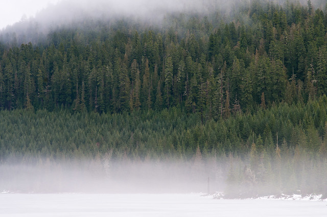
Dread Head posted:I get the feeling that a wide angle would be better here, the perspective effect and dragging in of the weather and sky might help. The fog on the bottom just seems plain distracting. Personally I find weather more interesting if you can display some sort of texture and the fog just obscures without adding any tone. Maybe wider for a bit more context and using the gradient of how fog obscures more and more with distance might have worked well with the pine forest.  Lighting Test by trambopaline, on Flickr Me playing around with a home made snoot and my flashgun, can't decide if I like the shot or not, and would humbly submit it to goons.
|
 #
¿
Feb 1, 2012 11:44
#
¿
Feb 1, 2012 11:44
|
|

|

|
| # ¿ May 1, 2024 09:02 |
|
|
Cockwhore posted:I don't like the fact that your face is obscured. If the focal point of the picture is somebody's body, that should be because their pose, clothing, body type, is interesting or unusual. Seeing the photo with no context, the first thing I think is, "self-portrait of somebody who feels insecure about how they look". I might be way off, here, it's just the first thing that pops into my mind. Yeah fair enough. Better than indifference for sure. I was trying to go for the, hey look at me i've got an old camera, trying to make that the focus of the image, but i guess something just got lost in the translation.
|
|
#
¿
Feb 6, 2012 07:22
|
|
|
Wafflecopper posted:
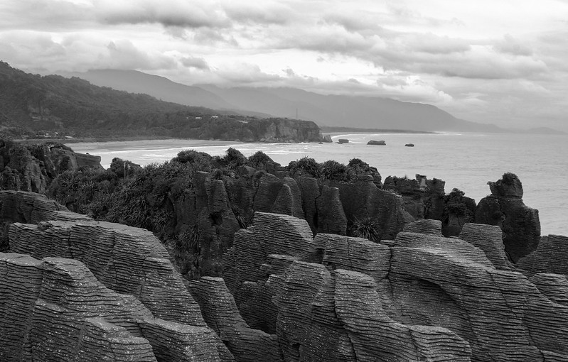
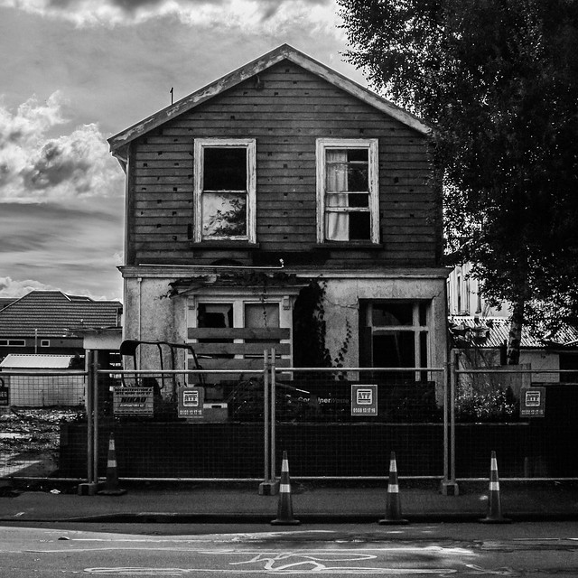
I like the first one. I wonder if you could try adjust it and squeeze a bit more of contrast out of it to really bring out the texture of the rocks. I also feel the composition is a little haphazard. Yeah there's cool rocks but there's not a ton you're really doing with them in the photo? The great landscapes I see always manage to have a composition, and don't just really rely on the subject being cool. The second one is neat too. Maybe the sky is a little overdone on this one? There's more detail in the sky versus the building itself and the photo is a little less balanced which detracts a little from the whole, very symmetrical look you're going for in the photo. Also, next time maybe move the cones around? I know it is a nitpicky detail, but again, if you're going for the square on, anything to help maintain the balance helps make it look a bit more interesting. Now me. Yay soundmonkey for dragging me back to this thread after fleeing from it for months at a time. Trying to get all like those sweet Med Format portraitists in the MF/LF thread at 798. 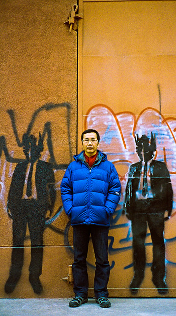 0025 by trambopaline, on Flickr
|
|
#
¿
Apr 10, 2012 11:09
|
|
|
harperdc posted:Early April is cherry blossom season in Japan; this year is my first, and while I want to go to some other, bigger places for it next year, where I did go was beautiful (plus I got to hang out under trees in the lovely spring weather with my friends, which is mostly the point anyways For the first one, i think the horizon is just a bit slanted. Can be a visual illusion, but it feels a bit wonky to me. Otherwise, I see how you're trying to show how a coastline looks with a ton of cherry trees but i feel the trees are a bit awkwardly cut off and you don't get enough tree in frame for it to dominate properly. If you use a longer lens, the focal length compression might help with something like that to blow up the background for the cherry trees to dominate, though getting just the right angle might be tough. Just my two cents. For the second one, the issue is again rather loosely composed image, you have a second lantern half cut off, a wonky post, a label below that's protruding from the bottom of the frame. Cool idea with the people in the background celebrating hanamatsuri with the lantern with the name on it, but they are a little too out of focus, and it took a while for me to realise it wasn't just about the lantern in this photo. I am assuming a lot, and forgive me if it sounds like i'm just ragging on you at this point, but I think to improve would just take you slowing down a little bit next time and really think about how everything fits together. You got some cool ideas and a really cool event/locations to shoot, which puts you ahead than a lot of people. ------------- So here's me trying to do self portraits. It's tough actually trying to pose someone's head and After a couple of hour's this the only one I like. Trying to look gritty and cool here. Any advice for improvements? 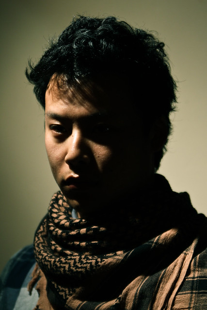 Self Portrait by trambopaline, on Flickr
|
|
#
¿
Apr 17, 2012 13:07
|
|
") ).
).

|
Polegrinder posted:This is also Rembrandt-esq, reminds me of his self-portraits. I do wish the scarf wasn't so crisp. It feels like the face needs to be more in focus. and maybe a bit warmer light on the face to get more detail on that right side, at least so the eye is less in shadow. Hmm yeah. It's really dumb when you finish everything and you realise major technical flaws. I do see it now, as I was just playing with shadows because a more hard lighting type set up has been my latest obsession but it is a little too severe. Will try later when I get more time.
|
|
#
¿
Apr 26, 2012 08:50
|
|
|

|
| # ¿ May 1, 2024 09:02 |
|
|
Axel Serenity posted:
I'm not a huge fan of the lack of depth of field. I find it, especially with the embroidery very dazzling to the eye, and you just end up a bit overwhelmed with the cardinals logo at the start. Maybe the answer is not necessarily more depth of field, but more construction of the composition and how the whole shot is composed with the DoF you have at hand. I also find the naked light source interesting as something to work with, but I agree Kiri in saying that it might be a little too dramatic. Using these flash ratios is fine, but the shadows are just a little too prominent in the composition as well. Again, not necessarily saying make it more boring, but be a little more regarded in how you are composing. 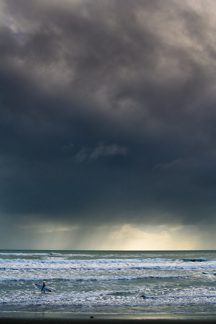 Surf by trambopaline, on Flickr Finally took a photo I don't hate. It's been a while, and too many commitments in life at the moment.
|
|
#
¿
Jun 25, 2012 13:12
|
|