


|
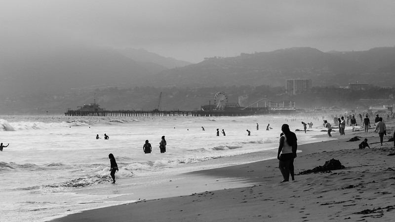
INTJ Mastermind posted:The patch of light works really well. From a lighting perspective, we could use some back-lighting to separate her hair from the leaves of the tree, and to seperate her rear eye from the background. Her brown eye just kind of blends right into the leaves, which is a bit awkward. Your other two pictures look great btw! The fog really helps this image. Telephoto compression can crush the feeling of depth in a photo like this and make it sort of boring but here some of the depth is preserved by the fog that gradually swallows things up as they fade into the background. The emptiness of the fog in the top-left also serves to counterbalance the busy beach scene in the bottom-right. You might consider the horizon line of this photo for your flickr or facebook banner. Foggy horizons make excellent skinny, horizontal banners.
|
 #
¿
May 21, 2013 16:16
#
¿
May 21, 2013 16:16
|
|

")

|

|
| # ¿ May 21, 2024 03:25 |
|
|
I like this one the best of the photos you posted. It's well exposed, well lit, and you captured a nice smile. It's funny that the wide angle distortion makes the baby's hand look enormous. If that wasn't intentional, watch out for it. Opals25 posted:
 House planet
|
|
#
¿
Jun 3, 2013 01:24
|
|


|
crime fighting hog posted:First, a bad one: What do you mean by "simply not enough exposure"? What I see wrong there is that you framed a shot with that huge blown out window in the background. In a situation like that you need to either have a fill flash to bring the room up to the level of the giant, bright, distracting window or you need to recompose so that there is no giant, bright, distracting window. I don't like the eye lines either. The kids are all looking off camera at...? Show us (or at least hint at) what they're looking at. Nothing generates internal structure in a photograph quite like an eye line, we are always interested to see what other people are looking at.
|
|
#
¿
Jun 3, 2013 20:06
|
|

|
That metal dude, I think you did a fine job working with the focal lengths you had. Each of those images is well composed, even if you'd have liked to have zoomed more. What is the deal with the flooding? First I see your photos then this pops up on my reader: http://www.boston.com/bigpicture/2013/06/flooding_in_europe.html
|
|
#
¿
Jun 5, 2013 20:14
|
|
|
FistLips posted:How did you do this? It looks cool and I'll like to try something like this too! The short answer is to shoot a 360 panorama and stitch it as a stereographic projection, pitched 90 degrees. I used a panoramic tripod head but people say you can get it to work without one. There are tutorials available on the web: https://www.google.com/search?q=hugin+planet+tutorial&oq=hugin+planet and here are a smattering of other photos created using this technique: http://www.flickr.com/search/groups/?w=1007018%40N22&m=pool&q=planet
|
|
#
¿
Jun 10, 2013 17:07
|
|
|
Dread Head posted:I wish that the was higher up and instead of including some of the brick at the bottom I would have rather seen more of the window. I think while the tv reflection is not ideal it is not so over powering that it is the first thing you see. I like the second one a lot because fog but you've pushed the blue and the green too much in the first one and it comes off looking a bit unnatural.
|
|
#
¿
Jun 26, 2013 18:27
|
|
|
xenilk posted:Love the window light on that one, if you wanted you could have defused it a little bit more so her stomach has the same amount of light than her face but other than that it's fine. Her eyes are gorgeous and the posture is great. I have to agree with the other poster than her right hand is the weak point of that photo since everything else is well posed the right arm just feels out of place. I would say you could have moved it along her body to define the right side of her waist but that's just me. Are you familiar with https://www.flickr.com/photos/itsedsy
|
|
#
¿
Jun 27, 2013 19:18
|
|


|
I find that along with working the curves and the basic exposure, a split tone with a bit of orange in the highlights and a bit of blue or purple in the shadows can add some depth to a midday shot's harsh shadows and over saturated colors.
|
|
#
¿
Jul 1, 2013 04:47
|
|
|
I could just google but... what is agrotourism?
|
|
#
¿
Jul 4, 2013 02:55
|
|
|
rio, you forgot to post the shot of the unicorn in that set. I like middle shot the best. It's well composed with regard to the horse, the rainbow and the pond. When I look at it blown up I find myself wishing the people in the background camera left were not there, that there wasn't quite so much clutter in front of the building camera right, and that the flowers in front of the pond weren't there since all of those things distract from the double rainbow and the horse. The top shot seems to be an effort to reduce all of those distractions (and catch the rainbow reflection in the pond) but it has a really unbalanced feel to it. My eye follows the rainbow up and out of the frame, which is kind of a weird place to have your eye taken, and I only notice the reflection upon second viewing. The background on the shot of the peafowl is a bit underexposed. How would people have processed this shot?  I felt that the background in the original was too bright and that it distracted from the subject. I used the radial filter in Lightroom 5 to darken the background around the flower and the bee, then dodged a few petals that didn't quite fall under the radial filter. Then I bumped the overall exposure so that the flower and the bee were brighter because the whole thing had gotten a bit dark. Here is the original: 
|
|
#
¿
Jul 5, 2013 15:30
|
|
|
Huxley posted:Second try at posting a couple, with some critiques on my own. (All with an S90, the flowers in macro mode.) In all of the shots you posted you're suffering from the near infinite dof of a point and shoot. All three of these shots could be improved by isolating the subject with a shallow dof. This shot with the tree is especially tricky. Taking pictures of trees in a forest is quite difficult. Light and trees in a forest that look interesting in person often appear as an unorganized jumble in a photograph. A shallow dof and a perspective away from the big blown out highlight could have helped your image. Try firing up photoshop or whatever you use and take a crack at applying a gaussian blur and some burning to the background of those images to help isolate the subjects. It should give you an idea of what's possible. krackmonkey posted:
I like that this shot has a pretty even divide between a warm cast and a cool cast along the bottom left to upper right diagonal. Did you process it this way or did it just happen? I almost feel like you had to have processed it like this because I'm having a hard time imagining what the light would have reflected off of in order to get that color cast.
|
|
#
¿
Jul 8, 2013 17:42
|
|
|
In the second shot it would help a lot if the skater were facing the camera.
|
|
#
¿
Jul 9, 2013 23:16
|
|
|
Oprah Haza posted:Was there a fireworks moratorium? No offense but shots of the actual fireworks themselves are really same-y seen one you've seen them all. The last one you posted is well executed. Nice shape, good color, very clean and isolated. My favorite fireworks shots are landscapes + fireworks. This guy has some nice ones from DC:  Fireworks on the Potomac by dyoshida, on Flickr  Fireworks of Alexandria by dyoshida, on Flickr  RedWhite n Blue by dyoshida, on Flickr I also like fireworks shots that incorporate a viewer:  Boom. by rogvon, on Flickr Sometimes you can get turn around and get shots of the awestruck faces of kids, lit by the fireworks. Those are pretty good too.
|
|
#
¿
Jul 11, 2013 15:06
|
|


|
Marshmallow Blue posted:Sorry, I'll make sure that its in focus or not before I post it. Better focus is something I'll definitely start working on, making sure that its tight and crispy. I think of all the photos I've posted so far they have been from one of two hikes, and both of those hikes were poor lighting ( I think at least the plane crash metal was at close to half a second shutter speed + an ISO over 800. I'll rapid fire some of the other questions. I'm trying to work more on my close up photography as I think some of my more land-scapey shots are better. http://www.adorama.com/BG190CXPRO3.html http://www.adorama.com/OTTS.html Expensive but they go on sale sometimes and they're very light. If you get a nice ballhead it might end up weighing half as much as the tripod. If you ever get serious about getting a tripod consider saving up for a nice carbon fiber one because eventually you're going to want it, especially if you hike with it and the weight matters. AF is not cheating but I could see a product photography class having an emphasis on being able to get manual focus. In product shots if the focus is ever so slightly off it can matter a lot and there's no reason not to manually tweak the focus since the product isn't going anywhere.
|
|
#
¿
Jul 11, 2013 15:15
|
|
|
That metal dude posted:As someone who left DC three years ago I want to personally thank you for these firework pictures. Stunning and well composed, you did a wonderful job incorporating the city. The first two are my absolute favorite and the colors really help set the mood of the overall picture. I am going to use these as my reference point for future firework projects, my last attempts weren't so productive. Thanks but I didn't take them! Just a photog I follow on flickr. I'd like to take fireworks pictures like that too but I usually have some social commitment on the 4th (beer) that prevents it. (Also I probably am not that good). I'm surprised your photo doesn't have a thousand likes and sparkly great photo gifs attached to it already. It is a fine example of sliders set to max style. The only thing it's missing is some additional sunset light on those clouds.
|
|
#
¿
Jul 11, 2013 22:36
|
|

|
I am not much of a zootographer, what do you like about those shots you posted? They all have some technical issues that I don't think you intended.
|
|
#
¿
Jul 16, 2013 22:48
|
|
|
The first one is a bit blurry. I'm guessing it's either the glass between you and the monkey or missed focus. The second one has a huge, obvious reflection. The third one has big blown out areas in the background that I find sort of distracting. Not to say that any of that stuff is wrong, just pointing it out so you're mindful of it in case it wasn't intentional. I was asking what you liked about those photos because I figured there had to be something about them that made them the ones you like and I was interested in what that was.
|
|
#
¿
Jul 16, 2013 23:41
|
|
|
Putrid Grin posted:The girl seems a bit squished at the bottom of the picture. I would play with the crop to see if you can get a bit more balanced composition. The picture has a bit of a counterclockwise twist to it that is really bothering me. Part of it is lens distortion, I think, since the lines in the center behave differently from the lines toward the edges.
|
|
#
¿
Aug 9, 2013 17:33
|
|

|
Mr Yuck posted:I mention the background, because I didn't really notice the trees in the background of this shot, either. It's hard to find open space in Delaware... https://www.youtube.com/watch?v=DDGDgc1qNCA
|
|
#
¿
Aug 11, 2013 15:30
|
|
|
Huxley posted:The cranes were kind of the last thing I noticed about the picture. Like VB said above, it might all be in the style you're shooting for, but the white cranes on white sheets over white wall get a bit lost. Especially since I guess they were dropped over her and shot, they seem a bit out, especially compared to her. If you have a ton of time to set up, maybe consider suspending them so they come out as crisp as the model (again, assuming that's the goal)? You could fishing line them long then sheepshank the line to change heights as you care to. All the hard setup would be in pre and you could still move quickly with the model there. You haven't toned yours quite the way the inspiration photo is toned. Your blacks aren't crushed far enough, you are missing the bluish haze surrounding the shadows, and your photo doesn't have the blue shadows/golden highlights split toned quality. Your photo also isn't tack sharp and has more depth of field than the inspiration photo (notice how the man in the background of the shop is very visible and noticeable in your shot but the background of the inspiration photo is more nicely blurred out). You might run into problems with yours too because it mixes incandescent lights (the background light) with window light (the key light on the baby's face). The inspiration photo looks like it's all daylight. At the very least it's all one color temperature. All in all, your photo looks a little flat compared to the inspiration image. When I look at the technical details of the shots the reasons for all of this become apparent. The inspiration image is medium format film and probably shot with a nice, sharp prime lens. All at once that gives it shallow depth of field, great sharpness, and all of the tonality you're after. Your shot was on a Canon S90 which has a comparably tiny sensor (7.44 x 5.58 mm vs the 6" x 7" film in that medium format camera). The tiny sensor means tons of depth of field in anything but macro mode. You've also got a zoom lens which means you aren't getting the sharpness, clarity and contrast that's really making those two little girls pop. And you're shooting digital so you don't get all the tonality of the film. You can pop over to the post-processing thread if you've got questions about how to mimic that film tone. It's a very common question. I think people usually say you can get there just by playing with lightroom/Photoshop but it can be helpful to be a preset pack like VSCO. Dren fucked around with this message at 21:19 on Aug 13, 2013 |
|
#
¿
Aug 13, 2013 21:17
|
|


|
Skizzzer posted:I feel uncomfortable walking around people with my camera, I don't know how you guys just take pictures of angry old men and kids and stuff: Hint: it is not a coincidence that the old man was angry
|
|
#
¿
Apr 23, 2014 15:07
|
|
|
StarkingBarfish posted:And for some of my own, I'm trying a bit of split toning, based on some discussion in the post-processing thread about this picture: The split toning in the first one seems very subtle. The second one is less subtle but it's nowhere near over the top. Did you go with yellow highlight/purple shadows for your split toning in both? I think you'd need to go more of a yellow/blue to get tones more like the one in the photo where you are infatuated with the tones. Maybe play with the hue and stuff too. You want the image to end up feeling a little bit washed out so maybe cut the contrast/clarity too. A split tone I kind of like in shots in midday sun is blueish highlights/reddish shadows. Kind of counters the harshness of midday. You could try that on img_0056. The composition of img_0056 puts the girl a bit too far to the left for me. The composition of img_0002 is too tight for me. There is too much neg space between the couple and they are too close too the edges... it takes a second to see that it's a shot of a couple looking at each other across the crowd and that would be remedied by being zoomed out a tad.
|
|
#
¿
Apr 23, 2014 18:38
|
|


|
StarkingBarfish posted:I'm surprised you find it subtle in the first photo- the original shot was very vibrant, and I found the toning procedure washed it out a lot. I don't have the original to compare to. What I mean is that it's not hit-you-in-the-face instagram obvious that you split toned it.
|
|
#
¿
Apr 23, 2014 21:27
|
|
|
grack posted:The biggest issue as that your model/actor is totally dead weight in terms of body language and expression. He's not really coming across as aggressive. Seconding this. XTimmy, you said the guy is trying to sell himself as aggressive, and the lighting/setting were great for aggressive, but when I looked at the guy all I thought was "puppy". grack posted:
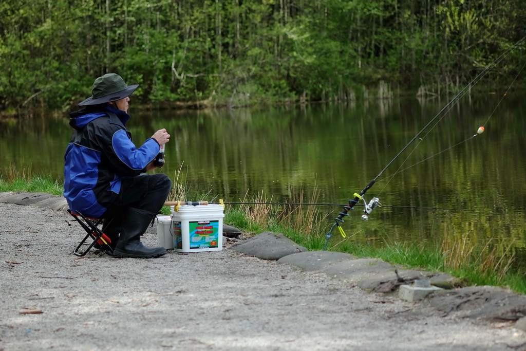
Not sure what the subject is here. There's a lot of negative space in the foreground which makes me think maybe you're showing the lack of a second fisherman along with the unattended pole. But the unattended pole is cut off along the right edge of the shot so that's probably not it. I dunno it's sort of jumbled. It'd be an ok shot of just the fisherman if not for the unattended pole.
|
|
#
¿
Apr 28, 2014 18:11
|
|
|
Huxley posted:I've cropped this one a dozen different ways and never settled on anything, really. Placing the V dead center felt right enough, but it does push the balance a bit high. If you crop it a bit tighter it makes a nice v for a letters-made-of-things-that-are-not-letters series
|
|
#
¿
May 3, 2014 23:26
|
|

|
Hydrocodone posted:I like the second and third but not so much the first, for the same reasons people have brought up. I think the colors are good as vibrant as they are, seeing as it's advertising. The vibrancy is attention-getting and fun. But this last one I think needs more depth of field. I'd like it more if the curls of her hair were all in focus or close to it. I feel like you missed a typical angle I expected to see w/ the furnace fire showing,  If you can get them to turn out the lights in there so everything is lit only by the fire/hot glass that would be a bonus. Something where you drag the shutter to capture motion as she spins the glass or something would have been good too.
|
|
#
¿
May 9, 2014 19:10
|
|


|
iammeandsoareyou posted:Well here goes for my first attempt at a critique. I like the mood the picture set with the light rays, but I feel like there is not enough separation between the dark background and the dark cross to make the cross pop. I think if you upped the exposure slightly it might pop more. Or if you are good with dodging and burning, dodging the background a bit might make the subject pop more. Also I think that the tree in the bottom right hand corner is a bit distracting. What's up back of the capitol buddy? The back is the best view of the capital.  Mine suffers from a blown out sky but oh well, it was just a quick iphone shot. I liked those lamp posts too. I'll have to check my archives to see if I took any with my real camera and how they turned out. I recall trying to get something working with the lampposts in it but not being very happy with the results. Looking at the iphone shot the problem probably was the sun being too high and blowing out a huge section of the sky. You were at 26mm on your 18-55, could you have gone wider to get the lamp posts, the sky, and the plaza all in the shot? As it is the shot feels like it's been chopped off at the bottom, seeming to scream for a bit more foreground. Something else you might have tried if you'd had a longer telephoto was to back wayyyy down that walkway and try to include the lampposts that way. This guy did that and the results aren't amazing but I think a better shot with the same idea could be pulled off https://www.flickr.com/photos/toshio1/11456831156. The sky isn't your friend here either. I'm sad to say that the sky in yours is drab and uninspiring. Are the girders in Georgetown? I think I know that spot. Anyway, I feel like the leafless trees in the background are a distraction from the clean lines of the girders. edit: and since I am posting poo poo from DC here is a shot from Union Station that I really like 
Dren fucked around with this message at 22:24 on May 13, 2014 |
|
#
¿
May 13, 2014 22:19
|
|


|
iammeandsoareyou posted:Thanks for everyone's input on the capitol shot. I think the consensus on that one is that the cropping is off and the clouds are distracting. Looking at the files from that day I think I am just going to have to go back and re-shoot it before I transfer out of DC. There is a lot going on back there anyway that I did not get the first time. I like the telephoto idea. Thanks for the compliment. I looked up the thing I tried with the lamp posts. Basically I just went all wide angle nutjob trying to squeeze them in. I do not recommend it, it looked stupid.  It's unbalanced, the lamp post is getting crushed by the wide angle distortion, there's a dude w/ a suitcase in it because it was just a test shot, that small fence really throws things off... blech. Someone better than me or who spent more time might be able to get it to come out nicer but I think one of the other views would be better. Something else you might try is one like this where you catch the reflection of the dome off of that glass in front of it:  I imagine I was at the edge of where the glass ended, so it may not be possible to get the reflection of the entire dome in the glass. Which is kind of a shame because the shot would work much better for me if the whole dome was reflected. Maybe I wasn't at the edge of the glass though, check it out.
|
|
#
¿
May 14, 2014 01:35
|
|
|
Wafflecopper posted:
The lighthouse is disconnected from the foreground and tiny. It kind of looks like a toy or a small scale model + a perspective trick. I like the idea of the reflection but the shot would be more effective if the lighthouse had more presence and that might have meant giving up on the reflection. thetzar posted:Here's one from me that's also in the portraits thread. As I said there, "I've started playing around with selectively applying color temperature, which I picked up from this guy, who is way better than I am." This was also a quick shoot which reenforced to me just how bad at directing a subject I am. This is a co-worker who I stole five minutes from for the shot. I'm generally introverted, and I find my taking pictures of people to be something of an imposition -- so I try to move as quickly as possible, not bothering to give much direction or try too many things. This is something I know I need to work on. The results of this shoot were a dozen exposures that were all -almost- there. If I had taken more time then, I think I could have gotten better results and more engagement from my model. You went much more subtle with the different color temperature of light for your subject than the guy who you cite as your inspiration. I like the grit and the texture present in the wall and on the hoodie. Not sure what you were going for with your model that you didn't feel like you pulled off.
|
|
#
¿
May 19, 2014 02:49
|
|


|
whaam posted:There's something about the contrast between the rock and the pale blue sky that is making this feel washed out to me. Not sure if that makes any sense but that's just how I'm seeing it. It's perfectly exposed but things feel a bit too bright, maybe just the time of day and the harsh light. The reflection turned out great, and it looks really great as a pocket of blue in all that rock, the light and sky is just throwing me. Maybe you'd like it better if you fixed the vignetting? The composition does feel unbalanced. If that's what's bothering you then cropping out some of the water like you suggested would put the island closer to the bottom where it will feel more settled and probably result in a composition that feels more balanced. Thoogsby posted:The color of the ceiling bricks is fantastic in this. Thanks, it's from that afternoon light reflecting off of the sidewalk. That corridor looks fairly drab in comparison at other times of the day.
|
|
#
¿
May 23, 2014 21:55
|
|

|
murp posted:Here's some beach stuff from a trip this weekend. I like the first two, they're nice and well composed. The second one is especially nice. The third one is interesting but for whatever reason I'm just not feeling it. That might just be me though. What technique did you use? Also, I looked through your stream a bit and you should post some of those abandoned amusement park shots over in the landscape thread. I liked this one but there were a bunch that were good.  DSC_9412 DSC_9412by Dingus Falcon, on Flickr
|
|
#
¿
May 26, 2014 17:50
|
|


|
mAlfunkti0n posted:My wife and I went out for a hike yesterday. Since I bought my X-E1 I enjoy taking it with me and have found a love for photography again. Too bad I am not all that great, so tell me what I can do better! The one thing I did not like about this one is the ftfy Seriously though if you take a picture and find that you don't like it because there is a huge tree in the way try moving. Take ten steps to your left to get the tree totally out of the frame. Take five steps to the right to try and work with the tree by framing the path under it. Walk past the tree and switch to a wide angle to get a similar composition relative to the woman and the position of the sun and see if that works out. Or cut the tree down and go back to where you were originally. Sometimes there isn't a better vantage point to be found and that's ok, some pictures don't work out exactly perfect for whatever reason (in this case a huge tree) and it's perfectly fine to like them anyway.
|
|
#
¿
May 28, 2014 18:09
|
|

|
Yeah thinking like the camera is tough. I agree with this:xzzy posted:Hiking and enjoying nature is easy, bringing it back home in a camera is hard. I find it especially hard to take a pleasing shot of the woods. There's some people on here who do a nice job of it though.
|
|
#
¿
May 28, 2014 18:36
|
|
|
David Pratt posted:Johnny Reb - you might want to read the OP, you know, like it says in the title of the thread. I find your warning to the poster to be tough but fair. I don't think I would change it. However, it ultimately failed to convey its message to the viewer — he posted a critique but didn't edit it into his post so it's possible he may still be probated.
|
|
#
¿
Jun 2, 2014 20:17
|
|
|
Skizzzer posted:
I like this picture. The light from the streetlamp is nicely flagged by the housing of the lamp, creating some nice falloff that makes the shot. Also, the shot is framed well. The other two pictures are kinda meh. In the first one there's not a whole lot going on. The subject is the 25 sign I guess? 25 is a good number. The flowers are pretty in the second one. The centered composition is sort of dull, the background is busy w/ all those cars, and the light is kind of dull too.
|
|
#
¿
Jun 6, 2014 15:34
|
|

|
Hydrocodone posted:Leaving the color discussion aside just a moment, I think these shots have a lot of potential but I want a wider angle on both of them. The first feels like it needs a little breathing room above and on the right side. The second I want there to be more space all around, the gate's close to fitting in and so I want it to fit entirely in and I think it would serve the photo well. u mean something like this? https://www.flickr.com/photos/damonabnormal/3185438616 or this? https://www.flickr.com/photos/sthomasphotos/2761798491 It is kinda tough to take a pic of *just* the arch and get the whole arch but leave space bc the thing is tightly hemmed in by buildings.
|
|
#
¿
Jun 16, 2014 17:03
|
|
|
Mr. Despair posted:don't bother naming all your pictures cause man it's weird  Pretty much anything past an informational title is almost always pretty 
|
|
#
¿
Jan 3, 2015 02:17
|
|
|
Thorpe posted:I don't really know much but I do really like the colors and how it draws my eyes farther and farther back. Would love to visit a place like that one day. First two are fine snapshots of stuff in a museum for you to file away then one day when you're looking through your photos be like "Oh hey yeah I remember that time I went to the museum and saw the mastodon skeleton and the Teddy Roosevelt bas relief. That was a nice day." The third one is a nice photograph though I wish it weren't cropped so much. Seems like you did a really nice job of standing right in the middle and getting the symmetry perfect. When I look at it big on flickr it could be a little sharper. Might be camera shake, try using a faster shutter next time. 1/25 is a little slow for 18mm on a crop body. There's also some distortion evident in the ceiling that's being held up by those two big columns. Do you have Lightroom set to correct the distortion from your lens? All in all though it is a nice composition and a pleasing subject. It's a bit more interesting than the first two pictures.
|
|
#
¿
Jan 4, 2015 04:00
|
|


|
I don't know how auto ISO works on Pentax but if it's like Nikon you can set a minimum shutter to make sure you don't get camera shake while shooting in A. Or use manual like Velocibacon suggests.
|
|
#
¿
Jan 4, 2015 06:01
|
|
|

|
| # ¿ May 21, 2024 03:25 |
|
|
Mr. Despair posted:I think a more useful rule of thumb is 1/focal length, so if you're using a 300mm lens you want to shoot for 1/300, if you're shooting a 15mm lens you can probably get away with 1/15. That's assuming you're shooting 35mm, so on crop you might be a little worse off, but still, it's a good starting point. 1/(focal length * crop factor) works for me
|
|
#
¿
Jan 6, 2015 04:58
|
|