


|
Tactical Mistake posted:I agree with you, those are my thoughts on the pics as well. Overall your shots are considered and have a good zone 5 range and warm, unified colours which are working very well. However, in the top and bottom one, the island/subject matter breaks the negative space in quarters and halves which isn't the strongest. Watch your ratio of negative space to positive space and you'll see that the edges of the islands and lighthouses hit the centre points of the composition.
|
 #
¿
Dec 4, 2011 01:57
#
¿
Dec 4, 2011 01:57
|
|


|

|
| # ¿ May 12, 2024 22:56 |
|
|
Pickman posted:I'm not sure about the post-processing on the above pic. Can't quite put my finger on what the problem might be though. In addition to composition (already mentioned), the two colours that are mixing -- the purple-blue and yellow-green aren't very flattering to the subject. The blacks cross-processed to ultramarine ads a sci-fi hue, which can be cool in some cases, but not this one. Also, they are very sickly colours that don't compliment the subject (food-related). In addition to composition, lighting -- good lighting -- is your friend. Chase it relentlessly. 3 Photos I took recently on a trip to SF: 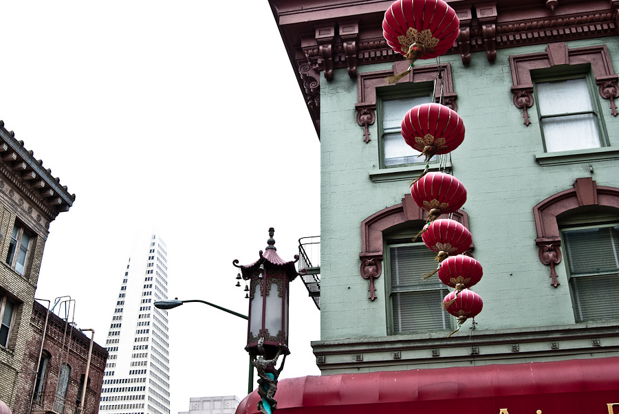 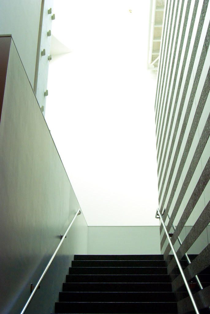 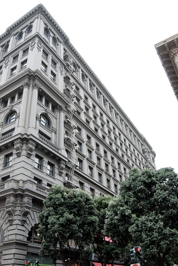 I'm pretty slow and infrequent when it comes to photography (just got a digital 2 years ago), and I'm just mostly focusing on basic composition. Would love to know what more experienced eyes see. ") Disreputable Dog fucked around with this message at 07:35 on Dec 6, 2011 |
|
#
¿
Dec 6, 2011 07:28
|
|
|
Tighten, crop, simplify. I can work on that. Thanks Kingdom of Sin, I'll take that forwards into new shots, and more seriously consider elements that can be lifted out.
|
|
#
¿
Dec 9, 2011 04:40
|
|