|
Enigma89 posted:Thanks for the feedback! This is my 2nd week with my first camera so I appreciate it. There's nothing wrong with autofocus. It's fast and let's you get nice, in-focus pictures. Manual exposure, on the other hand, is where you want to play around. I don't know if there's many people here who would actually say manual focus is better than autofocus..to me there's no point in manual focus, especially in a fast paced place like a party. I mean, it's a good skill to have probably, but I would spend my time learning things like composition/exposure first. I don't mean to speak for robertdx, but I assume what he means when he says "cutting things off in portraits..." is because you disembodied her hand away from her face. There is her head, then a hand in the middle of the frame, and nothing to connect the two. To you, obviously you knew it was her hand, but to an objective viewer who wasn't there, it looks a little funny. It's something to watch for. I know the feeling of having a new camera and taking pictures of everything because it's super fun, but try to keep in mind what would be interesting to an outside viewer, and frame your photos based on that. That's not to say pictures of lights or wine glasses can't be interesting, it's just the way that you choose to frame them and compose the shot that will bring interest to those objects. Keep practicing ")
|
 #
¿
Nov 30, 2011 03:34
#
¿
Nov 30, 2011 03:34
|
|


|

|
| # ¿ May 1, 2024 03:06 |
|
|
atomicthumbs posted:In my opinion, manual focus is better than autofocus if you have a camera with a focusing aid and a big viewfinder. I knew there would definitely be some people that prefer manual focus, but especially at this stage in the game, I would spend my time focusing (hurr) on composition and getting the exposure right, and then move on to manual focus if it's something you feel you want to learn. Just seems like it's a bit unneccessary as something to try to battle right off the start, especially with a camera that isn't the easiest to work with in that regard.
|
|
#
¿
Nov 30, 2011 04:52
|
|
|
Turd Nelson posted:I like this when looked at from an abstract perspective, but from a landscape perspective it's just too busy to work. What's the subject? The tree? The table? I like the choice of B+w, as it forces the viewer to focus on the shapes and not the colors of your photo. I really enjoy both of these. The first one seems slightly off-level, but it could be my lovely monitor isn't level. The bright, saturated foreground blends nicely with the muted colours and contrast of the fog.
|
|
#
¿
Dec 12, 2011 18:25
|
|
|
Waarg posted:Here are a few of mine, all feedback gratefully received for these or others in my stream! The first one doesn't do anything for me. It's not contrasty enough to be abstract, and the lines and shapes don't really line up in such a way to be pleasing or interesting to the eye. A contrast adjustment might help, but I would just try again. Think about what you are trying to achieve with the picture, and then actively frame your shot with that in mind. The second one is my favourite because the rectangles and squares of the bricks, the white thing, the little drain at the bottom all kind of match each other, and you have the harsh lines of the vine to break it up. Try correcting the perspective though, it looks slightly off. The third one again, I don't really get. The building is cut off in a weird place, the other building peaking in on the left is distracting, and the contrast/colours are kind of bland. I think you've got something in mind that you want to get out, but keep practicing and trying these shots and you'll learn to capture what it is you want the viewer to see. Try to keep in mind that we are not there, and all we can see is what you show us, so any of the environmental stuff around that may have affected your decision to take the picture doesn't affect us, so you have to show that somehow in your photo. I posted these in SAD, but they aren't snapshots. This is the first time I've tried something really different from what I usually do, which is very friendly, smiley, "nice" portraits.  IMG_2455 by Breanne Unger, on Flickr  IMG_2464 by Breanne Unger, on Flickr
|
|
#
¿
Dec 29, 2011 02:26
|
|
|
krackmonkey posted:I think you nailed it with the composition and posing this time, getting around the complicated comfortable footwear issue that your previous attempts had. I even like the post-processing and the muted colors. My only real gripe is that your model doesn't have an expression that does either shot the justice they deserve. If she looked a little more mysterious or a little more frightened, it would have closed the circle on the images as a whole and really sold them as evocative. I think you get closer each time, so I really hope you keep experimenting like this. Thanks. We struggled a bit with the expressions. My model is pretty self conscious, so she was holding back a lot and needed really really explicit directions which I wasn't really able to provide in such a short time. Something I need to work on, and something I've always struggled with. nonanone posted:The actual tone of these I don't really like, kind of reminds me of cheap film (this is just my personal preference). The poses are kind of awkward, but not awkward enough to be intentional. It feels like you had a good idea going in but didn't flesh out exactly what you wanted so you experimented around hoping you'd hit it accidentally. The photos where she is less of a focus, I feel, do a better job of conveying "lost girl in the woods" type of thing. The clothing is also quite awkward, but again, not in a deliberate way. Basically for me it comes down to, if it's going to be about the girl, the clothes, expression/body language becomes that much more important and it's not coming across. If it's about the scene, and she's a player in that scene, the photos where she is not as large of an element in the photo have a much better feel. The composition is also much stronger in those photos. It's pretty amazing how all of your assumptions about these photos are pretty much bang on. I had an idea of what I wanted, but wasn't able to scope out the scene beforehand, and I had about 5 minutes while she ran back to the truck to get changed to come up with something that I thought would work. I have a few where she takes up less space in the frame - I might try those and maybe I can get back some of that lost in the woods feeling. The clothing again, spot on: I didn't bring anything out with me from home, and I was reduced to digging through my mom's old clothes to find something that sort of fit what I wanted. I wanted something really lacy, flowy, muted colours, and this was the best I could find. The posing was something I struggled with, and something I always struggle with. I was trying to show her what I wanted, and she was almost there, but like I said, she's pretty self conscious and I think she felt really weird going all the way and really committing. Not trying to shift blame, as I definitely need to direct more, but I think it'll be easier with a model who is more theatrical and needs less direction. Also I need to plan out more thoroughly beforehand, as I was rushed because of the cold again, and I felt a little scrambled. She gets mighty cranky and I didn't want to piss her off :P I really appreciate the feedback. I'm going to take this back with me and pick up some new clothes and try some new concepts with a few different models when I get back to the city. The comments on the processing are also welcome - The cheap, harsh look was what I wanted, but not sure if it really fits the scene now. Depending on how bored I get over the next few days I might redo it completely differently and see where that gets me. Post is something I definitely still struggle with, especially when it's quite heavy handed.
|
|
#
¿
Dec 29, 2011 19:08
|
|
|
krackmonkey posted:I'm gonna cross-post 2 of mine from SAD, as they weren't intended as snapshots either, and I may as well put my money where my mouth is with a little bit of self critique thrown in I really like both of these. The first one is appealing, and I've been trying to figure out why I like it, but I still can't articulate why. I think it's because the black and white conversion/constrast is very nice, and it's symmetrical and has repeating elements without being perfectly symmetrical/repeating. While I think the lights add some interest, I would be interested to see what it looks like without them (beyond your control, I'm sure) as they're slightly out of focus and that contrasts with the in-focus building but not in a good way. I think I would really like it without the lights. The second one is really interesting. Again, I think you did a good job on the conversion, and there is a lot of interesting elements to look at without being overly busy. The guy adds a lot of story to the picture, and really makes it a lot stronger. I don't think the flat sky hurts this one - I think if it were a busy, cloudy sky, the picture would become too busy and distract from the scene below. Not really sure what could be improved on that one - I think it's really nice.
|
|
#
¿
Jan 3, 2012 20:17
|
|
|
I re-edited a picture that I posted in SAD. I am trying to work on my post, and while this picture has a lot of motion blur and isn't something I will look back on and enjoy technically, I like the shot anyway. I think pulling out a lot of the orange in the first one helped a lot, and I tried to edit the branch away from her face (oh god do not look at that close up), and it was good practice, even if it's not perfect yet. I'm mostly looking for advice on whether the post on this one is more on the right track than the last one. It's still quite heavy for me, but I think it's better than the first go. I am concerned it may be too drab, though that muted look was what I wanted. I also prefer the new crop, as I didn't like the big tree on the right, and I was able to put a darker emphasis on the left. However, now I'm concerned she's pushed to far to the right. New edit:  IMG_2296-2 by Breanne Unger, on Flickr Original edit:  IMG_2296 by Breanne Unger, on Flickr
|
|
#
¿
Jan 4, 2012 03:27
|
|
|
Mightaswell posted:Okay, let me have it. I know this is one of those pictures that is interesting only because of the subject, and not because of any compositional storytelling. That being said, I'd still like an honest opinion on the way I presented it. I really like the colours and tones in this shot. I agree with cloning out the light post coming out the top of the car, but I don't mind the crop/framing of the rest of the image. I like the feeling that the rest of the normal cars add to the parking lot. It also usually bothers me to no end when pictures are crooked, but I think the slight angle actually adds something to this one. It adds to the wack-job feeling that the bumper stickers give. I agree that it may not be a really strong photo on it's own - it's interesting to look at and read, but a several of this style of images together could be quite strong and really interesting I think. ---------------------- I went back to these shots of the girl in the woods. Processed new ones and re-processed old ones. Since these were shot a while ago and I've since had critique on the composition, I'd like to focus on the post work. I'm not trying to salvage these in any way, just trying to practice my post skills for when I can get out again and do a similar style. I think I am getting closer to what I want. I can't decide if I want the colours more drab or more saturated, but I like the lower contrast in these ones, and the cooler tones. Sometimes when I look at them I like the The first one was posted already, but much more orange. The other two are new, and the third one is my favourite. I feel like I may have pushed the first one too far on the low-contrast, but I can't decide and I keep waffling.  IMG_2455-2 by Breanne Unger, on Flickr  IMG_2438 by Breanne Unger, on Flickr  IMG_2444 by Breanne Unger, on Flickr Getting sick of this shoot yet? :P I am working on getting new stuff!
|
|
#
¿
Jan 6, 2012 04:11
|
|
|
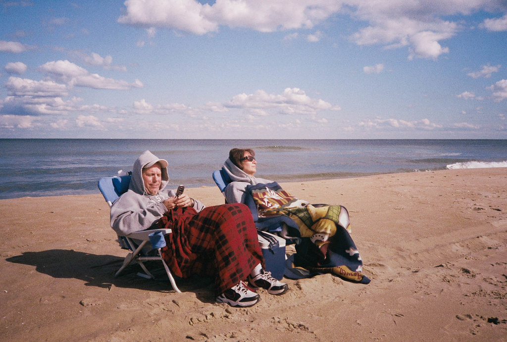
AIIAZNSK8ER posted:I think the problem your having is actually creating a mood. When I saw this photo, I enjoyed seeing primary colors on the dresses, but I don't see a solid concept or vision. Are you trying to show a lifestyle or culture or tell any kind of story? Making the chandelier look like it's lighting the scene would help set the mood. Right now the light looks like a spotlight to me with a hard edge all around the frame. The distortion in the ceiling and the one yellow bright dot are distracting me from enjoying the rest of the frame because it seems so carefully set up. You said you can't go back and re-shoot, but could you have moved the pool table between the two windows and center the moose head. Then get closer and only show the two windows and the top half of the pool table? Unless the full bodies are important to you I think you should get closer. I disagree with Sevn. I really like this picture. I like the colours and the light. I like that they're sitting on a beach, but away from the water - makes me wonder why they are doing that; what's opposite the water that's so interesting? I think that creates a story. I also love that they're bundled up and bored looking because it's so atypical for a beach scene and also reminds me of several days when my family has gone to the beach on freezing days and had to bundle up. I think the contrast of "they're facing away from the water so something must be interesting" vs the bored faces and the guy checking his phone is really nice. I don't think it looks set up in the least. In summary, I think it creates a really neat story and makes me ask a lot of questions, which in turn makes me look at it longer and holds my interest. I don't think a picture has to have everyone looking super engaged and happy for it to be a good photo - I really like the feel that you captured in this one.
|
|
#
¿
Jan 12, 2012 20:40
|
|
|
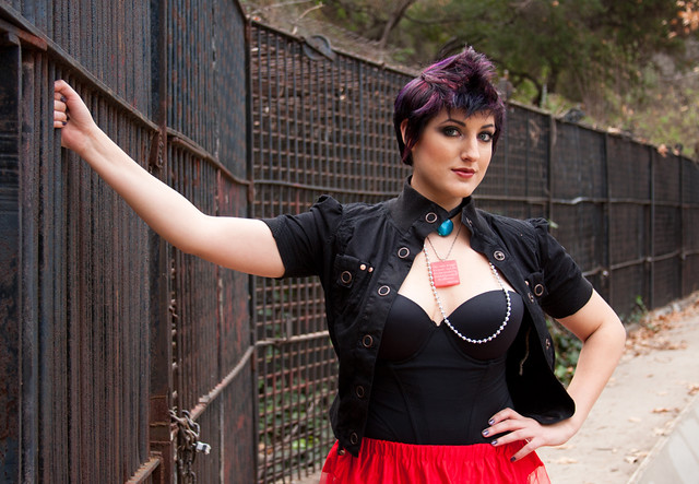
Axel Serenity posted:It's not what I would consider the greatest technical photograph, Can you expand your thoughts on this point? What about it, technically, would you change?
|
|
#
¿
Jan 15, 2012 05:58
|
|
|
Axel Serenity posted:That necklace is pretty awkward. Necklaces tend to do that on large busted women when moving around, so just make sure to check that.
|
|
#
¿
Jan 15, 2012 18:03
|
|
|
Bottom Liner posted:
I like that she has a natural smile in this one. In the ones you posted to the portrait thread, her smile looks much more forced and unnatural, so I like how you caught her in a nice smile. I don't find that the straight-on portraits work very well for females as they aren't very flattering. Kind of widens everything out, the face looks flat and it's just not a good look for most girls. I sometimes forget that when I'm taking the photo because people will naturally turn their whole body to the camera and just smile. It feels unnatural to have your body facing one way and your face or even just your eyes looking at the camera, so most people won't do it naturally, but it looks much more flattering. I'm not sure if I'm a fan of the processing. I like the colours of the background, but her skin looks weird to me. A little too magenta or something. My major issue though is that she's a performer and an actress, and this is just a normal, standard portrait. I feel like none of the performer is coming through, and that a more dynamic pose or expression would really help that. Without the description, I would have never guessed she had the dynamic personality needed to be a performer, and I wish I could see that come through in the image. Do you have any which may not be as typically "nice" but show off a bit more of her personality?
|
|
#
¿
Jan 19, 2012 21:48
|
|

|
William T. Hornaday posted:Here are a couple recent photos that I want some critique on, particularly the processing. It seems to be a direction I've been unconsciously going in lately with my photos and I'm really fighting myself as to whether I like it or hate it. I'd love a second and unbiased opinion. Does it look bad? Fake? Gimmicky? Good? The processing is obviously quite heavy on these, but I don't think it's a bad thing. I want to see the dramatic, almost posed look like you have with these. It separates them from the rest of the crowd and makes me wonder how the hell you got animals to pose for you like that (if I didn't know they were taken in a zoo, I wouldn't assume it). I love the tiger shot. The light and the pose really make it work for me. It's like a portrait, almost like you set up lights and asked him to pose a certain way. You don't see that a lot with animal photos. Yes, the processing is heavy, but I don't think it hurts the images at all. It gives your photos a distinctive, unique look and I like that. I like being able to scroll through SAD (obviously not snapshots, btw) and be able to pick our yours without looking at the username.
|
|
#
¿
Jan 27, 2012 05:44
|
|


|
Bottom Liner posted:I think one of the reasons it is not optional to give criticism here is because that is part of the process. Learning to disect, discuss, and think about what makes a photo good and bad is important for developing your own eye and skill. Don't feel bad about your level of knowledge or skill, that's not what is important, your opinion is still valid as an active viewer of the photos. You can point out the strong points, talk about things you would change, or say something just doesn't work for you, all are ok. You've got a Brooke Shaden type feel going on with the poses and elements, but not the processing, which is interesting. I feel like in the first one, she is overexposed for the rest of the scene. I don't know what you were going for, but the way it's set up, and with her expression, I almost feel like it should be a little darker, or a little dirtier...thats not quite the word I'm looking for, but she just feels too clean and well lit for the rest of the scene. Second one, I really like. I love the colours and tones - I feel like the cooler temperature really works with it. I also think she is lit really nicely. Reminds me of a resurrection type thing, which is cool. I wish her expression was a little stronger. Again, the elements around her (the string, the lighting, the forest) create this quite dramatic scene, but her expression is just kind of dead looking. Actually that goes for the first one too. They both are just there - I want to see more emotion in their faces. Third one is great. I agree with the colour of the legs not matching the arms is a little weird, but it's a great image. If anything, I think I might want to see a little bit more negative space on the bottom to really get a sense of floating, but it's a neat image this way too. Were you the one who did those Brooke Shaden type images on the beach a while ago?
|
|
#
¿
Feb 8, 2012 02:44
|
|


|
Leit Motif posted:Is anyone still interested in doing critiques? I was hoping this thread was still active, but alas... There were 10 posts in PAD today - that's pretty active for PAD. The Dorkroom isn't really the fastest moving forum. Why don't you post a photo and/or a critique and maybe it will become more to your liking?
|
|
#
¿
Feb 8, 2012 05:28
|
|
|
Tamgerine posted:Had my first engagement session yesterday, but had some trouble because the girl was overweight. I feel like this is a really bad way to view a session with less than perfect clients. If the photographer is uncomfortable with your weight, how are you supposed to feel comfortable enough to pose? I'm sure you didn't say anything outright, but that's a vibe people can pick up on. I would try to just portray them as a beautiful, fun, happy couple rather than worry about her looking "typically" beautiful or something. Obviously there are poses that will work better than others for overweight girls, but trying to avoid it altogether and making her look like a size 4 won't work. I would try looking at various posing guides and seeing what they have to say for flattering larger figures. For the photos, I feel like overall they are too far away and too dark to really give an intimate feel that I personally think an engagement session should give. The first one, they are way too small in the frame, and the colour of the light is too cool to mesh with the rest of the scene; their faces look a little green. I think if you had gone in closer again, and maybe had her sit cross-legged or had her tuck her legs in to the side, it might make them look a bit longer. They look kind of unflattering in that photo. The second one is kind of a neat idea, but I think if you had gotten in closer and gotten just their waist up, it would be stronger. For the third one, it was already pointed out about going up the nose, but I would also watch out for having girls lean on their arms like that. I used to do it a lot too, but it makes the arm look much bigger than it actually is. -------------------------- My photos: I wanted to practice more moody shots. Unfortunately due to space I wasn't able to move the light around much, or zoom out so they're all headshots. Mostly looking for critique on the processing and lighting.  IMG_0178 by Breanne Unger, on Flickr  IMG_0212 by Breanne Unger, on Flickr  IMG_0227 by Breanne Unger, on Flickr Also as much as I appreciate her modeling for me, I can't wait to work with someone who has a little more latitude in facial expressions and has some modeling experience. This is the only expression that doesn't look really awkward, other than the friendly smiles, but I'm trying to get away from that, so yes they are all the same.
|
|
#
¿
Feb 21, 2012 03:12
|
|
|
Bottom Liner posted:The second one is really nice. The first one could benefit from having a dark background like the others, and her expression doesn't really fit the hood. Overall they're a little dark, and the back of her face is brighter than the front in all, something I try to avoid. I like for the brightest part of the face to be the closest cheek/nose for headshot style portraits. Also, be mindful of models' jaw lines, she could push out her chin more in all of these and really help her look. I always tell subjects to push it out until it feels awkward, then when they inevitably relax a little it usually ends up in the right place. Thanks for taking a look. I agree with the background on the first. I debated adjusting it - I didn't want the black on black look, but making it white made it look weird so I just left it. It's not my favourite so I'll admit I didn't put as much effort into that one as I should have. Just wanted something a bit different with the hood. The expression thing - yeah we were trying to work on that, but she's kind of a one trick pony unfortunately, and any other expression looked really weird and stiff so I just said gently caress it. I'm looking into getting other models who aren't close friends or family so hopefully that will help. As for the lighting - normally I have the light like you suggested, but I wanted to try something differently, and a video of a fairly well known portrait photographer said she always lit females with short lighting (dark side closest to camera) because it was more flattering. Figured I'd try it out anyway. I don't really prefer one way over the other, I think they both have their places. I find this way look a little moodier, so I like it for this shoot. Same goes for upping the exposure, I normally have faces super bright, but I didn't want that look for these ones so I left it a little dark. I agree about the chin thing - usually I remember because girls will sometimes get a little double chin when they tuck it in, but since she's so thin she didn't get one, so I just forgot. Anyway, I hope it doesn't sound like I'm debating your critique too much. I appreciate it, I just wanted to go over my thoughts on why I did it this way. It was my first shoot where I made really conscious decisions about things like lighting and stuff, so I wanted to explain that. And while I'm here: For yours, I really like the last one, I think it's definitely the strongest of the set. I think in the first 3, the whites of the eyes and the teeth could stand to be reduced a bit - they really stand out too much when the rest of the photo is darker like that. The third one, she has kind of a crazy rear end expression, but it fits if you want it to be taken that way. I also like the closer crop of the second one over the first one.
|
|
#
¿
Feb 22, 2012 03:21
|
|
|
Bottom Liner posted:I'm going to post this here to help both people that are shy about posting critiques and those that are shy about posting photos. I feel that with the strength of the lighting in these and how easy it is to clean up skin, you should remove those blemishes, especially on her chin. Easy fix and no one wants to remember bad skin.
|
|
#
¿
Apr 2, 2012 19:25
|
|


|
Musket posted:
It's not an effort shot for you, but he could very well have taken the time to think about it, frame it and shoot it a certain way. Is it good? No. but that didn't mean effort wasn't put in. for all the bitching about having pad more active, we seem to be saying "don't post that here" a lot. It's fine to post it, just make sure you actually did put effort in and can learn why it doesn't work. Just saying "this sucks, stop posting crap" isn't going to help him.
|
|
#
¿
Apr 2, 2012 19:30
|
|
|
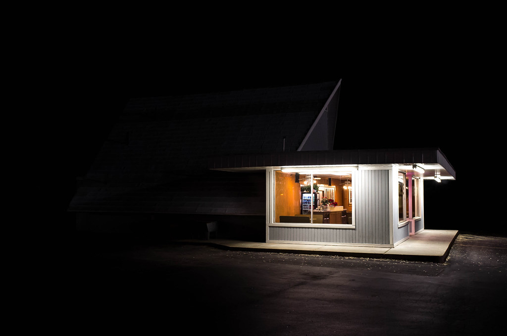
AIIAZNSK8ER posted:Thing I found interesting tonight: You can put me on the "love it the way it is" side. The blackness is overwhelming, but I like it. It reminds me of those summer nights when it's still warm and I'm way out in a little campground and I'm coming up to the convenience store which is the only source of light for miles and everything else it just pitch black. Makes me remember the feelings of being terrified because I can't see 3 feet in front of me, and then there's that little oasis of light. Love it. And that's why, to me, it's a great photo. It makes me feel something fairly strongly rather than just say "oh, that's a pretty shot". Nice job.
|
|
#
¿
Apr 3, 2012 04:21
|
|
|
AtomicManiac posted:I absolutely love this. There's something about lighting like that, it just makes me want to only take pictures of gas stations at night. I've never been able to properly put it in words, maybe it's just because I love light that comes from above (which is how I light like 95% of my portraits). I also find the processing very odd. Usually this sort of low contrast look works well with modern portraits that want to portray a feeling of warmth and softness, but for something like this, I would expect a harsher, more gritty processing. Like way higher contrast and deepen up those blacks.
|
|
#
¿
Apr 3, 2012 04:54
|
|

|
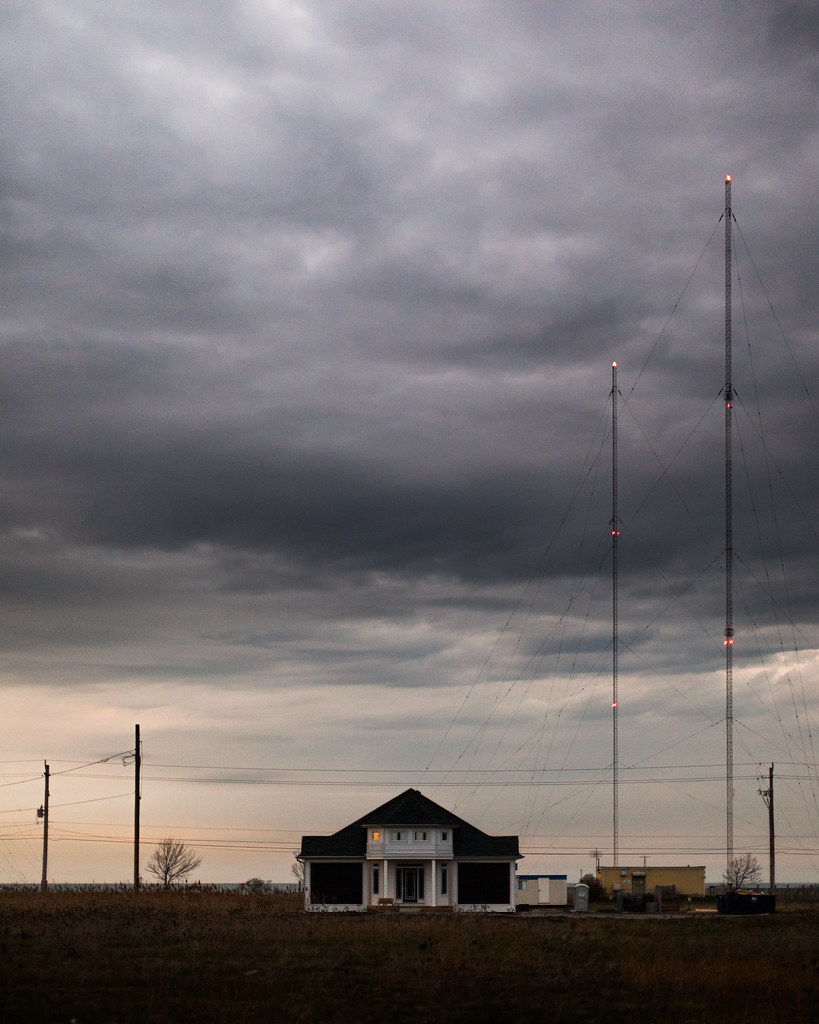
TomR posted:I decided to take a photograph today: This is really gorgeous. I've always been a fan of how you can add so much sky in something and still make everything else in the picture just as powerful. The processing on the sky is really nicely done - dramatic enough without being too much. The time of day this was shot at looks to be about the most perfect time you could have done it - the colours are really nice. The little bit of noise adds to the feeling of desolation I think. I absolutely love the one light in the left window. I waffle on my feelings with the construction stuff. I feel that if it weren't included, the image would be stronger, but I also think it would be a lot more cliche so I'm undecided. However, I really like the radio towers (??) and the power lines and poles in this shot, and I feel maybe it would be strong enough with just those added elements. Anyway, it's great. I shot this with a subtle light but I was told that it was a bit too dark for sushi , though I think a brighter look might have reduced the richness of the colors.  Sushi by alkanphel, on Flickr I agree that this one is just a touch too dark. I think food always looks way better when it's bright, and I don't think bringing it up a touch would hurt the texture or colours. The food placement is really appealing though, and if it were a bit brighter, it'd be fantastic. I started changing the way I do portraits. Here are a few:  IMG_1886 by Breanne Unger, on Flickr  IMG_1787 by Breanne Unger, on Flickr  IMG_1751 by Breanne Unger, on Flickr Obviously I'm going for 2 totally different looks with these sets, but I like them both. The first 2 because it was the first time someone hired me and I think I did a pretty good job of posing them casually (you can take a look at the whole set if you want: http://www.flickr.com/photos/carrot_flowers/sets/72157629371499022/) but I wish I had gotten more variety in the poses. I think I got a nice natural smile in a lot of them, but wish I would have incorporated more fun poses. I also like the processing, but it's something I always struggle with so I don't know. The third picture is probably one of my favourite portraits I've taken. I had to crop it quite close because the way I posed her made her arm look huge (it still looks too big) but I like the closer crop - I feel it makes it more intimate. I also am quite happy that I spent 5 dollars on some home made reflectors and it's probably the most useful thing in my camera bag...sigh. I can't decide if I want more contrast or not.
|
|
#
¿
Apr 4, 2012 04:21
|
|
|
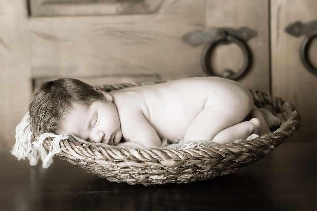
I agree. Dead baby look tends to be guided moreso by the color temperature and any selective coloring than by having their eyes closed. I've seen hundreds of closed eye baby photos that look great. In fact, I prefer them to eyes open shots, especially for newborns because their eyes are pretty wonky and they can look cross-eyed really easily.
|
|
#
¿
Apr 4, 2012 21:45
|
|
|
Bad Munki posted:Also, I was trying for a more intimate feeling, is it just not working here? Usually when holding a baby, you really are that close. Babies just aren't meant to be held at a distance. It's a really awkward crop. I think you could probably pull off a tight crop, but you are cutting off the top of his head and the chin, so it looks really odd. Have you looked at lots of baby pictures that you like? Try to copy those - they will give you an idea of what works and what doesn't. For example you could probably get away with cutting off the top of the head but leave the chin intact. The angle is weird too. I would also like to see it either more contrasty in black and white (while still looking soft, if that makes sense) or it in color. Edit: by more contrast, I mostly mean just brighter whites. Baby pictures should be bright I think. CarrotFlowers fucked around with this message at 21:07 on Apr 5, 2012 |
|
#
¿
Apr 5, 2012 21:05
|
|
")
|
RangerScum posted:I like this, but I'd take the heal brush to her armpit to get rid of those wrinkles. Noted, thank you. I tend to spend a lot of time on the face and not enough time elsewhere on the body. alkanphel posted:I quite like this shot, she's got a strong look. Only problem is her shoulder is too high up, making me think that she is very tensed up and makes her shoulder and arm look kinda large. Yeah, I definitely was struggling with making her arm look huge. Next time I'll try and lower it a tad and keep it away from the wall a bit. I do like the more posey look as I didn't want it to be super casual, but she does look too tense. Mannequin posted:I think the first one generally works as a general portrait that kind-of shows who the person is. She's leaning up against a wall of graffiti, I would be curious to know if she is somehow linked to that either personally or professionally, (does she work for the town council responsible for cleaning that up? I can't picture her being a graffiti artist. Or is she just showing her fun side by leaning up against a colorful wall?) Thanks for the in depth look. For the first one, she wasn't linked to the wall in any way - it's just so hard to find any colour outdoors this time of year and I wanted to bring some colour to the pictures. I have a bunch of her in other places as well in case she didn't like the background. I do agree that it's quite busy, but I can't help but like the colours. Sick of winter I guess. She is a graphic designer though and I wanted to bring some fun to the portraits, and I was hoping to achieve that through the colours and shapes. The second one does look a tad unatural, but I'm not sure if I would have changed the pose at all. I think the majority is from the jacket being so bulky as another poster pointed out. I felt she was feeling quite comfortable and natural the whole time so I didn't really have an issue with it. Basically all I said was "sit forward and cross your arms over your knees" and she just sat comfortably like that. The third one however, I would agree with you in that it looks too forced. She is extremely uncomfortable in front of a camera and needs very explicit directions. If I had said "lean up against the wall" she would do exactly that, with no shape or contours to her body and would say "what do I do with my hands" or something and get frustrated (this has happened before). So while I agree that it looks a bit unnatural, I disagree on the method of getting her to look more natural. I take the blame for that one and should have specifically told her to lower her shoulder a tad. I would rather be in control of the poses completely rather than let them think about it because people start doing weird things when they have to think about posing themselves. Like I asked her to bring her shoulder up and she basically forgot about the rest of her arm and body and it just kind of hung there and looked even worse. So being comfortable doesn't always translate to being pretty on camera. Obviously it failed in this instance as she looks too forced, but there's a happy medium in there somewhere. That being said, I think our style of photography is completely different, so we just have different experiences. I used to just tell or show people the general pose and I got the question 'well what do you want me to do with my hands, feet, arms, hips, etc' too many times or people would have no idea how they were actually looking. I find I get way better results this way, even if it's not perfect yet. Obviously your style works great for you, but I don't think we are going for the same feel with our portraits and it doesn't work for me (having tried it before). The advice about modeling the pose for them to copy is great though. I actually did that here, she just doesn't have a lot of body awareness in terms of posing herself so things didn't go that smoothly. All in all she's one of my most difficult models to pose, so I am still fairly happy with the shot, especially considering most of my clients in the future may feel very similar. I will definitely reshoot her when she has some more time so I can get the practice in. ZoCrowes posted:I like the feel of the first two. I don't know what the purpose of the shoot is but your subject looks very friendly and approachable. It feels very bright and sunny without being over the top. As for the nitpicks I think that the wall in the first one is waaaaaay too busy. It distracts me away from her and the colors are are pretty garish. Her coat in that second shot is not built for that pose. It makes her look a little hunched over and a bit on the frumpy side. The silhouette is jacked all to hell by that shoulder flap sticking out too far. Thanks as well for the in depth critique. The point of the first two were just for fun shots that she could use to promote herself and her business. She sent me a bunch of example pictures that she liked and we tried to emulate the feeling of those a bit. It appears the background is too busy, yeah. I did take a very similar shot with a brick wall and a stone wall so she's free to use either of those as well, thankfully. Or she might really like that one! Looking at the second picture again, I completely agree. Her coat was way too bulky for that. Unfortunately it was really cold that day and it wasn't until later that she was comfortable taking her jacket off, but I should have asked to reshoot a few of the stairs pics. Noted for next time! I appreciate all of the comments, everyone! Everything discussed gives me lots to think about and make note of for next time. Cheers Oprah Haza posted:Here are my three (I posted critique three posts up). Holy spots on the first one. Is your sensor that dirty? What happened? It's incredibly distracting. I don't think I've ever seen a sensor that dirty before. Did you drop it in a pile of dust? The third one doesn't work becase the crop is weird, and her eyes are completely dead. Cropping at the neck like that doesn't really give any context to ground the head, and looks quite awkward. It also gives no context for the hand reaching up and touching her face, and that combined with the dead look in her eyes makes me feel like it's someone else reaching up to touch her face. She's not really connecting with the camera at all, but I can see she's trying to give off a sultry vibe. She has to know that the intensity has to be in the eyes for that to work, as it's extremely obvious when it doesn't.
|
|
#
¿
Apr 6, 2012 06:10
|
|


|
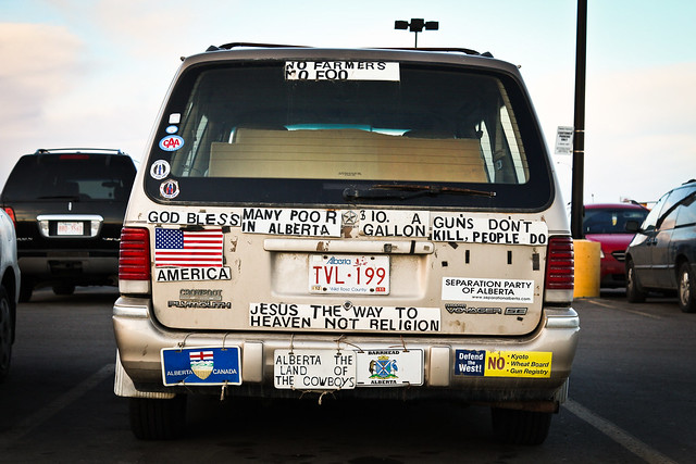
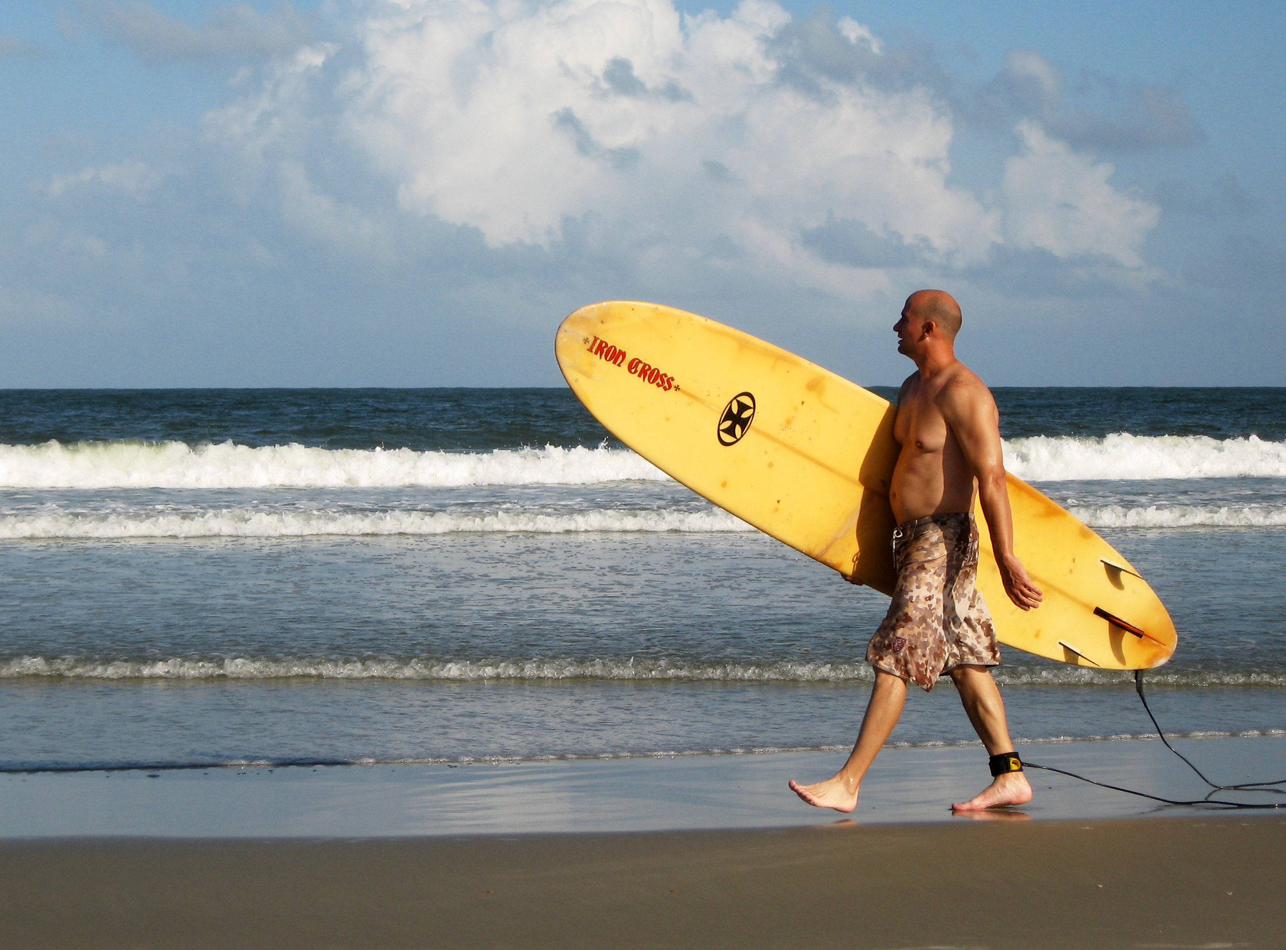
dennyk posted:
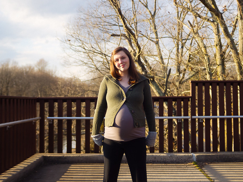
The first one is a really busy vacation snapshot. I do think it would be better if you had included some of the sky, if you had gotten lower and tilted up a bit or like you mentioned, got a wider lens. Without it, it cramps the photo and makes it appear even busier. There's a lot going on, but at the same time I'm not really sure what the point of it is or what the focus is - the chair/umbrella or the girls? Did you want me to feel like I want to be there on the beach? Did you just think it was a nice scene? For both of those, I don't think it was successful. Take away some of the clutter and bring in in the horizon - I think that would make it much stronger already. I think the colour of the water is also pretty unappealing in that big wave. For the second, it's not bad but again just looks like a vacation snapshot to me. I don't think the empty space on the left hurts the picture because he's walking into it, not away from it, but it's just kind of boring. The third is your strongest, even though it's the most cliche. However, the harsh contrast between the blown out sun and the kayaker's silouette is a little too strong for me. I think if you had turned left slightly until the sun was just out of frame, you'd have a nice warm coloured sky without the harsh blown out spot of white, which would balance out the black of the guy a lot better. Also I know it wasn't posed, but getting a better angle on the guy or waiting until he was reaching or doing something other than just stand with his arms in front might have helped to decifer his limbs, which would make it more appealing, because right now he's kind of all just mashed together as a black blob. rio posted:Ok, so I have been shooting since I last had the pleasure of posting here, but my new daughter has taken too much time to get to edit a lot. This past week I hae been able to get back to it, so I hope to post more here in the next few days. Thee were all shot a few days before said daughter was born, walking around trying to shake that baby out. I think the first one is the strongest. The colours are pleasing, I like the tilt of the verticals (I rarely do). It reminds me of a creepy old ominous house that still looks nice from the outside. I do think it could use a bit better of a crop. Maybe widen it up a bit, but I feel like the gate is just pinched a little too close to the right. Also the tease of letters on the sign is frustrating - I wish I could either read them or not see them at all. For some reason I'm drawn to the reflections in the windows as well, which I find really interesting. Second one I don't like for a lot of reasons: First and foremost, like you said, you did not pose her. While that can sometimes be a good thing for candid pictures, when people have no guidance whatsoever for a portrait, they usually end up doing what she did: just standing there. You said you liked Mannequin's style, and while he said he doesn't pose them super specifically, he does give them suggestions on how to stand. I would suggest not photographing anyone (and especially a very pregnant lady) straight on, unless you are going for a specific look and have movement or posing in other areas of the body. As it is, she is just standing straight on, feet shoulder widtch apart with her arms at her sides. I kind of expect her to bend over and pick up some dumbells or start doing squats or something. So I would definitely encourage you to at least think about what you want the shot to say about her: is it a fun portrait, is it a pregnancy photo to show off her belly, is it a candid shot? Think about what you want us to think when we see it, and then take it from there. The other main issue I have with that portrait is how you cropped it. I usually hate it when people nag about cropping when it doesn't really affect the photo negatively, but in this case it's a huge no no. You chopped her off right at her knees, which makes her legs look very stumpy and that combined with her straight on pregnant belly just isn't very flattering. She is very pretty but this shot does nothing for her. Do not crop girls right at the knees! Thirdly, you had some pretty nice golden hour lighting there, but because she's standing at a 90 degree angle to it, half of her face/body is very bright and the other half is in complete shadow. I'm not sure if that was intentional or not, but I don't think it adds to the photo. Because the lighting was pretty dramatic, you could have some fun with it to really emphasize the pregnant belly with shadows etc, or shoot backlit or even just shoot in the shade to even out those harsh shadows on her face for a more classic look. I don't mean to rag on you for that one, I just think it had a lot of potential but kind of fell flat. Keep your intentions in mind next time Third one is eh...like you said overdone. Clone out those branches on the right and I think you'd have a better shot for what it is. CarrotFlowers fucked around with this message at 01:37 on Apr 12, 2012 |
|
#
¿
Apr 12, 2012 01:33
|
|
 (Click for varying degrees of huge...)
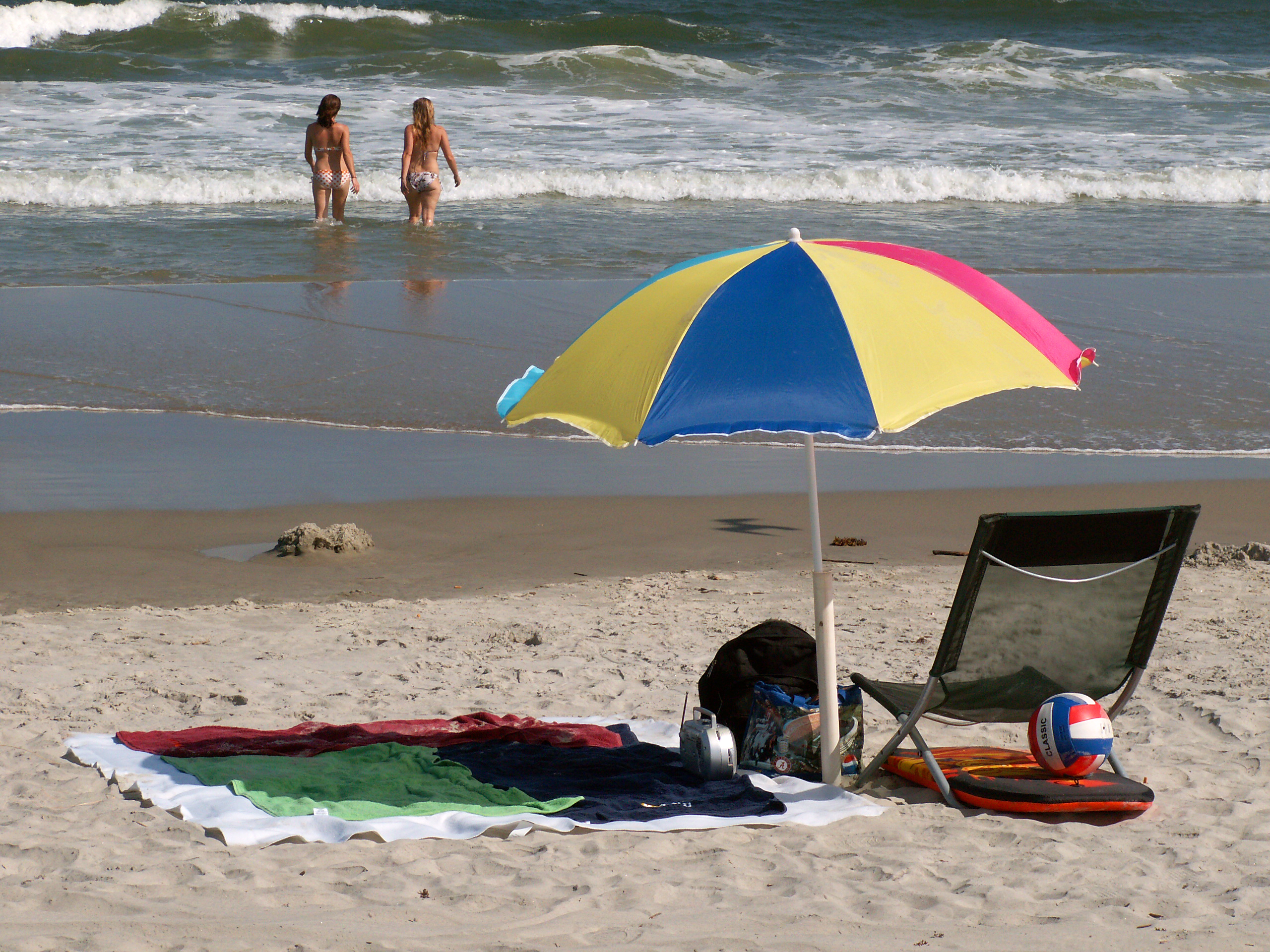


|
TomR posted:I really like this photo. The way the light is highlighting the greens and yellows in the middle of the frame draws the eye. I like the ugly black building as well, it gives an interesting element. I wish it could be just a little more prominent to break things up a little more. This is an awesome dramatic portrait. I don't think it'd be easy to pull off that super dramatic look for such a young subject, but it's fantastic!
|
|
#
¿
Apr 15, 2012 05:26
|
|
|
Erg double post
|
|
#
¿
Apr 15, 2012 05:36
|
|
|
Learn to take critique. Jesus Christ.
|
|
#
¿
Apr 29, 2012 22:48
|
|
|
TomR posted:I don't like to give technical criticism too much, but I think you've over sharpened this way too much. I almost looks like a photoshop pencil crayon filter was applied to it. This is great. It makes me so uncomfortable to view, and those are the photos I love the best. At first glance it looks so innocent and happy, with the playground plastic colours and the spring grass and buds, but it just feels wrong, and I love that contrast.
|
|
#
¿
Apr 30, 2012 04:12
|
|
|
Falco posted:This right here is absolutely stunning. Print and frame that today. I absolutely love how tack sharp it is and the amount of detail that you can see with the snow and in the horns. I'm definitely envious of the opprotunities you get to capture shots like these. He's actually said on several occasions that he takes his photos during time off from work, from the same viewing places as everyone else, which just goes to show you how loving talented he is. I wish I could produce images like that.
|
|
#
¿
May 4, 2012 03:37
|
|
|
Jose Pointero posted:Hmm, I guess SaD is gone? Man, I've been away for a while... I like that she doesn't look very relaxed or natural, but that is kind of my thing. I love the colours, I think it suits the image really nicely and the one colour scheme makes it seem a bit eerie. I don't like the part of the wall that juts into the frame on the left though. It's not completely vertical and feels like it cramps the space in a bit for me. I'd crop it out and tilt the picture slightly clockwise as it seems a touch off vertical at the moment.
|
|
#
¿
Jun 11, 2012 03:29
|
|
|
the posted:It's alright. I can't tell that the thing in the foreground is a beach chair until I stare at it for a bit. The wind ruined it. I have seen this same picture a thousand times. It just seems very done. It's boring. I think you could push yourself a lot more.
|
|
#
¿
Jun 15, 2012 22:23
|
|
|
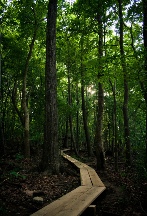
the posted:How could I shoot that area differently? Or should I just avoid it altogether? It's not specifically you and that photo, it's everyone and that photo. There have been many poster in the dorkroom alone (which is a small subset of everyone who posts photos) who have done that photo. Just the very cliche shot of the wooden bridge in the forest shot. I honestly do not believe that you could salvage it. Do the woods, yes, but don't do foot bridges in the woods from that angle. I know you have better ideas in your head. Follow those instead.
|
|
#
¿
Jun 16, 2012 00:38
|
|
|
David Pratt posted:Happy summer solstice everyone Ah gently caress already?? Thanks for that depressing reminder. Hotwax Residue posted:I tried to hold myself back from maxing out the contrast slider and smashing the blacks I'm a big fan of your landscapes, always have been. I really like this one too. The colours are gorgeous, and the bridge is nicely exposed in contrast to the water. I do feel like it's been done a lot though. I know a lot of your other landscapes feel quite a bit more original to me, so while I think this is very pretty, I also think it was an easy picture for you to take so I'm not quite as impressed as I usually am.
|
|
#
¿
Jun 22, 2012 05:54
|
|


|
ogopogo posted:Thanks for all the critique guys! As far as the look/style goes, this is what she asked me to do. She was looking for low contrast, super flare, etc. I feel the vibe she was desiring came through, and she was happy. I'm always looking to improve so this was fun practice and not for a paying client. As far as the color upload, I'm outputting from PS on a Mac, but I've had this problem before and still haven't figured it. Here are two more from the same session. I have to agree with the poster who said her hair looks really slick. I'm not sure if it's the wind or what, but it looks really quite greasy and unappealing. I think it might have to do with the wind looking quite strong, but because her hair is wrapped around her neck, it looks really heavy and, well, greasy. I also think her face could use an exposure boost in the first one. You're going to blow out the background when you backlight it like that anyway, might as well at least bring her face up a bit. I also agree that a better background would give more context and make it a better image. Either that or I'd crop in closer to eliminate a lot of the background. But yeah, the lens flare on 2 is really quite strong and overpowers the whole thing. Especially since she's also squinting. Squinting is rarely a good look, I think.
|
|
#
¿
Jun 28, 2012 01:57
|
|


|
somnambulist posted:For the flower shots, I think you picked a bad time of day to shoot them. The light seems really hard and personally I feel shots of flowers should try and have the softest light possible. Also the shadow on the top right of the first flower is really distracting. I don't get the dead baby vibe from this. People overreact to black and white pictures of sleeping babies and think they all look dead. I think the ones in the terrible photographers thread look that way because the posing is terrible as well, but I think you did a good job. pretty sure the parents and everyone else looking at it aren't going to assume omg dead baby. The worst dead baby pictures are the ones where the baby is selectively desaturated. I don't think when the whole image is, it gives that look. I'd keep it b&w.
|
|
#
¿
Jul 1, 2012 18:49
|
|
|
Metalslug posted:e: vvvv Yeah, there are some extra modes on the NEX like an auto HDR mode that only work when you're using jpeg. I think it's more...you're severely limiting yourself if you shoot only in jpeg creative modes. If you shoot in raw, you can do anything the in-camera creative modes can do, but you have significantly more control and way more information to work with. In camera processing is easy mode, but you're relying solely on the camera to do things for you, and are really limiting yourself to what it thinks is best. You want HDR? Do it yourself! You'll get way better results and you'll learn a lot more about your camera. Seriously, don't rely on in camera creative modes, there is no reason to go that route.
|
|
#
¿
Jul 4, 2012 05:52
|
|
|
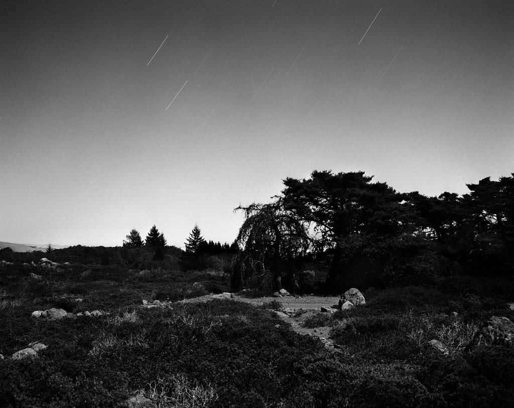
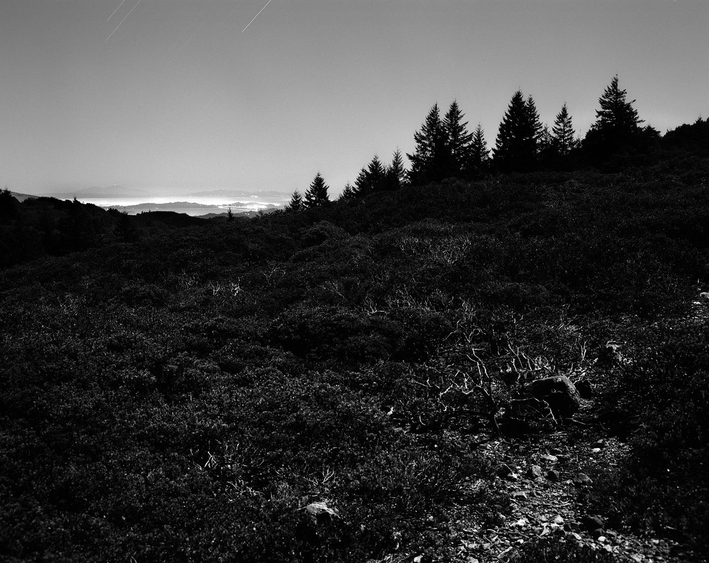
atomicthumbs posted:
I really love these two. I love how they have enough contrast to make me wonder if at first it's just a really contrasty day shot, then notice the star trails in the sky and realise it's a night shot. The black and white was an awesome choice for these. I really love the misty/glowing city in the top left of the second picture. The first shot of the road and car trails you posted is nice, but I feel like I've seen it so often it doesn't do much for me anymore. But those last ones are really awesome. ------------------- I did this shoot in June, and I've been sitting on it since then, barely touching it because I actually really ended up hating it in the end. I think my biggest issue was that I tried shooting in daylight when I wanted a darker look to them, and then struggling to get that feel in post was a mistake. I also feel like I staged it way too much, and it just came out feeling really cheap. I wanted to post them anyway so that I could get some feedback on what else I could change and how they look to other people. I feel like this shoot was a failure, but I also learned a ton from it so I guess it's not a complete write off. Here are 3 from it:  IMG_2956-2 by Breanne Unger, on Flickr  IMG_3119 by Breanne Unger, on Flickr This is the only one I'm decently happy with:  IMG_3145 by Breanne Unger, on Flickr
|
|
#
¿
Oct 22, 2012 04:41
|
|
|

|
| # ¿ May 1, 2024 03:06 |
|
|
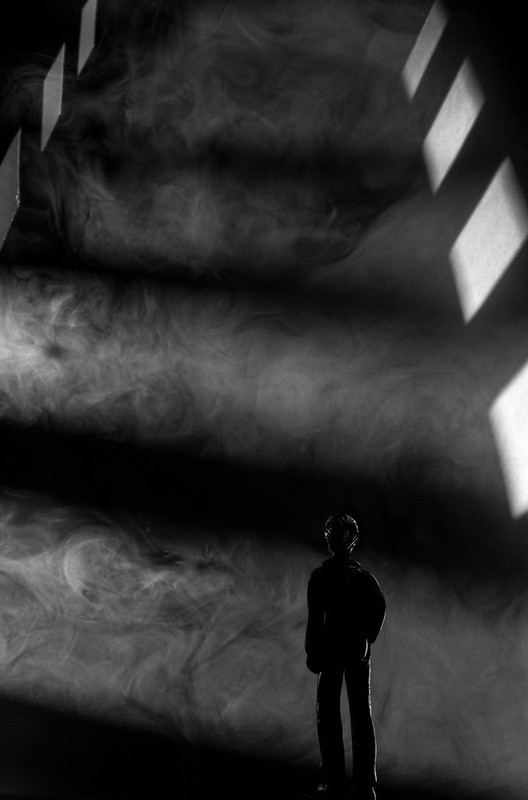
David Pratt posted:--- This is awesome. I like it better than your first go around, and not just because of the smoke instead of icing sugar (I'd actually like to see it with icing sugar). I find the tower composition a lot more foreboding, and it draws me in a lot more. Though it could just be that the other one is almost identical to a picture that TomR took a while ago and I like that it's a slightly different take on the same idea, rather than it being almost exactly the same.
|
|
#
¿
Oct 31, 2012 04:49
|
|
 If you want to try this out I'd recommend a smoke machine.