|
CarrotFlowers posted:I don't know if there's many people here who would actually say manual focus is better than autofocus.. In my opinion, manual focus is better than autofocus if you have a camera with a focusing aid and a big viewfinder.
|
 #
¿
Nov 30, 2011 04:35
#
¿
Nov 30, 2011 04:35
|
|

|

|
| # ¿ May 13, 2024 06:32 |
|
|
whereismyshoe posted:
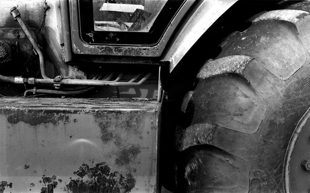
I like these, and especially like the last one; industrial abstract photos are awesome. There is a crescent mark that you should clone out in the lower left.
|
|
#
¿
Jan 6, 2012 10:12
|
|
|
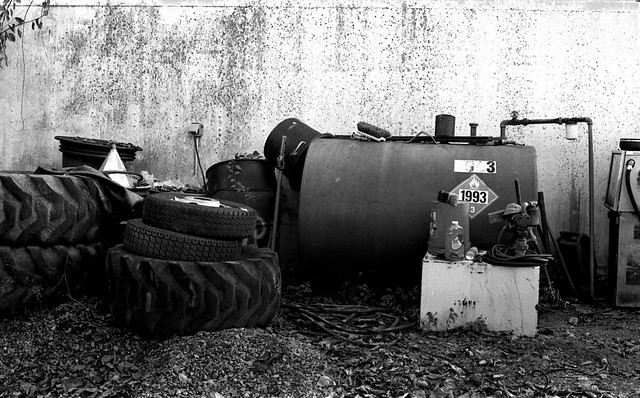
Wafflecopper posted:I've been playing with my film camera again. Turns out the film was black and white. Who knew? (Not me.) I like the first two, but the third one seems a little uninteresting to me; I love the textural effects that the grain lends to the sky, but nothing in it draws my eye. I agree with Mr. Despair that the second one's the strongest. The first one could be improved (in my opinion) if you try a panoramic crop:  I shot some black and white too (and one color)!  Midnight, Open Space Preserve by atomicthumbs, on Flickr 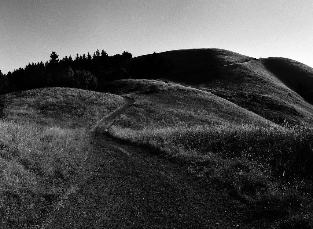 Onward and Upward by atomicthumbs, on Flickr 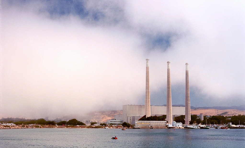 Welcome to Morro Bay by atomicthumbs, on Flickr
|
|
#
¿
Aug 29, 2012 08:42
|
|
|
mr. mephistopheles posted:Nobody thinks processing means something is instantly bad. That's dumb. Every photo in here has been processed except for some of the film shots. People have questioned how the dramatic processing improves the image. I can assure you that every single film shot posted here has been processed in some form or other.
|
|
#
¿
Sep 16, 2012 18:20
|
|
|
TheJeffers posted:
I would move back a little, including the left edge of the bumper in the shot and moving the cutoff for the hood either to the right edge, or out of the shot entirely. As it is, it seems a little unbalanced. Also, it's a matter of personal opinion, but I'd move the camera up a little and point it more straight at the front of the car; that way, the lines are a little more horizontal and less sloping, and the lines in the headlight lenses would be straight too. Ignore this if you're going for a more dynamic look like that. Hotwax Residue posted:Tried another night time landscape. I'm worried that it looks to much like day time. I tried making it darker and less blue, but it just didn't look right to my eyes and processing night photos isn't something I'm used to. When I'm trying to emphasize the night-ness of a night landscape, I like to darken the picture and increase the contrast. Especially with color, it tends to darken the blue in the skies and emphasize the stars more, as well as lowering dark details to emphasize the highlights, which is what'd you'd mostly be seeing under moonlight anyway. Here are a couple examples:   The one on the left is brought down using a LAB-space L-channel curve (which messes with the colors less), the one on the right is an RGB curve. Edit: increasing the contrast also brings up the whites, which I don't think you did enough in the initial processing; your snow is a little orange/brown and your stars are mostly light grey (partially because of the downsampling for this size). 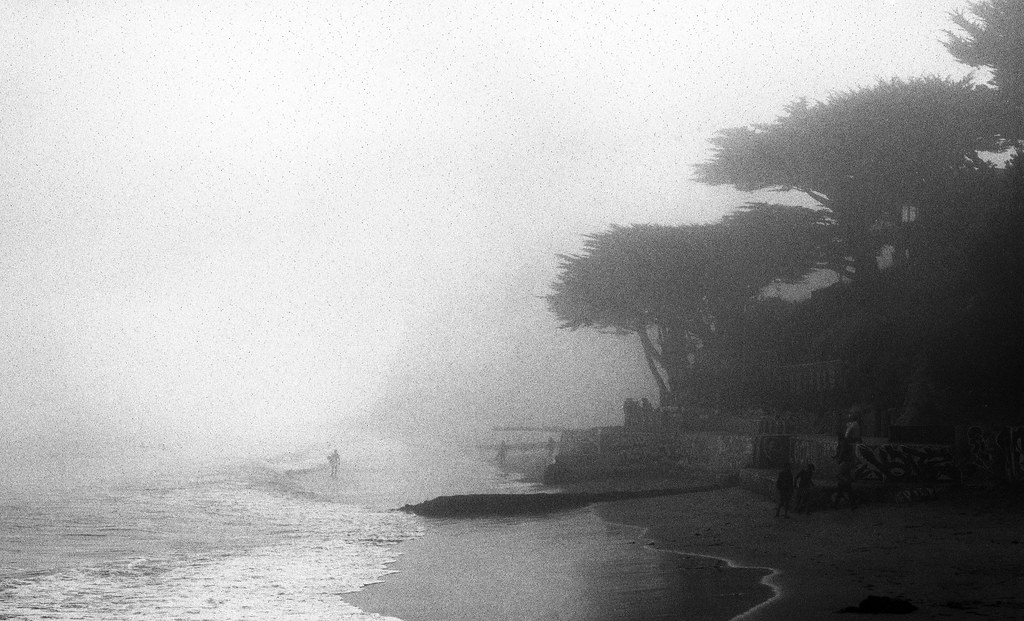 Untitled by atomicthumbs, on Flickr 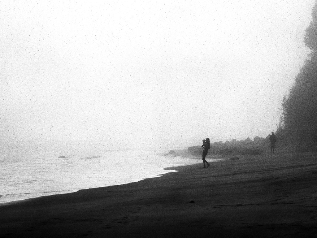 Lady with Dog by atomicthumbs, on Flickr 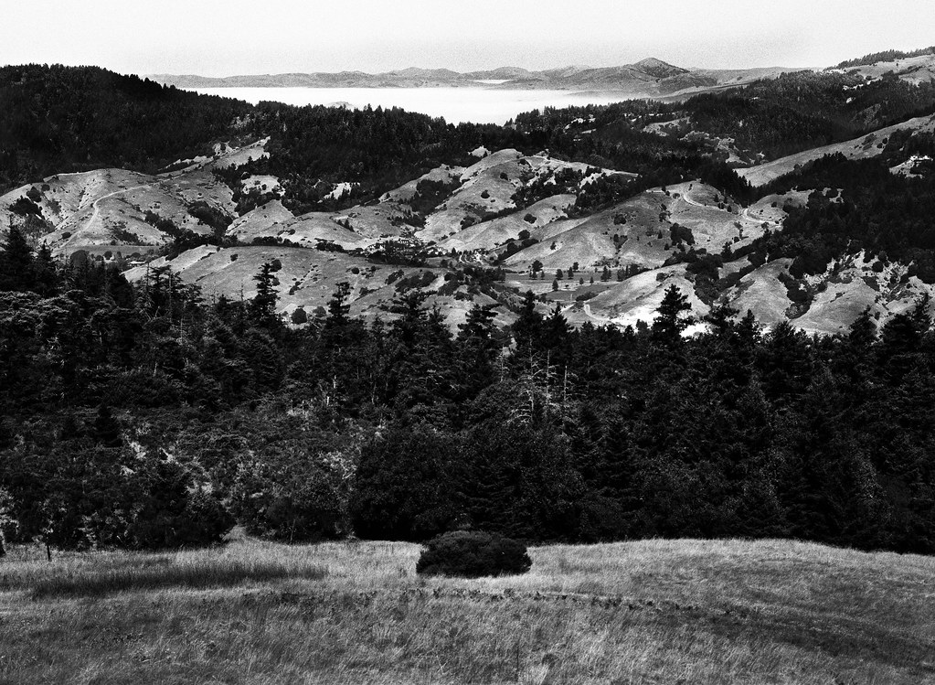 Coyote Land, Fog Sea by atomicthumbs, on Flickr atomicthumbs fucked around with this message at 23:38 on Sep 17, 2012 |
|
#
¿
Sep 17, 2012 23:33
|
|


|
The grain's a function of the film I used and the fact that I didn't get the exposure quite right. Nothing I can do about it now 
|
|
#
¿
Sep 18, 2012 20:53
|
|
|
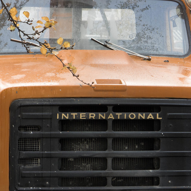
Mathturbator posted:Does this have anything going for it? It has a great loving deal going for it. I love your composition here. If there's an uncropped version with the tip of the building at the very top of the frame, I'd love to see it to see how it compares. David Pratt posted:
I like the idea you're going for here, but I'm not sure the execution works out as-is. I'd stand directly in front of the truck and go for some symmetry on the grille and with the hood scoop; you could use the branch to break the symmetry if you chose. This feels like it's tilted a little clockwise, and I'd crop it more towards a panoramic aspect ratio to get rid of some of the blank sky up top. It's pretty nice otherwise, though! 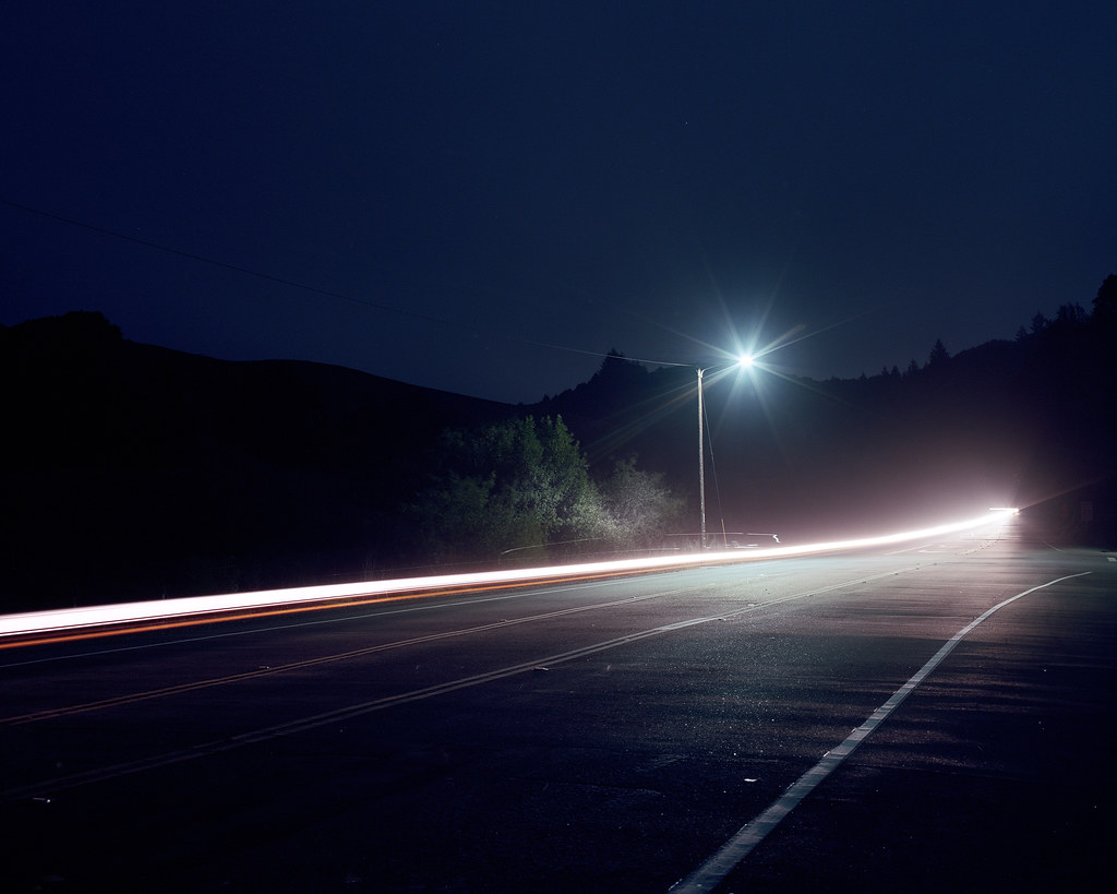 The Impression of Speed by atomicthumbs, on Flickr 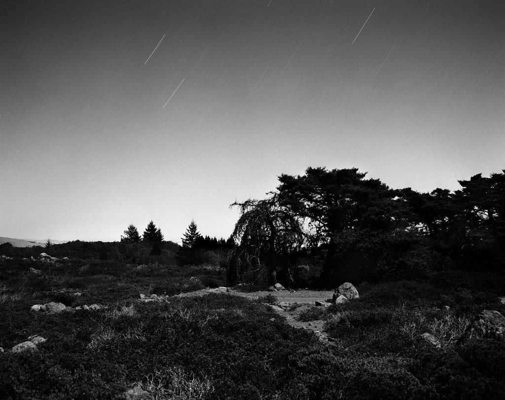 Chaparral Plains by atomicthumbs, on Flickr 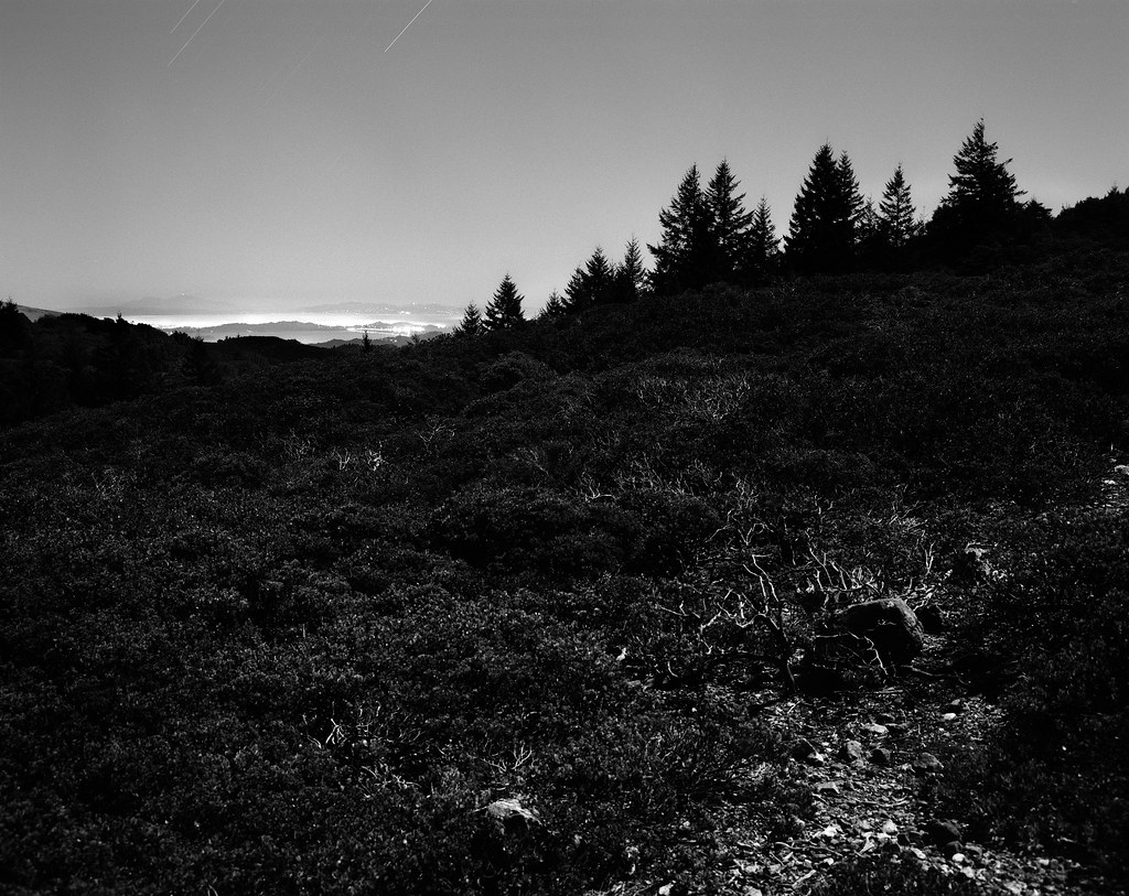 East Bay, North Bay by atomicthumbs, on Flickr
|
|
#
¿
Oct 10, 2012 10:02
|
|


|
Mathturbator posted:Atomicthumbs, I've attached the almost-uncropped, original for your enjoyment I actually like the cropped one better. I guess the horizontal lines in the apartment mesh better with the whole image than topping it with a curve does.
|
|
#
¿
Oct 11, 2012 01:16
|
|
") Goes to show how much the color balance changes the image... It's got an ugly chimney right on top, which I've just cropped out here, but it could easily be removed in post.
Goes to show how much the color balance changes the image... It's got an ugly chimney right on top, which I've just cropped out here, but it could easily be removed in post.
|
Dr. Cool posted:
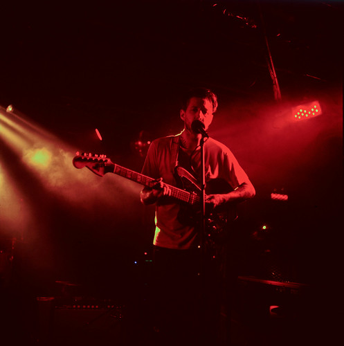
I don't really see a point to the first one; the colored moss is an interesting subject, but the out-of-focus foreground dominates the image. I would stop down, focus on the moss in front of the camera, or tilt it up. The second one is pretty darn good. It's got good composition, though if you were somehow able to freeze time and get the moment again I'd move over a tad to separate his mouth from the mic a bit. This is a nice shot, but I would personally go a little tighter on cropping out the bottom and/or left (or maybe the right), to emphasize the sunset sky more. Also, I'm not sure your horizon is exactly straight (though it might just be lens distortion). Here's some photos of mine that I think work as a series. Feedback about how folks feel they go together is appreciated (or just the photos themselves, either way). 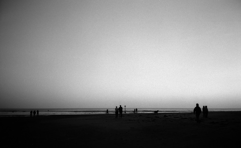 Nothing by atomicthumbs, on Flickr 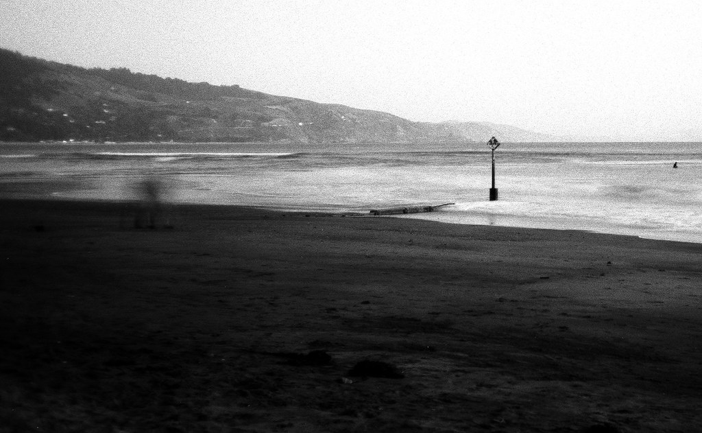 Break by atomicthumbs, on Flickr 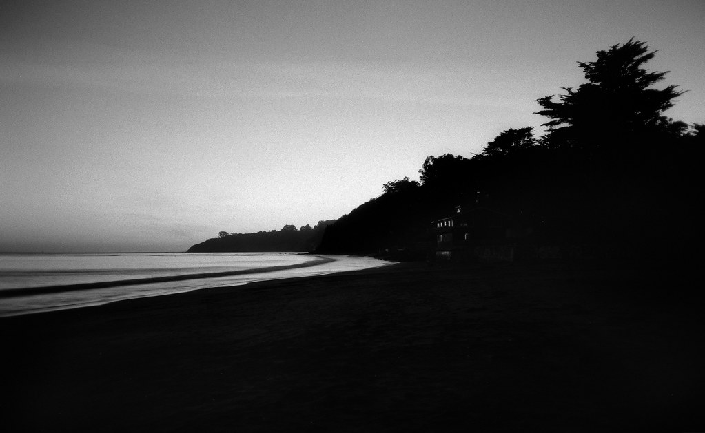 A Home by atomicthumbs, on Flickr 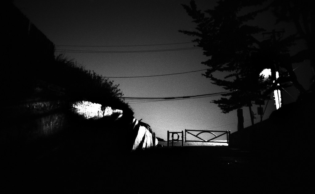 Leaving by atomicthumbs, on Flickr
|
|
#
¿
Nov 11, 2012 09:39
|
|

|
krooj posted:Went to see the Royal Winter Fair yesterday, which is basically a giant expose for all kinds of farmers in Canada, and even draws some from the states. It was a great opportunity to get photos of "wildlife." You didn't critique anyone's photos; did you mean to post these in the other thread? Also, to make forums-sized images on imgur, just add an h before the . in the image URL.
|
|
#
¿
Nov 11, 2012 21:06
|
|


|

|
| # ¿ May 13, 2024 06:32 |
|
|
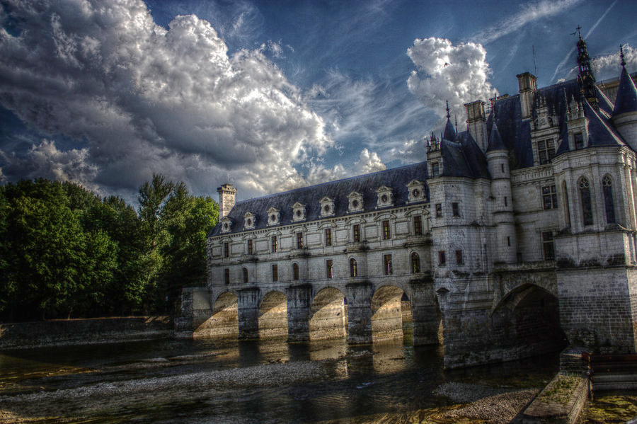
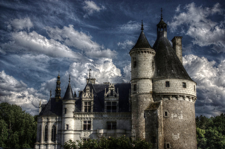
threnody posted:I would totally normally agree with this, but for some reason I really love it cranked when it's architecture. these look like a real time rendering demo for an nvidia graphics card from 2007
|
|
#
¿
Mar 25, 2015 23:21
|
|