


|
Bottom Liner posted:
I like this, but feel like her right shoulder is a bit over exposed. Otherwise, I like the warmth of the color. I keep thinking "Why the poo poo is she surrounded by string in the woods and what is she looking at?" which makes it interesting to me. I think this is one of those photos that's very good when it's large. Bottom Liner posted:
This is fun. Everyone is going to wonder how you did it and the absurdity of the subject is very interesting. It bugs me that her legs and face/arms are different colors and I also kind of wish there were a bit more detail in the background. Both are great photos though. drat NIGGA posted:
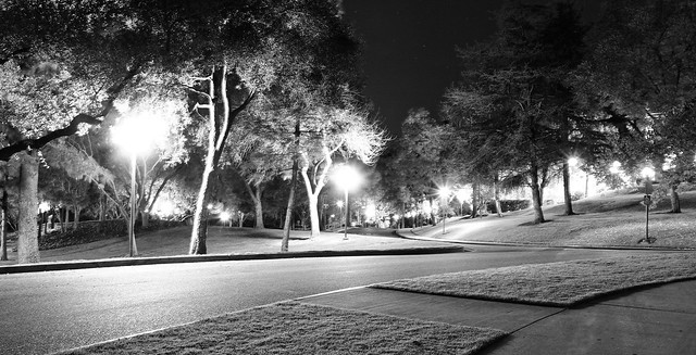
Looks like an alien landing or something. It's kind of surreal, I like that there is detail in the sky on the background with stars. That said, I see what Bottom Liner is saying and I think the photo could be really cool if you darkened it a lot so the lights weren't so blown out too. Here are a couple cross posts from SAD. I haven't shot digital much lately, but had an opportunity to this weekend. I decided to do some post processing, which I'm always nervous about because I'm terrified of over doing it. My main self-critique is that I wish there were some more detail on the grill to the right and the step/box thing by the wheel seems too bright.  Camper by jhunter!, on Flickr And a film shot  News by jhunter!, on Flickr eggsovereasy fucked around with this message at 02:31 on Feb 8, 2012 |
 #
¿
Feb 8, 2012 02:24
#
¿
Feb 8, 2012 02:24
|
|


|

|
| # ¿ May 1, 2024 04:53 |
|
|
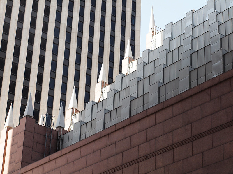
HeyEng posted:This stuck out to me because of how the sun created some interesting shadows and changing light throughout the front of the building. My post-processing work was mostly to cool the picture down some and raise the levels of black a touch. I just wanted to emphasize the lighting without going cartoonish. I like way the light accentuates the lines and shadows on the building, but I wish the center column thing wasn't cut off at the top. Augmented Dickey posted:I like the contrast of the squares on one building to the lines on the other. The lack of lines parallel to the frame edge (as someone else mentioned) doesn't really bother me, but the left edge of the building in front feels a bit cramped that close to the edge of the photo, I'd prefer more space or for the building to just be cut off. I'd try some crops to see if there is one that looks a bit better. Here are a couple of mine.  Cables by jhunter!, on Flickr I liked the way the sidewalk was cracked and had plants growing up through it and really like diagonals in square format though I do wish there were some more contrast between the cables and the road behind them.  Rambler by jhunter!, on Flickr I decided to stick the car right in the middle as it takes about one third of the frame, then one third house above it and one third road below it. I thought it had a nice symmetry. I don't like that the car has a flat tire (can't fix that though) and I got some pretty strong flare off the chrome. Not sure how to fix the flare though, polarizing filter maybe? I think that would be hard to use on a rangefinder.
|
|
#
¿
Apr 2, 2012 06:36
|
|

|
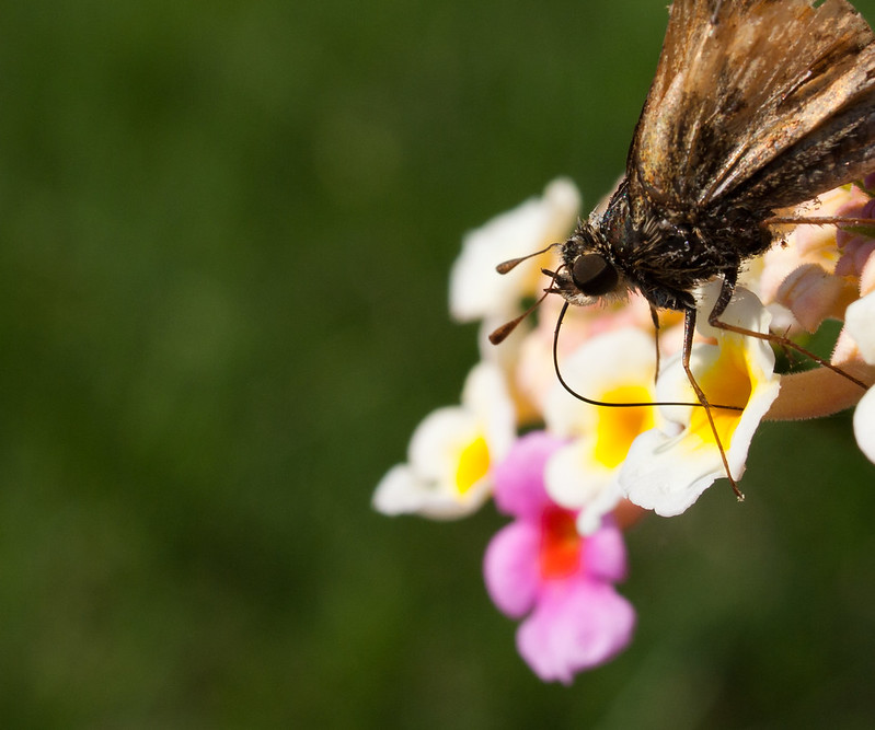
Augmented Dickey posted:Vessel I don't like that the wings are cut out at the top or all the negative space out to the left I feel like the photo is all out balance. The color of the flowers distracts from the bug just a bit. That said, you nailed the DoF, which I know can be hard with macro photography. Not to mention even getting a photo in before the drat bug flies away. I did flip through your photostream a bit and you haven't posted this photo here (or I missed it), but I love the lines and abstractness of it... http://www.flickr.com/photos/44029953@N08/7037348481/in/photostream/ Anyway, a couple I did over the weekend at a waterfall-dam thing, which I'd never done before.  Dam by jhunter!, on Flickr  Falls by jhunter!, on Flickr and a flower  Flower by jhunter!, on Flickr eggsovereasy fucked around with this message at 18:57 on Apr 9, 2012 |
|
#
¿
Apr 9, 2012 18:51
|
|

|
Edmond Dantes posted:I think this may be lovely in colour. Any particular reason you went with B&W on this one? I only had b&w film with me 
|
|
#
¿
Apr 10, 2012 04:11
|
|
|
Musket posted:Sorry for the derail here mods. For what it's worth, I have no ego about Mannequin's photos and I thought you were taking a jab at him too.
|
|
#
¿
Apr 10, 2012 16:33
|
|

|
xzzy posted:I'm pretty sure telephone poles/power lines are actively pursued by companies who do not want their property photographed. I know we've all had great shots ruined by enormous wires being strung across the landscape. I'm convinced Nashville Electric Service hates photographers 
|
|
#
¿
Apr 16, 2012 17:02
|
|
|
Augmented Dickey posted:I like this. The subject is cool and I think you framed it well. I think it would look really good in a really contrasty black and white too, don't know if you gave it a try or not. For what it's worth I really like the color in the railroad tracks, something about the saturation or tones or whatever is really pleasing. I tried doing some abstract stuff with buildings downtown today, which I've done a bit in the past, but decided to try and concentrate on it today.   
|
|
#
¿
Apr 30, 2012 01:34
|
|
|
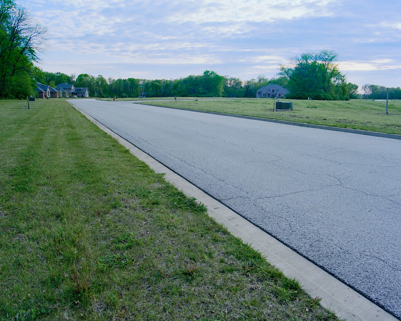
MrBlandAverage posted:I had trouble with this last one - I wanted to show the emptiness of this subdivision without including too much sky, but now I feel it's a little too wide. Thoughts? Maybe get closer to the houses and put them in the foreground and use the wideness of the lens to show the emptiness around it? VomitOnLino posted:Took this on my way home from another shoot, which didn't turn out. Also have a version without car, but I like this one better. I enjoy the railing and the segmentation between light/dark. I agree with 8th-Samurai about the guard rail down the middle. Moving to the right and having the road/guard rail move more across the frame rather than straight to the middle might be nice?
|
|
#
¿
May 11, 2012 18:31
|
|

|
nielsm posted:Fun thing is, it would probably work better if it was taken with an actual tilt (or rather, swing) lens so the same aperture could have been used, but the lens swung to get the entire worm in focus. Do they make tilt-shift macro lenses? By the time you get it extended out to 1:1 the image circle would be huge so it should be possible right?
|
|
#
¿
Jun 16, 2012 20:59
|
|
|
I really like this, the uniformity of everything in the photo (subject I mean) is a bit depressing, this is your intent I assume? Did you go on a helicopter to take those ariel photos?
|
|
#
¿
Jun 17, 2012 04:23
|
|

|
ThisQuietReverie posted:Thank you, I've been doing from-the-car shots heavily for a while now. Not in a Lee Friedlander way where part of the car is part of the framing but as an exercise in anticipation. I only have a few seconds between seeing something and pressing the shutter. I can't zoom and framing changes every fraction of a second and if I screw it up it's gone. I only get something I like ~1 in 50 but when I get it right it's something I'm really happy with because it's often a collision of elements and events I don't have control over or wouldn't have achieved via more deliberate shooting. I learn a little bit from each one. That sounds pretty fun, I need to convince someone to drive me around for a while now.
|
|
#
¿
Jun 20, 2012 15:50
|
|
|
the posted:Wait... what? The Rebel XS is just a digital camera, right? http://en.wikipedia.org/wiki/Canon_EOS_500
|
|
#
¿
Jun 23, 2012 05:59
|
|
|
I really like the color treatment you've given these, it kind of has an old movie feel to it. I feel like with some more photos or a refinement in selection you could come up with a pretty awesome set that tells a storey.  
|
|
#
¿
Oct 8, 2012 16:25
|
|
|

|
| # ¿ May 1, 2024 04:53 |
|
|
David Pratt posted:The contrast is pretty strong in the first one, maybe a little too strong. The composition is nice and it feels well balanced, but there isn't much of a subject that interests me. It feels like maybe this is part of a series on a town - is it? It's the start of a set I've been considering putting together, I should have written that when I posted the pictures. I was concerned that I had overdone the contrast but felt it worked, I'll try tweaking it some more. Thanks for you're input.
|
|
#
¿
Oct 8, 2012 22:41
|
|