


|
Kingdom of Sin posted:
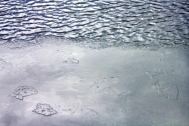
OK, cool concept. I think you should have killed the glare, it would be interesting to see the photo broken into sections of blue with the little islands of ice in the bottom left raised up more. Maybe a dark gradient coming up from the bottom with put them into relief a little bit more. I like where you've started going with this. Adjusting the black levels might also help to make things a bit more interesting. I wish there was a leaf or something was stuck in the ice. Maybe a dead fish? Could you go back? Use your hand to melt the ice, put a playing card or something funny into it, spray some water over it and let it freeze again. Could be fun!  The lonely raven. by Nathan Harburn, on Flickr  The moon rises over Vancouver. by Nathan Harburn, on Flickr  The Start of Winter. by Nathan Harburn, on Flickr
|
 #
¿
Dec 1, 2011 05:26
#
¿
Dec 1, 2011 05:26
|
|

|

|
| # ¿ May 13, 2024 02:47 |
|
|
Enigma89 posted:I am a complete noob so take my comments with a grain of salt (I actually encourage someone else to also make comments), but I only have 2 things to comment. On the bird photo, I sort of wish the angle was a bit different. You have two different cloud layers behind the crow, if you were a bit closer and lower, then the bird would be under one solid cloud layer. I think it may look better, but I am a noob. I agree with you, those are my thoughts on the pics as well. David Pratt posted:
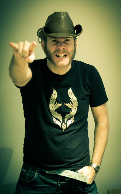
I see that someone has covered this above but I'd like to toss in my thoughts as well. You've got to get more light up under that hat, but you mentioned it was poor lighting. The vignette is pretty high for this kind of shot but I like the drama. I would rather have everything in focus instead of the fist blurred, but since you mentioned you like it, it really doesn't matter. Maybe crop a bit higher to get rid of the desk/lamp, and his hand could be on his hip instead of in his pocket, especially for a rockin' out pose like that. ") I'd get a nicer flash for your camera and do adjustments in lightroom, it would really help out impromptu shots like this and you'd be surprised with the results! I took three shots of the same lighthouse, thoughts on which is strongest, comments on any of them?  '3 Treatments Project' 500px. by Nathan Harburn, on Flickr  '3 Treatments Project' 500px. by Nathan Harburn, on Flickr  '3 Treatments Project' 500px. by Nathan Harburn, on Flickr
|
|
#
¿
Dec 4, 2011 00:59
|
|
|
Disreputable Dog posted:However, in the top and bottom one, the island/subject matter breaks the negative space in quarters and halves which isn't the strongest. Watch your ratio of negative space to positive space and you'll see that the edges of the islands and lighthouses hit the centre points of the composition. Nice, thank you for pointing that out! I'm going to take another look at them. Tamgerine posted:I like your first one the best because the clouds almost match the look of the mountains. I like the panorama style better as well. The last one looks more lonely and empty, so I think it depends on which sort of feeling you're going for and the theme if it's an ongoing series. Thanks. I like this photo and I took a look at it, here's some thoughts; The lighting is a bit wonky in the areas I circled here.  I think everything is great but it's dark in between the two girls, one girls thigh looks like raw chicken breast and then her shin is weird. The other girl looks fantastic! The blue lighting and the background turned out really well, in my opinion. Could you bring up the exposure between them to even it out a bit and change the lighting on the girl on the right? I feel like that would help bring the photo together more into the same style, she stands out right now. Sorry for drawing on your picture.
|
|
#
¿
Dec 4, 2011 02:46
|
|

|
TheLastManStanding posted:I get your intentions with the black and white, but that sky is way too perfect to not be in color. Really, that's a fantastic colour sky.
|
|
#
¿
Dec 6, 2011 05:59
|
|