|
Thirteen Orphans posted:I really like this one! The water is fantastic, my biggest complaint is that the rocks lose their definition as they get darker. Perhaps brighten the rock formation and keep the water as is? I'm seeing plenty of definition on my screen in the dark areas.
|
|
|
|

|
| # ¿ May 21, 2024 21:59 |
|
I think the first one is your best one compositionally, with the sky textures, the mysterious looking mass of land and the way the light hits the water and how it seems to radiate from it. The visual weight in the elements, the sky, the land and the water are harmonically pleasing together. That said you have a bit of dust in your sensor that you should clean at some point  The other two are interesting, but don't do as much for me tbh. There's too much dynamic range in the second one and you're losing a lot of detail to both to the sky and the shadows.
|
|
|
|
They look really underexposed for daylight photos, the first two at least. I appreciate those kinds of banal urban/suburban environment photos though, but even then it feels like it's missing.. something.
hope and vaseline fucked around with this message at 21:06 on Oct 17, 2019 |
|
|
|
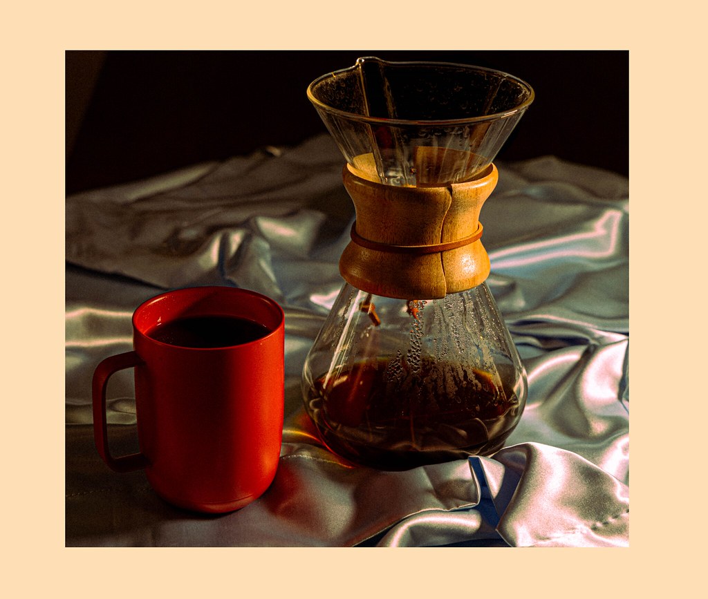
blue squares posted:Hey, thanks! I appreciate it That glossy tablecloth is super distracting to me. Overall i like that low key lighting though, it's nice and moody.
|
|
|


