|
Turd Nelson posted:Good or bad? Even noticeable? I would keep the trees from version 2 and combined the foreground from before and after. I would maybe play with some masks so the few trees in the foreground still have the look you had in the second photo, then softly, and gradually mask off areas, so those changes don't take effect in the background. That may help preserve the better fog "feel" from the first photo, or maybe accentuate it.
|
 #
¿
Dec 14, 2011 13:27
#
¿
Dec 14, 2011 13:27
|
|

|

|
| # ¿ May 5, 2024 18:00 |
|
|
I think you hit it spot on with the new one. Nice subtle improvements over the first one you had posted. It pops, and keeps that nice fog feeling.
|
|
#
¿
Dec 15, 2011 03:04
|
|
|
whaam posted:
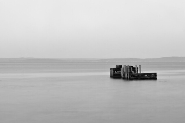
I like where you are going with this and it is a big change from your other sea scapes, which are great btw. Maybe a touch more contrast between the water ant the land would be nice. just a touch to separate them a bit but not distract from the pier. For me though I think an 8x10 crop might work better where you would still have a majority of your negative space on the left of the pier and half or third less space as you have now to the right of the pier. To me this would help the feeling of solitude(loneliness, maybe?) the pier in the mostly empty space provides, and then it would end a bit more abruptly heightening that feeling. As it stands there is enough stuff to the right to take away that feeling for me. MrBlandAverage posted:
I like the first one as is, maybe a symetrical, down lower shot might work, but I think you would lose to much of the nose shape and character that way, also a touch more DoF would help me then the rear tire would be in focus as well. The second one is the one I was thinking might be more successful as a straight on shot, as you might get some cool kaleidoscope reflections of the bolts in the entire surface of the rim. The third I agree with David Pratt, its a neat texture, just not enough to hold attention in this presentation. ---------------------------------------------------------------------- Trying to visualize what I want the finished product to look like when I'm finished with it, and this one actually turned out how I saw it. Just wondering what works with this, doesn't work, or if it's complete crap. Fire away.  Ice by David Jachym, on Flickr
|
|
#
¿
Mar 11, 2012 13:24
|
|
|
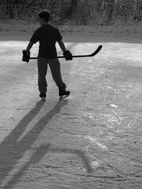
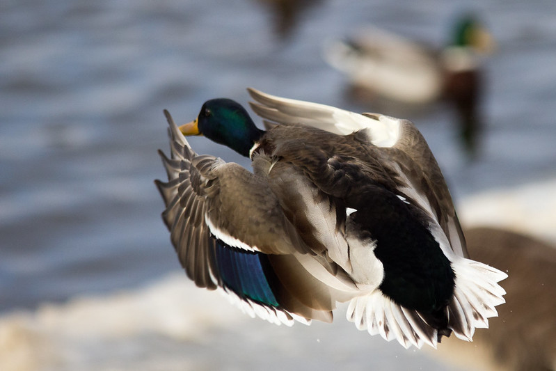
Druckman posted:Here's one that I've been struggling with. I think that the way his head is turned is not a problem and in fact an asset in my opinion. Really works with how he is holding his body in this shot. I think what would help out is including all of his shadow if that didn't introduce distracting elements into the shot. I think the shadow would lead from the lower left up to the boy in the upper left and really work well with the mood. Good conversion to B-W, really like the feel of the shot. Really cool capturing the intensity of flight. I really like this one. App13 posted:
I think your conversion is spot on but for me all the horizontal lines, especially the window frame or whatever the thicker one towards the top really adds some distraction. I think its a really cool subject, and a good idea, but there are so many distracting elements with all the different lines in the photo, it takes a bit away for me. Though the tension added by that may be what you were going for? Playing around with my new 50mm prime.  _MG_5675-Edit.jpg by Flying Ferris, on Flickr
|
|
#
¿
Jan 13, 2013 15:20
|
|