|
Brewdog posted:
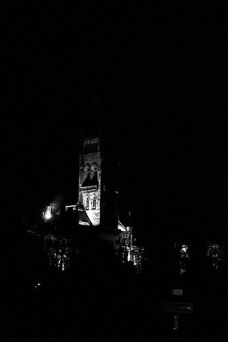
I know this is deliberately high contrast, but all that does is emphasize how little of the picture is filled with the actual subject. The sign at the bottom is distracting and the treeline is cutting off what is actually a pretty detailed part of the building (archways etc). The tower is also a lot more impressive than that and as a result of the contrast coupled with the lighting (or lack of it, I know it's beyond control, but still), you've cut off quite a bit of gothic architecture. I'd recommend going back and re-shooting, at this time of year you'll get near-darkness at a point when you can still wander into university grounds even if you're not a student/employee (at the moment a good time to shoot would be around 15:50). The best spot for shooting that particular part of the main building is the north stairs of the Wolfson/Davidson link building. If you're not comfortable with entering uni grounds for whatever reason, another good spot is about 20yrds past the southern gates beside the anderson/pontecorvo complex - this will allow you to include the Kelvin in your shot and reduce negative space.
|
 #
¿
Dec 1, 2011 04:00
#
¿
Dec 1, 2011 04:00
|
|


|

|
| # ¿ May 1, 2024 02:10 |
|
|
The Lighthouse is kind of "just there". I don't think the issue is that it's so close to centre, more that the centre of the image is dominated by the strongest highlights in the photograph and their reflection on the water surface. The lighthouse just gets kind of lost, but given its relative scale, I can't really see it being more prominent anywhere else. The eye kind of gets drawn towards it due to the reflection of the red light, but to be honest, you could probably clone it (and the light reflection) right out the picture and it wouldn't make too much of a difference. I agree with you on the rock's shadows (and actually I think the deep black in the lower right is already at the point of being a little distracting, so the addition of more dark rocks would have been a mistake). But really, you have to ask yourself what you were seeking to showcase with this picture? If the answer is anything but the lighthouse it's a success.
|
|
#
¿
Feb 4, 2012 15:52
|
|
|
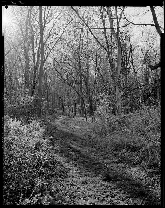
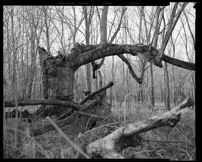
MrBlandAverage posted:I went on a walk and took pictures of trees. I wanted to get some more practice with the 4x5. Really nice tones in both. In the first, I like the way the trees form a natural gradient in the light: from being darker at the front to fading into an almost imperceptible wall of grey that obstructs any further view of the path as it proceeds into the undergrowth. And yet at that point you can still discern individual trunks. Composition is good and the shadows across the immediate foreground present a point of interest after the eye moves away from the centre of the image. Second image, as said, again nice tones. Good texture on the "main" tree branch, and the camera is well positioned - giving the impression that the woods stretch out for miles in all directions. I think you've done well with both to capture a lot without making the final picture too busy. ---------- 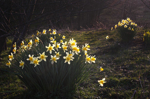 Rites of Spring by falamhachd, on Flickr 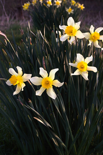 Here comes the sun. by falamhachd, on Flickr
|
|
#
¿
Mar 30, 2012 00:02
|
|
|
alkanphel posted:While I like the general composition of the 2 photos, with the repeating pattern of the flower groups, I just feel it's lacking something to push beyond an ordinary image. I feel that the background is quite boring as it's dark and not very vibrant. I shoot a lot of flower macros so I could be biased for saying this but I think these flowers would work well for a macro shot that cuts out the background entirely. No disagreement here, I prefer macro b/w of plants myself, but didn't have the appropriate lens with me at the time. I did attempt a handheld lens reversal, but none of the shots from that had the requisite focus. Of your shots I prefer the b/w and think it might benefit from, as suggested, slightly darker tones in the background. I see what you mean about left/right, but the slight edge of leaf in focus in the periphery on the left somewhat detracts from that and is a little distracting.
|
|
#
¿
Mar 30, 2012 02:38
|
|
|
Oprah Haza posted:Here are my three (I posted critique three posts up). 1. It looks underexposed, and is that dirt on the lens or sensor? Together they give a really grimy look to the picture. The exposure stops the "looking away" pose working for me as well, as the model is currently looking into darkness as far as I know - which makes her appear glum and completely disinterested. Honestly, the overall picture actually feels a bit seedy. 2. Processing is fine, crop is too tight, leading to a lack of depth between the microphone and his face. Currently it looks like it's practically resting on his chest and in his beard. You've caught a good expression - he's clearly concentrating quite deeply at this point, but unfortunately his eyes draw me towards a guitar that, well, isn't there. Mine:  Barren by falamhachd, on Flickr
|
|
#
¿
Apr 4, 2012 16:08
|
|


|
Bad Munki posted:Because last time when I tried to get more in the frame it was advised I try a tighter crop, maybe I'm just not getting it. If you'd framed that straight-on, instead of at an angle, you'd see more clearly that there's almost no negative space in that picture at all - it's not tight, it's suffocating. The tight crop would have been specifically for the typical "baby's hand" shot.
|
|
#
¿
Apr 5, 2012 21:04
|
|

|
Wafflecopper posted:
I'd like to see these shots reversed in terms of colour versus black and white. The second shot looks to have far more compressed tonal range and a good coverage of shadows, being in closer proximity to the rocks there's also more texture present. The first shot is quite jarring - you start off looking at a position in the photo where there isn't really anything, and then you're greeted by the sight of the rocks at the bottom and the coastline to the left. But aside from the rock texture, there's little contrast across the picture despite the comparatively large area.
|
|
#
¿
Apr 10, 2012 12:14
|
|
|
Bottom Liner posted:
I really like this shot, you're right, she's photogenic, and the texture of the branch plays well in contrast with her skin, given the relatively high key nature of the shot. I don't know how you've edited in post, but I feel her eyes whites might just be a little too white, but it's possible I only think that because of how deep the iris and pupil are. Tonality is good. The subject comes across as calm and confident, I'd be hard pressed to tell you what she did for a living based on this photo, but I don't think that was the intention. Other than that, possibly do a little bit of editing at the exposed pit of the arm?
|
|
#
¿
Apr 12, 2012 08:00
|
|

|
Mr Yuck posted:
I really like this shot. I've never been there, nor seen a picture of the site before and yet without even reading your comment the immediate impact of the photograph is how solitary the cross is. It's tinged with sadness without being overly sentimental, but also there's a real atmosphere of peace. The out of focus flag at half mast in the background brings an additional sombre tone to proceedings, as well as bringing the eye to (given the context) what is presumably Arlington House. I especially like the way the light is half-catching the cross, and coming from the same side where the cloud sits almost beside the flagpole, it enhances the benevolent and peaceful air of the picture. It's really quite moving. Mine: Barren by falamhachd, on Flickr (A repost since there was no feedback last time, if that's okay)  cowshed by falamhachd, on Flickr  Synergy by falamhachd, on Flickr
|
|
#
¿
Apr 17, 2012 06:00
|
|

|
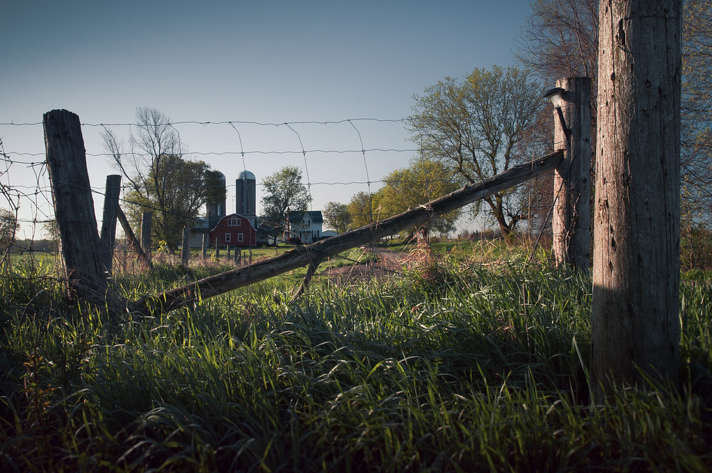
I wasn't going to comment on this, since plenty of others did, but I'm not much good at keeping my opinion to myself! Anyway, one of the first things that strikes me about this image is how flat it is in comparison to most of your other pieces. While there's still the expected light play and post-work, it isn't as heavy in contrast and depth of shadow, and it creates a much more muted tone for the overall picture. I get the idea of the gate functioning as a "no entry", but feel the actual farmhouse and silos are a little removed in distance, lessening the impact of the gate and fence (I'm not sure if you could have used a perspective trick to make the fence more imposing). I actually like the palette you've chosen. While it's a slightly different direction from the norm, it does create a sense of intrusion by virtue of the colder colours. While I was previously bemoaning the lack of heavy contrast between the light, it does provide a sense of uneasiness. It's always good to try things, even if they don't always quite come off. (Incidentally, your pic of glencoe you linked to reminds me of a painting. I'll need to go check the museum again for the exact details). My crap: 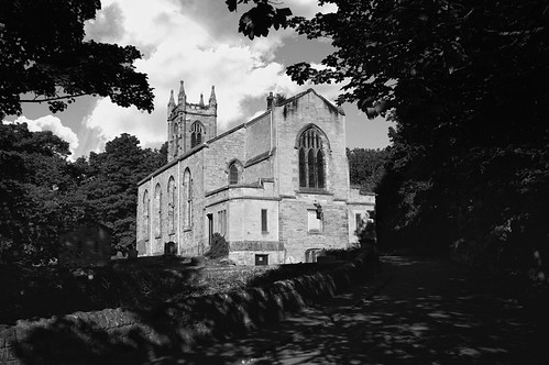 The auld kirk by falamh, on Flickr 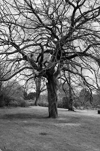 Branching out by falamh, on Flickr
|
|
#
¿
May 30, 2012 08:49
|
|
|
Hotwax Residue posted:
Something about this just doesn't scan properly to my eyes. The composition is conventional, but I think with the colour profile and, the (shall we settle for uninteresting?) foreground, there's a large area in the picture that doesn't really do much. Part of the reason the foreground fails to draw attention is that it's quite small and almost seems as if the beach-head was included as an afterthought. The mountains are the obvious focal point, and are great, but I'd like to see the framing either 2 feet forward (cutting out the end of the beach-head, and just making the picture the tide and mountains) or 2 feet back and a looser crop (giving more top space, but also introducing more foreground). At the moment it feels a little too tight at the top and bottom and with the cool blue shade being the prevailing colour it doesn't quite work for me. Augmented Dickey posted:A silhouette from a resent vacation- I'm not quite sure how to process this type of shot. You've got several interesting silhouettes there, and a gradual change in the depth of the shadow. The natural lack of colour in the image would lead me to process this in black and white and rely on tonality to convey the scene (additional exposures might help here). I'd also dodge/burn areas of the photo (eg. the highlights on the water to the mid and lower left) in order to increase the tonal range. My own stuff: 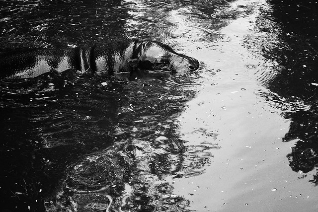 Water's Bovine by falamh, on Flickr  Pride of the Pantanal by falamh, on Flickr  Melanistic by falamh, on Flickr
|
|
#
¿
Jul 9, 2012 14:28
|
|

|
VomitOnLino posted:I'm going to comment on the hippo picture first, because I like it the best out of the three posted. The black and white really gives the hippo's skin some nice definition. Also the crop is the most interesting, too as it indicates movement. Thanks for the feedback. I toyed with cropping the hippo photo, but I liked the light segment of water just in front of the hippo and the wave crescent, I will probably revisit it and re-process it when it's less fresh in my mind. Flipping the Third picture is obvious and I can't believe I didn't bother. The large area of focus and heavy textures is quite intentional however - the cats are Jaguars and actually were very difficult to spot in their enclosures, blending and melding into the background quite easily. I should also admit that the last two were shot through horribly reflective plexiglass!
|
|
#
¿
Jul 16, 2012 22:31
|
|
|
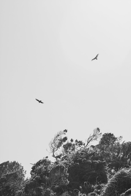
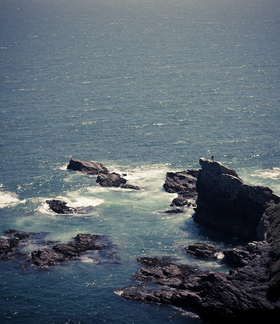
Nice use of empty space in both. In the former, the emptiness of the sky as opposed to the (quite) dense outcrop of canopy below emphasises the freedom of the birds in the air. I think the black/white process works more in favour than the colour (solo bird) picture beforehand in your photostream, which would have suited a tighter crop to the (leafless) tree, but you can't direct nature. I might have been tempted to clone in some extremely light cloud coverage at the top right of the picture myself, but I'm glad you left the sky empty. Nice tones. The second picture I feel like focus was missed slightly, it looks okay at small sized, but viewed large isn't quite right. However, I'll critique the composition mainly since I really like the feeling of "standing on the edge of the world" I get from this, which would be good on its own, but the figure on the rocky ledge just elevates the idea to great. The sunlight playing off the waves is really nice too, and the tones and processing are favourable. It has a real, hazy cinematic feel, like you're just waiting for the end credits to roll and Chi Mai to start playing.
|
|
#
¿
Oct 30, 2012 12:35
|
|
|

|
| # ¿ May 1, 2024 02:10 |
|
|
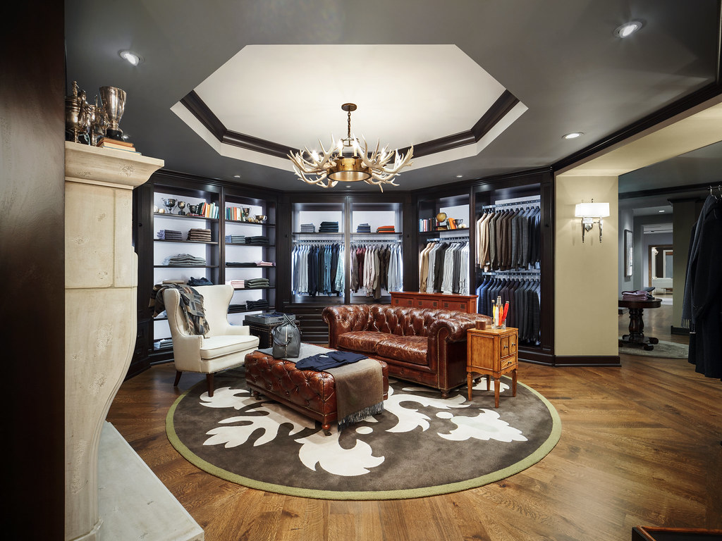
The fireplace on the left is killing this for me. It's intrusive, feels like it isn't adding much to the photo, and the trophies at the top are, in juxtaposition to everything else, much less crisp and defined from your usual pictures.
|
|
#
¿
Dec 6, 2012 10:09
|
|