|
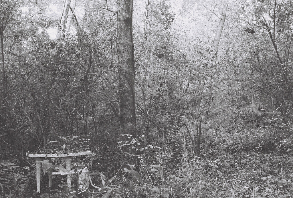
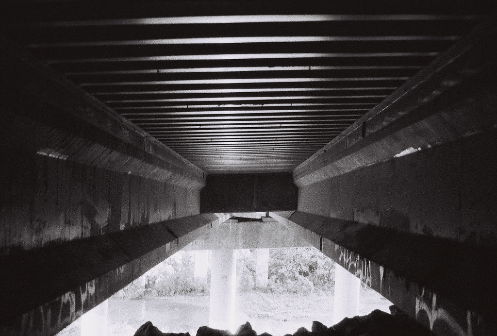
pootiebigwang posted:I have never had a critique done for me so I just kind of went into flickr and chose 3 random shots. Please rip them to pieces Welcome to the Dorkroom, in that case! Just about everyone here has some great knowledge so please keep taking those photos! As for your three, my favorite of them is definitely the second. I actually really, really enjoy it. It looks almost like something you would see in those creepy photos from the 1930's or so. It could use a slight bit more contrast for my tastes, though, as a lot of the foliage starts to blend together. It's also slightly off-kilter so maybe straighten that up. However, whatever you do, don't clean up the noise! It suits the photo and adds a ton to that creepy, mysterious vibe. The other two could stand to have the noise reduced just a little, though (more in the first than on the third). The first is ok, but I feel like it's very busy and doesn't focus enough on the waterfall. The colors seem to be all over the place, and the light on the left end is distracting. Maybe do some cropping to bring the focus back onto the waterfall. The third is much better composed, but the rock or whatever that is at the bottom could stand to be cropped out and the whole photo straightened a bit if possible. Otherwise, it's a great detail shot. Black and White seems to be your strong suit just judging from these three. ") Finally got a chance to visit Saguaro National Park. Nature and Environment photography is still, by far, my weakest genre but I feel like I'm slowly improving! Waiting on a Graduated ND filter to help me with overexposed skies. Lots of good info in the thread here, but I'm trying to avoid masking, merging, etc that feels a little too "Photoshop," even though it would probably help my photos a bit for now. Anyway, here were my 3 favorites from the weekend: 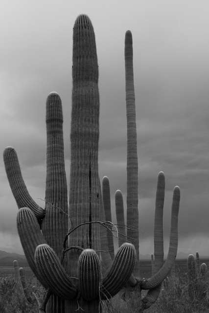 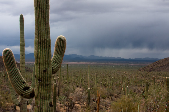 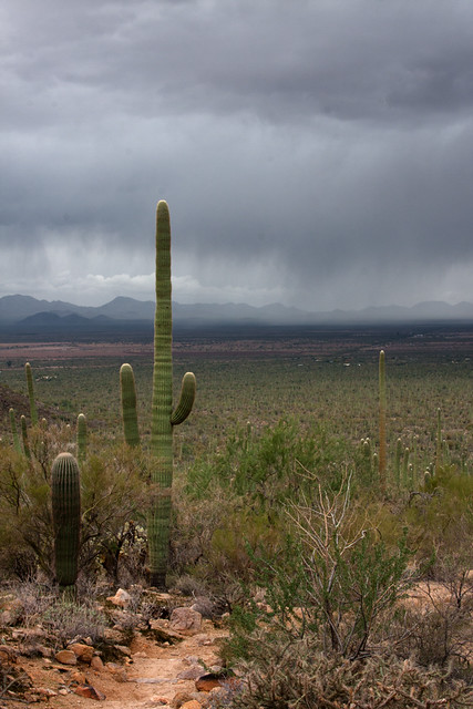
|
 #
¿
Dec 5, 2011 07:16
#
¿
Dec 5, 2011 07:16
|
|


|

|
| # ¿ May 3, 2024 12:03 |
|
|
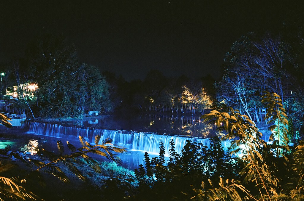
quote:I get your intentions with the black and white, but that sky is way too perfect to not be in color. quote:Really, that's a fantastic colour sky. Here you go! Wasn't sure the subject was solid enough to be in color vs. the stark detailing of B&W, but I'm glad you guys liked the sky. All I wanted on the trip was a little rain, and thankfully we got there during one of the few times a year it happens. 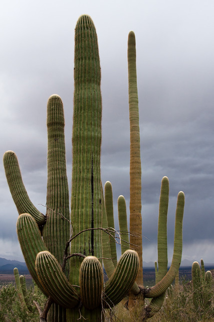 rio posted:So, I had another 10 minutes to go out for a walk at work today. This is a kust a shot of the environment, just to give you an idea of what is around. Not so much a shot for critique. Dude, there's nothing to be shy about with this. Yes, it's a mundane subject, but you've made it very interesting. I'm not sure if the framing was intentional or not, but what really made this photo for me were the evergreens in the background. They turned what normally would be a snapshot into an extremely interesting image when contrasted with the winter trees that cover the background. Yeah, the shot's a little asymmetrical, but mostly because of the bushes behind the fence to not go across the whole image and instead lean on the left side. If you have a chance to get more shots of it, I really think you're onto something, and it's the most interesting of the ones you posted in my opinion.
|
|
#
¿
Dec 7, 2011 07:27
|
|

|
AIIAZNSK8ER posted:Yeah, that helped a ton. The magenta thing really didn't add too much to it. I not exactly crazy about the noise, but the colors are muted enough to have that vintage 60's look without actually being vintage. It's not what I would consider the greatest technical photograph, but you captured a really fun, silly, and interesting image. Which is really what a lot of good photography is about in the long-term. Even with the cellphone in it, this is a photo that now or 50 years down the line, people will find the same things to like about it and be asking the same questions, which is something very, very difficult to do in our era. TomR posted:
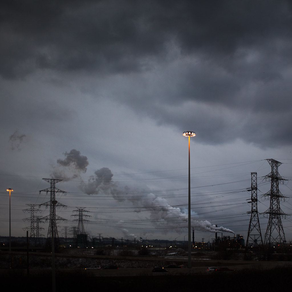
This is a pretty mixed bag, in my opinion. It is extremely busy with the lines going all over the place between the electrical wires, the lamps, the smoke, etc. I feel like I would get more out of it if it was cleaner in that regard. However, the detail in this is stellar. I love the crop you chose, since the smoke and sky really deserve the focus with the amount of clarity you have in this. I also do like the lamps, just not how they're framed. It's a good concept, and the splash of light and color they add really stand out. I feel like maybe the focus should have been either the sky or the lamps, as right now it's a lot of good elements that conflict with each other a bit too much. Finally got out and about to take a fashion/conceptual shoot, which I haven't done well in ages. I definitely need to relearn a bit that I've forgotten. We had fun, though, and I feel like there are enough solid shots in the batch that I'm not sure which ones to be pushing in my online galleries. Also, we had out first experience of being told we couldn't take photos in an LA park without a permit, even without having so much as a tripod with us! Honestly surprised they didn't remotely bring up the clothes instead.  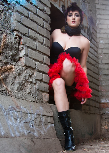 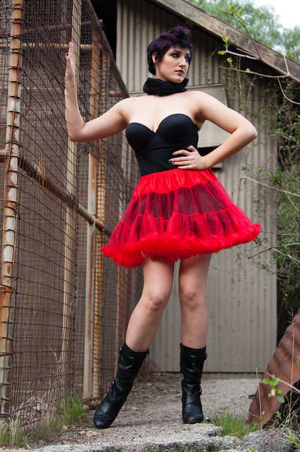 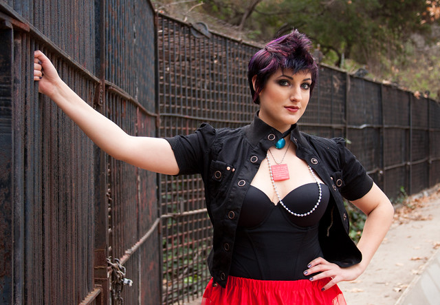
|
|
#
¿
Jan 15, 2012 05:39
|
|
|
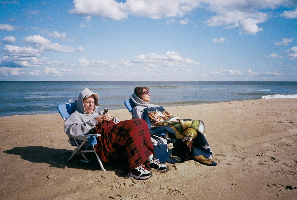
CarrotFlowers posted:Can you expand your thoughts on this point? What about it, technically, would you change? Well, the color was fixed, which helped a ton. But, I'm still not entirely crazy about the grain and don't think the photo would suffer any at all if there was less. I'm also a fan of tight crops, at least from the sides with that one white strip of foam on the right, but that's probably a personal choice in the matter. Looking at the data, it looks like this was shot on film? If so, I'm not sure it can be fixed, but I feel like there is something funky going on with the blanket with the reds kind of merging together a bit more than they probably should. It's actually kind of hurting my eyes now that I focus on it a little more. I can't really place my finger on it, and it could be a saturation thing given that the rest of the photo is relatively muted in comparison. Those are my thoughts, anyway. And don't get me wrong; I absolutely love this photograph! But more for the imagery and story it tells than the overall look and feel. I'm not much of a fan of that vintage look in general, but this is a great photograph to use it. I just prefer a little more contrast in photos (some would probably say too much contrast). Axel Serenity fucked around with this message at 06:12 on Jan 15, 2012 |
|
#
¿
Jan 15, 2012 06:10
|
|
|
AIIAZNSK8ER posted:The second photo is is OK, but I think you should shoot with a longer lens to compress her in the scene more and shoot either at eye level or just a bit higher. Thanks a ton for the feedback on the photos, guys! I'll definitely keep it in mind for next shoot, especially about the lower angles. I was wondering, AI, if maybe you could expand on the quoted section a little more or maybe link to a post/tutorial on how a longer lens would affect it. I only really own a 28-135mm kit lens that came with my 40D, so my experience with different lengths is pretty limited. I understand that different lengths will affect DoF and a photo in different ways, but I still don't quite understand the technical aspects of how it works or how to keep it in mind for future shoots for when I can eventually afford longer glass. vvv Thanks! That was exactly was I was looking for
Axel Serenity fucked around with this message at 08:03 on Jan 17, 2012 |
|
#
¿
Jan 17, 2012 04:13
|
|
|

|
| # ¿ May 3, 2024 12:03 |
|
|
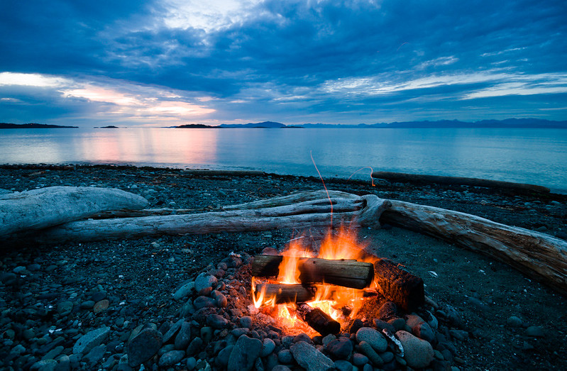
Dread Head posted:My summer solstice. I do enjoy this one quite a bit. It has some nice clarity to it, and it doesn't fall into being just another generic "Hey guys here's a time-lapsed ocean with COLORS" picture. Although I do have to admit the first thing I thought of was the now-defunct I'm tired of teal and orange thread in CD. I also think that for having such a cool sky, it seems a little flatter than it should be and could use a little more contrast/slight burning in a few places to give it some nice detail that is hiding around in there somewhere. doctor 7 posted:
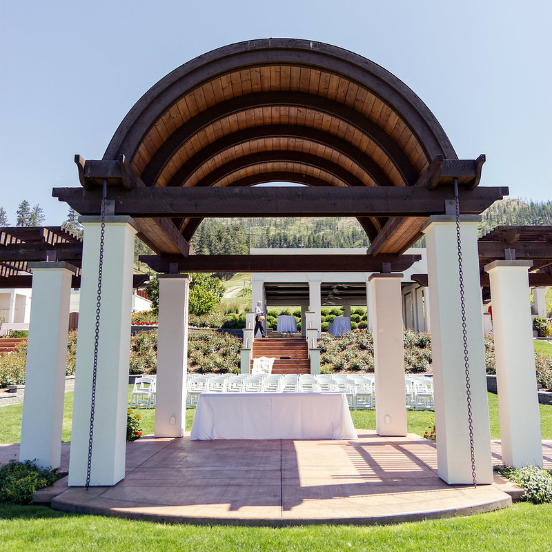
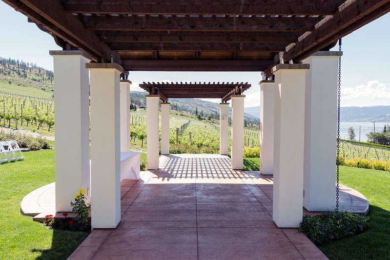
I really want to like both of these. They have great lines and shapes to them, but they are way too bright, in my opinion. I would love to see the same architecture shot at a much later or much earlier time of day or at a lower exposure. Also, in the first one quoted, the person walking around in the back is a little distracting since it doesn't seem like he was purposely put in there as a focal point. It could be my eyes playing tricks on me, but I also feel like these are every so slightly off-kilter. The first definitely seems like it's leaning backwards, but they also seem a little uneven horizontally, as well. Overall a good eye on these pieces but could use some more work in post if it's a location you can't go back to shoot again. --- Finally shot something new. I hate having creative blocks and lack of motivation for months at a time. Thankfully, unlike most of my recent shots in this thread, these are simple still lifes that can easily be set-up again and fixed! I almost forgot how nice it was taking shots that I can go back an do over once I get feedback. Anyway, just one for today. I wasn't sure how I felt about having the logo cut off on the side, but there is another on that Flickr page before it that has everything intact (I'm not posting it since it's pretty much the exact same image slightly scaled back and a larger DoF). I don't know; I just felt like this was a stronger image with the DoF more than other, but I like them both. The slight yellow hue is also intentional since apparently that is The Thing To Do with baseball still lifes to make things old-timey and help old people reminisce about funny mustaches on pitchers or something. 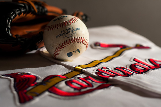 IMG_4766 by Wes_Smith, on Flickr Axel Serenity fucked around with this message at 20:24 on Jun 24, 2012 |
|
#
¿
Jun 24, 2012 11:08
|
|