|
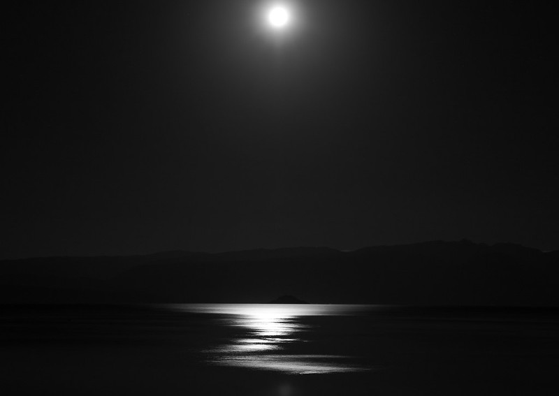
CarrotFlowers posted:I posted these in SAD, but they aren't snapshots. This is the first time I've tried something really different from what I usually do, which is very friendly, smiley, "nice" portraits. I'm gonna cross-post 2 of mine from SAD, as they weren't intended as snapshots either, and I may as well put my money where my mouth is with a little bit of self critique thrown in ") 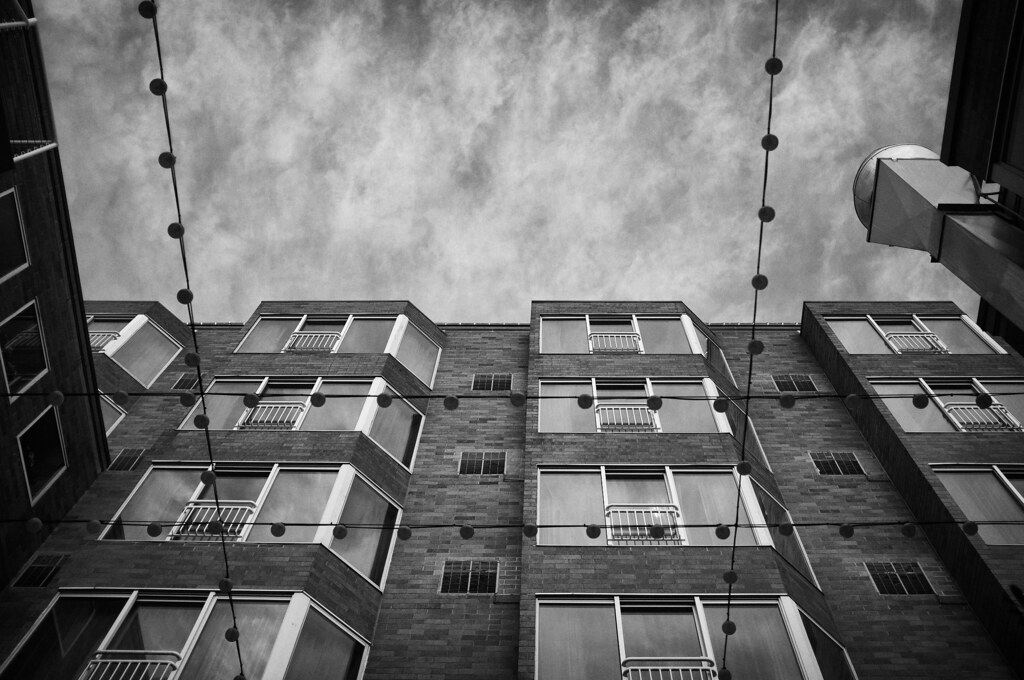 sky and lights by Trip Sixes, on Flickr 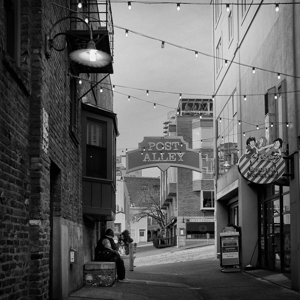 alley by Trip Sixes, on Flickr I really like both of these images, but I will say that I wish the sky in my second shot was not just a slab of uninteresting gray. It took a bit to tame the verticals in that one, and I know they're not perfect, but I went for the best compromise I could.
|
 #
¿
Dec 29, 2011 03:50
#
¿
Dec 29, 2011 03:50
|
|


|

|
| # ¿ May 5, 2024 20:15 |
|
|
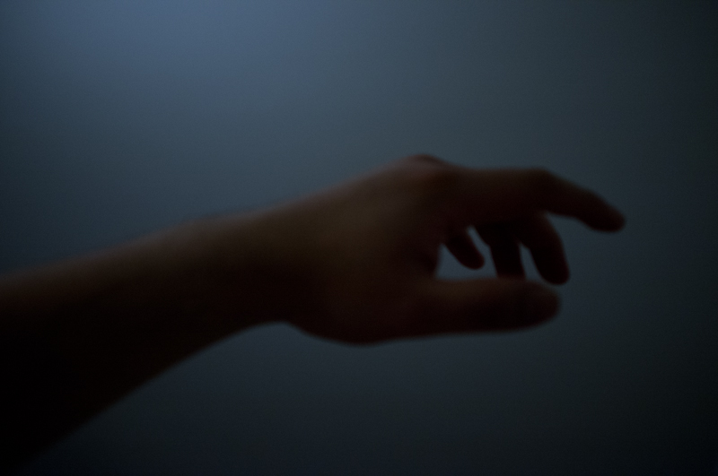
Mightaswell posted:Okay, let me have it. I know this is one of those pictures that is interesting only because of the subject, and not because of any compositional storytelling. That being said, I'd still like an honest opinion on the way I presented it. Here are 3 of the last photos I took in 2011, taken on the last day of the year (these were posted in the archived SAD thread originally, but they really aren't snapshots and I wanted to get some critique):  ladies by Trip Sixes, on Flickr  over the edge by Trip Sixes, on Flickr 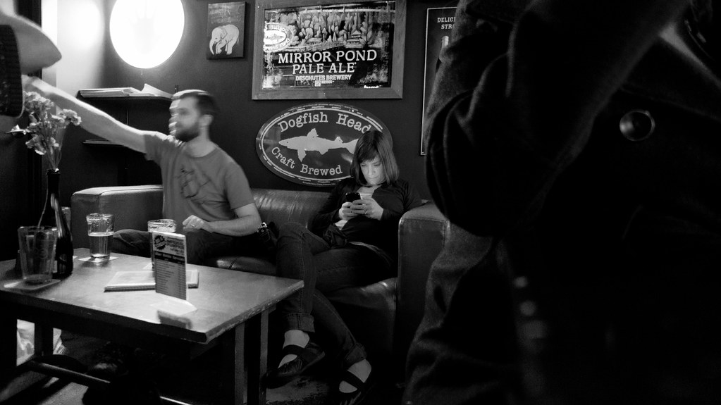 the glow of someone elses' conversation by Trip Sixes, on Flickr The last one is interesting to me because it ends my year the same way my year started - in a bar ( http://www.flickr.com/photos/trip_sixes/5331764301/in/photostream ) It's no secret that I'm really awkward at photographing people, hence all my subjects tend to be isolated and overpowered by their surroundings. Much of my pictures convey loneliness and isolation, which probably reflects back on me more than it accurately portrays the people I've photographed. The girl in the bar fascinated me, lost in her own little world- even while surrounded by friends. I'm not sure I managed to capture that moment and convey it anywhere near as well as witnessing it did for me, it's something I'm really striving to improve on in the coming year, along with my awkwardness about people in general. Anyhow, just an observation and a little explanation for what that picture in particular was trying to be about...
|
|
#
¿
Jan 5, 2012 06:48
|
|
|
bandaid posted:
|
|
#
¿
Jan 25, 2012 07:21
|
|
|
Augmented Dickey posted:
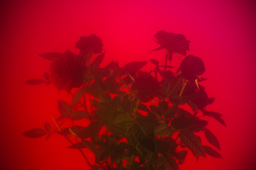
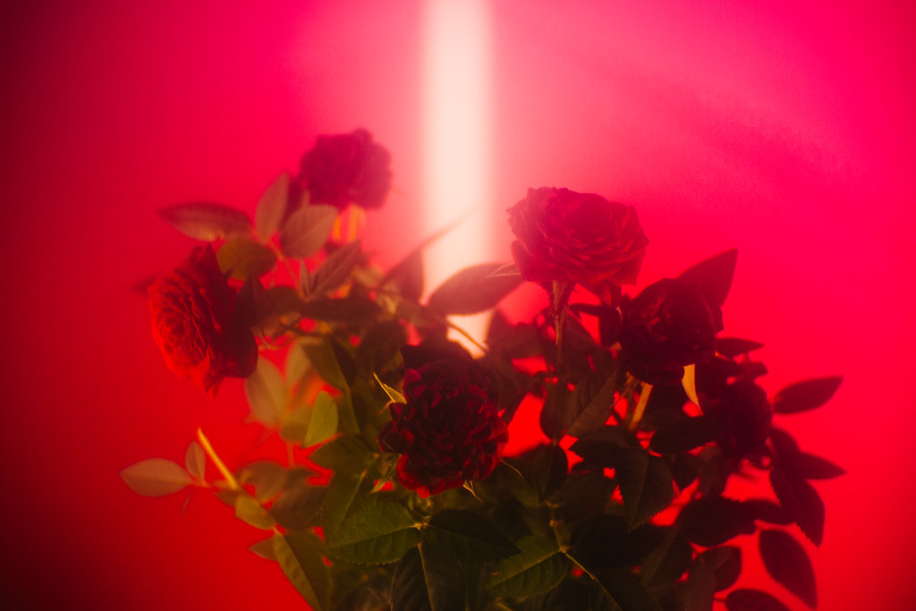
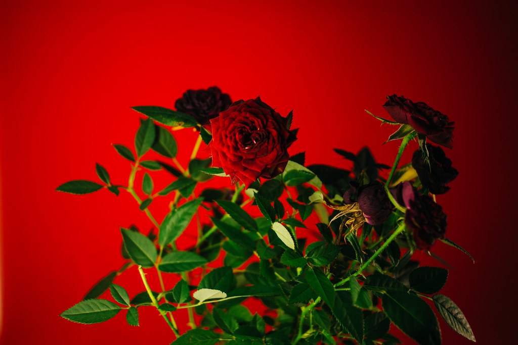
OK, I've been in a slump. Just miserable and uninspired for MONTHS. I did that thing you're never supposed to do, I went and threw money at the problem (bought a new camera), and it probably didn't help anything in any permanent fashion, but it got me out and off my rear end for a couple of hours this weekend. I already know this isn't staggering work, but I had an idea of what I wanted to accomplish in terms of theme, and I feel like I succeeded on at least a small level in terms of trying to express something visually. I wanted to capture that point between winter and spring, where nothing is as perfect or as beautiful as it will be yet, but change is evident and in progress everywhere. Color is emerging from a tangle of gray and things seemingly dead are starting to resemble something living again. To that end, here are 3 pictures that try to tell of that transition.  Emerge by Trip Sixes, on Flickr  pod by Trip Sixes, on Flickr 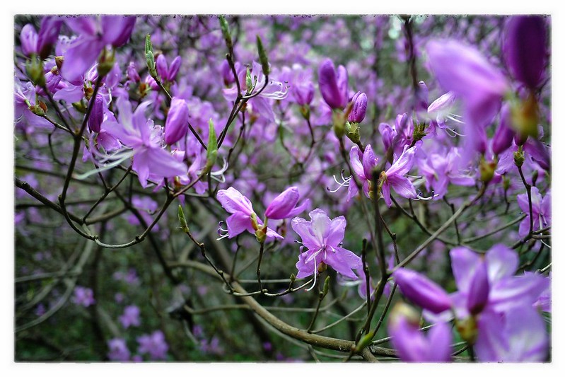 blossoms by Trip Sixes, on Flickr yeah, that sounds as pretentious to me as it probably reads to you, LOL 
krackmonkey fucked around with this message at 03:03 on Apr 3, 2012 |
|
#
¿
Apr 3, 2012 02:54
|
|

|
HookShot posted:
Found a new friend at the zoo today...  Emu by Trip Sixes, on Flickr I waited for this fella to move close enough that I could take a picture that didn't just shriek "ZOO PHOTO", and this is what I was finally able to accomplish. The crop is a little tight, but there was some ground debris and a water dish that detracted from the rest of the picture, and cloning attempts did not look natural at all. I really love the myriad of contrasts in his black and gray mottled feathers, hence the B&W treatment, as color didn't bring any additional information to the image and only made him blend even further into that drat rock wall in the background.
|
|
#
¿
Apr 15, 2012 02:18
|
|

|
Turd Nelson posted:
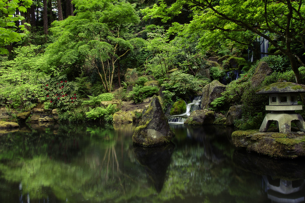
The second one is technically fine and aesthetically pleasing, but I feel like I've seen this shot in every book about a Japanese garden ever published. Not your fault, it is what it is. The red flowers are almost unreal looking, the way they pop in the background, I find my eyes drawn to them almost instantly, and yet they're not the focal point of the image. went for a walk at lunch today, trying to shoot my way out of a slump - still pretty deep into one...keep shooting...  DSC00034.jpg by Trip Sixes, on Flickr 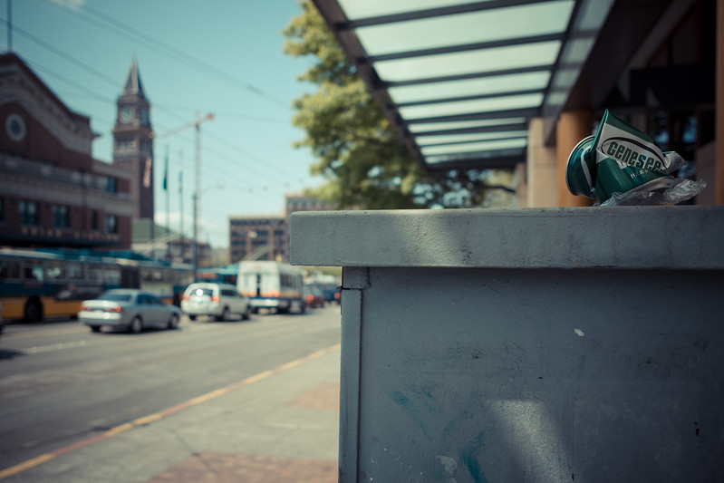 Genesee by Trip Sixes, on Flickr krackmonkey fucked around with this message at 07:23 on May 18, 2012 |
|
#
¿
May 18, 2012 06:44
|
|
|
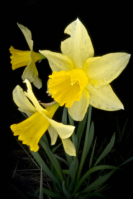
David Pratt posted:More from my 366: The first one I keep going back to, it's really just lovely and there's something very unreal about how it looks, like it really made me think it was a painting almost at first. I know people get a lot of "it's just a flower" in here, so I really did want to chime in and say this is pretty fantastic, from the subdued color to the detail, to everything else. That being said, I don't know why you would distract from that picture with the second and third ones, because the first one is so far superior to the other two that it really looks quite out of place. The third one has potential, in that I think maybe lightening the background and making the colored glass pop a little more could make a huge difference. Even as an abstract, the wall and camera and shadows just don't work for me. That said, I'm sure someone on here loves it, and this is just my take. Again, the daffodils are pretty fantastic, let that be the take-away from this. Here's what made my pulse race on this fine spring afternoon:  _D7K0037.jpg by Trip Sixes, on Flickr  lungs by Trip Sixes, on Flickr I'm having a hard time finding my way lately, but these 2 were the first in a while that didn't feel forced or like anything but what I wanted them to be from the moment I raised the camera up to my eye. *edit* - one more from tonight - I haven't shot a band since last August. This is the singer from Seattle grind/crust band "Theories". ( http://theories.bandcamp.com/album/2011 )  Theories 1 by Trip Sixes, on Flickr krackmonkey fucked around with this message at 10:58 on May 27, 2012 |
|
#
¿
May 27, 2012 03:10
|
|

|
xenilk posted:
here's a cross-post from the SAD dump, I was tired and not certain how confident I was about it when I posted it last night, but rest and fresh eyes make me see it in a new light. 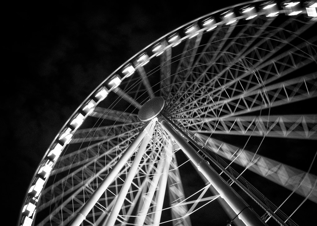 wheel1 by Trip Sixes, on Flickr
|
|
#
¿
Jul 22, 2012 17:08
|
|
|
TheJeffers posted:Crosspost from the Photo Contest thread: I spent a chunk of my afternoon in a hothouse, enthralled by the fragility and texture.  P7280057.jpg by Trip Sixes, on Flickr  P7280051.jpg by Trip Sixes, on Flickr and a cross-post from the low effort thread:  P7280050.jpg by Trip Sixes, on Flickr (mad props to Alkanphel for the inspiration)
|
|
#
¿
Jul 29, 2012 08:03
|
|

|
Augmented Dickey posted:
I really love the setting and what you had to work with, I wish the bright spot wasn't quite so bright and harsh, it's the one rough edge on something that is so smooth and tranquil in all other aspects. Even the ripples in the water don't bother me, although I agree that you should try and get a similar shot on a still day to see what calm water does for the image. I'm cross-posting these from the low-effort thread and I'll get rid of them there, in case this isn't kosher. It's time to wade in a little deeper. 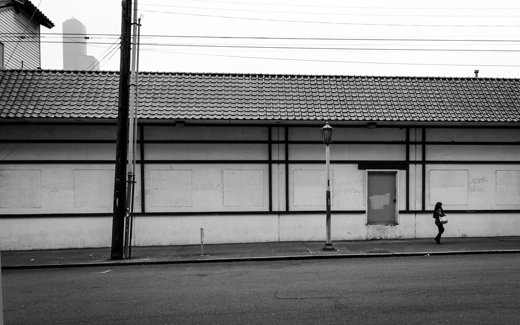 linear by Trip Sixes, on Flickr  shift's end by Trip Sixes, on Flickr
|
|
#
¿
Oct 11, 2012 04:35
|
|
|
CarrotFlowers posted:
My only nitpick is in the last one, and it's the vertical row of cups, etc... on the right side of the frame, I feel like they frame in the subject too much instead of hinting that there is a continuance of the world you're creating outside of the image area. If that makes any sense? Back on the subject of second-guessing myself - here's a cross-post from the low-effort thread- although I did put more than low effort into them, and I had to chase spotty light breaks mere minutes before a torrential downpour to get these shots. The spot I wanted on a bridge lower and slightly right from my vantage point was already camped in by a few other more "serious" photogs with big white lenses. This left me opting for the higher point and having to integrate the brush I had to deal with as a result. The bottom one had me smacking myself in the head that I didn't manage to get the foreground tree in sharper focus along with everything else. I've made this mistake a couple of times now and it's kept what could have been much better shots from really hitting the mark. I include it as my public shaming, in the hopes it helps me remember to avoid this in the future.  cloudbreak by Trip Sixes, on Flickr  briefly illuminated by Trip Sixes, on Flickr krackmonkey fucked around with this message at 05:10 on Oct 22, 2012 |
|
#
¿
Oct 22, 2012 05:00
|
|


|
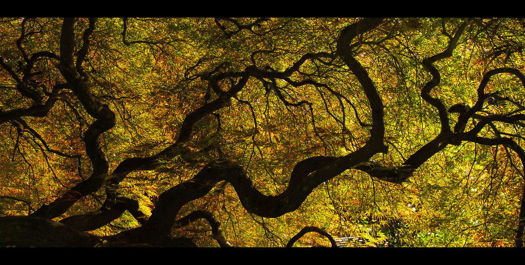
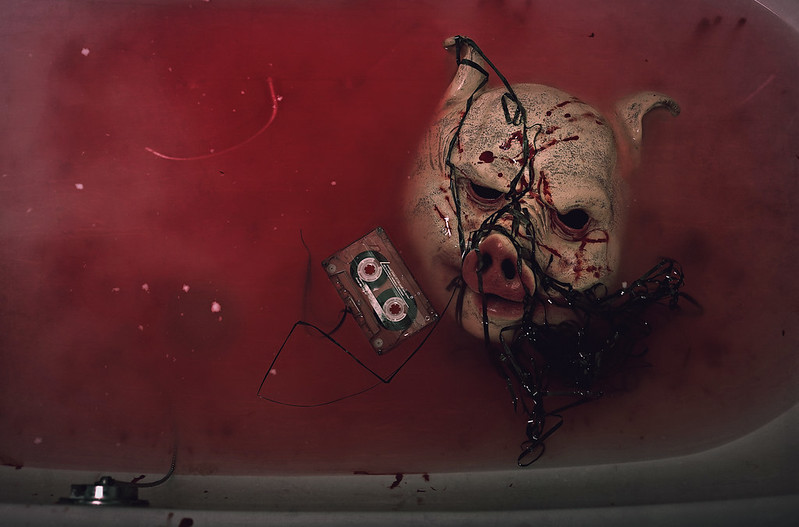
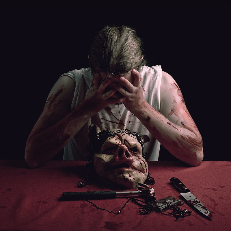
Gazmachine posted:So a game called Hotline: Miami came out recently. I made some images for the hell of it. It quit raining for a couple of hours today, so I went in search of fall colors  _B040059.jpg by Trip Sixes, on Flickr 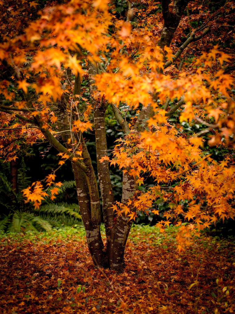 _B040118.jpg by Trip Sixes, on Flickr  crimson carpeting by Trip Sixes, on Flickr
|
|
#
¿
Nov 5, 2012 04:05
|
|

|
Shampoo posted:Like everyone else, I like the DOF on this one a lot, as well as the rich, vibrant colors. Is there a good amount of vignetting on this one, or is that just a side-effect of the DOF? It seems really dark in the corners, but that might be by design. I can't decide how I feel about the yellow leaves. Part of me would have liked to see them removed before the shot was taken to make the red carpet more monochromatic, but another part of me likes to see them there specifically to break up the pure field of red. The vignetting was done in post intentionally, it's something I like but appreciate that it's not everyone's cup of tea. I tried it both ways and ultimately just liked the one with vignetting more than either the more subtle approach or the one without it altogether. As for cleaning up the leaves, I shot it as I found it.
|
|
#
¿
Nov 6, 2012 23:35
|
|

|
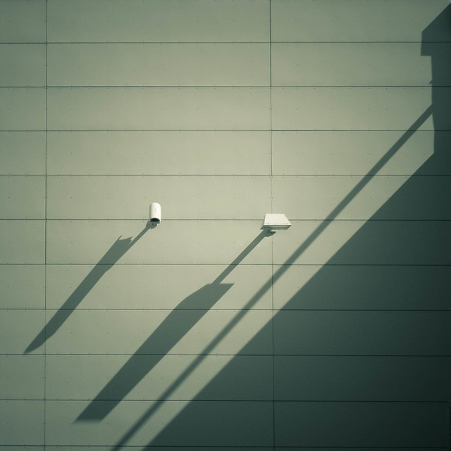
El Laucha posted:
I'm a sucker for these sort of minimalist shots, I like it. I wonder what effect bumping the exposure about a quarter to half a stop would have on the hills in the background, I would like a touch more distinction between the 2 layers of depth, and I can't help but wonder if just a touch less subtlety wouldn't somehow work better. I've been sidelined with a blown-up knee since before Thanksgiving. Today I managed to feel limber and mobile enough to get over to West Seattle and hobble down to Alki beach for a few minutes in late afternoon. 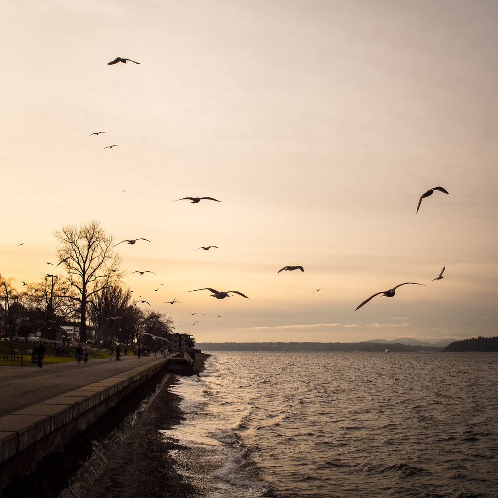 _1010333.jpg by Trip Sixes, on Flickr
|
|
#
¿
Jan 2, 2013 05:40
|
|
|
Oprah Haza posted:Nice, may benefit from a different crop, play with it. How'd you get that angle, ladder or did the sidewalk take a turn? Thanks, I will tinker with cropping and see how I like it. There's a series of protruding platforms/steps that lead down to the water, you can see a set in the distance, I was on the top deck of another set. This is really nice, has a very dreamy, cinematic quality to it. I like the darker hues a lot. krackmonkey fucked around with this message at 06:55 on Jan 2, 2013 |
|
#
¿
Jan 2, 2013 06:53
|
|
|
Huxley posted:Second try at posting a couple, with some critiques on my own. (All with an S90, the flowers in macro mode.) I'm going to disagree with you regarding the first one, there just isn't anything that draws the eyes anywhere and the light is just too bright and it washes over the top of the image without much purpose. Trees are tough to make interesting, and to do it well, you have to almost use a portraiture type of approach and really emphasize shape, texture, and light so they become the character of the image. The second shot feels like a crop decision, I'm wanting for more flower petal to give it some balance - I know pulling back would ruin a lot of the macro emphasis, so I think you made the most of what you could and the bugs are very sharp and noticeable, which is a good thing. I actually like most of what you did with your third image, but you could easily force that into the confines of a square crop and get a much stronger image as a result. I've been recovering from a knee injury and surgery, which had turned me into more or less a shut-in for the last 8 months or so. this last weekend was one of the first comfortably mobile weekends I have had since before the injury. It was really one of the first times I've had to reconnect with my camera and I feel like I'm starting all over again, in a lot of ways. I'm sure that I've been pretty heavy-handed on the processing for these, but they do a good job of expressing my feelings of re-entering the world from the darkness of confinement- on a personal level. I know, BORING, right? These were all taken out in Eastern WA on a day trip.  A new take on an old favorite place/subject - HWY 2 Schoolhouse, Eastern WA - 7/5/13 by Trip Sixes, on Flickr  _DSC0495.jpg by Trip Sixes, on Flickr 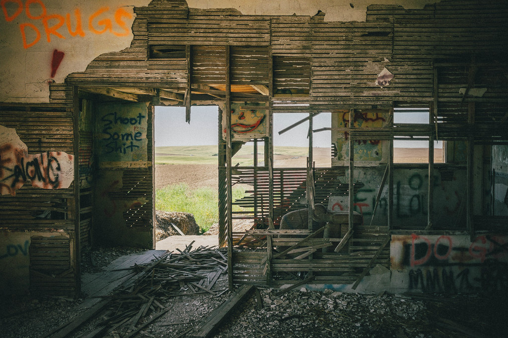 _DSC0470.jpg by Trip Sixes, on Flickr
|
|
#
¿
Jul 8, 2013 05:55
|
|

|
Dren posted:I like that this shot has a pretty even divide between a warm cast and a cool cast along the bottom left to upper right diagonal. Did you process it this way or did it just happen? I almost feel like you had to have processed it like this because I'm having a hard time imagining what the light would have reflected off of in order to get that color cast.
|
|
#
¿
Jul 8, 2013 21:13
|
|
|
Claw Massage posted:Well, I knew there was a reason I chose that one over the five other positions I shot. Ha. Maybe I should crop see off the right to see if that looks better. I'd leave it, any less branch on the right and there's no context for having any there at all and it becomes a distraction. As-is, it helps frame the subject and gives the image some harmony.
|
|
#
¿
Jul 9, 2013 13:22
|
|
|
Chekans 3 16 posted:These two are from my fashion photography final: The first portrait I think could stand to have greater contrast and shadow, as it stands right now the light isn't very flattering and it doesn't evoke any feeling. The second is a much better catalog type of pose and look, but the janky lines in the lower quarter of the image from the offset corner just sit funny with me and are distracting. I think if you're going to sell me on those corner lines, you need to step back and include his feet as well. I just got back from the Dominican Republic, which is an incredibly photogenic country, it feels like cheating.  Dominican Republic, 11/2014 by Trip Sixes, on Flickr Dominican Republic, 11/2014 by Trip Sixes, on Flickr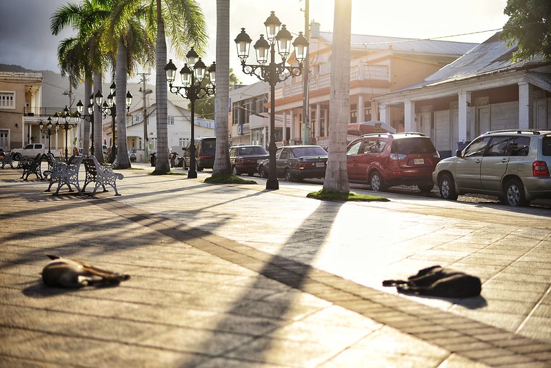 Dog Days by Trip Sixes, on Flickr Dog Days by Trip Sixes, on Flickr The Fighter by Trip Sixes, on Flickr The Fighter by Trip Sixes, on Flickr
|
|
#
¿
Dec 10, 2014 02:17
|
|

|
Arrgytehpirate posted:I actually enjoy how the dogs are out of focus. It gives them a real feeling of laziness on a warm sunny day without a care in the world. Thanks for noticing that, I was wondering if anyone else was going to cue into that. The heat and humidity in the Dominican Republic was pretty intense, and I really wanted to capture that dreamlike feeling that just laying down or grabbing a seat on those benches would be a wonderful moment of escape.
|
|
#
¿
Dec 23, 2014 20:51
|
|
|
Thirteen Orphans posted:I went to the Sackler and Freer Galleries in DC today and got these: The first one is way too much just "this is an art someone did", whereas your next 2 go into composition and isolating parts of the art and are much more interesting as a result. The textures in the 3rd one are great, and the composition in the second one is appealing. It's always tricky taking photos of art, or at least getting something unique from it. Ideally you want to show what moved you to take the photo, and the last 2 definitely accomplish that. Good work. I've been in a rut this year, with the one bright bright spot being another trip to Tokyo, which is really kind of cheating since it's such a naturally photogenic city. 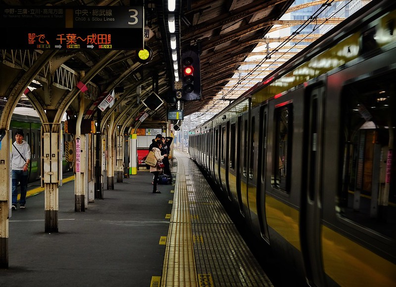 Chuo Local Line by Bill Baker, on Flickr Chuo Local Line by Bill Baker, on Flickr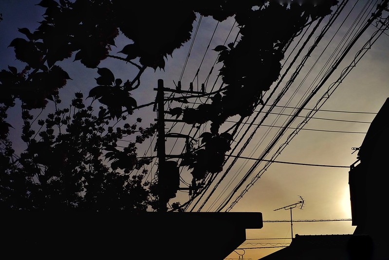 silhouette at sunset by Bill Baker, on Flickr silhouette at sunset by Bill Baker, on Flickr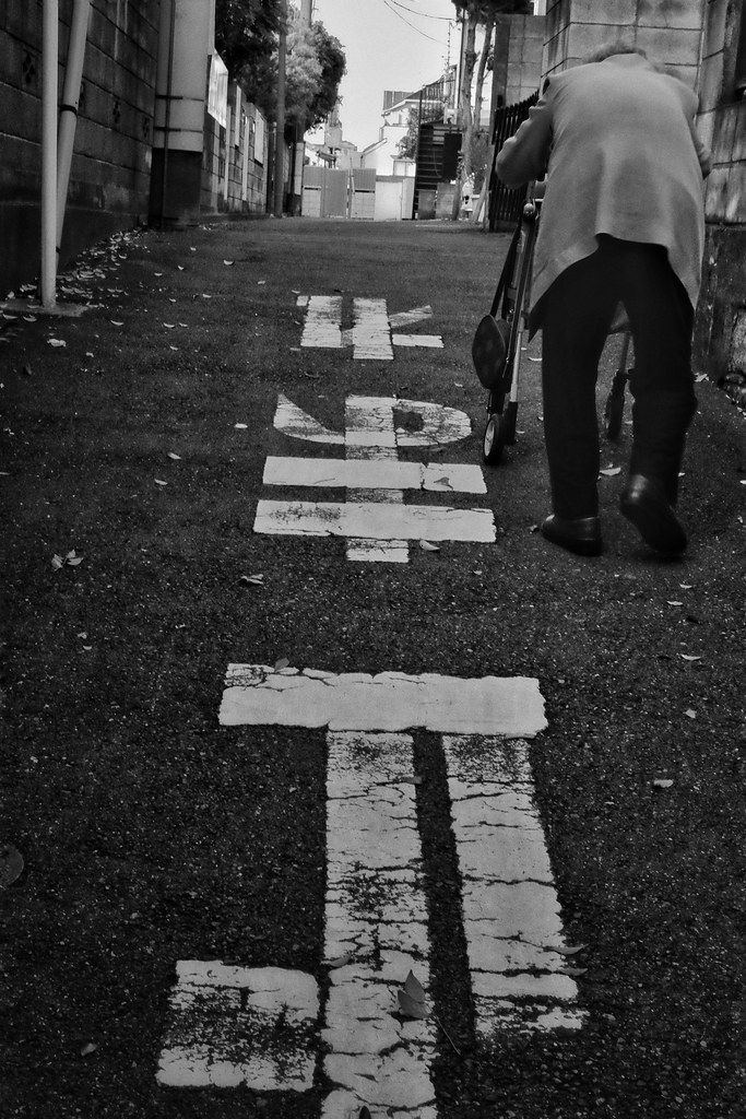 ascending by Bill Baker, on Flickr ascending by Bill Baker, on Flickr
|
|
#
¿
May 15, 2015 02:34
|
|
|

|
| # ¿ May 5, 2024 20:15 |
|
|
Magic Hate Ball posted:wow great photos! that third one is so good it just detracts from the first 2. I could stand to see an entire series shot in the style and clarity of the third on, but the other 2 just don't have enough going for them in texture or detail to merit the same consideration. that third one is great, however, and you should revisit what led you to that shot and see if there's more to mine from that perspective. there's an album cover in there as well. felt a real Stephen Shore pang when I saw this scene, didn't do the man any justice whatsoever, but still had those feels when I clicked the clicky bit  Americana by Bill Baker, on Flickr Americana by Bill Baker, on Flickr
|
|
#
¿
Jul 8, 2017 06:57
|
|