


|
IsaacNewton posted:Had a photo session with the neighbors grand kids. It was pretty fun, but I'll never have a shoot past 10 am with a kid that age. He was tired from the get go. Working with kids can be hard. The lighting you have is pretty good, there aren't any stray hard shadows messing up anyone's face. That said, I think the light may be a little too soft. There could be more definition in their faces. Right now they look kinda flat. You can see it's just smooth flat skin tone from the top of her nose all the way to her chin and ear. This is also a bit of an awkward point in a kiss to take a photo. They just look a bit silly. Her hair crosses her eye, which bugs me as well. If her head was turned slightly so her face was more towards the camera it would help the photo a lot. 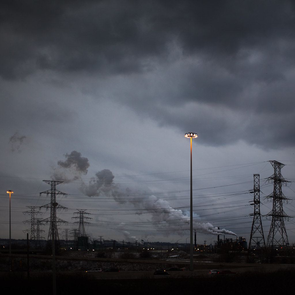 2012-28 by Tom Rintjema, on Flickr
|
 #
¿
Jan 14, 2012 17:42
#
¿
Jan 14, 2012 17:42
|
|


|

|
| # ¿ May 3, 2024 12:09 |
|
|
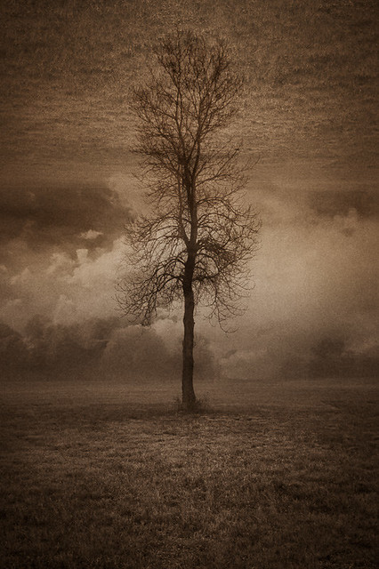
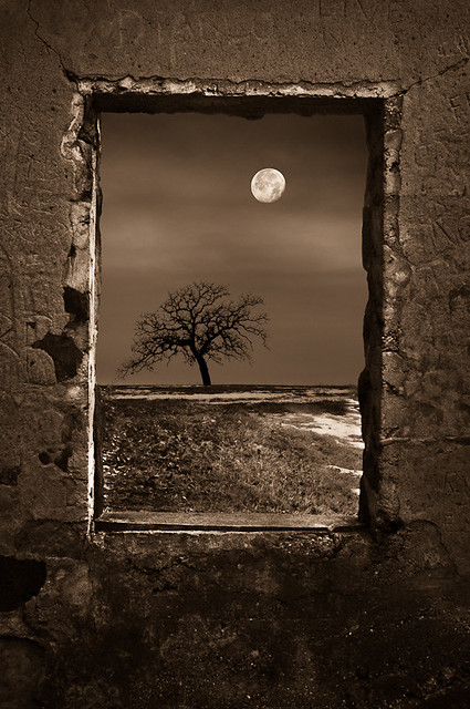
quazi posted:The sky detail is fantastic, but the ground is pretty dark. View it as a thumbnail, shrink it to a postage stamp and see what dominates the view. When it's large, I'm having fun playing with the zig-zag road and the smokestacks. When it's small, the power poles stand there and everything else is muddy. Thanks for all the responses on my photo. I did have a hard time with composition as there is so much going on in that area. I considered going black and white with it, but I just couldn't give up the orange on the light pole. Out of camera the prominent light was in the center of the frame, which I didn't like. I went with square crop because I wanted to contrast the busy lower half of the photo with the much sparser sky. I do like the crop you came up with, but I would reshoot this if I was going to crop that much. earth tree earth is okay, I don't think I like it any better than I would have liked just the tree and earth with that sky behind it. The treatment works well with the subject matter and I like the colour. dead of winter I like. I know it's one of those things that have been done to death, but this was done well so there's nothing wrong with that. The only thing that bugs me is the window frame isn't 100% square, but if it was it would look too fake I think. path of power uses the mirror effect much better, but the first tower is too clear and the second tower is too muted. I would bring out the second one and tone down the first one as it really jumps out right now, like it was suck on after. Everything else has a bit of a dreamy feel to it. The tower is also a bit close to the top of the frame, some space above it would help I think. Maybe if you re-framed the shot so it wasn't sitting right on the horizon, and was instead closer to the foreground, bringing it down some. EDIT: I was messing with the Lightroom 4 BETA and thought I'd post the results. I didn't crop this time, other than to straighten it. 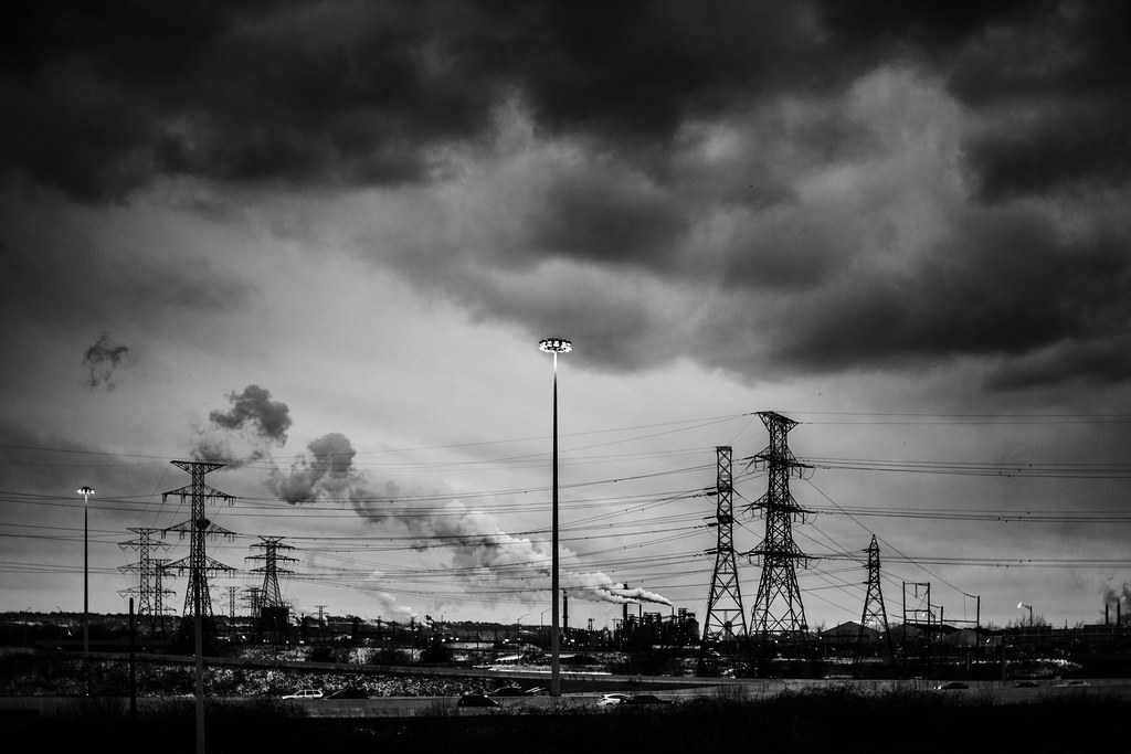 2012-29 by Tom Rintjema, on Flickr TomR fucked around with this message at 00:18 on Jan 18, 2012 |
|
#
¿
Jan 17, 2012 23:18
|
|

|
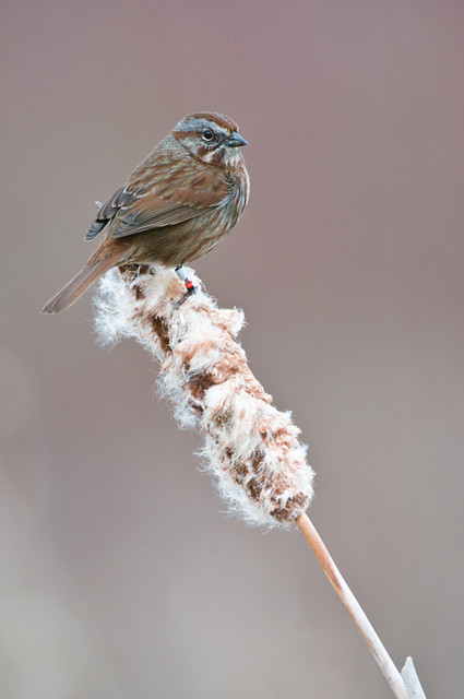
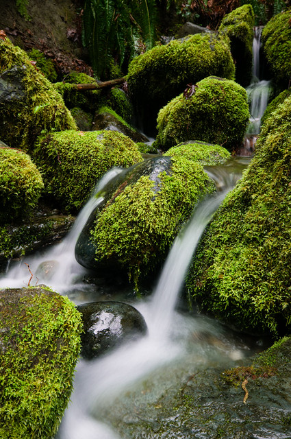
Dread Head posted:Two from the weekend. The bird photo is composed well and I feel the entire frame has been used effectively. The colour pallet is pleasing. The subject is engaging and well posed. I feel a distant connection with the subject, engaged, but not welcome any closer. The sharp red collar on the subjects leg highlights a point about it's past. This photo tells a real story. The deep shadows and dark rocks make a nice contrast with the vibrant moss and flowing water. The photo is pretty, but it doesn't say much. One from me: 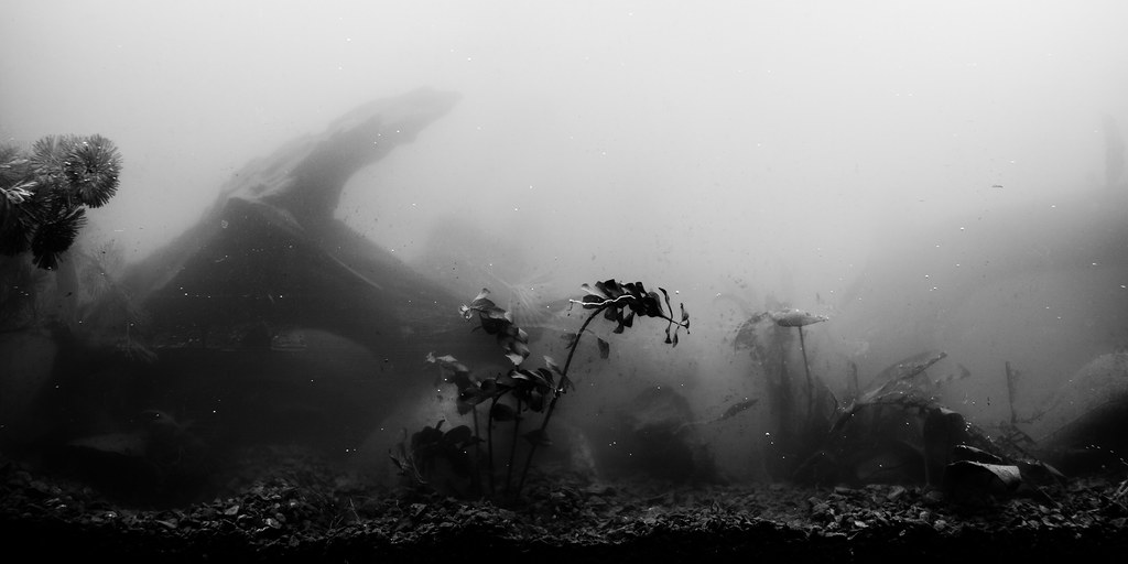 2012-94 by Tom Rintjema, on Flickr
|
|
#
¿
Apr 2, 2012 22:53
|
|
|
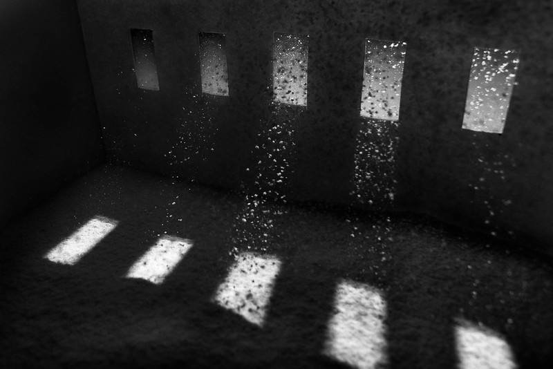
Augmented Dickey posted:This is really cool. It took me a minute to figure out what I was looking at, and I mean that in a good way. Might want to try taking care of the hair and dust on the film though- it's very easy to remove in post with b&w film. I appreciate the comment, but it's not film! The spots are bubbles on the tank wall and the hair formed a big long bubble around it. We just moved the tank, that's why it's so foggy and dirty.
|
|
#
¿
Apr 3, 2012 21:29
|
|
|
samjack56 posted:
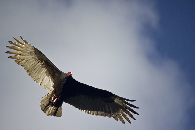
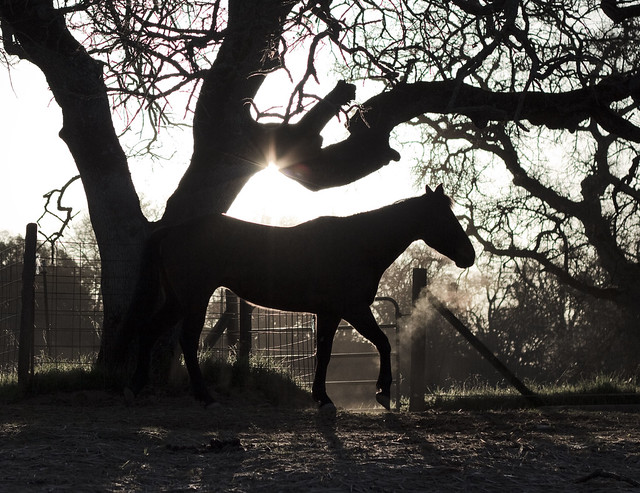
1. Waterfall I don't know how to take a photo of a waterfall either. 2. Bird This is well composed and the lighting is good. The bird is in a classic bird pose. The cloud in the background frames the subject well. This type of photo is good for testing your telephoto lens and autofocus system, and if you only press the shutter button once, it's good practice for your eye for pressing that photo at the correct moment to capture the perfect shot of something in action. 3. Horse I think this shot works very well. I like the silhouette and how the light accents the horse, and how the trees add an interesting structure around the horse visually. The only thing I would change is maybe I would crop it so that everything left of the tree behind the horses behind was gone. Really like this one. I decided to take a photograph today:  2012-95 by Tom Rintjema, on Flickr
|
|
#
¿
Apr 4, 2012 01:57
|
|

|
HookShot posted:
I really like this photo. The way the light is highlighting the greens and yellows in the middle of the frame draws the eye. I like the ugly black building as well, it gives an interesting element. I wish it could be just a little more prominent to break things up a little more. I was just messing around here. 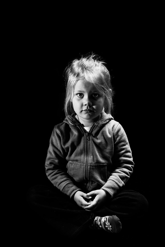 2012-97 by Tom Rintjema, on Flickr Edit: VVV Yes sir, my little girl keeps growing! TomR fucked around with this message at 02:30 on Apr 15, 2012 |
|
#
¿
Apr 15, 2012 02:24
|
|

|
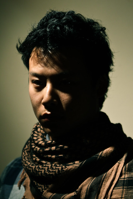
Trambopaline posted:
I don't like that I can't see your eyes. Too much of your face is obscured and that leads to a disconnect with the viewer. I can't make a connection with you because I can't really see your face. I don't know what expression you are making and I can't get an emotion out of the image. I would at least try to get some light on your eyes, they are the most important part of the face.
|
|
#
¿
Apr 18, 2012 00:10
|
|
|
QPZIL posted:
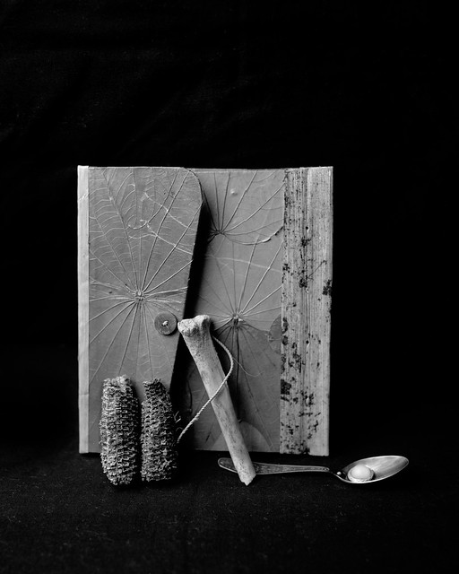
I like the still life alright. Nothing jumps out at me about it, and I don't understand the items in it. It looks nice though and is well done. This photo of the girl, what's the idea behind it? She looks to me like she is making a frump face about having her photo taken. The right side of the image is unattractive, from the dark grey empty of the upper right to the odd stance of her hip in the lower right. Also I don't like the band of light above the back of her head. Her eyes are lit well and her face has a nice defining light on it to separate it from the background. I don't know what's out there, but I would have framed her with more space to her front than to her back. Here is a photo of mine: 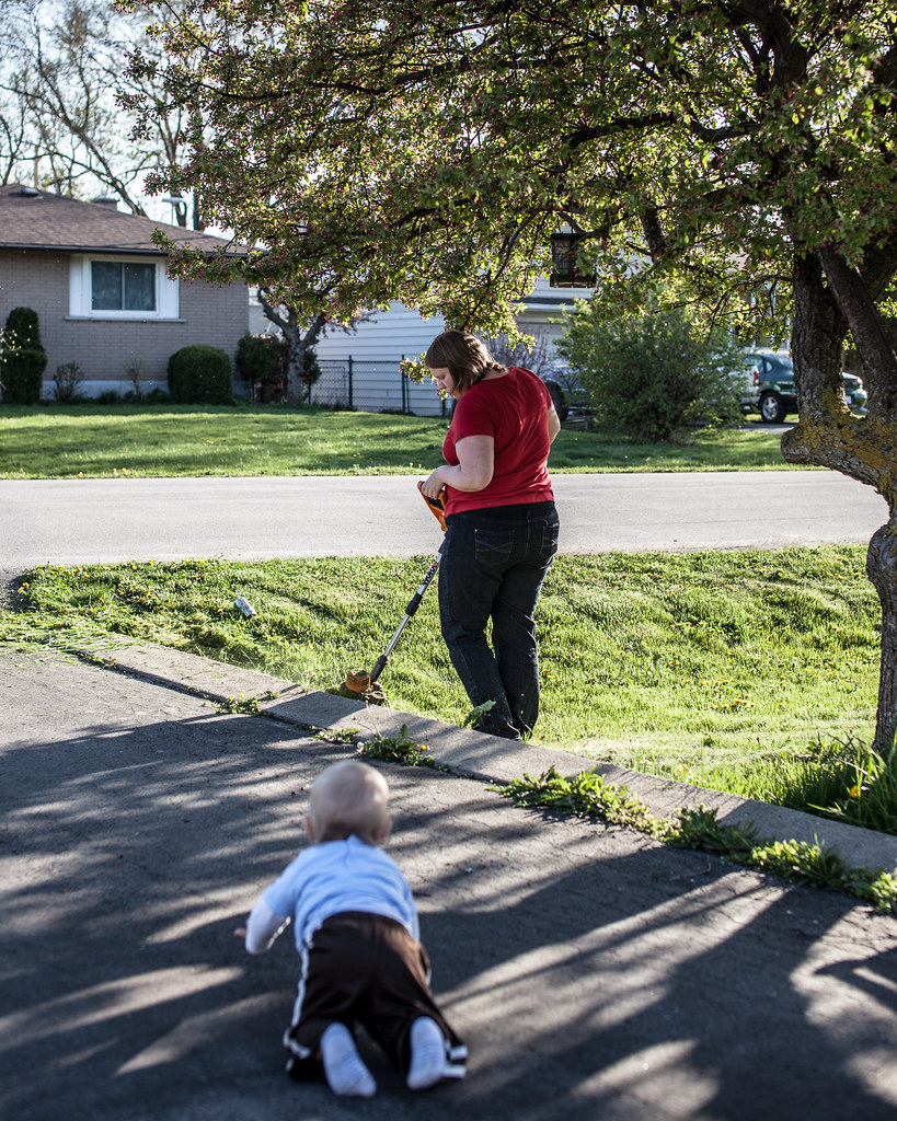 2012-108 by Tom Rintjema, on Flickr
|
|
#
¿
Apr 18, 2012 23:55
|
|

|
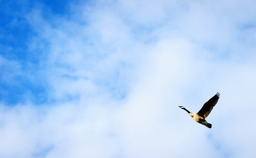
rio posted:Other than the obvious safety issue here, what were you looking to do with this picture? Please don't take this the wrong way, but the beer can on the lawn, the woman and the weedwacking near the baby all make this not a particularly flattering document of this family's life, but maybe I am misunderstanding the point of the picture. I also want to say that I am not trying to be a dick here and I would hope that if the situation was reversed and I was just trying to get a nice photo of my family that someone would point out the things I should think about changing to get better shots in the future. I don't think you're being a dick. I have failed as an artist to make the meaning of my photograph clear. That was not meant to be a nice family snapshot. Instead it was meant to be the exact opposite. My intentions were for you to view this photo and have it make you feel uneasy about the situation. I have received a fair amount of critique on the photo, and while some people were able to guess the intent, it still failed on a few levels. One thing you should do when taking photos of pretty things just for the sake of it is to consider the background. Try to align your subject in a way that the background makes a good contrast with the subject and isn't distracting. This includes thing like poles sticking out of peoples heads and that sort of thing. Also a shallower depth of field to separate the subject from the background would help. Landscapes are best taken when the light is interesting and compliments the land. This is normally in the early morning or late evening when the sun is low in the sky. What you have here is really bright and while it's not ugly, it's suffering from harsh light. The goose photo is pretty good. The placement of the bird in the frame and the timing of it's wings works really well. Here is a photo of mine.  2012-109 by Tom Rintjema, on Flickr
|
|
#
¿
Apr 25, 2012 03:19
|
|

|
maxmars posted:As for my own pic, here's one I shot today. More like a lucky encounter, but it's all I got. I don't like to give technical criticism too much, but I think you've over sharpened this way too much. I almost looks like a photoshop pencil crayon filter was applied to it. I think the concrete cylinders are more interesting than the bird. I would have framed them and used the bird as a point to draw the eye in the composition. As it stands this is more of a documentation that you happened to see a bird. If you do want a portrait of a bird then I would have put him lower in the frame just a bit. This is mine for today: 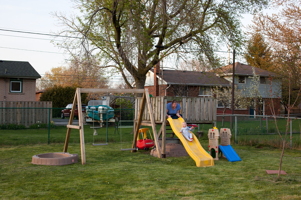 2012-144 by Tom Rintjema, on Flickr
|
|
#
¿
Apr 30, 2012 01:49
|
|
")

|
Thanks torgeaux. I let her pick the outfit.
|
|
#
¿
Jun 8, 2012 01:51
|
|
|
I like the rectangles and circles.
|
|
#
¿
Jul 18, 2012 01:12
|
|
|
David Pratt posted:
I would like to see the structure continue out of frame left. Great concept.
|
|
#
¿
Oct 23, 2012 20:39
|
|
|
If you have icing sugar dust in the air it's hard to see, but it will show up with a flash very well. You don't need any of the actual sugar falling.
|
|
#
¿
Oct 24, 2012 01:00
|
|
|

|
| # ¿ May 3, 2024 12:09 |
|
|
thetzar posted:Crossposted to the portraits thread, I've gone back to manually loving with color temperature. I cool the whole photo, then paint in warmth on the face. It was cold, I wanted it to feel cold. Don't really know if it's cheesy or not. I'd say it's almost cheesy to a little too cheesy depending on taste. You are almost into selective color territory here, but I think the colors you chose and their spacial relationships work well. I'd tone it down personally but I'm sure there are a bunch of people who wouldn't even notice anything had been edited at all.  2014-802 by Tom Rintjema, on Flickr
|
|
#
¿
Dec 22, 2014 16:16
|
|
