


|
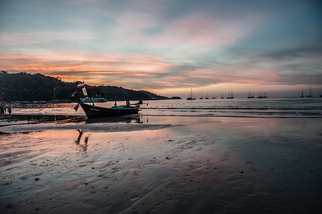
quazi posted:Here's more of whatever this is: In the first one, something about the nature of the compositing makes the stars seem more like dust or something. The second one doesn't seem too silly to me - I like the contrast between organic and constructed. It feels like we're looking at the underwater remnants of a civilization. rio posted:One more I was hoping to throw out there for advice. I was at the mall and this guy was totally asleep standing up behind the counter. This mall is filled with empty stores, it has really declined. All I had was a 16mm lens, so I ended up shooting wide of course, took off some clutter on the left and ended up with my first crop: The second one works better compositionally and I think there's still plenty that shows you how empty the mall is. ------------------------------- A few from California I just scanned. 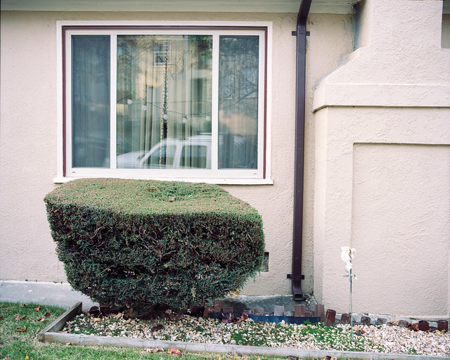 Santa Ray by RHITMrB, on Flickr  Mandana by RHITMrB, on Flickr  Sea View by RHITMrB, on Flickr
|
 #
¿
Feb 13, 2012 05:48
#
¿
Feb 13, 2012 05:48
|
|


|

|
| # ¿ May 22, 2024 16:51 |
|
|
Ambihelical Hexnut posted:I'm confused about the subject here. If you're trying to do what I think you are trying to do in the second photo, then I find the non-parallel lines that are obviously parallel in real life to be sort of distracting because it seems unintentional. Thanks for the crit. The first and second photos are unrelated - the first is more about this meticulously groomed juniper bush that really isn't uniformly shaped at all, whereas the second is meant to be about the uncomfortable arrangement of space that you get at the margins of buildings when they're built on a 15% grade. All of those pictures (and the following ones) were taken in a 1/2-mile radius area in Oakland/Piedmont, California, where my parents live. Xerxes17 posted:Today I decided to finally get of my arse and take a few photos. My reasoning being that the best way to learn how to swim is to throw oneself into the sea. I'd encourage you to think more deliberately about composition. For example, in OldSoldier, why did you cut off the clock tower? Why did you cut off the sides of the artillery piece where you did? That one in particular would benefit, I think, from a much looser composition. Bottom Liner posted:
I think what's throwing people off about the pairing of these two in a diptych is how different the light is in each. drat NIGGA posted:Yeah I have a bunch of ideas I want to do with him. He loves it, couldn't get him to stop smiling. Don't just tell us, show us how cool he is. -------------------------------------------- 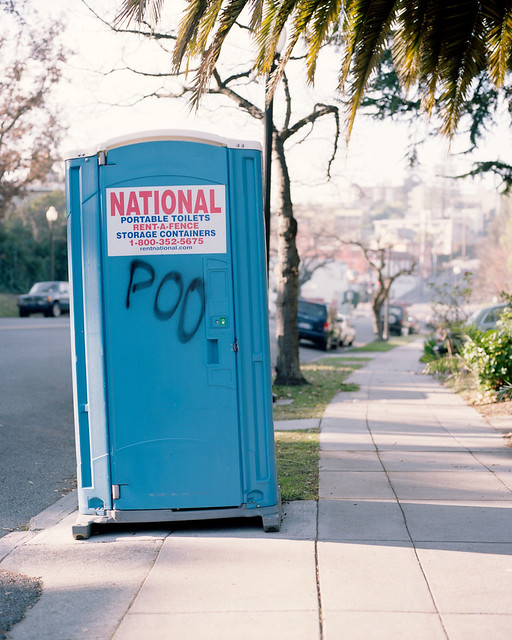 POO by RHITMrB, on Flickr  No! by RHITMrB, on Flickr  580 by RHITMrB, on Flickr edit: rules 
MrBlandAverage fucked around with this message at 15:14 on Feb 17, 2012 |
|
#
¿
Feb 17, 2012 14:44
|
|


|
Man_of_Teflon posted:Did I take the split toning too far on this one? I was going for that dusk look that I like so much. This doesn't look split toned to me, just magenta. OOPRCT posted:I live in a housing cooperative and I'm shooting a project which is essentially a collection of pictures I take of the members. One thing I'm trying to do is to get a head shot of everybody. I have these so far: Try bouncing the light - all of these are still pretty harsh. It'd also be a super easy way to avoid things like the reflections in the glasses in the second one. -------------------------------------------- I tried to approach the subject of my friend's dragster a little more abstractly than I might otherwise. What works? What doesn't work?  Fronts by RHITMrB, on Flickr  Strange by RHITMrB, on Flickr  Rubber by RHITMrB, on Flickr
|
|
#
¿
Mar 6, 2012 05:45
|
|


|
Ferris Bueller posted:Trying to visualize what I want the finished product to look like when I'm finished with it, and this one actually turned out how I saw it. Just wondering what works with this, doesn't work, or if it's complete crap. Fire away. The depth of field and composition is such that I'm not sure what you're trying to say. If you want to show how the icicles at the left look like human figures, crop tighter or use less DoF or do anything to deemphasize everything else. If you're wanting to show how the icicles sit on the shore and/or their interaction with the landscape around them in general, I'd want to see a much, much looser composition. What's happening along the shoreline in the distance, to the right? ohrwurm posted:I would slightly bring up the shadows under the car. Seems a little dark. This is good the way it is. The higher angle leads my eye into the lower left corner in a way I like, and I like being able to see a little more of what's behind the car. whereismyshoe posted:
The problem is that in correcting for the sidewalk, you made everything else out of whack somehow. TsarAleksi posted:Everything about this is right. -------------------------------- This is Green Valley, Arizona. It's a retirement community - city bylaws state that every household must have at least one occupant over the age of 55. There's golf cart lanes (really extra-extra-wide bicycle lanes) everywhere. It's also creepy as poo poo.  Green Valley by RHITMrB, on Flickr  Green Valley by RHITMrB, on Flickr 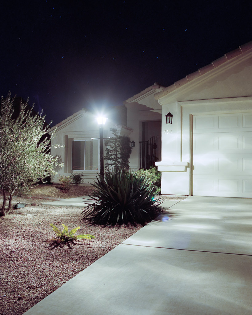 Green Valley by RHITMrB, on Flickr 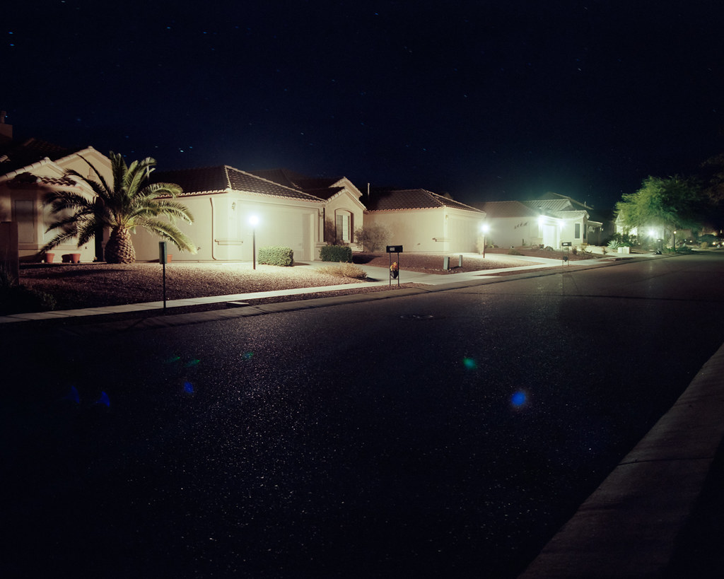 Green Valley by RHITMrB, on Flickr MrBlandAverage fucked around with this message at 07:05 on Mar 14, 2012 |
|
#
¿
Mar 14, 2012 07:02
|
|


|
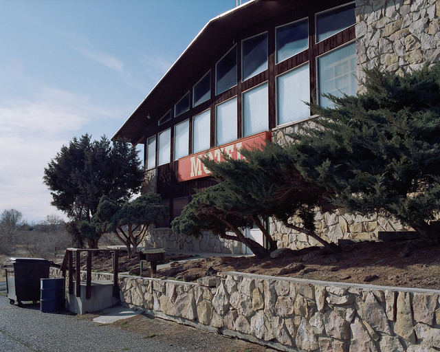
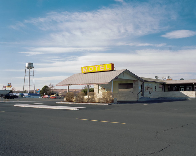
dukeku posted:I really like the first one. It's got enough light in the frame to give it interest, but the tones are still recognizable as night. The others have too much dark space - were you going for something relating to the intensity of the light coming out of homes in the dead of night, or were you just going for a picture of a retirement community at night? If you were going for the "lighting nothing" direction I think they might work a bit better by obscuring the light sources (and avoiding flare) and just letting the light fall. Yeah, among other things, these were meant to be about the intensity of light. I'm not sure how to frame pictures like these without light sources in the frame unless it's a really tight composition. I agree, though, that aside from the first, the interplay of light and suburban landscape isn't what I'd hoped for. Is there some reason you couldn't back off a bit from the shot of the motel with the red sign? It's an unusually tight composition for you. I like how the second motel sits in its sea of asphalt - the wider composition makes a big difference in that regard.
|
|
#
¿
Mar 14, 2012 19:11
|
|
|
Pagan posted:My roommate and I decided to spend the day walking around Boston. The weather was pretty dreary, so I didn't get much good stuff while the sun was up. Please read the OP.
|
|
#
¿
Mar 15, 2012 16:51
|
|


|
Pagan posted:Good critiques take a moment, champ, and the OP specifically says they are not mandatory. Are you referring to another part of the OP? You should make that clear instead of a one line no effort post. Thanks for posting critiques. They may not be mandatory, but if you don't care to make the effort, the SaD thread is there, and gets more attention too. The general trend has been to put critiques in the same post as your pictures, so you'll have to excuse my annoyance. In your first picture I would prefer if that skyscraper in the background weren't there or were hidden by one of the posts, because it's distracting from an otherwise quite visually elegant photo. I think the second would be more compelling if it were a tighter composition more closely focused on the interaction of the two men on the left. ------------------------------------- The previous pictures were more about the gratuitous amounts of light being dumped out of/away from these houses. I'm torn on removing the lens flares, because I think they do help show how much light is there. Here's some more from after the sun started coming up.  Green Valley by RHITMrB, on Flickr  Green Valley by RHITMrB, on Flickr  Green Valley by RHITMrB, on Flickr
|
|
#
¿
Mar 15, 2012 17:41
|
|
|
smallmouth posted:I'm just starting out with taking pictures, so I don't really feel comfortable critiquing anyone's stuff. Critique can be as simple as telling us what you liked or didn't like about an image. If you have working eyes you are qualified to give critique. Why did you take this picture? What are you trying to say with it? Before you worry about technical aspects like the sky being blown out (the main resolution is not shooting at high noon) or composition (could you have taken a step to the left so the tree isn't chopping off the mail truck?), try to address what your subject is.
|
|
#
¿
Mar 22, 2012 20:19
|
|

|
icke posted:I like this one. On the small preview I thought I was looking at some sort of old building with really weird clouds in the background, before I realized what it was. I wonder if longer exposure would have added to that effect to make the water less recognizable and the foreground appear even more out of place. Are the muted colors a product of overexposure, or did you do that on purpose? Either way, it really suits the empty feel of the image. I would consider cloning out the bright spot in the middle of the shadow at the bottom of the stairs, I think it's a little distracting. A smug sociopath posted:I'm relatively new to photography, so I can't really give a professional insight, but there were a few things that this picture brought to mind. I think I'd actually prefer the first one without the contrail - it'd be like an abstract, almost, except anchored by the treeline. As for the second, well, I think subject isolation is a good thing, but yes, I agree, not to the extent it's shown here. Besides stopping down some, it'd be interesting to see a little more context. What kind of road is this? Could that be relevant to the scene? ----------------------------------------- I went on a walk and took pictures of trees. I wanted to get some more practice with the 4x5. 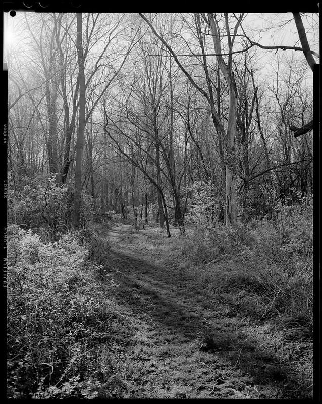 Untitled by RHITMrB, on Flickr 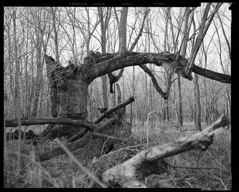 Untitled by RHITMrB, on Flickr
|
|
#
¿
Mar 27, 2012 00:29
|
|


|
David Pratt posted:I just bought a speedlite and I have no idea what the gently caress I'm doing. Here's some test shots, tell me what I'm loving up! Make the light source bigger. As it is now the light is harsh and casting some weird shadows, like the nose and the lip stud. Try bouncing the flash, or use the flash to supplement natural light.
|
|
#
¿
Mar 28, 2012 18:52
|
|
|
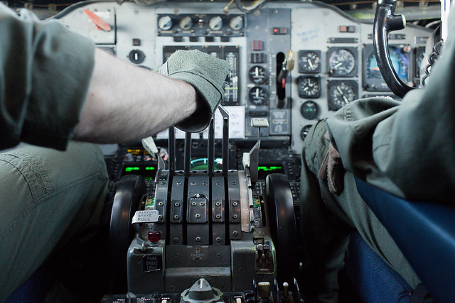
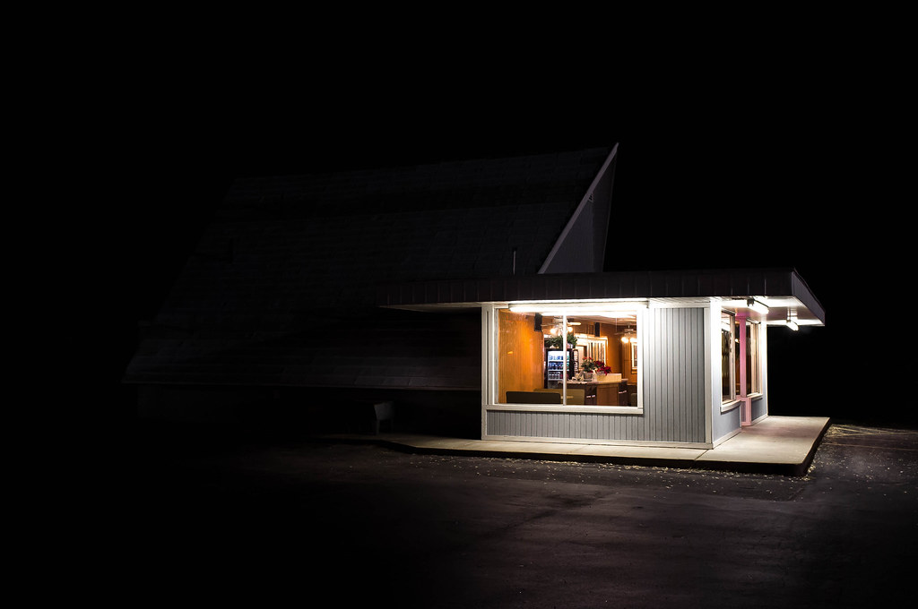
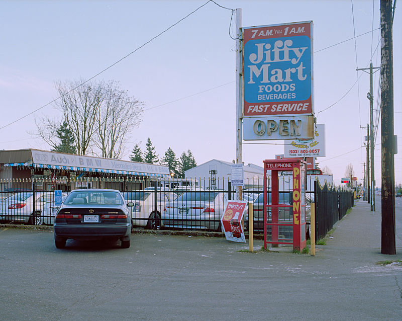
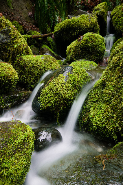
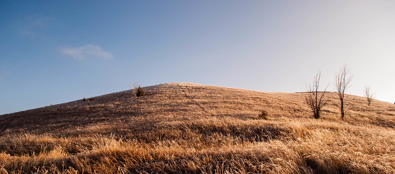
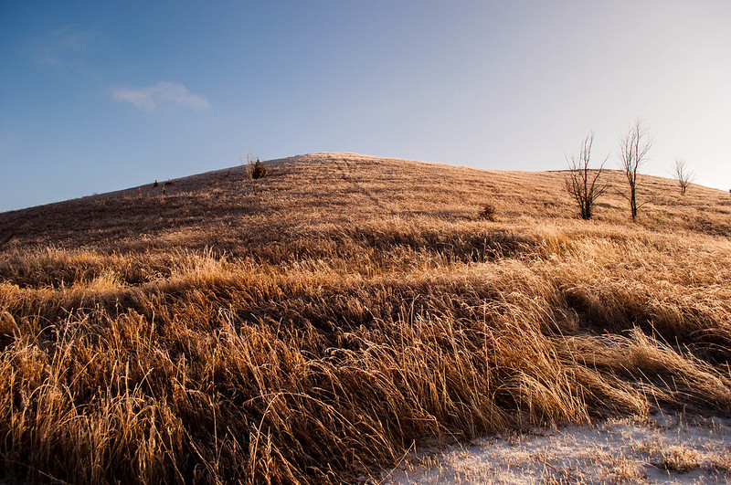
xenilk posted:I think you should read the OP where it says So I guess you didn't look at anything in this thread besides the OP?  Let me help you out a little by quoting this post below. It'll make you a better photographer and hopefully a better poster as well. Let me help you out a little by quoting this post below. It'll make you a better photographer and hopefully a better poster as well.Bottom Liner posted:I'm going to post this here to help both people that are shy about posting critiques and those that are shy about posting photos. Mightaswell posted:I'm compelled to mention that I like this pic, since some others offered harsh critiques. I think a slight angle from shooting a bit more to the left would help define the building as a space rather than a surface, which I think would make it more interesting - the picture isn't just about the sign, right? Aside from the generically pretty-looking sky, most of the visual interest for me is in the boat stuck in the mud at low tide. Could you have gotten closer to it so it wouldn't be lost in the visual clutter right above it? Cyberbob posted:Mine: Nice job balancing flash and ambient in this one. VomitOnLino posted:The tonality and texture of this one speaks to me even though it is quite simplistic. I guess the composition could be better. Both of these are cropped in ways that bother me. Pull back a bit - I feel context and surroundings are important to both of these. I want to see more of the body language of the guy smoking. Also, is he looking at something or just staring off into space? AtomicManiac posted:I absolutely love this. There's something about lighting like that, it just makes me want to only take pictures of gas stations at night. I've never been able to properly put it in words, maybe it's just because I love light that comes from above (which is how I light like 95% of my portraits). The blacks aren't black. Is that intentional? Also agreeing that you should crop to emphasize the action, since it's really tight on the left. HeyEng posted:Here's one from flying today. Usually I take the camera to go snapshot the landscape or whatever but I figured might as well try to capture just how complex and dingy a flight deck really is. I think you framed this really well for your intent but I'd like to see it with more depth of field if you really want to emphasize the complexity of an instrument panel. AIIAZNSK8ER posted:Thing I found interesting tonight: I agree with the people telling you to leave all the black space to the left; I like the isolated feel it gives. I'd include more black space to the right, though, to balance the picture a bit better. dukeku posted:I really, really like this although I think it would be a bit more effective if you had made the perspective lines created in the ceiling intersect with the edges of the frame. Were you perfectly centered when you took the shot? I think the reason this doesn't work as well as some of your other stuff is because there's so many competing subjects going on - the lines in the right 1/4 and top 1/3, the sign, the phone booth, the car on the near side of the fence conferring with its imprisoned buddies, etc. No one subject is strong enough to make me say "that is the subject of this photo." Demon_Corsair posted:I think this may have worked better if the duck was just a silhouette, so being out of focus wouldn't matter. This is a fantastic scene and you should go back when you have a camera where you can use some front rise. Also, the dust  fnif posted:I like this one, but there's something that's just not working for me. I don't know, but somehow I feel that the jacket is taking too much of my notice. Was the intent just "the light hitting this thing is nice, let me capture it"? Tell us more about what you were hoping for and we can help you make it better. Dread Head posted:I dig everything about this - the color, the detail in the moss, the way the eye flows through the picture along with the water... eggsovereasy posted:
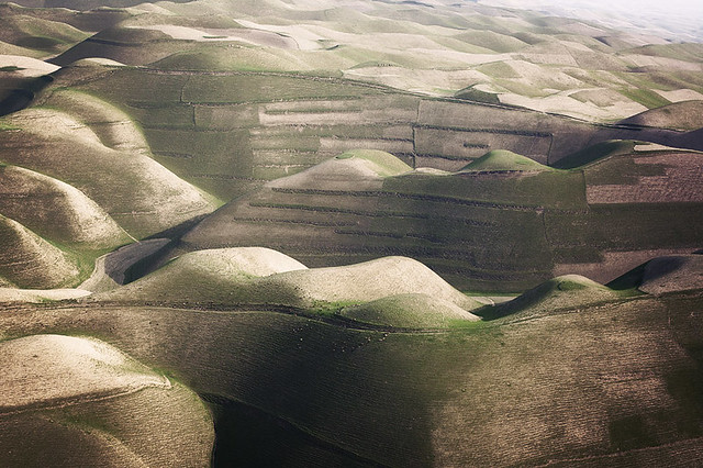
I think this is better off for the flat tire - it provokes more questions, along with your choice of black & white. If I didn't know you'd taken this, it could be from when the car was new. EatinCake posted:Here are a few from myself. What do these tell us about the subjects' personalities? As far as I know, for example, the first one suggests he's the kind of wanker who ~ironically~ sharpies "thug life" on their fingers. Remember that the rest of us don't know these people. TheLastManStanding posted:This first one is definitely channeling some William T. Hornaday up in here. Ambihelical Hexnut posted:No SAD makes me sad, but I'll play along. Recent critique a few posts above this one. I love both of these but the first one especially reminds me favorably of William Garnett's abstract aerial landscapes. Keep going with this. Find beauty in these smaller sections of landscape, if you can. ohrwurm posted:
I too would like this more without the road/guardrail at the bottom. It's a cathedral-like space and the road takes away from what would otherwise be a visually pure image. hepkitten posted:
The hand in the foreground isn't enough to tell the story - as is, it's just a distracting, disembodied hand. For it to tell the story more completely we'd need to see more of the second-place finisher attached to it, even if it were still a tight crop. The green in the skin on "windup doll" is what makes me think "zombie." Maybe a masked color adjustment would help? Musket posted:I really quite like this one. The colors pop rather well with each other, and i really enjoy how much depth is added by the farm in the distance. Over all a really great photo. The vignetting is a little extreme. Also, I can't un-see the little bit of clear reflection right under the middle of the bridge - I wish it weren't there.
|
|
#
¿
Apr 3, 2012 21:10
|
|


|
Oprah Haza posted:Crosspost from portraits thread: Besides what the other people said about these, another thing that makes the third one uncomfortable looking is that it's the only one in which the subject is looking directly at the camera. Nondo posted:Nondo posted:I don't remember why I framed the cactus this way (shot this in December). I kinda like it but I don't. Thoughts? Since you're committed, I say crop tighter - maybe to just above the clouds hovering over the cactus on the right. Mr. Despair posted:This is a shot I took a few months ago in the evening as some snow flurries were coming in. I like how there's a nice split down the middle between the incoming snow and the blue skies. I'm not sure which of these crops work better, or if I should try something else with this. I definitely prefer the second. I prefer having the visual interest of the edge of the grass meeting the snow at the bottom. ---------------------------------------------  Nest by RHITMrB, on Flickr 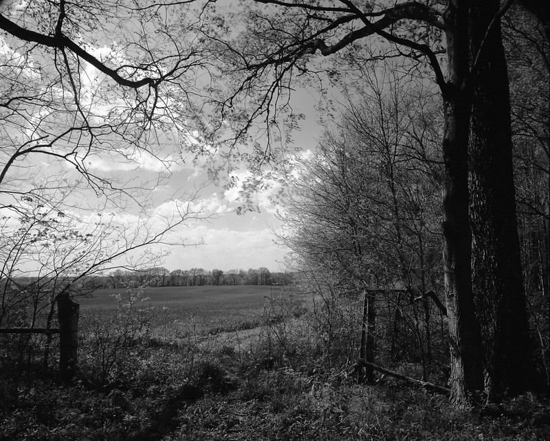 The Edge of the Field by RHITMrB, on Flickr
|
|
#
¿
Apr 9, 2012 05:18
|
|


|
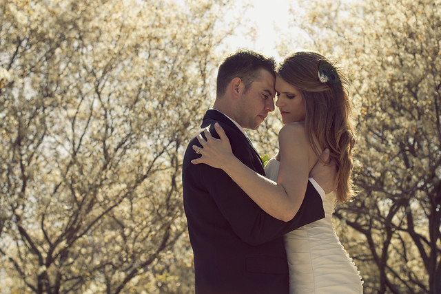
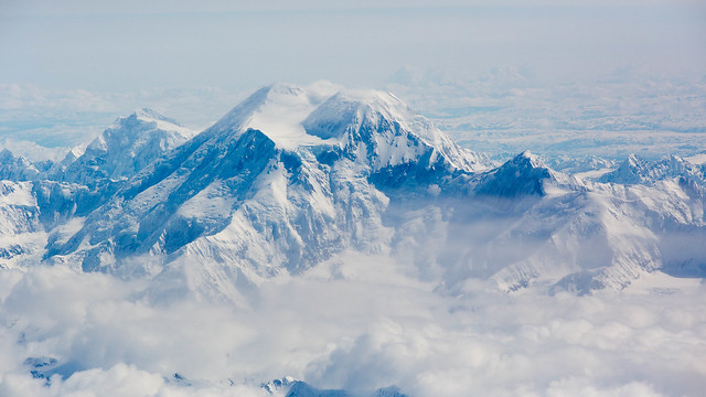
xenilk posted:As for me, just a shot from my first wedding. Used an ND 4 filter on that one, such a sunny day. I have to agree that both the bride and groom look uncomfortable/tense here. TheJeffers posted:Thanks for the compliments. I bounced my flash off the opposite wall on a whim while I was refining the picture and it turned out well, so I carried that into the final shot. Black and white is definitely better for this - it emphasizes form and tone more. HeyEng posted:Anyhow, I don't do landscape shots often because I find them really difficult to grasp and having aliencowboy post his poo poo makes me feel very inferior. With that being said here is Mt McKinley. Shots through airplane windows are always tough but that second one is about as good as it gets. aliencowboy posted:The weather around here is finally starting to be consistently pleasant. It's been motivating me to get up at ungodly hours in the morning and drive out into the country, exploring the back roads before having to scramble back into the city for work. Waiting for the weekend would be easier, but where's the fun in that? There's something about these I don't like quite as much as most of your work. The first one especially seems super flat - I think what makes most of your stuff work is when your processing style emphasizes the directionality of light. --------------- Here are some parking lots.   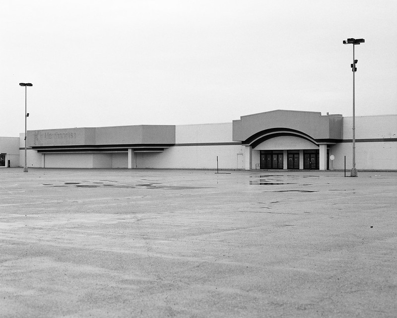
|
|
#
¿
May 10, 2012 14:14
|
|


|
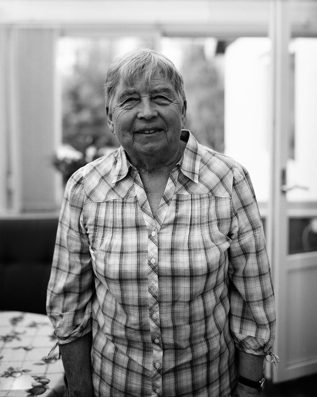
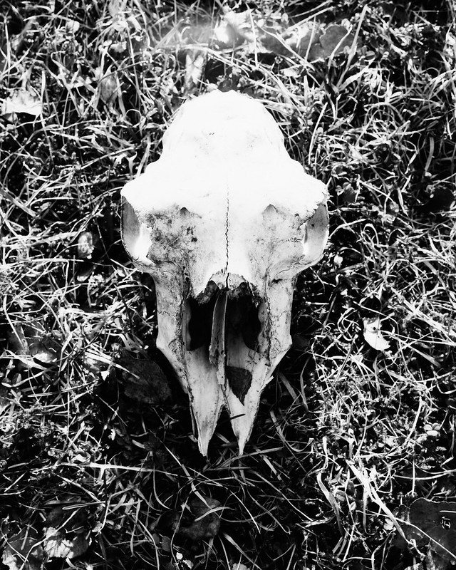
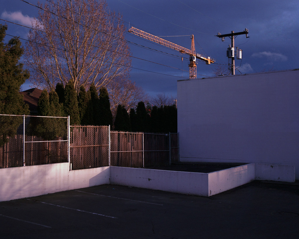
sensy v2.0 posted:Of the three, I think the first is the weakest. It doesn't interest me as much as the other ones for some reason, and I think the busy background with all the trees makes it feel out of place compared to the other two. I can see that one being out of place with the other two, certainly. What about in a series with more pictures of parking lots, where the lots themselves rather than the surroundings are more clearly the subject? What I like about that first one is the three different tones of asphalt... sensy v2.0 posted:These three are me trying to get back into large format, and portraits are not something I usually do. The first two are great as environmental portraits. I wish there were just a little less clutter on the seat behind your grandfather, and I wish your grandmother were standing a little further back, in the same place as your grandfather was, so her hands wouldn't be cut off. The pictures work better individually than together because of this, I think. Watch your highlights. The skull looks pretty blown out. Bad scan, or is the negative blocked up in the highlights? 8th-samurai posted:Here is another one from my city in color series: Normally I hate this kind of color cast, but here it just makes me think of golden hour on a day where there's a cloud cover that happens to be open where the sun is setting, so you get a certain kind of light bouncing off the bottom of the clouds in addition to the normal golden hour light. I really dig how the crane is lined up with the power lines - it's hard to find ways to manage the presence of power lines in urban landscapes and you did it here. HookShot posted:
If only the benches were straight in that last one  The one of the museum guard is about perfect. This reminds me of JaundiceDave's series about people interacting with art, except because he's there all the time, to this guard the art is so mundane. The only thing I'd change would be to crop top and left so the painting runs all the way into the corner. ---------------- I've been shooting some color negs too. I haven't forgotten about you my sweet Portra... 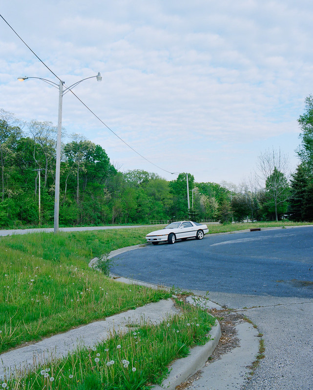 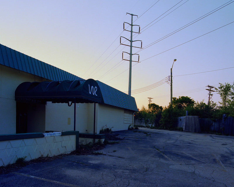 I had trouble with this last one - I wanted to show the emptiness of this subdivision without including too much sky, but now I feel it's a little too wide. Thoughts? 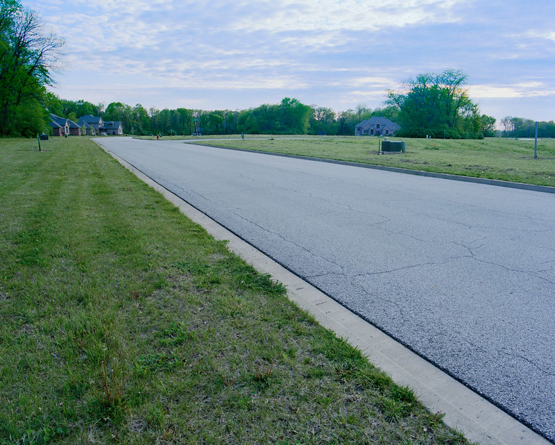
MrBlandAverage fucked around with this message at 17:22 on May 11, 2012 |
|
#
¿
May 11, 2012 16:36
|
|


|
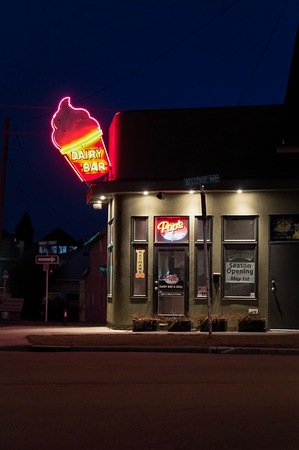
guidoanselmi posted:cyan/red balance might need a lil adjusting - at least on firefox for my monitor. The first one looks like you have a reflection of a reflector in her eye? It makes her look a little  , like the other people said. I like the second one best even though the posing of the hands seems a little forced or something. The third one has a weird shadow where your lights didn't catch her right eyesocket and I'm distracted by that one out of focus flower. , like the other people said. I like the second one best even though the posing of the hands seems a little forced or something. The third one has a weird shadow where your lights didn't catch her right eyesocket and I'm distracted by that one out of focus flower.drat NIGGA posted:I really like this one, but I think it the sky could be cropped down even more. It'd be three rectangles, one sand, one ocean, and one sky. What's the subject here? What are you showing us? Please think about how people who are not you are going to interpret a scene visually with the context removed. Also, I don't see a mountain... None of the straight lines in these seem to be vertical or horizontal and it bugs me. doctor 7 posted:Did some more night time photos and I swear after uploading the Flickr the colours are a touch off for some reason. Also the lens flare from the powerful lights is starting to get to me. Is there something I can do about that or is it just Flare is something you pretty much have to  when using a kit zoom. Most good primes will handle it better, though with that kind of scene it's nearly impossible to avoid. when using a kit zoom. Most good primes will handle it better, though with that kind of scene it's nearly impossible to avoid.My favorite of these is IMG_4966 because of some of the little details and the way you lined up everything here. For example, utility poles are a pain in the rear end to deal with compositionally, but the way it's lined up with the front of the building is great. I also like Nighthorts because you captured the building without any cars or other distracting compositional elements around it, so it's a clean look the others don't have. ---------------------- Two random things. 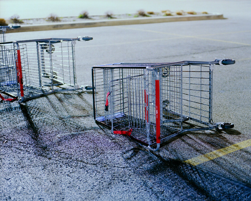 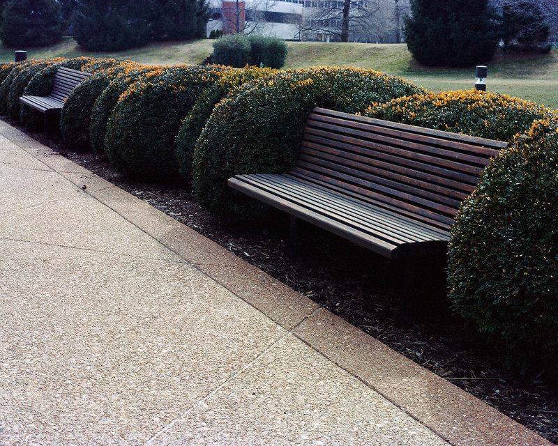
|
|
#
¿
May 14, 2012 14:26
|
|


|
Augmented Dickey posted:I think this would work better with a larger aperture- as is, the exposure and tones are very nice but I find myself distracted by all the detail in the top fifth of the frame.  8th-samurai posted:Explain to me why you ruined what might have been my favorite photograph (at least this week). HookShot posted:
nielsm posted:
------------------ Took a drive up a rural state highway on a foggy morning. Skies not very interesting, but I like the fog in the first one.  
|
|
#
¿
May 22, 2012 01:47
|
|
 Seriously though, I love everything about this photo except the left upper edge. This would have owned so hard if that third cart wasn't there and the second cart was entirely in frame. Having them all bunched up together just ruins the balance for me.

|
Lon Lon Rabbit posted:
The lighting in this is intense. How did you get this shot? I can't imagine a pumpkin like this just being left alone by itself.
|
|
#
¿
May 22, 2012 15:46
|
|

|
David Pratt posted:Unusually, I like the central composition of these, they remind me of a kid's drawing of a house. And not in a bad way - little kids are loving masters of composition. In retrospect, this would have been a really good place to use some shift to get the road straight without having to move the camera... the posted:You are not. They are good. All of these look like they got metered for the bright part of the sky and as a result there's no detail in anything else. This might be okay if the "everything else" weren't a major part of the composition of each. MrBlandAverage fucked around with this message at 04:47 on May 24, 2012 |
|
#
¿
May 24, 2012 04:45
|
|


|
Dread Head posted:To me they look like he (she?) went for a walk through a local park. None of the images to me really look like a lot of thought went into the subjects/composition of the images. I don't really think they are bad photos I Just find them boring, and somewhat forced (I want to use my new gear!). I think unless you have purchased gear to solve a specific issue that you will always have this problem and after the novelty of the new gear has worn off you will have a better idea of what that gear is best for and you should use it for that. It's important to use your new gear so you do know what it is good and bad for so you can get the most out of it. I think that just going on a photowalk isn't per se enough to make the pictures snapshots. I think the problem is that they don't seem to have a particular subject; if you're just going to take a picture of how things are arranged, they had better be arranged in a compelling way. That might be my bias showing through because these next two pictures are from a photo{walk|drive}. I don't think the composition of the second one is what I was hoping for, though.  
|
|
#
¿
Jun 17, 2012 22:21
|
|
|
Pukestain Pal posted:Crop out most of the Here, I made this post more helpful.
|
|
#
¿
Nov 19, 2012 19:38
|
|
|
Pukestain Pal posted:Quick and dirty crop. Obviously you'd want to do better than this, but you get the idea. That's not an improvement - I think you made it boring. It doesn't have the tension from the two different light temperatures and between the flat wall and the space in the background anymore. I will say I wish the car weren't there, but your crop is the wrong way to resolve that.
|
|
#
¿
Nov 19, 2012 19:55
|
|

|
 Maverick by Isaac Sachs, on Flickr Who Gotch Ya posted:
The subject gets lost in the visual noise in this one. "5PTZ Hip Hop Nurse 2" is the best of this set. The Jizzer posted:Here's three more from my first night shoot with my RX1. Keep in mind it was pretty much dark as poo poo. The first one is boring - it doesn't tell a story like the other two do. Also, what's up with the excessive vignetting on it? Deadreak posted:I decided to keep this photo under-exposed, maybe wrong choice. I think this would work way better as a square crop or 1.25:1 crop. The very top and bottom don't really have any visual content. For me the picture is all about how the sunlight is breaking over the mountain ridge, so emphasize that.
|
|
#
¿
Jan 17, 2013 06:31
|
|


|
RangerScum posted:It's part of Indiana Dunes State park, about a one hour drive from Chicago, which after looking at your avatar I am guessing is probably somewhat close to you. FYI, the Michigan City Generating Station uses coal and natural gas, so it's not nuclear  Aside from the balloons, the steam coming out of the cooling tower also looks weird to me. edit: because what Spime Wrangler said.
|
|
#
¿
Feb 27, 2013 19:05
|
|
")
|
sw1gger posted:drat dude, you really need to learn how to engage in conversation. drat dude, you really need to learn to respond to critique less defensively.
|
|
#
¿
Apr 26, 2013 17:38
|
|
|
beneatsfood posted:If you want details, look into researching Jeremy crewdson and see if you could appropriate anything from his methods. He puts a loooot of time into his work though. Ah, yes. Spending $50,000 on a set and lighting it is a great idea and the logical next step for somebody with a D7000.
|
|
#
¿
Jul 22, 2014 17:13
|
|
|
simosimo posted:D7000 with the '35mm' prime lens. I like it a lot, and would love to hear other methods of squeezing out that raw-detail of subject matter, normally non-humans! Shoot 20x24 film. This is a more sensible recommendation than using Gregory Crewdson's methods. Hope this helps.
|
|
#
¿
Jul 23, 2014 00:27
|
|
|

|
| # ¿ May 22, 2024 16:51 |
|
|
threnody posted:Un-HDR-'d, I don't think either of these are that remarkable. Composition on the first one is good, but I hate that I had to crop out the very front of the castle because it had all kinds of scaffolding and poo poo all over it. An unremarkable image is unremarkable with or without HDR. HDR is not a band-aid for bad photos, sorry.
|
|
#
¿
Mar 25, 2015 23:19
|
|