


|
It's clearly the focus of the picture, and your composition reinforces that.
|
 #
¿
Jan 4, 2012 18:35
#
¿
Jan 4, 2012 18:35
|
|


|

|
| # ¿ May 7, 2024 00:39 |
|
|
I know kodachrome is cool and all but clean your slides, those are disgusting.
bellows lugosi fucked around with this message at 02:36 on Jan 11, 2012 |
|
#
¿
Jan 10, 2012 22:06
|
|
|
Enigma89 posted:It looks like he was at Burning Man, and if so it means cleaning his lens would have been impossible. Those are spots on the film, not on the lens. If that's what they're like after cleaning (if the dust was there pre-exposure there's no hope), but if any of it is post-exposure dust it can be cleaned.
|
|
#
¿
Jan 11, 2012 17:16
|
|
|
If you're using bulb mode, you can just cover up the lens with a piece of cardboard and wait for the car to pass before continuing your exposure.
|
|
#
¿
Jan 26, 2012 00:42
|
|
|
AceClown posted:I'm a sucker for retail shots, but I think with this one you could have done a little better providing some context. By putting her right in the middle you're forcing the composition to be about her, when I think it's really more about her and the space she's occupying. Maybe I'm nuts. Here's a few from a "project" I've been doing that I could use a little input on: 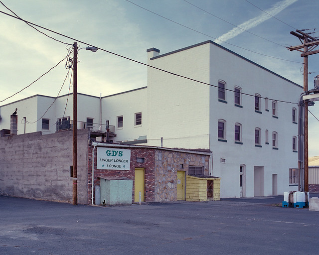   The series I'm doing is mostly about the more rural/agricultural side of Oregon that's often overlooked. I'm still not particularly good at fleshing out my ideas into writing, but I'm trying to invoke the feeling of standing in what amounts to an empty area while still feeling the connection to human life - scenes where people could be, but aren't. How do these work, with that in mind?
|
|
#
¿
Feb 23, 2012 00:50
|
|

|
David Pratt posted:The first one is ok. I'd have tried looking down between the wheels for a symmetrical shot. The second one is great. The third one is a bit boring and doesn't have a strong subject. The grainy texture isn't enough to hold the eye - I'm more interested in the spring in the background but it's out of focus. I'm the opposite - I mostly only like the first. The second one doesn't do anything for me, and the third could use harsher contrast to highlight the worn rubber.
|
|
#
¿
Mar 9, 2012 23:28
|
|
|
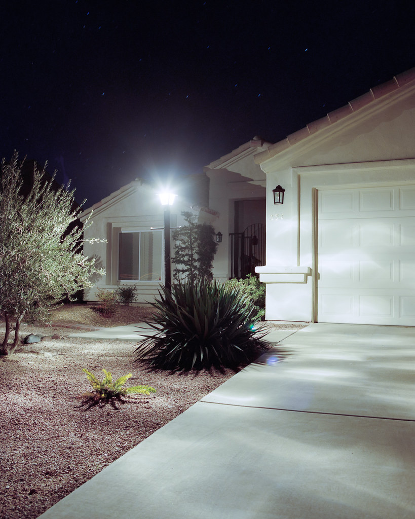
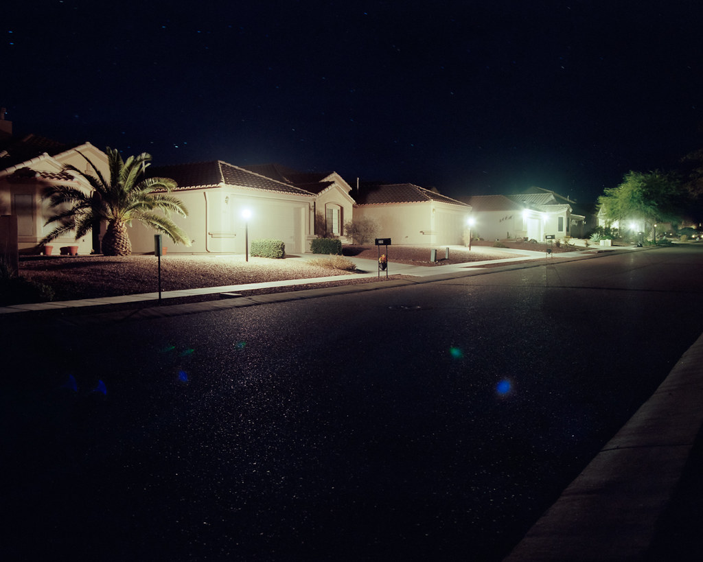
MrBlandAverage posted:This is Green Valley, Arizona. It's a retirement community - city bylaws state that every household must have at least one occupant over the age of 55. There's golf cart lanes (really extra-extra-wide bicycle lanes) everywhere. It's also creepy as poo poo. I really like the first one. It's got enough light in the frame to give it interest, but the tones are still recognizable as night. The others have too much dark space - were you going for something relating to the intensity of the light coming out of homes in the dead of night, or were you just going for a picture of a retirement community at night? If you were going for the "lighting nothing" direction I think they might work a bit better by obscuring the light sources (and avoiding flare) and just letting the light fall. ------------------ Here's some more stuff I'm throwing in with my east of the cascades project:  
|
|
#
¿
Mar 14, 2012 18:07
|
|


|
I completely regret not stepping back now. I took a few shots of the same building from various angles, most too far - across the road and sitting back onto an empty lot next to I-84. I was mostly going for the juniper obscuring the entrance, but I think it would be stronger if I had stepped back about 15 feet and hit it a little more dead-on.
|
|
#
¿
Mar 14, 2012 19:17
|
|
|
Pagan posted:This is my favorite of the three. You've got a good capture of that golden moment, where the light from the sun and the light from artificial lights are equal. The colors are nicely saturated, too, especially that gorgeous sky. I disagree with you and think the first image (with tire tracks reversing) is the strongest. I think the subject is absolutely clear - he doesn't need to open up the aperture to make it clear. Pagan posted:This pretty much suffers from what you're describing - no clear subject and "everything in focus". Why does that work for your image, but not his?
|
|
#
¿
Mar 15, 2012 18:14
|
|

|
Pagan posted:Is the subject the tire tracks? If you think it's a good shot, then fine, but I strongly disagree. There's a lot of noisy business in this image, nothing about the light or the sky is interesting. If the subject is supposed to be the tire tracks, then different photographic choices would make that more clear. Of course it's about the tire tracks - they're symbolic. Look at this similar shot by Todd Hido:  It has more going on in the background, but I think it's pretty clear what the subject is. You don't see the significance of tire tracks going in and backing out, or the significance of the houses actively hidden behind shrubs? It's a landscape, it's about all of the elements of the photo interacting to give an idea. Pagan posted:For example, a much wider angle, and lower field of view would make the tire tracks loom larger, and push all the other stuff farther away. The plants and buildings would be much smaller. The sky would also be a much bigger part of the picture, and a polarizing filter would make it a darker blue. The sky in the 3rd shot looks amazing. Also, not having the horizon smack dab in the middle of the frame would break it up a little. That would remove all context from the photo, making *the entire shot* the tire tracks and taking away context and interest. Pagan posted:It doesn't work for mine, and his critique is spot on. The buildings in the background take away from the lines, shapes, and curves of the pilings and the pier. I have other shots where you can't see the skyline in the back, and it makes for a much stronger image. If you were trying to make it about the curve of the pier, I think you would be better off leaving the left side more open rather than having an underexposed log creating a harsh boundary. Try to have it flow from one side of the frame to the other, rather than restricting.
|
|
#
¿
Mar 15, 2012 18:33
|
|
|
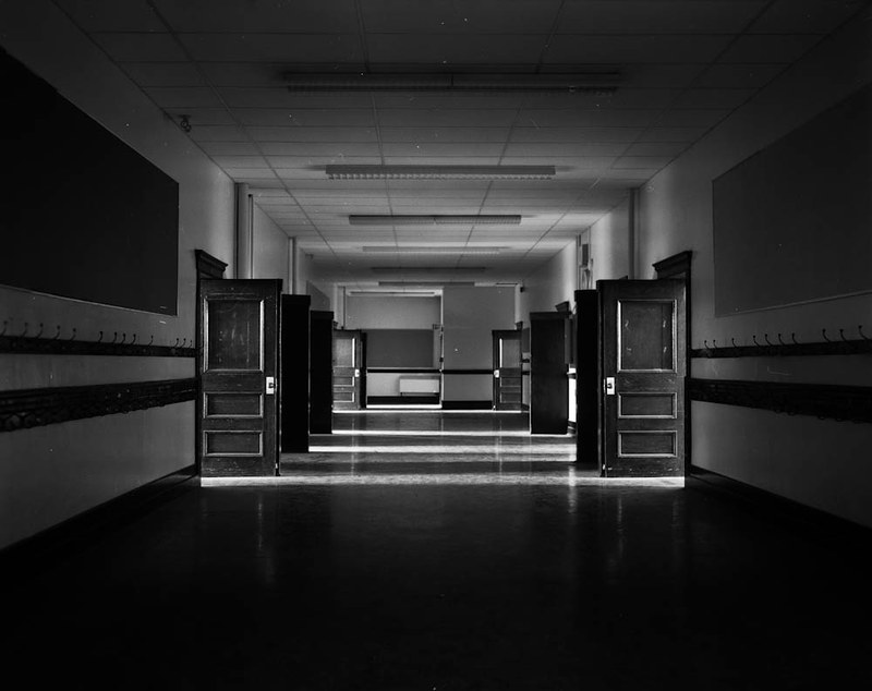
No critique? I think you need to straighten the horizon, maybe bring up the blacks. If you're going for the silhouette look, there's too much light in the corridor and not enough at the end - something that could be fixed with a bit of curves tweaking.
|
|
#
¿
Mar 29, 2012 19:48
|
|
|
AtomicManiac posted:This one is composed on the "Golden Spiral" which I guess is just an augmented form of the rule of thirds + it has symmetry? I don't know I'm not good at this stuff. I guess it is kind of generic though, here's two others from the night that are a bit more exciting. Don't just use LR's crop guides to tell you how to compose.
|
|
#
¿
Mar 29, 2012 23:31
|
|
|
rcman50166 posted:
I don't understand what you're going for here, aside from the "photowalk" look. Your critique of whereismyshoe is pretty apt in this case: "But I can't help but ask myself here, what am I supposed to be looking at? "
|
|
#
¿
Mar 30, 2012 17:10
|
|
|
rcman50166 posted:I'll think twice about posting here in the future. You should think twice about what kind of images you post, not what kind of critiques you give or what kind of feedback you may see. Constructive criticism doesn't always seem nice when you're the person being criticized. edit after edit: rcman50166 posted:I was once told in the snapshot a day thread to post in here for some good criticism, and not to fear photo a day. I think I was mislead. Critique is how you improve. Dumping photos with hopes of someone saying "Nice job!" will not cause you to advance as a photographer, it will just encourage you to continue to take horrible photos.
|
|
#
¿
Mar 30, 2012 22:02
|
|
|
rcman50166 posted:I generally post a photo here if I think it is decent. I don't post garbage on purpose. I know I am not the best photographer in the world and have much to learn, and that more experienced photographers might have something to tell me that I didn't see before. That's the kind of advice I am looking for, not people jumping on my back about a criticism I was not comfortable doing. Any criticism you give is good criticism, don't feel bad about giving your opinion on something - that's why people are posting here.
|
|
#
¿
Mar 30, 2012 22:09
|
|
|
fnif posted:
Why do you think you like it? There's nothing there.
|
|
#
¿
Apr 2, 2012 19:20
|
|

|
Demon_Corsair posted:I think this may have worked better if the duck was just a silhouette, so being out of focus wouldn't matter. I really, really like this although I think it would be a bit more effective if you had made the perspective lines created in the ceiling intersect with the edges of the frame. Were you perfectly centered when you took the shot? Here's a "discard" from a recent roll that I could use some feedback on: 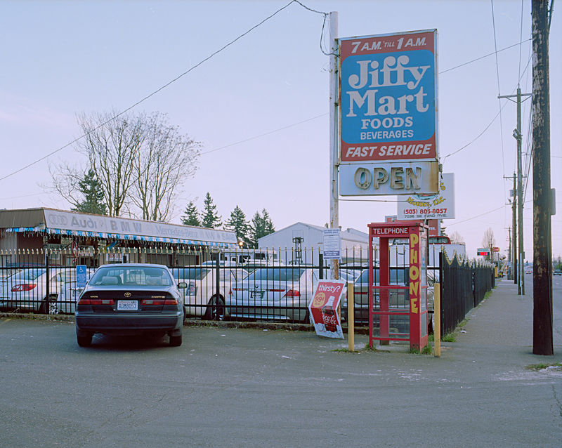
|
|
#
¿
Apr 2, 2012 19:48
|
|
|
Buceph posted:My thoughts on it are that I should have just ignored the sky. It was a very bright day, with almost total but very thin cloud cover. I should have just let the sky blow even more, and gotten a bit more depth in the black. Aren't the buoys black? They're already fairly grey in the final image, bringing the blacks up any would make it look pretty unnatural, IMO.
|
|
#
¿
Apr 3, 2012 00:49
|
|
|
TsarAleksi posted:Crossposting in multiple threads is just like submitting to groups, right???
|
|
#
¿
Apr 3, 2012 17:20
|
|

|
Mightaswell posted:
I like the subject, but I feel you could have done a little better including the sidewalk in the frame. If you had backed up a tiny bit and allowed the curb to sneak into the frame, you would have a nice "corner" feel going on. I'd also probably shoot it 15 minutes earlier into the sunset for a bit more ambient light on the building and a bit more contrast in the sky.
|
|
#
¿
Apr 3, 2012 19:20
|
|
|
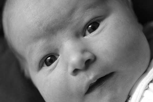
Bad Munki posted:New day, new allowance of three photos! Still working on this... Why do you have to be so close? Is the baby a monster, ready to devour the frame?
|
|
#
¿
Apr 5, 2012 20:10
|
|
")
|
Mannequin posted:How did you manage to turn that New York street into a funhouse?
|
|
#
¿
Apr 6, 2012 22:43
|
|

|
Oprah Haza posted:I think the biggest problem with this guy is the slouching. Each photo you've posted of him, he looks unconfident and huddled. Mannequin posted:I think this has a bit more "character" than your regular stuff, you tend to stick with the "down the street" perspective pretty frequently. samjack56 posted:
Based on the title I think I understand what you're going for here, but it mostly looks like you found a corpse on a dock. Here's 2 recent photos of mine: 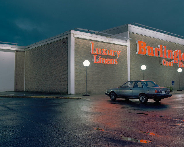 
|
|
#
¿
Apr 9, 2012 16:47
|
|


|
Santa is strapped posted:Medium format film and skill. Print film and careful metering. Pretty sure you could still manage to keep highlights under control on 35mm film.
|
|
#
¿
Apr 9, 2012 23:44
|
|
|
Better than the second one, but it'd be even better if you didn't cut her chin off with the railings.
|
|
#
¿
Apr 10, 2012 00:31
|
|

|
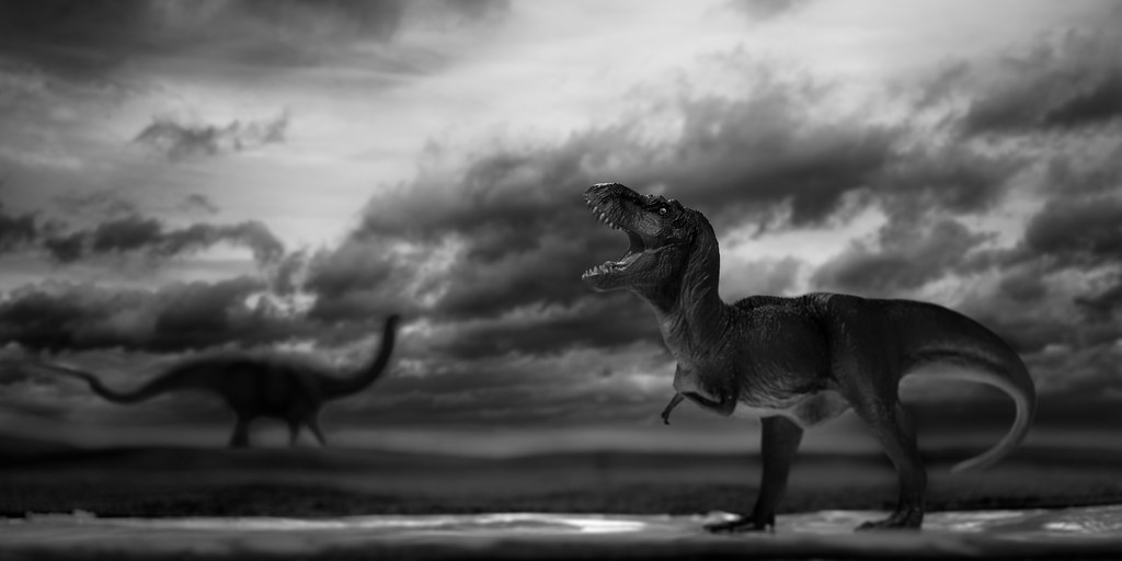
TomR posted:
I really dig this, but I do feel that the blacks are too deep on the in-focus dinosaur. Maybe burn a tiny bit near the tail to bring it out?
|
|
#
¿
Apr 25, 2012 19:38
|
|
|
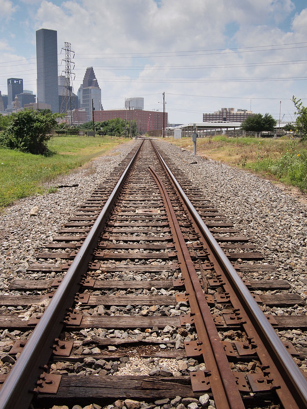
Augmented Dickey posted:Does the world need more train track photos?
|
|
#
¿
Apr 29, 2012 17:09
|
|

|
Oprah Haza posted:Does the world need more portraits/travel photos/shots of monuments/shots of flowers/wildlife photos/concert photos/medical photos/...? I'm sorry my critique didn't meet your standards. Let me rephrase. Train tracks are boring. If you're going to critique someone for using an overused angle, don't post your own photos of the same loving thing in the same post. Train tracks are easy, that's why they're clich�. This thread isn't for snapshots.
|
|
#
¿
Apr 29, 2012 22:16
|
|
|
William T. Hornaday posted:Define 'snapshot' please. Two shots of the same subject in the same post, slightly different, just scream "out taking snapshots" to me. Augmented Dickey posted:Sorry, I guess I should stick with taking shots of old toyotas in front of the burlington coat factory. If you can't take it when someone critiques your photos, this thread isn't for you. bellows lugosi fucked around with this message at 23:03 on Apr 29, 2012 |
|
#
¿
Apr 29, 2012 23:00
|
|
|
Augmented Dickey posted:Did I miss the part where you posted an actual critique? All I saw was 'I don't like train tracks'. If you feel like putting any effort into posting a critique of my shots I would be more than happy to read it. How do you give a thought-out response to a photo that you didn't even think about when taking? Your composition is completely contrived. You can't rely purely on two lines moving to a vanishing point to create an interesting photo. The skyline is boring and muddled. The light is flat, the greens look sad and it appears that the vanishing point moves to the left rather than directly to the center.
|
|
#
¿
Apr 29, 2012 23:13
|
|
|
Now, in contrast, if you'd like to say something about my photos - please do. I spend a lot of time taking them and a lot of time considering what I show other people, and I greatly appreciate when someone (especially a detractor) tells me they dislike it. No one has ever improved through misguided praise.
|
|
#
¿
Apr 29, 2012 23:17
|
|
|
the posted:
Give this some more contrast (through curves) and you'll have a pretty nice image. Right now it's mostly flat. the posted:
The horizon's crooked here and I'm not really sure what drew you to this scene - the bench? The idea of the view? The dead-on composition isn't really doing it any favors as far as setting a mood/tone.
|
|
#
¿
May 2, 2012 21:13
|
|


|
Augmented Dickey posted:I see what you're going for here, but I don't think your composition supports it very well. How your lines interact with the edges of the frame is just as important as how they interact in the middle of the frame.
|
|
#
¿
May 4, 2012 17:12
|
|
|
8th-samurai posted:I think you are right, too wide. The looming foreground just doesn't work here. I think the most natural way to show emptiness is in a straight on manner. Using wide angle tricks always makes it look exaggerated and that doesn't always work. A more matter-of-fact shot closer to the the houses might give you what you are looking for. 100% agree. There's far too much empty space in the frame and it makes the image more about the pavement than anything else.
|
|
#
¿
May 11, 2012 17:53
|
|
|
VomitOnLino posted:No people photos from me this time. Took this on the fire escape of a tall building when I was shooting a cityscape which didn't come out. (Notice a pattern?) Like the color and the simple geometry in this one. I want to like this more, but one of the bars on the ladder cage almost perfectly lines up with the edge of the building and compresses things a bit too much for my taste. Did you take any pictures of the same subject, maybe sitting more towards the right? I'd also like to see the verticals a little straighter for a subject like this.
|
|
#
¿
May 11, 2012 19:00
|
|

|
Trying out slides at night, metering is a little tricker than with print film.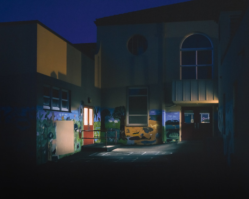 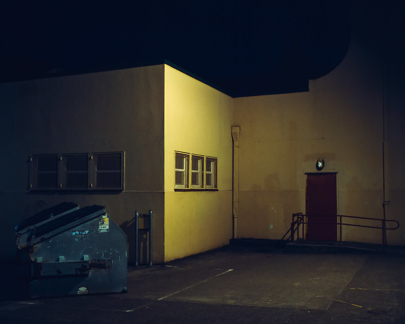
bellows lugosi fucked around with this message at 01:33 on May 12, 2012 |
|
#
¿
May 12, 2012 01:28
|
|
|
You took a photo with dimension and perspective and made it into a boring, zero-perspective mess.
|
|
#
¿
Nov 19, 2012 19:56
|
|
|
smallmouth posted:Cool, thanks for the comments. Rotating it isn't going to fix it as it's perspective distortion. You can correct that with a variety of tools.
|
|
#
¿
Feb 5, 2013 21:01
|
|
|
drat dude, you really need to learn how to handle some critique.
|
|
#
¿
Apr 25, 2013 20:03
|
|
|

|
| # ¿ May 7, 2024 00:39 |
|
|
I don't think that was anyone's critique.
|
|
#
¿
Apr 25, 2013 20:43
|
|